Movie Poster Design vs Concert Poster Design: What's the Difference?
Movie poster design and concert poster design both turn promotion into a visual event. Each uses bold typography, striking focal points, and layered imagery to grab attention fast, but movie posters usually aim for polished storytelling and broad commercial appeal, while concert posters lean into expressive graphics and subcultural energy.
People compare them because they share many tools: dramatic composition, vivid color, and strong hierarchy. The difference is in intent and finish. Movie posters are built to sell a narrative and genre at a glance; concert posters are built to capture mood, sound, and scene with more texture, spontaneity, and graphic attitude.
Same Prompt, Both Styles
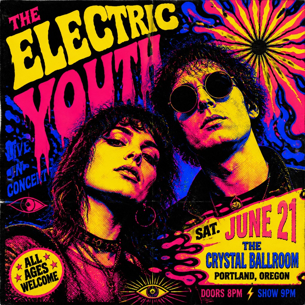
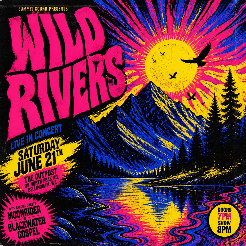
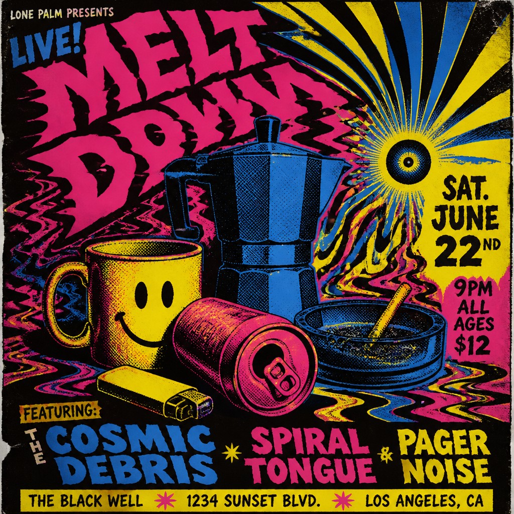
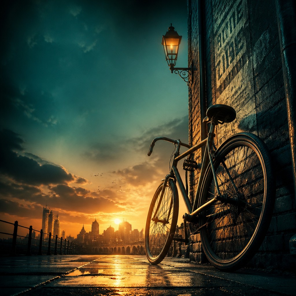
Each pair below was generated from the identical prompt — only the style changed.
“portrait of two people together”

“wide landscape with natural scenery”

“still life with everyday objects”

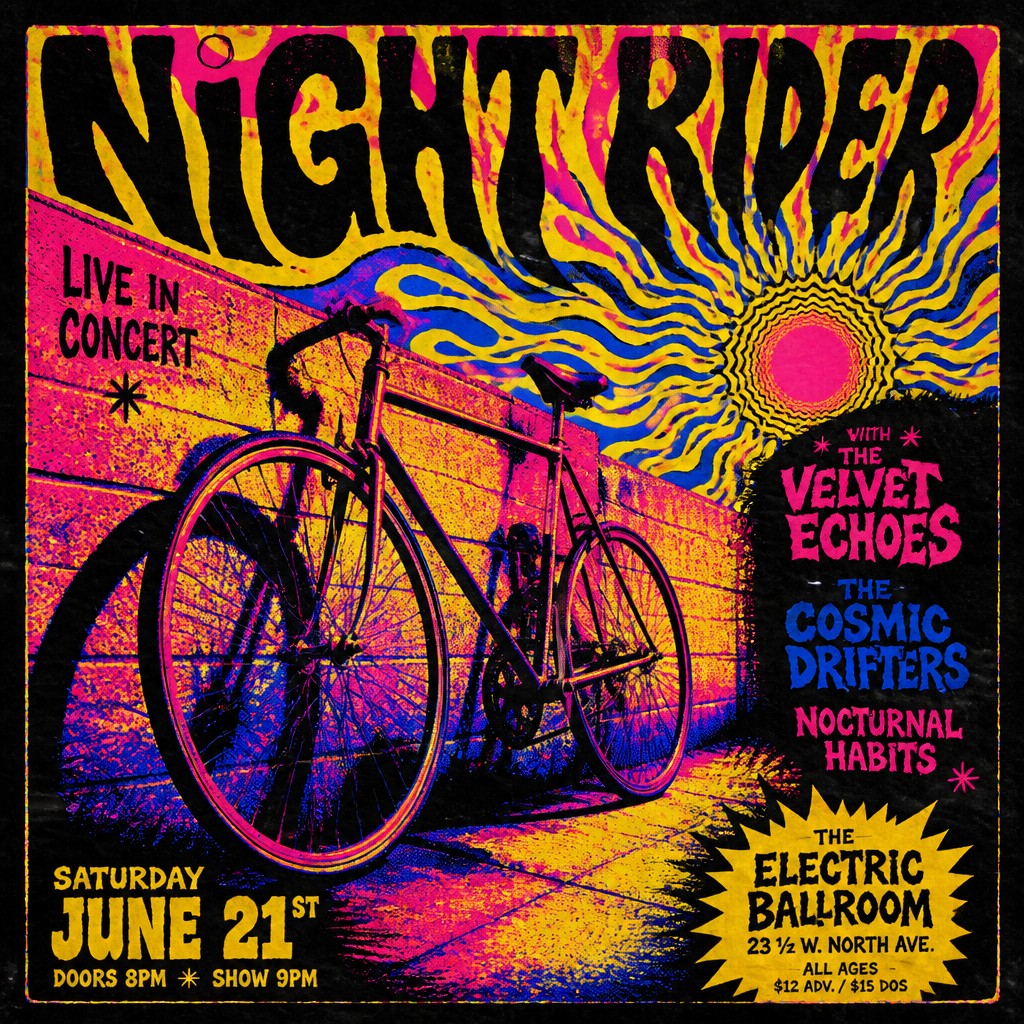
“bicyle resting against a wall”
Key Differences
| Movie Poster Design | Concert Poster Design | |
|---|---|---|
| Purpose | Promotes a film by suggesting story, genre, and spectacle. | Promotes a performance by amplifying mood, sound, and identity. |
| Composition | Often centered on faces, ensemble layouts, and cinematic depth. | Often built from bold shapes, dense type, and poster-like balance. |
| Imagery | Uses characters, scenes, and visual clues from the movie. | Uses symbols, abstract motifs, instruments, or energetic forms. |
| Color | Prefers blockbuster grading, dramatic contrast, and controlled palettes. | Prefers psychedelic hues, high saturation, and unexpected combinations. |
| Texture | Usually looks polished, glossy, and film-advertising ready. | Often shows screen-print grain, rough edges, and DIY wear. |
| Typography | Supports readability and title recognition with clear hierarchy. | Can be more experimental, expressive, and integrated into the art. |
| Mood | dramatic, cinematic, tense, epic | bold, electric, psychedelic, rambunctious, edgy |
| Energy | intense | intense |
| Detail level | detailed | detailed |
| Color | high-contrast, saturated, atmospheric | high-contrast vivid saturated colors |
| Texture | polished, glossy, layered | flat graphics, halftone, grainy ink |
| Origin | 20th-century film marketing | 1960s–1970s music poster culture |
| Best for | movie posters, trailers thumbnails, event promos, album covers, book jackets | concert posters, album covers, festival flyers, music event ads, band merchandise |
| Difficulty | advanced | moderate |
Which Should You Choose?
Choose movie poster design when you need a polished, narrative-driven image that quickly signals genre, cast, and scale. Choose concert poster design when you want a louder, more tactile piece that feels handmade, energetic, and rooted in music culture. If the goal is broad mainstream appeal, go with A; if the goal is personality, edge, and event-specific atmosphere, go with B.
Frequently Asked Questions
Are movie posters and concert posters both considered graphic design?
Yes. Both are promotional graphic design formats that combine typography, imagery, and composition to communicate quickly. They differ mainly in tone, production style, and the kind of message they prioritize.
Which style is more readable from a distance?
Movie posters often prioritize distance readability through a clear title hierarchy and familiar layout conventions. Concert posters can also be readable, but they more often favor expressive composition and texture over strict clarity.
Can a design mix both styles?
Absolutely. A poster can combine cinematic lighting and composition with screen-printed texture or psychedelic color. The key is deciding whether the finished piece should feel more polished and narrative or more raw and music-driven.
Which style is better for digital sharing?
Movie poster design often works well in digital spaces because its polished look translates cleanly across screens. Concert poster design can also perform strongly online, especially when the bold color and texture create a memorable, shareable image.