Die-Cut Sticker Design vs Hand-Drawn Sticker Design: What's the Difference?
Die-cut sticker design and hand-drawn sticker design are two popular ways to make stickers feel finished and expressive. Die-cut sticker design focuses on bold outlines, flat color, and a cut-to-shape silhouette that reads clearly and prints cleanly. Hand-drawn sticker design leans into sketchy ink lines, watercolor fills, die-cut borders, paper grain, and visible imperfections that make each sticker feel crafted by hand.
People compare them because both aim for strong visual impact, but they create very different moods. Die-cut stickers usually look crisp, polished, and production-friendly, while hand-drawn stickers feel warmer, more organic, and personal. Choosing between them often comes down to whether you want precision and clarity or texture and handmade character.
Same Prompt, Both Styles
Each pair below was generated from the identical prompt — only the style changed.
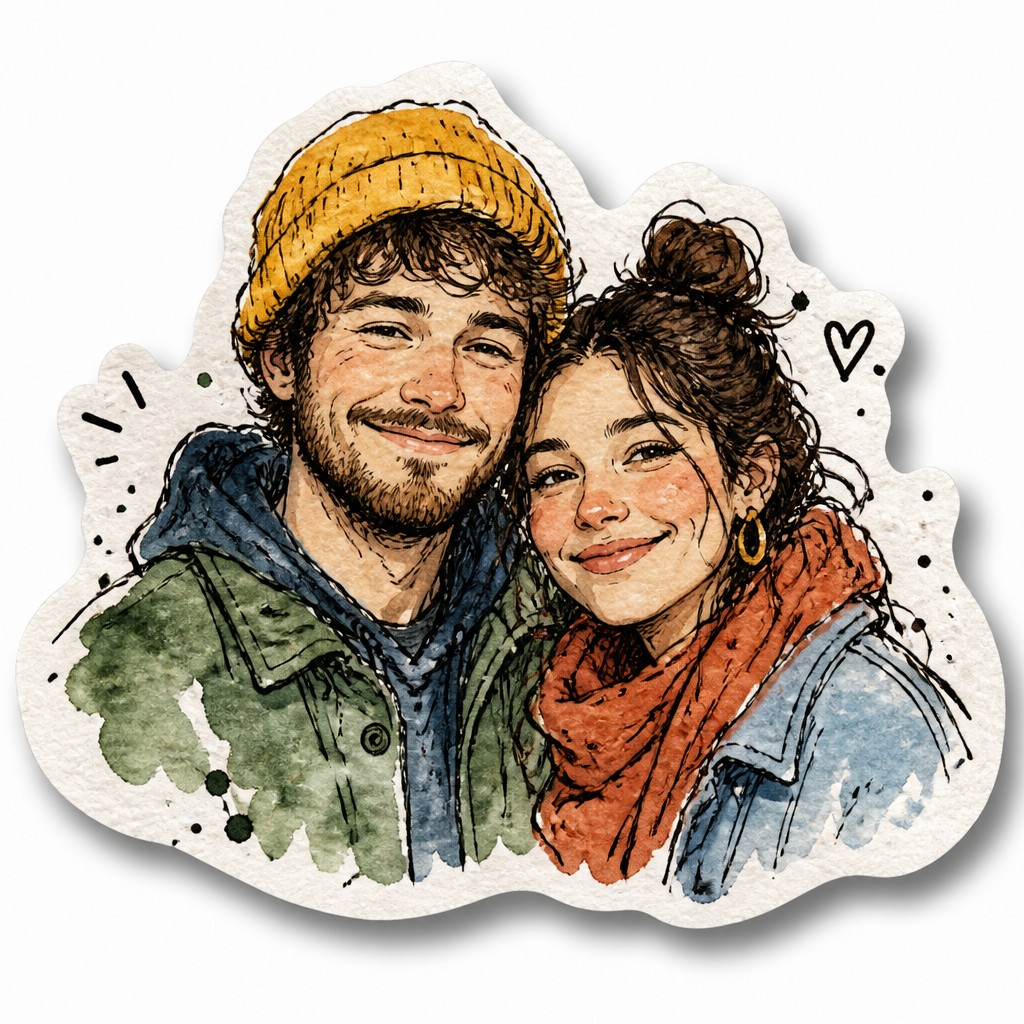
“portrait of two people together”

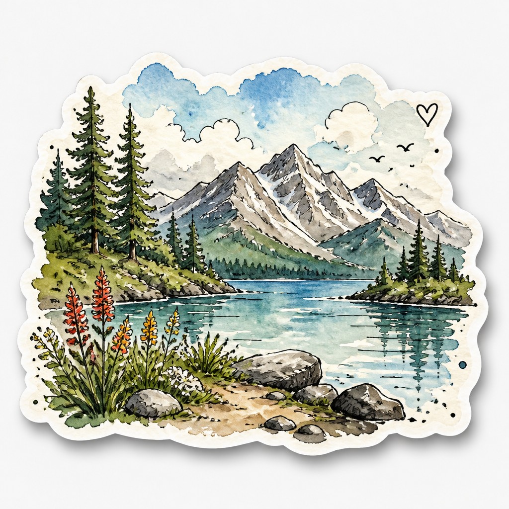
“wide landscape with natural scenery”

“still life with everyday objects”
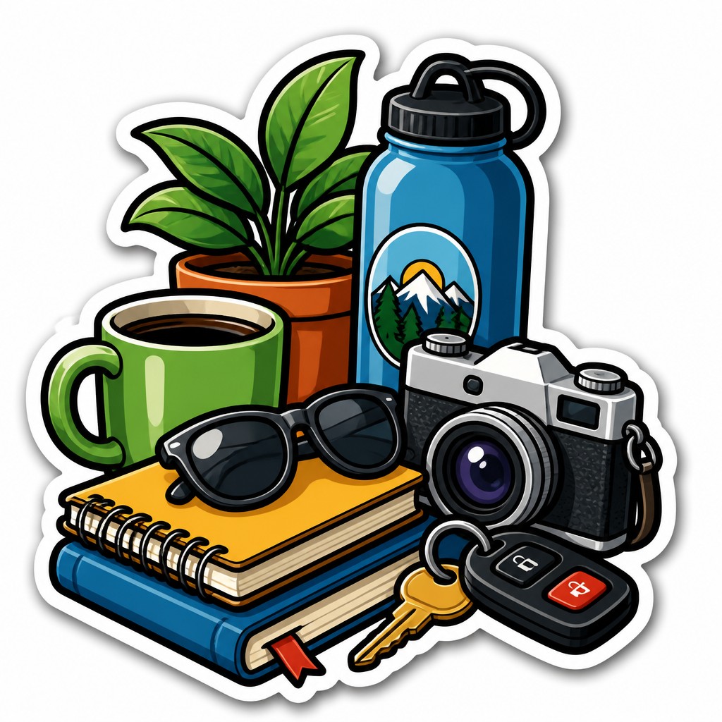
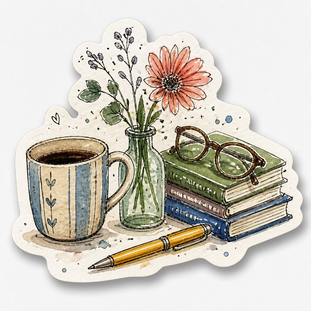
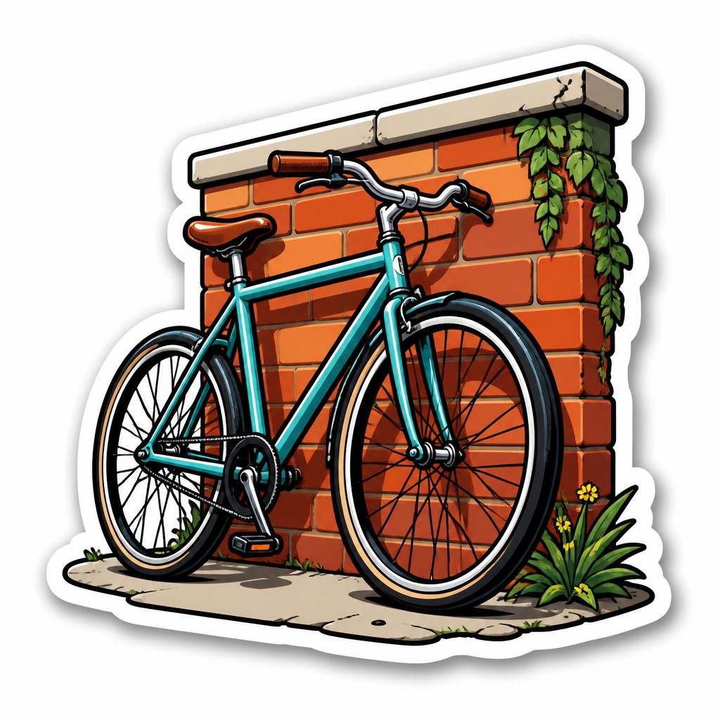
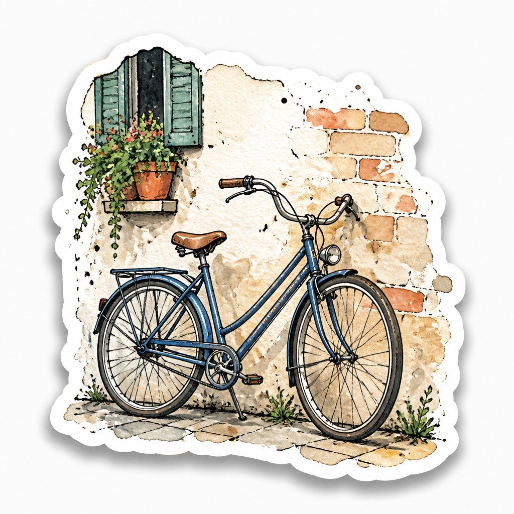
“bicyle resting against a wall”
Key Differences
| Die-Cut Sticker Design | Hand-Drawn Sticker Design | |
|---|---|---|
| Line quality | Bold, clean outlines with consistent edges. | Sketchy ink lines with visible hand-drawn variation. |
| Color treatment | Flat, solid color areas with minimal texture. | Watercolor fills and subtle tonal variation. |
| Shape and border | Cut-to-shape silhouette defines the sticker form. | Die-cut borders frame a looser, handmade interior. |
| Texture | Smooth surfaces with little or no paper feel. | Paper grain and imperfect marks are part of the style. |
| Overall finish | Polished, crisp, and print-ready. | Organic, tactile, and intentionally imperfect. |
| Visual mood | Cleans up the image for a graphic, modern look. | Adds warmth, charm, and an illustrated handmade feel. |
| Mood | playful, bold, clean, cheerful | playful, tactile, whimsical, friendly |
| Energy | lively | balanced |
| Detail level | moderate | moderate |
| Color | bright flat colors with strong contrast | soft watercolor hues, muted and natural |
| Texture | smooth vector-like crisp edges | paper grain, sketch lines, organic imperfections |
| Origin | digital-native aesthetic | digital-native aesthetic |
| Best for | laptop decals, water bottle stickers, brand merch, social media graphics, packaging labels | app stickers, planner icons, social media graphics, children's books, merch designs, packaging |
| Difficulty | beginner-friendly | beginner-friendly |
Which Should You Choose?
Pick die-cut sticker design when you want sharp readability, simple shapes, and a professional finish that reproduces well across sizes. Choose hand-drawn sticker design when you want texture, personality, and a craft-like look that feels more expressive and human. If your priority is clarity and clean production, go with A; if your priority is warmth and artisanal character, go with B.
Frequently Asked Questions
Which style is easier to print consistently?
Die-cut sticker design is usually easier to reproduce consistently because it relies on flat color and clean outlines. Hand-drawn sticker design can print beautifully too, but its texture and tonal variation may need more careful color management.
Which style looks more handmade?
Hand-drawn sticker design looks more handmade because it includes sketch lines, watercolor fills, and visible imperfections. Die-cut sticker design can still be custom and creative, but it generally feels more polished than handcrafted.
Can these styles be combined?
Yes, many sticker designs mix the two approaches. A design might use a die-cut silhouette for a clean finish while keeping hand-drawn linework or watercolor texture inside.
Which style works better for simple logos or icons?
Die-cut sticker design often works better for logos and icons because its bold outlines and flat color improve clarity. Hand-drawn sticker design is better when the image itself is meant to feel illustrative, textured, or personal.