Kawaii Sticker Design
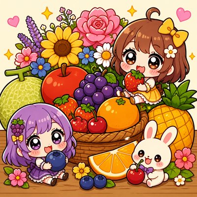
Cute Japanese-inspired sticker art with pastel colors, thick outlines, chibi characters, and glossy, die-cut charm.
Instantly rendered in Kawaii Sticker Design — or transform a photo
Kawaii Sticker Design Gallery
Tap any artwork to explore it
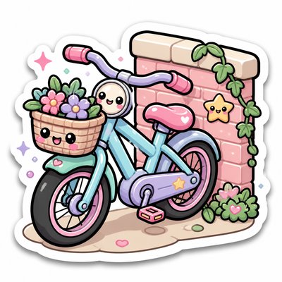
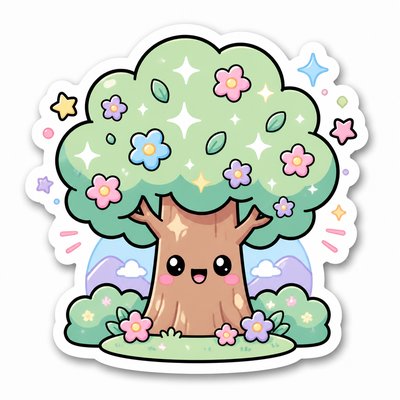
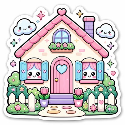
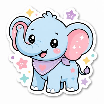
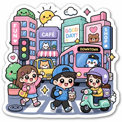
What is Kawaii Sticker Design?
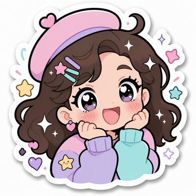
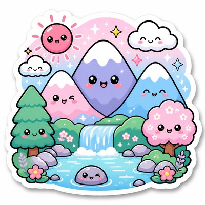
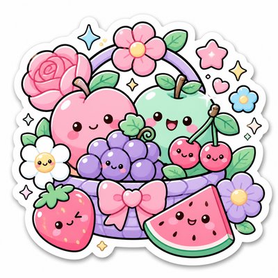
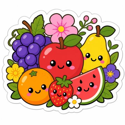
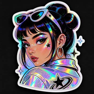
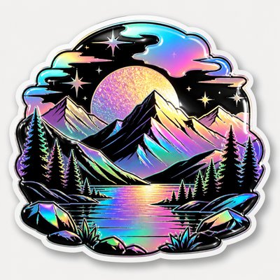
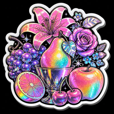
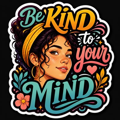
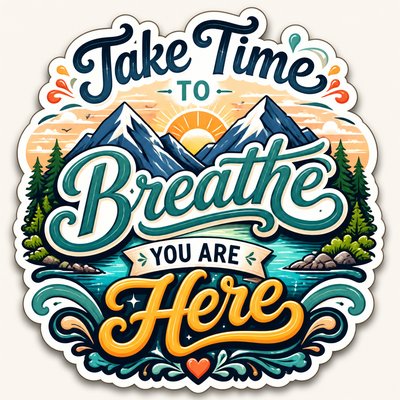
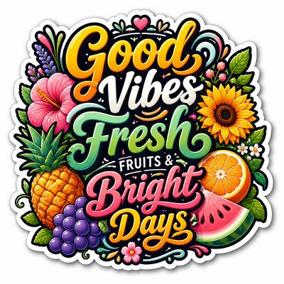
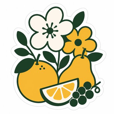
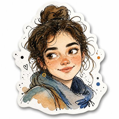
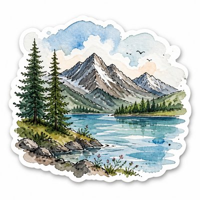
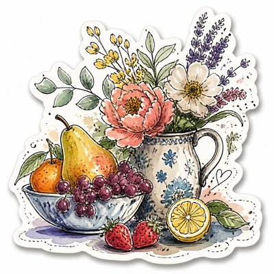
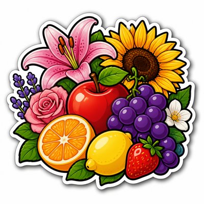
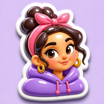
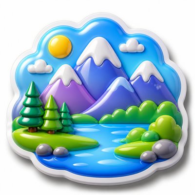
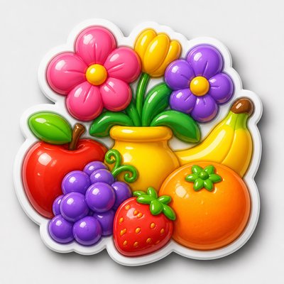
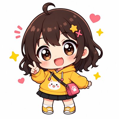
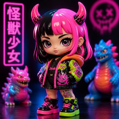
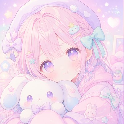
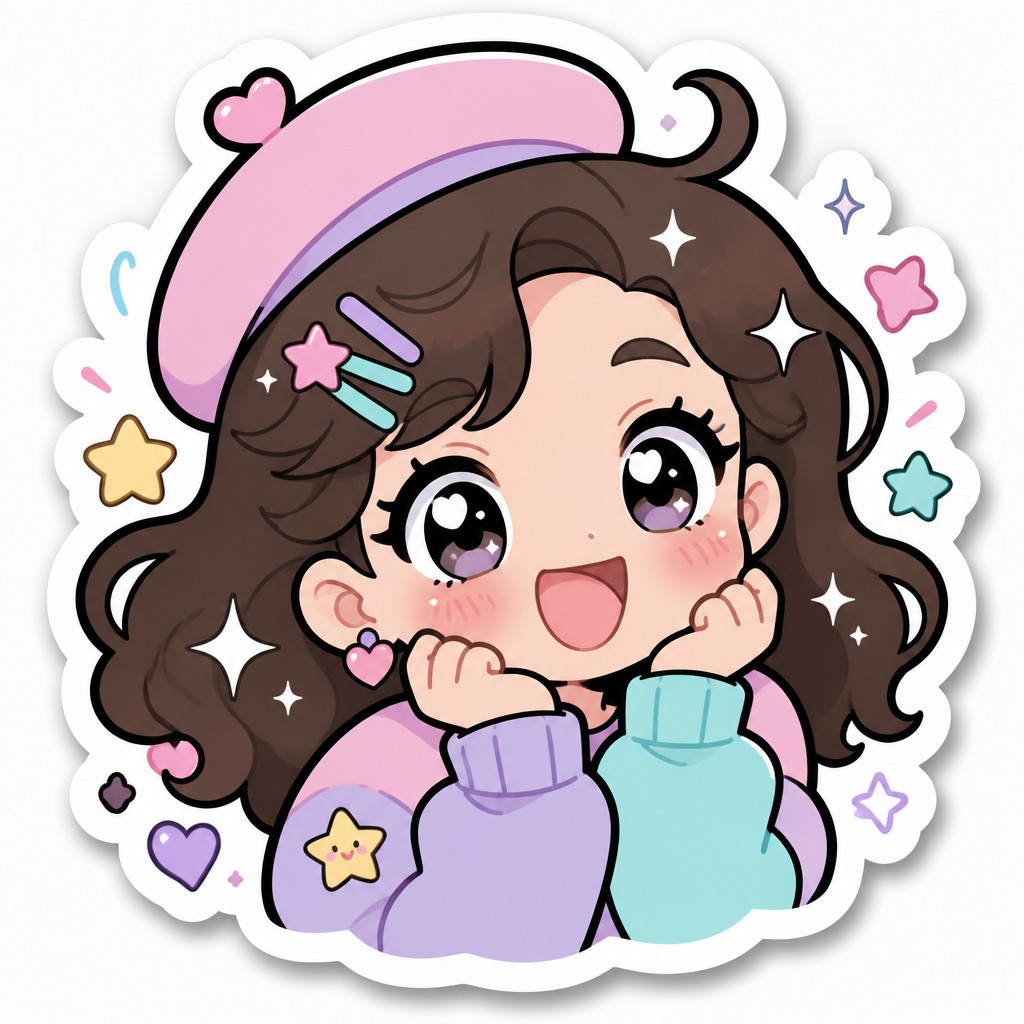
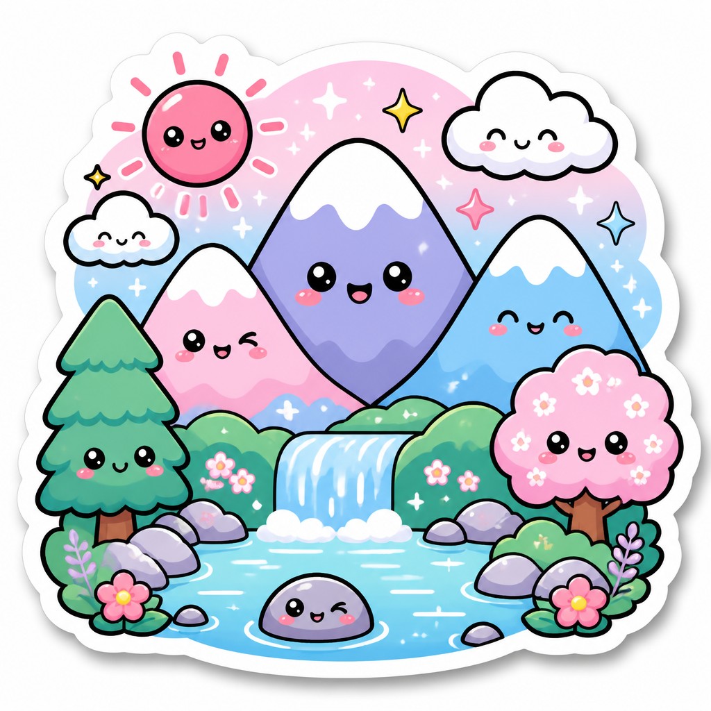
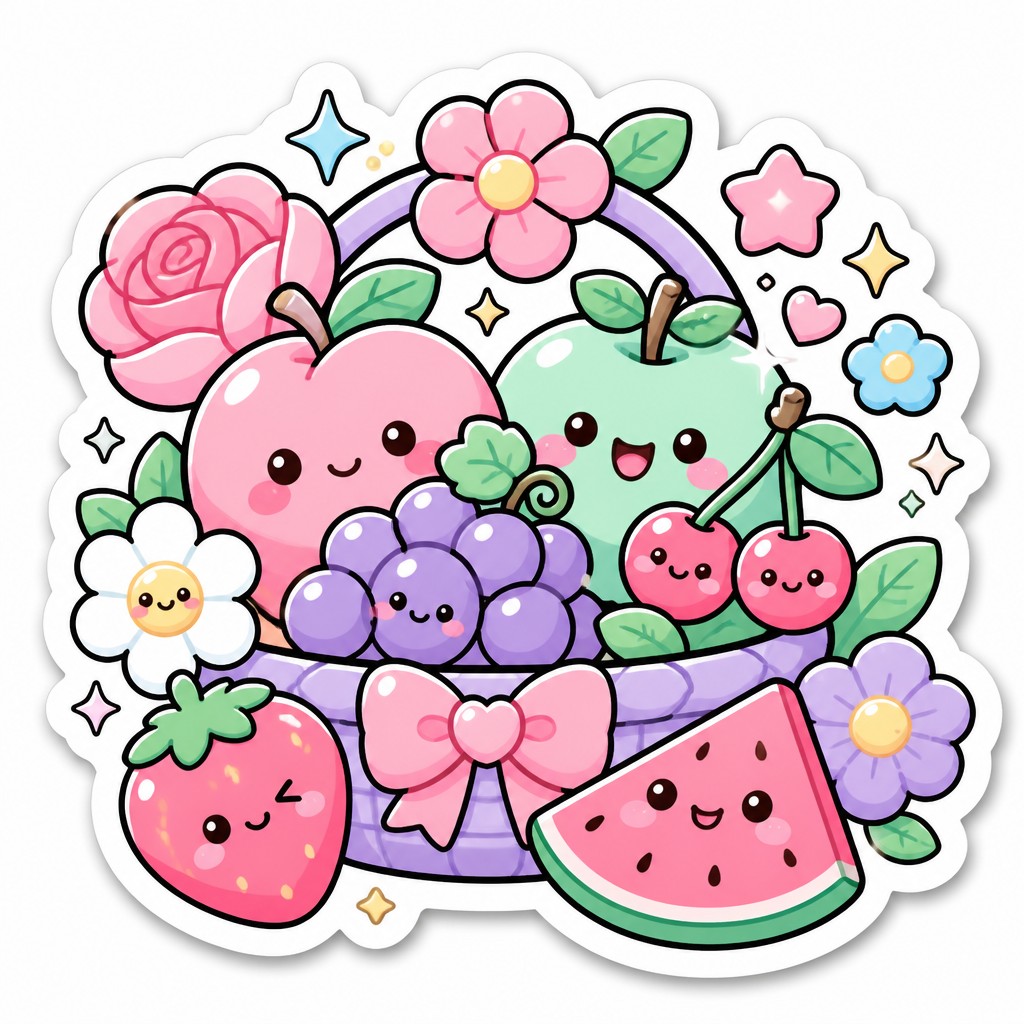
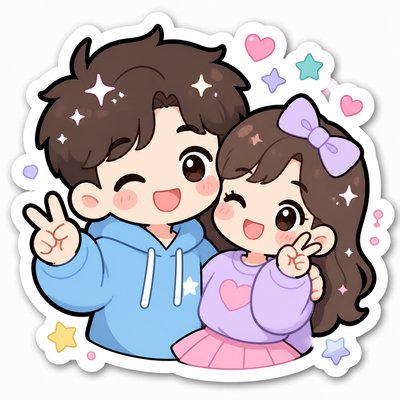
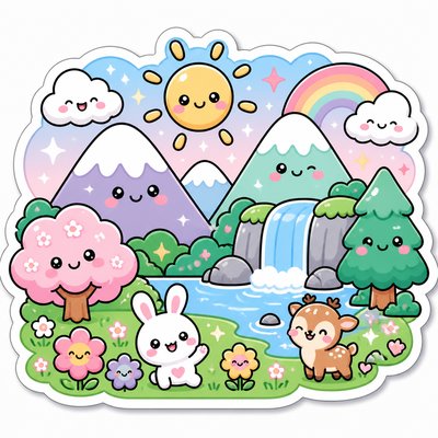
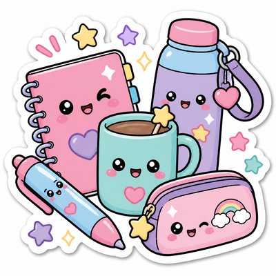
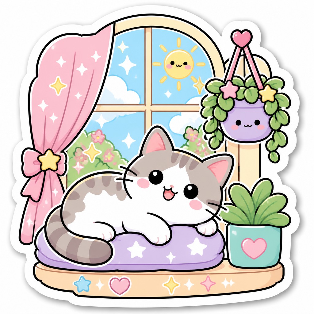
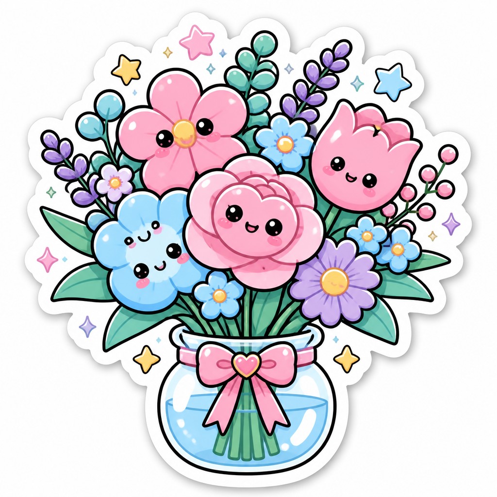
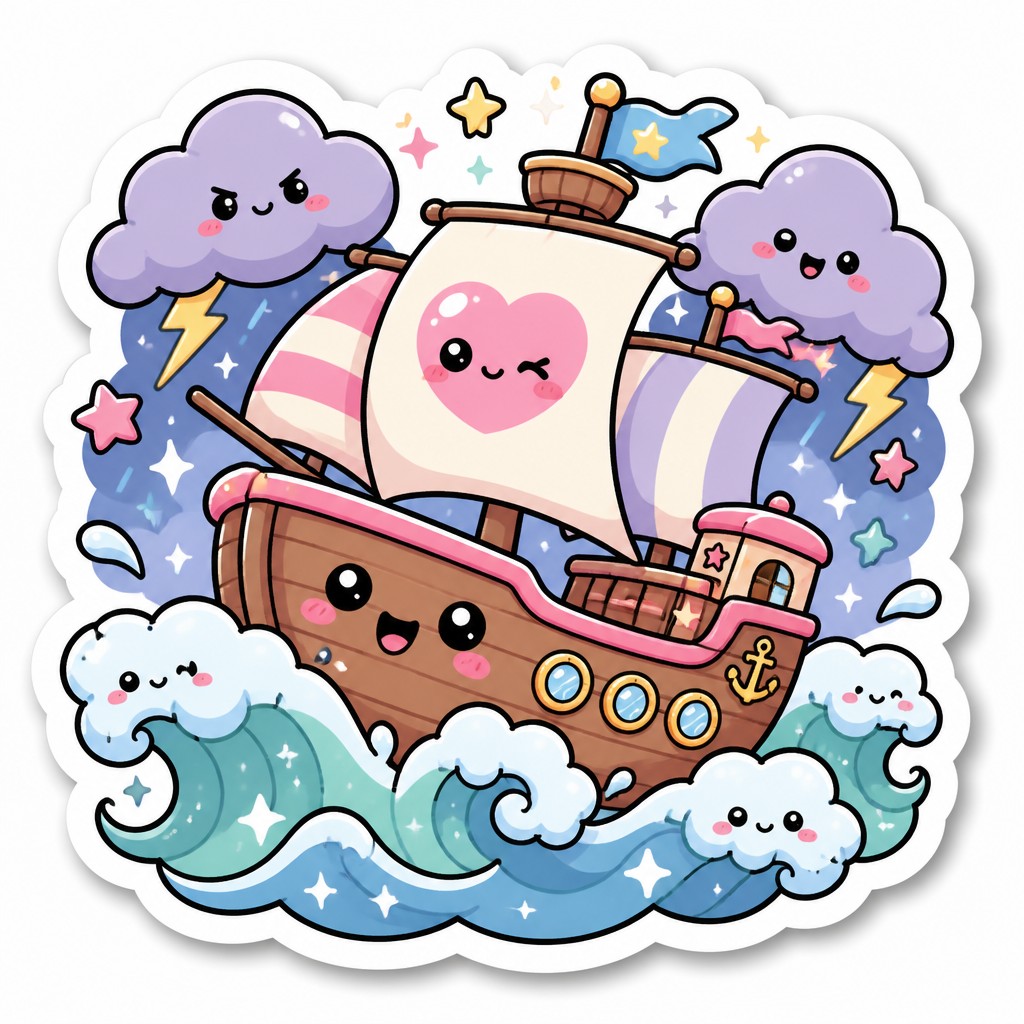
Kawaii Sticker Design is a cute, highly simplified illustration style modeled after the look of collectible and messaging stickers. It features rounded chibi-like characters, thick black outlines, pastel palettes, and cheerful expressions that make every subject feel friendly, small, and approachable. The forms are usually reduced to their most recognizable essentials, with emphasis on charm, readability, and immediate emotional appeal.
The style looks the way it does because it is designed to read instantly at small sizes, whether on a phone screen, packaging, or a physical sticker sheet. Flat color, minimal shading, sparkles, blush, and glossy highlights help create a playful, polished finish, while the white die-cut border gives the impression of a removable sticker. Its visual language draws on Japanese character merchandising, kawaii culture, manga-derived expression, and the broader graphic logic of icon design.
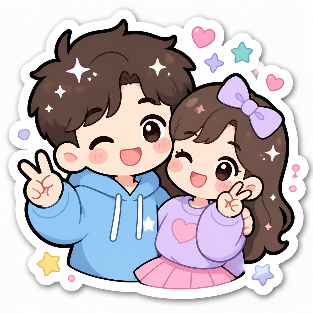
Try It On Your Photos
Upload any photo and convert it into Kawaii Sticker Design — drag the sliders to compare before and after.
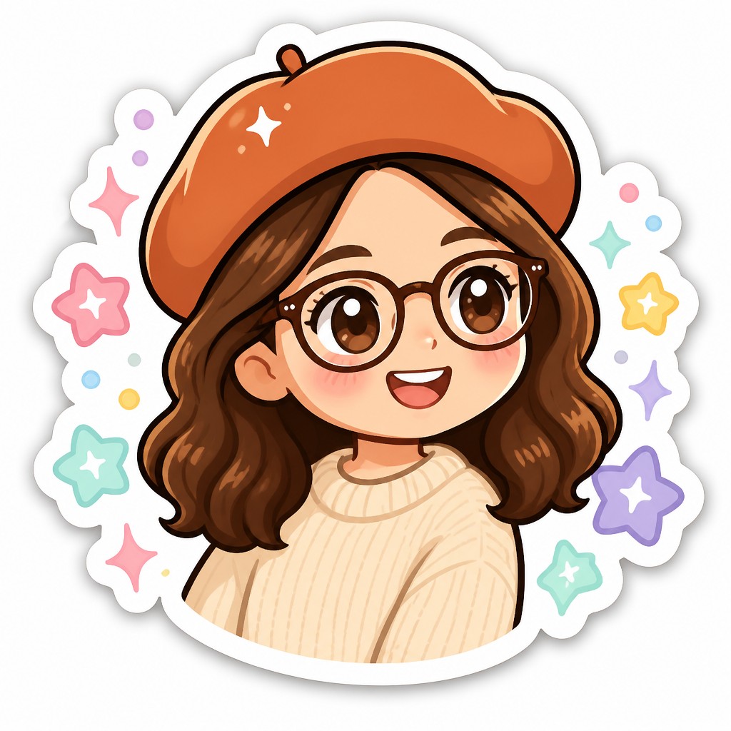

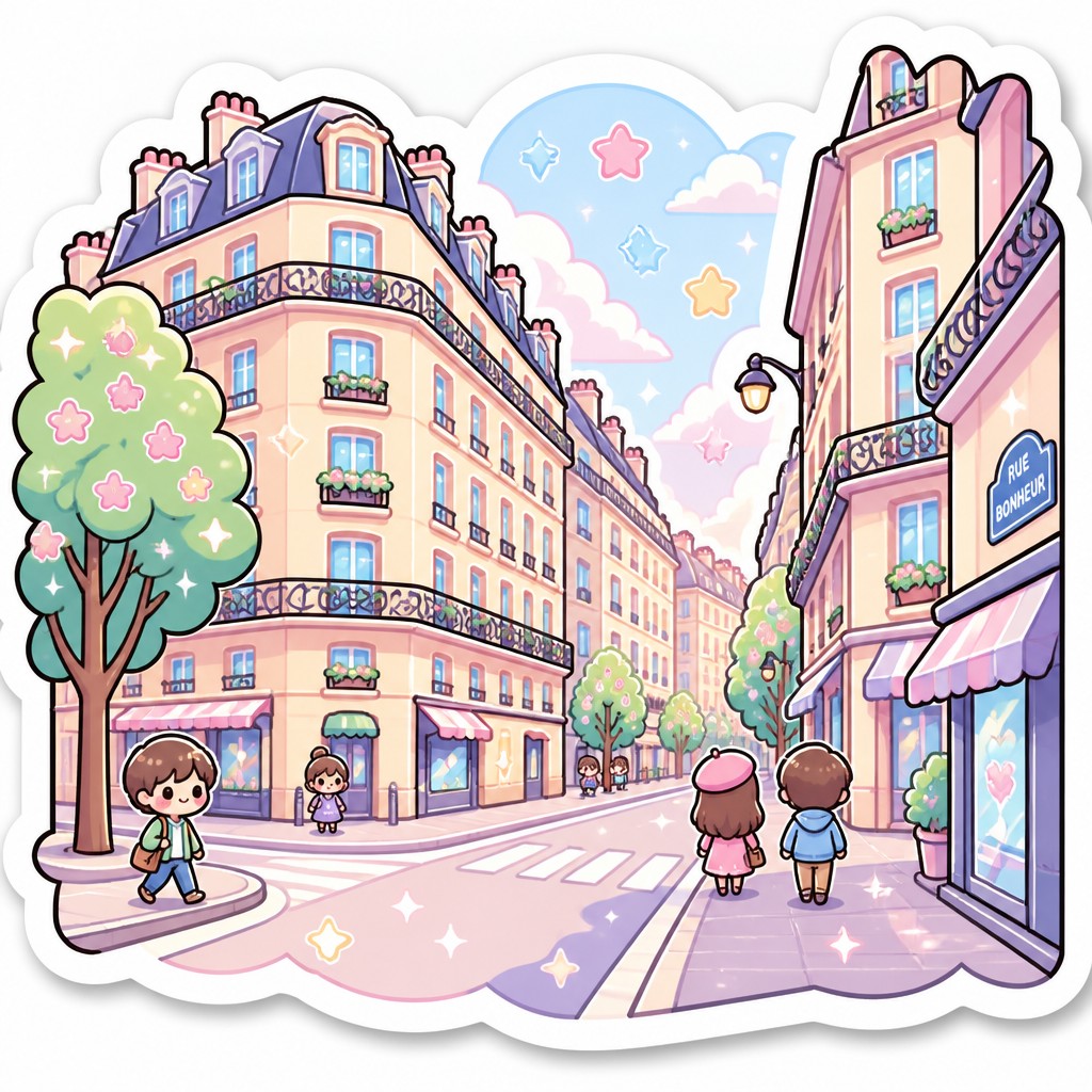

What Defines Kawaii Sticker Design
The signature details, up close
Rounded chibi proportions
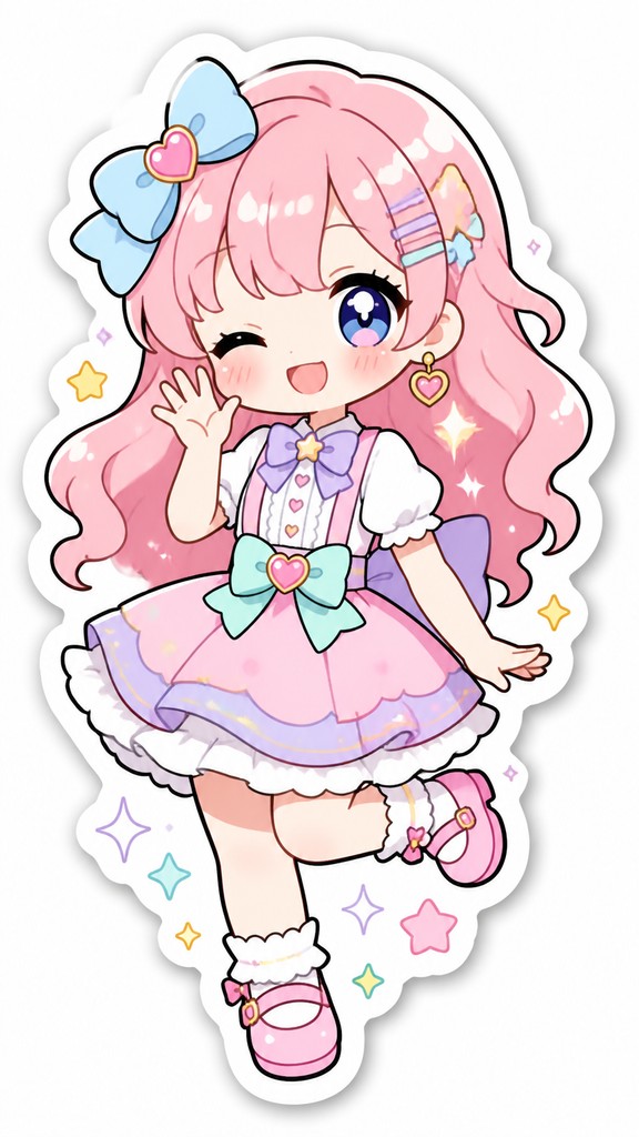
Figures are compressed into compact, childlike shapes with oversized heads, tiny bodies, and soft curves. This makes subjects feel cute, harmless, and easy to recognize at a glance.
Thick black outlines
Uniform outlines separate the character cleanly from the background and keep the image readable at small scale. The linework is usually smooth and even, with little or no sketchiness.
Pastel flat coloring
Colors are typically soft pinks, baby blues, mint greens, lavenders, and buttery yellows. The palette stays light and gentle, with limited contrast and minimal realistic color variation.
Simple cel shading
Shadows are reduced to one or two clean tonal steps rather than blended gradients. This keeps the image crisp, graphic, and easy to reproduce.
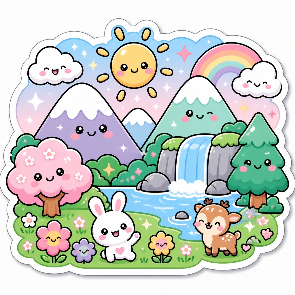
Gloss and sparkle accents
Catchlights, star-bursts, and tiny sparkles add a shiny, candy-like finish. These details reinforce the impression of sweetness and excitement.
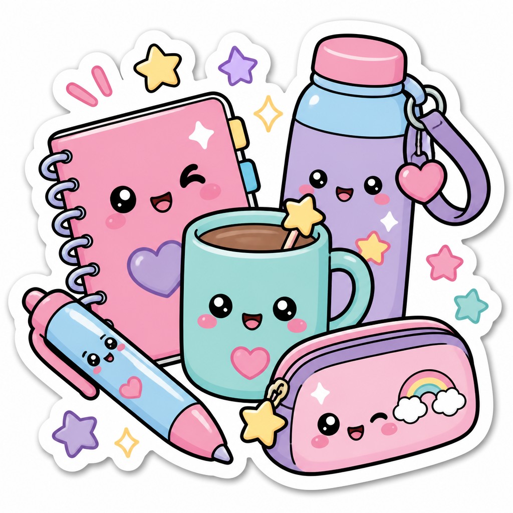
Rosy blush and happy faces
Cheeks are often tinted with soft blush marks, and expressions are usually smiling, excited, or content. Facial features remain minimal so the emotion is instantly legible.
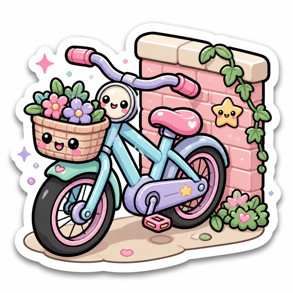
Die-cut sticker presentation
A white border and subtle drop shadow simulate a cutout sticker pasted onto a surface. This framing is central to the style’s identity and helps it feel like a designed object rather than a plain illustration.
Try It
Create Videos in Kawaii Sticker Design
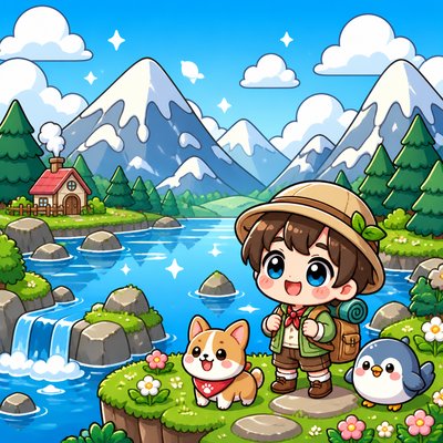
Styles aren't just for stills — describe a scene or animate an image and get a short video rendered in Kawaii Sticker Design. Press play to see this pond come to life.
Make a VideoKawaii Sticker Design Prompt Ideas
Start from an idea — each one opens the generator with the style ready to go. See all 40 Kawaii Sticker Design prompts →
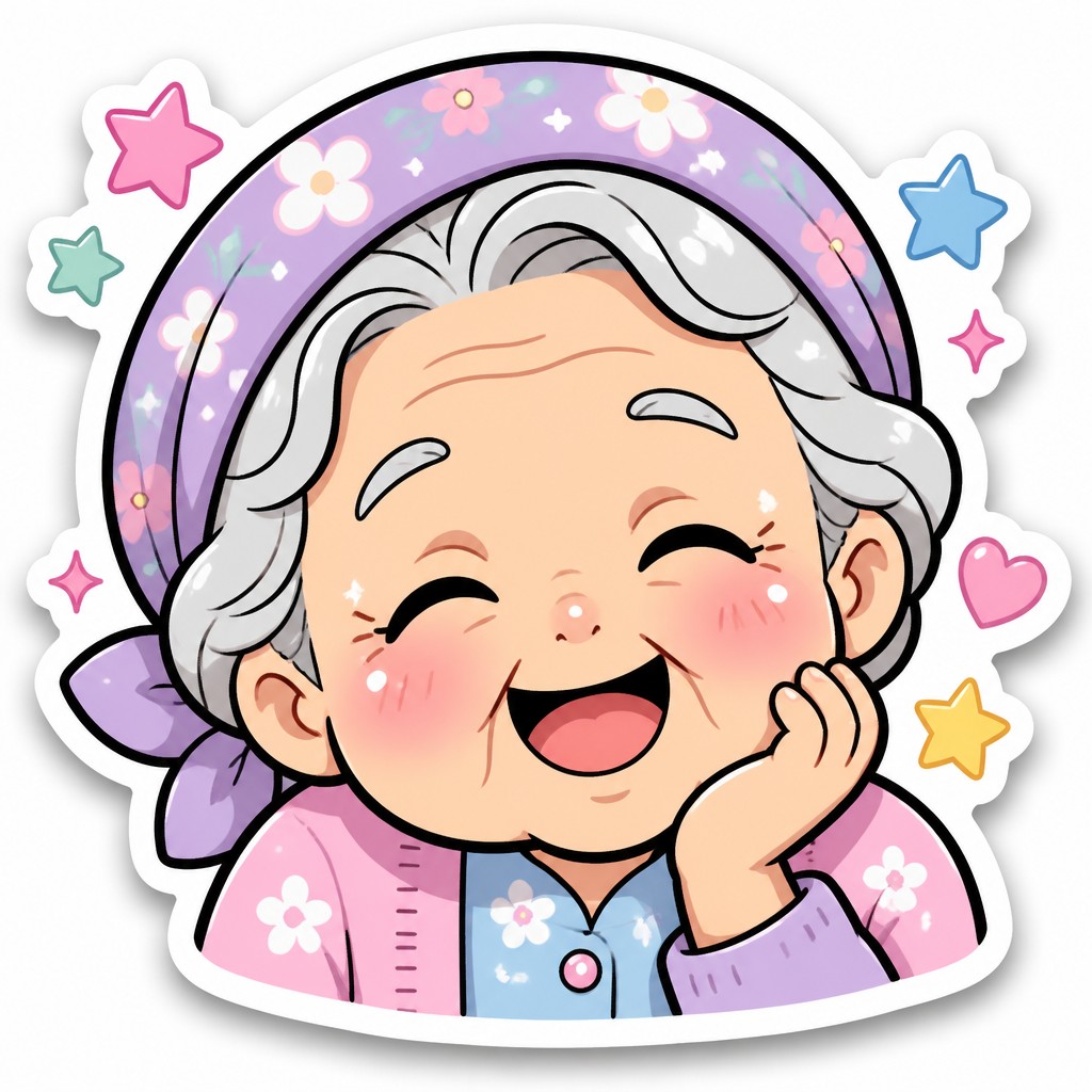
How to Create Kawaii Sticker Design Art
Master the craft step by step — or skip straight to creating. Read the full guide →
- 1
Simplify the silhouette
Start with a clear, rounded shape language and reduce details to the minimum needed for recognition. For traditional drawing, sketch with large head-to-body ratios and smooth curves; for digital work, keep shapes clean and avoid intricate textures.
- 2
Use a limited pastel palette
Choose soft, low-saturation colors and keep contrast gentle. When rendering, preserve a bright, airy look rather than deep shadows or heavy realism.
- 3
Outline boldly and evenly
Use a consistent line weight to frame the character and define key features. In digital illustration, vector-like line control or stabilized inking works especially well; in prompt-based generation, specify thick uniform outlines and clean sticker edges.
- 4
Keep shading simple
Use one shadow tone and perhaps one highlight tone, avoiding complex lighting. The goal is a graphic, toy-like finish rather than volume-heavy realism.
- 5
Add sticker finishing effects
Include a white die-cut border, a faint shadow, glossy highlights, and small sparkle marks to sell the sticker illusion. These details help the image read as a standalone object rather than a scene element.
- 6
Prompt for emotion and format
When generating digitally, describe the character, expression, border, outline, pastel palette, and simple composition clearly. Phrases like ‘clean white sticker border,’ ‘thick black outline,’ ‘pastel cel shading,’ and ‘bouncy playful pose’ reliably steer results toward this look.
The Story
History & Origins of Kawaii Sticker Design
Kawaii Sticker Design is not a single historical art movement but a contemporary aesthetic that developed from Japan’s kawaii culture, character merchandising, and the visual economy of small-format graphics. Its lineage can be traced to postwar Japanese cute-character branding, manga and anime iconography, and the rise of mass-market stickers in stationery, packaging, and messaging culture. The style also reflects the practical demands of digital communication, where images must be legible, emotionally immediate, and compact.
Its formal traits—chibi proportions, simplified faces, pastel coloring, sparkles, blush marks, and bold outlines—echo conventions long used in Japanese illustration and character design. In the digital era, these traits became even more standardized through emoji-like icons, social media stickers, and app-based character packs, producing a globally recognizable visual shorthand for sweetness, friendliness, and playful affection.
Influences: This style draws from Japanese kawaii culture, manga and anime character design, stationery illustration, and the visual shorthand of emoticons and digital stickers. Its simplified readability also overlaps with logo design and iconography, while its rounded figures and expressive faces recall the broader traditions of cute character merchandising seen in mascots and collectible goods. Rather than belonging to one canonical school, it synthesizes contemporary graphic design with the emotional clarity of Japanese pop illustration.
Frequently Asked Questions
What defines this sticker art style?
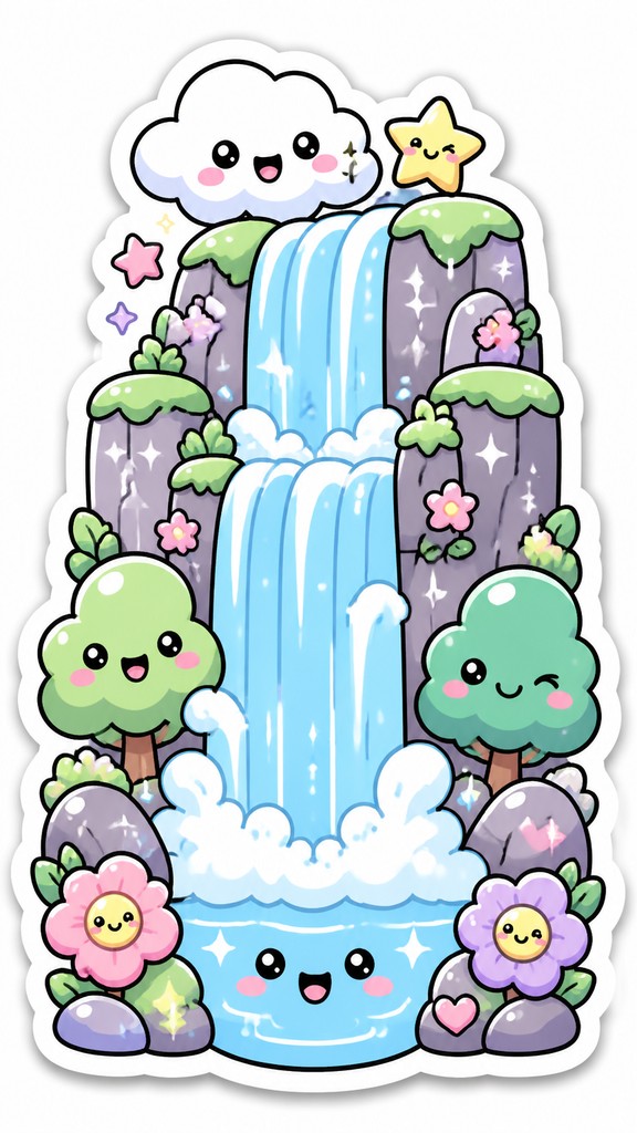
Its core features are rounded chibi-like proportions, thick outlines, pastel colors, simple shading, and a white die-cut border. The expressions are usually sweet, cheerful, or playful, and the composition is designed to look immediately readable at small size.
Is this the same as anime or manga art?
It is related to anime and manga, but it is more simplified and graphic than most narrative character art. Instead of dramatic anatomy, perspective, or scene-based storytelling, it prioritizes cuteness, instant readability, and sticker-like presentation.
Why do these images always have a white outline or border?
The border imitates a physical die-cut sticker and makes the character stand out from any background. It also helps the design feel self-contained, polished, and easy to place on phones, packaging, or message apps.
How can I make my own artwork in this style?
Use a small number of shapes, soft pastel colors, and bold outlines, then add blush, sparkles, and a subtle sticker shadow. Whether drawing by hand or digitally, simplify the subject until it reads clearly as a cute icon rather than a detailed illustration.
Where is this style commonly used?
It is common in messaging stickers, social media graphics, stationery, packaging, children’s products, and character branding. The style works well anywhere a cheerful, compact, highly legible image is needed.
How is it different from chibi art or cute cartoon art?
Chibi is mainly a proportion system—big head, small body—while this sticker style adds specific graphic treatments such as pastel palettes, thick outlines, glossy accents, and die-cut presentation. Cute cartoon art can be broader, but this style is especially optimized for sticker-like clarity and emotional immediacy.
Create your first Kawaii Sticker Design artwork
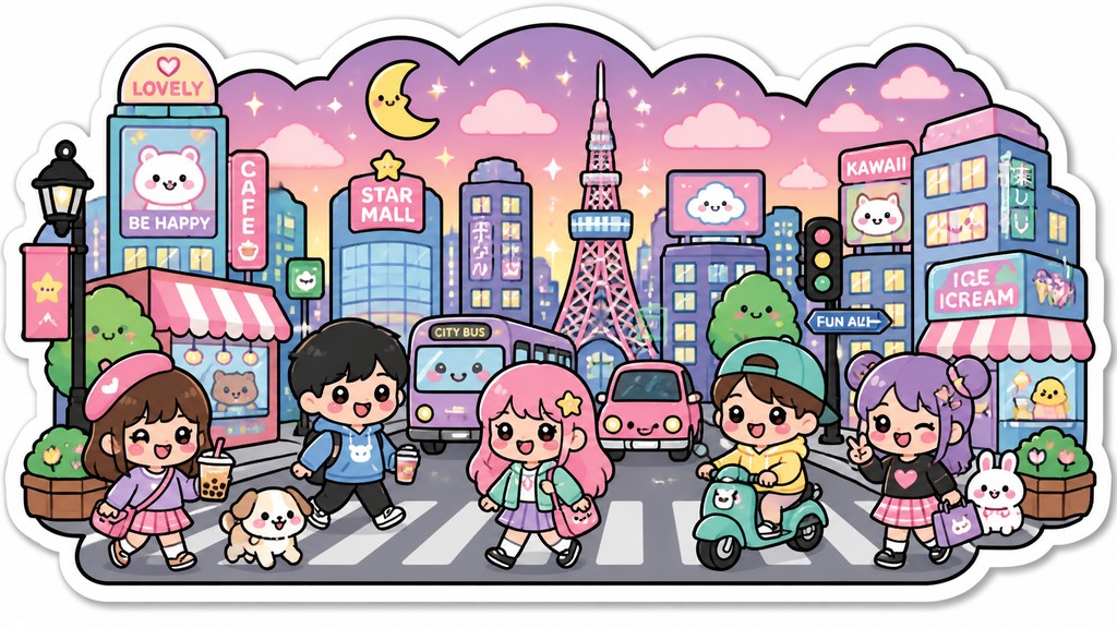
Describe anything — or upload a photo — and see it in Kawaii Sticker Design in seconds.
Make Something with Kawaii Sticker Design
Compare Kawaii Sticker Design
Related Styles
Discover similar art styles