Character Sticker Design vs Kawaii Sticker Design: What's the Difference?
Character Sticker Design focuses on bold, readable mascot-style stickers built for clear communication. It uses clean outlines, rounded forms, glossy color, and strong visual hierarchy so the artwork works well for branding, chat reactions, and storytelling.
Kawaii Sticker Design leans into cute, Japanese-inspired sticker aesthetics with pastel palettes, thick outlines, chibi proportions, and a glossy die-cut feel. People compare the two because both aim for instant charm and sticker-friendly clarity, but they differ in mood, color treatment, and how they present personality.
Same Prompt, Both Styles
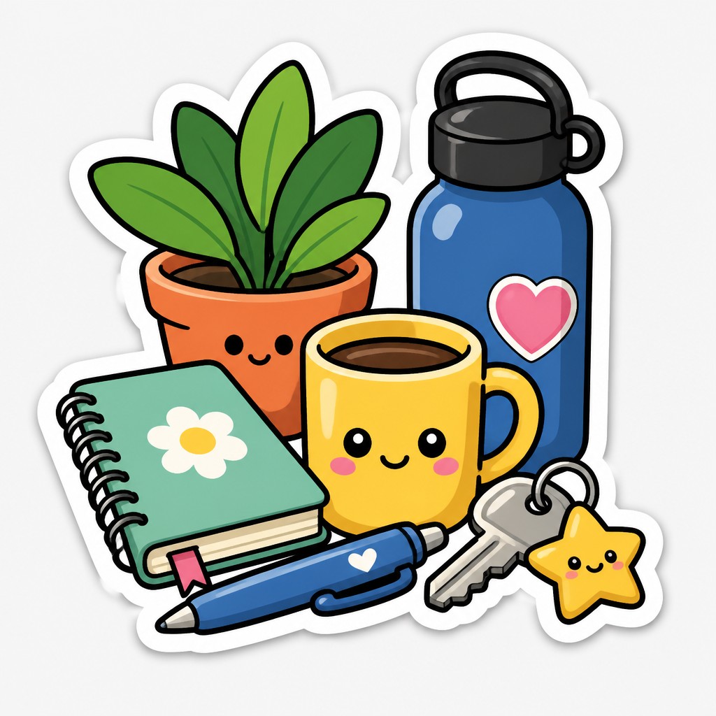
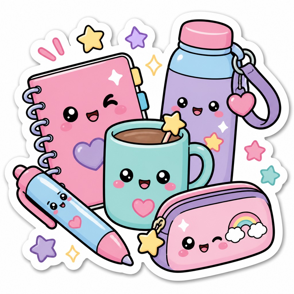
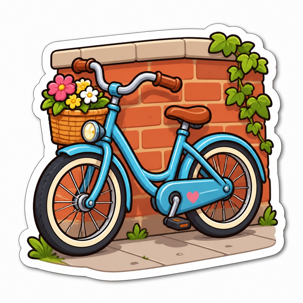
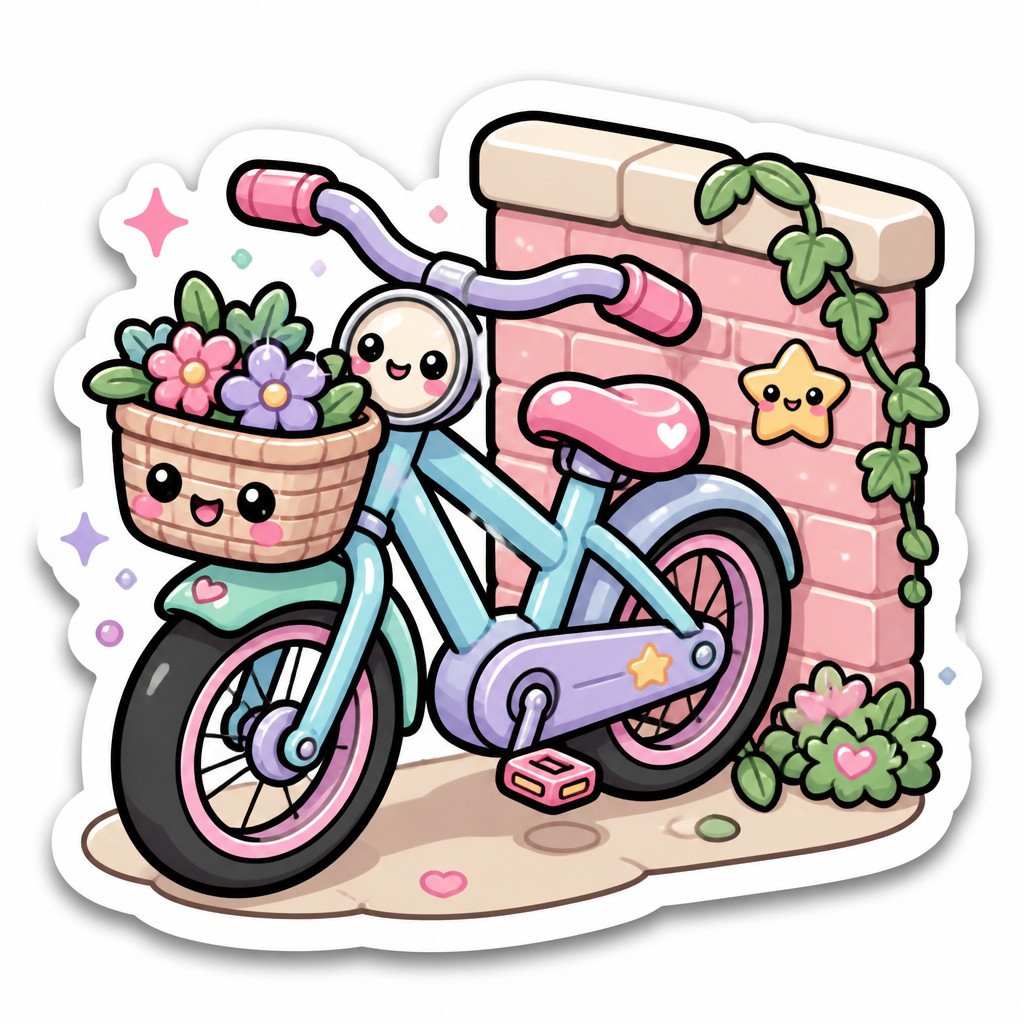
Each pair below was generated from the identical prompt — only the style changed.
“portrait of two people together”
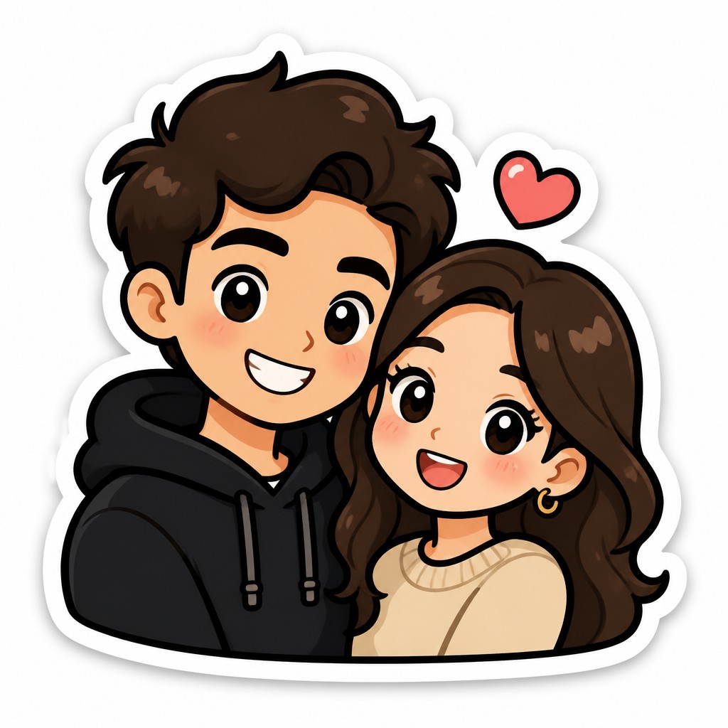
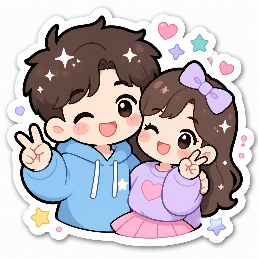
“wide landscape with natural scenery”
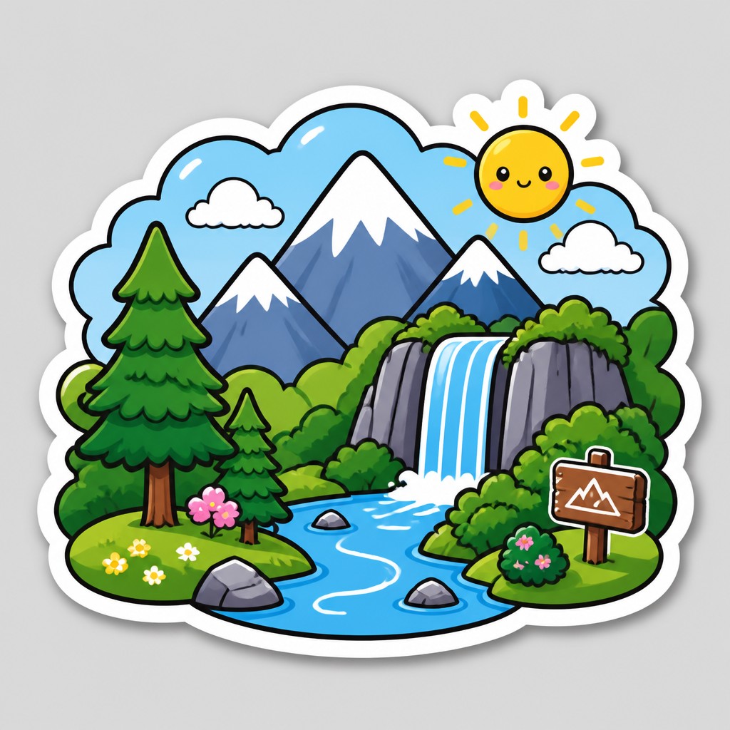
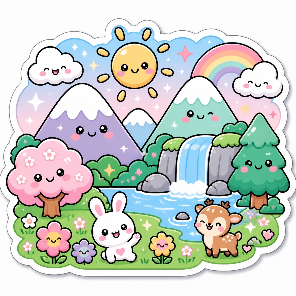
“still life with everyday objects”
“bicyle resting against a wall”
Key Differences
| Character Sticker Design | Kawaii Sticker Design | |
|---|---|---|
| Mood | Confident, playful, and brand-forward. | Sweet, soft, and extra cute. |
| Color palette | Often uses brighter, more saturated colors. | Usually favors pastel or gentle colors. |
| Line & form | Clean outlines with rounded, simplified shapes. | Thick outlines with chibi proportions and plush shapes. |
| Readability | Designed for fast recognition at small sizes. | Also readable, but may prioritize cuteness over clarity. |
| Brand use | Common for mascots, product identity, and messaging. | Common for collectible stickers, fan art, and cute merchandising. |
| Finish | Glossy highlights support a polished, modern look. | Glossy, die-cut styling adds soft charm and sticker appeal. |
| Mood | playful, cheerful, friendly, expressive | cute, cheerful, playful, friendly, adorable |
| Energy | lively | lively |
| Detail level | minimal | minimal |
| Color | bright flat pastel or primary colors | pastel pinks, blues, yellows, soft brights |
| Texture | clean vector-like, smooth, sticker-like | smooth, glossy, clean linework |
| Origin | digital-native aesthetic | late-20th-century Japan, sticker and character culture |
| Best for | messaging stickers, brand mascots, social media icons, merchandise graphics, emoji packs | messaging stickers, emoji sets, stationery, merchandise packaging, children's media, social media graphics |
| Difficulty | beginner-friendly | beginner-friendly |
Which Should You Choose?
Pick Character Sticker Design if you need strong branding, quick recognition, and a versatile mascot that can work in chat, marketing, or storytelling. Pick Kawaii Sticker Design if your goal is maximum cuteness, a softer emotional tone, and a more playful collectible feel. If you want both, use Character Sticker Design for the main identity and borrow kawaii elements like pastels or chibi proportions for special editions.
Frequently Asked Questions
Are these two styles the same thing?
No. They overlap because both are sticker-friendly and cute, but Character Sticker Design is broader and more branding-focused. Kawaii Sticker Design is a more specific cute aesthetic with pastel, chibi, and Japanese-inspired cues.
Which style works better for branding?
Character Sticker Design usually works better for branding because it emphasizes clarity, consistency, and instant recognition. Kawaii can work for branding too, especially if the brand wants a soft, friendly, or collectible image.
Which style is easier to read at small sizes?
Character Sticker Design is often easier to read because it prioritizes bold shapes and clear silhouettes. Kawaii designs can still read well, but extra cuteness details may reduce simplicity if overdone.
Can a sticker use both styles at once?
Yes. Many designs combine them by using the strong silhouette and readability of Character Sticker Design with the pastel colors and chibi charm of Kawaii Sticker Design. The key is balancing clarity with cuteness.