Tonal Unity Art Style
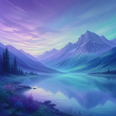
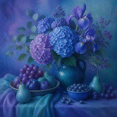
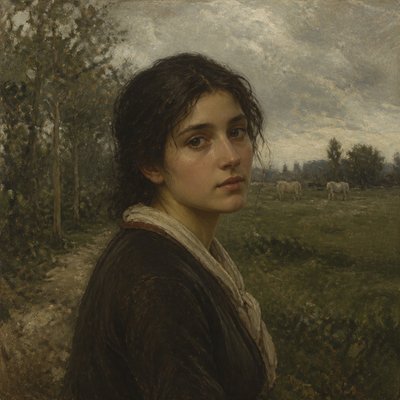
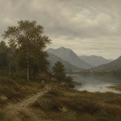
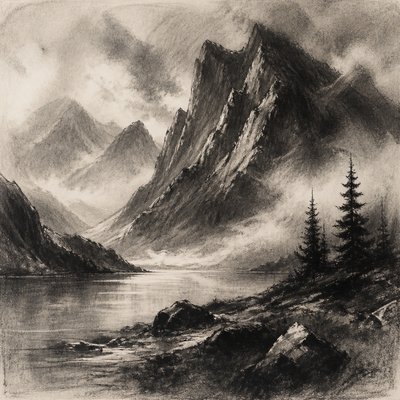
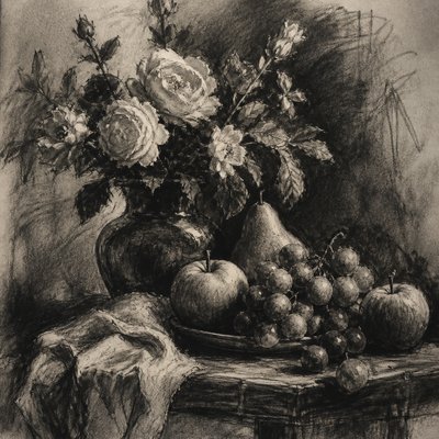
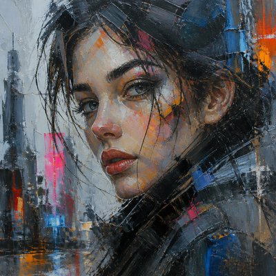
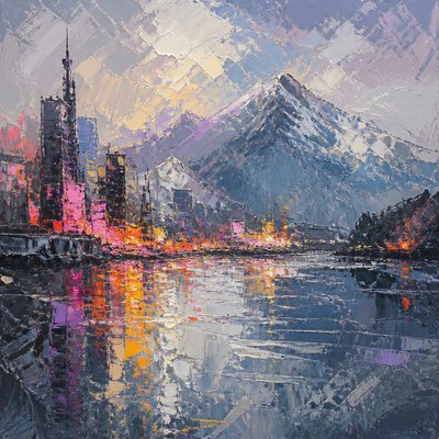
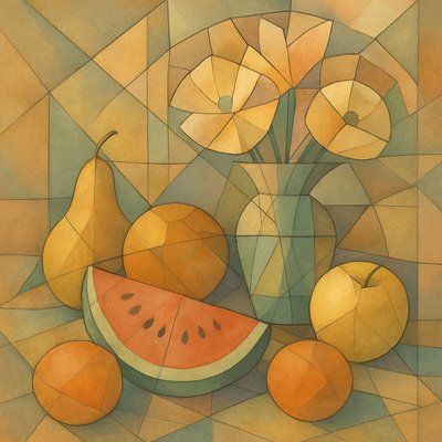
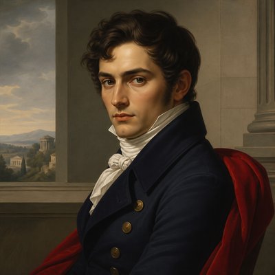
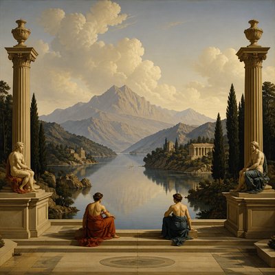
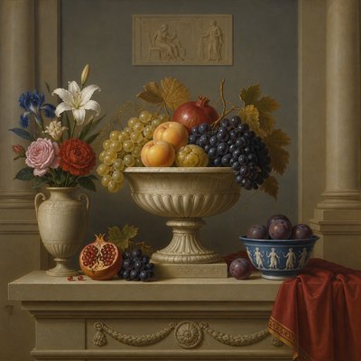
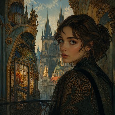
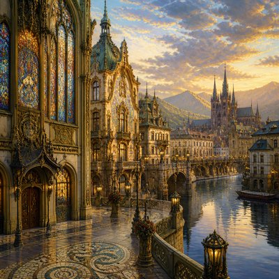
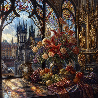
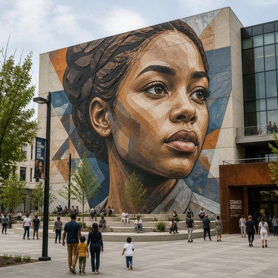
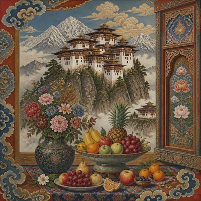
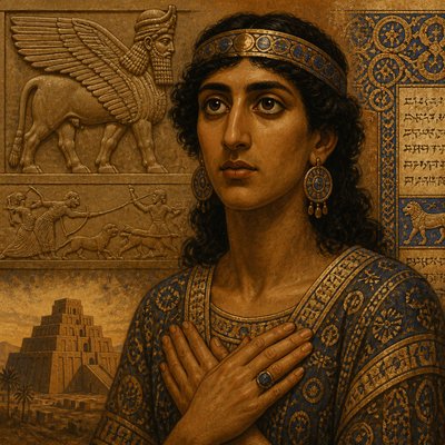
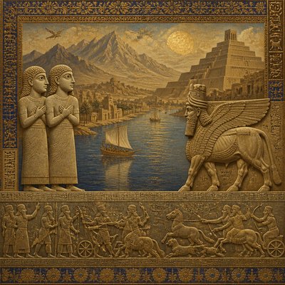
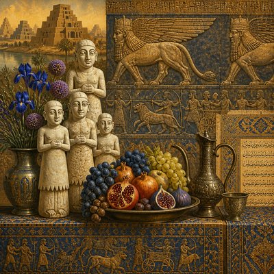
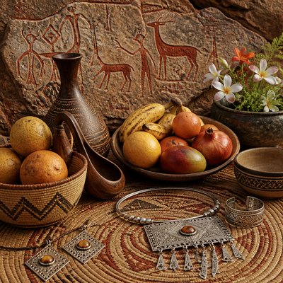
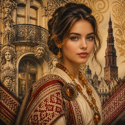
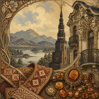
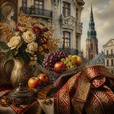
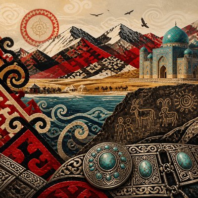
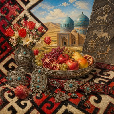
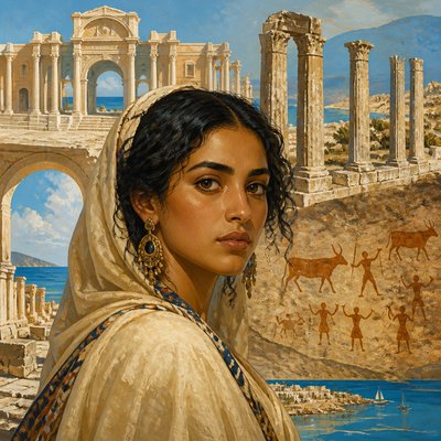
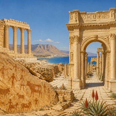
Explore Tonal Unity, an atmospheric style built on narrow palettes, softened edges, and a single mood that unifies every element.
Instantly rendered in Tonal Unity — or transform a photo
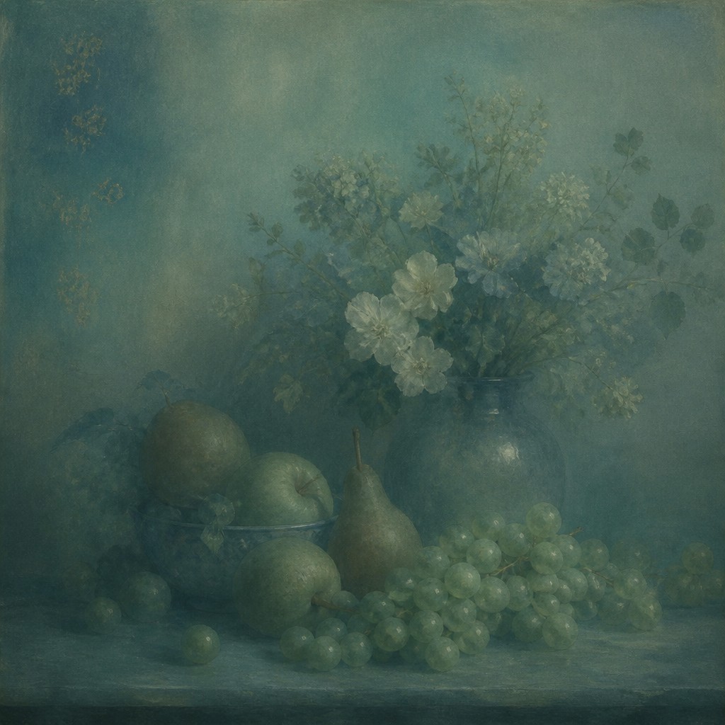
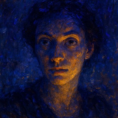
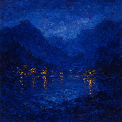
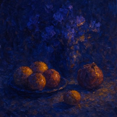
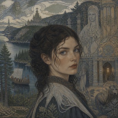
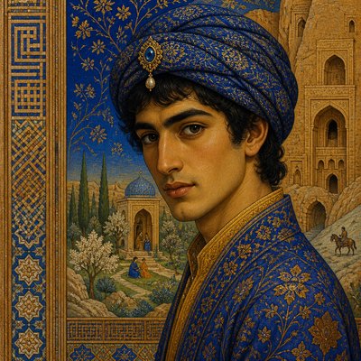
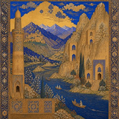
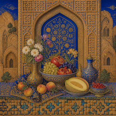
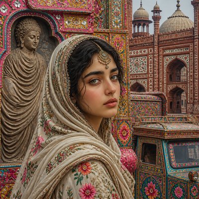
Tonal Unity Gallery
Tap any artwork to explore it
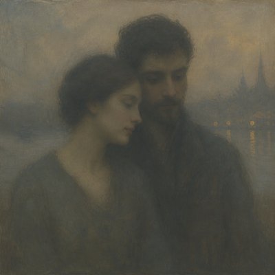
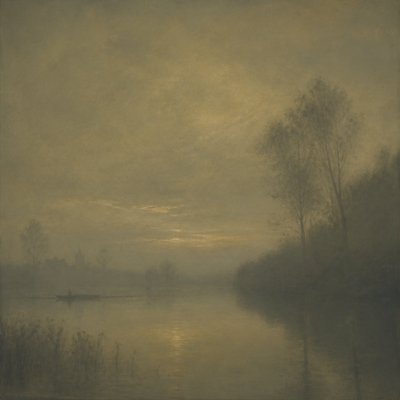
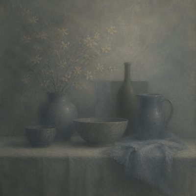
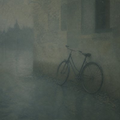
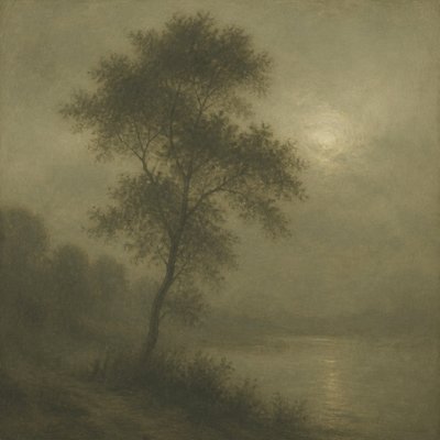
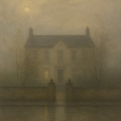
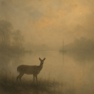
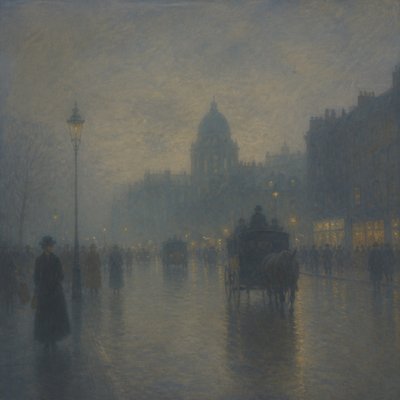
What is Tonal Unity Art Style?
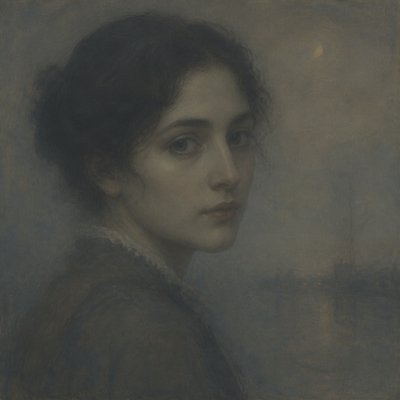
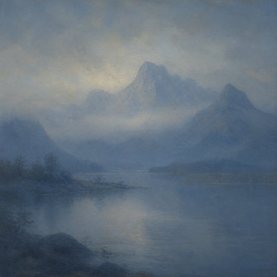
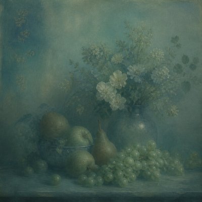
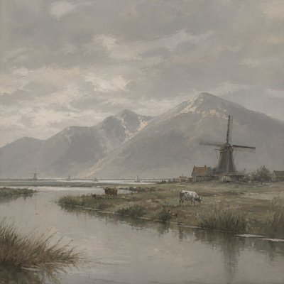
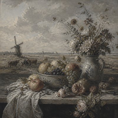
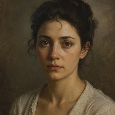
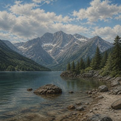
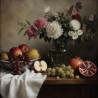
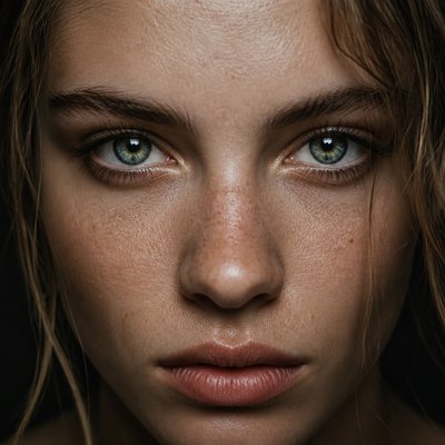
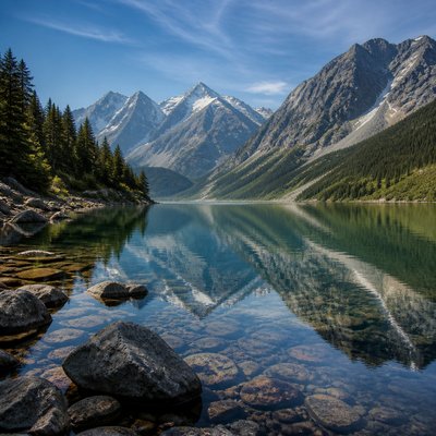
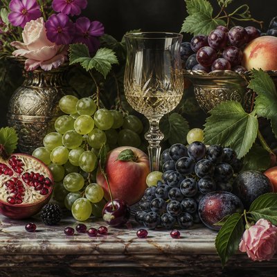
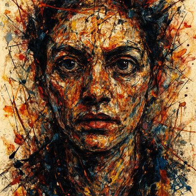
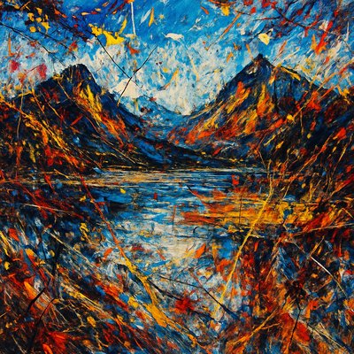
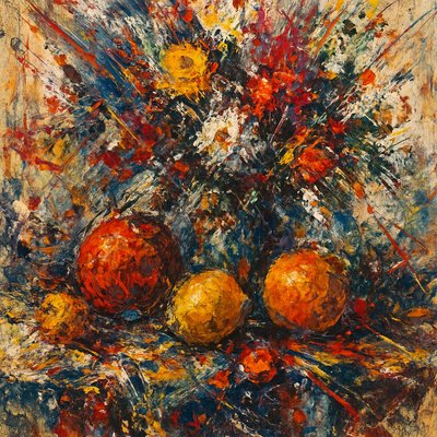
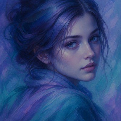
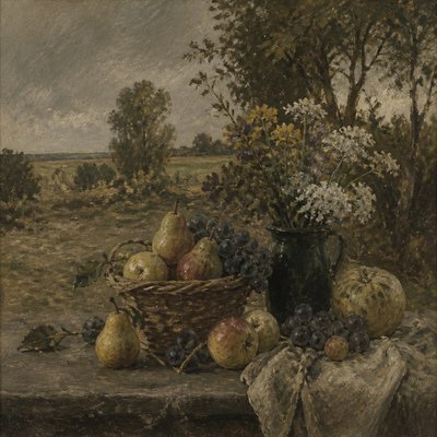
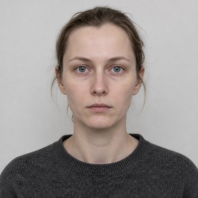
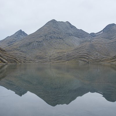
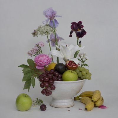
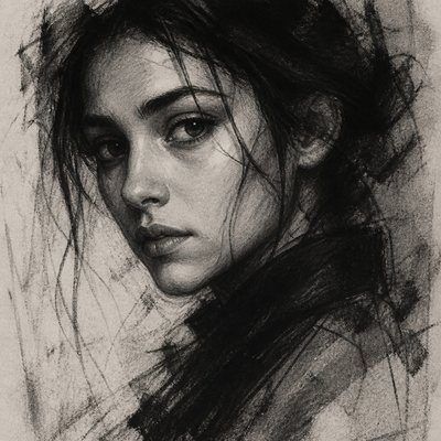
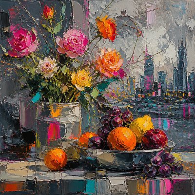
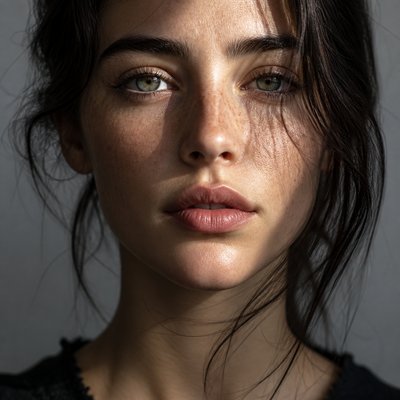
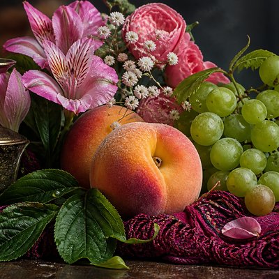
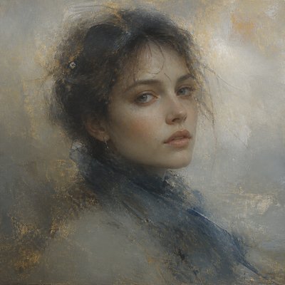
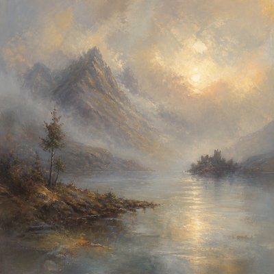
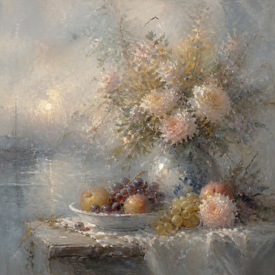
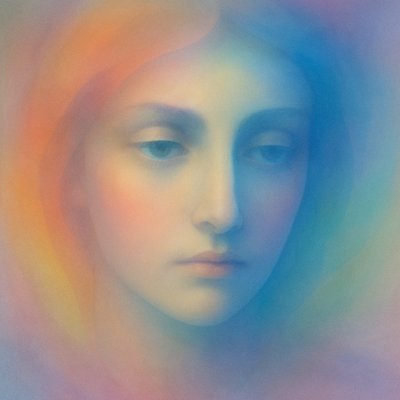
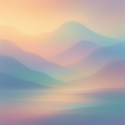
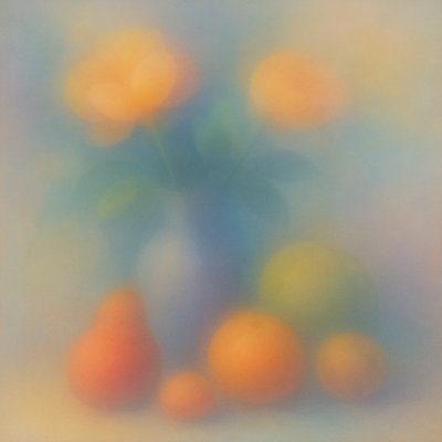
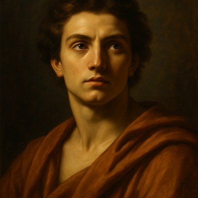
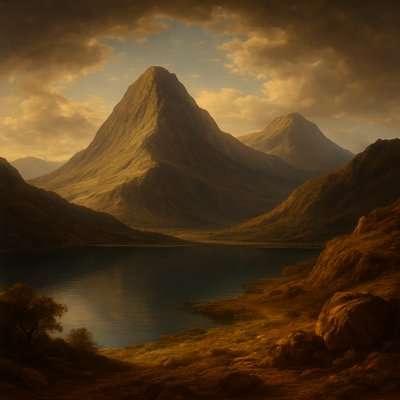
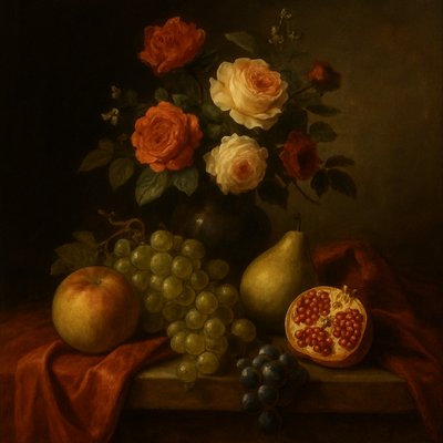
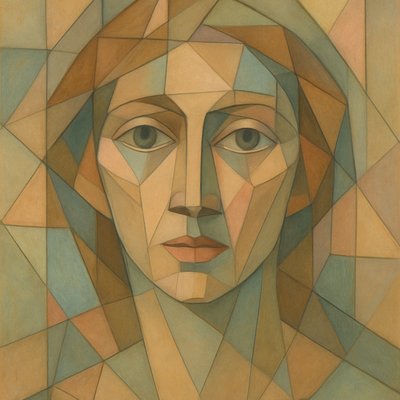
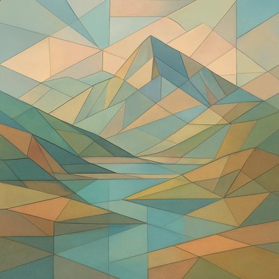
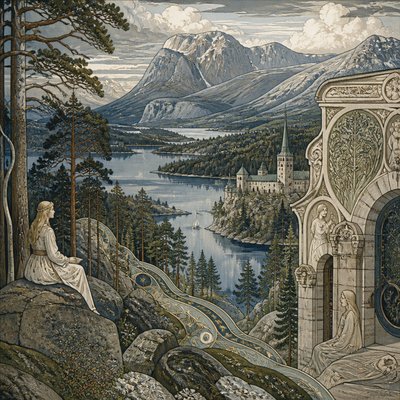
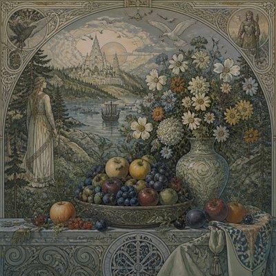
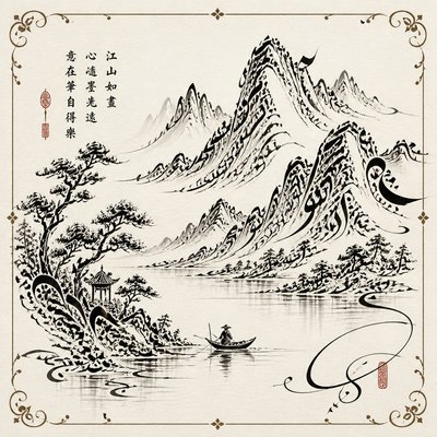
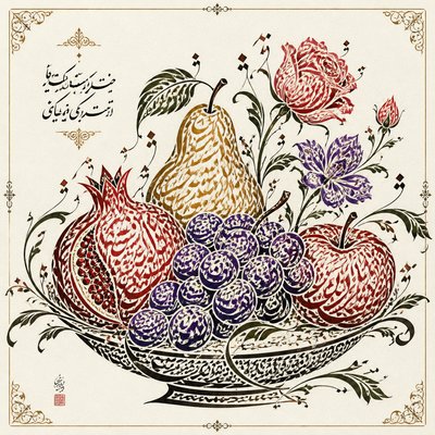
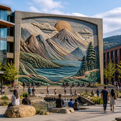
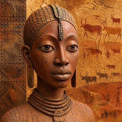
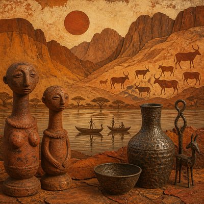
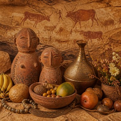
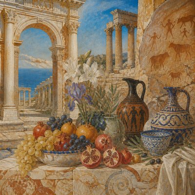
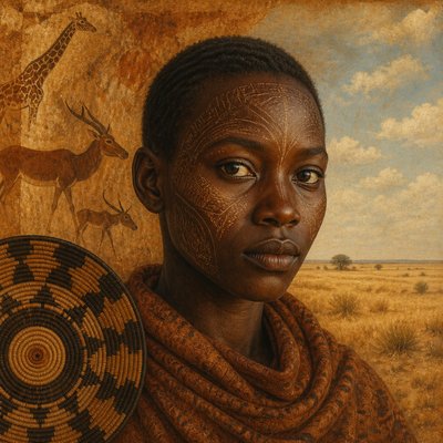
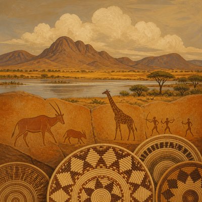
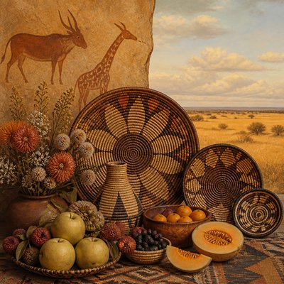
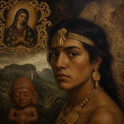
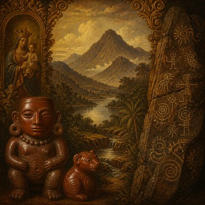
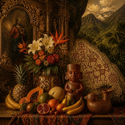
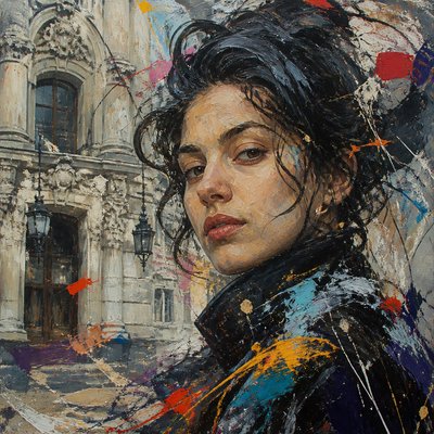
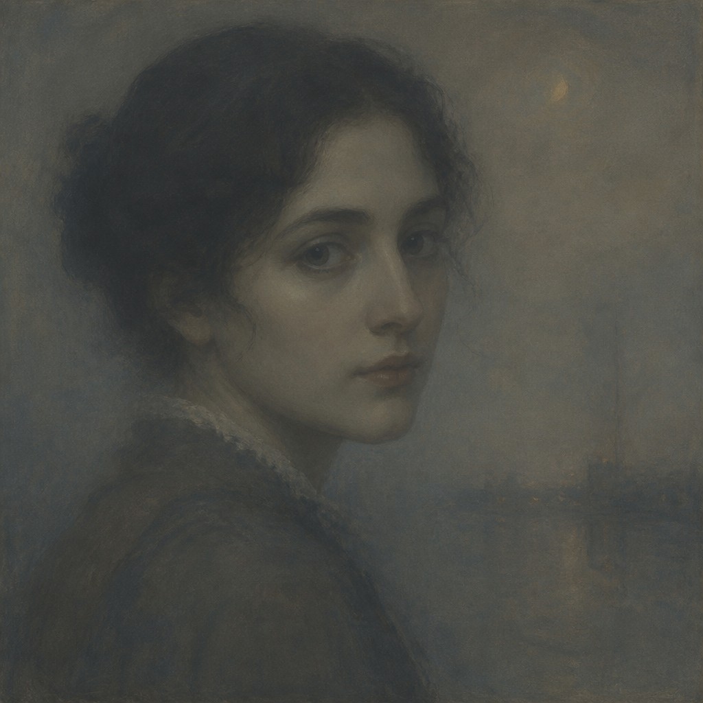
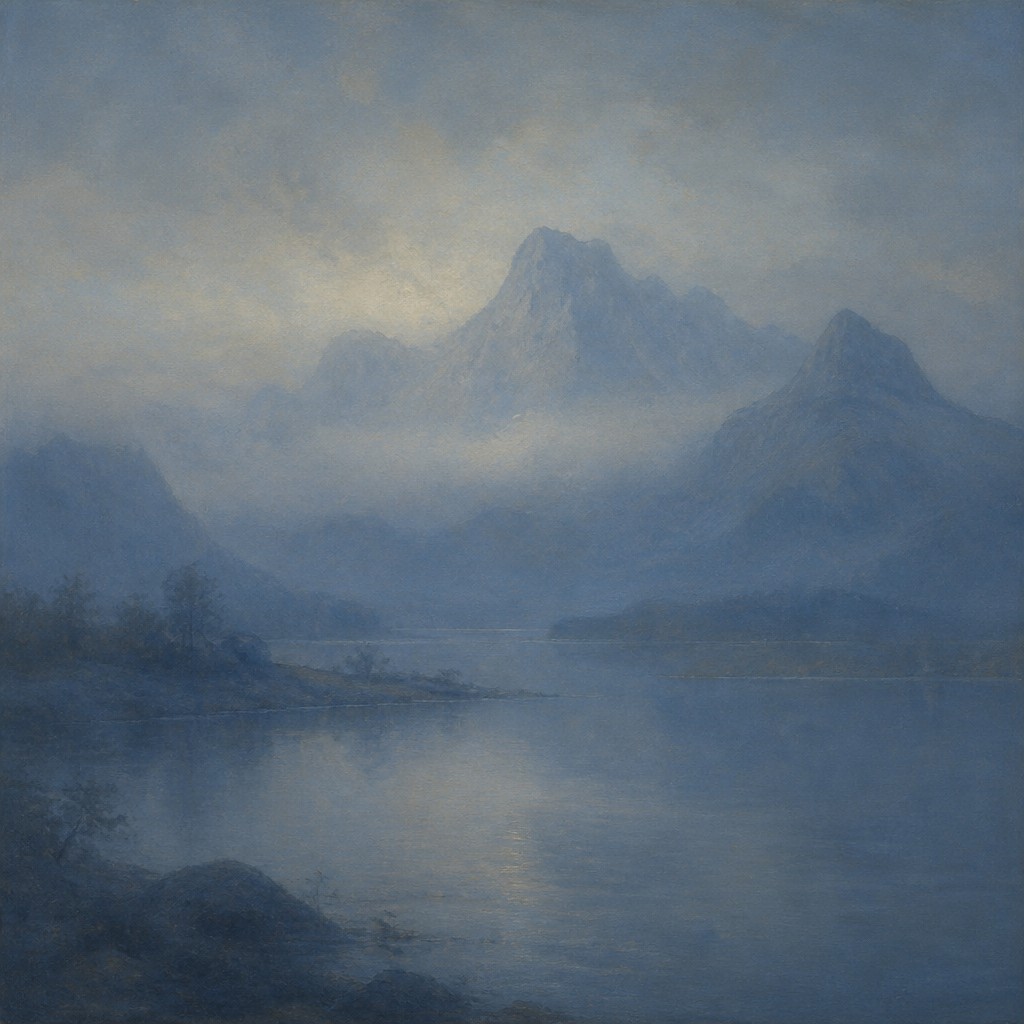
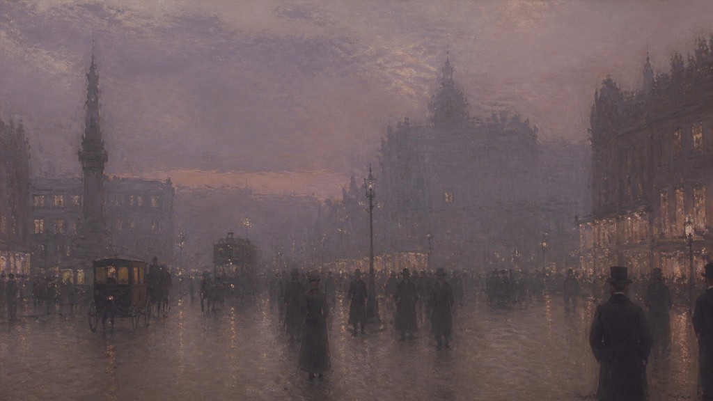
Tonal Unity is an atmospheric art style in which the entire image appears to exist within one shared emotional and chromatic climate. Rather than separating objects through strong outlines, local color, or sharp contrast, it binds the scene together with a narrow palette, consistent lighting, softened edges, and a pervasive haze or tonal veil.
The style can be quiet, melancholy, dreamlike, contemplative, or serene, but its defining principle is coherence: no isolated detail should disrupt the prevailing mood. Objects remain recognizable through subtle value shifts, overlapping silhouettes, texture, and atmospheric perspective rather than through abrupt color changes or hard contours.
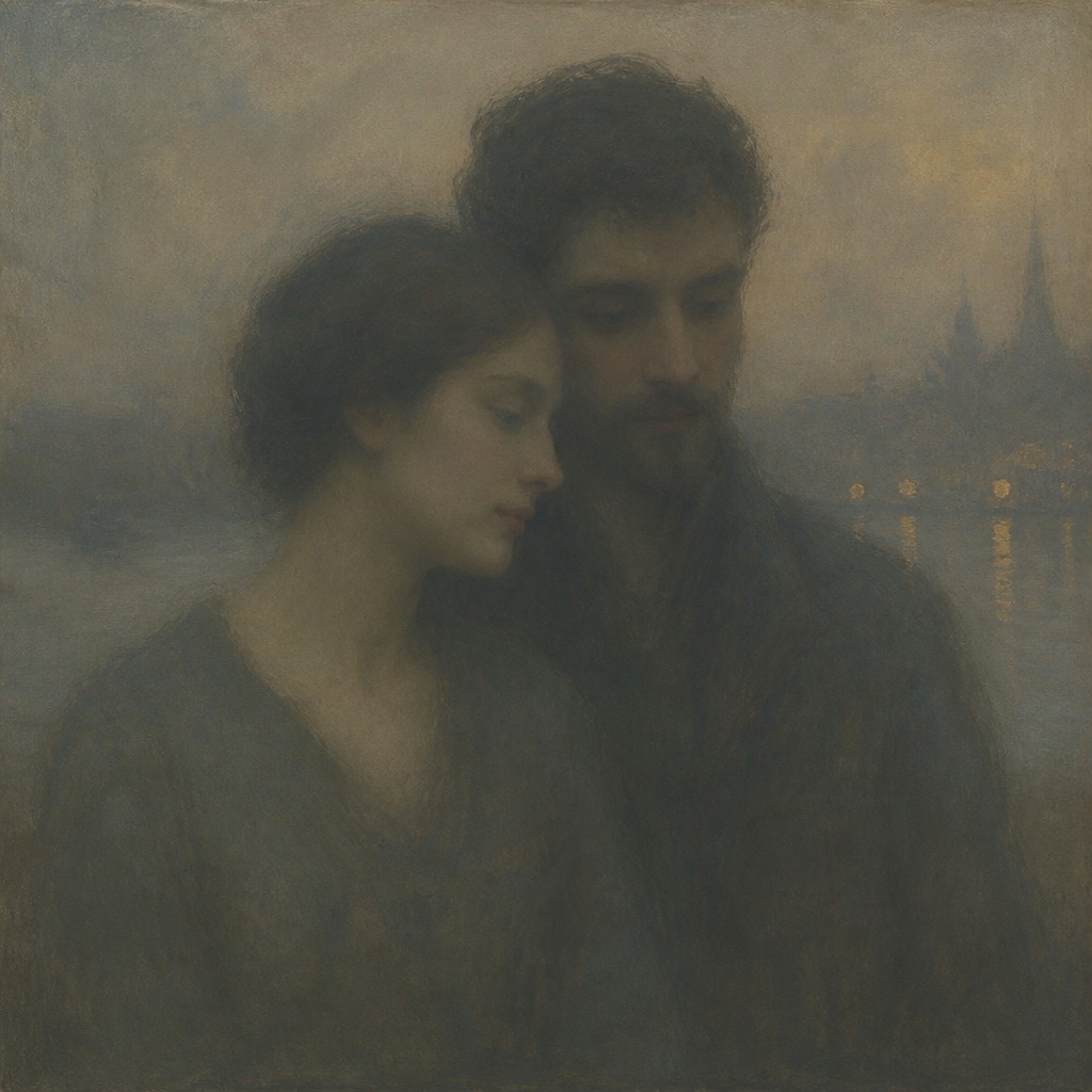
Try It On Your Photos
Upload any photo and convert it into Tonal Unity Art Style — drag the sliders to compare before and after.
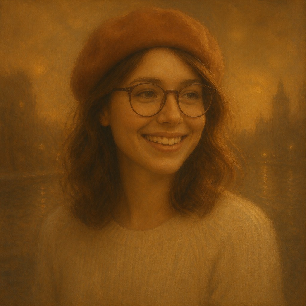

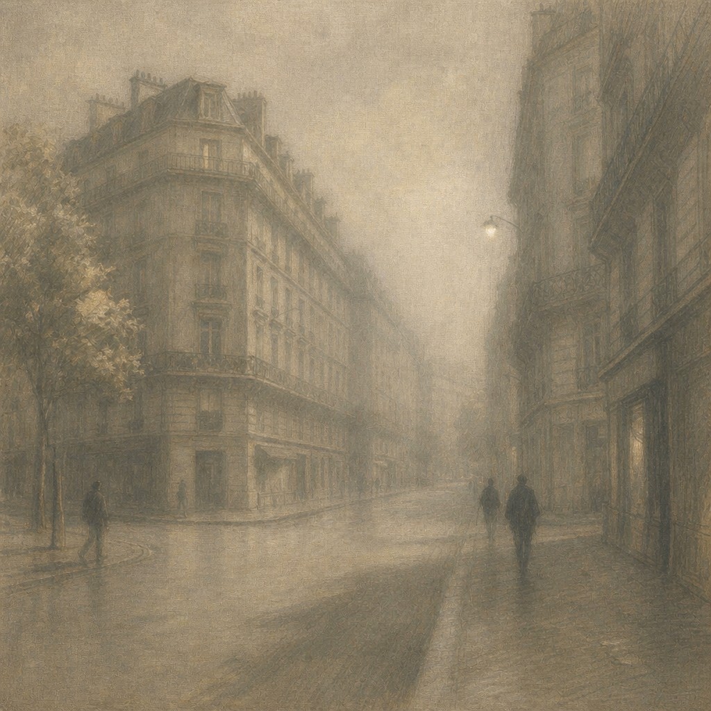

What Defines Tonal Unity Art Style
The signature details, up close
Narrow harmonious palette
Most of the image is organized around a restricted family of related hues, such as blue-gray, sepia, olive, mauve, or muted amber. Small color accents may appear, but they are subdued so the dominant tonal envelope remains intact.
Atmospheric unification
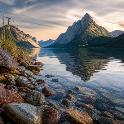
Mist, haze, smoke, rain, dust, or diffused light can pass visually between foreground, middle ground, and background. This shared atmosphere makes separate forms feel as though they occupy one continuous world.
Softened edges
Contours are selectively blurred, feathered, or allowed to dissolve into neighboring tones. The strongest edges are reserved for focal areas, while peripheral forms merge with the surrounding atmosphere.
Controlled contrast
Value relationships are compressed or carefully distributed to prevent any element from overpowering the whole. Deep shadows and bright highlights are used sparingly and usually remain tinted by the dominant palette.
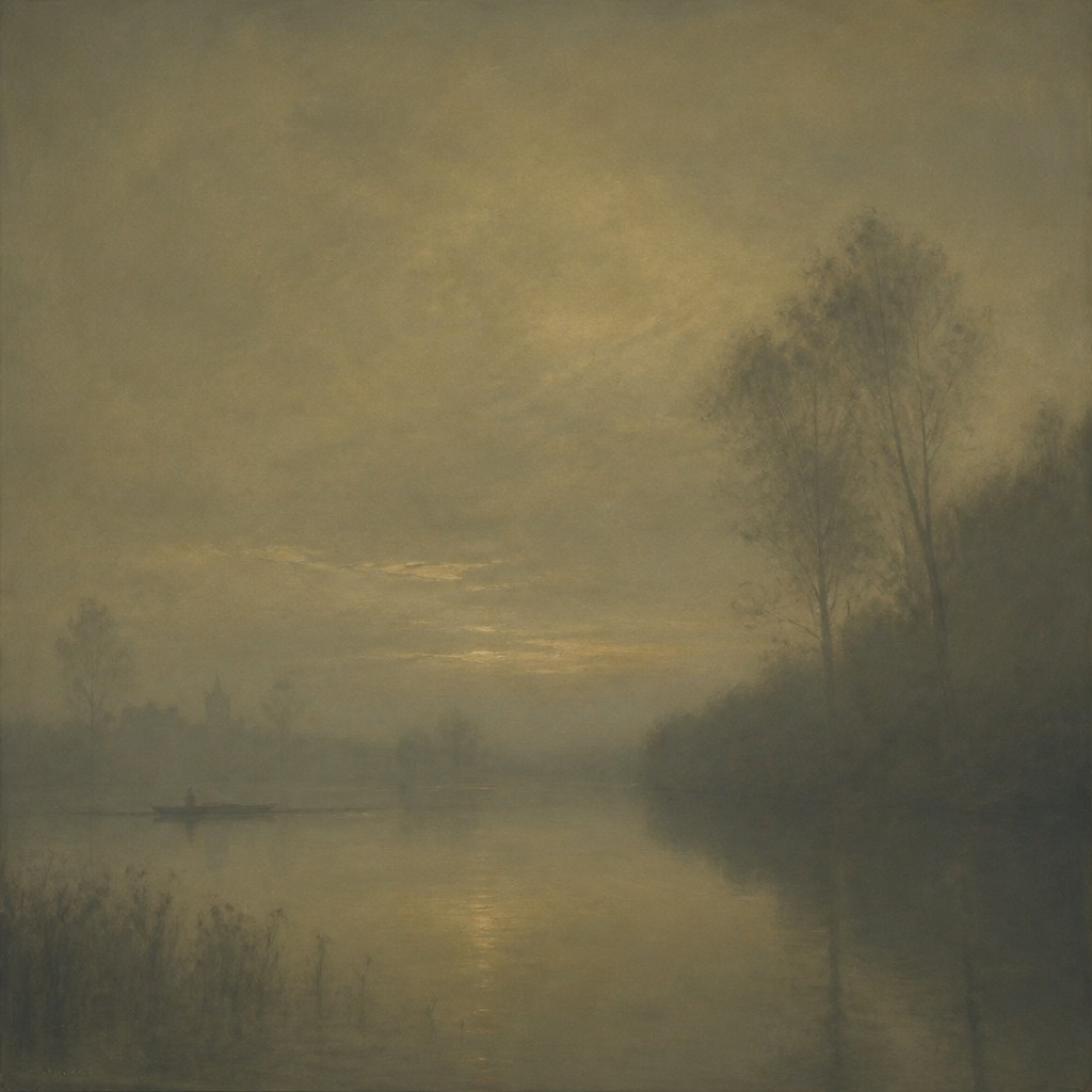
Mood before detail
The emotional temperature of the scene takes precedence over descriptive precision. Surface information is simplified, veiled, or selectively omitted when it would weaken the intended calm, mystery, solitude, or reverie.
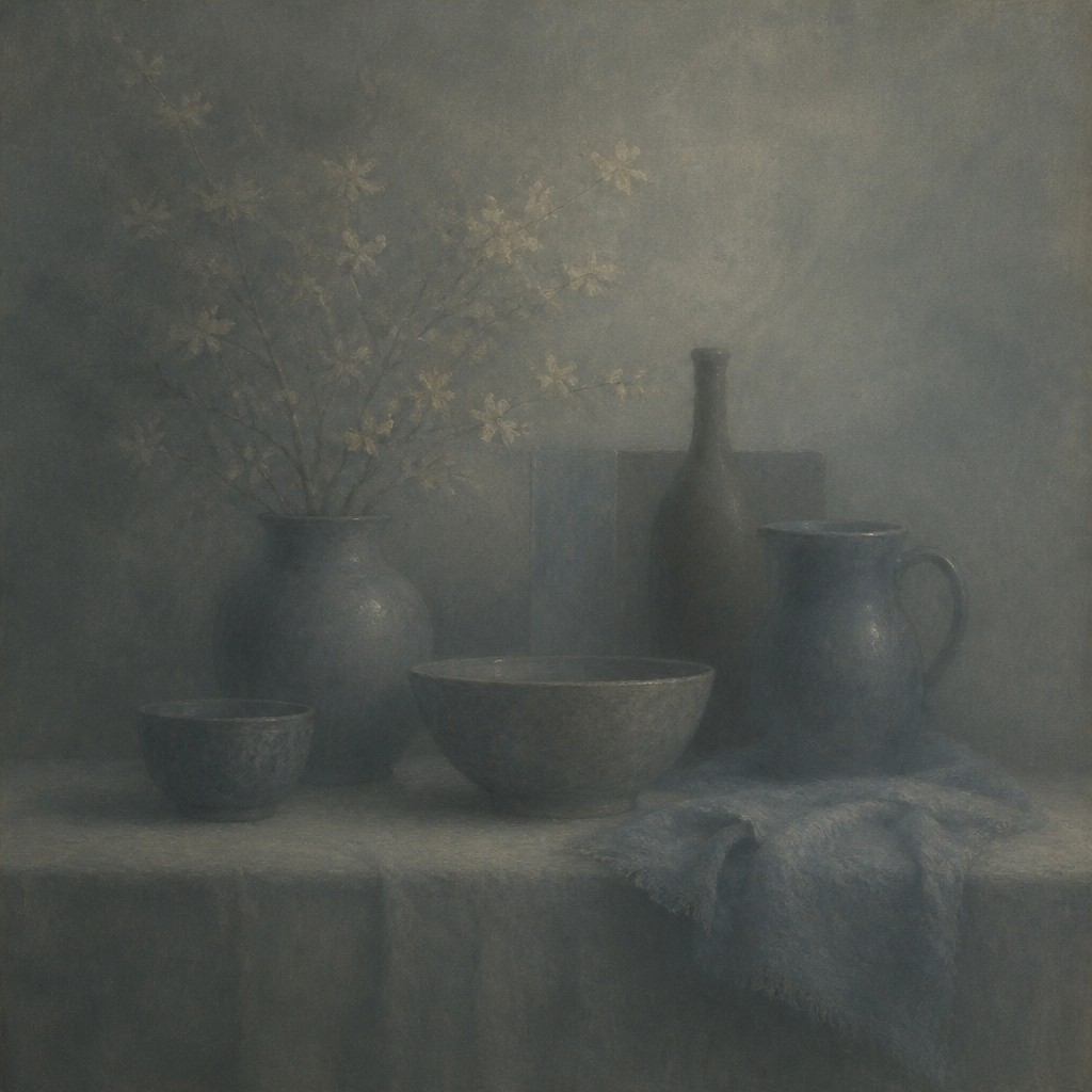
Subtle spatial depth
Depth is created through gradual changes in value, saturation, scale, and atmospheric clarity rather than strong linear outlines. Distant forms typically lose contrast and become closer to the prevailing background tone.
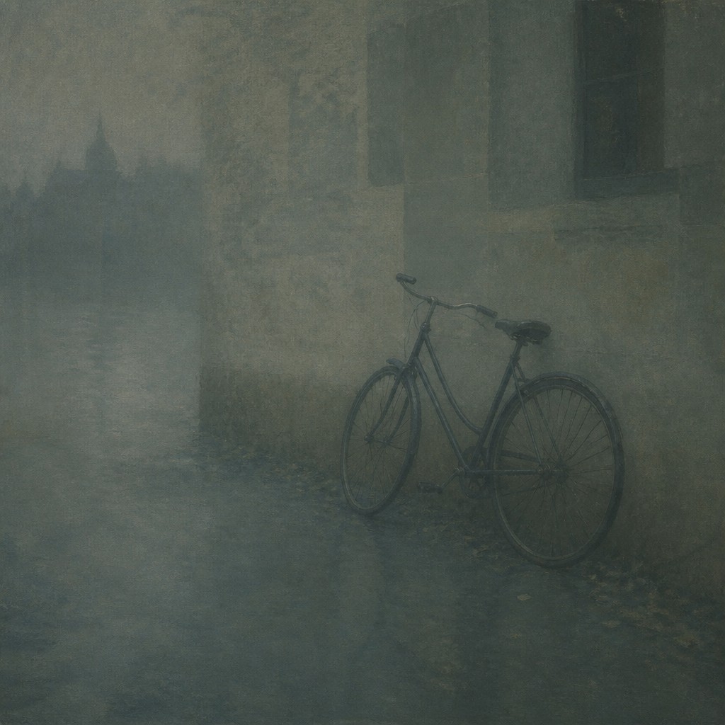
Quiet compositional balance
Arrangements often favor stillness, open space, asymmetry, and restrained focal points. Repeated shapes or tonal transitions guide the eye without introducing visual interruptions.
Try It
Create Videos in Tonal Unity Art Style
Styles aren't just for stills — describe a scene or animate an image and get a short video rendered in Tonal Unity. Press play to see this pond come to life.
Make a VideoTonal Unity Prompt Ideas
Start from an idea — each one opens the generator with the style ready to go. See all 40 Tonal Unity prompts →
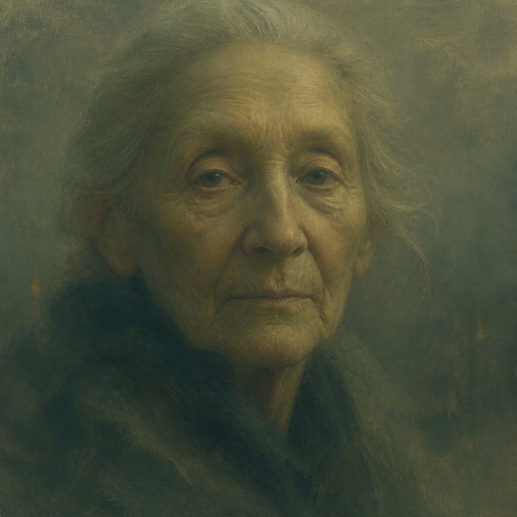
“close-up portrait of an elderly person with expressive weathered features”
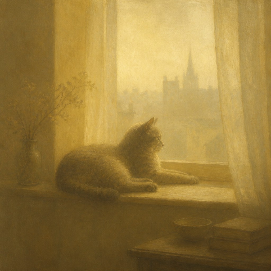
“a cat lounging in a sunlit window”
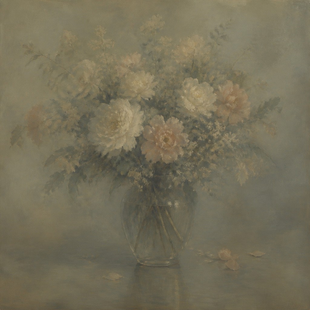
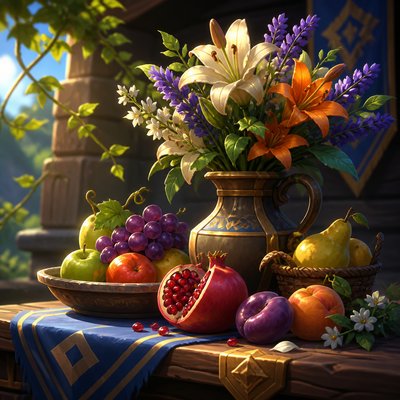
“bouquet of flowers in a glass vase”
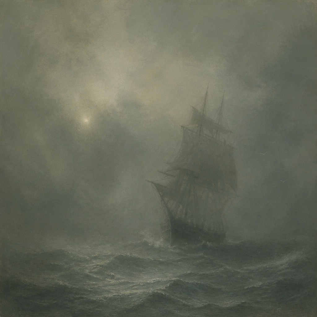
“sailing ship on a stormy sea”
How to Create Tonal Unity Art
Master the craft step by step — or skip straight to creating. Read the full guide →
- 1
Choose a tonal key
Decide on the dominant hue family and emotional register before developing the image. In painting, mix most colors from a shared neutral or atmospheric pigment; digitally, establish a restrained color grade or lookup palette at the beginning.
- 2
Build atmosphere in layers
Use thin glazes, scumbling, diluted washes, translucent overlays, or low-opacity digital layers to connect objects with the same air and light. Keep atmospheric effects integrated with the scene rather than adding them as an unrelated filter.
- 3
Reserve sharpness selectively
Allow the focal subject to carry the clearest edges and most legible details, then soften surrounding contours with blending, dry-brush transitions, masks, or reduced local contrast. Avoid outlining every object equally.
- 4
Control value and saturation
Create a grayscale check to ensure that one area does not break the intended unity. Reduce the saturation of incidental details, and tint highlights and shadows so they belong to the same environmental light.
- 5
Use image-to-image or prompt-based workflows
For digital and AI creation, describe the subject first and specify a narrow palette, enveloping haze, diffused illumination, softened edges, compressed contrast, and one consistent mood. When transforming a photograph, preserve the main silhouette while applying the shared tonal treatment across background and subject.
The Story
History & Origins of Tonal Unity
Tonal Unity is an invented contemporary style rather than a documented historical movement. Its aesthetic lineage can be traced to late nineteenth-century tonal painting, atmospheric landscape traditions, nocturne studies, the Aesthetic movement, and photographic approaches that use fog, limited exposure, or restrained color grading to create emotional coherence.
The style has also developed through digital compositing, cinematic color treatment, matte painting, and image-based generative workflows. These tools make it especially easy to apply one shared palette, haze structure, and lighting condition across subjects that would otherwise appear visually separate.
Influences: The style draws from late nineteenth-century tonalism, atmospheric landscape painting, nocturne traditions, the Aesthetic movement, and modern photographic color grading. It also relates to Japanese ink-wash approaches to suggestion and empty space, fog-bound romantic landscape imagery, cinematic production design, soft-focus photography, and digital compositing practices that use unified lighting and palette to make disparate elements feel continuous.

Frequently Asked Questions
What defines the Tonal Unity art style?
Its defining feature is a single visual and emotional atmosphere shared by the entire image. A narrow harmonious palette, softened edges, controlled contrast, and continuous haze or lighting prevent individual elements from breaking the scene's tonal coherence.
Is Tonal Unity the same as monochrome art?
No. Monochrome art is generally restricted to one hue and its variations, while Tonal Unity may use several neighboring hues. The essential requirement is not one color but a unified palette, atmosphere, and mood.
How does it differ from atmospheric perspective?
Atmospheric perspective is a spatial technique in which distant forms become lighter, less saturated, and lower in contrast. Tonal Unity can use that technique, but it applies the same principle of visual coherence to the whole composition, including foreground subjects and focal details.
Can bright colors be used in this style?
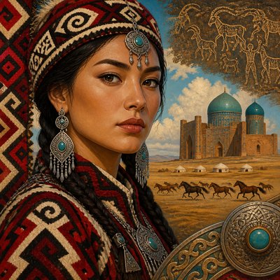
They can, but they should be carefully integrated into the prevailing tonal envelope. A single bright accent may work as a focal point, while several unrelated saturated colors will usually undermine the style's calm unity.
What subjects work well with Tonal Unity?
Landscapes, quiet interiors, coastal scenes, rainy streets, portraits, still lifes, and dreamlike architectural views are particularly effective. The style can suit almost any subject when the lighting, palette, and atmospheric treatment are consistently shared.
How can I prompt for this look without losing subject clarity?
Name the subject and its essential structure first, then request a narrow palette, diffused light, soft atmospheric transitions, selective focus, and controlled contrast. Specify that the main silhouette should remain legible while secondary details dissolve into the surrounding air.
Create your first Tonal Unity artwork
Describe anything — or upload a photo — and see it in Tonal Unity Art Style in seconds.
Related Styles
Discover similar art styles