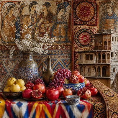
Analogous Colors Art Style
Explore analogous colors art: harmonious neighboring hues, soft transitions, unified palettes, and practical techniques for creating calm, cohesive images.
Instantly rendered in Analogous Colors — or transform a photo
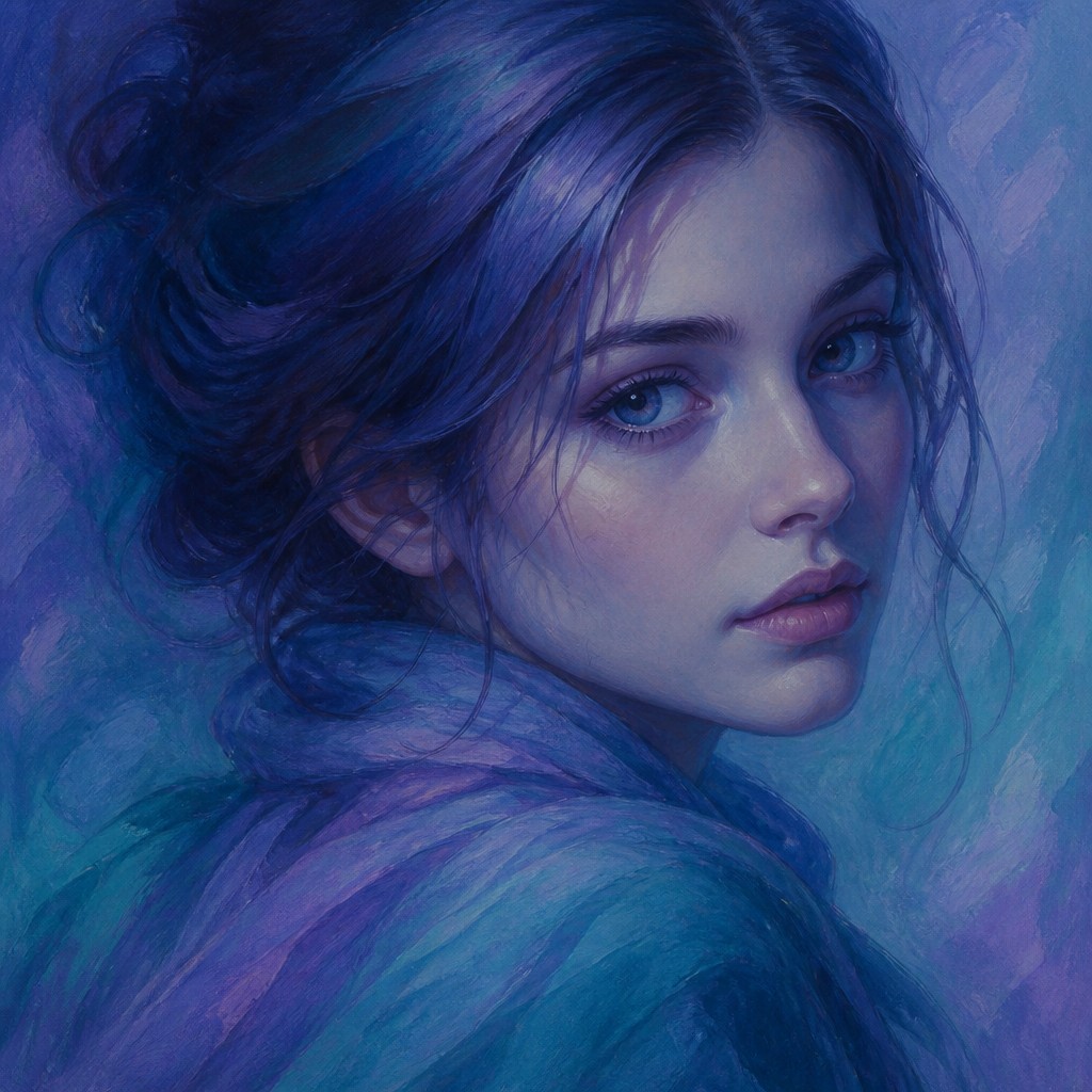
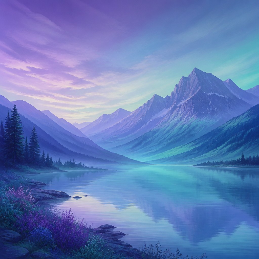
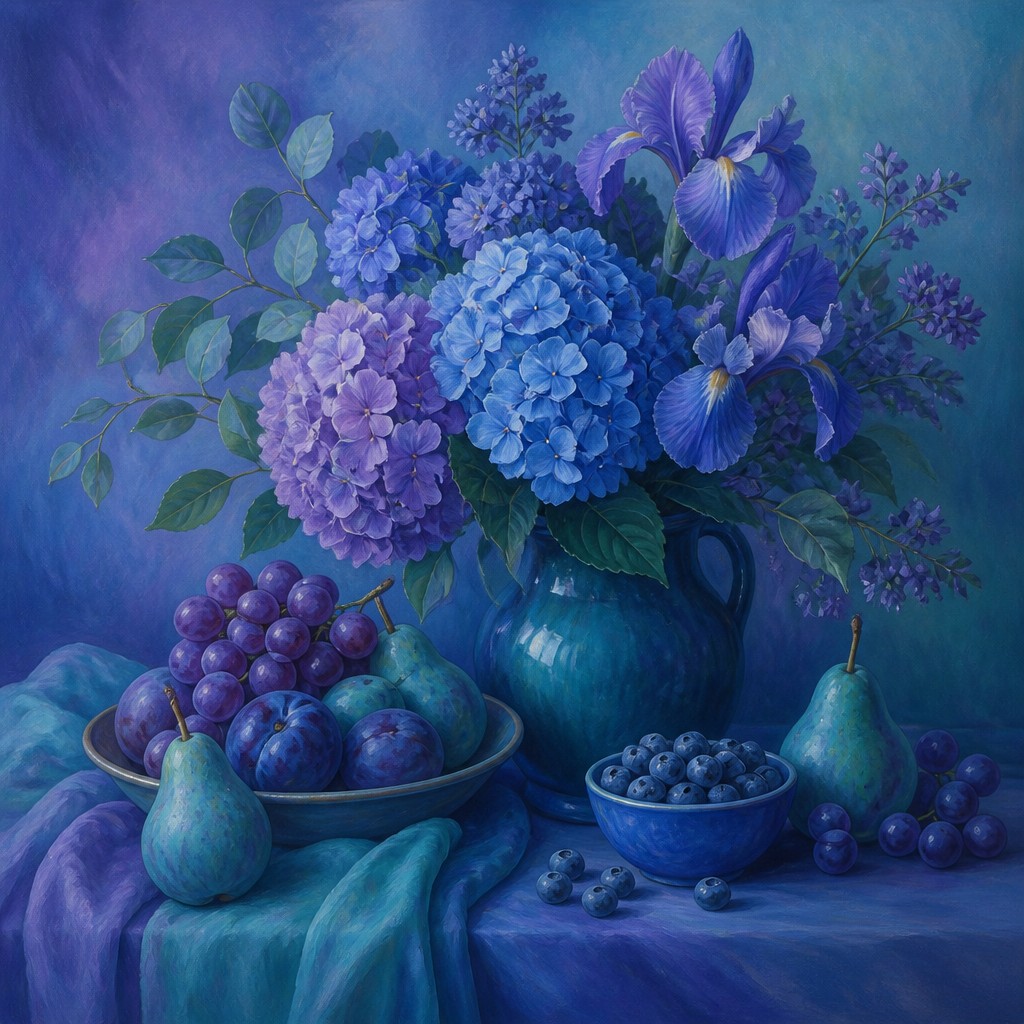
Analogous Colors Gallery
Tap any artwork to explore it
What is Analogous Colors Art Style?
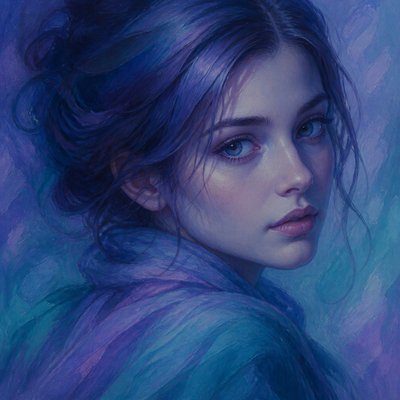
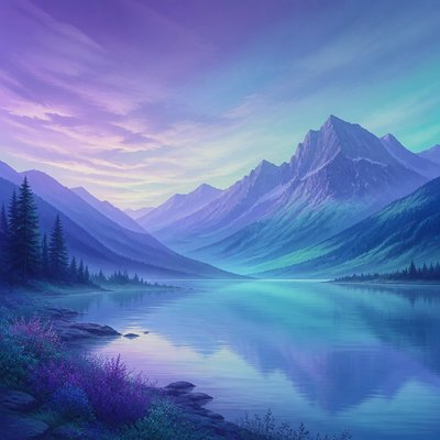
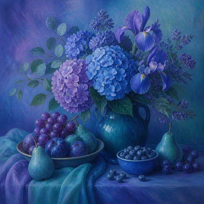
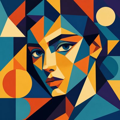
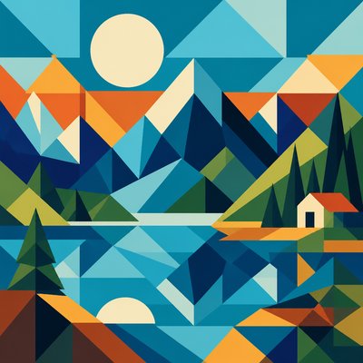
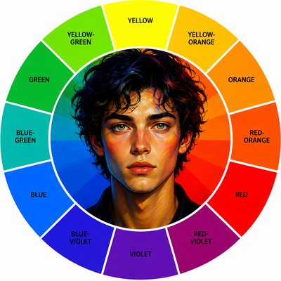
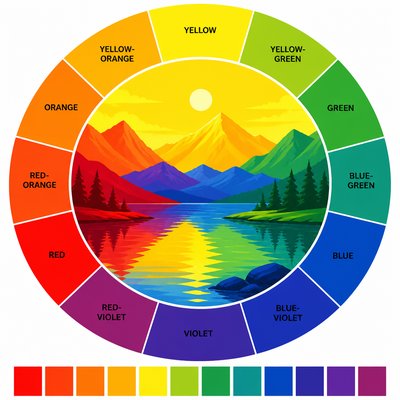
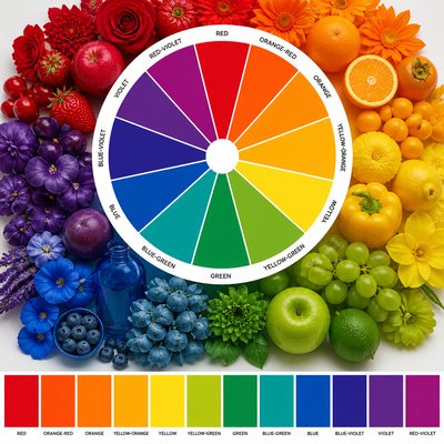
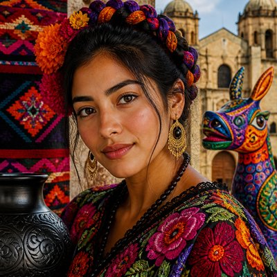
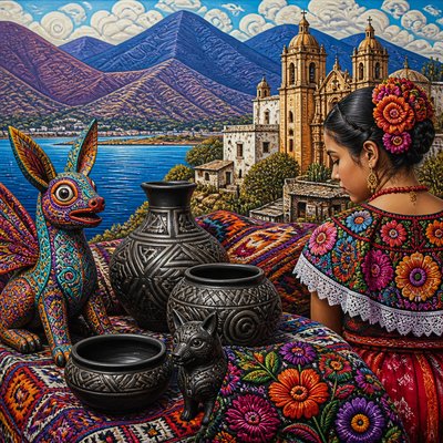
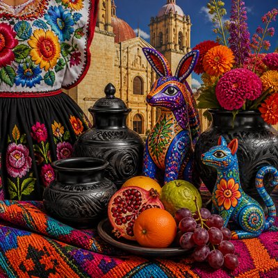
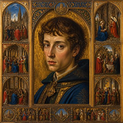
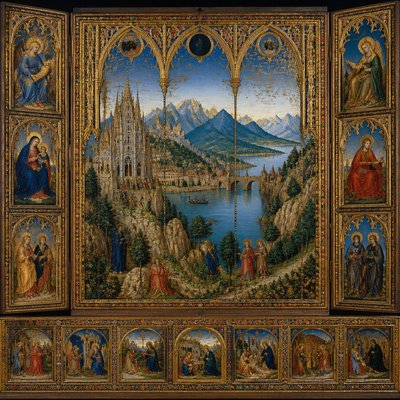
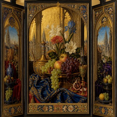
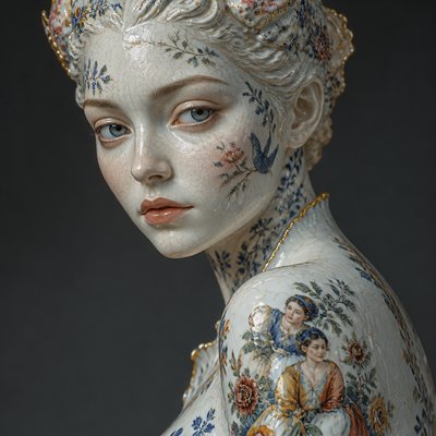
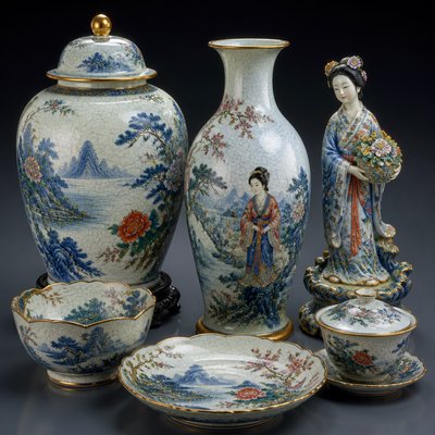
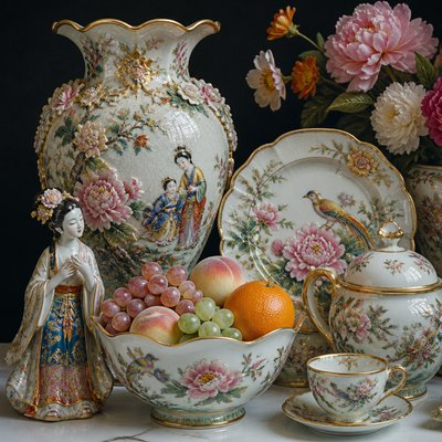
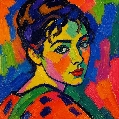
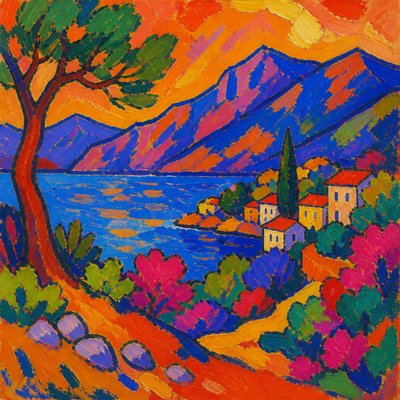
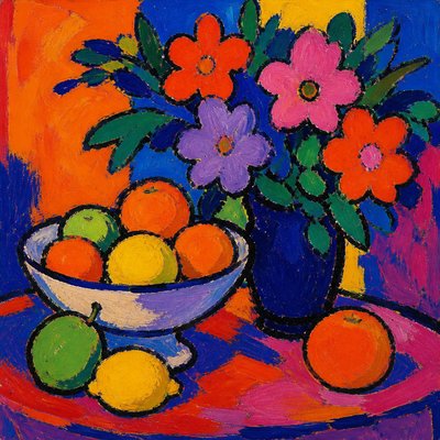
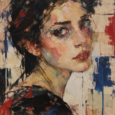
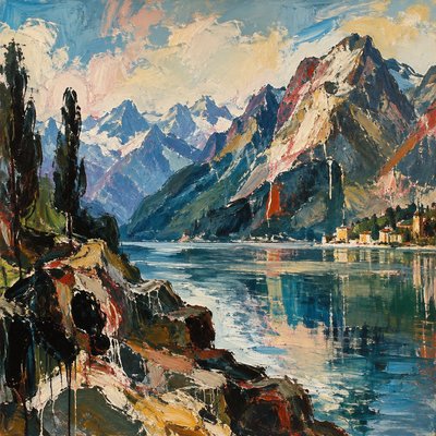
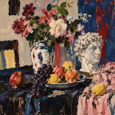
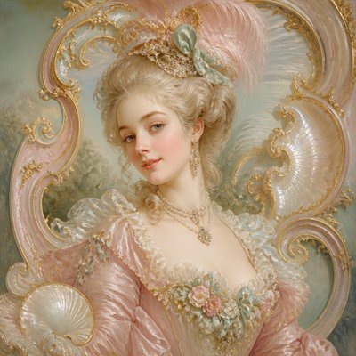
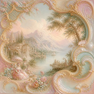
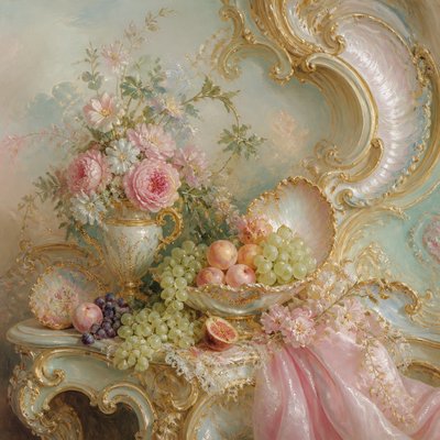
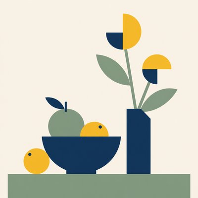
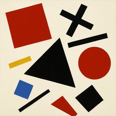
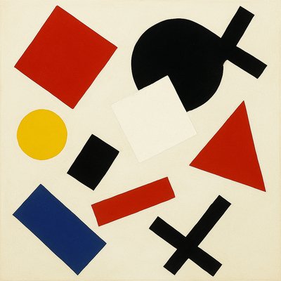
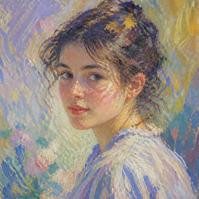
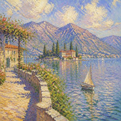
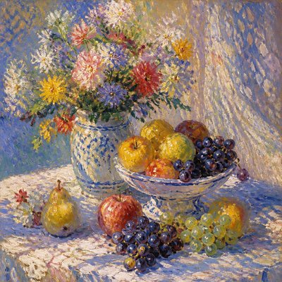
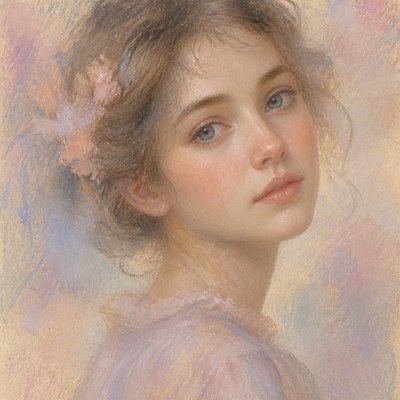
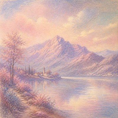
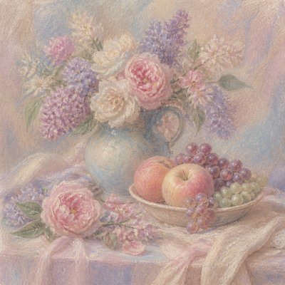
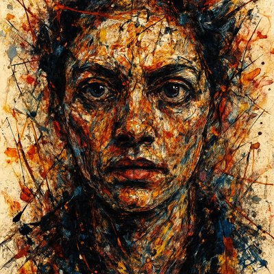
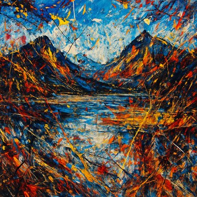
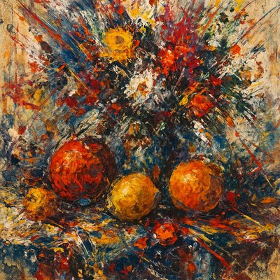
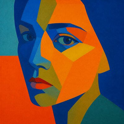
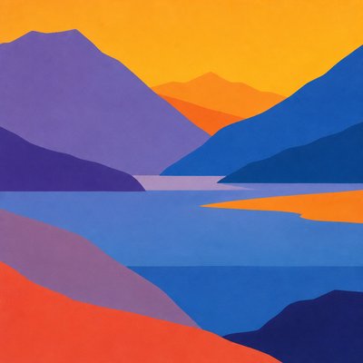
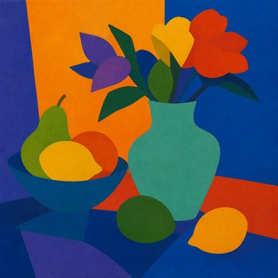
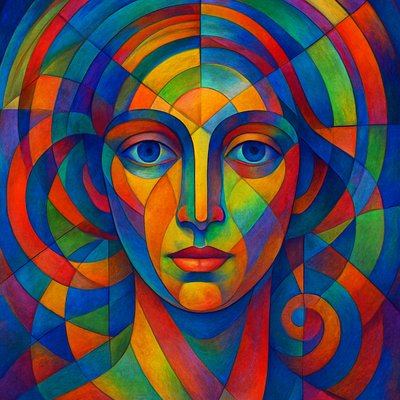
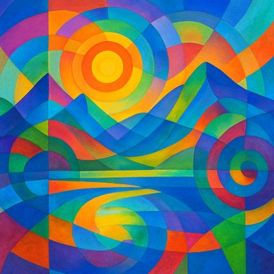
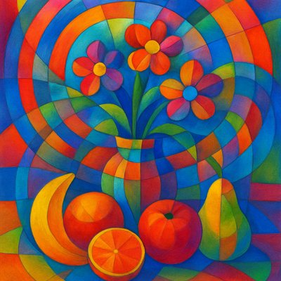
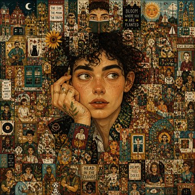
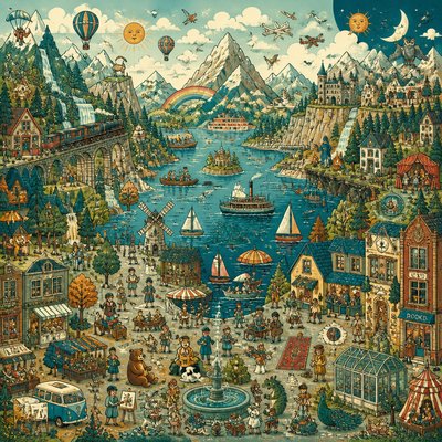
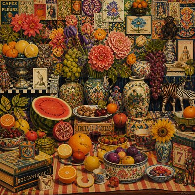
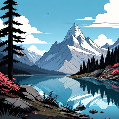
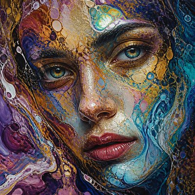
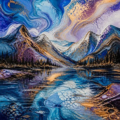
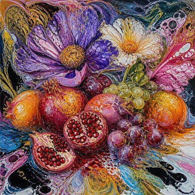
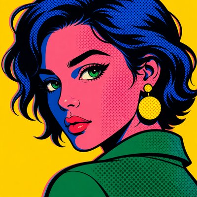
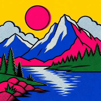
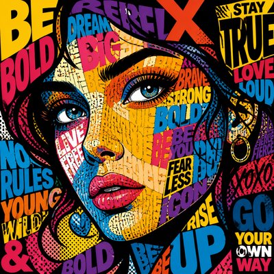
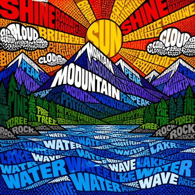
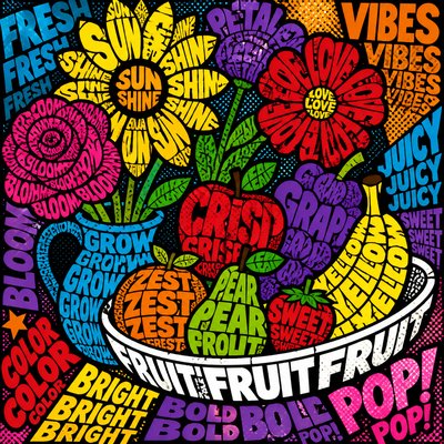
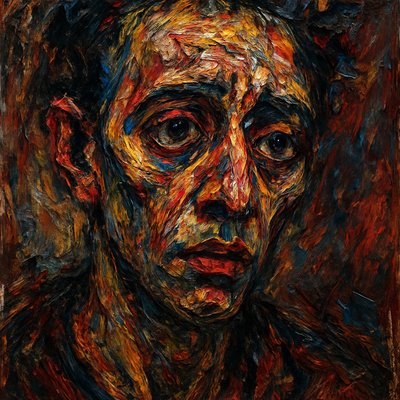
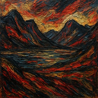
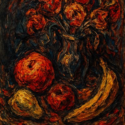
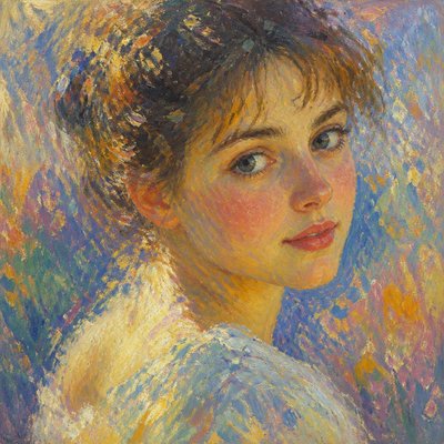
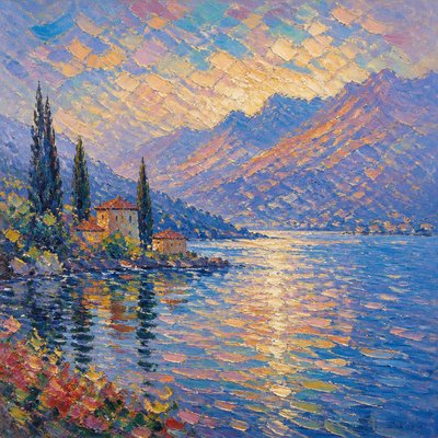
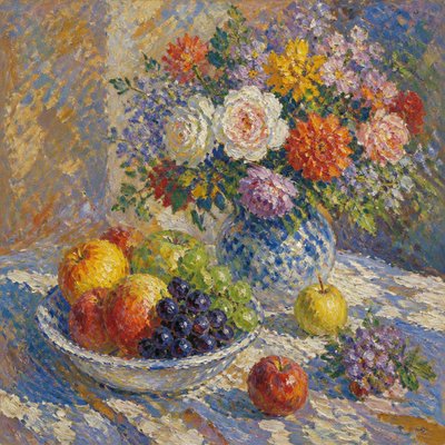
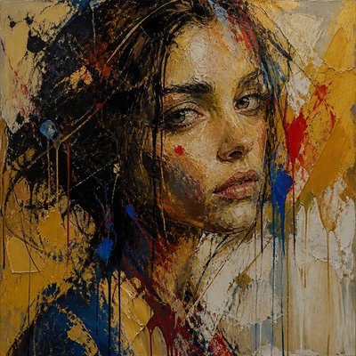
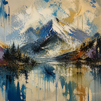
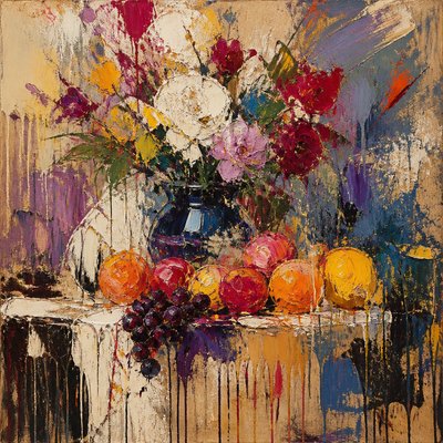
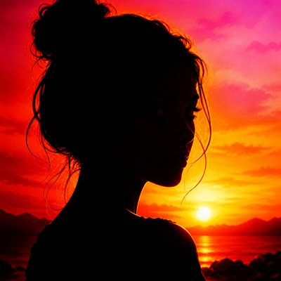
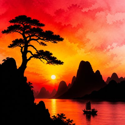
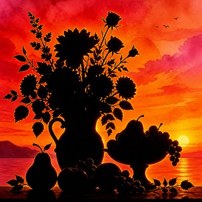
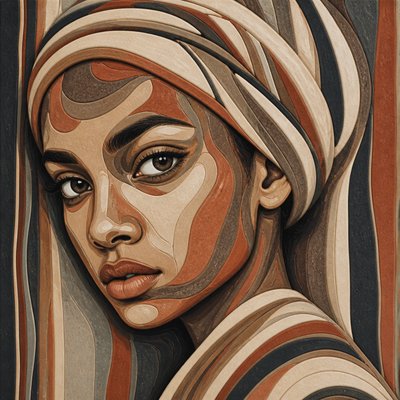
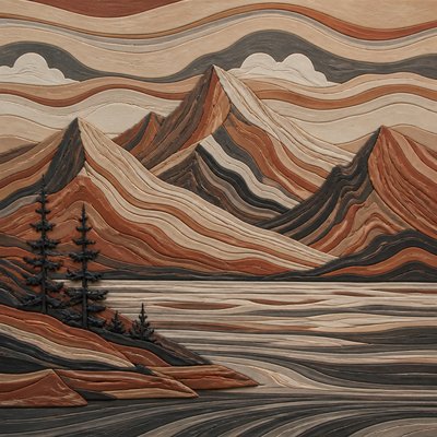
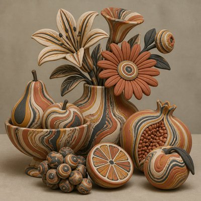
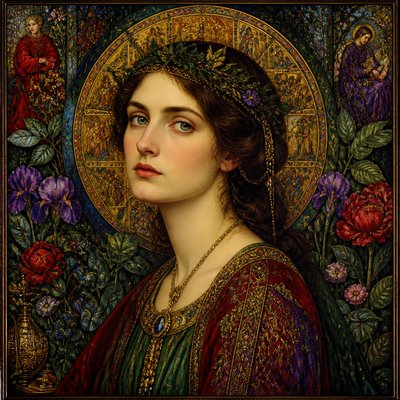
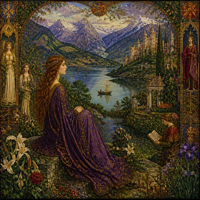
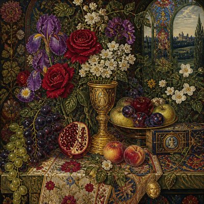
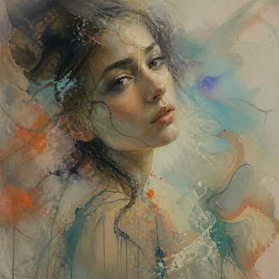
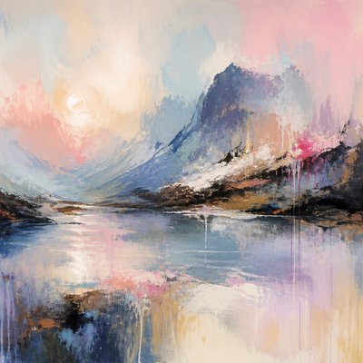
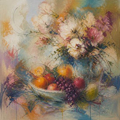
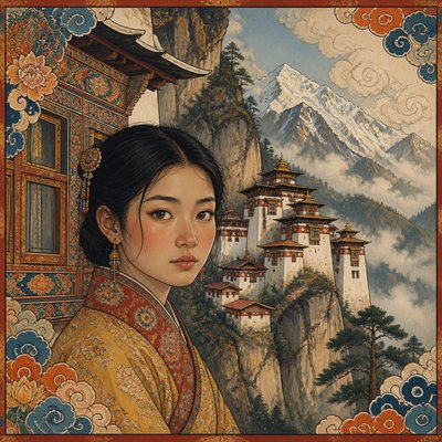
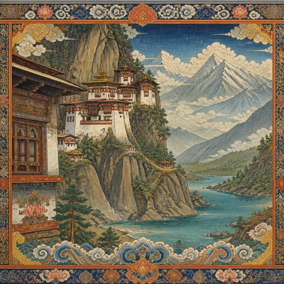
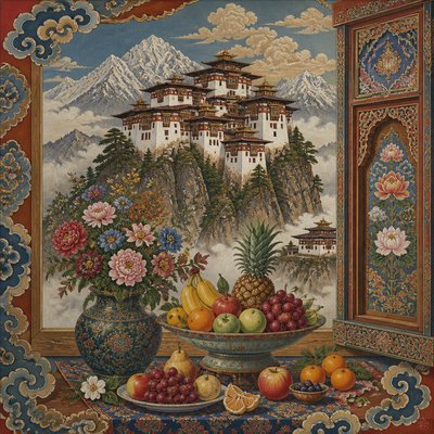
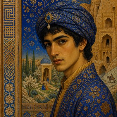
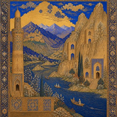
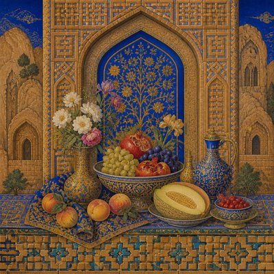
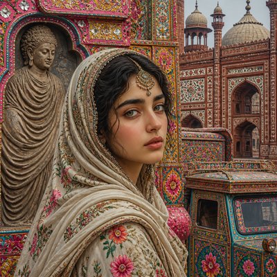
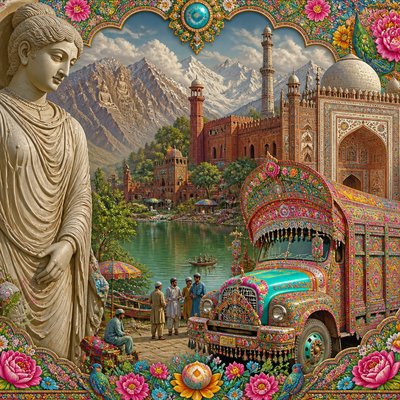
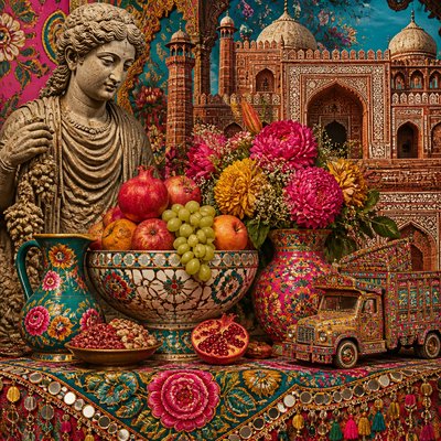
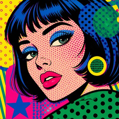
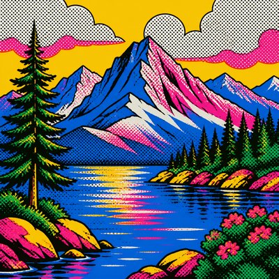
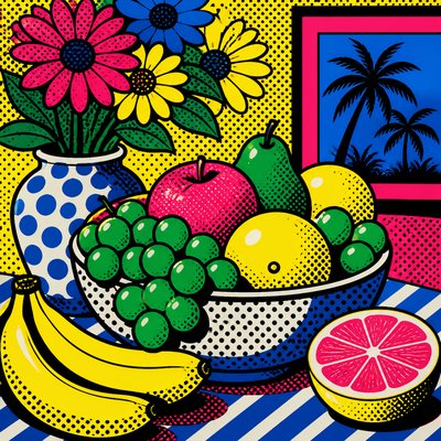
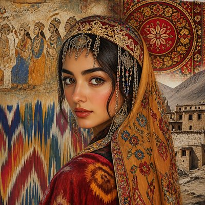
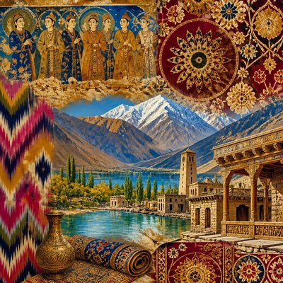
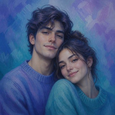
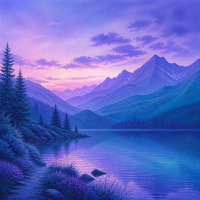
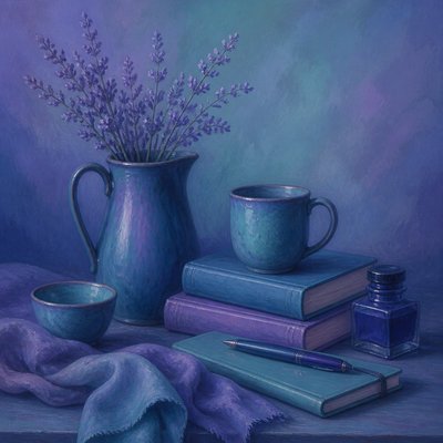
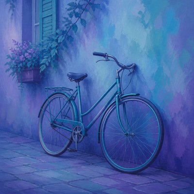
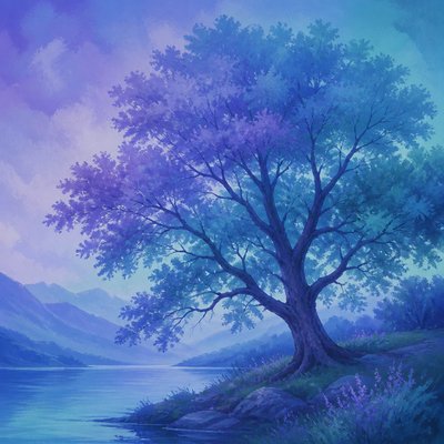
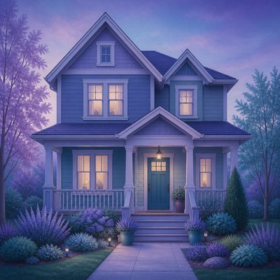
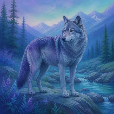
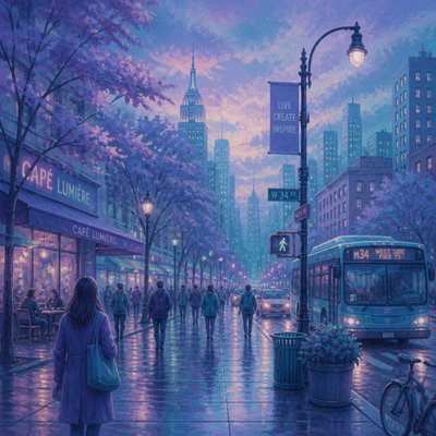
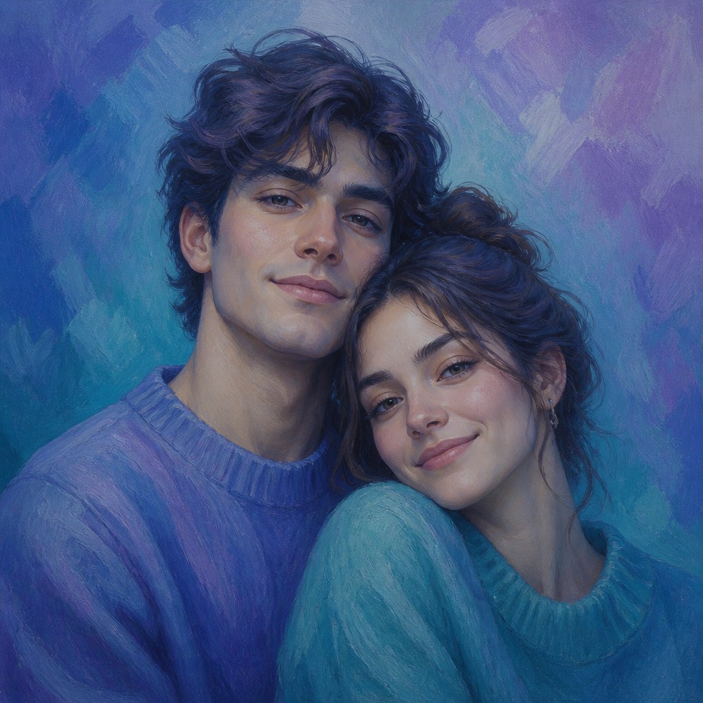
Analogous colors art is defined by a palette built from neighboring hues on the color wheel, such as blue, blue-violet, and violet or yellow, yellow-green, and green. Rather than relying on strong complementary contrasts, it creates unity through close color relationships, gradual shifts, and carefully controlled saturation and value.
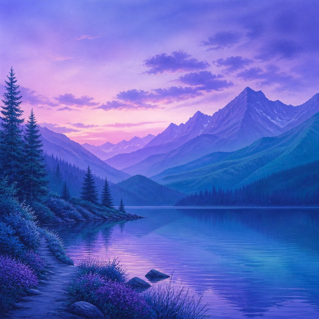
The style can be representational, abstract, atmospheric, or graphic. Its visual identity comes from colors that appear to flow into one another across forms and backgrounds, producing soft edges, tonal continuity, and a calm, cohesive mood. Warm analogous palettes may feel glowing and intimate, while cool palettes often suggest distance, quiet, water, night, or serenity.
Try It On Your Photos
Upload any photo and convert it into Analogous Colors Art Style — drag the sliders to compare before and after.


What Defines Analogous Colors Art Style
The signature details, up close
Neighboring hues
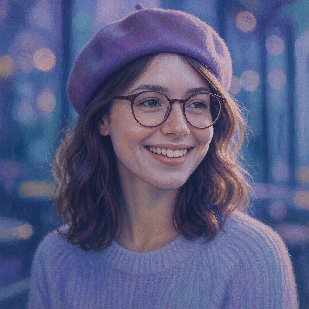
The palette is centered on adjacent colors from the color wheel, usually with one dominant hue supported by one or two neighboring hues. The color family may be cool, warm, or balanced around a transitional hue.
Smooth transitions
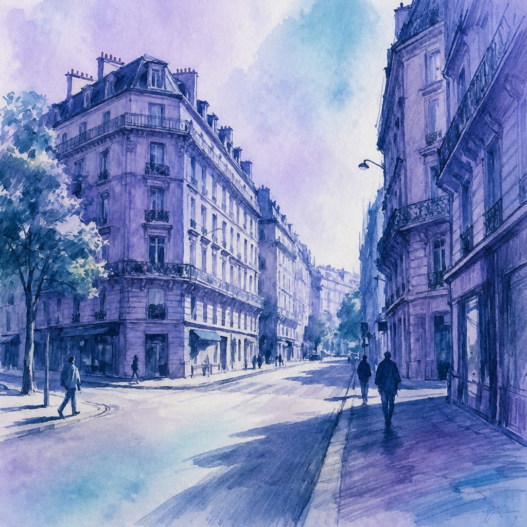
Colors merge through subtle gradients, glazing, blending, or closely spaced tonal steps. Abrupt boundaries are minimized unless they are needed to clarify a subject.
Unified mood
Because the palette shares related chromatic qualities, the image tends to feel coherent and emotionally consistent. Cool schemes can appear meditative, while warm schemes often feel welcoming or luminous.
Controlled contrast
Contrast is usually created through differences in lightness, saturation, scale, or texture rather than opposing hues. Small accents of a distant color may be used sparingly without disrupting the overall harmony.
Softened edges
Forms often dissolve gently into surrounding color, especially in atmospheric, painterly, and abstract treatments. Edge softness supports the sense that the entire image belongs to one continuous chromatic environment.
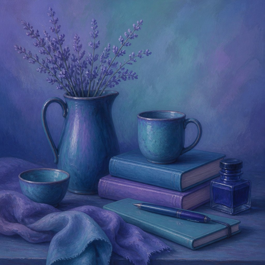
Color-led composition
Palette relationships may organize the composition as strongly as line, perspective, or subject matter. Repeated hues can connect separate objects and guide the eye across the image.
Analogous Colors Prompt Ideas
Start from an idea — each one opens the generator with the style ready to go. See all 40 Analogous Colors prompts →
How to Create Analogous Colors Art
Master the craft step by step — or skip straight to creating. Read the full guide →
- 1
Choose a narrow color family
Select a dominant hue and one or two adjacent hues before beginning. Build lighter and darker variations by changing value and saturation rather than introducing unrelated colors.
- 2
Establish value first
Keep the light-dark structure readable even when hues are closely related. A monochrome value study or grayscale check can prevent the image from becoming flat.
- 3
Blend with restraint
In paint, use glazing, wet-on-wet blending, or thin translucent layers to create gradual transitions. Digitally, use low-opacity brushes, soft gradients, and layered color adjustments while preserving enough edge definition for clear forms.
- 4
Use contrast strategically
Create focal points with a darker value, a more saturated passage, sharper detail, or a small accent from outside the main color family. Keep these interruptions limited so the palette remains unified.
- 5
Repeat colors across the image
Echo the same blue, green, violet, or warm hue in multiple objects and background areas. This repetition visually links the composition and prevents isolated colors from feeling accidental.
- 6
Describe the palette in a prompt
For digital or AI-assisted creation, specify the neighboring hues, the desired transition quality, the dominant mood, and the level of contrast. Phrases such as "blue-violet and teal palette," "soft gradient transitions," and "no jarring complementary contrast" give clearer direction than simply naming a color.
The Story
History & Origins of Analogous Colors
Analogous colors art is not a single historical movement with a fixed period or founding school. It derives from longstanding color-theory practices in painting, design, illustration, photography, and decorative arts, where neighboring hues are organized to create harmony and visual coherence.
Its aesthetic lineage includes tonal painting traditions, atmospheric landscape methods, color-field abstraction, modernist poster design, editorial illustration, and contemporary digital image-making. Improvements in digital color selection, gradient tools, and palette systems have made analogous schemes especially common in interface design, motion graphics, conceptual imagery, and generative image workflows.
Influences: The style relates to color-harmony systems in traditional and modern painting, atmospheric landscape practices, tonalism, color-field abstraction, impressionistic approaches to changing light, and modern graphic design. It also shares techniques with gradient-based digital illustration, cinematic color grading, minimalist photography, and decorative arts that use restricted palettes for unity. Unlike a historical movement defined by a particular group or manifesto, it is best understood as a flexible color strategy applicable across media.
Frequently Asked Questions
What defines analogous colors art?
Its defining feature is the use of neighboring hues on the color wheel as the dominant palette. These colors are connected through smooth transitions, repeated accents, and restrained contrast, creating a unified visual and emotional atmosphere.
How is it different from monochromatic art?
Monochromatic art generally uses one hue with variations in lightness and saturation. Analogous colors art uses several adjacent hues, so it offers more chromatic variety while maintaining a similarly harmonious appearance.
How is it different from complementary color art?
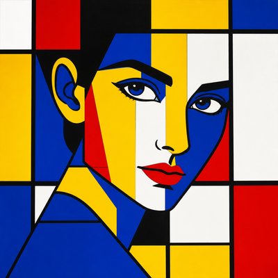
Complementary schemes emphasize opposing hues, such as blue and orange, to create energetic contrast. Analogous schemes place neighboring hues together, producing softer transitions and a more continuous, restful effect.
Can any subject be rendered with an analogous palette?
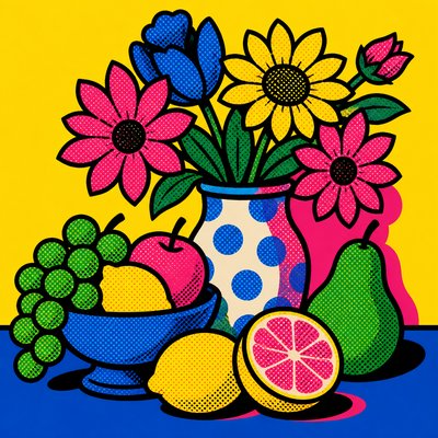
Yes. Landscapes, portraits, architecture, still lifes, abstract compositions, and photographs can all be reorganized around a narrow color family. The palette may describe natural lighting or deliberately override realistic local colors for a more expressive result.
How can I keep an analogous image from looking flat?
Vary value, saturation, texture, scale, and edge sharpness within the chosen hue family. A small number of dark passages and a clearly placed focal accent can provide structure without introducing harsh color opposition.
Where is this color approach commonly used?
It appears in painting, illustration, photography, film and game color grading, branding, editorial graphics, interiors, interfaces, and atmospheric digital art. It is particularly useful when a project needs visual consistency, a calm mood, or a strong sense of environmental unity.
Create your first Analogous Colors artwork
Describe anything — or upload a photo — and see it in Analogous Colors Art Style in seconds.
Related Styles
Discover similar art styles