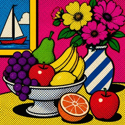
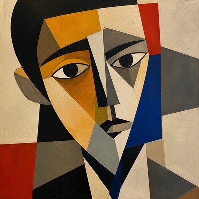
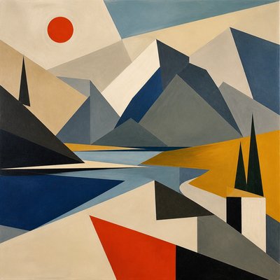
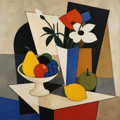
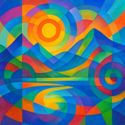
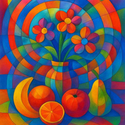
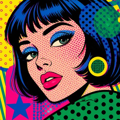
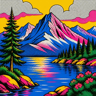
Primary Colors Art Style
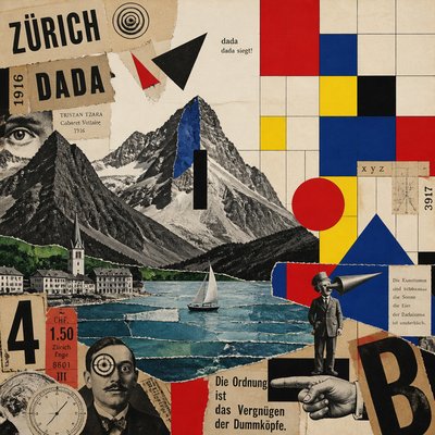
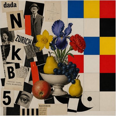
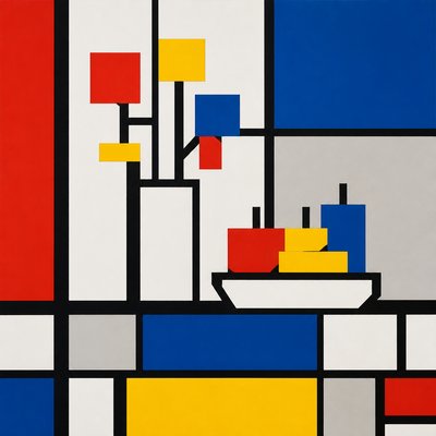
Explore Primary Colors Art Style: crisp geometric grids, bold red, yellow and blue blocks, thick black lines, and balanced white space.
Instantly rendered in Primary Colors — or transform a photo
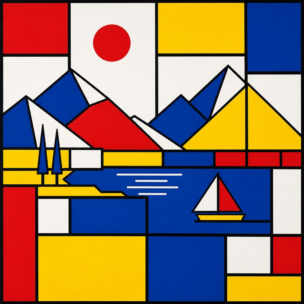
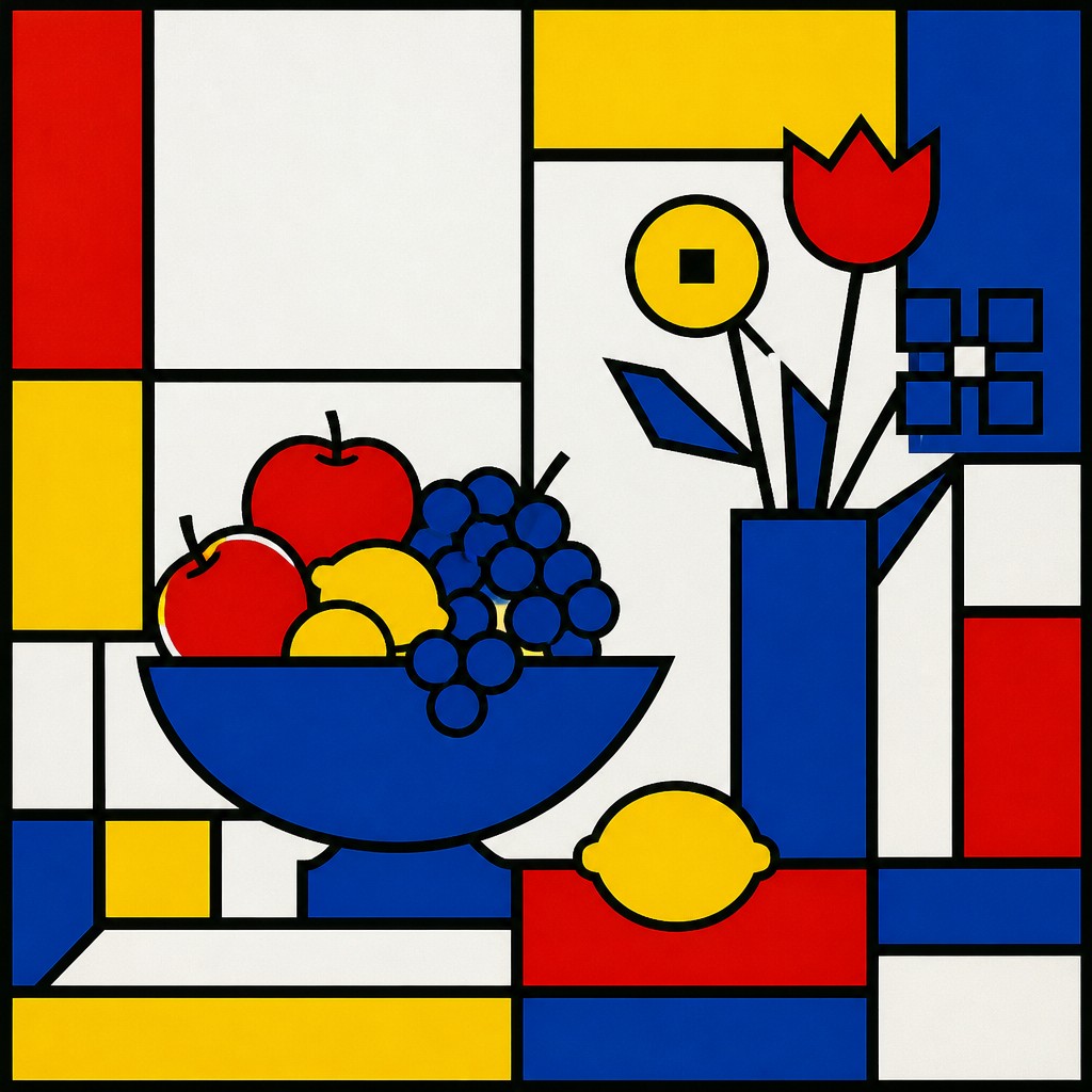
Primary Colors Gallery
Tap any artwork to explore it
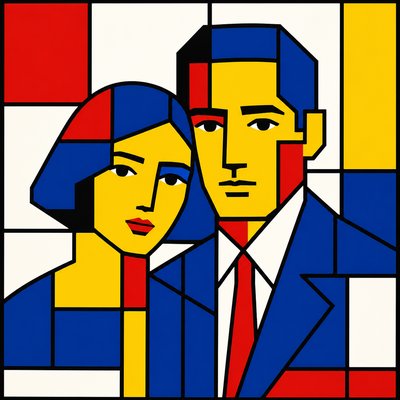
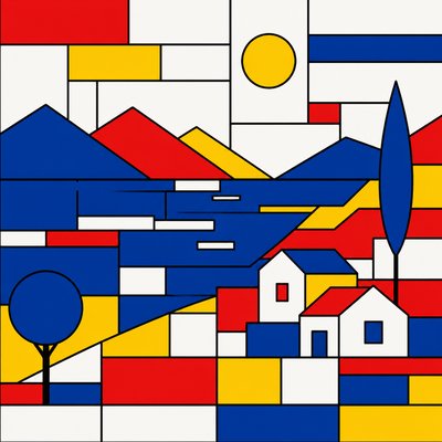
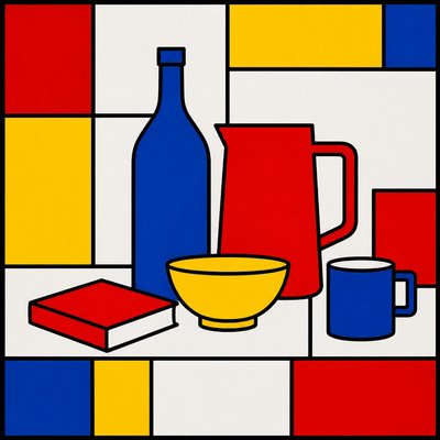
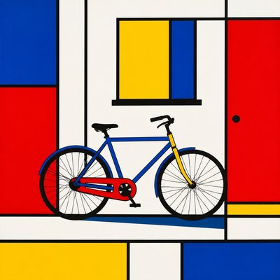
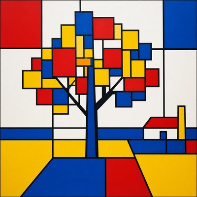
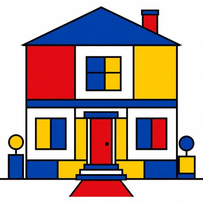
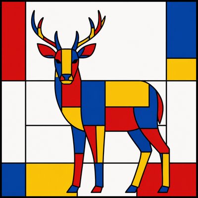
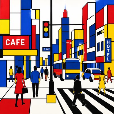
What is Primary Colors Art Style?
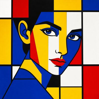
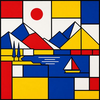
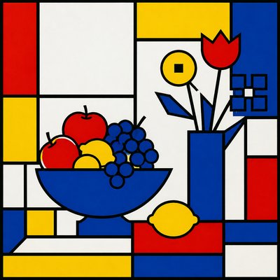
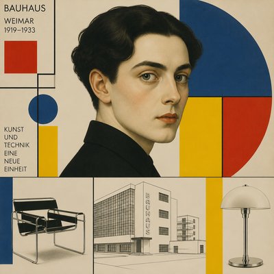
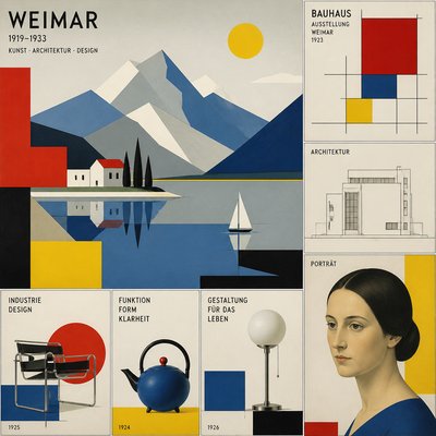
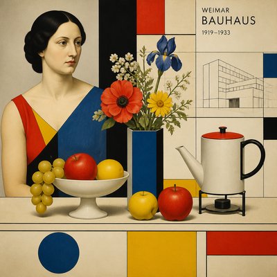
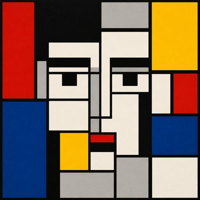
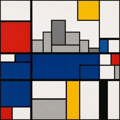
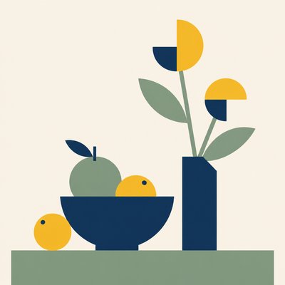
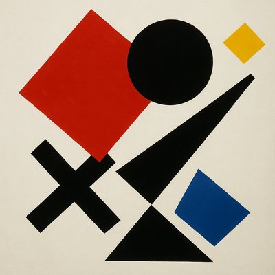
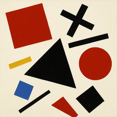
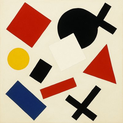
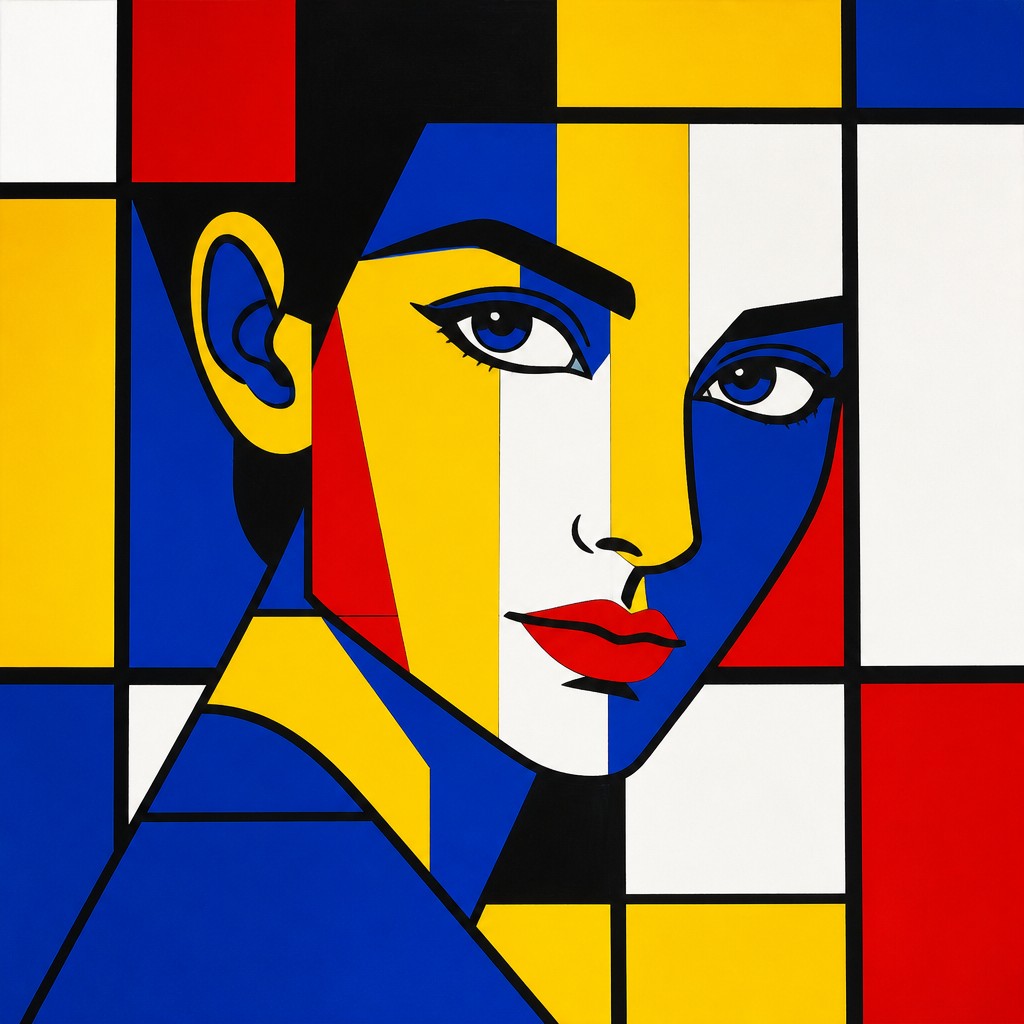
Primary Colors Art Style is a geometric, abstract visual language built from flat fields of pure red, yellow, and blue, usually arranged within a strict rectangular grid. Thick black lines divide the composition, while white ground or negative space provides breathing room and sharp contrast. The result is orderly, architectural, and immediately legible.
The style depends on reduction rather than detail. Objects, scenes, or figures are translated into simplified blocks and planes, with depth suggested through proportion, placement, and spatial intervals instead of shading or texture. Its limited palette creates visual unity, while asymmetrical balance and strong horizontal and vertical divisions keep the image dynamic without making it visually busy.
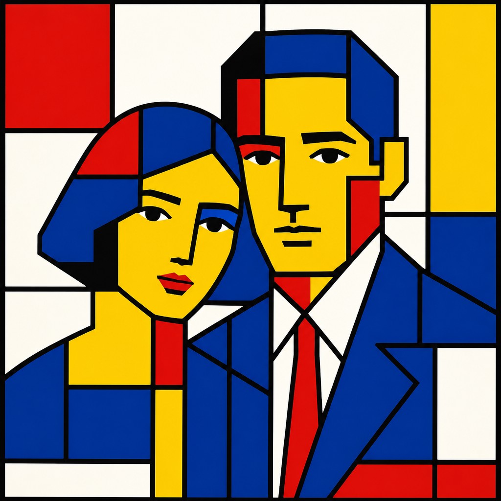
Try It On Your Photos
Upload any photo and convert it into Primary Colors Art Style — drag the sliders to compare before and after.
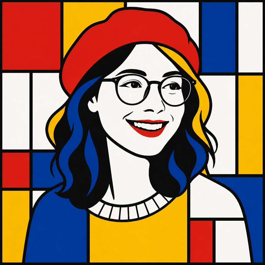

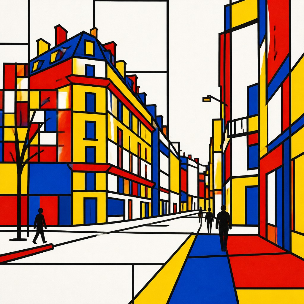

What Defines Primary Colors Art Style
The signature details, up close
Primary-color restriction
The palette centers on pure red, yellow, and blue, often supported by black and white. Mixed secondary colors, gradients, and muddy intermediates are deliberately excluded.
Rectangular grid
Horizontal and vertical divisions organize the image into panels, bars, and rectangular color fields. The grid may be regular or subtly varied, but it remains the main structural device.
Thick black lines
Bold black rules separate adjacent fields and clarify the composition. These lines function both as outlines and as architectural framework.
Flat unmodulated surfaces
Color areas remain even and opaque, without brush texture, atmospheric modeling, highlights, or cast shadows. Flatness makes each hue read as a clear graphic unit.
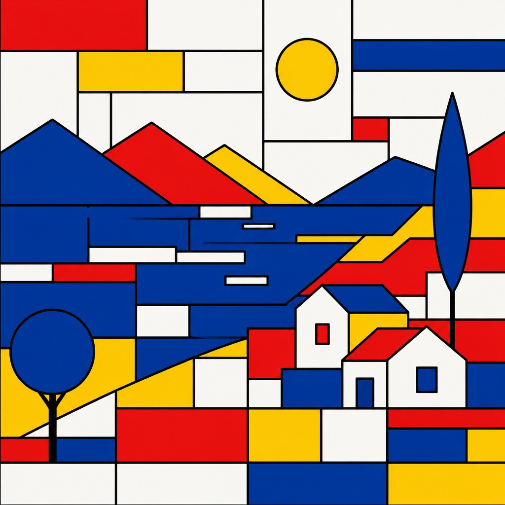
Geometric simplification
Subjects are reduced to blocks, planes, silhouettes, and repeated angles. Recognition comes from essential contours and relationships rather than naturalistic detail.
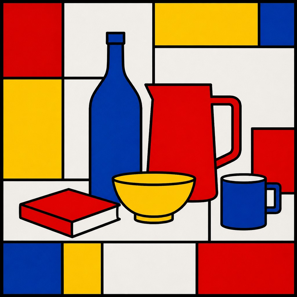
White-space balance
White areas separate intense colors and prevent the composition from becoming saturated. Empty space is treated as an active structural element rather than unused background.
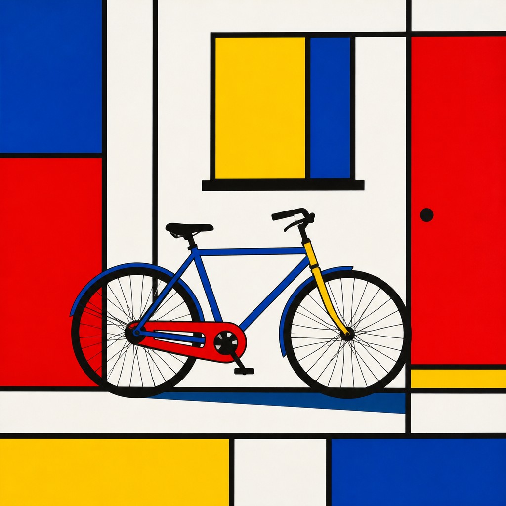
Architectural equilibrium
The arrangement favors measured proportion, visual weight, and tension between symmetry and asymmetry. Every colored panel appears intentionally placed within the overall grid.
Primary Colors Prompt Ideas
Start from an idea — each one opens the generator with the style ready to go. See all 40 Primary Colors prompts →
How to Create Primary Colors Art
Master the craft step by step — or skip straight to creating. Read the full guide →
- 1
Build a structural grid
Begin with a white ground and establish a small number of horizontal and vertical divisions. Vary panel sizes carefully so the composition feels balanced without becoming mechanically repetitive.
- 2
Limit the palette
Use clean, saturated red, yellow, and blue alongside black and white. Avoid gradients, transparency, textured brushes, and accidental color mixing at adjoining edges.
- 3
Reduce the subject
Translate the subject into its most recognizable silhouettes and planes before assigning color. Remove incidental details, then use black lines to reinforce the key divisions.
- 4
Use precise edges
For traditional work, masking tape, rulers, stencils, and opaque paint help create crisp boundaries. Digitally, use vector shapes, snapping, alignment tools, and separate locked layers for each color field.
- 5
Control visual weight
Place larger or brighter red areas against quieter white or yellow sections, and use blue to stabilize the composition. Check the image at a distance to ensure that no single block overwhelms the grid.
- 6
Write a focused generation prompt
Specify the subject first, then request pure red, yellow, and blue blocks, thick black grid lines, white ground, flat opaque color, and no gradients or secondary tones. Add composition instructions such as asymmetrical balance, rectangular panels, and crisp architectural spacing.
The Story
History & Origins of Primary Colors
Primary Colors Art Style is a contemporary descriptive style rather than a historically established movement with a single place of origin or fixed period. Its aesthetic lineage can be traced to early twentieth-century geometric abstraction, especially grid-based compositions associated with De Stijl, as well as constructivist design, modernist architecture, Swiss graphic design, and hard-edge painting.
In digital illustration and image-generation culture, the style has developed as a concise visual formula: primary hues, black structural lines, white space, and simplified geometry. It can be applied to portraits, landscapes, interiors, products, and symbolic scenes without claiming a distinct historical school of its own.
Influences: The style draws on De Stijl and other early modern geometric abstraction, where horizontal and vertical order, primary color, and reduced form became central principles. It also relates to constructivist composition, Bauhaus-informed design education, hard-edge painting, Swiss graphic design, pixel-based imagery, architectural drafting, and contemporary vector illustration. Its emphasis on modular panels and visual economy connects it to editorial graphics, signage, posters, interfaces, and modern interiors.
Frequently Asked Questions
What defines Primary Colors Art Style?
It is defined by pure red, yellow, and blue color fields arranged within a crisp geometric grid. Thick black lines, flat opaque surfaces, white space, and simplified forms are equally important to the look.
Is this a historical art movement?
No. The name describes a contemporary aesthetic formula rather than a formally documented movement with a founding date or unified group of practitioners. Its visual lineage includes De Stijl, geometric abstraction, modernist design, and hard-edge painting.
How is it different from De Stijl?
The two aesthetics share primary colors, grids, black lines, and geometric abstraction. De Stijl refers to a specific early twentieth-century movement with broader philosophical and architectural aims, while this style is a flexible contemporary application that can simplify almost any subject.
Can recognizable subjects be used in this style?
Yes. Portraits, buildings, landscapes, objects, and animals can all be translated into geometric planes and rectangular fields. Recognition depends on preserving essential silhouettes and proportions while eliminating naturalistic detail.
How can I create it without digital tools?
Use heavy paper or board, a ruler, masking tape, opaque paint, and a carefully limited palette. Plan the grid first, paint the lightest areas before darker ones, and remove the tape only after the color fields are fully dry.
Where is this visual style commonly used?
Its clarity makes it suitable for posters, editorial illustration, book covers, packaging, wall art, branding systems, textiles, interiors, and educational graphics. It also adapts well to digital icons and image-to-image transformations when strong shapes are preserved.
Create your first Primary Colors artwork
Describe anything — or upload a photo — and see it in Primary Colors Art Style in seconds.
Related Styles
Discover similar art styles