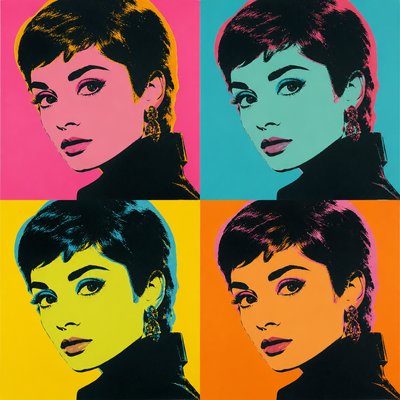
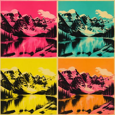
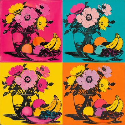
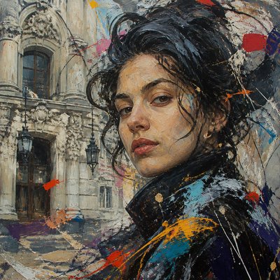
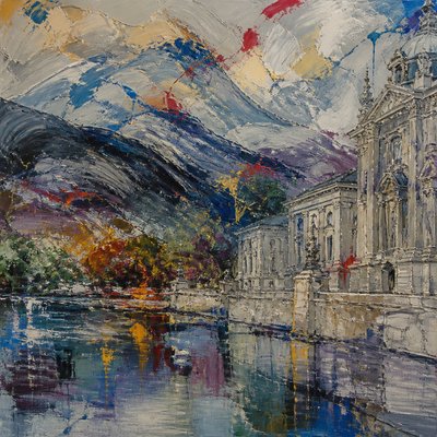
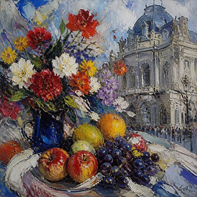
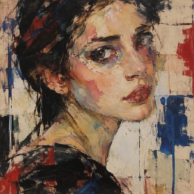
Advertisement Pop Art Style
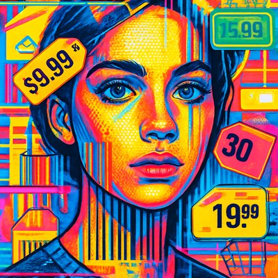
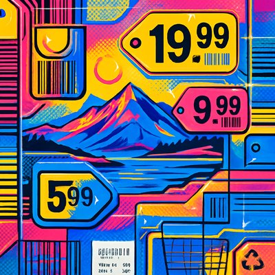
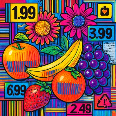
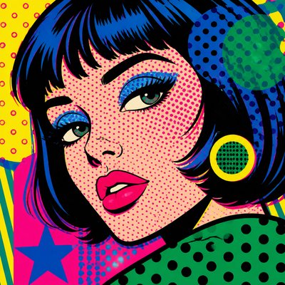
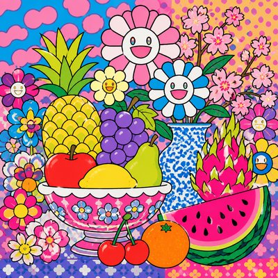
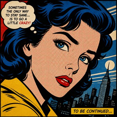
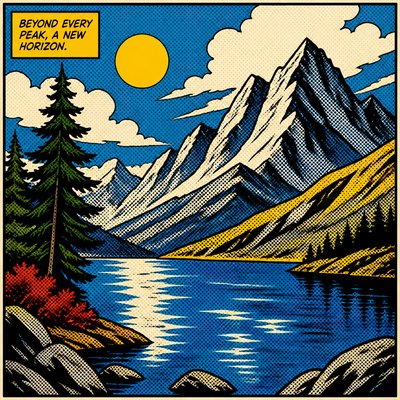
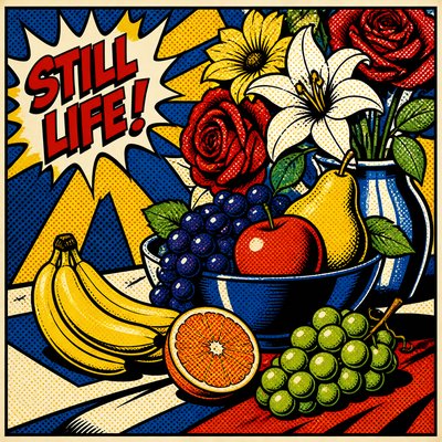
Bold pop-art advertising visuals with Ben-Day dots, loud colors, product-shot polish, and consumer-culture critique.
Instantly rendered in Advertisement Pop — or transform a photo
Advertisement Pop Gallery
Tap any artwork to explore it
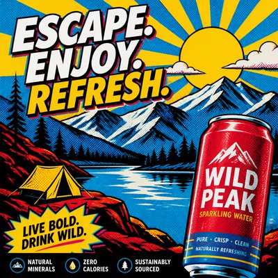
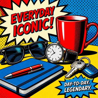
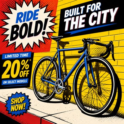
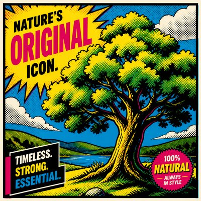
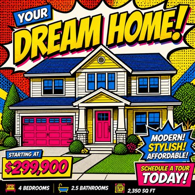
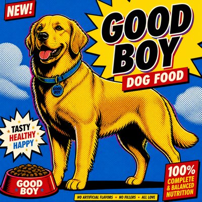
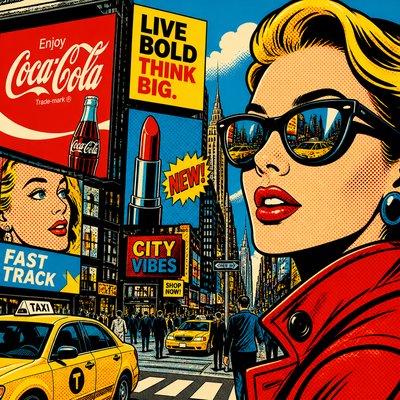
What is Advertisement Pop Art Style?
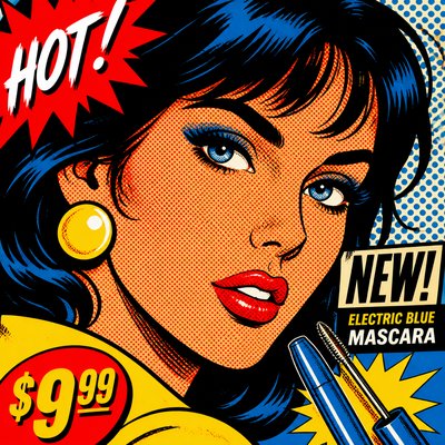
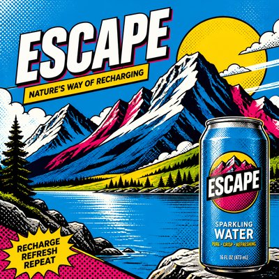
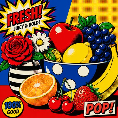
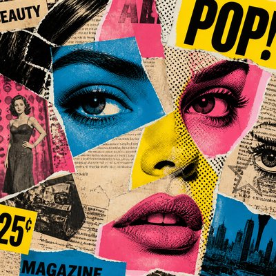
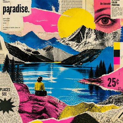
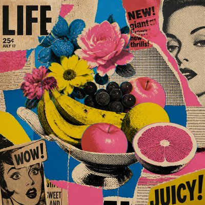
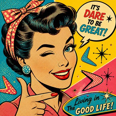
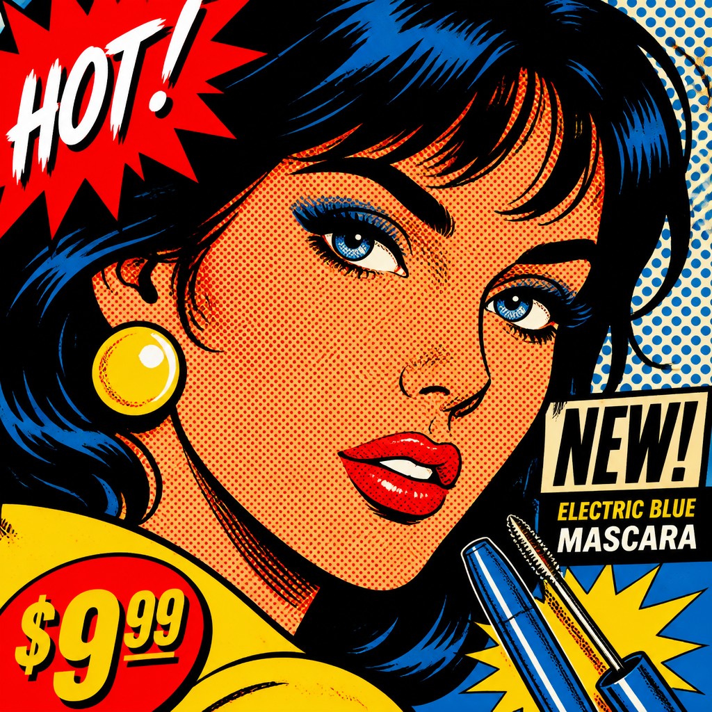
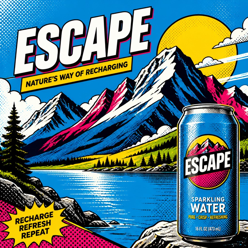
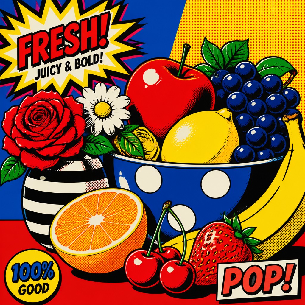
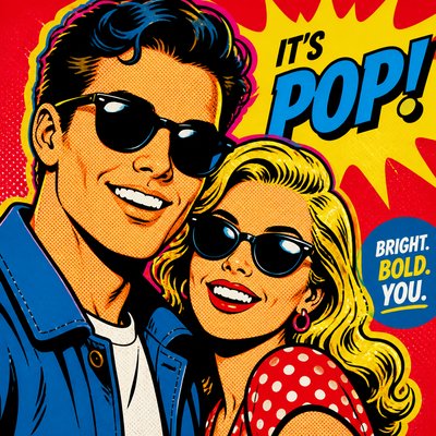
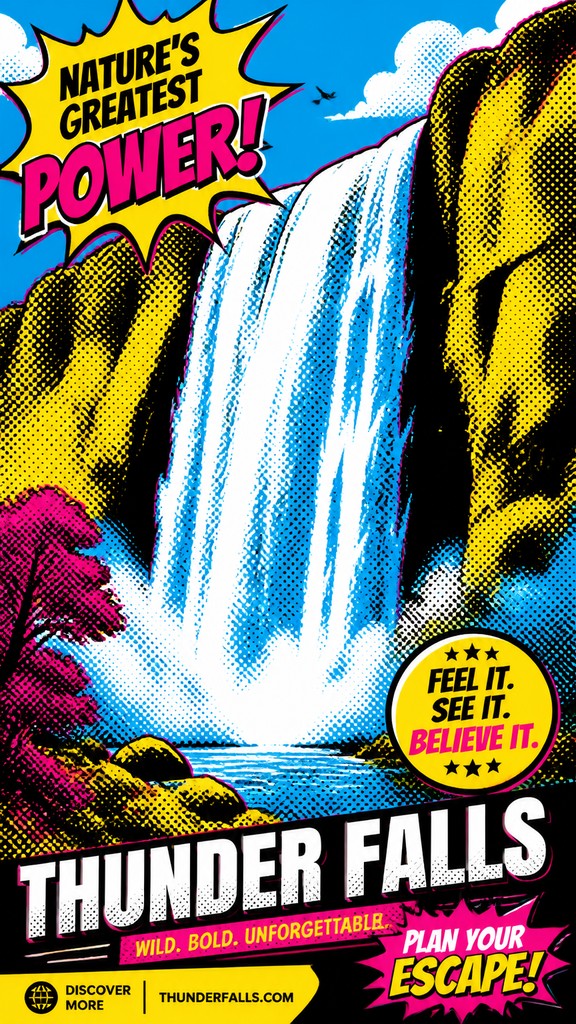
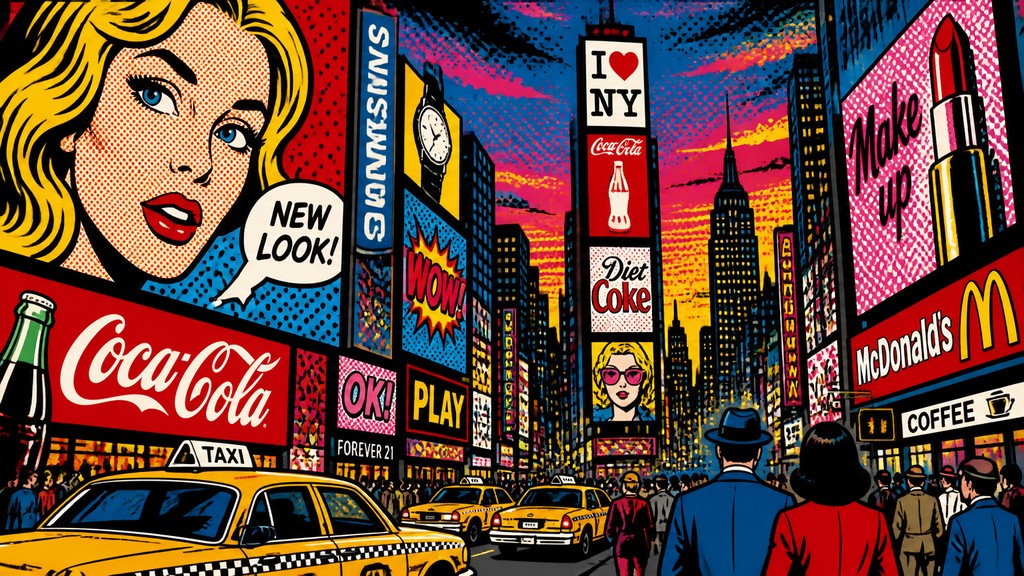
Advertisement pop art is a graphic style that borrows the look of commercial advertising: bright promotional colors, hard-edged outlines, product-photography shine, and layout devices meant to grab attention instantly. It uses sales language and the visual persuasion of ads not just to mimic them, but often to comment on the seductions of consumer culture.
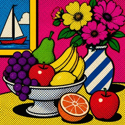
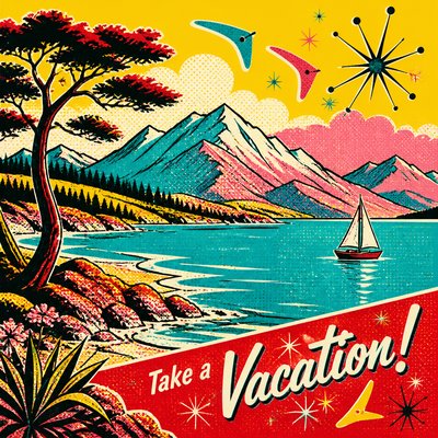
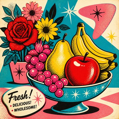
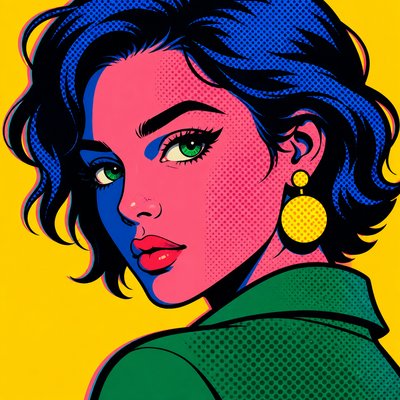
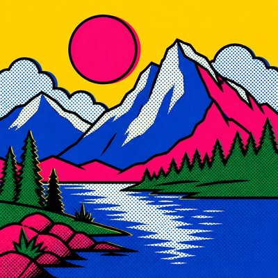
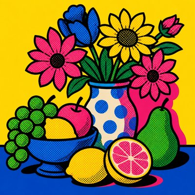
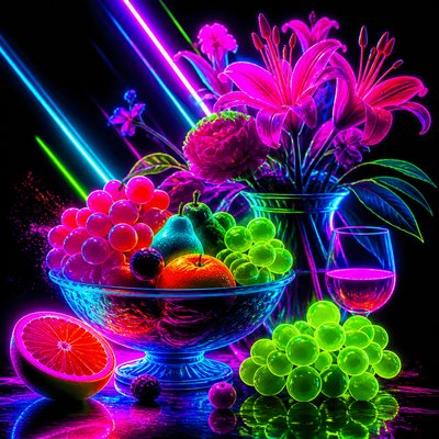
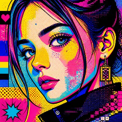
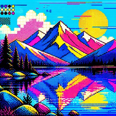
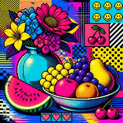
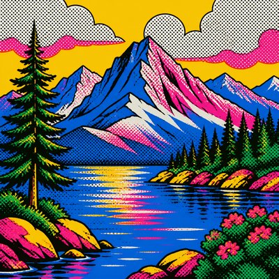
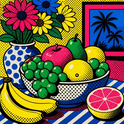
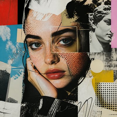
Its visual identity comes from the collision of fine art pop strategies and mass-media design. Images are usually simplified into flat color areas with thick contour lines, halftone or Ben-Day dot shading, and deliberate print effects such as CMYK misregistration. The result feels like a billboard, magazine ad, or packaging panel: loud, legible, polished, and intentionally artificial.
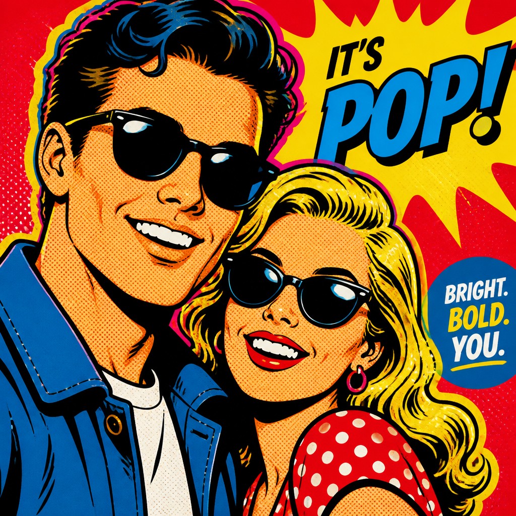
Try It On Your Photos
Upload any photo and convert it into Advertisement Pop Art Style — drag the sliders to compare before and after.


What Defines Advertisement Pop Art Style
The signature details, up close
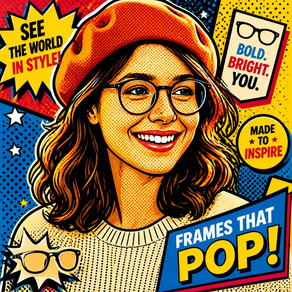
Commercial color intensity
The palette relies on saturated primaries, candy brights, and electric accent colors that feel borrowed from packaging and billboard art. Color is used for instant impact rather than subtle atmospheric modeling.
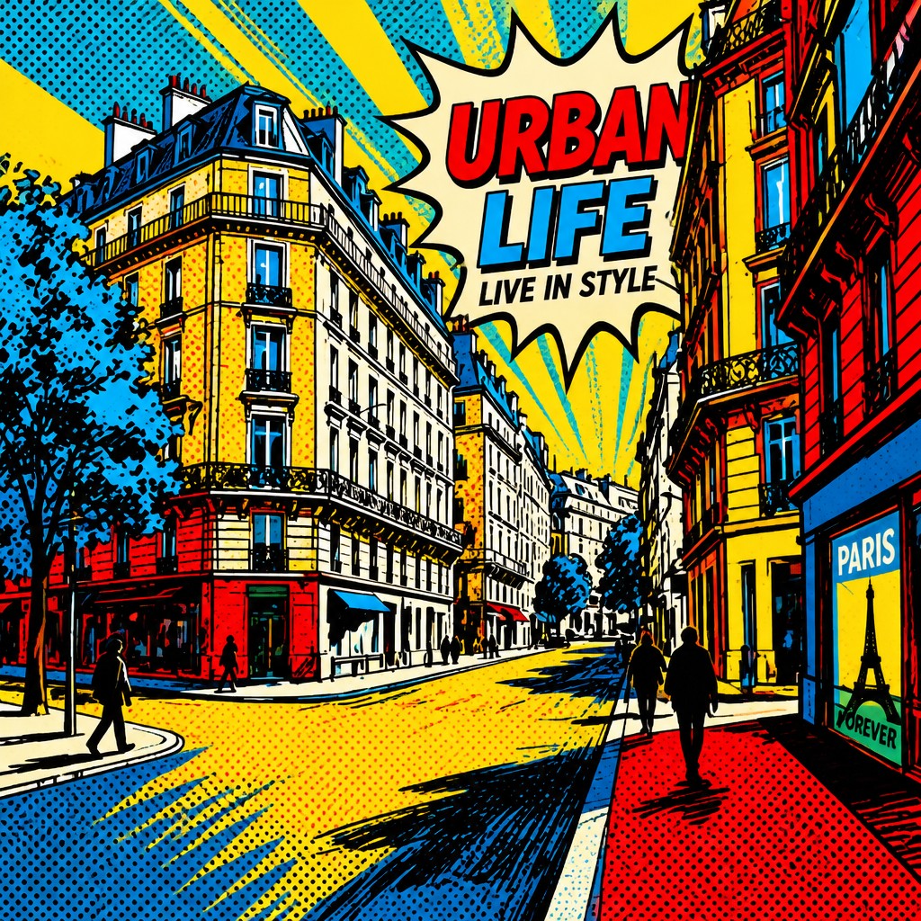
Flat, graphic construction
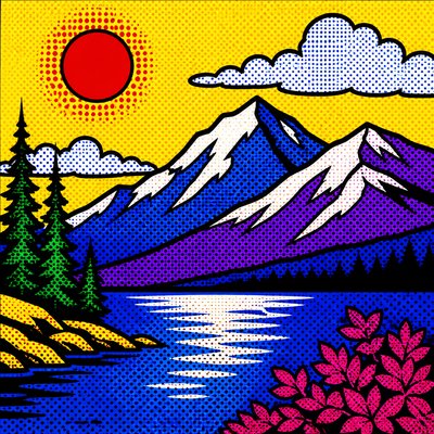
Forms are simplified into clear blocks of color with strong black outlines and minimal blending. This gives the image the direct readability of an advertisement seen at speed.
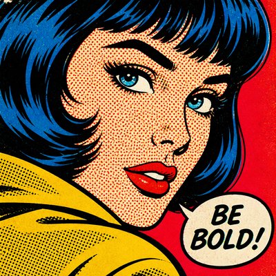
Halftone and Ben-Day dot texture
Shading often appears as dots, mechanical screening, or printed texture rather than painterly brushwork. These marks evoke magazine reproduction and comic printing, reinforcing the mass-produced look.
Hard-edged light and shadow
Highlights and shadows are crisp, glossy, and artificial, often resembling product photography or airbrushed promotional art. Gradual tonal transitions are minimized to preserve the graphic punch.
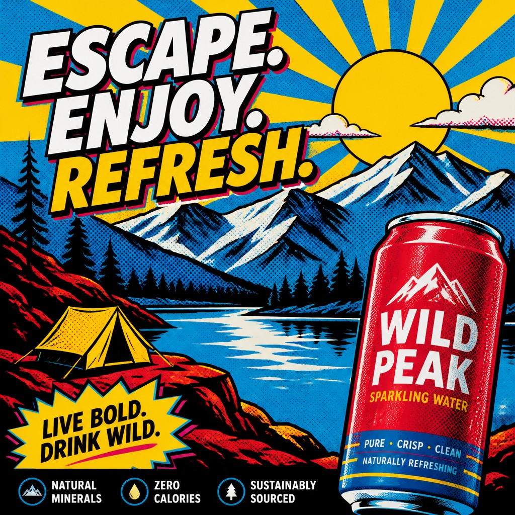
Billboard-like composition
The layout is designed for immediate legibility, with large focal elements, strong diagonals, and slogan-ready negative space. Everything reads like a campaign image meant to stop viewers in their tracks.
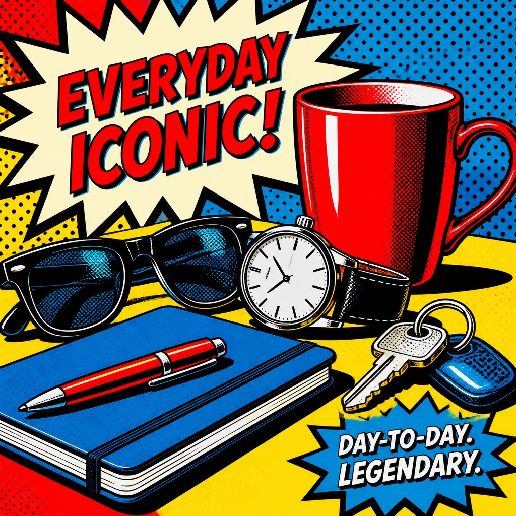
Advertising rhetoric
Logos, price-tag cues, headline typography, and sales language may be incorporated directly into the image. Even when text is absent, the composition often implies a product pitch or branded message.
Try It
Create Videos in Advertisement Pop Art Style
Styles aren't just for stills — describe a scene or animate an image and get a short video rendered in Advertisement Pop. Press play to see this pond come to life.
Make a VideoAdvertisement Pop Prompt Ideas
Start from an idea — each one opens the generator with the style ready to go. See all 40 Advertisement Pop prompts →
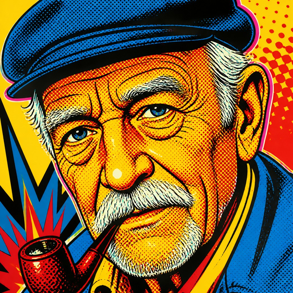
“close-up portrait of an elderly person with expressive weathered features”
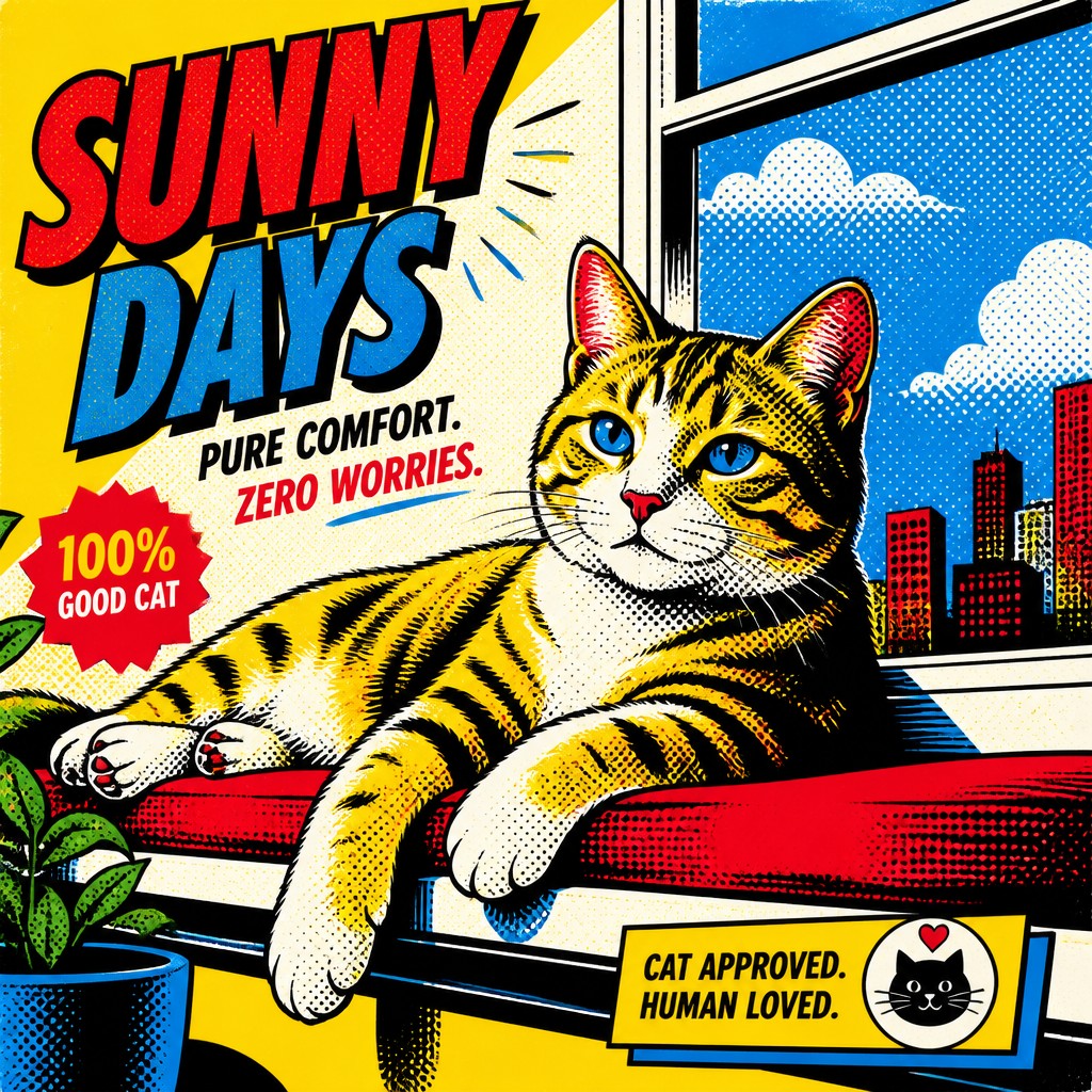
“a cat lounging in a sunlit window”
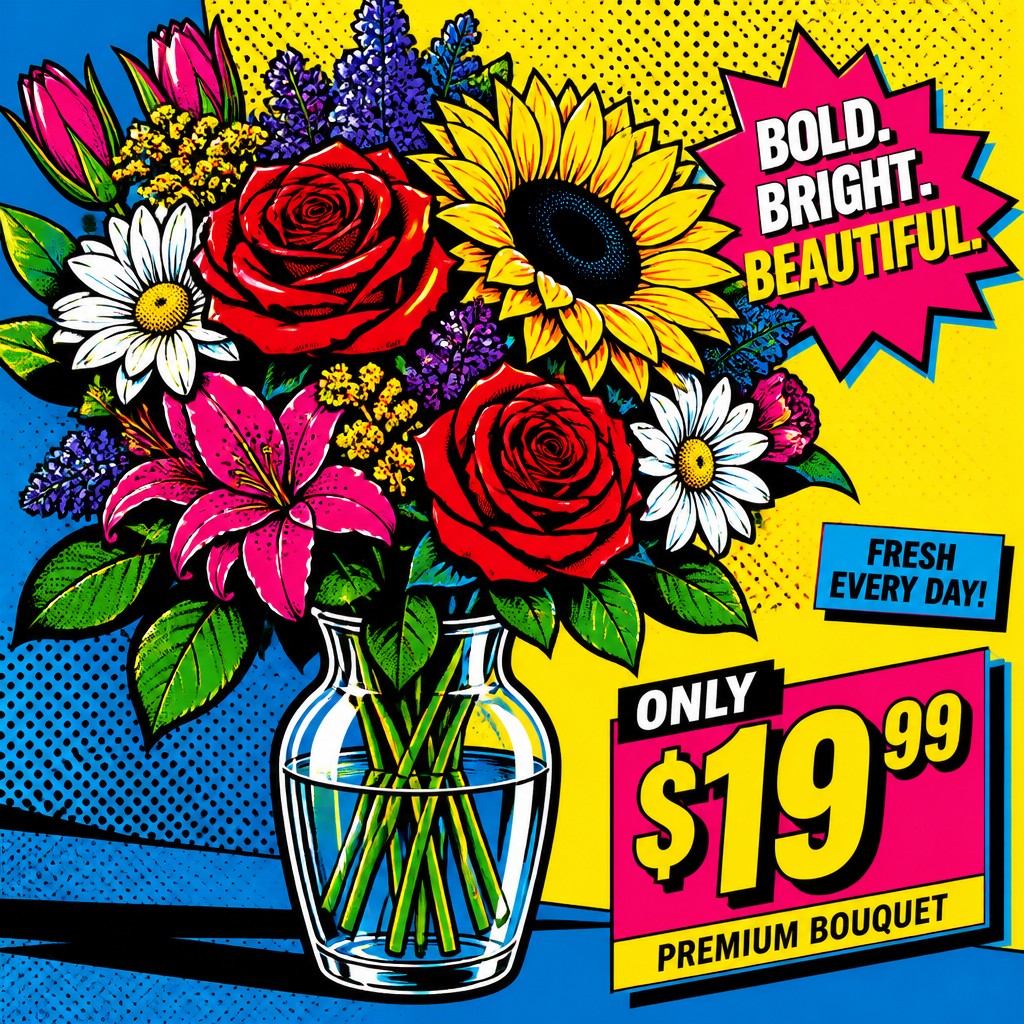
“bouquet of flowers in a glass vase”
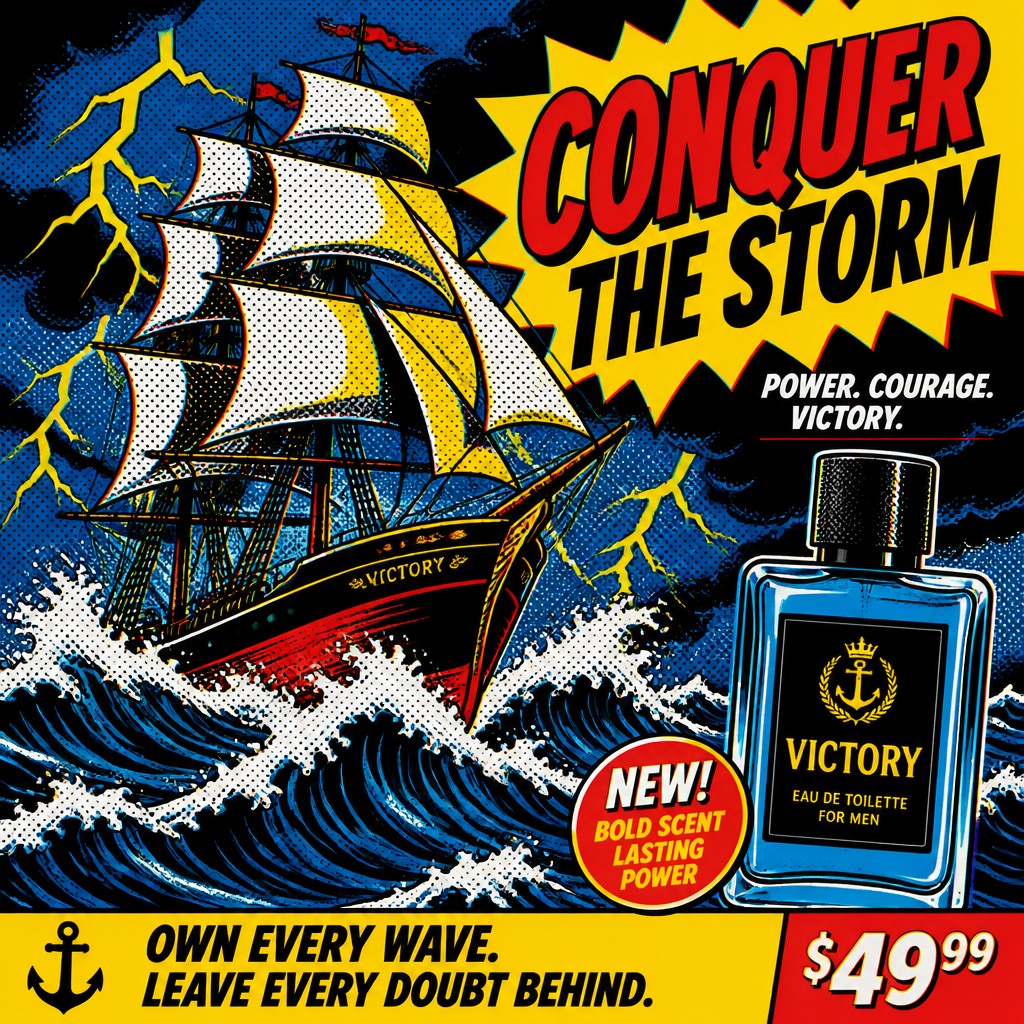
“sailing ship on a stormy sea”
How to Create Advertisement Pop Art
Master the craft step by step — or skip straight to creating. Read the full guide →
- 1
Build the image like a poster ad
Start with one clear subject and frame it as if it must be understood instantly from a distance. Use a bold silhouette, a simple background, and a composition with the visual hierarchy of a magazine cover or billboard.
- 2
Limit the palette and flatten the forms
Choose a small set of high-saturation colors, especially red, yellow, blue, black, and white, then separate them into clean areas. Avoid painterly blending; crisp edges and strong contrast are essential.
- 3
Add print-era texture
Introduce halftone dots, screenprint grain, and slight CMYK misregistration to simulate mass reproduction. In traditional media, this can be approximated with stencils, dot patterns, or layered screenprinting; digitally, use halftone overlays and offset color channels.
- 4
Use glossy advertising lighting
Model surfaces with hard highlights and shadow shapes that mimic product photography rather than naturalistic painting. Plastic, metal, glass, and packaging materials work especially well because they amplify the polished commercial feel.
- 5
Write prompts in promotional terms
For text-to-image generation, describe the subject as a campaign image, product launch, or billboard composition, and specify flat colors, dot patterns, and print texture. Include words like 'saturated primaries,' 'thick black outlines,' 'halftone,' 'CMYK offset,' and 'slick advertising polish' to steer the result.

The Story
History & Origins of Advertisement Pop
Advertisement pop art is not a single historical movement with a fixed origin, but an aesthetic lineage rooted in mid-20th-century Pop Art, commercial illustration, and advertising design. In the 1950s and 1960s, leading pop artists drew directly from consumer packaging, comic strips, billboards, and magazine graphics, elevating mass-media imagery into art while exposing its rhetoric of desire.
The style also reflects the broader development of postwar commercial print culture: offset printing, screenprinting, photomechanical reproduction, and later digital prepress all made bold flat color and visible dot patterns familiar to audiences. Contemporary uses of the style continue this tradition by combining nostalgic pop-art devices with the vocabulary of branding, product launches, and persuasive copywriting.
Influences: Advertisement pop art draws most directly from Pop Art, especially the work of major postwar pop artists who used commercial imagery and mechanical reproduction as both subject and method. It also inherits from mid-century advertising illustration, comic-book printing, screenprinting, and later graphic design systems that prioritize instant legibility, branding, and persuasive visual hierarchy.
Frequently Asked Questions
What defines advertisement pop art?
It is defined by the visual language of advertising: bright colors, bold outlines, product-shot polish, and printed textures like halftone dots. The style often looks like a commercial image, but with an art-world awareness that can make it feel witty, ironic, or critical.
How is it different from regular Pop Art?
Pop Art is the broader historical movement that incorporated mass culture, consumer goods, comics, and media imagery. Advertisement pop art is a more specific visual mode within that orbit, emphasizing the exact look of ads, branding, and marketing layouts.
What subjects work best in this style?
Consumer objects, fashion items, food, cosmetics, cars, gadgets, and celebrity-like portraits fit especially well because they naturally echo advertising. Everyday scenes can also work if they are framed like a promotional campaign or product launch.
How do I make it look authentic?
Use a limited, high-contrast palette, strong graphic contours, and mechanical texture rather than painterly blending. The image should feel printed, engineered, and immediately readable, as if it came from a vintage magazine or billboard campaign.
Is this style nostalgic or critical?
It can be either, and often both at once. The style celebrates the energy and clarity of advertising while also exposing how consumer culture packages desire through color, repetition, and image control.
Where is this style commonly used today?
It appears in posters, album art, editorial illustration, fashion graphics, and brand-forward digital artwork. It is also popular for concept art and image generation because its rules are clear and its visual impact is immediate.
Create your first Advertisement Pop artwork
Describe anything — or upload a photo — and see it in Advertisement Pop Art Style in seconds.
Make Something with Advertisement Pop
Compare Advertisement Pop
Related Styles
Discover similar art styles