Advertisement Pop vs Pop: What's the Difference?
Advertisement Pop Art Style turns the look of commercial graphics into a polished, punchy visual language. It uses Ben-Day dots, loud color, product-shot lighting, and composition cues borrowed from ads, but often with a sharper sense of irony or consumer-culture critique.
Pop Art Style is broader and usually more graphic and direct. It relies on flat color, halftone dots, thick outlines, and mass-media energy to capture the feel of posters, comics, packaging, and television. People compare the two because both borrow from advertising and popular media, but one is more ad-like and polished while the other is more openly graphic and generalized.
Same Prompt, Both Styles
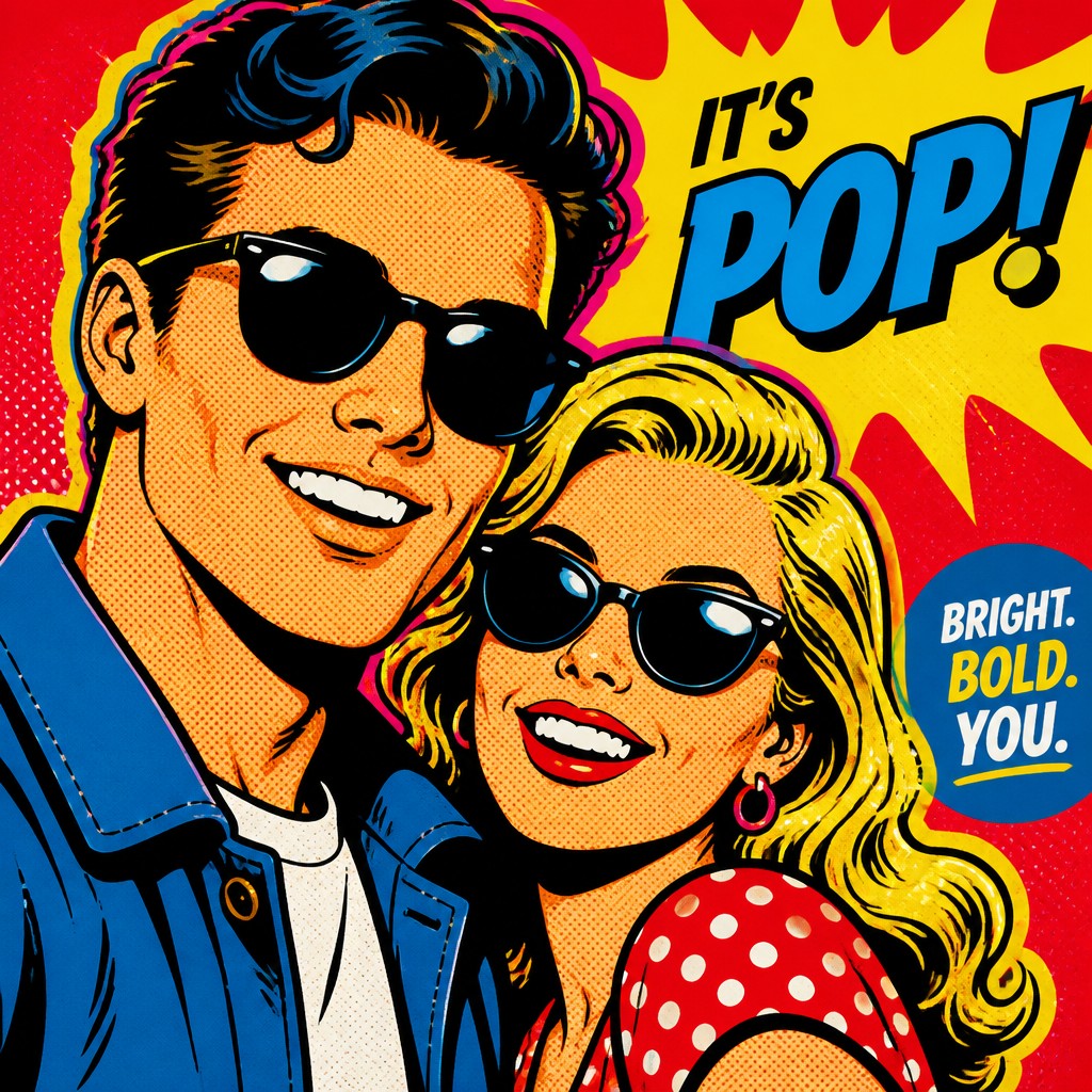
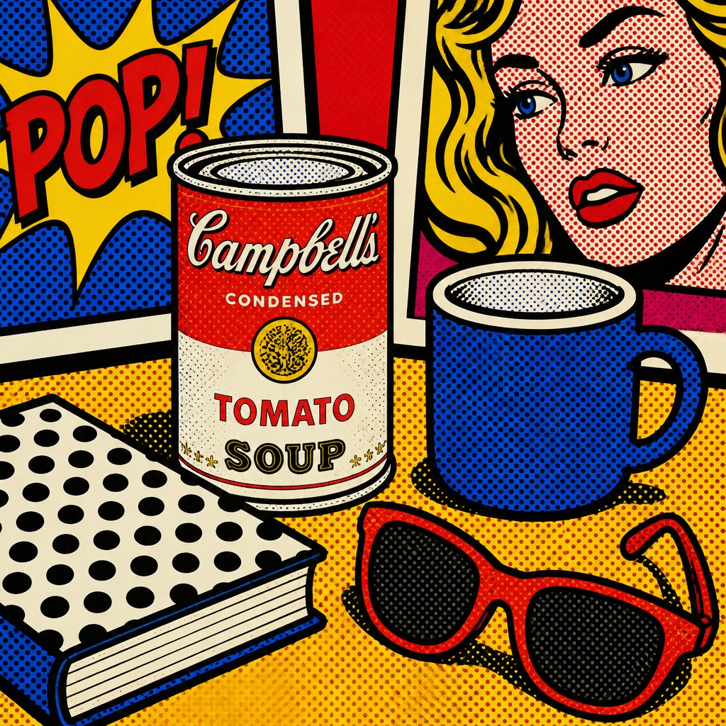
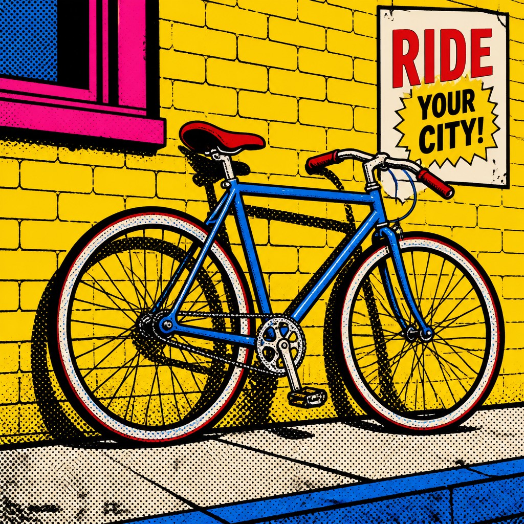
Each pair below was generated from the identical prompt — only the style changed.
“portrait of two people together”

“wide landscape with natural scenery”


“still life with everyday objects”

“bicyle resting against a wall”

Key Differences
| Advertisement Pop | Pop | |
|---|---|---|
| Visual polish | Looks like a glossy ad image with refined product-shot finish. | Looks flatter and more graphic, like printed mass-media art. |
| Dot treatment | Uses Ben-Day dots to echo printed advertising and comic reproduction. | Uses halftone dots more broadly as a pop-print texture. |
| Color handling | Pushes loud, advertising-bright colors for maximum commercial impact. | Uses bold, flat colors with strong contrast and simple blocks. |
| Line & form | Often combines crisp edges with slick shading and product-like contours. | Relies on thick outlines and simplified, poster-like forms. |
| Mood & message | Often feels ironic, promotional, or critical of consumer culture. | Feels energetic, playful, and rooted in media spectacle. |
| Image source | Directly evokes advertising layouts, branding, and consumer packaging. | Draws more generally from comics, posters, and mass media visuals. |
| Mood | bold, playful, ironic, flashy, consumerist | bold, playful, commercial, ironic, vibrant |
| Energy | intense | lively |
| Detail level | moderate | moderate |
| Color | bright primary hues, high-contrast advertising palette | bright saturated primaries and contrasts |
| Texture | clean, glossy, print-like finish | flat, printed, dot-patterned surface |
| Origin | 1960s Western advertising and consumer culture | 1960s Britain and United States |
| Best for | posters, album covers, editorial graphics, product campaigns, social media ads, satirical prints | posters, album covers, editorial graphics, advertisements, book covers, merchandise design |
| Difficulty | moderate | moderate |
Which Should You Choose?
Pick Advertisement Pop Art Style if you want the image to feel like a high-impact ad that also comments on consumption, branding, or selling itself. Pick Pop Art Style if you want a broader pop-culture look with bold simplicity, graphic clarity, and comic-like energy. If your goal is critique plus polish, choose A; if your goal is universal pop visual punch, choose B.
Frequently Asked Questions
Are these two styles basically the same?
They overlap a lot, but they are not identical. Advertisement Pop Art Style is more specifically tied to ad imagery and often feels more polished and critical, while Pop Art Style is a wider category with a simpler mass-media look.
Which style is better for a brand campaign?
Pop Art Style is usually safer if you want bold attention without a heavy ironic edge. Advertisement Pop Art Style works better if you want the campaign to feel self-aware, retro, or commentary-driven.
Which style is more suitable for editorial or social commentary art?
Advertisement Pop Art Style is often the stronger choice because it naturally suggests consumer culture and media critique. Its ad-like polish can make the commentary feel sharper and more pointed.
Can both styles use dots and bright colors?
Yes, both commonly use dots and vivid color. The difference is that Advertisement Pop Art Style leans toward ad-like precision and polish, while Pop Art Style emphasizes flatter, broader graphic impact.