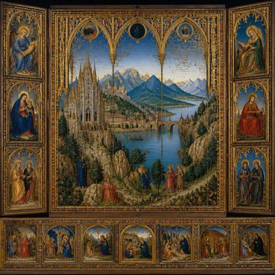
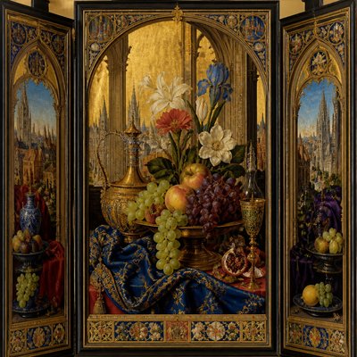
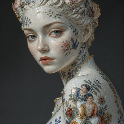
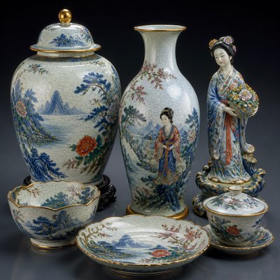
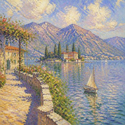
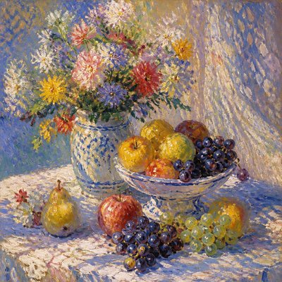
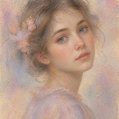
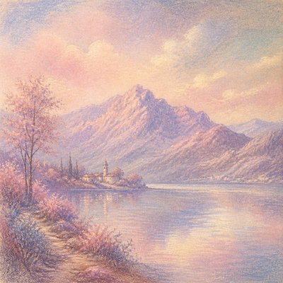
Triadic Colors Art Style
Explore Triadic Colors art: vivid three-hue palettes, bold color blocks, and balanced contrast for energetic paintings and digital images.
Instantly rendered in Triadic Colors — or transform a photo
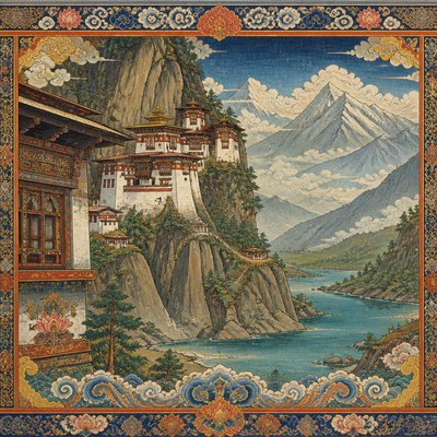
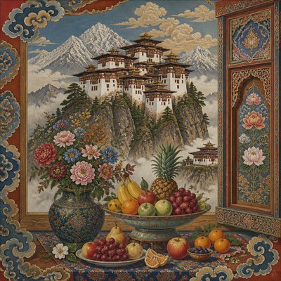
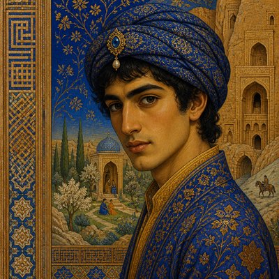
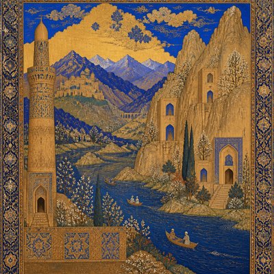
Triadic Colors Gallery
Tap any artwork to explore it
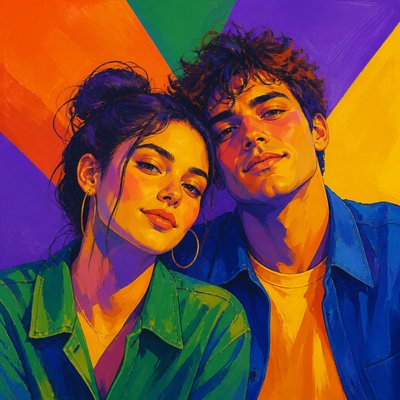
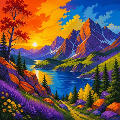
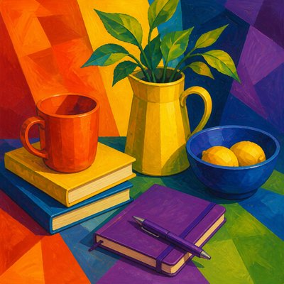
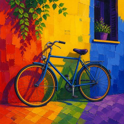
What is Triadic Colors Art Style?
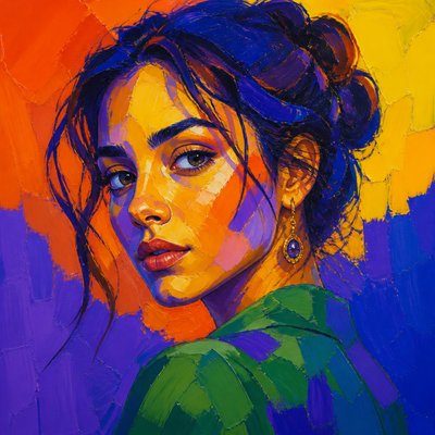
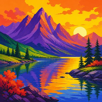
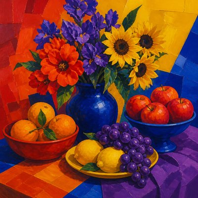
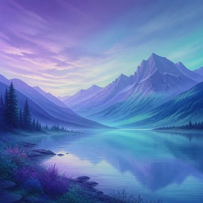
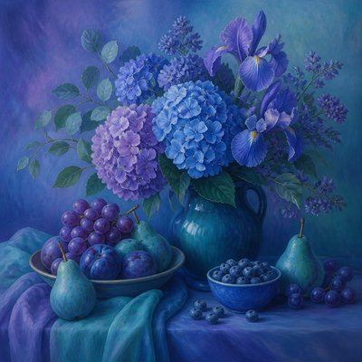
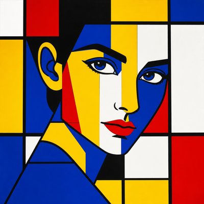
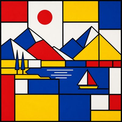
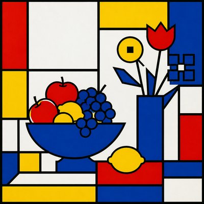
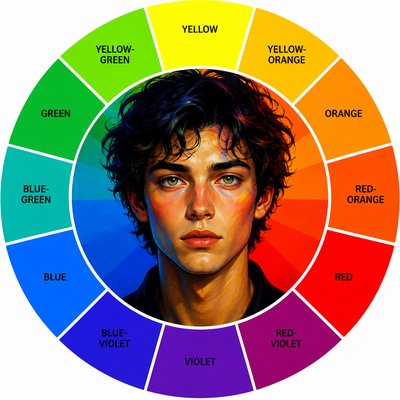
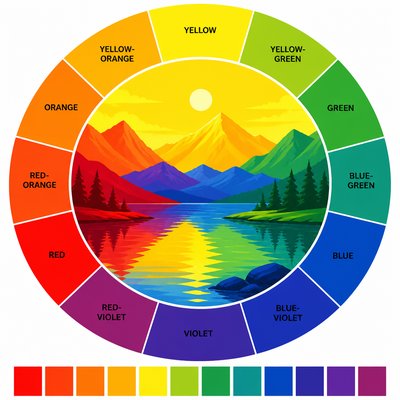
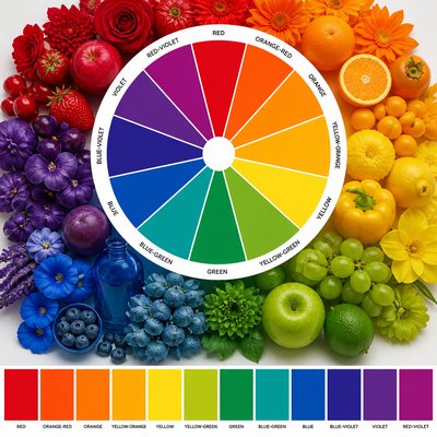
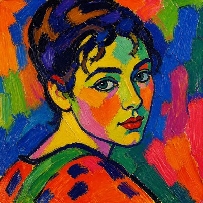
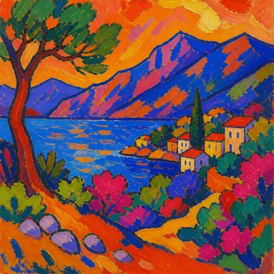
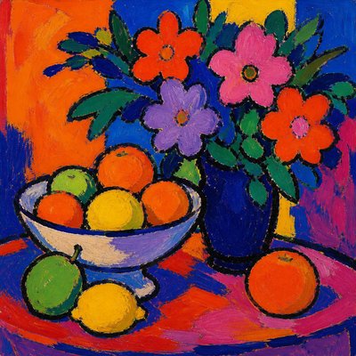
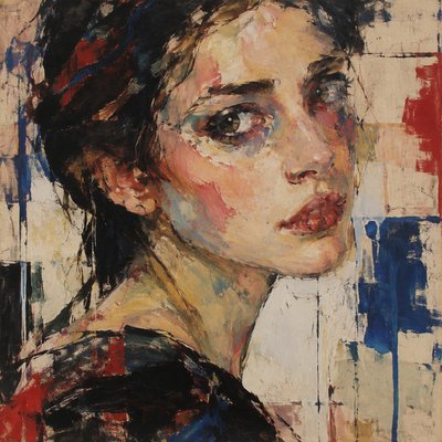
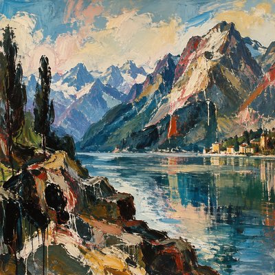
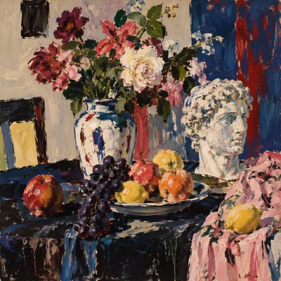
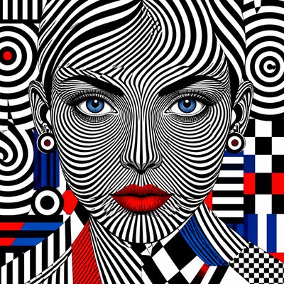
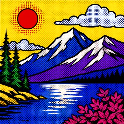
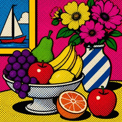
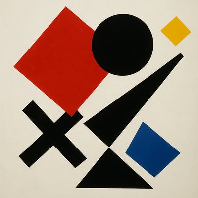
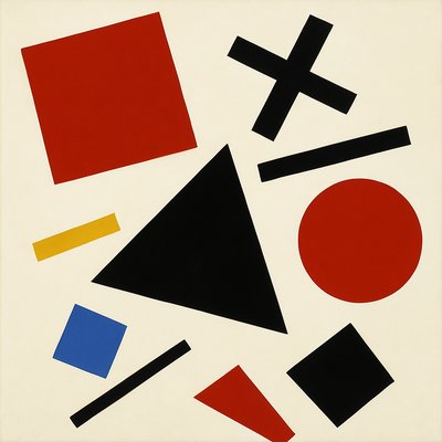
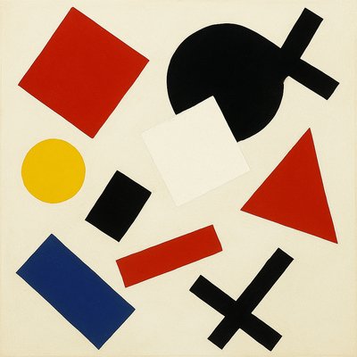
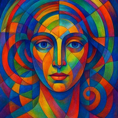
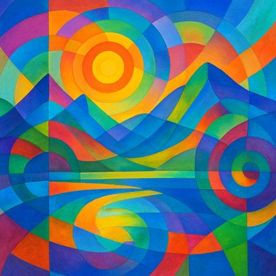
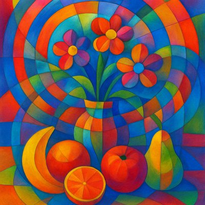
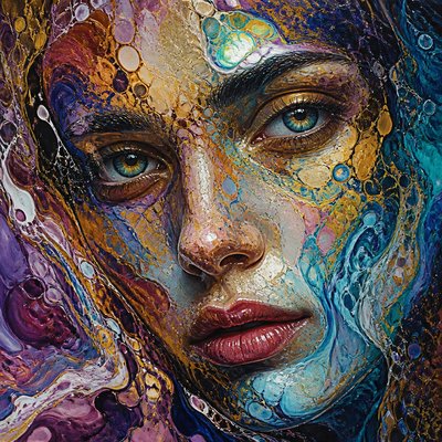
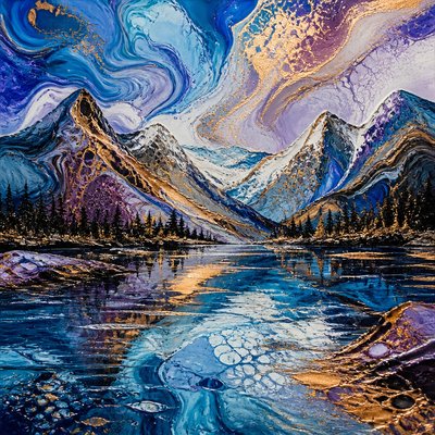
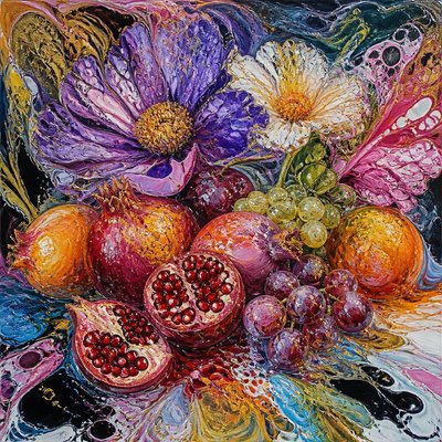
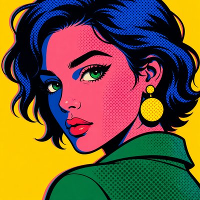
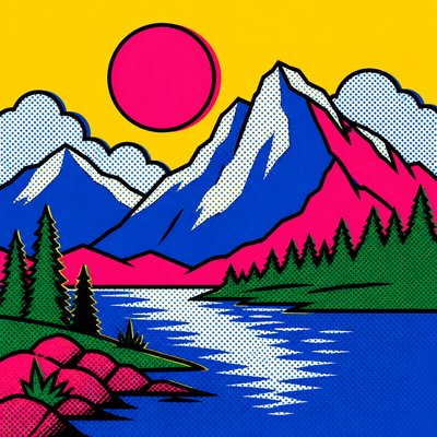
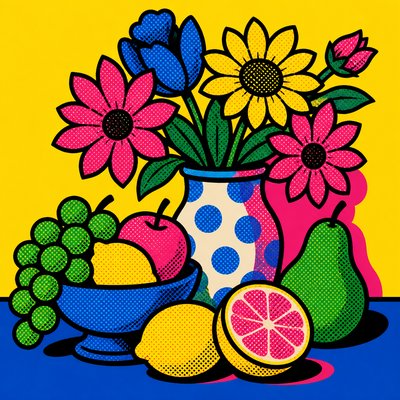
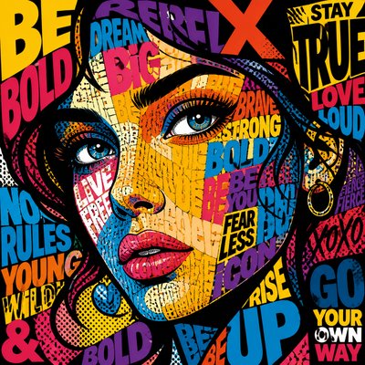
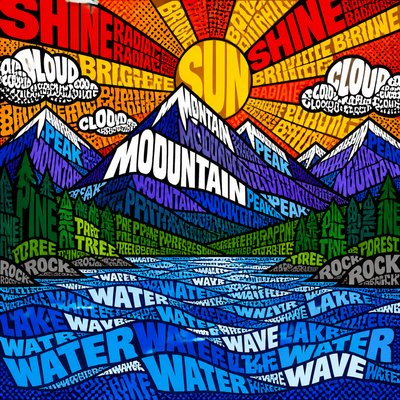
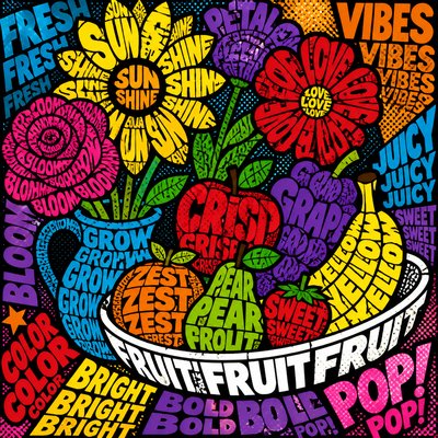
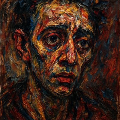
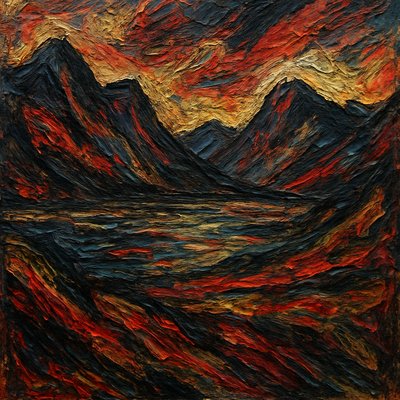
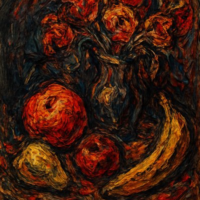
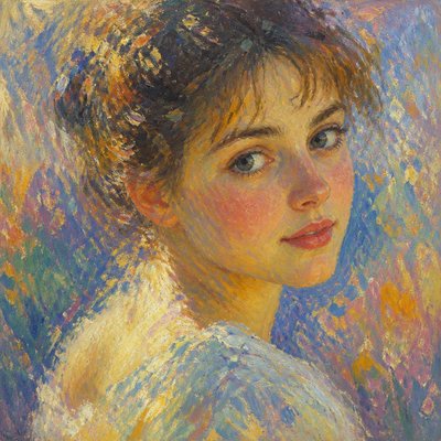
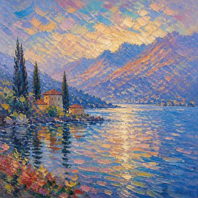
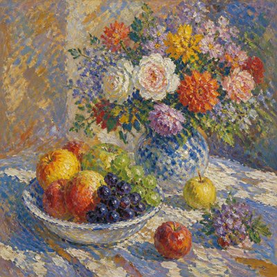
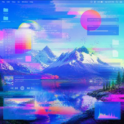
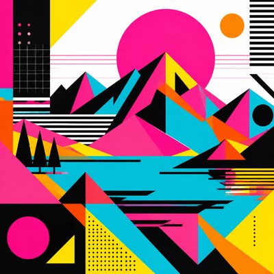
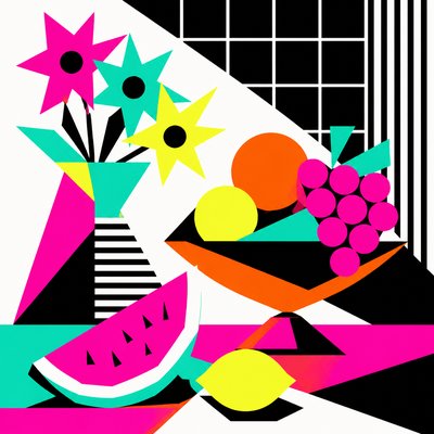
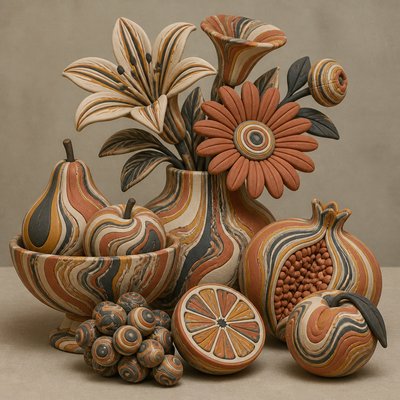
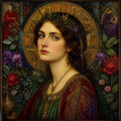
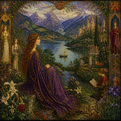
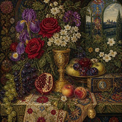
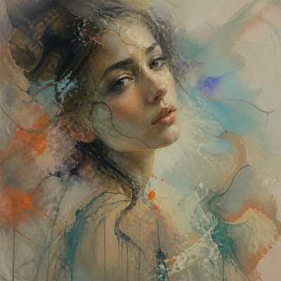
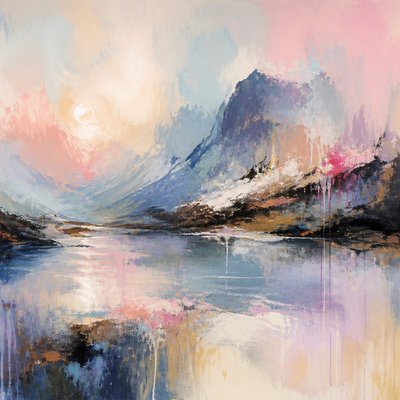
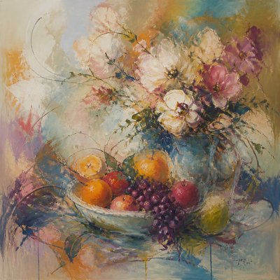
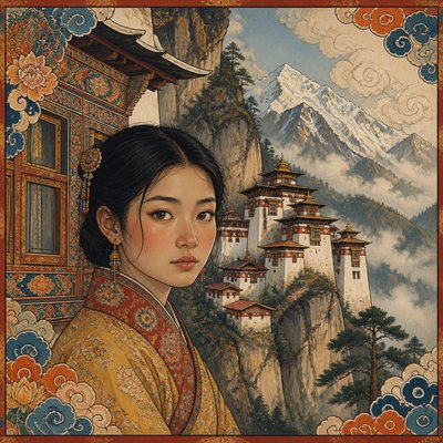
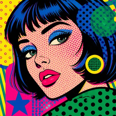
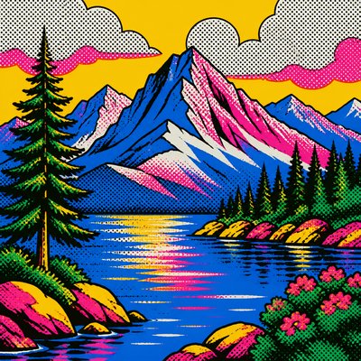
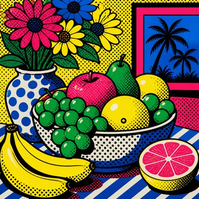
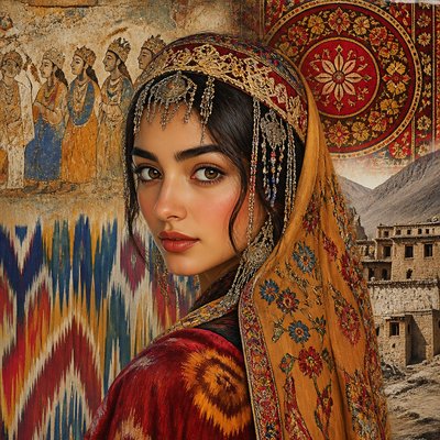
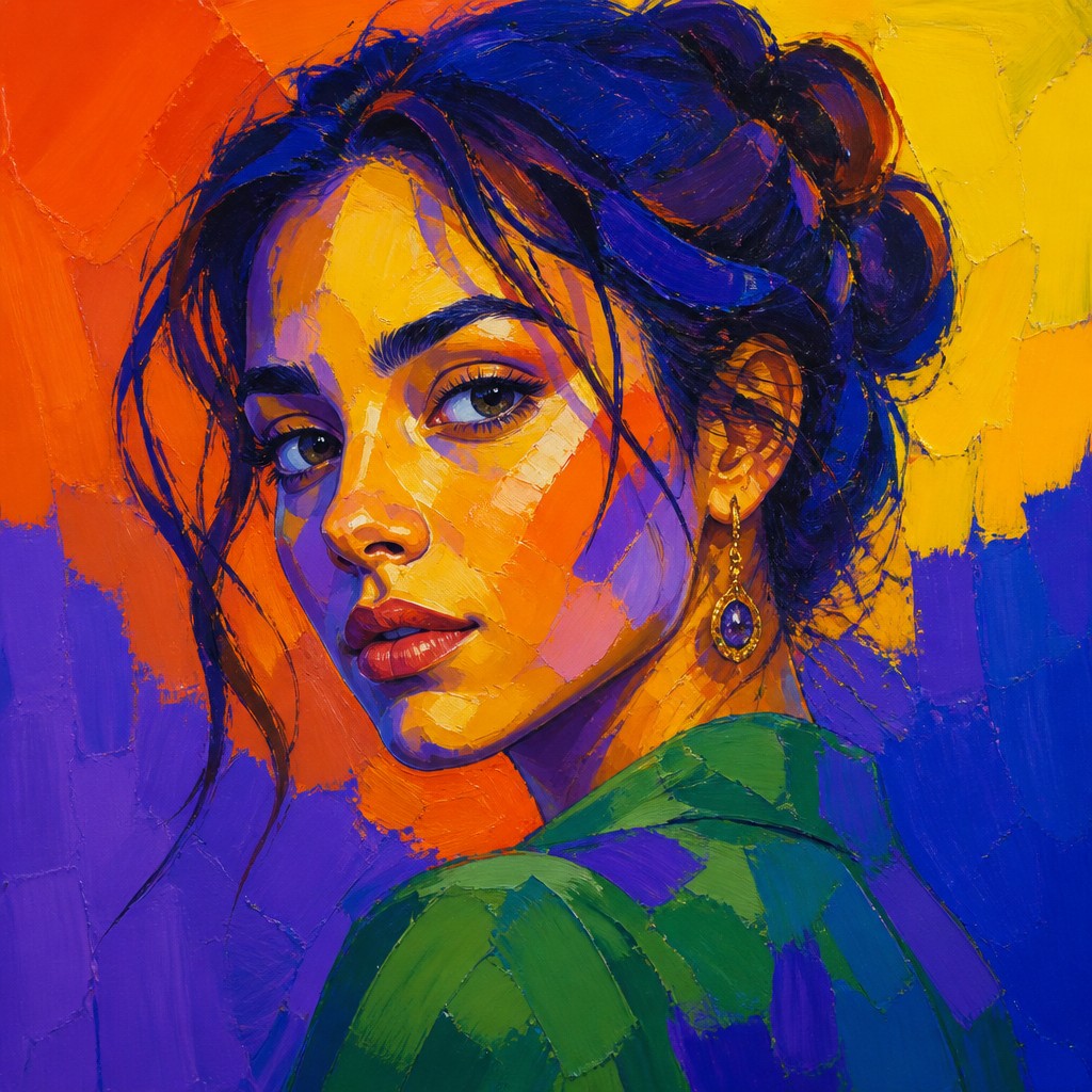
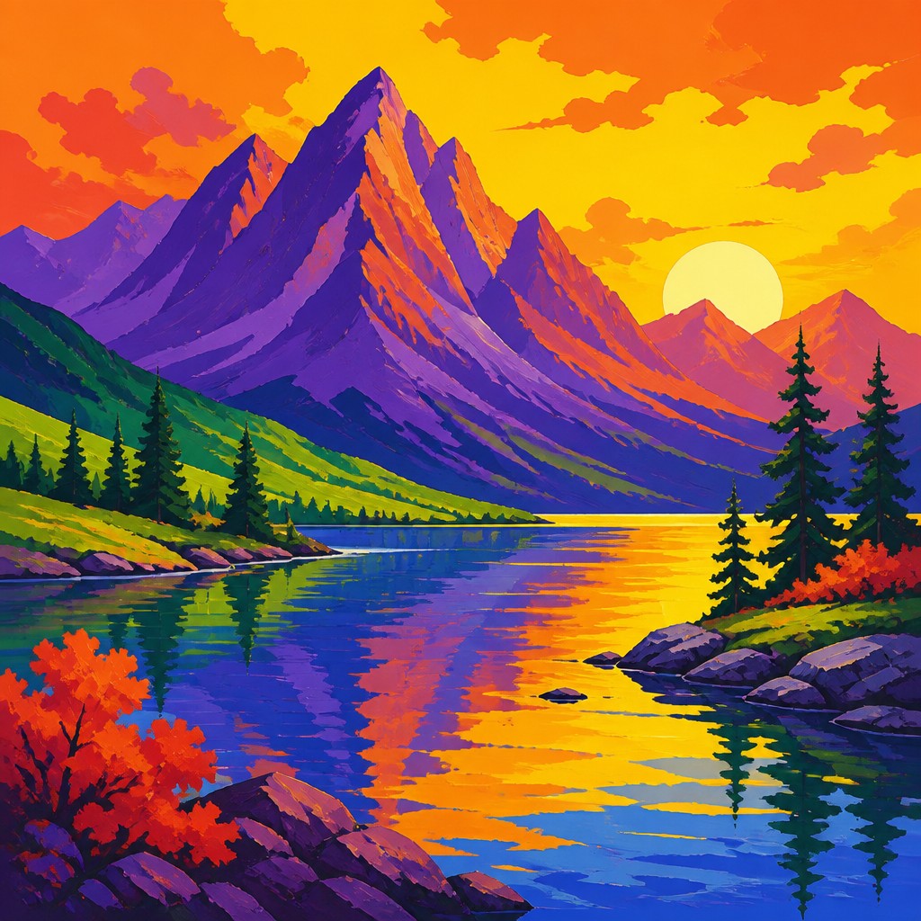
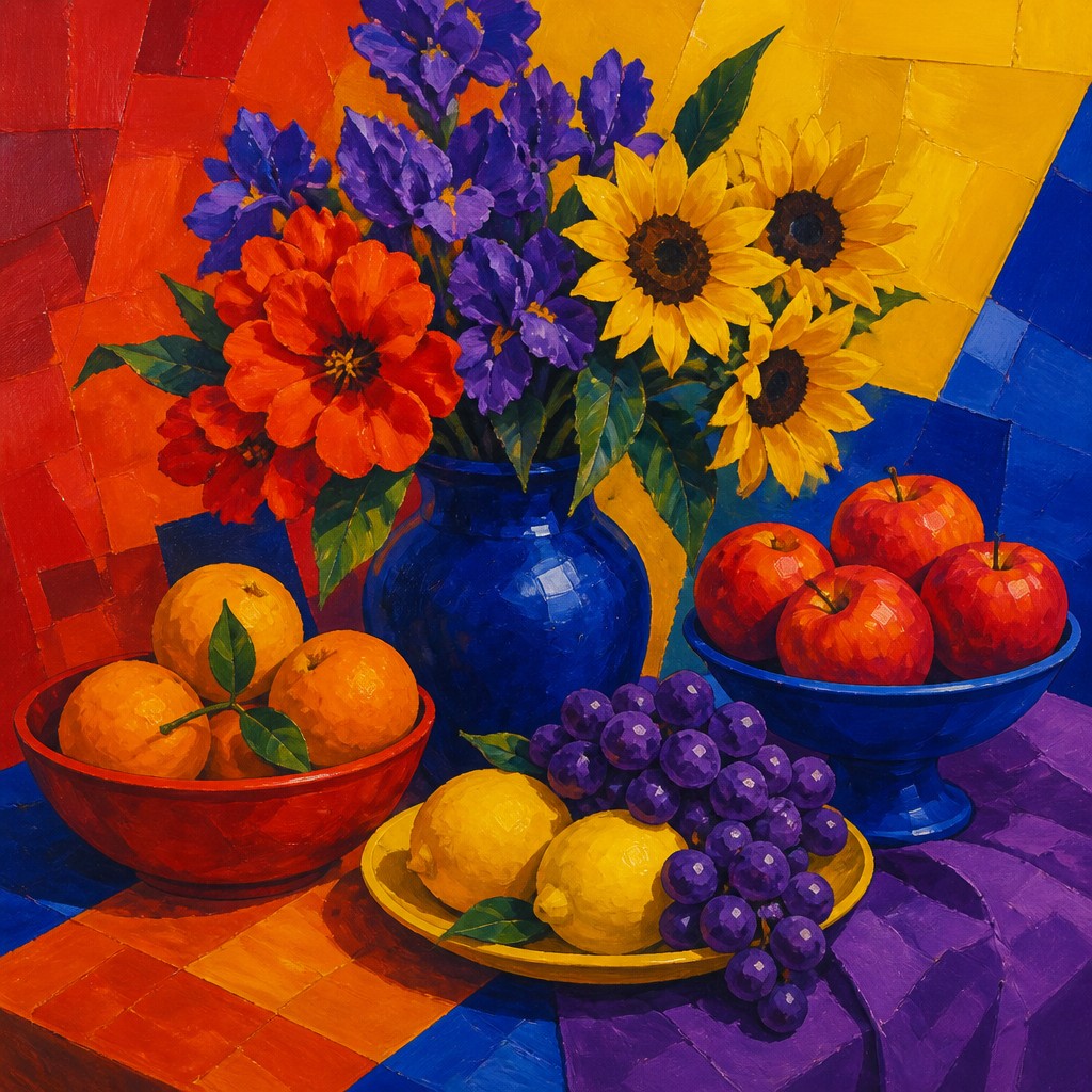
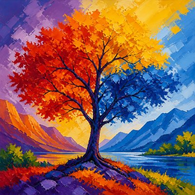
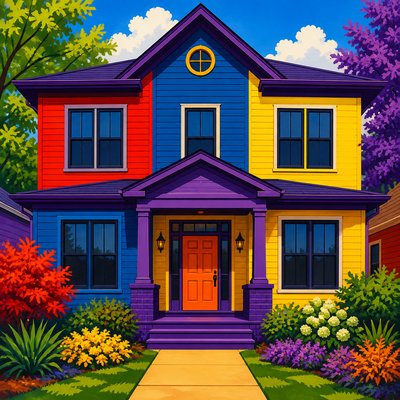
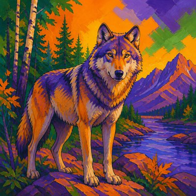
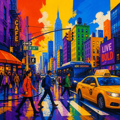
Triadic Colors is a color-centered art style built around three hues spaced evenly around the color wheel. Its most recognizable form uses a primary triad of red, yellow, and blue, while variations may use orange, green, and purple or other equidistant combinations. The palette creates strong contrast without allowing one color family to dominate completely.
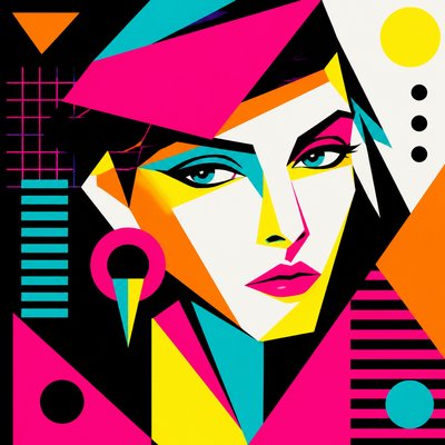
The style is defined less by a particular subject or medium than by the organized distribution of color. Broad color blocks, simplified forms, sharp boundaries, and saturated accents create a lively visual rhythm. Even representational scenes can be translated into this approach by assigning the three hues to different planes, objects, shadows, highlights, or compositional zones.
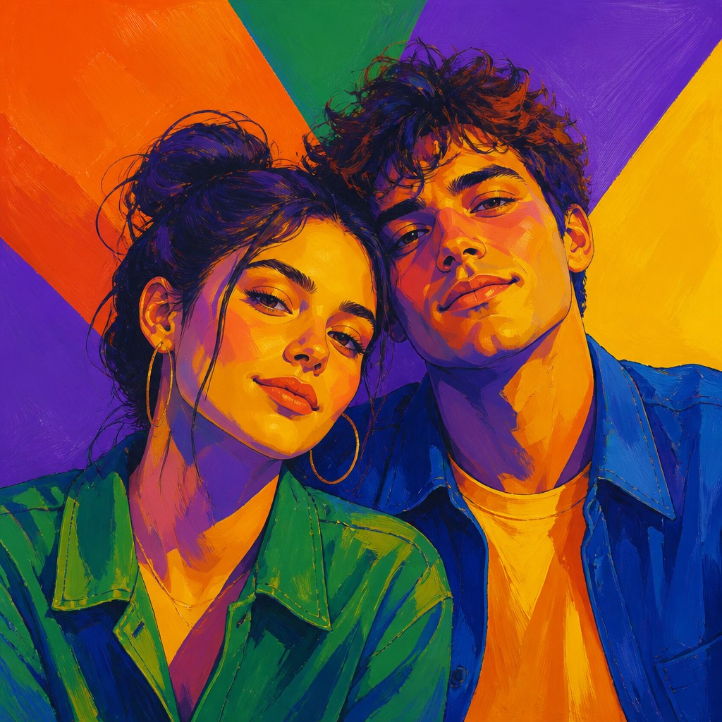
Try It On Your Photos
Upload any photo and convert it into Triadic Colors Art Style — drag the sliders to compare before and after.
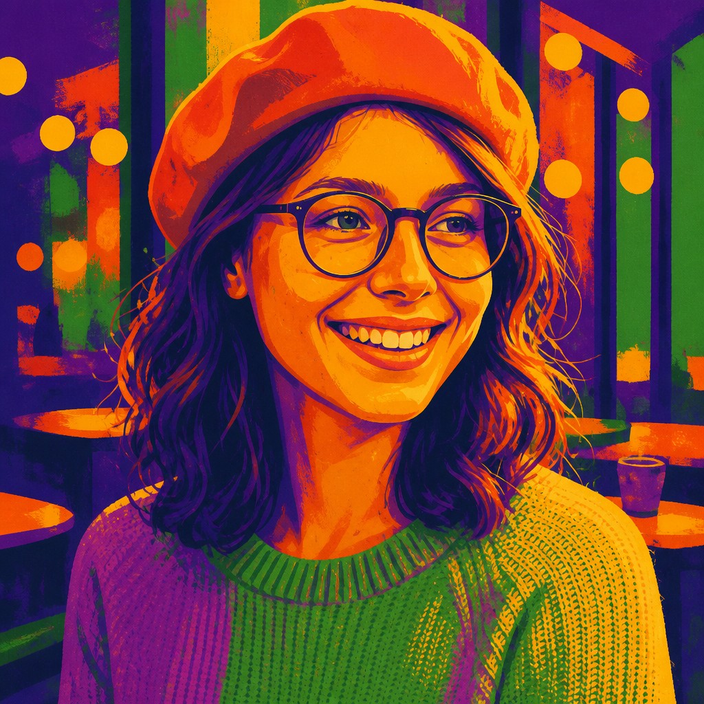

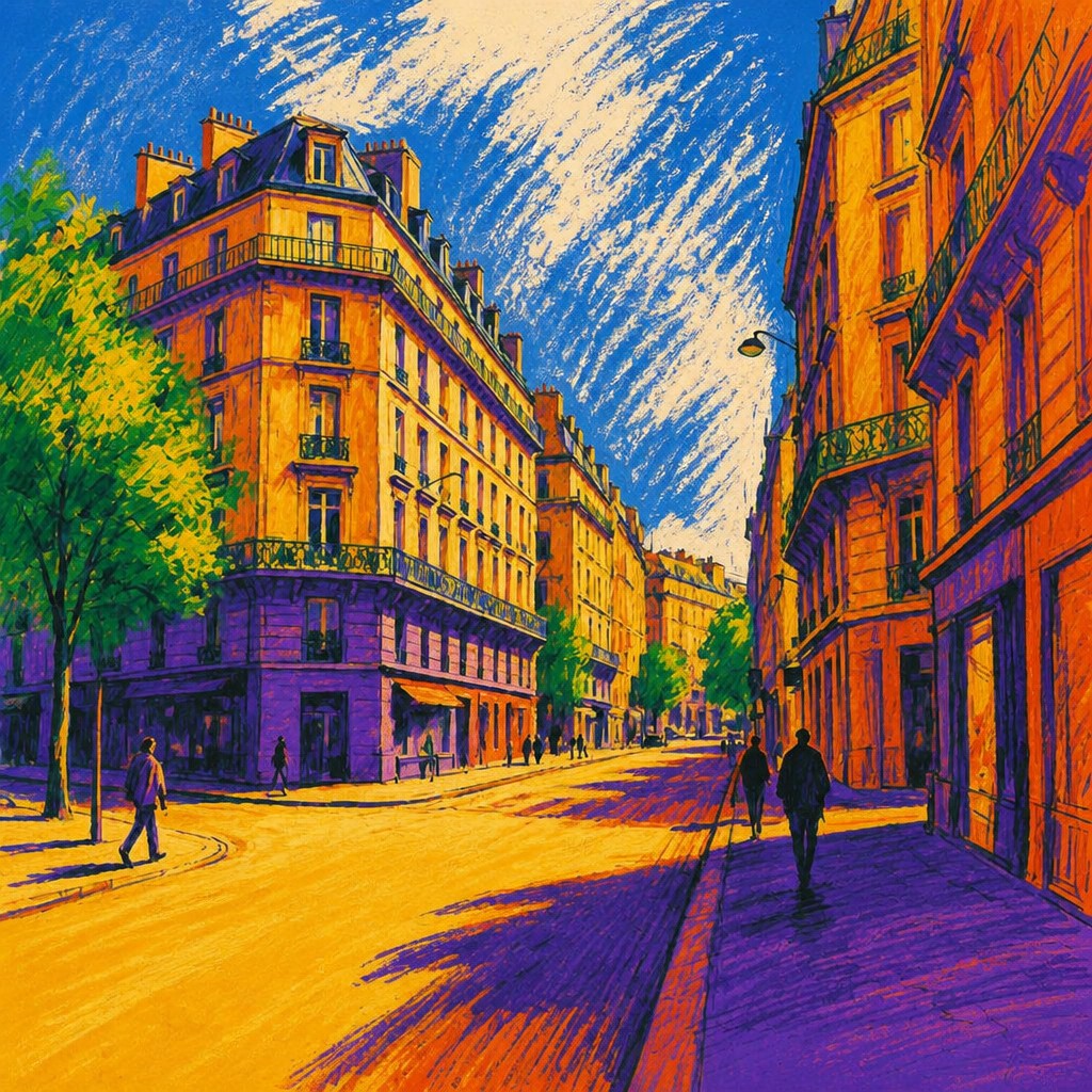

What Defines Triadic Colors Art Style
The signature details, up close
Three-part hue structure
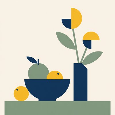
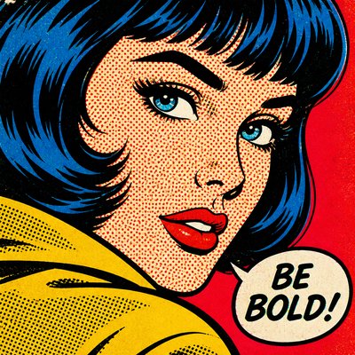
The palette is organized around three evenly spaced hues, commonly red, yellow, and blue or the secondary triad of orange, green, and purple. Intermediate and near-neutral tones may support the scheme without displacing its three-color logic.
Bold color blocking
Large, legible areas of flat or minimally blended color establish the composition. Shapes are often simplified so the relationships between the three hues remain immediately visible.
Balanced chromatic emphasis
Color is distributed across the image so that no single hue overwhelms the entire composition. One color may occupy more area, but the other two typically receive strong focal placement or high-saturation accents.
High saturation and contrast
Punchy, saturated colors produce visual energy, especially when neighboring areas are complementary or sharply different in value. Controlled darks and lights help preserve clarity when all three hues are intense.
Graphic contours and planes
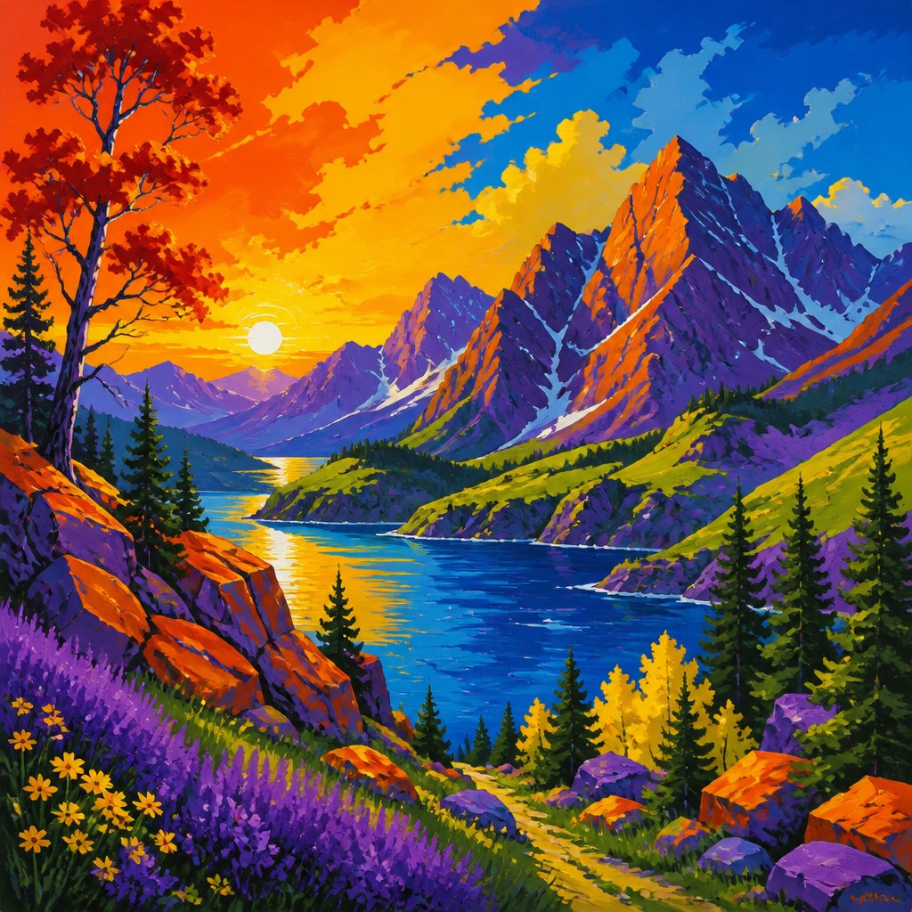
Crisp edges, outlined forms, faceted planes, and poster-like silhouettes are common. Texture may be present, but it usually supports the color architecture rather than obscuring it.
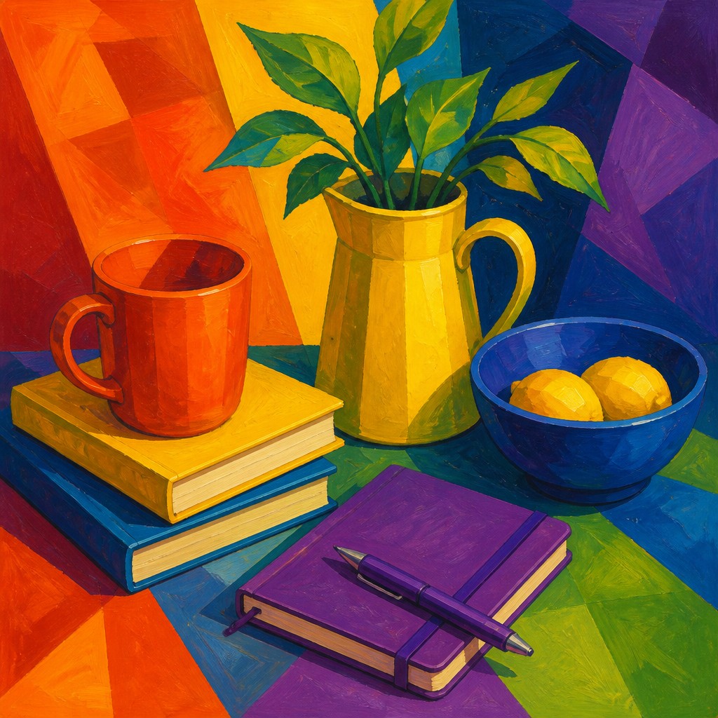
Energetic visual rhythm
Repeated color accents guide the eye through the image, creating a three-way cadence across figures, objects, backgrounds, or abstract forms. Uneven repetition can add movement while maintaining palette unity.
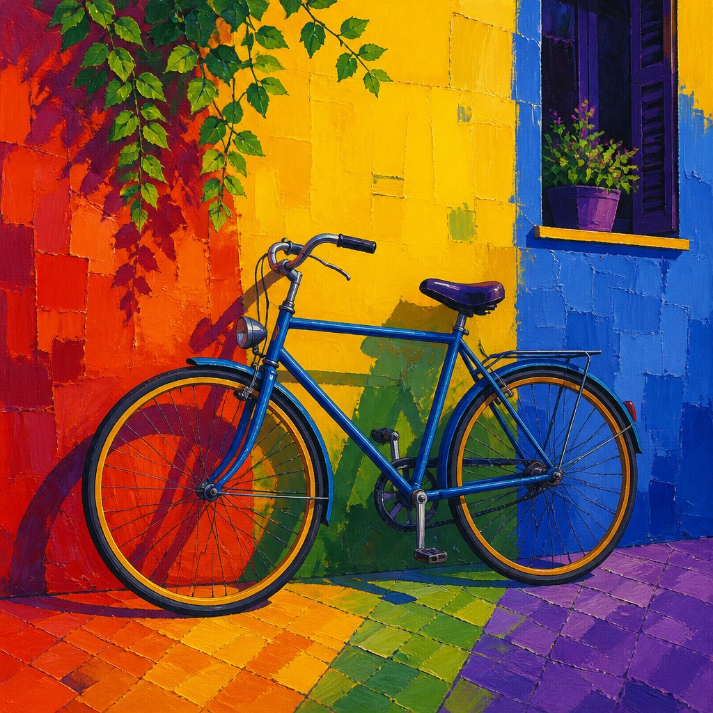
Expressive rather than naturalistic color
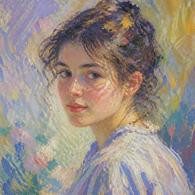
Objects do not need to retain their real-world colors. Skin, foliage, architecture, shadows, and skies can all be reassigned according to the triadic structure and the emotional needs of the composition.
Triadic Colors Prompt Ideas
Start from an idea — each one opens the generator with the style ready to go. See all 40 Triadic Colors prompts →
How to Create Triadic Colors Art
Master the craft step by step — or skip straight to creating. Read the full guide →
- 1
Choose a triadic palette
Select three hues evenly spaced on a color wheel, then decide which will carry the largest area and which will function as accents. Keep saturation and value relationships intentional so the palette remains balanced rather than chaotic.
- 2
Block the major masses first
Begin with a thumbnail or underpainting that assigns the three colors to broad compositional zones. Establish the focal point and overall value pattern before adding small details.
- 3
Control value and saturation
If all three hues are equally bright, the image may become visually noisy. Introduce darker mixtures, lighter tints, muted support colors, or small neutral passages to separate forms and create hierarchy.
- 4
Use crisp or deliberately varied edges
Gouache, acrylic, collage, screen printing, and vector tools are well suited to clean color blocks. In painting or digital work, combine hard edges with a few textured or softened transitions to avoid mechanical uniformity.
- 5
Repeat colors across the composition
Echo each hue in several locations rather than isolating it in one area. Small repeated accents can connect distant objects and make the three-color structure feel deliberate.
- 6
Write precise generation prompts
For prompt-based creation, specify the subject, the three chosen hues, saturated color blocks, balanced distribution, crisp forms, and the desired level of texture. Add constraints such as no dominant color, limited palette, or poster-like shapes when consistency is important.
The Story
History & Origins of Triadic Colors
Triadic Colors is an invented, contemporary style label rather than a formally recognized historical movement. Its aesthetic lineage comes from color-wheel theory, modernist experiments with non-naturalistic color, poster and editorial design, pop-oriented image making, and digital illustration. The principle of using three evenly spaced hues has long been discussed in practical color education as a way to achieve both contrast and palette unity.
The style has developed especially naturally in digital image-making, where hue, saturation, and value can be controlled precisely. It also adapts older techniques such as gouache color blocking, screen printing, painted signage, collage, and reduction-based printmaking, all of which encourage clear shapes and deliberate limits on the palette.
Influences: The style draws on practical color-wheel systems, modernist abstraction, Fauvist and Expressionist approaches to expressive color, Cubist simplification of form, Pop Art and poster design, screen-printing limitations, gouache illustration, collage, and contemporary vector graphics. It also shares methods with color-field painting and digital flat-shape illustration, but its defining requirement is the deliberate three-hue relationship rather than a specific historical period or medium.
Frequently Asked Questions
What defines Triadic Colors art?
Its defining feature is a palette of three hues spaced evenly around the color wheel and actively balanced throughout the composition. Bold color blocks, strong contrast, and expressive rather than strictly realistic color are common supporting traits.
Does the style always use red, yellow, and blue?
No. Red, yellow, and blue are the most familiar primary triad, but orange, green, and purple or other evenly spaced hue sets are equally valid. The important principle is the three-way spacing and balanced use of the colors.
How is it different from complementary color art?
Complementary color schemes are based on two opposing hues, such as blue and orange. A triadic scheme uses three distributed points on the color wheel, producing broader variety while retaining a controlled palette.
Can realistic subjects be made in this style?
Yes. A landscape, portrait, still life, or architectural scene can use naturalistic forms while assigning shadows, surfaces, and background areas to the selected triad. The color relationships take priority over literal local color.
What traditional media work well for this approach?
Gouache, acrylic, colored paper, screen printing, painted collage, and opaque marker are especially effective because they support clear, saturated shapes. Watercolor and oil can also work when blending is restrained and the three-hue structure remains legible.
How can I prompt an image in this style?
Name the subject first, then specify three evenly spaced hues, saturated color blocks, balanced distribution, crisp contours, and any desired medium or texture. Phrases such as "limited triadic palette," "no single dominant hue," and "bold graphic planes" help reinforce the intended color logic.
Create your first Triadic Colors artwork
Describe anything — or upload a photo — and see it in Triadic Colors Art Style in seconds.
Related Styles
Discover similar art styles