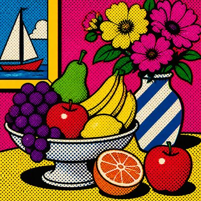
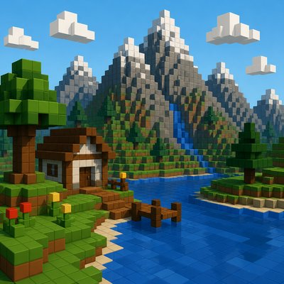
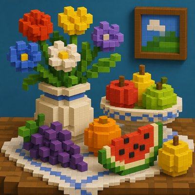
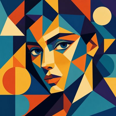
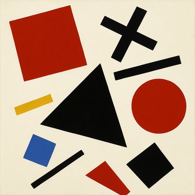
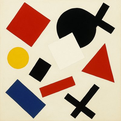
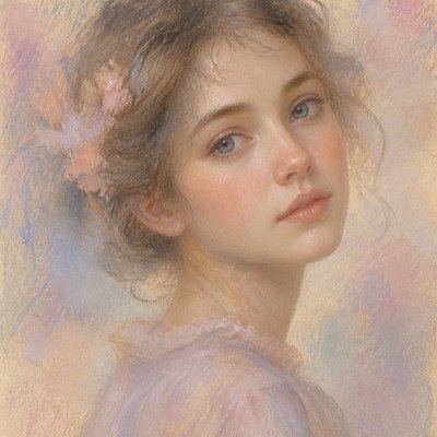
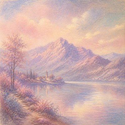
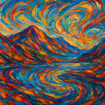
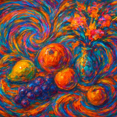
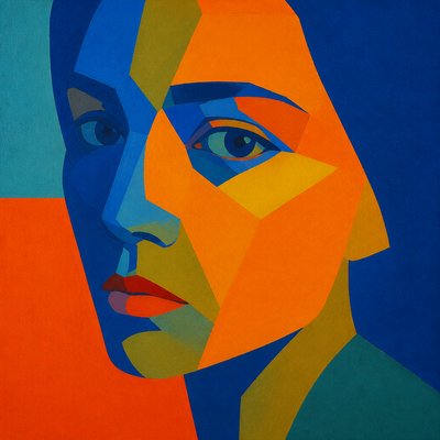
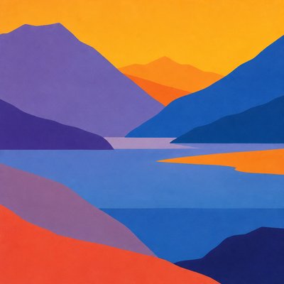
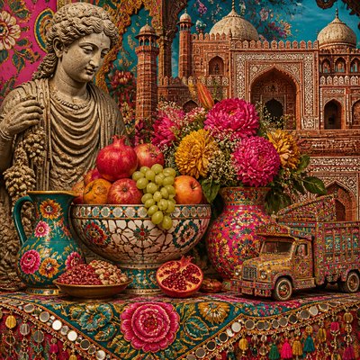
Split-Complementary Colors Art Style
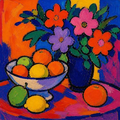
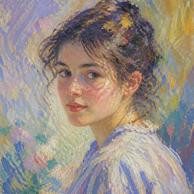
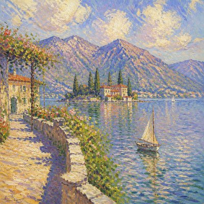
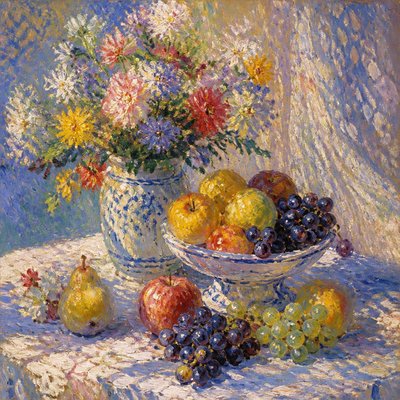
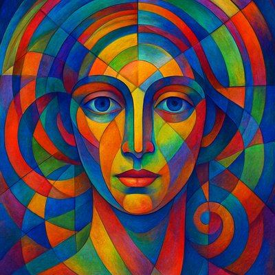
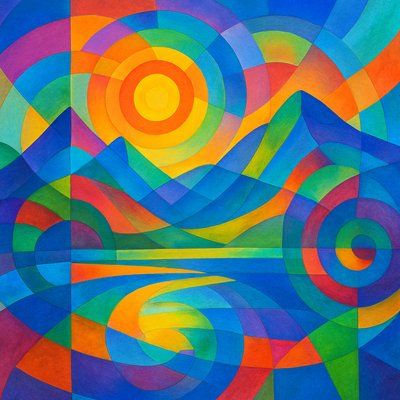
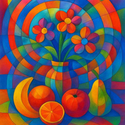
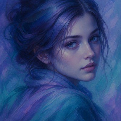
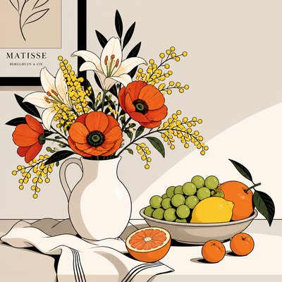
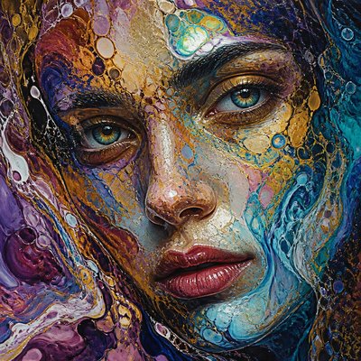
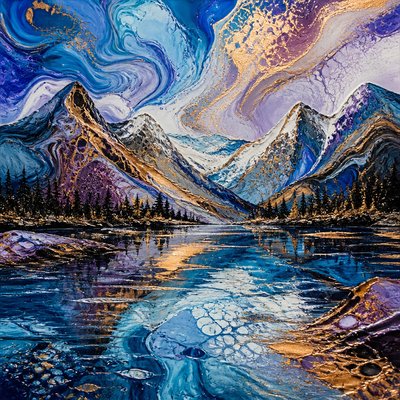
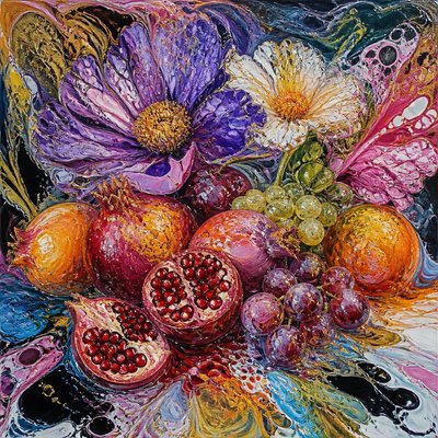
Explore Split-Complementary Colors: a balanced art style using one dominant hue and two neighboring opposing colors for vivid, softened contrast.
Instantly rendered in Split-Complementary Colors — or transform a photo
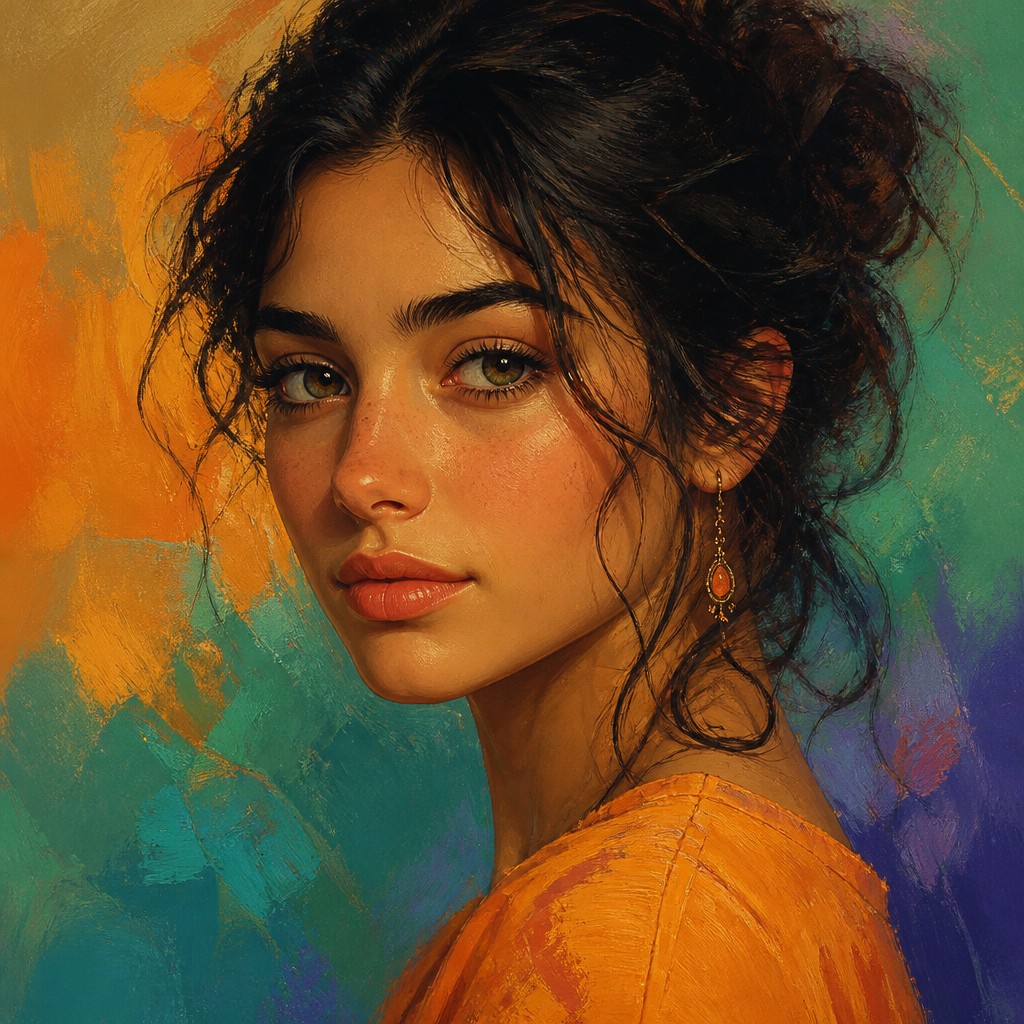

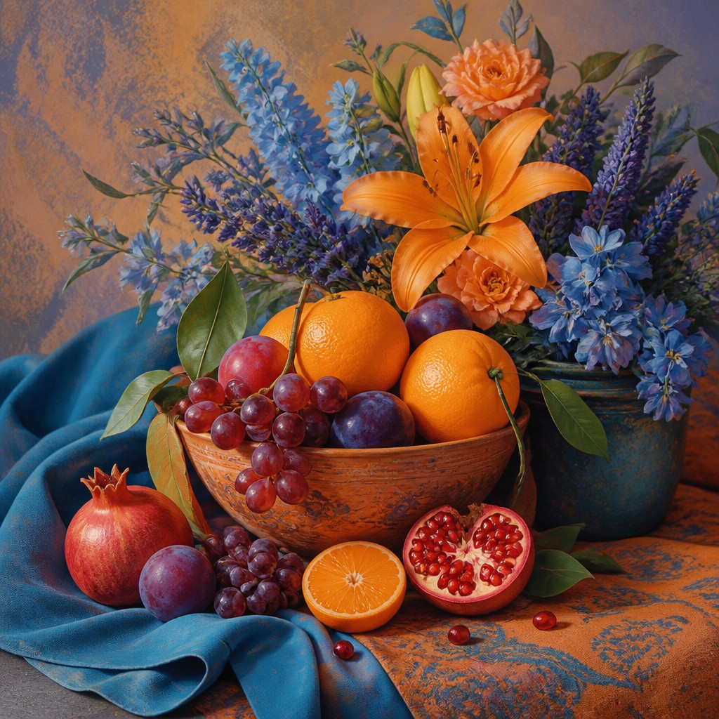
Split-Complementary Colors Gallery
Tap any artwork to explore it
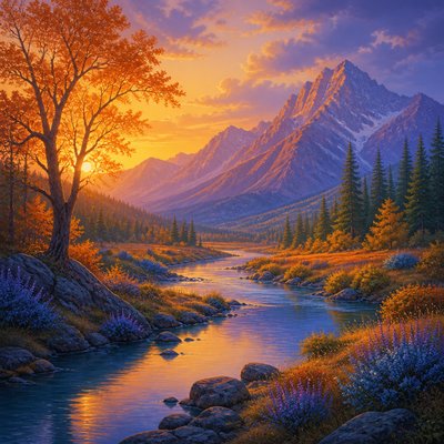

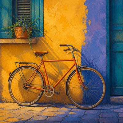
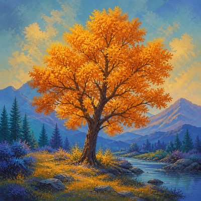
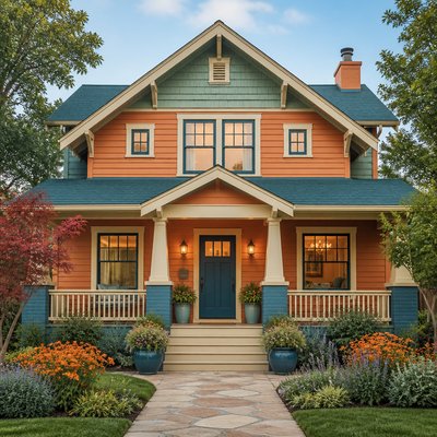
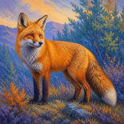
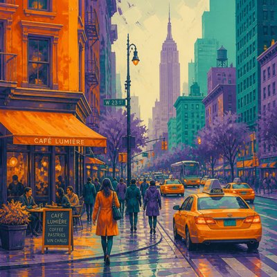
What is Split-Complementary Colors Art Style?
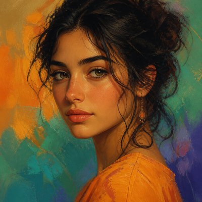
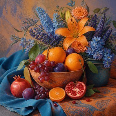
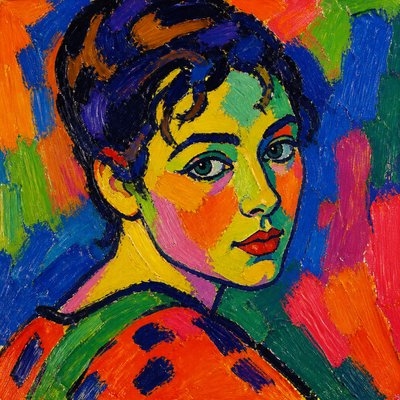
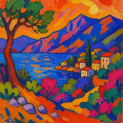
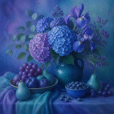
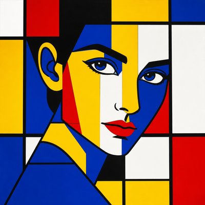
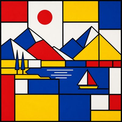
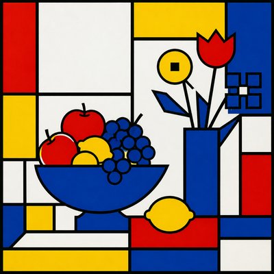
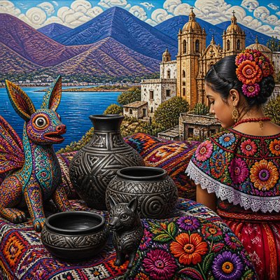
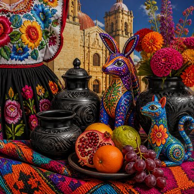
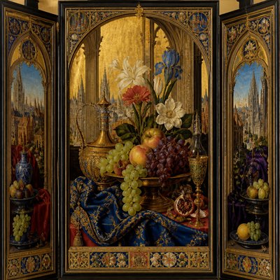
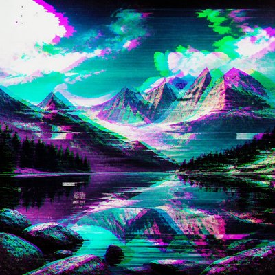
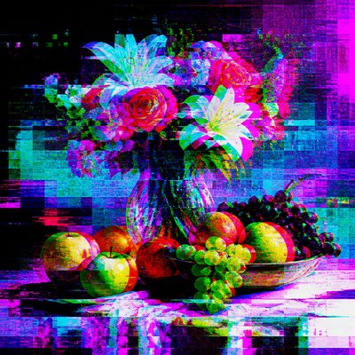
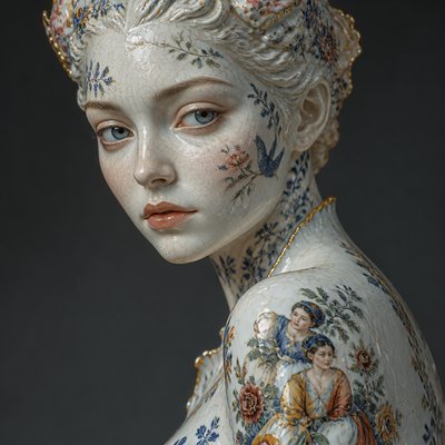
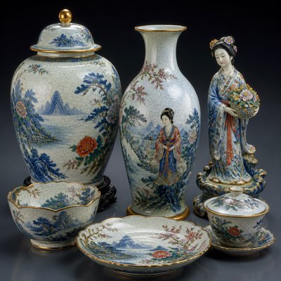
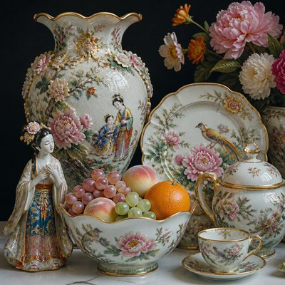
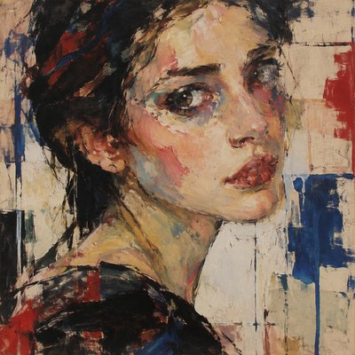
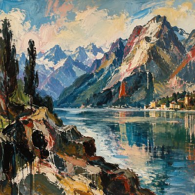
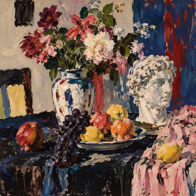
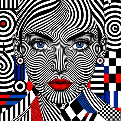
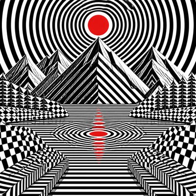
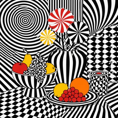
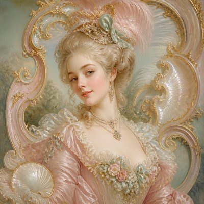
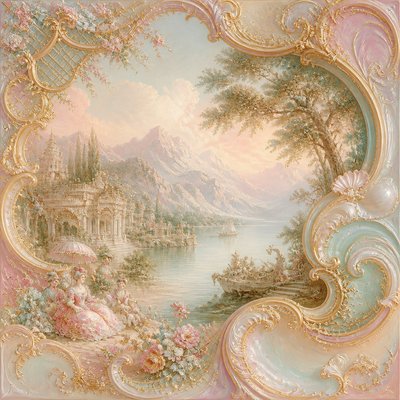
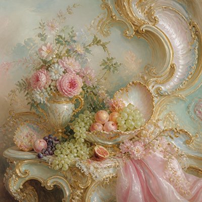
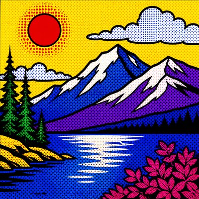
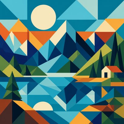
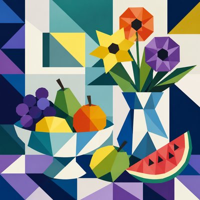
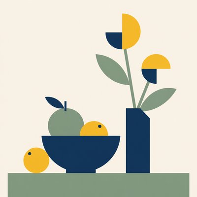
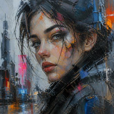
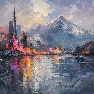
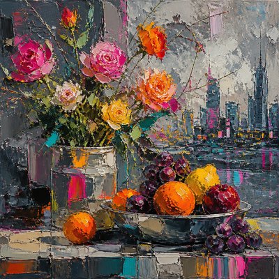
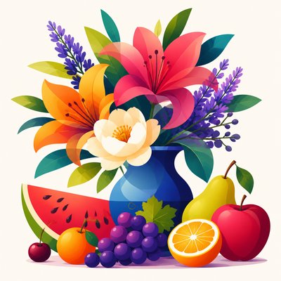
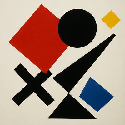
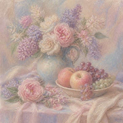
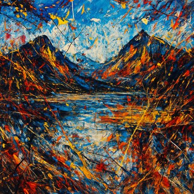
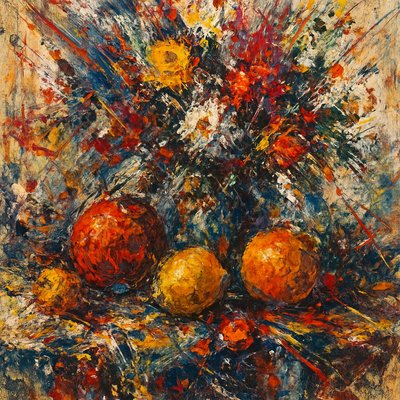
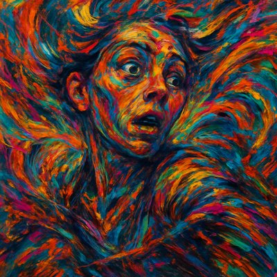
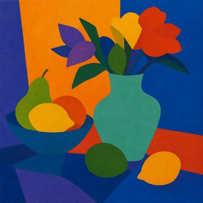
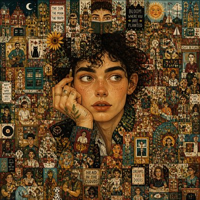
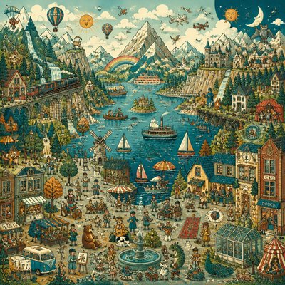
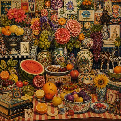
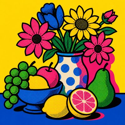
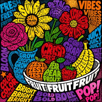
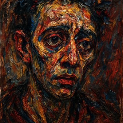
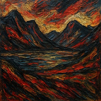
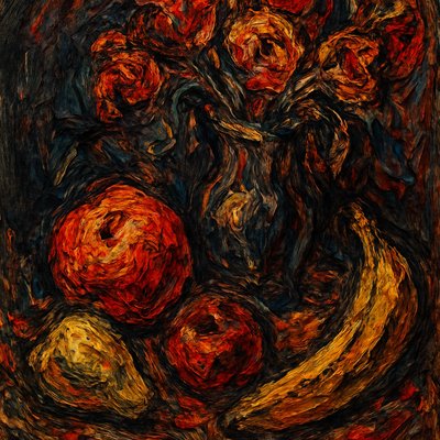
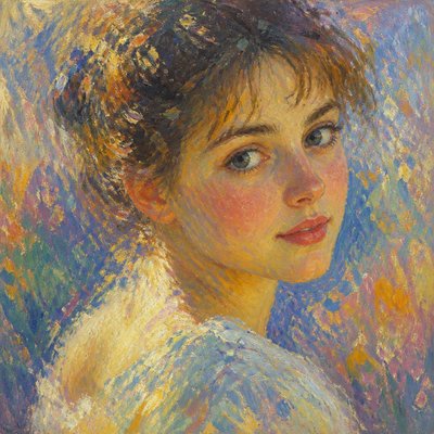
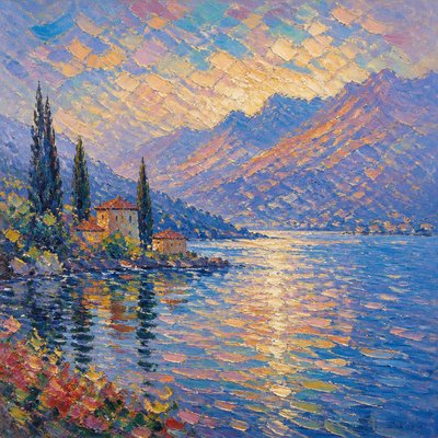
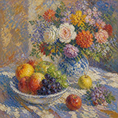
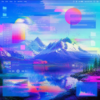
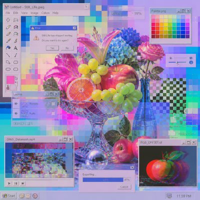
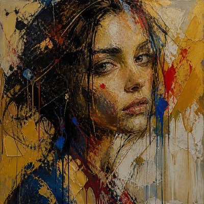
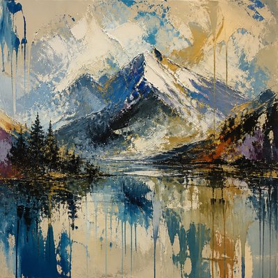
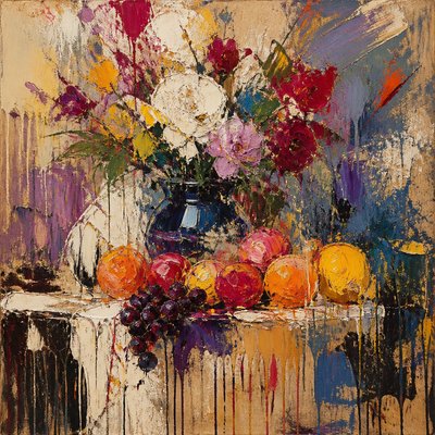
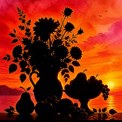
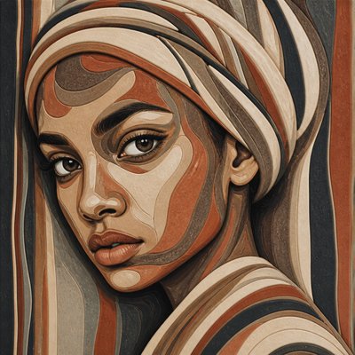
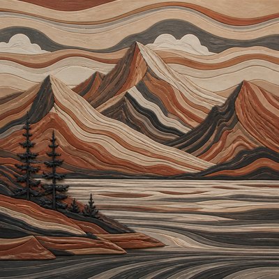
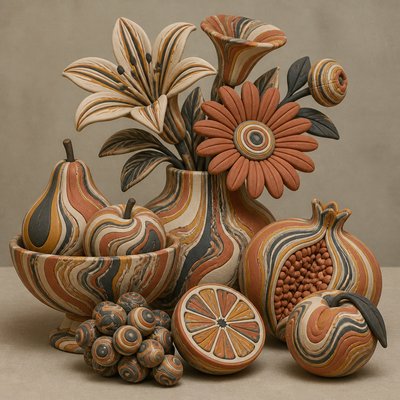
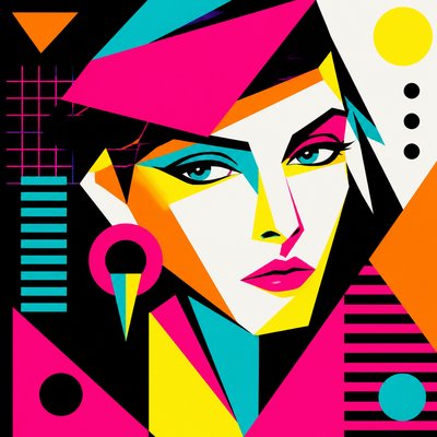
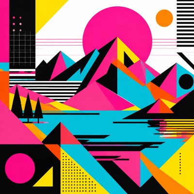
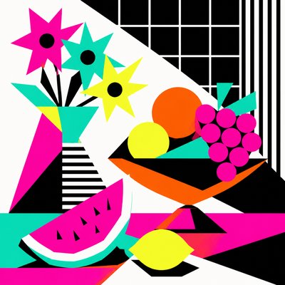
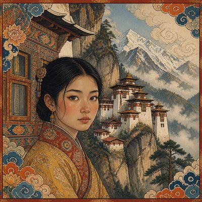
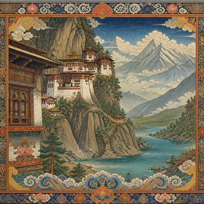
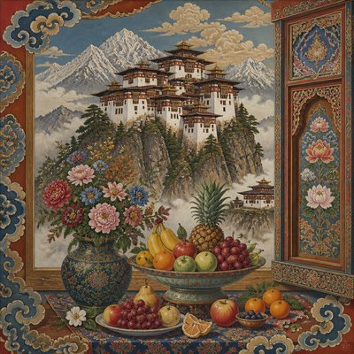
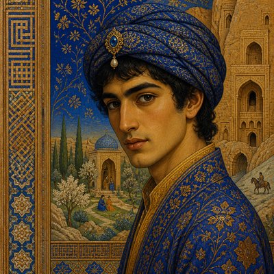
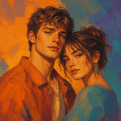
Split-Complementary Colors Art Style is a color-driven approach built around one dominant hue and the two colors positioned on either side of its complement. Instead of pairing a color with its exact opposite, it uses two near-opposites, creating strong visual energy with less severity and fewer clashes.
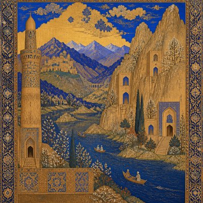
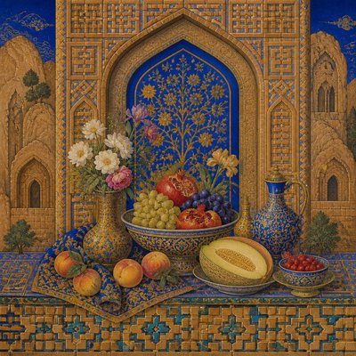
The palette often places a warm anchor against adjacent cool accents, although the temperature relationship can be reversed. A vivid focal color establishes hierarchy, while the neighboring accent hues create variation across forms, shadows, backgrounds, and secondary details. The result is dynamic but controlled: more colorful than a strictly complementary scheme and more directional than an analogous palette.
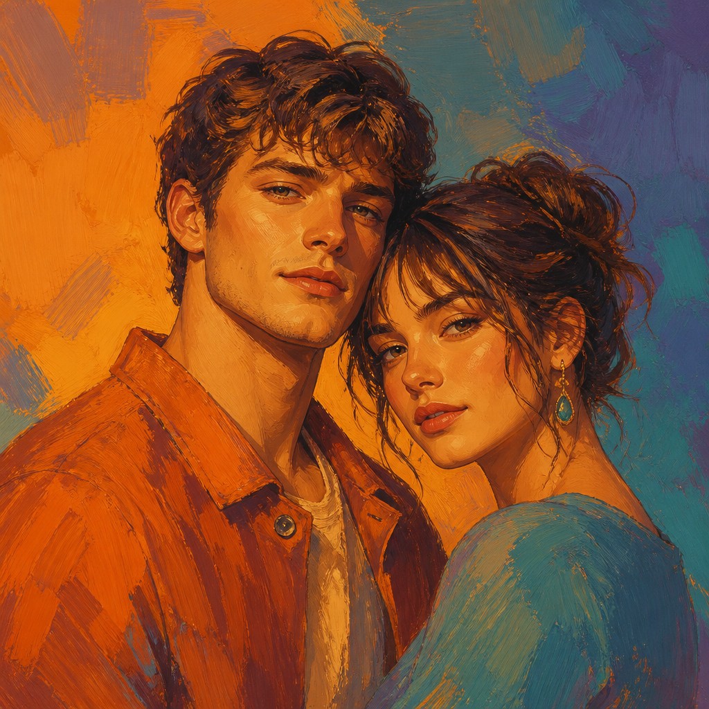
Try It On Your Photos
Upload any photo and convert it into Split-Complementary Colors Art Style — drag the sliders to compare before and after.
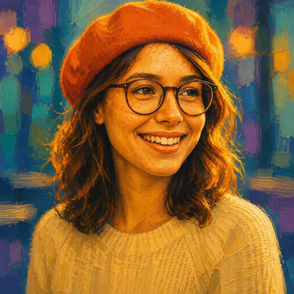

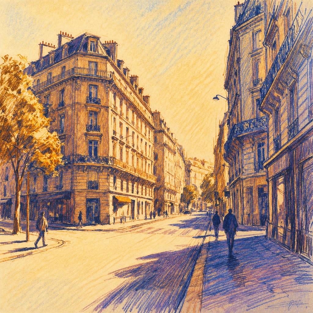

What Defines Split-Complementary Colors Art Style
The signature details, up close
Three-color foundation
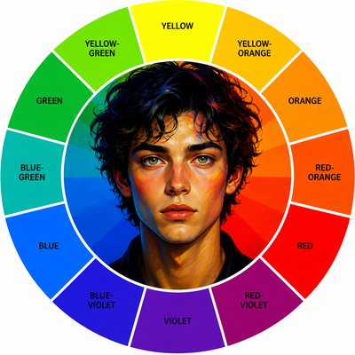
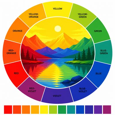
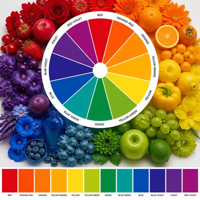
The palette centers on one dominant hue plus the two hues flanking its complement on the color wheel. These three colors may be adjusted in saturation and value while retaining their relational structure.
Softened contrast
The near-opposite accents preserve color contrast but avoid the sharper vibration produced by a direct complementary pairing. This makes the scheme energetic without requiring extreme saturation.
Dominant color hierarchy
One hue usually occupies the largest visual area or carries the subject’s main identity. The two accent colors are distributed selectively to guide attention and prevent the image from becoming evenly competitive.
Warm-cool tension
A warm anchor set against two related cool accents is a common expression of the style, producing depth and atmosphere. The scheme can also use a cool anchor with warm neighboring accents for a different emotional effect.

Vivid focal passages
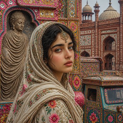
High-saturation color is concentrated in focal objects, edges, light, or symbolic details. Less important regions often use muted versions, tints, shades, or neutral intervals from the same palette.
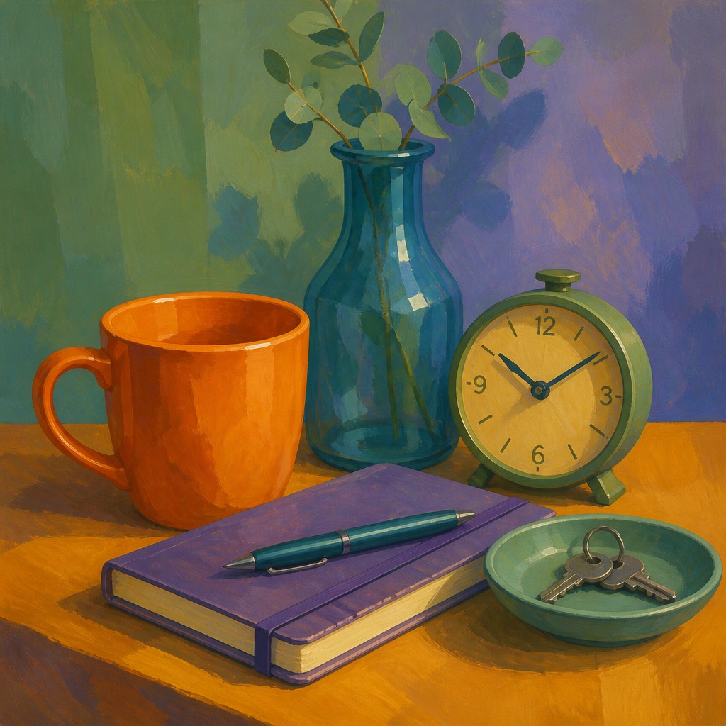
Controlled color repetition
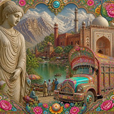
The three principal hues recur across separate forms so the composition feels unified. Small repeated accents can connect foreground and background while reinforcing rhythm and balance.
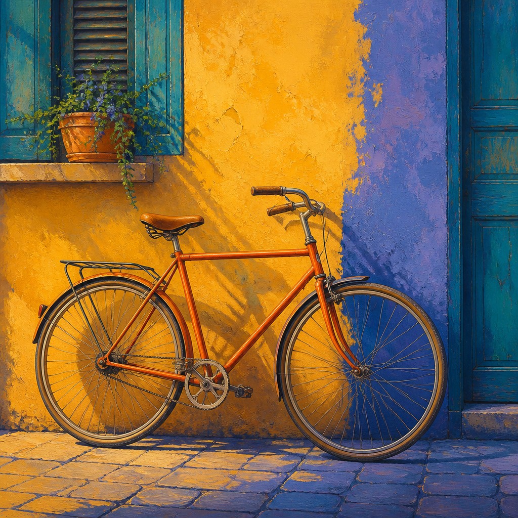
Graphic clarity with painterly flexibility
Clear color blocks, simplified silhouettes, and crisp edges suit the scheme, but blended modeling, textured brushwork, and atmospheric transitions can soften its structure. The palette is more defining than any single rendering method.
Split-Complementary Colors Prompt Ideas
Start from an idea — each one opens the generator with the style ready to go. See all 40 Split-Complementary Colors prompts →
How to Create Split-Complementary Colors Art
Master the craft step by step — or skip straight to creating. Read the full guide →
- 1
Choose the anchor hue
Select the color that should dominate the subject or composition, then locate its complement on a color wheel. Replace that exact complement with the two neighboring hues on either side.
- 2
Set proportions before details
Assign the dominant hue the largest area, reserve one accent for focal emphasis, and use the other as a supporting counterpoint. A practical starting balance is roughly 60 percent anchor, 30 percent secondary color, and 10 percent accent.
- 3
Vary value and saturation
Use tints, shades, and muted mixtures to create depth without introducing unrelated colors. Keep the most saturated passages near the subject’s focal point and reduce saturation in receding areas.
- 4
Build a unified surface
In painting, mix small amounts of the anchor or accent hues into neighboring areas so the colors relate across the surface. Digitally, use a limited swatch library, gradient maps, selective color adjustments, or layer-based recoloring.
- 5
Control composition with accents
Place the two near-opposite colors along important contours, focal objects, or directional paths rather than distributing them evenly. Neutral or low-saturation passages can provide rest between high-impact color zones.
- 6
Describe the color logic in prompts
For prompt-based generation, specify a dominant hue, the two hues flanking its complement, their warm-cool relationship, and the desired saturation hierarchy. Also state whether the result should be painterly, graphic, photographic, atmospheric, or sharply rendered.
The Story
History & Origins of Split-Complementary Colors
This is not a historical movement with a single origin, but a contemporary art and design style based on established color-theory practice. Its lineage includes traditional color-wheel systems, painterly approaches to complementary contrast, modernist color composition, poster design, illustration, and digital color workflows.
The split-complementary scheme became especially practical in graphic and digital production because it offers a reliable way to organize three strong colors without the visual tension of a direct complementary pair. Contemporary image-making applies it to illustration, editorial graphics, photography grading, game environments, interface imagery, and generative compositions.
Influences: The style draws on traditional color-wheel theory, complementary and analogous color relationships, modernist color composition, poster and screen-print design, editorial illustration, cinematic color grading, and contemporary digital painting. It also shares the simplified color planning of graphic design and the atmospheric color separation found in landscape painting and photography, while remaining distinct because its defining feature is the deliberate use of a split-complementary palette.
Frequently Asked Questions
What defines Split-Complementary Colors Art Style?
Its defining structure is one dominant hue paired with the two hues adjacent to that color's complement. The arrangement creates contrast while remaining more flexible and less visually harsh than a direct complementary scheme.
Is split-complementary the same as complementary color art?
No. Complementary color art pairs two direct opposites, such as blue and orange. Split-complementary art replaces one opposite with its two neighboring hues, producing a broader three-color relationship with softer tension.
Does the style always use warm colors against cool colors?
No, but a warm anchor with two cool accents is a common and recognizable arrangement. A cool dominant hue with warm neighboring accents is equally valid, provided the colors maintain their split-complementary relationship.
How can beginners choose the right palette?
Pick a dominant hue, find its opposite on a color wheel, and select the two colors immediately beside that opposite. Test the colors at different values and saturation levels, then reserve the strongest accent for the focal area.
Can this style be used for photography or realistic images?
Yes. Photographers can arrange subjects and lighting around the three-color scheme or apply selective color grading afterward. Realistic images usually work best when the split-complementary accents are concentrated in light, clothing, architecture, reflections, or background atmosphere.
Where is this color style commonly used?
It is suitable for painting, illustration, posters, editorial graphics, branding studies, photography, animation backgrounds, game environments, and digital concept art. Its clear hierarchy makes it useful wherever an image needs both visual excitement and palette control.
Create your first Split-Complementary Colors artwork
Describe anything — or upload a photo — and see it in Split-Complementary Colors Art Style in seconds.
Related Styles
Discover similar art styles