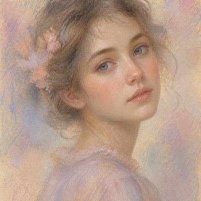
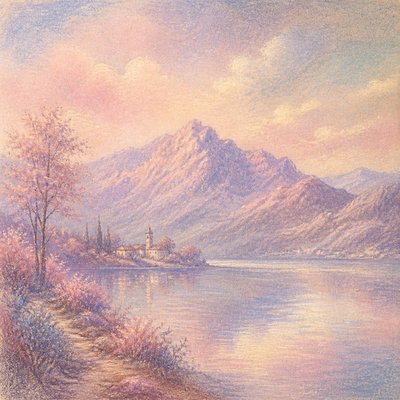
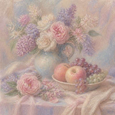
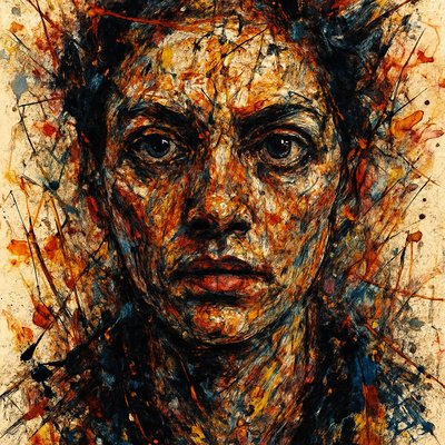
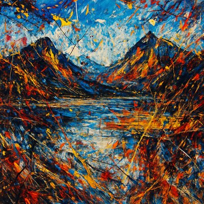
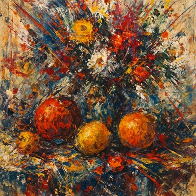
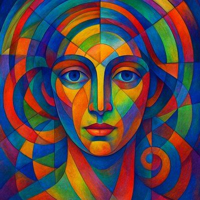
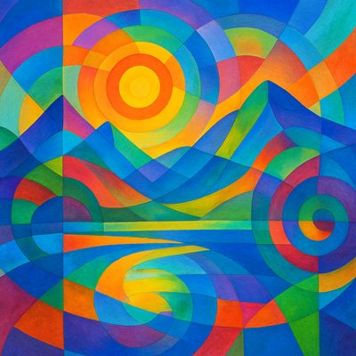
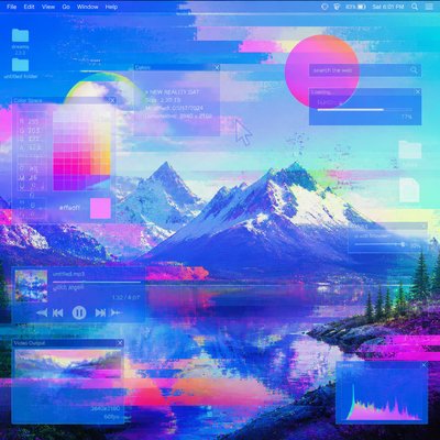
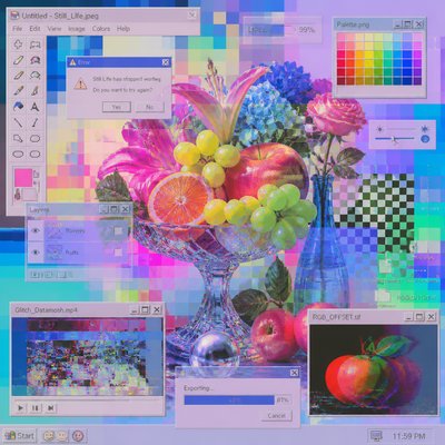
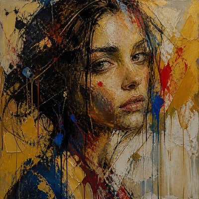
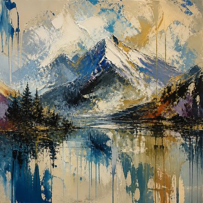
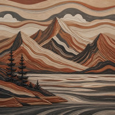
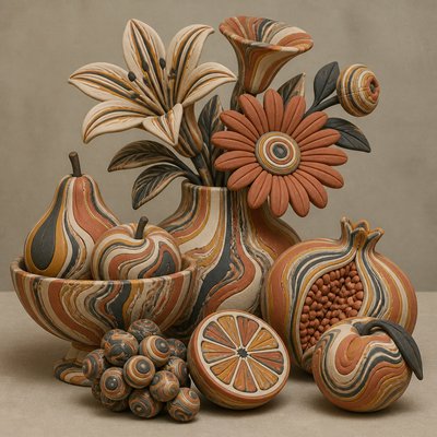
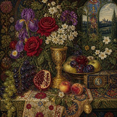
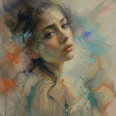
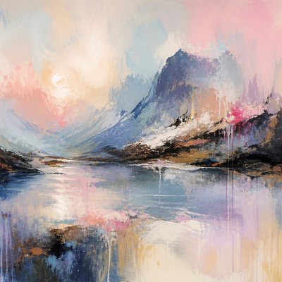
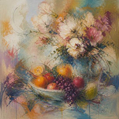
Secondary Colors Art Style
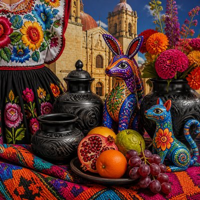
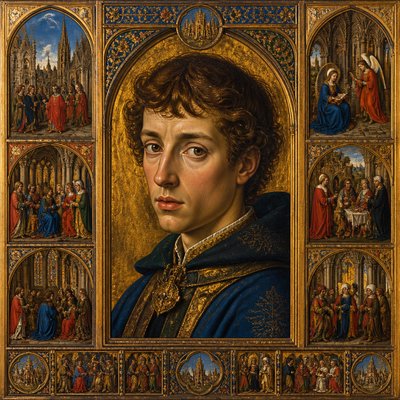
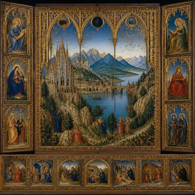
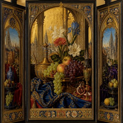
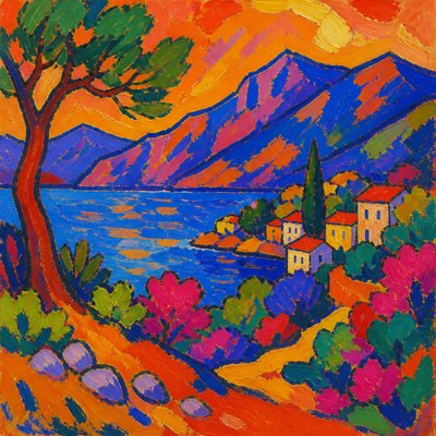
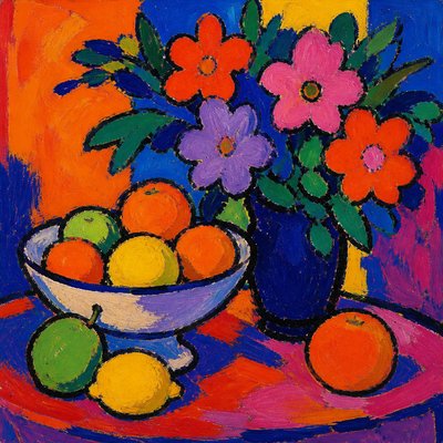
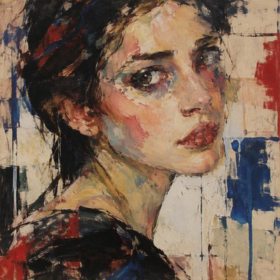
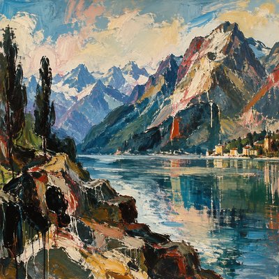
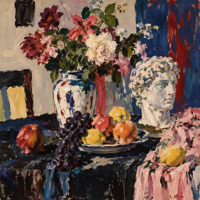
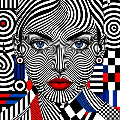
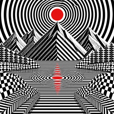
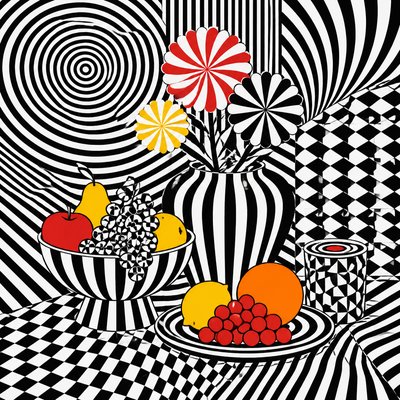
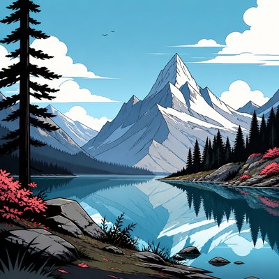
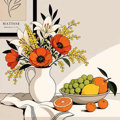
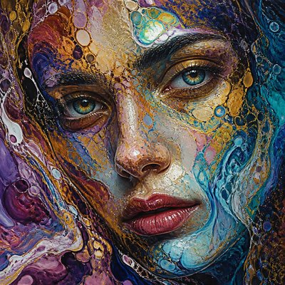
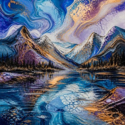
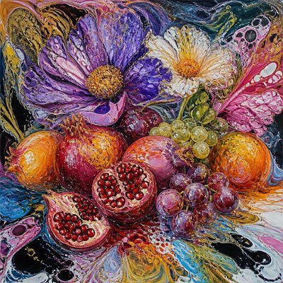
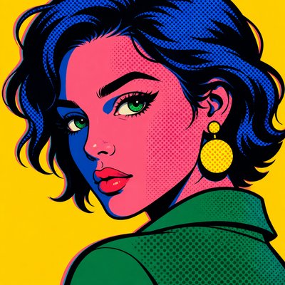
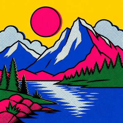
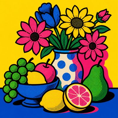
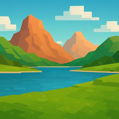
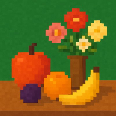
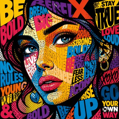
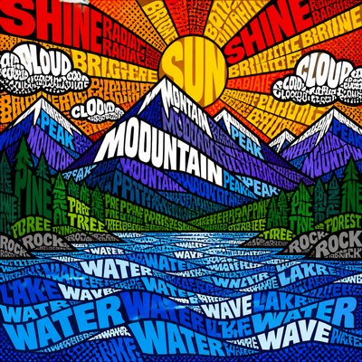
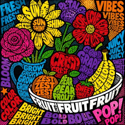
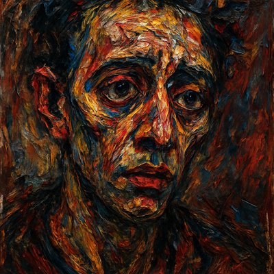
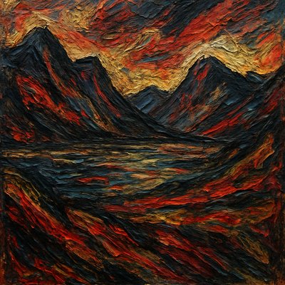
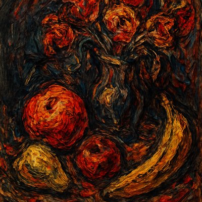
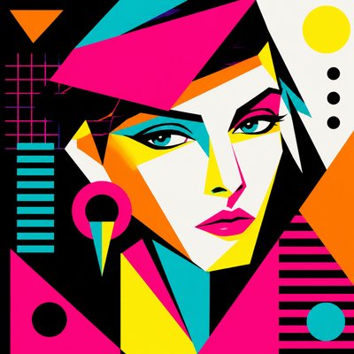
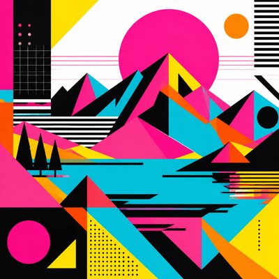
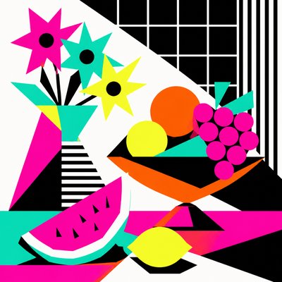
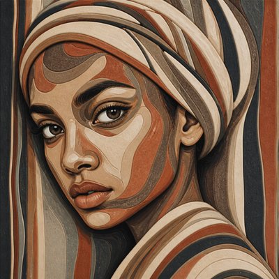
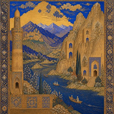
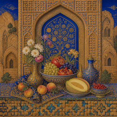
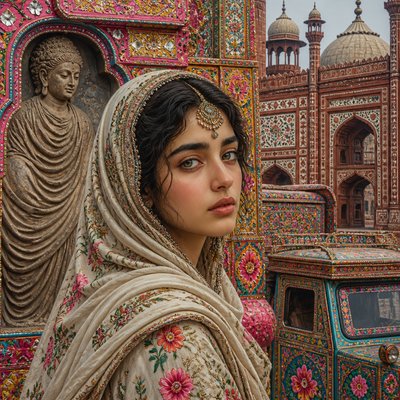
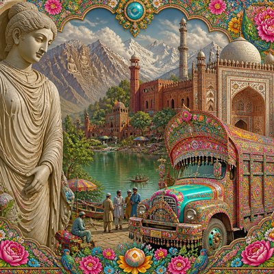
Explore Secondary Colors Art: vivid orange, green, and purple fields shaped by color theory, flat composition, and mixed-hue contrast.
Instantly rendered in Secondary Colors — or transform a photo
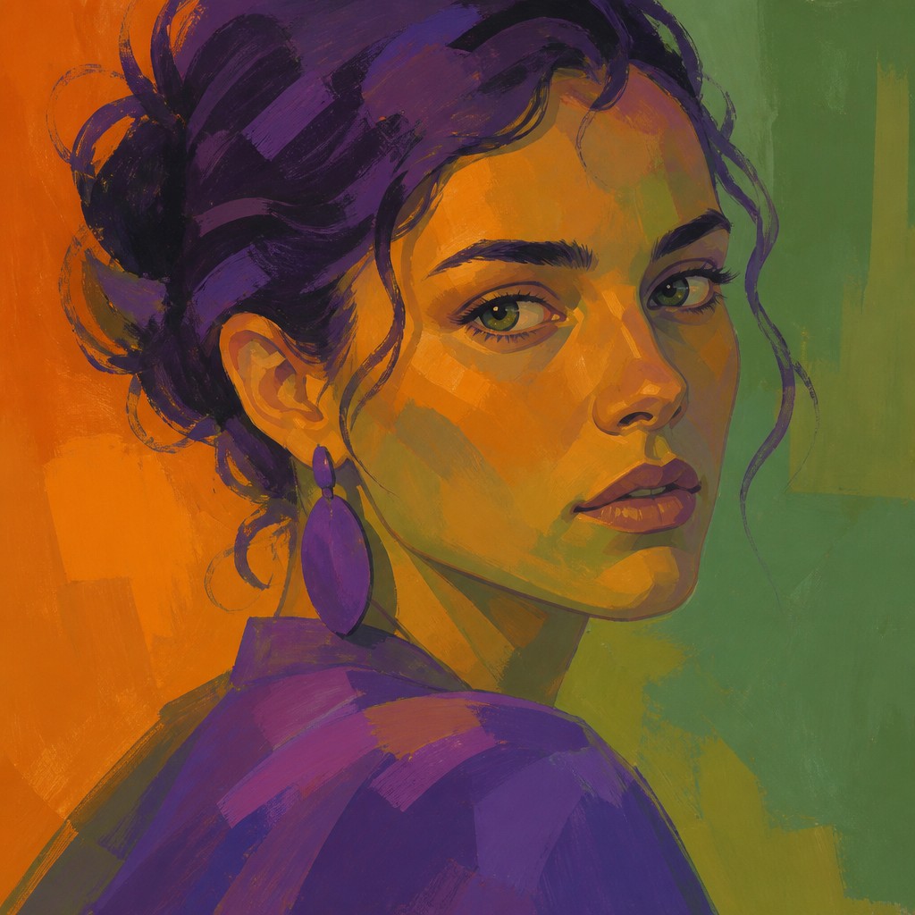
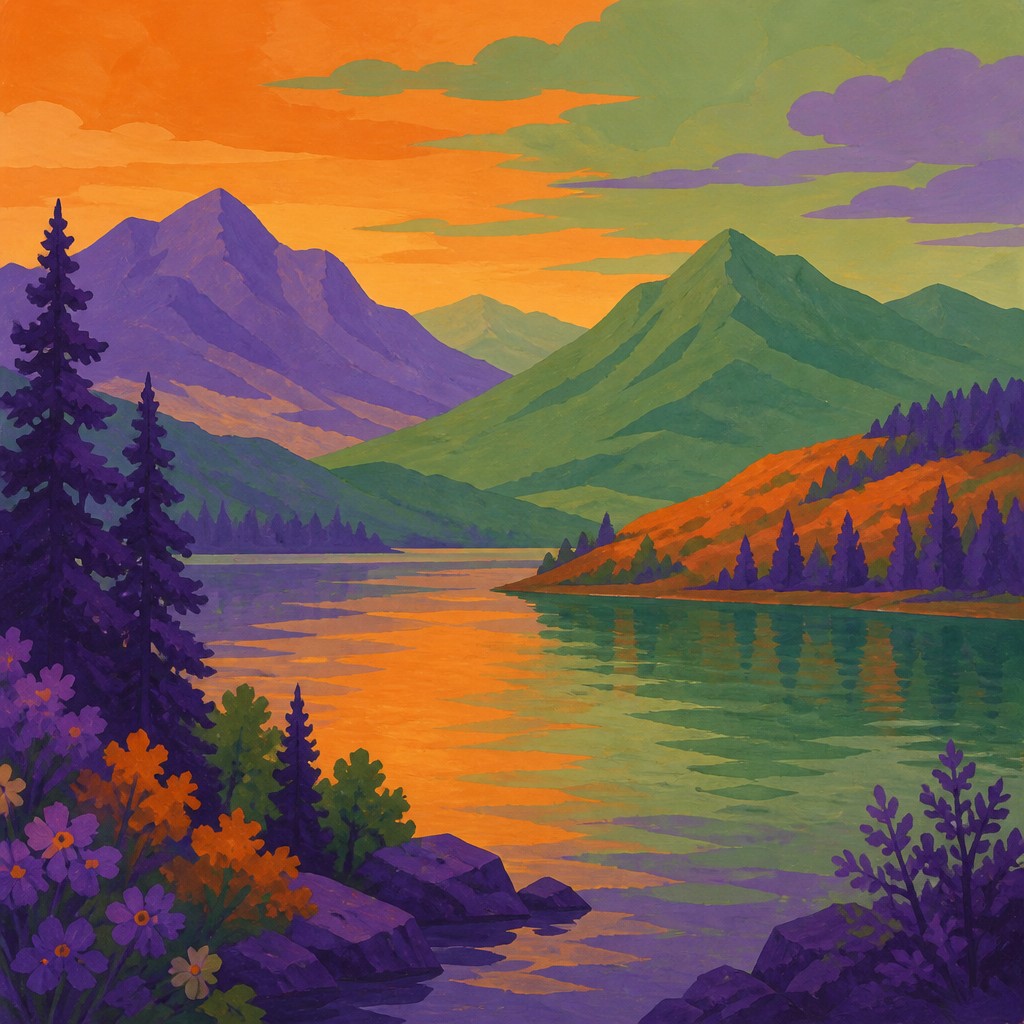
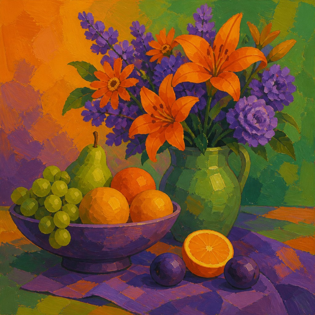
Secondary Colors Gallery
Tap any artwork to explore it
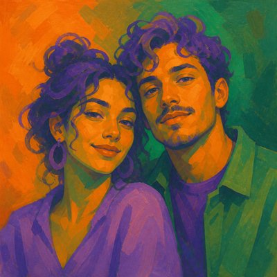
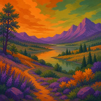
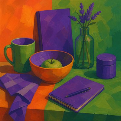
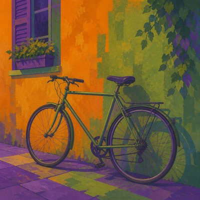
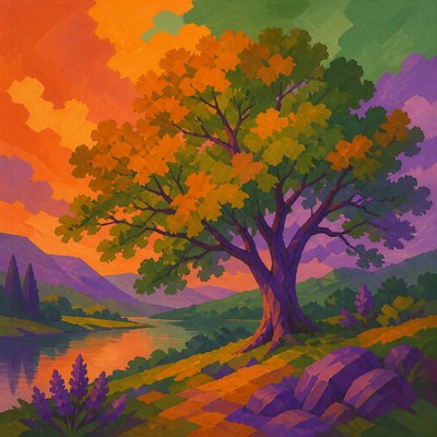
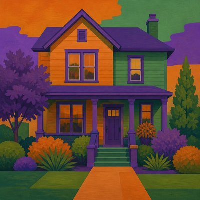
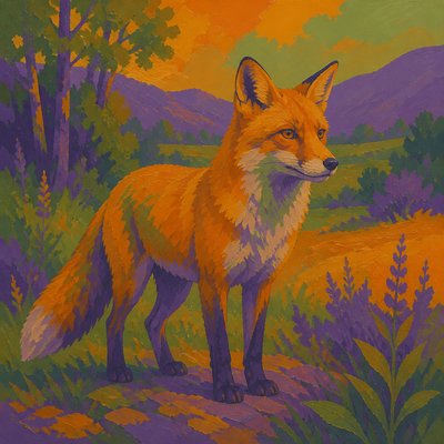
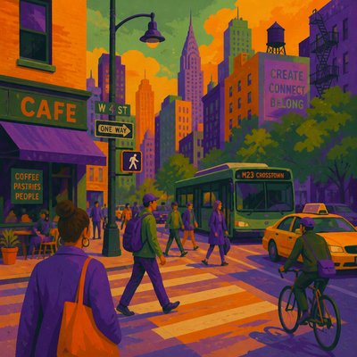
What is Secondary Colors Art Style?
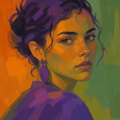
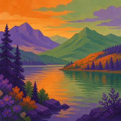
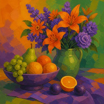
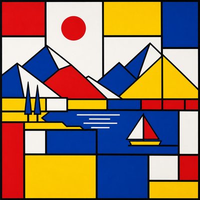
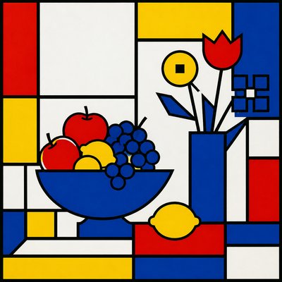
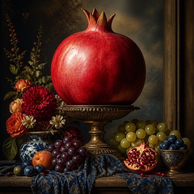
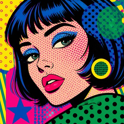
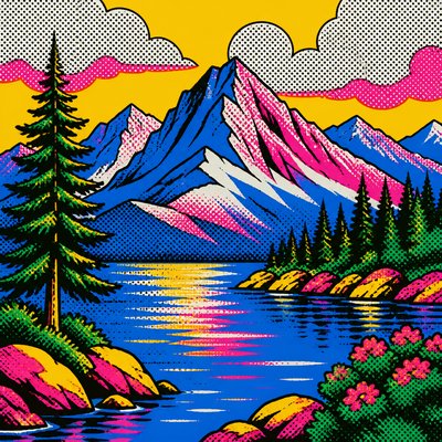
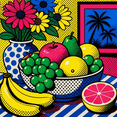
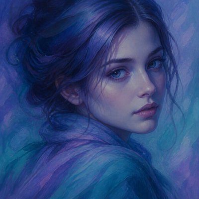
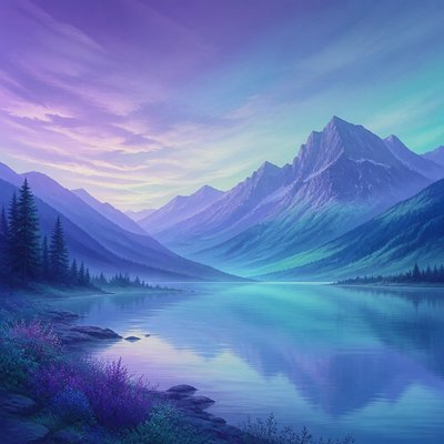
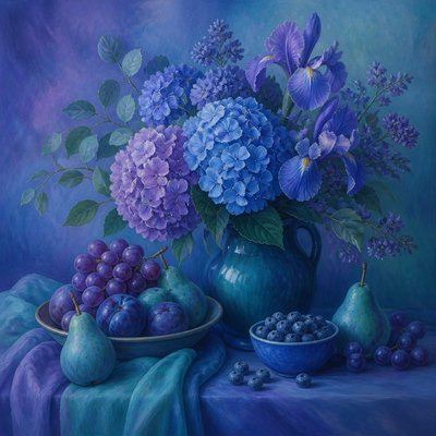
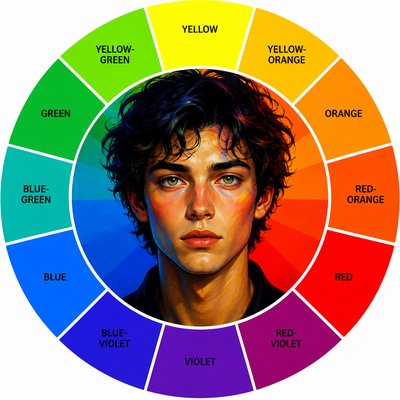
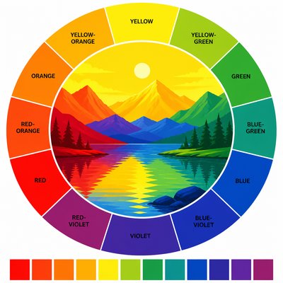
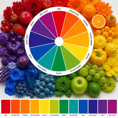
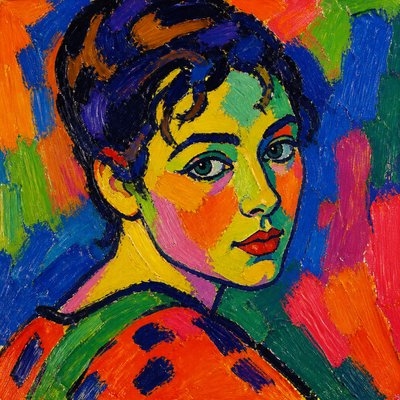
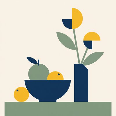
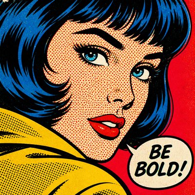
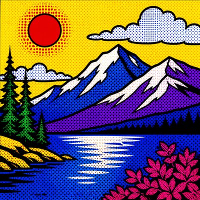
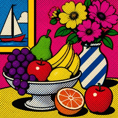
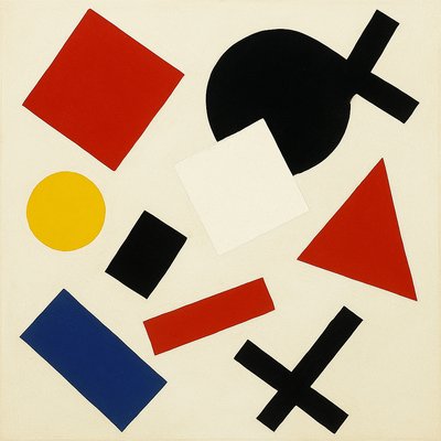
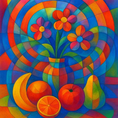
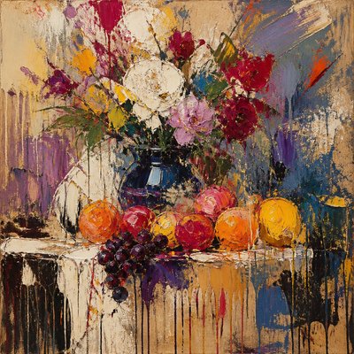
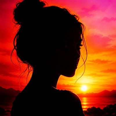
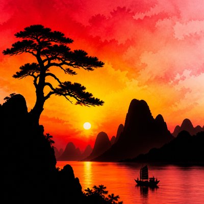
Secondary Colors Art is a color-led visual style organized around orange, green, and purple—the three secondary colors produced by mixing pairs of primary colors. Rather than treating hue as a minor detail, it makes these mixed colors the structural foundation of the image, using broad fields, distinct blocks, and carefully controlled transitions.
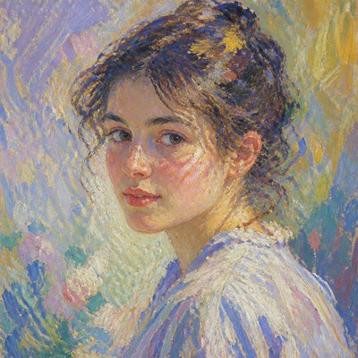
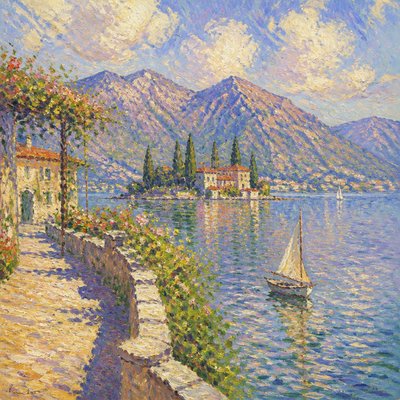
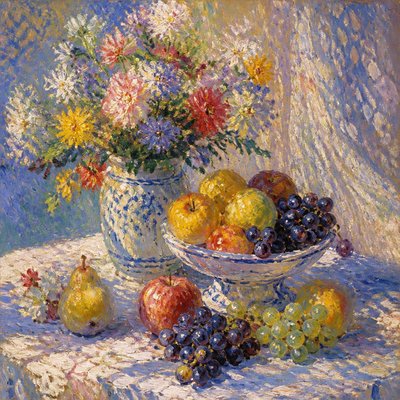
The style often places warm orange beside cool green, then introduces saturated violet as a counterweight. Its flattened forms, limited palette, and strong color relationships can make a landscape, portrait, still life, or purely abstract arrangement feel graphic and contemporary. The visual impact comes from the tension between related hues, complementary contrast, saturation, and the visible logic of color mixing.
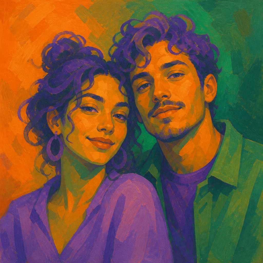
Try It On Your Photos
Upload any photo and convert it into Secondary Colors Art Style — drag the sliders to compare before and after.
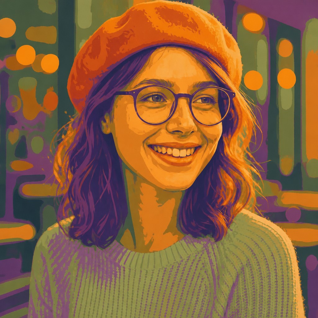

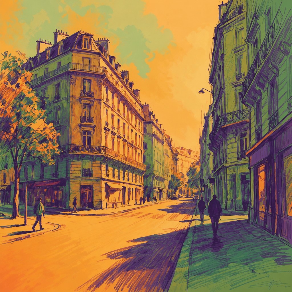

What Defines Secondary Colors Art Style
The signature details, up close
Orange, green, and purple foundation
The palette is built primarily from secondary hues mixed from pairs of primaries. These colors may range from earthy and muted to intensely saturated, but their mixed origin remains visually important.
Warm–cool color tension
Warm orange commonly meets cool green to create immediate spatial and emotional contrast. Purple can bridge, separate, or intensify the relationship between them.
Flat color fields
Large areas of relatively even color replace finely modeled shading. The image reads through adjacency, proportion, and shape rather than through realistic tonal rendering.
Mixed-hue transitions
Hard-edged blocks may sit beside gradual blends from orange into green or violet. These transitions show how neighboring color families can be optically or materially mixed.
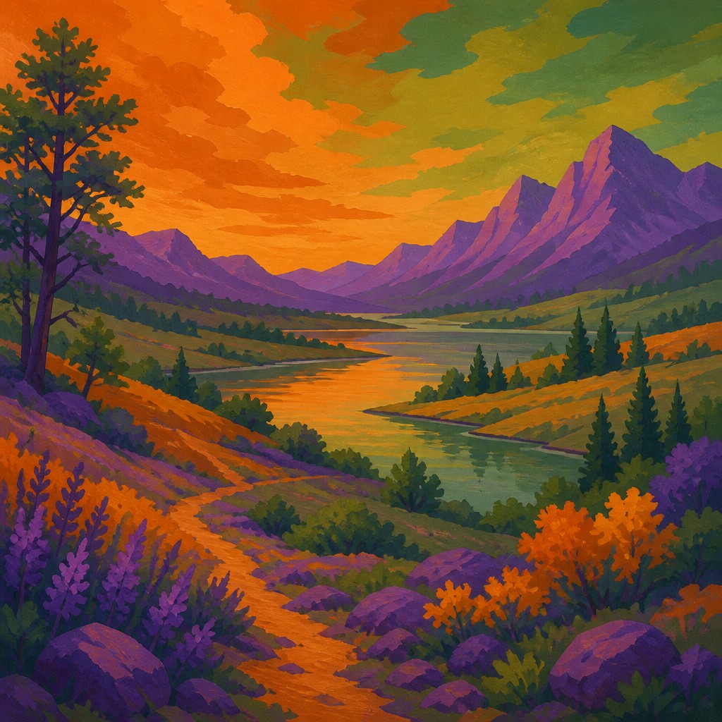
Saturated violet accents
Purple and violet often appear in smaller, concentrated areas that balance dominant orange-green passages. Their placement can establish rhythm, focal points, or visual depth.
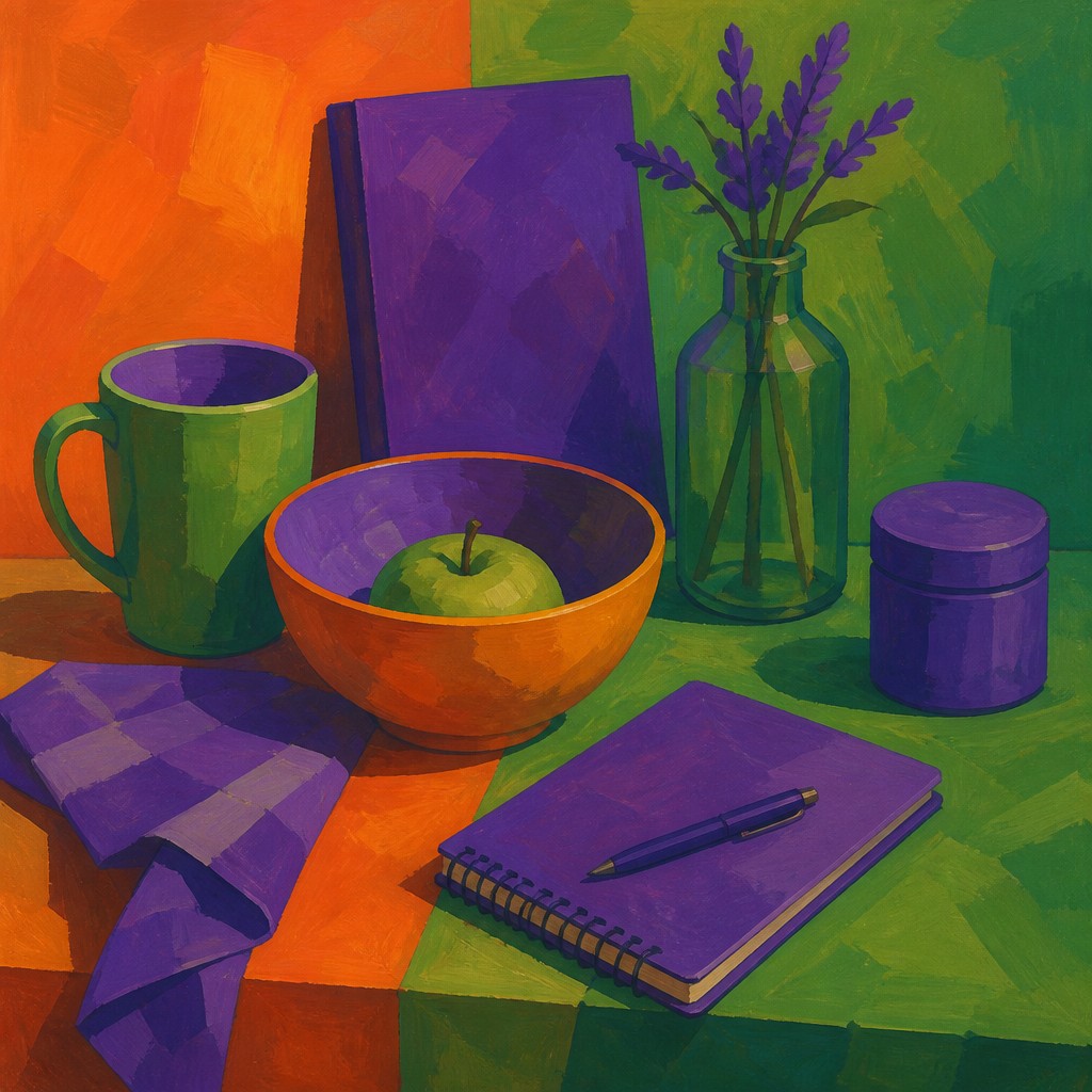
Graphic simplification
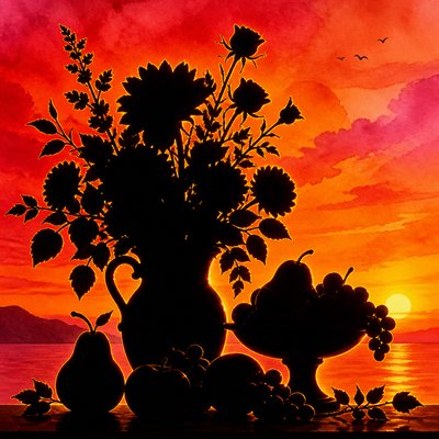
Objects are reduced to readable silhouettes, planes, and emblematic shapes. Detail is selectively omitted so that the palette and composition remain the primary subjects.
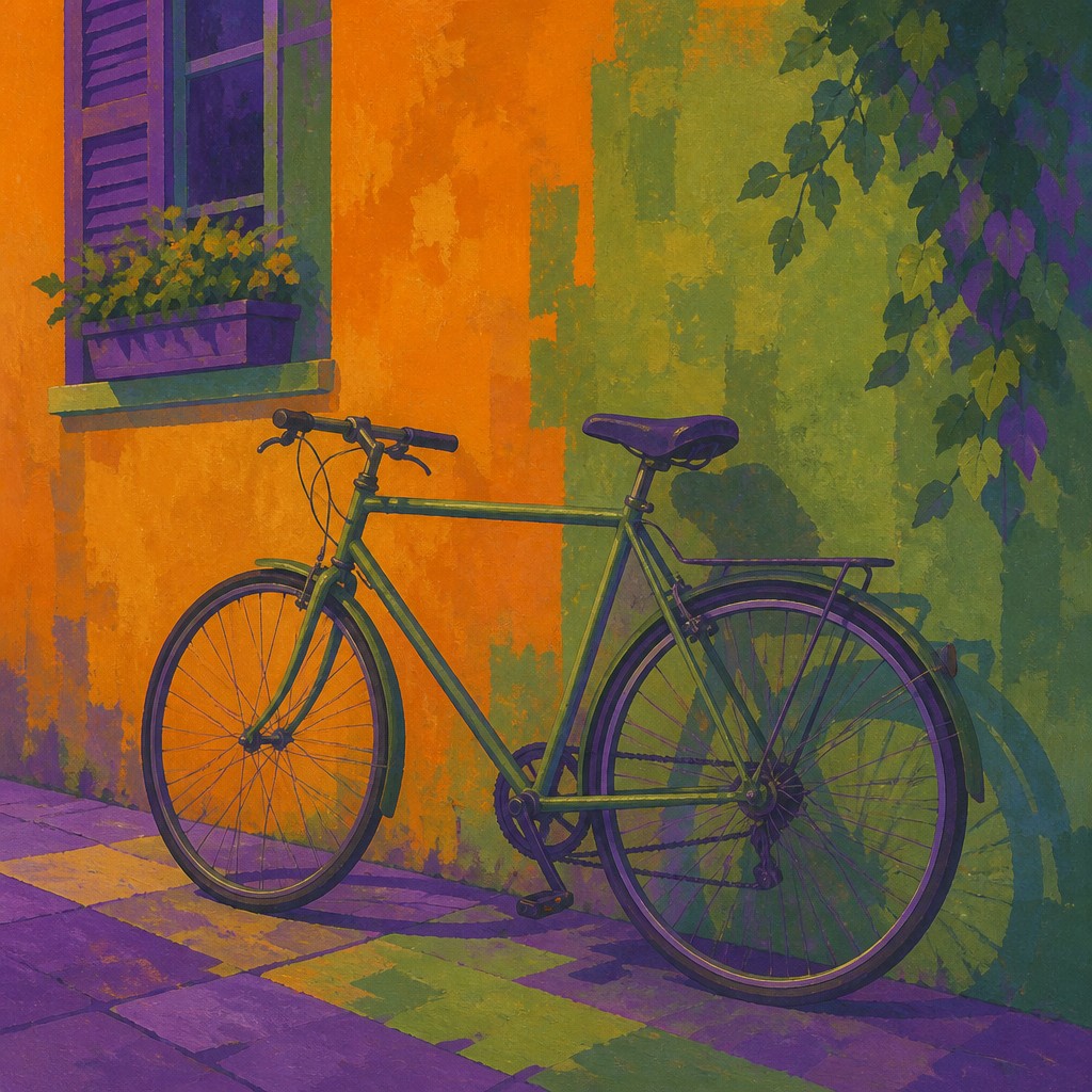
Secondary-color contrast
The style relies on hue opposition, saturation changes, and differences in area rather than a large number of colors. Small accents can therefore carry substantial visual weight.
Secondary Colors Prompt Ideas
Start from an idea — each one opens the generator with the style ready to go. See all 40 Secondary Colors prompts →
How to Create Secondary Colors Art
Master the craft step by step — or skip straight to creating. Read the full guide →
- 1
Choose a controlled palette
Begin with one orange, one green, and one purple, then add lighter, darker, warmer, or grayer variations of each. Avoid introducing unrelated hues unless they are clearly subordinate.
- 2
Mix pigments deliberately
For traditional painting, mix yellow with red for orange, yellow with blue for green, and red with blue for purple, adjusting the proportions to control temperature and saturation. Test mixtures before applying them to large fields.
- 3
Block in major shapes first
Separate the subject into broad silhouettes or planes and establish the orange-green balance before adding detail. Preserve clear edges where a graphic, poster-like result is desired.
- 4
Use transitions selectively
Blend colors only where a gradual shift supports the composition; keep other areas flat so the image does not become visually muddy. Digital artists can use masks, gradient layers, and hard-edged shape tools to maintain this balance.
- 5
Build contrast through placement
Place a small violet area against a broad orange or green field to create a focal point, or use adjacent warm and cool blocks to imply depth without conventional shading.
- 6
Write precise generation prompts
Specify the subject, flat mixed-hue blocks, orange-to-green transitions, saturated violet accents, limited secondary palette, and the desired degree of abstraction. For image transformation, describe which existing shapes should retain their structure while their colors are reorganized.
The Story
History & Origins of Secondary Colors
Secondary Colors Art is an invented, contemporary style rather than a documented historical art movement. Its aesthetic lineage comes from longstanding color theory, especially the use of primary and secondary hues in painting, design, illustration, and color-field abstraction.
It also draws on modernist experiments with flat planes, postwar color-field painting, poster graphics, screen printing, and digital palette construction. In digital practice, the style can extend beyond literal pigment mixing by translating the relationships among orange, green, and purple into luminous or highly saturated screen colors.
Influences: The style relates to color-field abstraction, modernist and Bauhaus-influenced color studies, geometric abstraction, screen-printed poster design, contemporary editorial illustration, and flat digital painting. It also draws on pigment-based color theory and the visual economy of palette-limited printmaking, while its luminous saturation can reflect RGB-based digital color systems.
Frequently Asked Questions
What defines Secondary Colors Art?
It is defined by an image structure based on orange, green, and purple, with those hues treated as mixed secondary colors rather than incidental accents. Flat fields, simplified forms, warm–cool contrast, and selective blending are central to the look.
Is Secondary Colors Art a historical art movement?
No. It is a contemporary, descriptive style label rather than a documented movement with a fixed period or founding school. Its visual language draws from established traditions including color theory, geometric abstraction, color-field painting, and graphic design.
How is it different from general color-field painting?
Color-field painting typically emphasizes expansive areas of color and their perceptual effects, often with minimal subject matter. Secondary Colors Art is more specifically restricted to orange, green, and purple relationships and may be applied to recognizable subjects, graphic shapes, or illustrative scenes.
Can the style include realistic subjects?
Yes. Landscapes, portraits, interiors, animals, and still lifes can all be translated into the style. The subject is simplified into planes or blocks so that its identity remains legible while the secondary-color system controls the image.
How can I make the colors look rich instead of muddy?
Use clean pigments or well-separated digital hues, mix small test quantities, and control the amount of neutralizing complements. Keep highly saturated passages apart from overly gray mixtures, and reserve the strongest violet or orange for focal areas.
Where is this style useful?
Its clear palette and bold shapes suit posters, editorial illustration, album artwork, branding studies, digital wallpapers, abstract paintings, and stylized photography treatments. It also works well for image transformations when the original composition has strong silhouettes or recognizable large forms.
Create your first Secondary Colors artwork
Describe anything — or upload a photo — and see it in Secondary Colors Art Style in seconds.
Related Styles
Discover similar art styles