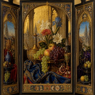
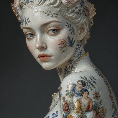
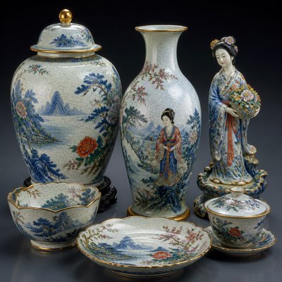
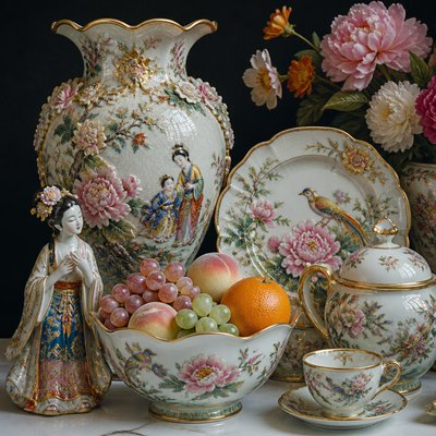
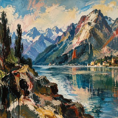
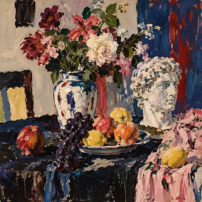
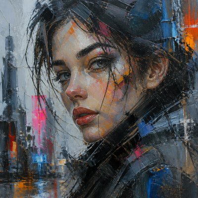
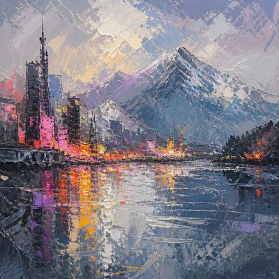
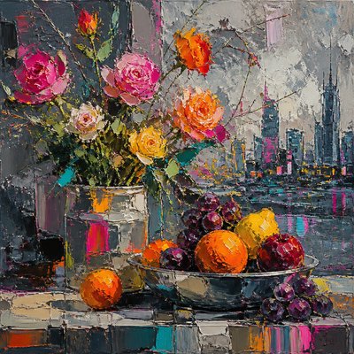
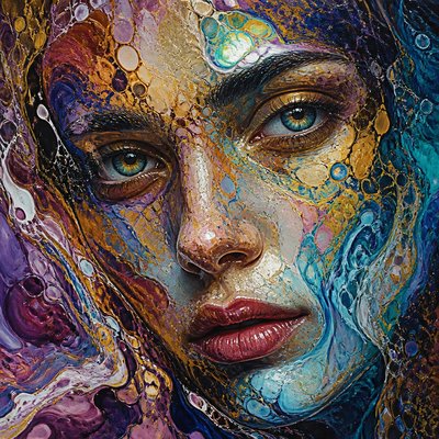
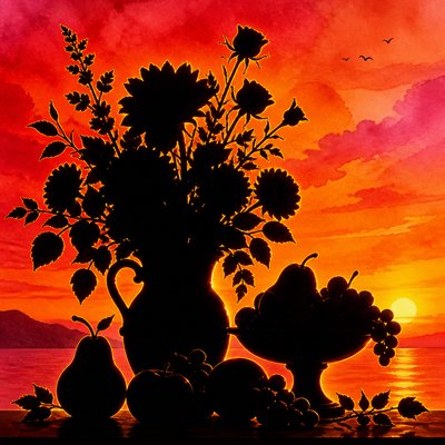
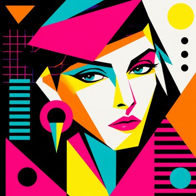
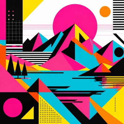
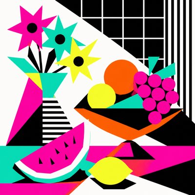
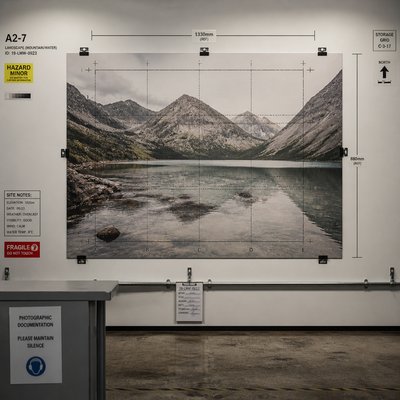
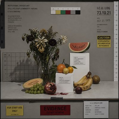
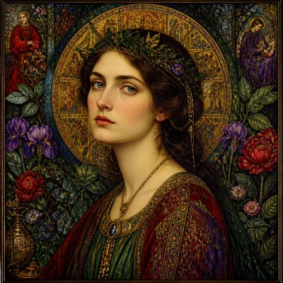
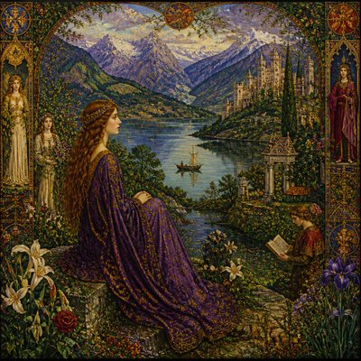
Neutral Colors Art Style
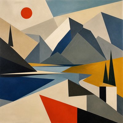
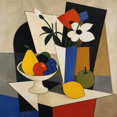
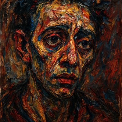
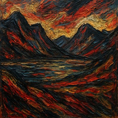
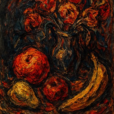
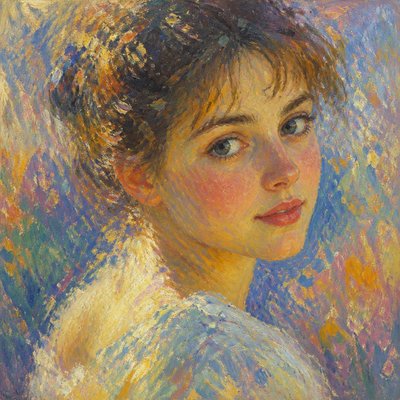
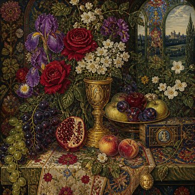
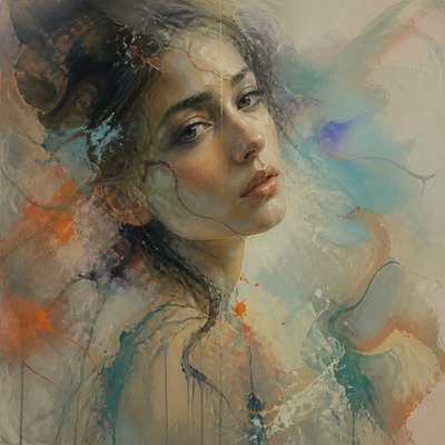
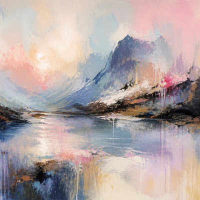
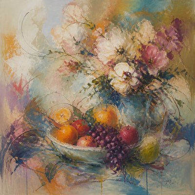
Explore Neutral Colors Art Style: muted grays, browns, and soft blacks create restrained, earthy images with timeless calm.
Instantly rendered in Neutral Colors — or transform a photo
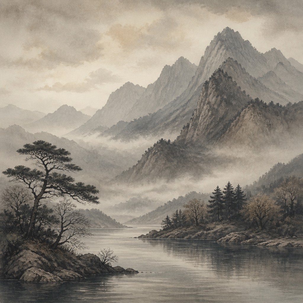
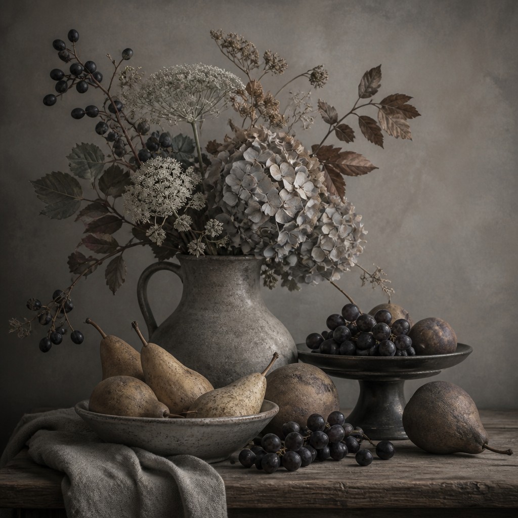
Neutral Colors Gallery
Tap any artwork to explore it
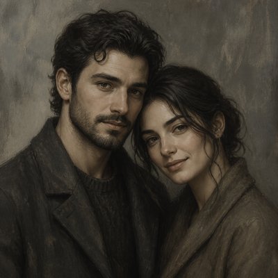
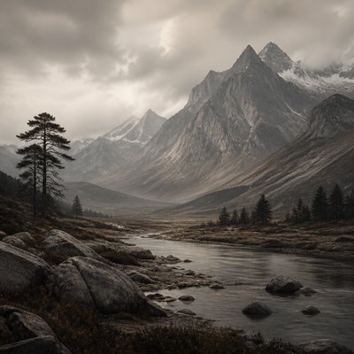
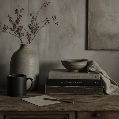
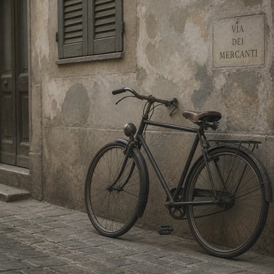
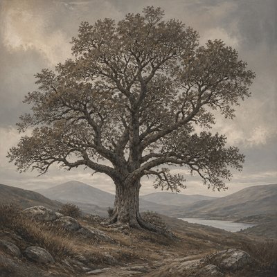
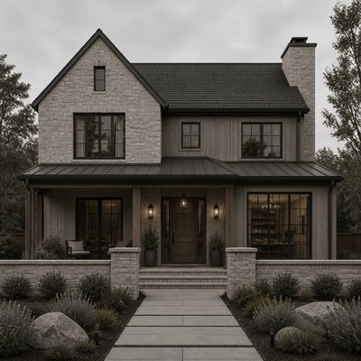
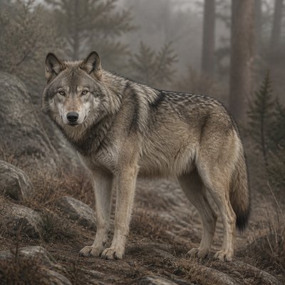
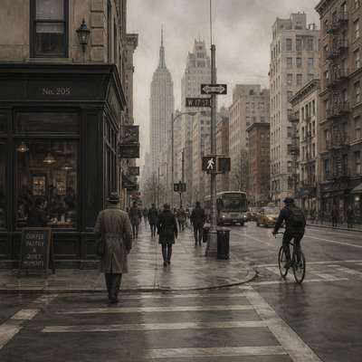
What is Neutral Colors Art Style?
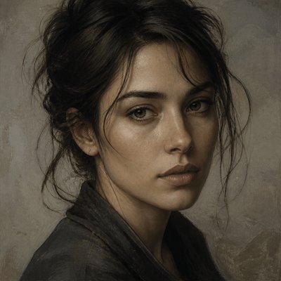
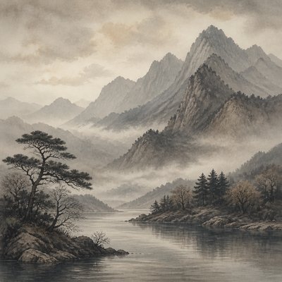
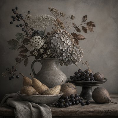
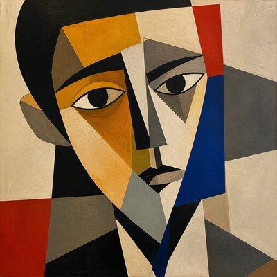
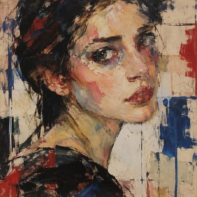
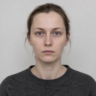
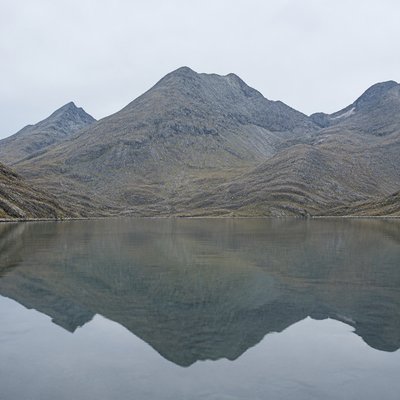
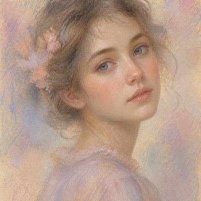
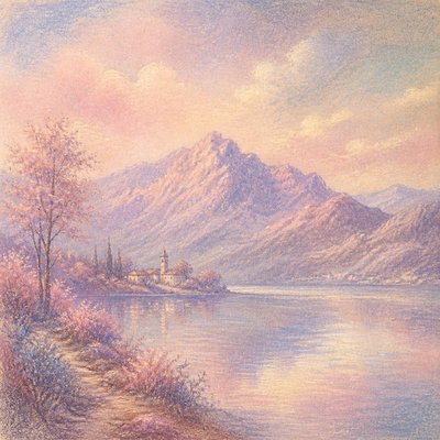
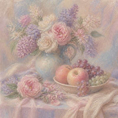
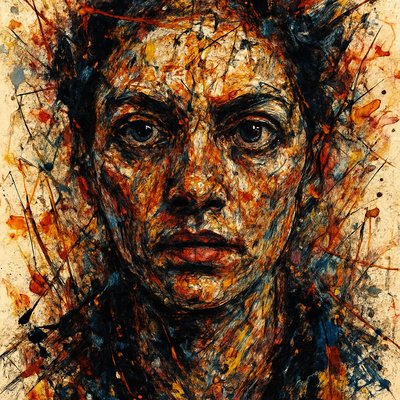
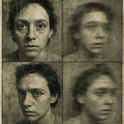
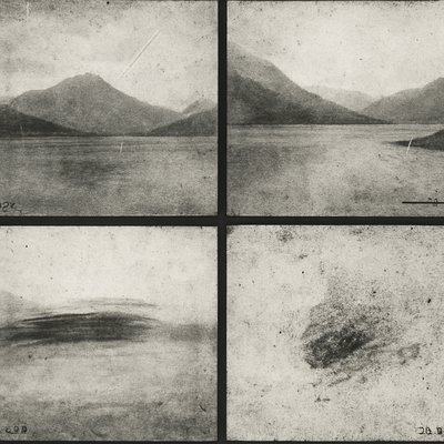
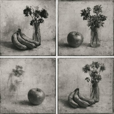
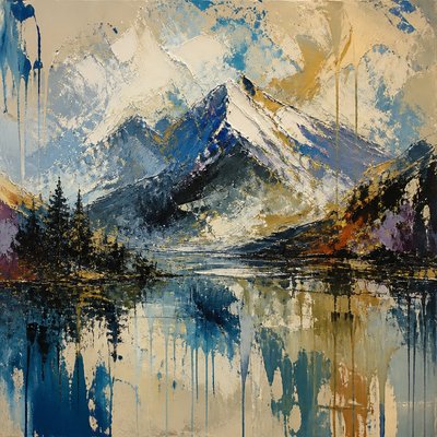
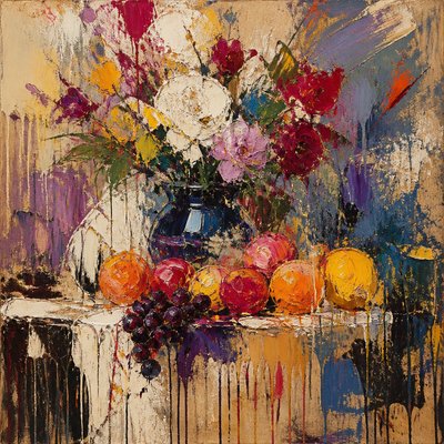
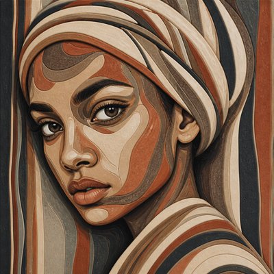
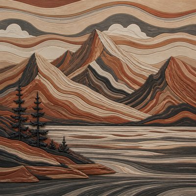
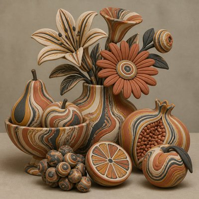
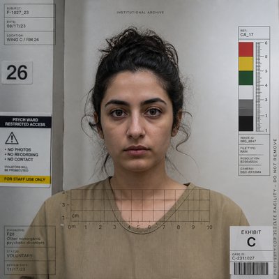
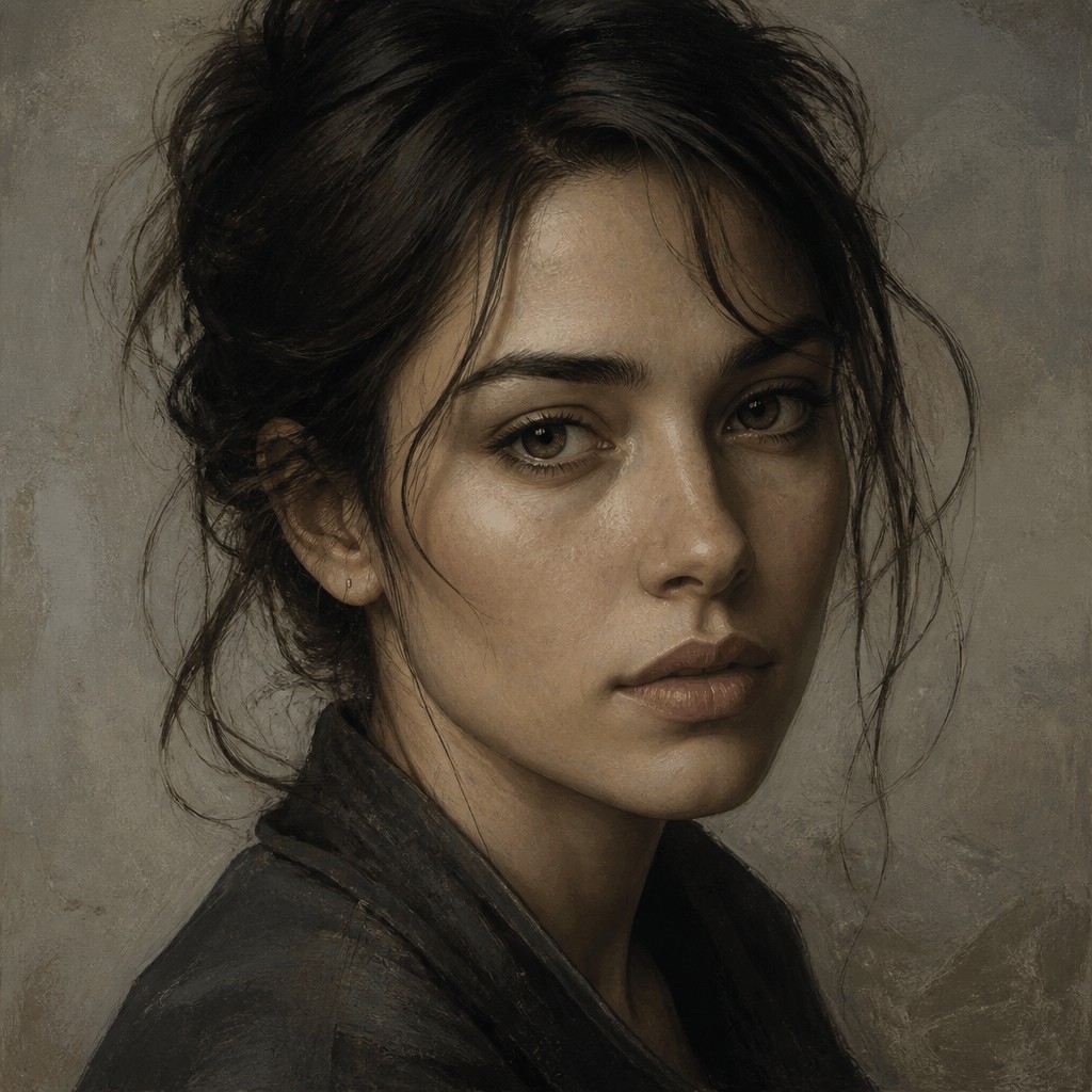
Neutral Colors Art Style is defined by a deliberately restrained palette of muted grays, browns, charcoal, taupe, beige, and near-black. Rather than relying on vivid color contrast, it builds atmosphere through subtle shifts between warm and cool neutrals, allowing texture, value, composition, and light to carry the image.
The result is quiet, earthy, and contemplative. Surfaces may appear weathered, powdery, matte, or gently layered, while shadows remain soft and highlights avoid stark whiteness. This visual restraint can make landscapes feel timeless, portraits introspective, interiors grounded, and abstract compositions materially rich without becoming visually loud.
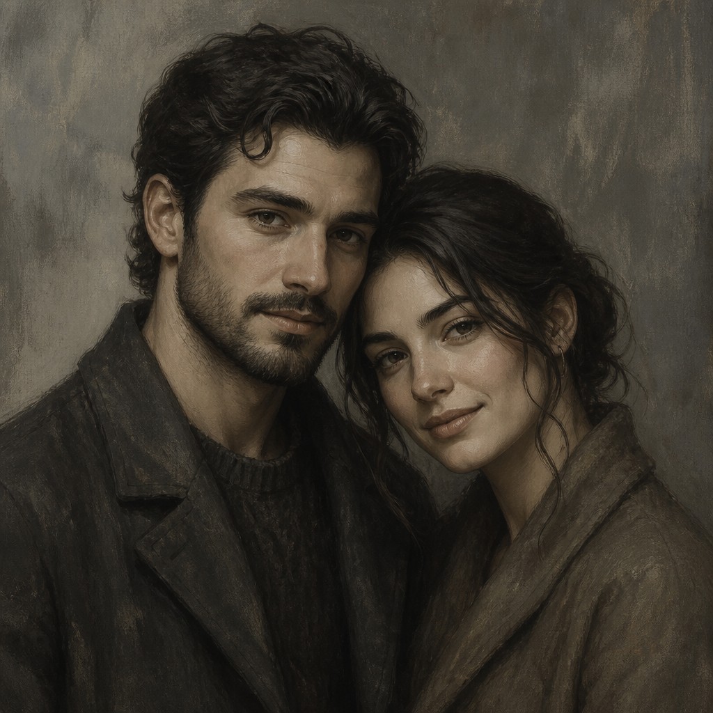
Try It On Your Photos
Upload any photo and convert it into Neutral Colors Art Style — drag the sliders to compare before and after.
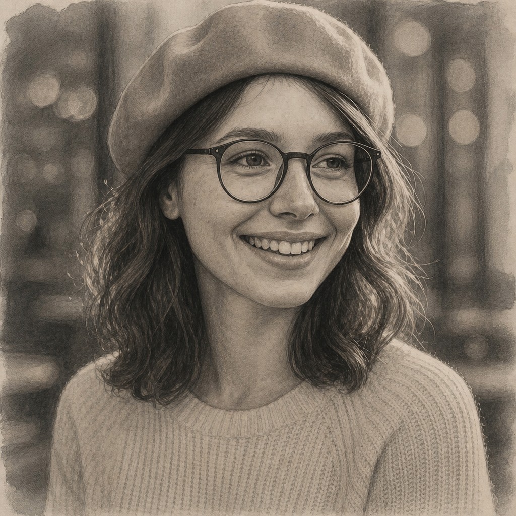

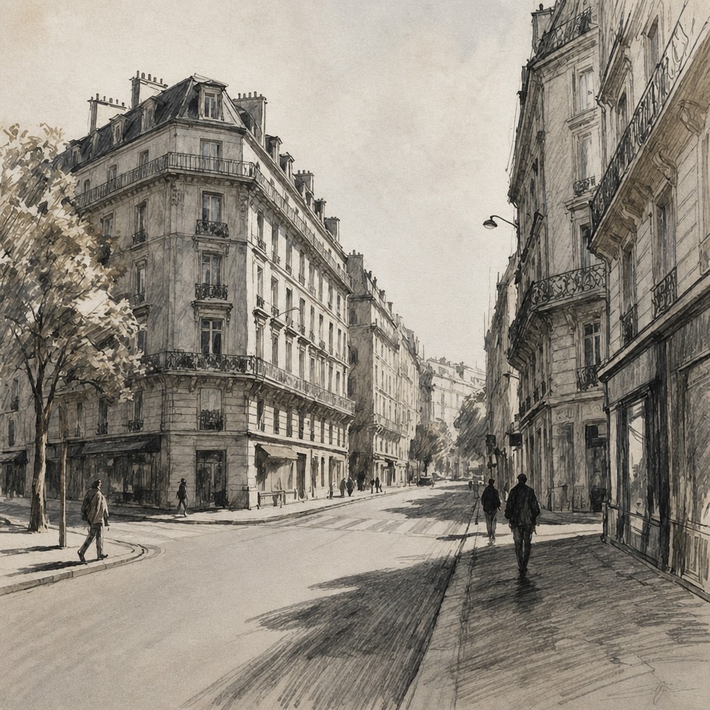

What Defines Neutral Colors Art Style
The signature details, up close
Muted earth palette
Grays, browns, taupes, charcoal, beige, and soft blacks dominate the image. Pure hues are rare and usually appear only as barely perceptible undertones.
Tonal restraint
Visual impact comes from carefully controlled value relationships rather than bright color contrasts. Midtones often occupy much of the composition, producing a measured and cohesive appearance.
Warm and cool shifts
Subtle warm-gray and cool-gray variations prevent the image from feeling flat or mechanically monochrome. Brownish shadows and blue-leaning grays can suggest depth without introducing obvious color.
Softened contrast
Edges and transitions are often gentle, with highlights softened and blacks lifted slightly toward charcoal. Strong contrast may be reserved for a focal object or a small structural detail.
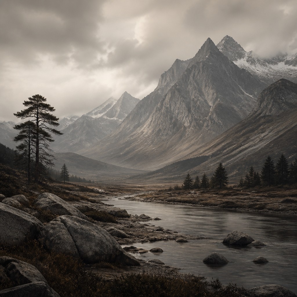
Material surface
Visible grain, brush layering, paper tooth, dust, weathering, or matte digital texture can give the palette tactile presence. Surface variation is especially important when the colors themselves are understated.
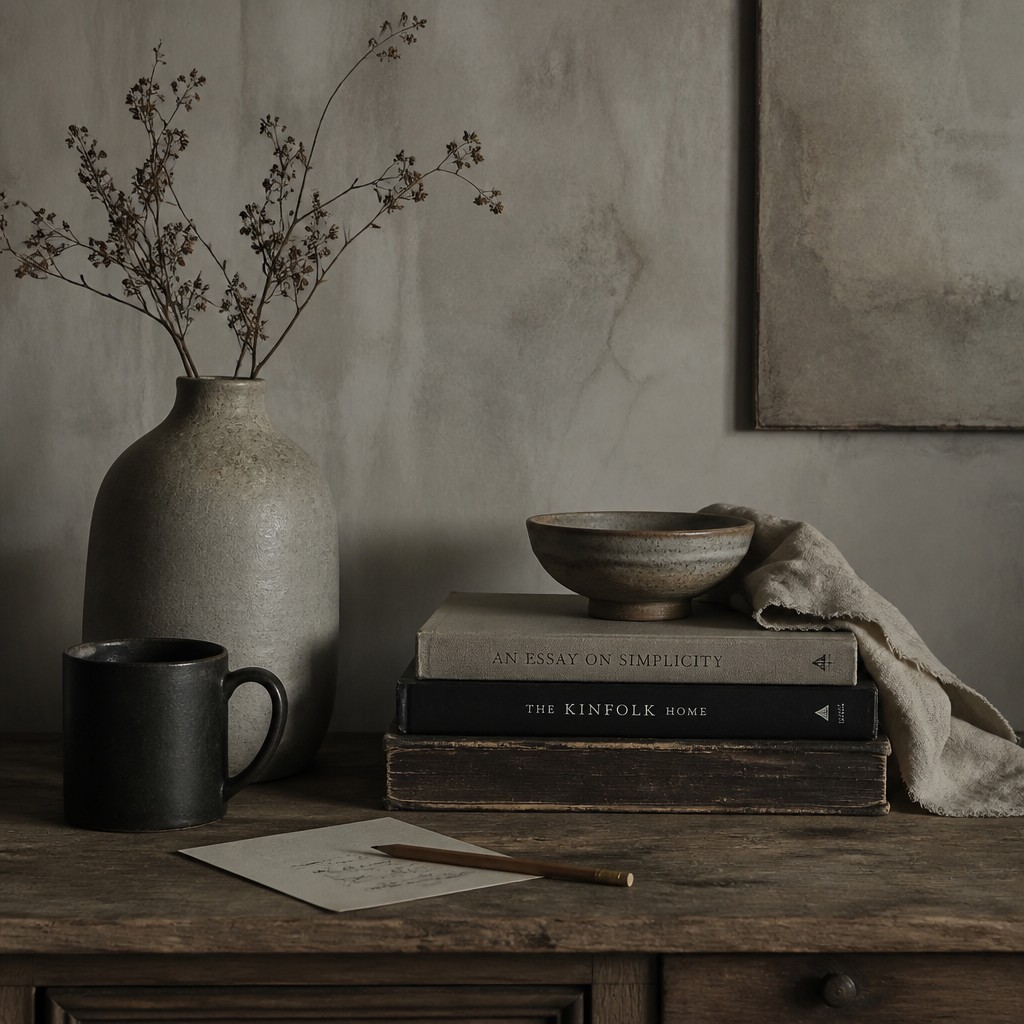
Quiet atmosphere
The style tends toward calm, sobriety, introspection, and timelessness. Empty space, still poses, subdued lighting, and unhurried compositions reinforce its contemplative mood.
Neutral Colors Prompt Ideas
Start from an idea — each one opens the generator with the style ready to go. See all 40 Neutral Colors prompts →
How to Create Neutral Colors Art
Master the craft step by step — or skip straight to creating. Read the full guide →
- 1
Build a restricted palette
Begin with a small selection of warm gray, cool gray, muted brown, charcoal, and off-white pigments or digital swatches. Check the image in grayscale to ensure that its structure remains legible without saturated color.
- 2
Work through layered values
Establish the broad middle values first, then add darker accents and restrained highlights. In painting or drawing, thin washes, dry brush, graphite, charcoal, or earth pigments can create nuanced transitions.
- 3
Use texture selectively
Add paper grain, canvas weave, dusty edges, plaster, wood, or film-like noise to support the material character. Keep texture subordinate to the subject so the surface does not overwhelm the quiet palette.
- 4
Control the lighting
Choose overcast daylight, window light, dusk, or a broad diffused source for gentle modeling. Avoid excessive specular highlights unless a small reflective detail is meant to anchor the composition.
- 5
Simplify the composition
Reduce competing details and organize the image around clear masses, silhouettes, and negative space. A limited palette is most effective when the subject has a readable shape and deliberate visual hierarchy.
- 6
Write precise generation prompts
Describe the subject first, then specify muted grays, browns, soft blacks, desaturated earth tones, subtle warm-cool shifts, matte texture, and restrained contrast. Request the absence of neon colors or bright saturation when a particularly subdued result is needed.
The Story
History & Origins of Neutral Colors
Neutral Colors Art Style is a contemporary descriptive style rather than a formally established historical movement. Its aesthetic lineage comes from monochromatic and limited-palette painting, tonal drawing, sepia photography, charcoal studies, earth-pigment traditions, and modern minimalist approaches to composition.
Digital imaging and text-based image creation have made this restrained palette easy to apply across many subjects and media. The style develops through the deliberate reduction of saturation: instead of removing color entirely, it preserves faint warm and cool undertones that give otherwise subdued images depth and atmosphere.
Influences: The style relates to monochromatic painting, tonalism, grisaille, charcoal and graphite drawing, sepia and low-saturation photography, earth-pigment painting, Japanese and Scandinavian restraint, minimalist composition, and weathered industrial or rural imagery. It also shares with documentary photography and contemporary digital matte work an interest in atmosphere, surface, and quiet observation rather than chromatic spectacle.
Frequently Asked Questions
What defines Neutral Colors Art Style?
It is defined by a limited palette of muted grays, browns, taupes, charcoal, and soft blacks. The image relies on value, texture, lighting, and composition instead of vivid hue or strong saturation.
Is this style the same as black and white art?
No. Black and white work removes color almost completely, while this style retains subdued brown, beige, and warm or cool gray undertones. Those small color differences create a more earthy and materially varied appearance.
How can I make a photograph look like this?
Lower saturation carefully rather than converting immediately to monochrome, then shift the remaining colors toward warm grays, browns, taupes, and charcoal. Reduce harsh highlights, soften excessive contrast, and add restrained grain or matte texture if appropriate.
Does the style have a specific historical origin?
It is not a formally recognized historical movement with a single point of origin. Instead, it combines established traditions including tonal painting, limited-palette drawing, sepia photography, earth-pigment art, and minimalist visual design.
What subjects work well with this palette?
Landscapes, architecture, still lifes, portraits, interiors, weathered objects, and contemplative conceptual scenes all suit the approach. Subjects with visible texture, strong silhouettes, or atmospheric depth are especially effective.
How do I prevent the image from looking dull?
Use variation within the neutral range: combine warm and cool grays, distinguish matte and reflective surfaces, and preserve a clear hierarchy of light and dark. A few carefully placed near-black accents or pale highlights can provide structure without breaking the restraint.
Create your first Neutral Colors artwork
Describe anything — or upload a photo — and see it in Neutral Colors Art Style in seconds.
Related Styles
Discover similar art styles