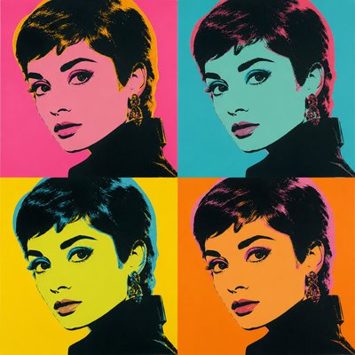
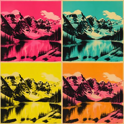
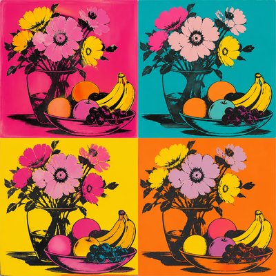
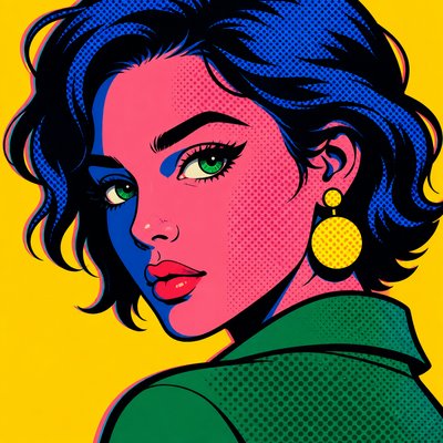
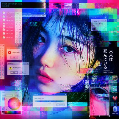
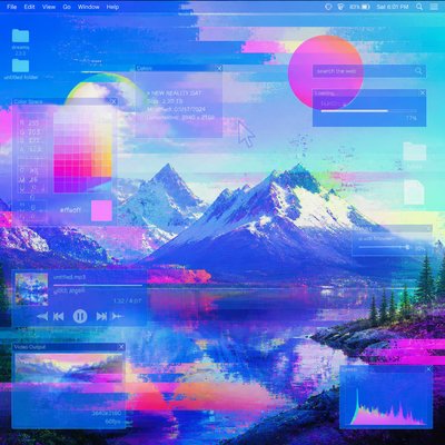
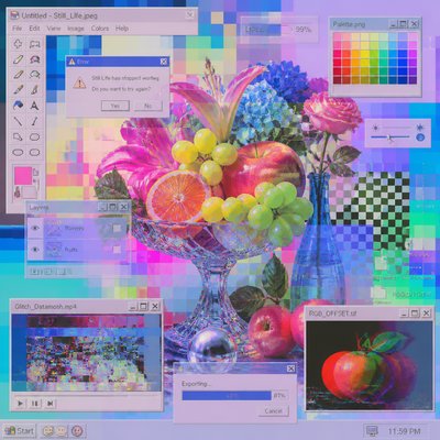
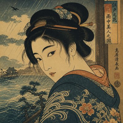
Screen Print Style
Explore screen print style: bold flat inks, hard edges, limited palettes, mesh texture, layered stencils, and expressive registration offsets.
Instantly rendered in Screen Print — or transform a photo
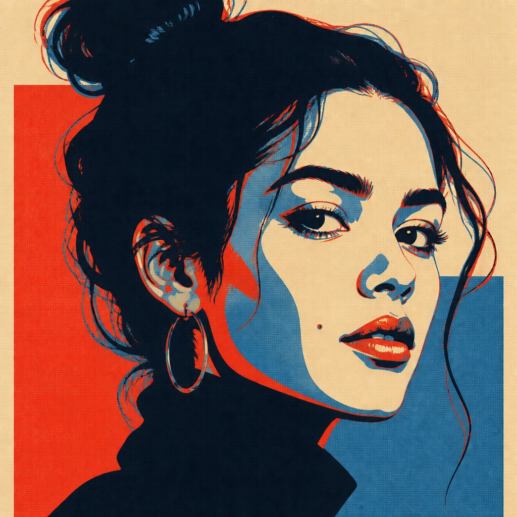
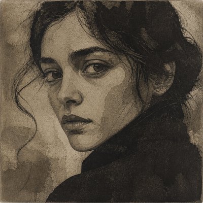
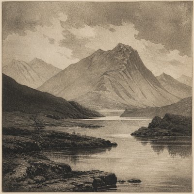
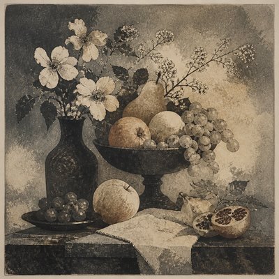
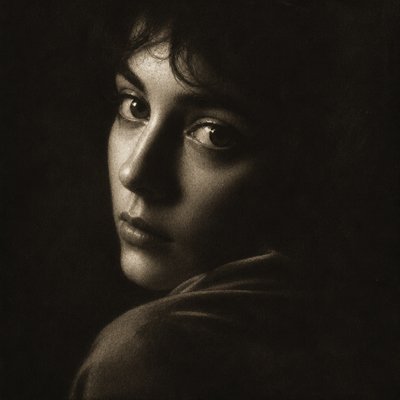
Screen Print Gallery
Tap any artwork to explore it


What is Screen Print Style?
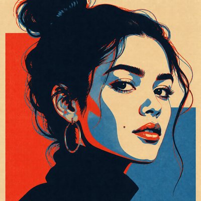
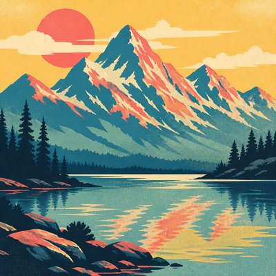
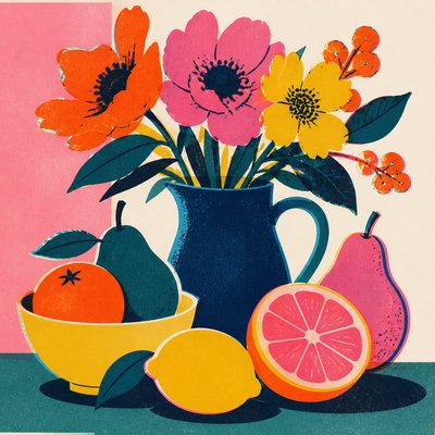
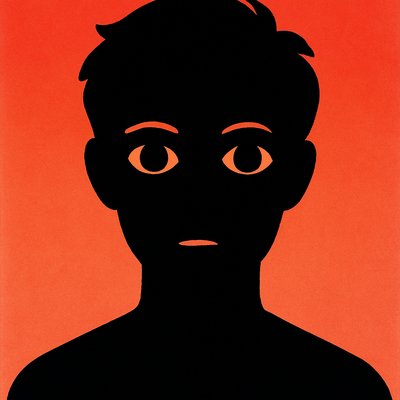
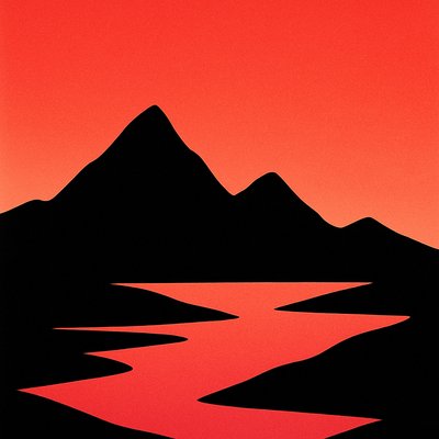
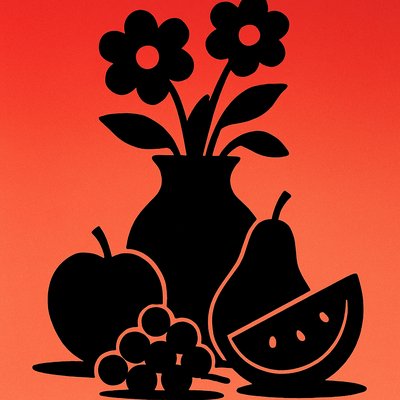
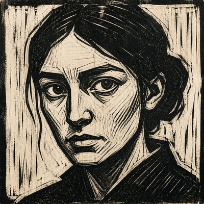
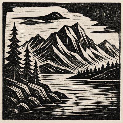
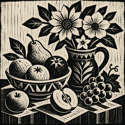
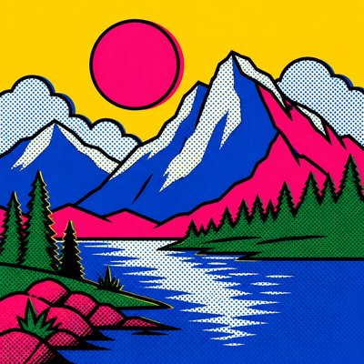
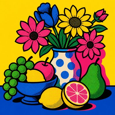
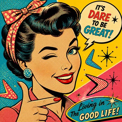
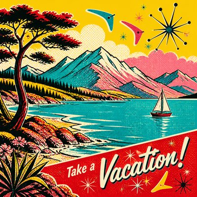
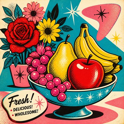
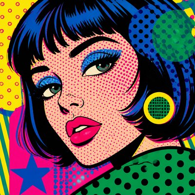
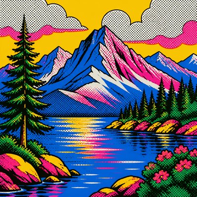
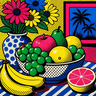
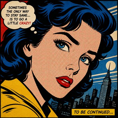
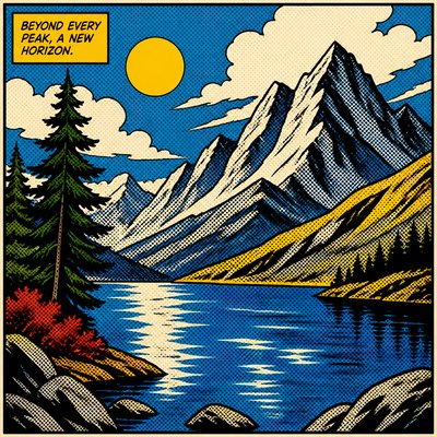
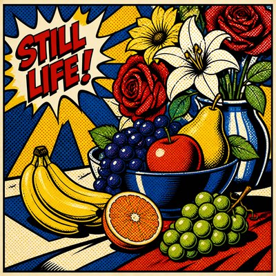
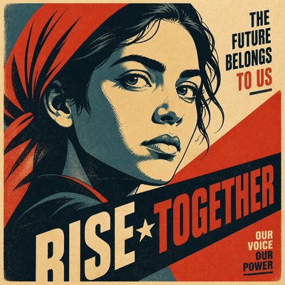
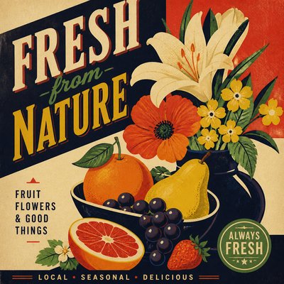
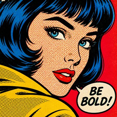
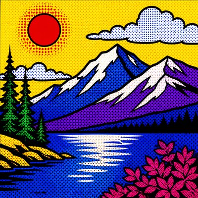
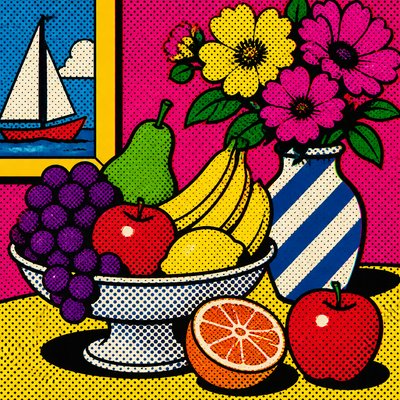
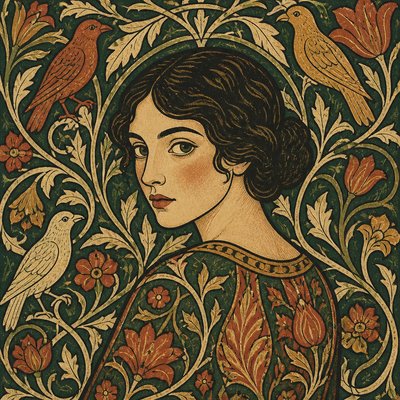
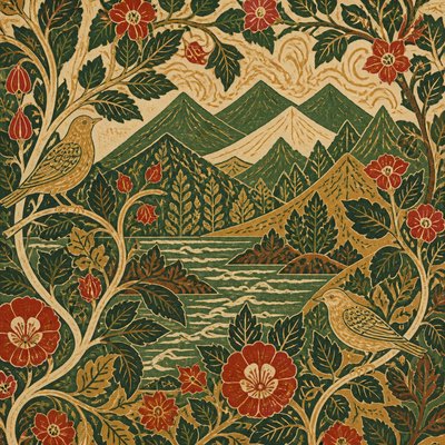
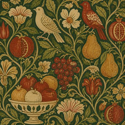
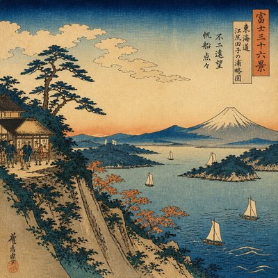
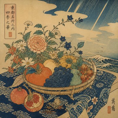
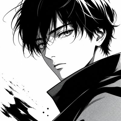
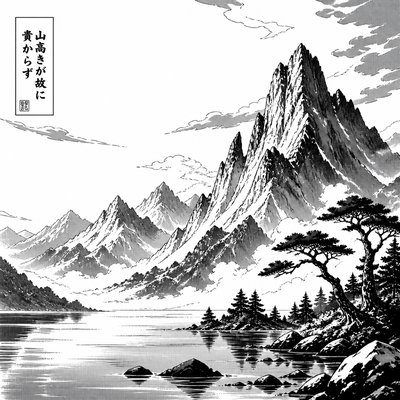
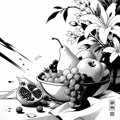
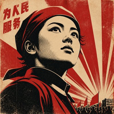
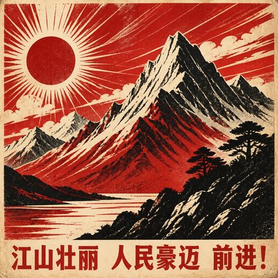
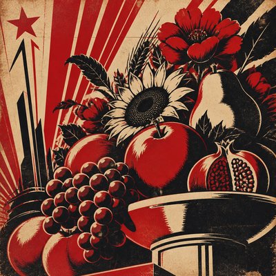
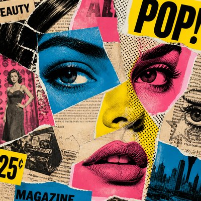
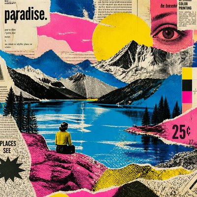
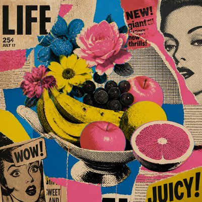
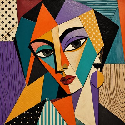
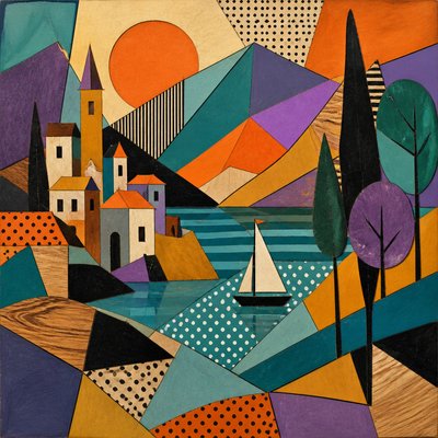
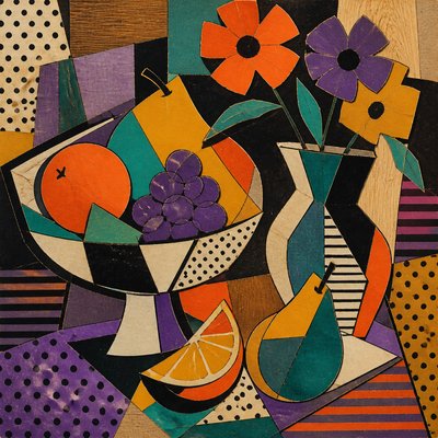
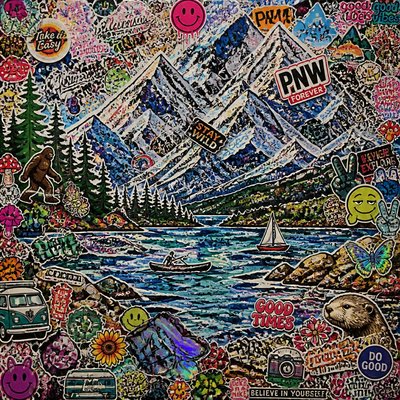
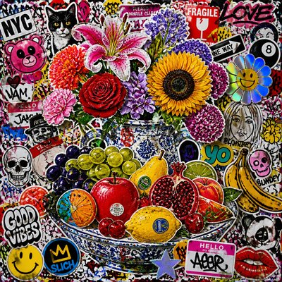
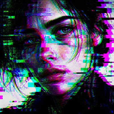
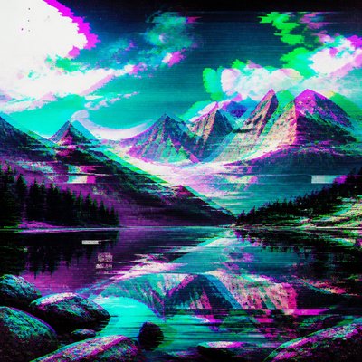
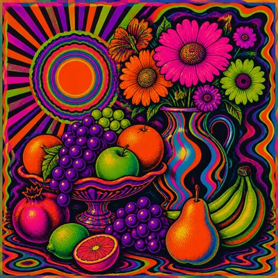
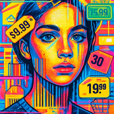
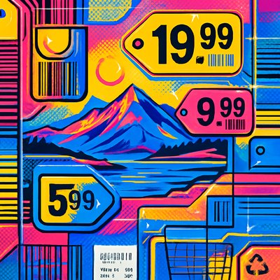
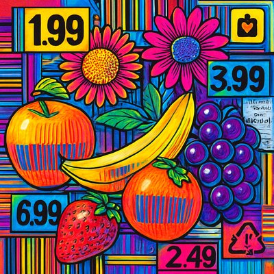
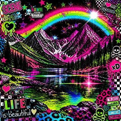
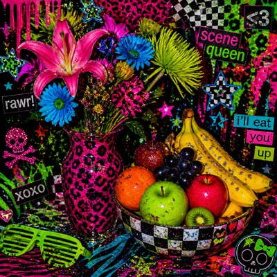
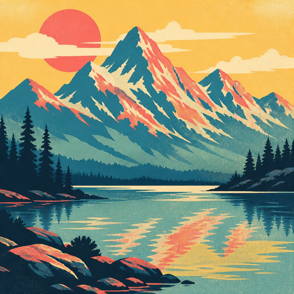
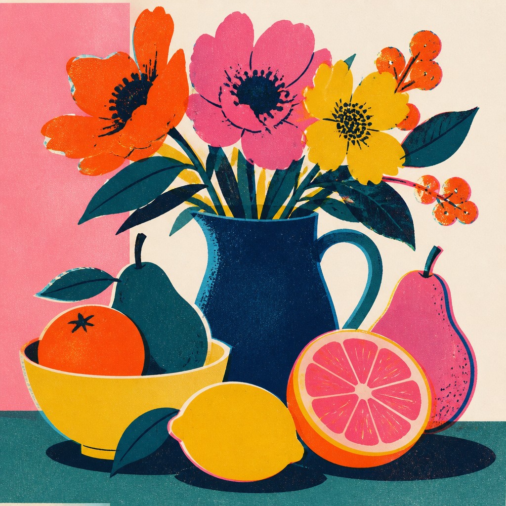
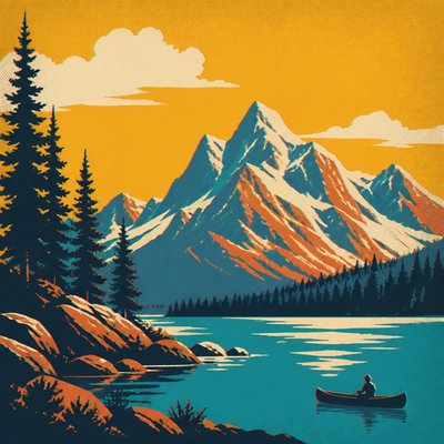
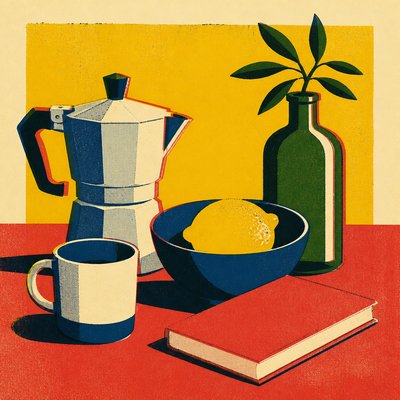
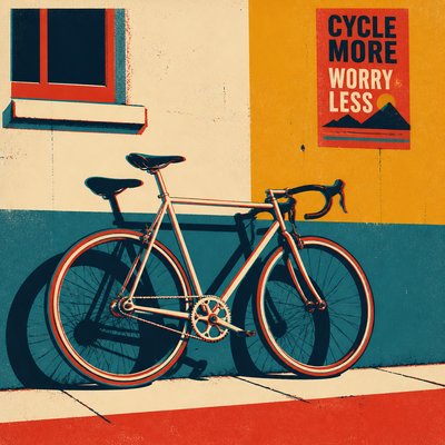
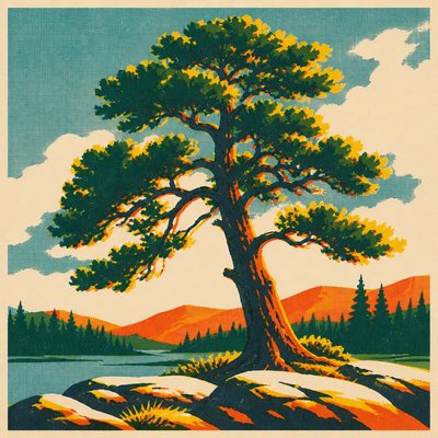
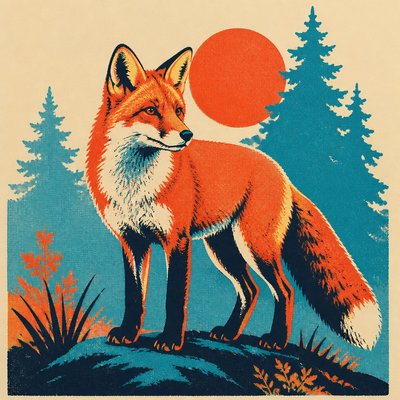
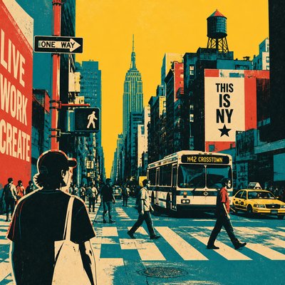
Screen print style is a graphic visual language built from flat, opaque areas of ink separated by crisp edges. Images are commonly reduced to a limited palette, then constructed as overlapping stencil-like shapes rather than modeled with continuous shading. Slight registration offsets, visible color layers, and occasional imperfections give the result a tactile printed character.
Its visual identity comes from the mechanics of forcing ink through a prepared mesh onto paper, fabric, or another surface. Each color is usually applied as a separate layer, so the final image may show deliberate overlaps, small misalignments, halftone passages, and subtle mesh or ink texture. The effect is direct, poster-like, and highly legible at a distance while retaining handmade evidence up close.
Try It On Your Photos
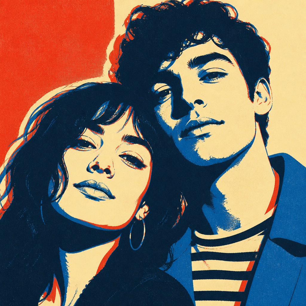
Upload any photo and convert it into Screen Print Style — drag the sliders to compare before and after.



What Defines Screen Print Style
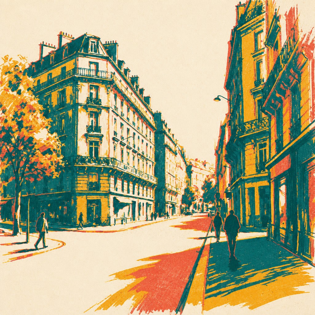
The signature details, up close
Flat opaque color
Color appears in solid, confident fields rather than gradual painterly modeling. Limited palettes make each hue function as a clear graphic component.
Hard-edged shapes
Forms are defined by clean contours and simplified silhouettes. Detail is selectively removed so the subject remains readable through a small number of printable shapes.
Layered color separation
The image is organized into distinct color layers that overlap or interact. Secondary tones may emerge where transparent or semi-opaque inks meet.
Registration offsets
Tiny shifts between color layers create a lively misaligned edge, often called registration error. The offset may be subtle and controlled rather than purely accidental.
Mesh and ink texture
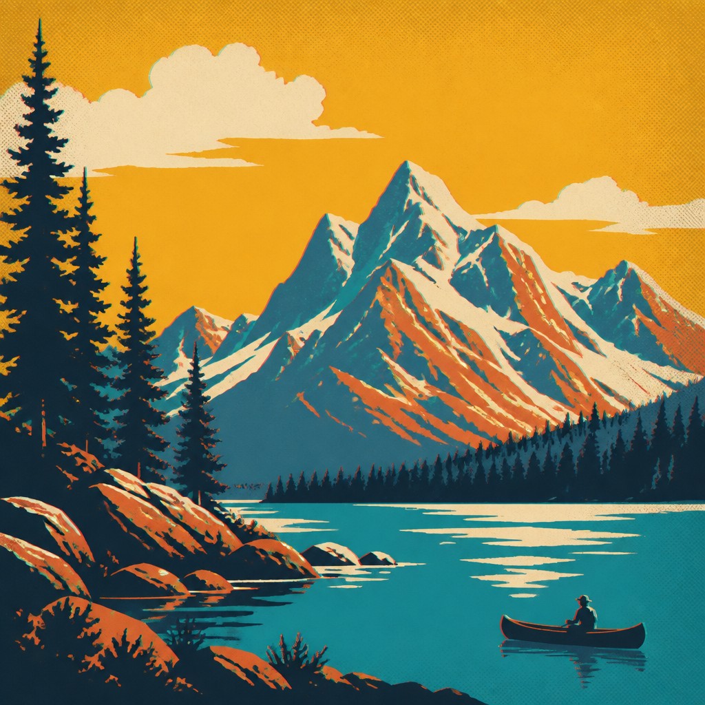
Solid areas can contain fine mesh grain, uneven ink coverage, or slightly rough edges. These marks suggest a physical print surface and prevent digital color fields from feeling sterile.
Stencil-based simplification
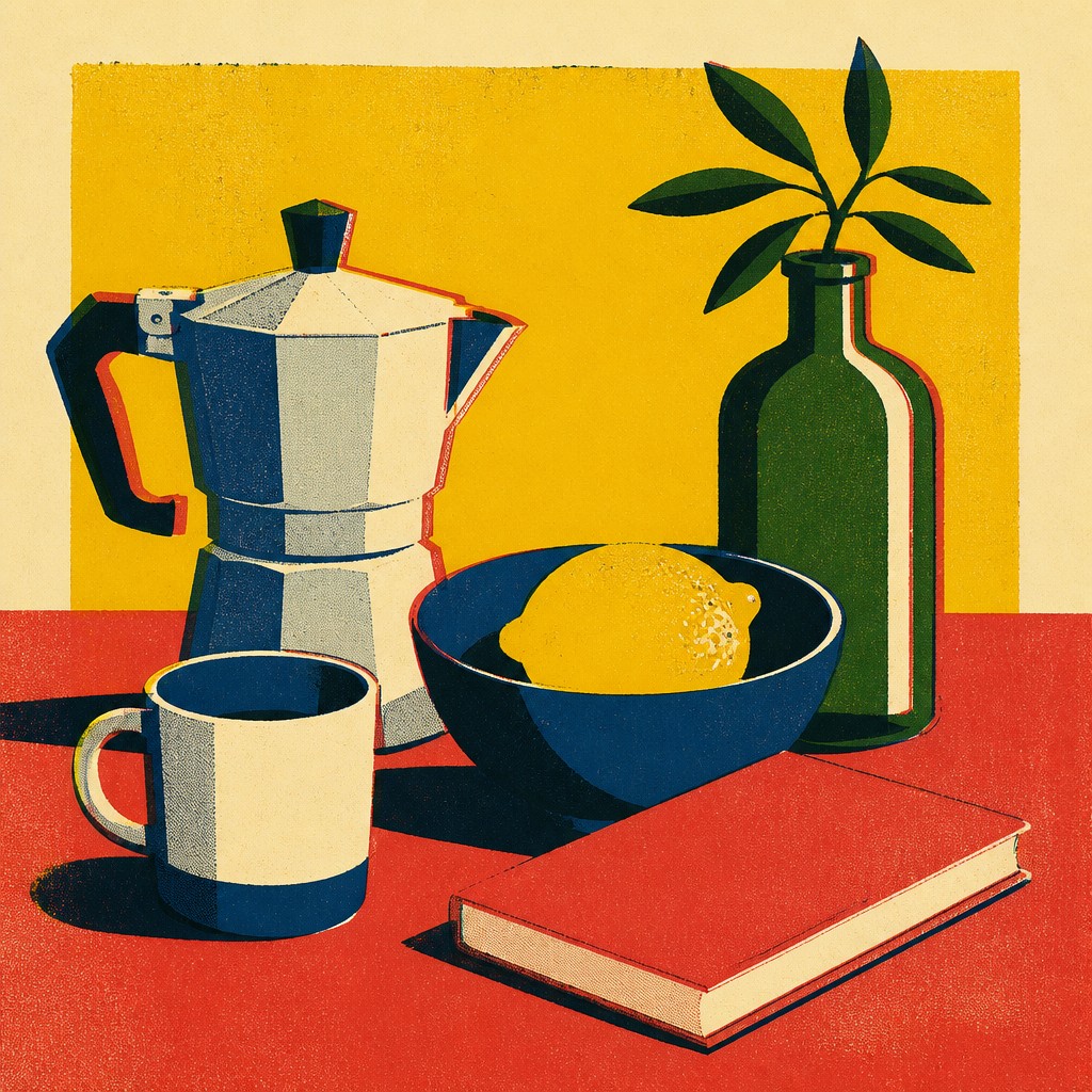
Shadows, highlights, and internal details are translated into bold cutout shapes, graphic marks, or restrained halftones. Tonal information is compressed into a small visual vocabulary.
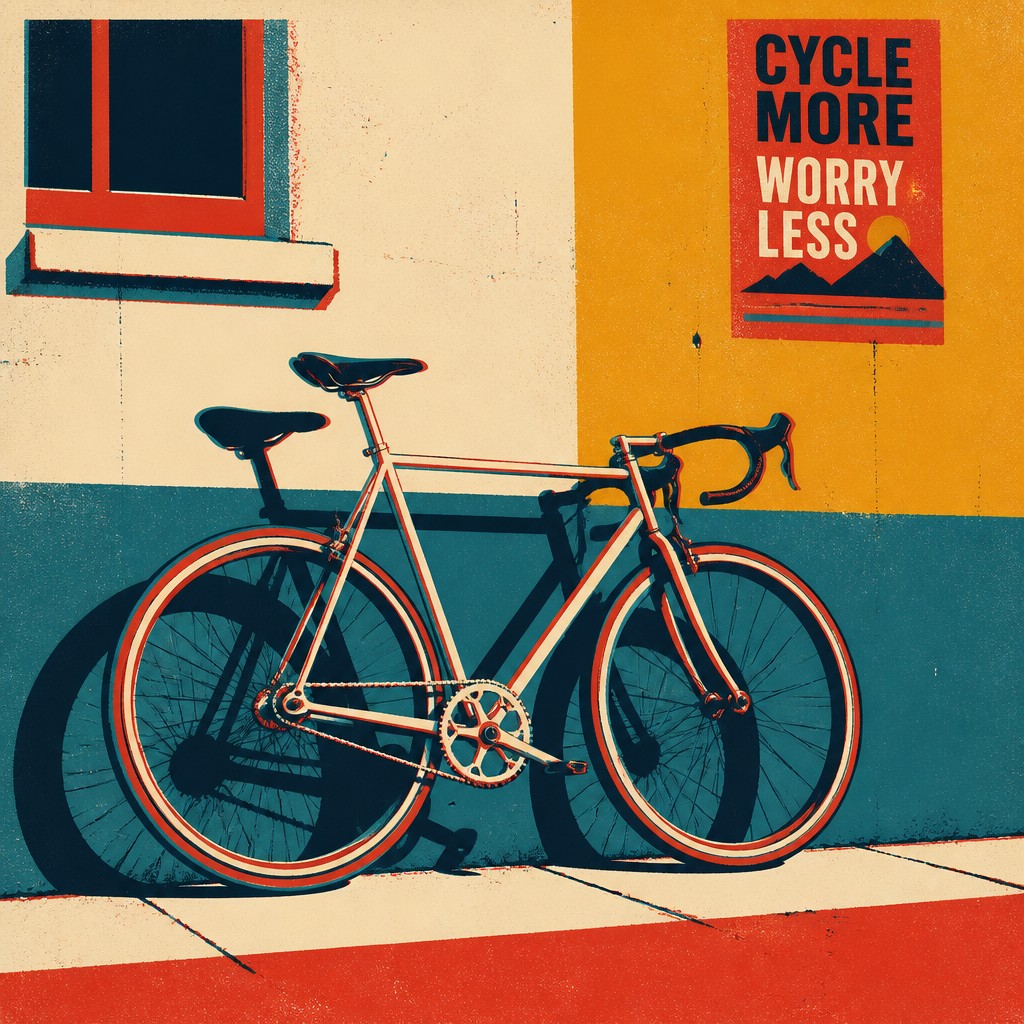
Poster-like composition
Strong silhouettes, emphatic cropping, and clear visual hierarchy support immediate recognition. Typography, borders, and emblematic framing often complement the image.
Try It
Create Videos in Screen Print Style
Styles aren't just for stills — describe a scene or animate an image and get a short video rendered in Screen Print. Press play to see this pond come to life.
Make a VideoScreen Print Prompt Ideas
Start from an idea — each one opens the generator with the style ready to go. See all 40 Screen Print prompts →
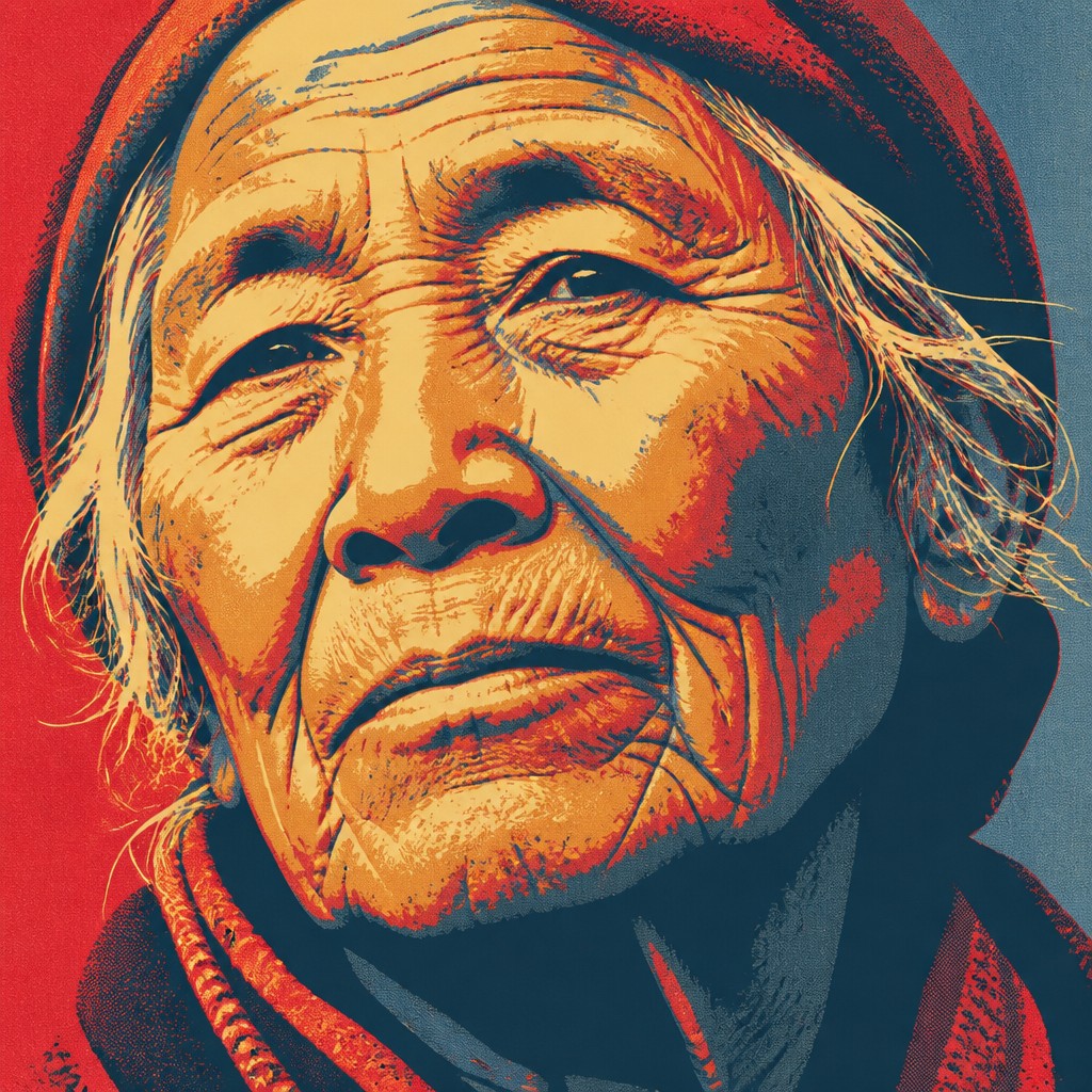
“close-up portrait of an elderly person with expressive weathered features”
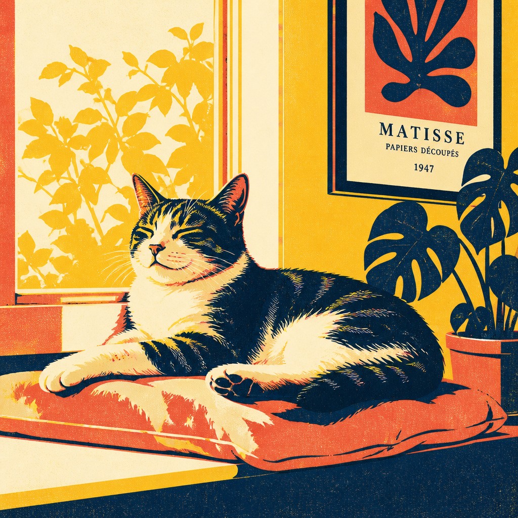
“a cat lounging in a sunlit window”
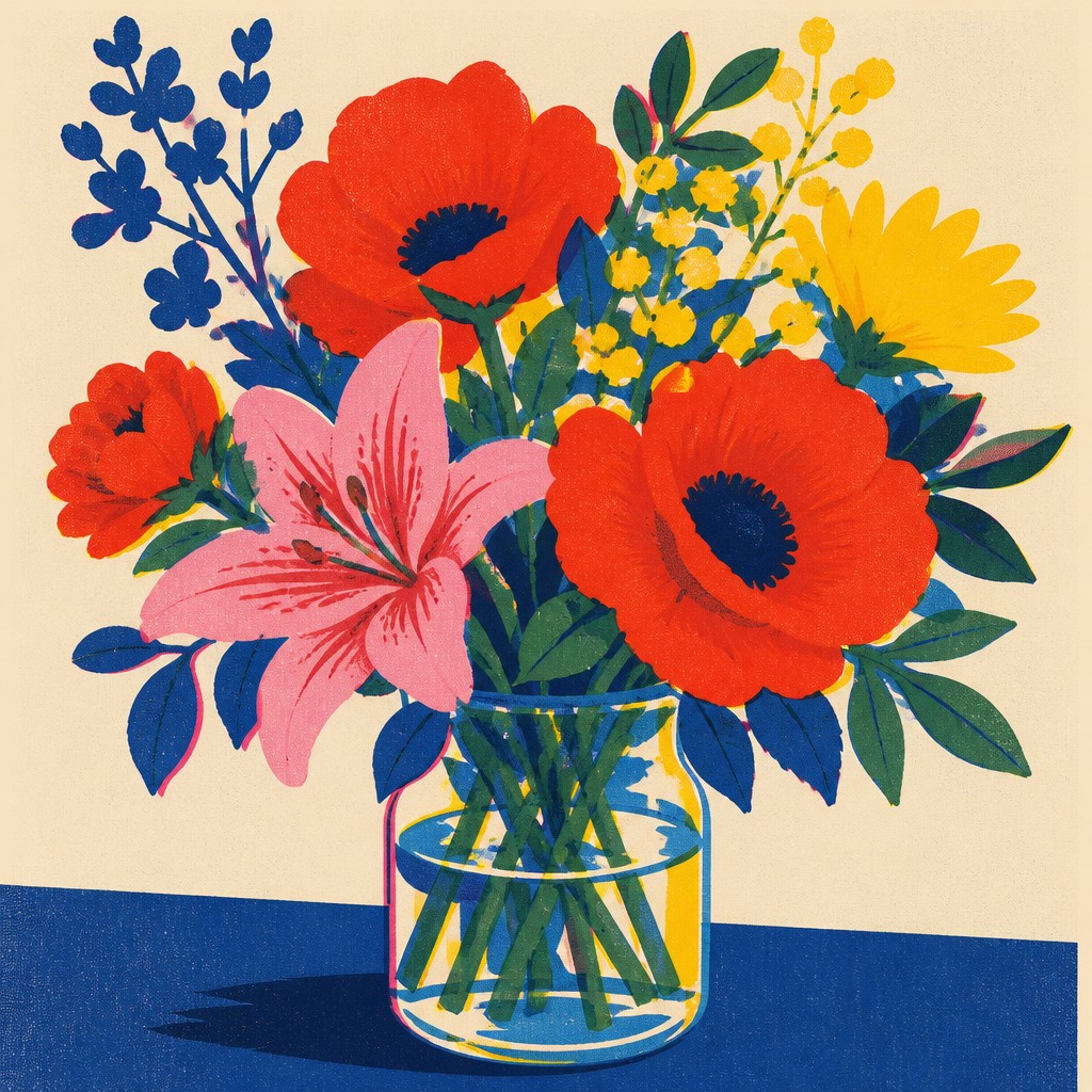
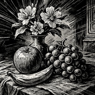
“bouquet of flowers in a glass vase”
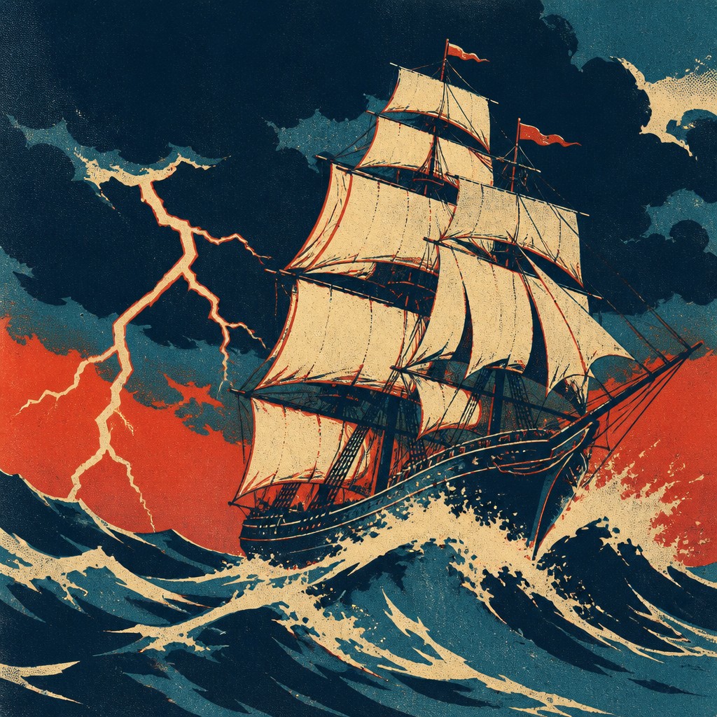
“sailing ship on a stormy sea”
How to Create Screen Print Art
Master the craft step by step — or skip straight to creating. Read the full guide →
- 1
Plan separate color layers
Reduce the reference to a small palette and assign each color its own layer or stencil. Test the layers in grayscale first to ensure the composition still has a clear value structure.
- 2
Build with bold shapes
Use vector paths, cut-paper forms, or opaque painted masks for clean contours. Replace soft gradients with stepped shapes, selective halftones, or overlapping blocks of color.
- 3
Introduce physical irregularity
Add restrained mesh grain, uneven ink density, and small edge imperfections after the main forms are established. Shift one or two color layers slightly to suggest manual registration.
- 4
Control the palette
Choose two to six punchy colors with a deliberate relationship between dark, midtone, and accent. Overprinting or transparent layers can create additional colors without expanding the base palette.
- 5
Use digital production methods
In raster software, work with masks and thresholded selections; in vector software, use stacked shapes and spot-color layers. Keep texture as a separate overlay so the underlying forms remain crisp and editable.
- 6
Write precise generation prompts
Specify a flat limited palette, opaque layered inks, hard clean edges, stencil-like shapes, slight registration offsets, and subtle mesh texture. Name the subject, composition, lighting hierarchy, and background so the graphic treatment does not obscure the intended image.

The Story
History & Origins of Screen Print
Screen print style is rooted in stencil printing and the development of commercially practical screen-printing processes in the late nineteenth and early twentieth centuries. The method became important for posters, signage, packaging, textiles, and editorial reproduction because it could deposit dense color on both paper and uneven surfaces. Its visual conventions were shaped by separate color separations, reusable screens, opaque inks, and the need to simplify imagery into printable shapes.
During the twentieth century, screen printing became closely associated with political posters, advertising, underground publishing, music graphics, fine-art editions, and mass visual culture. Contemporary versions draw from these traditions while using digital separations, vector shapes, simulated halftones, and texture overlays to recreate the physical logic of layered ink without requiring a press.
Influences: The style draws on stencil printing, commercial screen printing, color-separation methods, modernist poster design, constructivist and Bauhaus-influenced graphic reduction, political poster traditions, comic-book flat color, and twentieth-century pop and underground print culture. It also shares techniques with risograph-like layering, woodcut simplification, linocut texture, and contemporary vector illustration, while retaining the distinctive logic of opaque ink passed through mesh.
Frequently Asked Questions
What defines screen print style?
It is defined by flat opaque color, crisp edges, a limited palette, and imagery organized into separate layers. Slight registration offsets, stencil-like simplification, and subtle mesh or ink texture reinforce the impression of a physical print.
Is screen print style the same as a screen-printed photograph?
Not necessarily. A photograph can be converted into a screen print through thresholding, halftones, and color separation, but the style often begins with illustration or simplified shapes rather than photographic detail.
How does it differ from a flat vector illustration?
Both use clean shapes and limited shading, but screen print style usually adds layered spot-color logic, tactile ink variation, and controlled misregistration. A purely vector image tends to have more uniform edges and perfectly consistent fills.
How many colors should a screen print-style image use?
Two to six main colors is a practical range for a convincing result, although more layers are possible. The strongest examples assign each color a clear structural role and use overlaps or halftones to create additional tonal variety.
Can this style be created digitally?
Yes. Separate masks, spot-color layers, thresholded photographs, vector shapes, and texture overlays can reproduce the process digitally. The result feels more authentic when texture and registration shifts are applied selectively rather than uniformly.
Where is screen print style commonly used?
It is widely used for posters, editorial graphics, apparel, album and event artwork, packaging, signage, stickers, zines, and limited-edition prints. Its strong silhouettes and economical palette also make it effective for icons and social graphics.
Create your first Screen Print artwork
Describe anything — or upload a photo — and see it in Screen Print Style in seconds.
Related Styles
Discover similar art styles