Aquatint Print Style
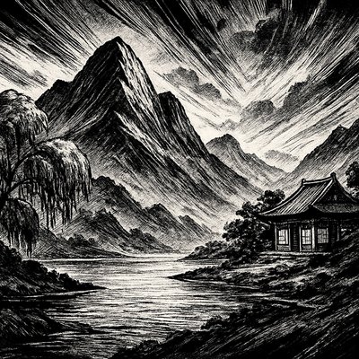
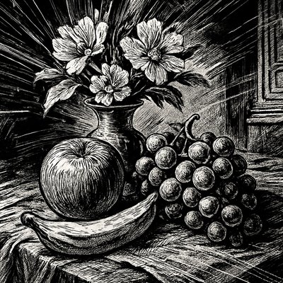
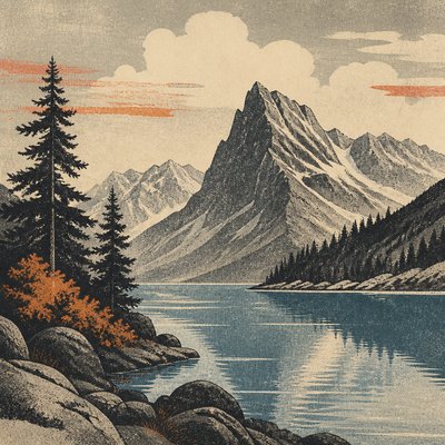
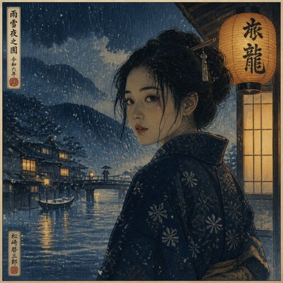
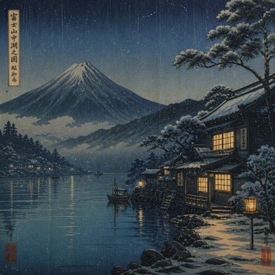
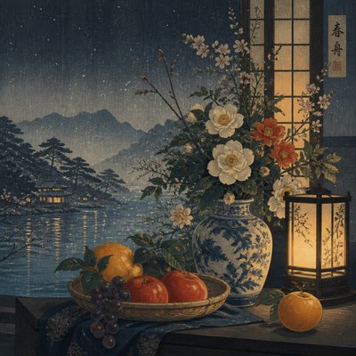
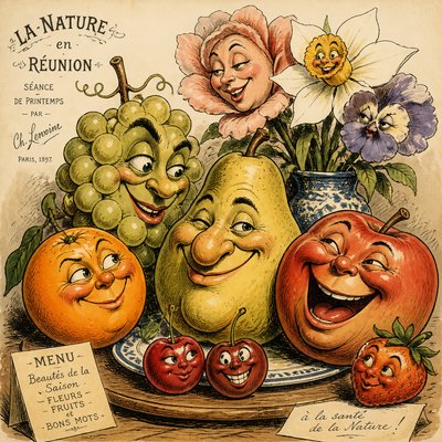
Explore aquatint print style: granular etched washes, muted gray and sepia tones, atmospheric texture, and crisp engraved detail.
Instantly rendered in Aquatint Print — or transform a photo
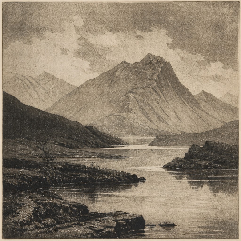
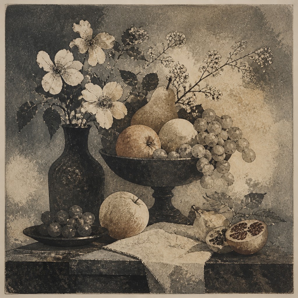
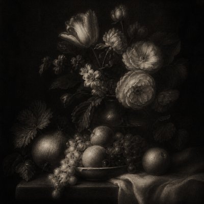
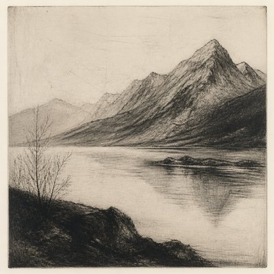
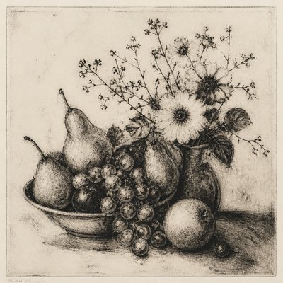
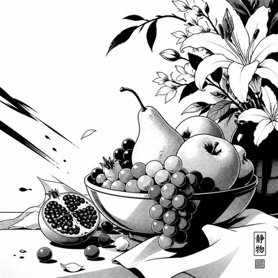
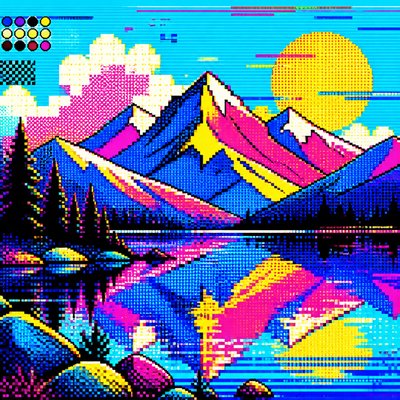
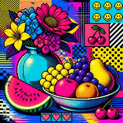
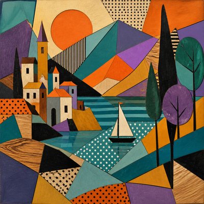
Aquatint Print Gallery
Tap any artwork to explore it

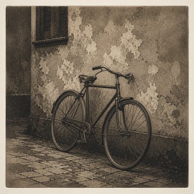
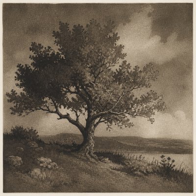
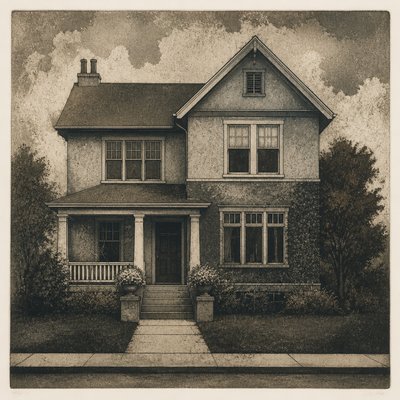
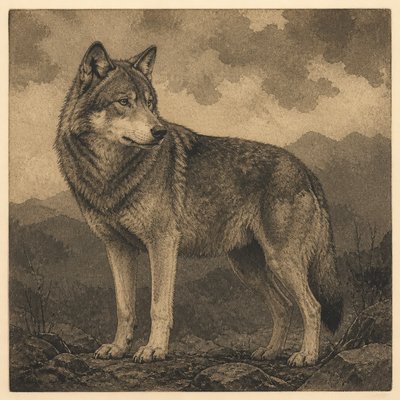
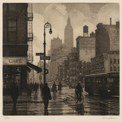
What is Aquatint Print Style?
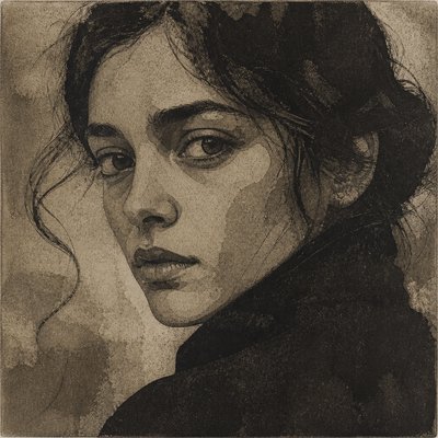
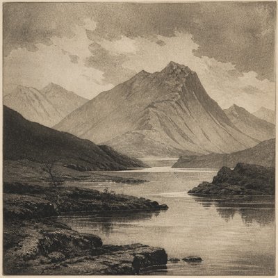
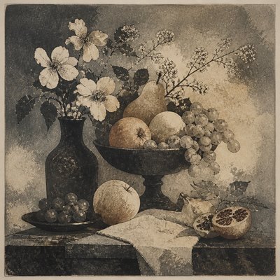
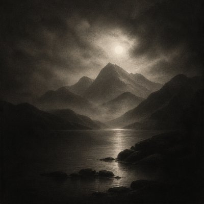
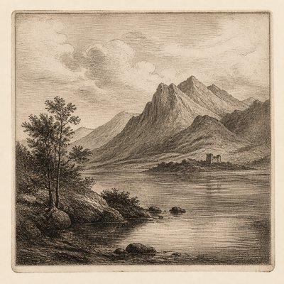
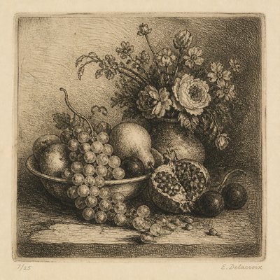
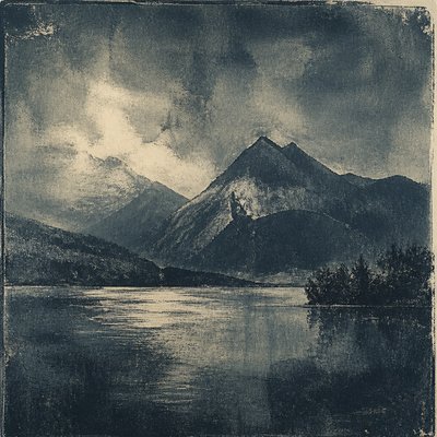
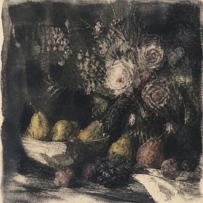
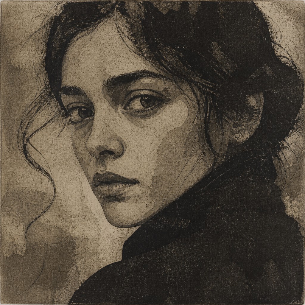
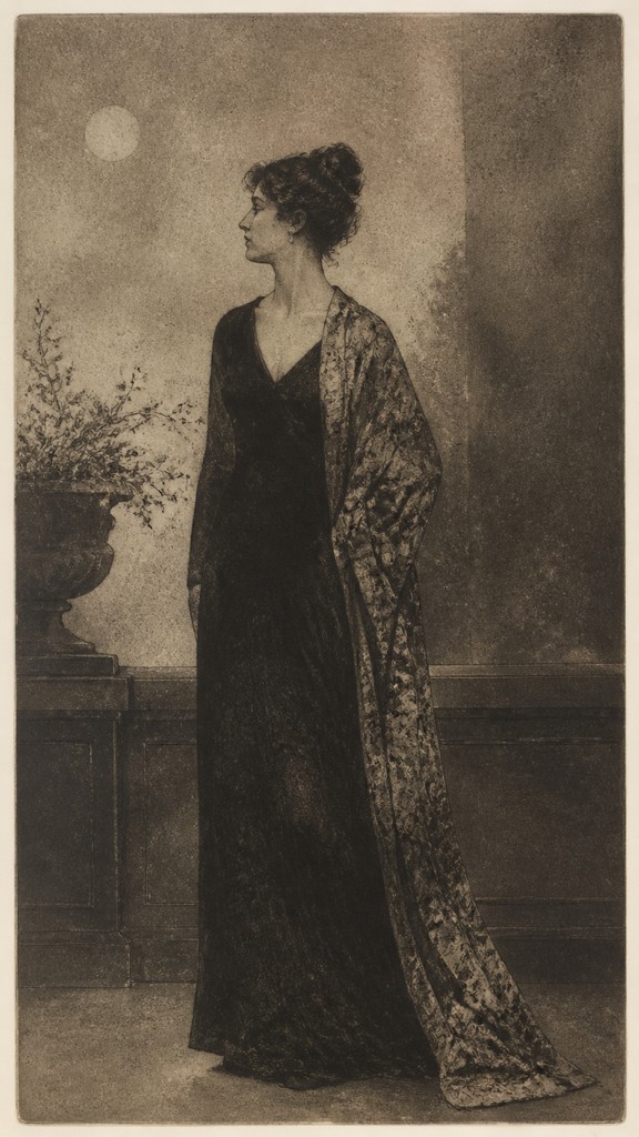
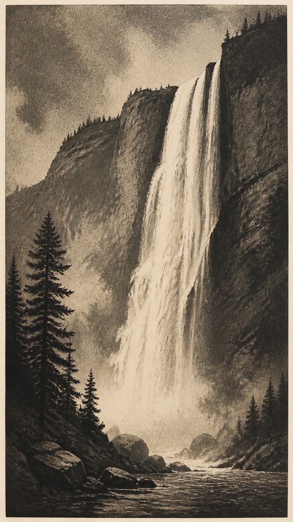
Aquatint print style is based on the tonal printmaking process that creates broad fields of granular, etched texture rather than relying only on lines. Its characteristic surfaces resemble diluted ink or watercolor washes: softly mottled, atmospheric, and capable of modeling light, shadow, fog, and volume across relatively flat printed areas.
The style typically combines layered gray, brown, or sepia tones with sharper etched contours and selective details. Its visual identity comes from the tension between diffuse tonal masses and precise marks, producing images that feel both painterly and mechanically printed. Uneven grain, restrained contrast, and visible plate-like texture often give the finished image an archival, melancholic, or documentary character.

Try It On Your Photos
Upload any photo and convert it into Aquatint Print Style — drag the sliders to compare before and after.


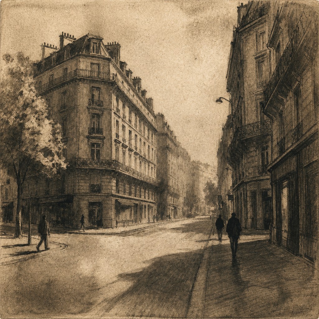

What Defines Aquatint Print Style
The signature details, up close
Granular tonal fields
Large areas are formed from fine, irregular speckling rather than smooth digital gradients. The grain gives shadows and washes a tactile, plate-printed surface.
Layered gray and sepia values
The palette commonly uses smoky grays, warm browns, muted umbers, and occasional near-black accents. Multiple tonal passes create depth without requiring vivid color.
Watercolor-like washes
Broad areas of tone suggest diluted ink, mist, stains, or transparent wash. Edges may soften gradually while remaining visibly structured by the print process.
Crisp etched accents
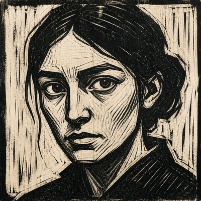
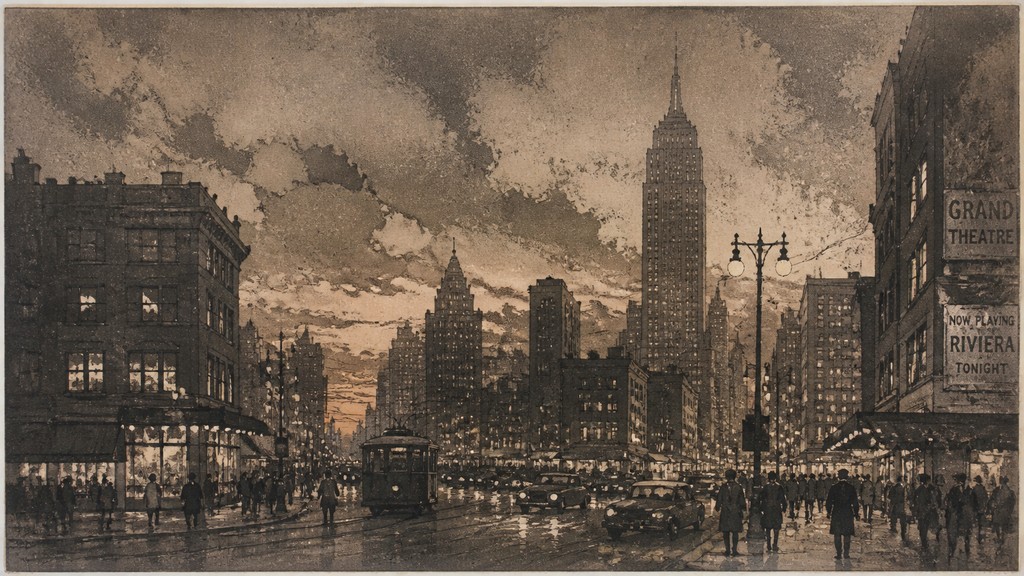
Fine contours, hatch marks, and selectively sharp details interrupt the softer tonal planes. This contrast helps define architecture, figures, foliage, and focal points.
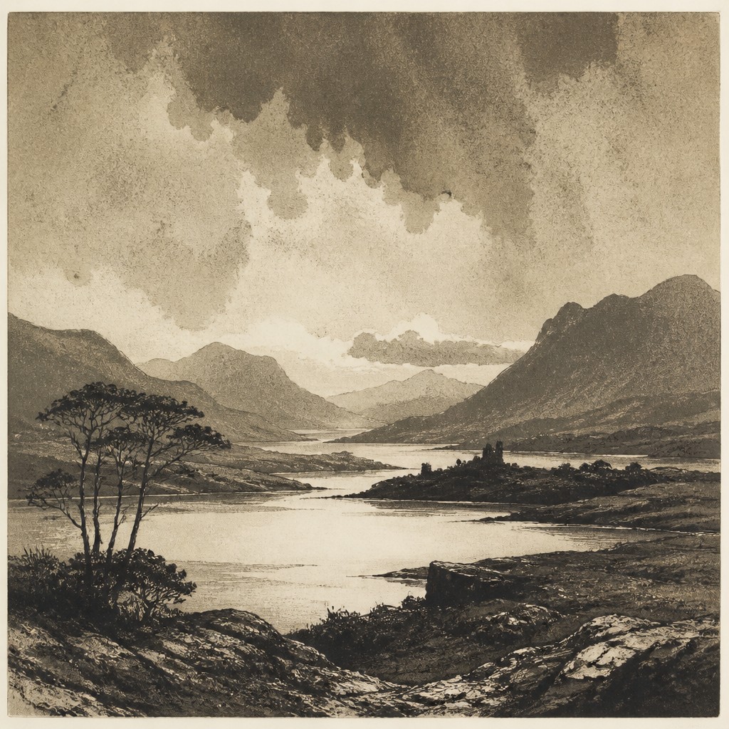
Atmospheric depth
Overlapping translucent values are well suited to fog, distant landscapes, dramatic skies, and subdued interior light. Receding forms often lose contrast and become more granular.
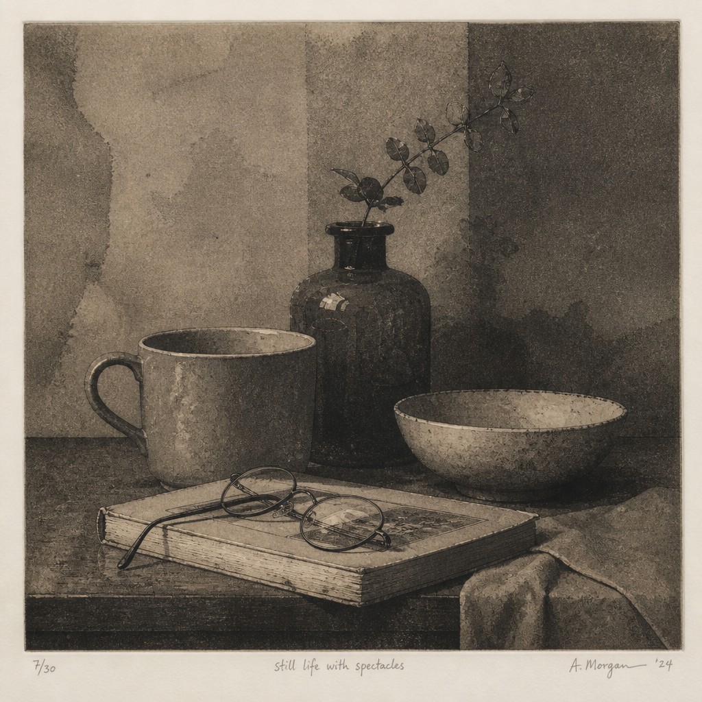
Limited, print-based contrast
Highlights are often reserved as paper-colored areas, while the darkest passages are used sparingly. The result feels restrained, tactile, and dependent on value organization.
Try It
Create Videos in Aquatint Print Style
Styles aren't just for stills — describe a scene or animate an image and get a short video rendered in Aquatint Print. Press play to see this pond come to life.
Make a VideoAquatint Print Prompt Ideas
Start from an idea — each one opens the generator with the style ready to go. See all 40 Aquatint Print prompts →
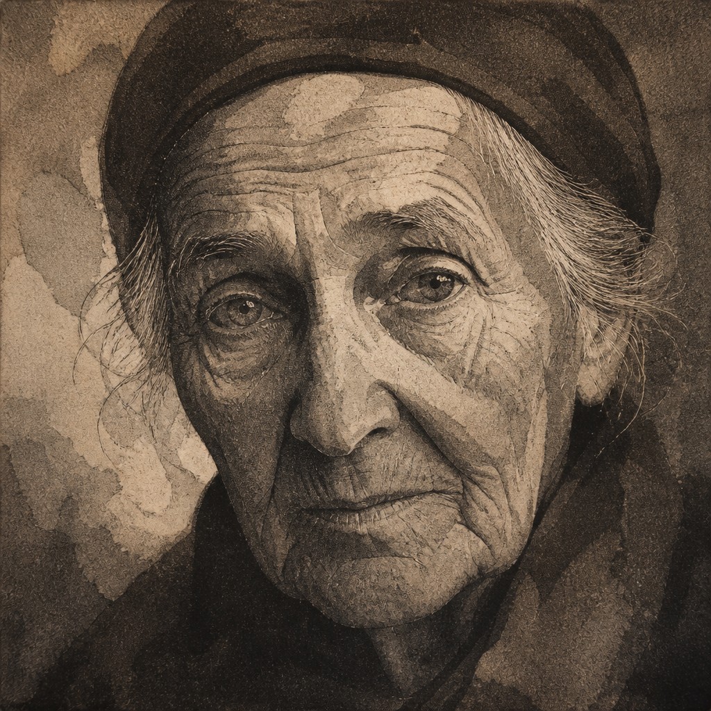
“close-up portrait of an elderly person with expressive weathered features”
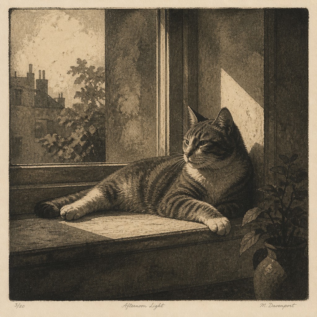
“a cat lounging in a sunlit window”
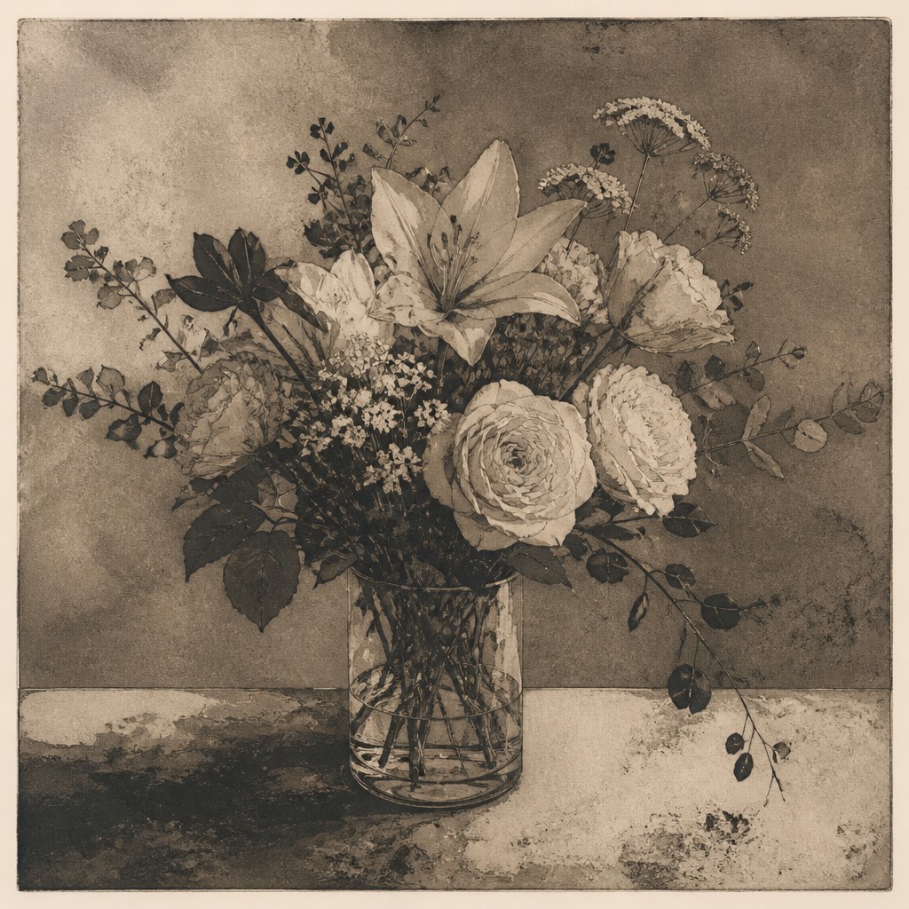
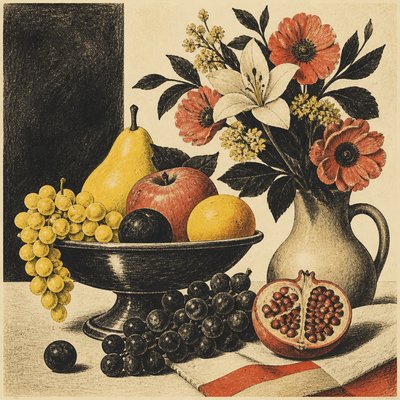
“bouquet of flowers in a glass vase”
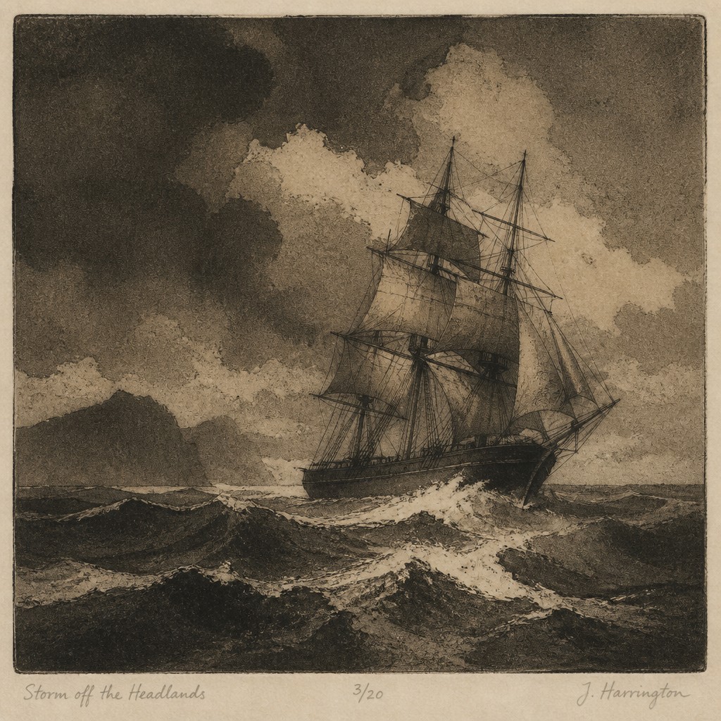
“sailing ship on a stormy sea”
How to Create Aquatint Print Art
Master the craft step by step — or skip straight to creating. Read the full guide →
- 1
Build a traditional aquatint plate
Dust a copper or zinc plate with resin or rosin, heat it to form a granular ground, and expose it to acid so the spaces around the particles are bitten. Use stop-out varnish and repeated baths to establish separate tonal levels.
- 2
Combine tone with etched line
Use aquatint for broad masses and conventional etching or drypoint for contours and fine accents. Reserve the lightest areas early, then deepen selected passages gradually rather than biting the entire plate uniformly.
- 3
Use restrained value design
Start with a small grayscale or sepia value map, keeping clear paper highlights and a controlled darkest dark. Atmospheric subjects benefit from lower contrast in the distance and sharper marks near the focal area.
- 4
Translate the grain digitally
Combine noise, stippling, scanned paper, and irregular mask textures with layered wash brushes. Apply grain differently to each tonal plane so the surface feels etched rather than covered by a uniform filter.
- 5
Prepare an image transformation
Simplify the source image into a few value groups before adding granular texture, etched contours, and warm gray or sepia color grading. Preserve recognizable silhouettes while allowing small details to merge into printed tone.
- 6
Write a focused generation prompt
Specify the subject, composition, lighting, limited palette, granular acid-bitten tonal fields, speckled flat planes, layered washes, and crisp etched accents. Request a physical print surface and avoid generic instructions such as merely adding an old-paper effect.
The Story
History & Origins of Aquatint Print
Aquatint originated in Europe during the eighteenth century as an extension of etching, developed to reproduce the broad tonal effects associated with wash drawing and watercolor. The process uses a porous resin or rosin grain on a metal plate; acid bites around the particles, creating a network of tiny recessed areas that hold ink. By stopping out selected regions and applying successive acid baths, printmakers can build a range of light and dark tones.
It became especially important in eighteenth- and nineteenth-century printmaking, where it was used for landscapes, architectural views, topographical records, illustrations, and expressive sequences of prints. Contemporary artists and digital practitioners continue to draw on its grain, tonal layering, and etched contrast, often translating the physical process into scanned textures, procedural brushes, or image-processing effects.
Influences: The style draws from European etching and intaglio printmaking, especially the tonal ambitions of eighteenth- and nineteenth-century aquatint, as well as wash drawing, monochrome watercolor, mezzotint, drypoint, and documentary topographical prints. Its atmospheric restraint also relates to Romantic landscape imagery, archival illustration, historical book plates, and contemporary texture-based digital print aesthetics.
Frequently Asked Questions
What defines aquatint print style?
It is defined by granular, acid-bitten tonal texture used to create broad washes and value fields. These soft areas are usually combined with sharper etched lines, limited gray or sepia color, and a visibly tactile print surface.
Is aquatint a style or a printmaking technique?
Aquatint is historically a printmaking technique, but the phrase aquatint print style also describes the visual appearance associated with it. Digital artwork can evoke that appearance without using a physical plate, provided it reproduces the granular tone, layered values, and etched accents.
How is aquatint different from engraving?
Engraving primarily creates tone and form through incised lines, while aquatint creates tonal areas through a granular acid-resistant ground. In practice, both methods are often combined, with aquatint supplying washes and engraving or etching supplying definition.
How is it different from a watercolor effect?
Both can suggest transparent washes, but aquatint has a more particulate, printed surface and usually a narrower value range. Watercolor depends on fluid blooms and brush variation, whereas aquatint tone comes from thousands of tiny etched recesses.
Can colorful subjects be rendered in this style?
Yes, although the most characteristic results use monochrome, duotone, or muted palettes. Restrained ochre, rust, blue-gray, and green-gray accents can be added while preserving the granular tonal structure and paper-like highlights.
Where is aquatint print style commonly used?
It suits landscapes, architectural views, historical scenes, botanical studies, editorial illustration, book art, maps, and moody narrative imagery. Its controlled detail and atmospheric values also work well for posters, album artwork, and textured digital compositions.
Create your first Aquatint Print artwork
Describe anything — or upload a photo — and see it in Aquatint Print Style in seconds.
Related Styles
Discover similar art styles