Data Visualization Contemporary Art Style
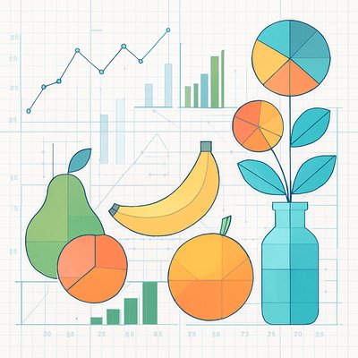
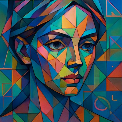
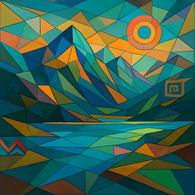
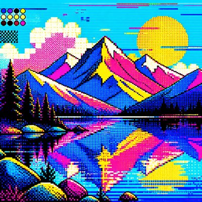
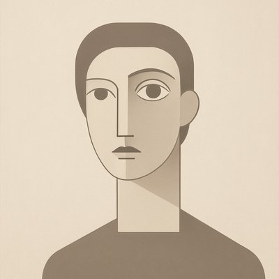
Contemporary data art using grids, particles, heat maps, and network diagrams to turn information into vivid visual form.
Instantly rendered in Data Visualization Contemporary — or transform a photo
Data Visualization Contemporary Gallery
Tap any artwork to explore it
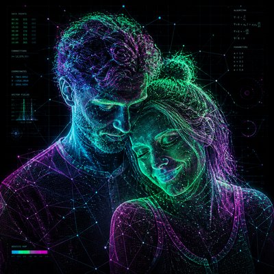
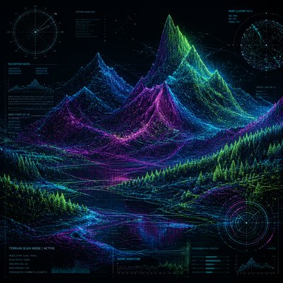
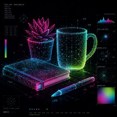
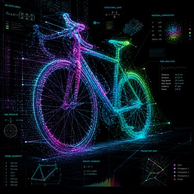
What is Data Visualization Contemporary Art Style?
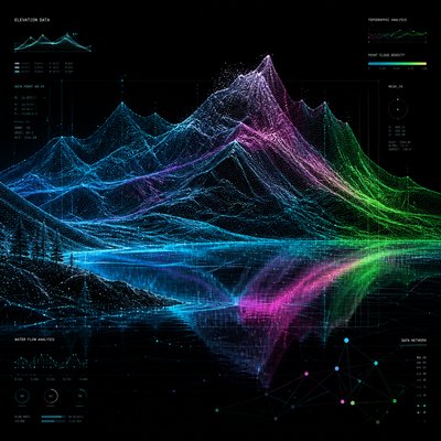
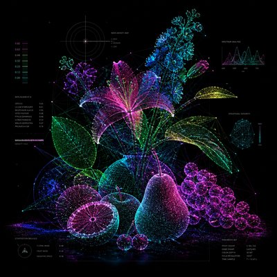
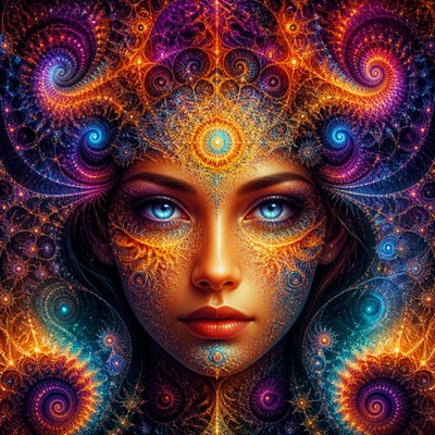
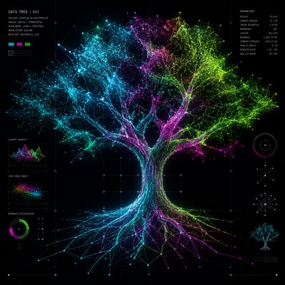
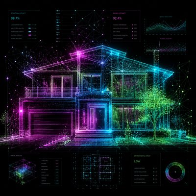
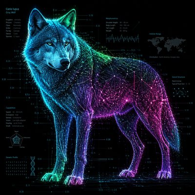
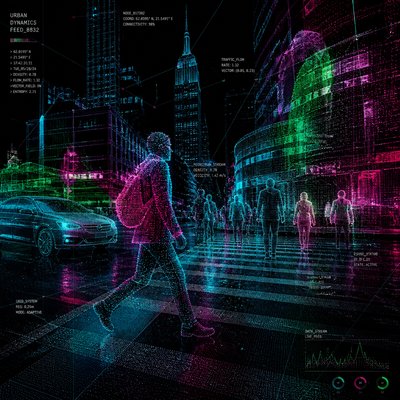
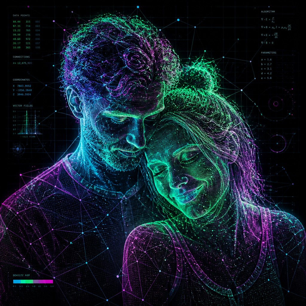
Data Visualization Contemporary Art Style is a visual language that turns information, systems, and statistical relationships into an aesthetic field. Rather than illustrating data in a purely utilitarian way, it uses the conventions of visualization—grids, nodes, charts, particle flows, heat maps, and network structures—as expressive material. The result often feels precise and analytical, yet atmospheric and immersive, with glowing points of color set against dark or minimal backgrounds.
Its visual identity comes from the intersection of contemporary design, scientific imaging, generative aesthetics, and information graphics. The style often presents a subject as if it were being mapped, measured, or decoded: contours become data threads, surfaces become wireframes, and motion is suggested through clustered points and luminous gradients. It looks this way because it borrows the visual grammar of computation and analytics, then pushes it toward abstraction and mood, making invisible patterns feel tangible and emotionally legible.
Try It On Your Photos
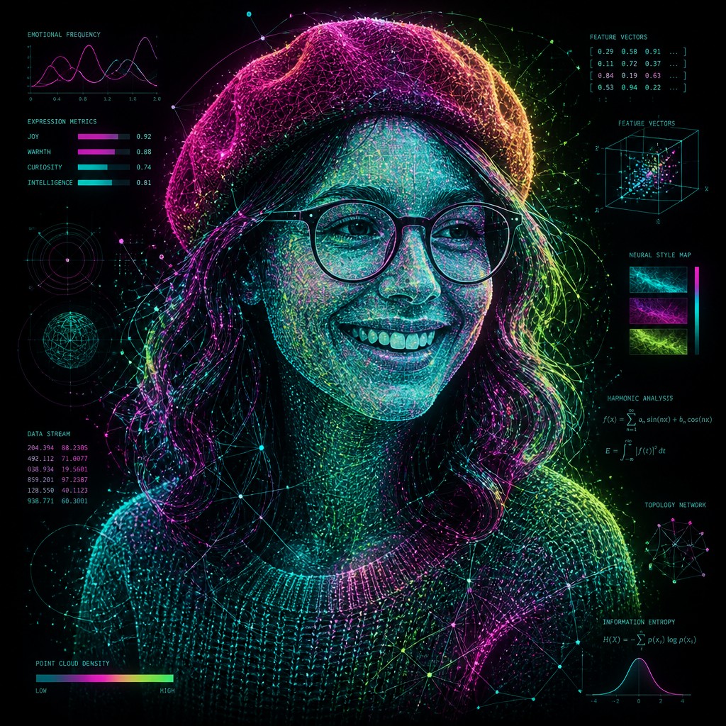
Upload any photo and convert it into Data Visualization Contemporary Art Style — drag the sliders to compare before and after.


What Defines Data Visualization Contemporary Art Style
The signature details, up close
Particle-based construction
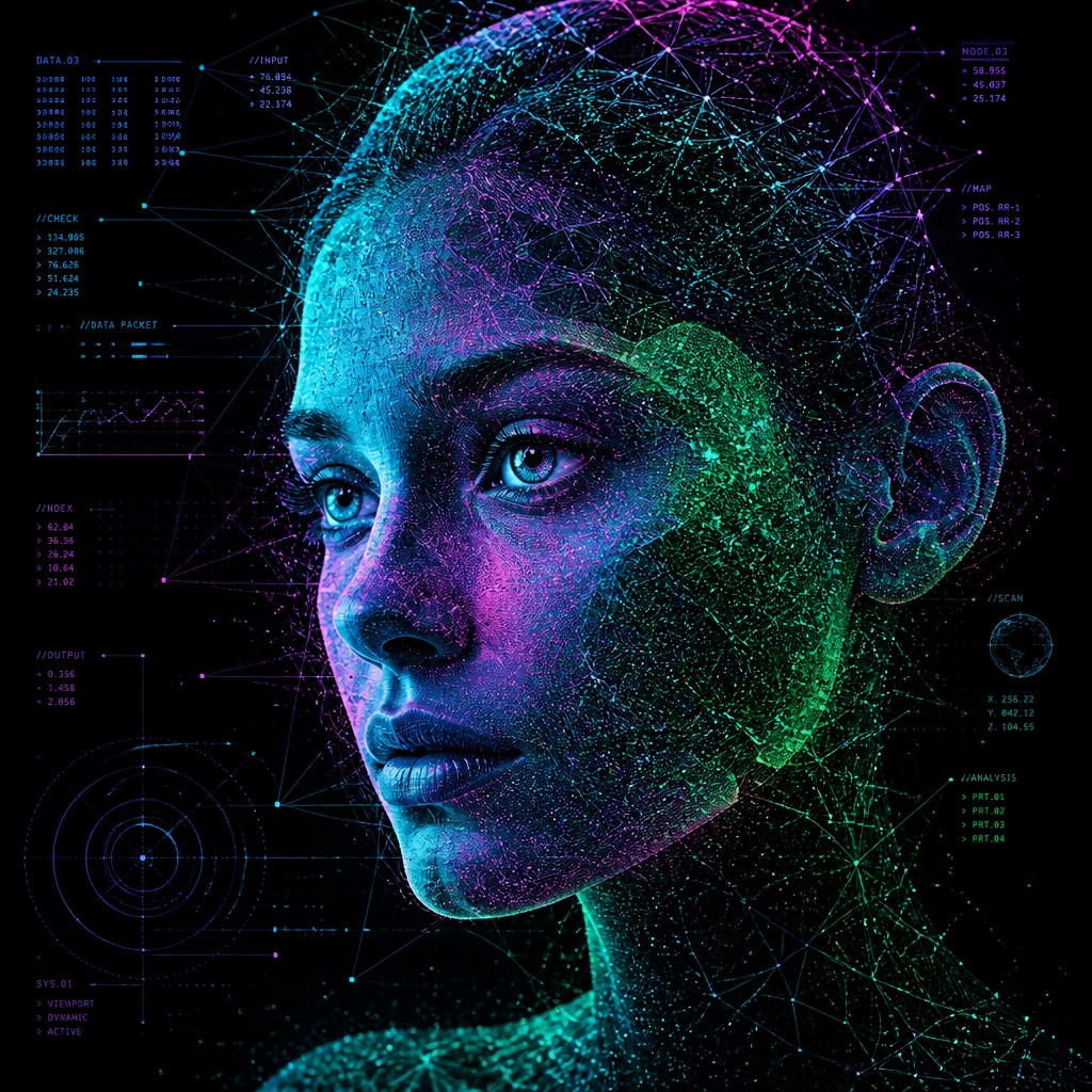
Subjects are often formed from dots, points, or glowing specks that suggest sampled information rather than continuous paint. These particles create a sense of density, motion, and signal processing.
Network diagrams and node lattices
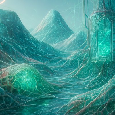
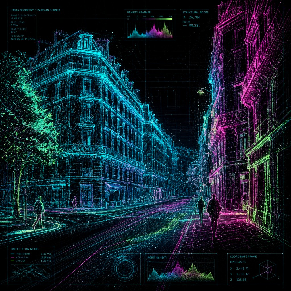
Lines connecting points appear throughout the composition, evoking graphs, neural networks, or systems maps. This gives the image a structural logic even when the overall subject is abstract.
Heat-map color logic
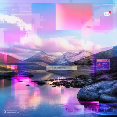
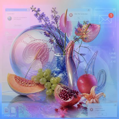
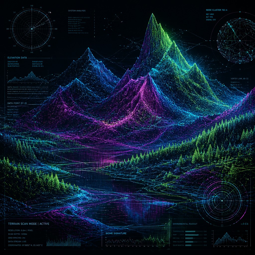
Cyan, magenta, green, and electric blues often shift across the image in gradients that resemble scientific visualization or sensor readouts. Color is used to imply intensity, value, or flow.
Grid and coordinate overlays
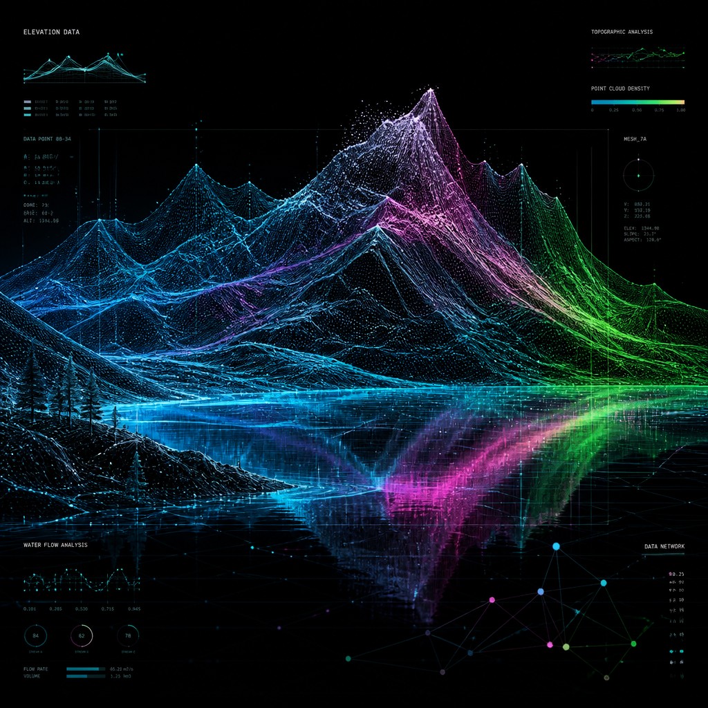
Mathematical grids, axes, and plotting references reinforce the sense of measurement and analysis. These overlays help the image feel like a visualization of something observed, tracked, or computed.
Translucent depth layers
Wireframes, transparent planes, and stacked visual fields create the impression of multidimensional data space. The layering makes the composition feel technical while preserving visual richness.
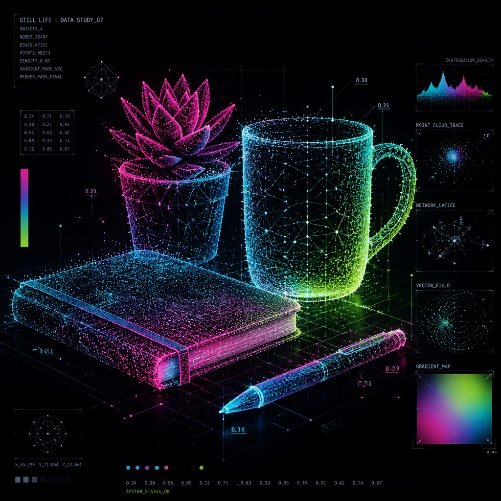
Dark void backgrounds
A stark black or near-black background is common because it heightens contrast and makes luminous elements read like active signals. The emptiness around the data also emphasizes clarity and spatial isolation.
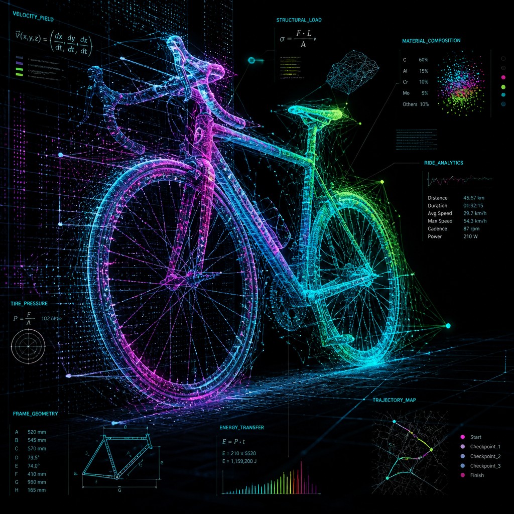
Balanced density and negative space
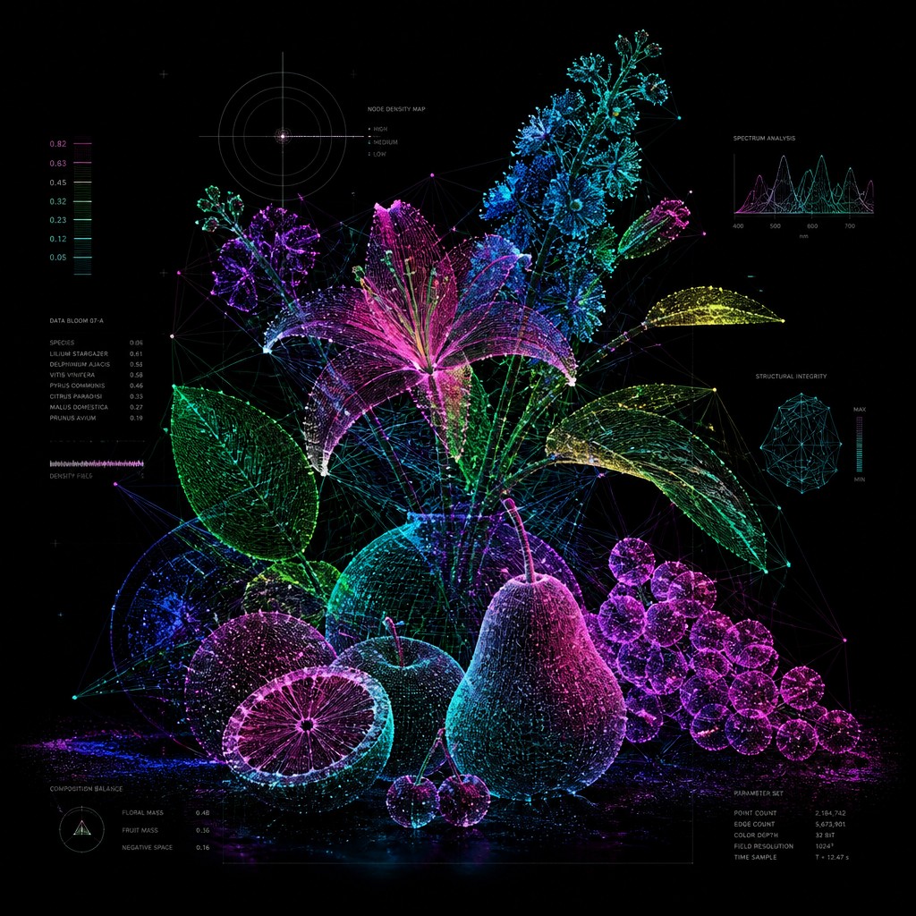
The strongest examples alternate concentrated information clusters with open areas. This balance keeps the work legible and gives the visual system room to breathe.
Try It
Create Videos in Data Visualization Contemporary Art Style
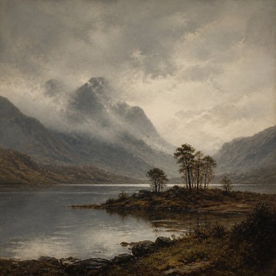
Styles aren't just for stills — describe a scene or animate an image and get a short video rendered in Data Visualization Contemporary. Press play to see this pond come to life.
Make a VideoData Visualization Contemporary Prompt Ideas
Start from an idea — each one opens the generator with the style ready to go. See all 40 Data Visualization Contemporary prompts →
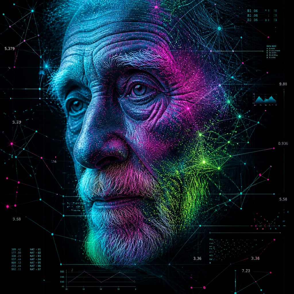
“close-up portrait of an elderly person with expressive weathered features”
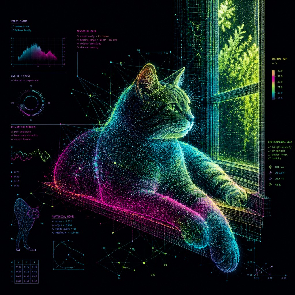
“a cat lounging in a sunlit window”
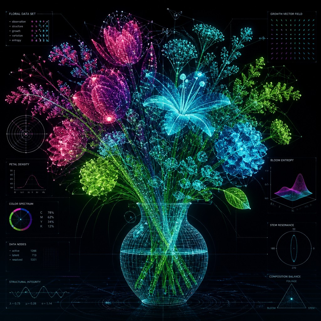
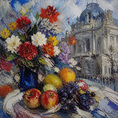
“bouquet of flowers in a glass vase”
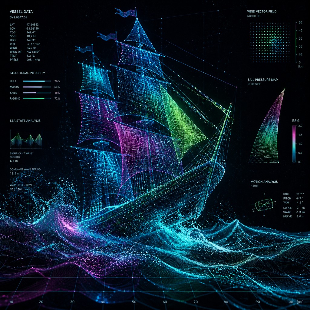
“sailing ship on a stormy sea”
How to Create Data Visualization Contemporary Art
Master the craft step by step — or skip straight to creating. Read the full guide →
- 1
Start with a data structure, not just a subject
Even a portrait, cityscape, or animal benefits from being organized as a system of points, paths, and measured segments. In traditional media, sketch the form as a scaffold of nodes and vectors before adding visual density; in digital work, build the piece around layers, masks, and plotted marks.
- 2
Use luminous point clouds and line networks
Replace solid contours with clusters of dots, linked nodes, and fine connecting lines. Keep the linework clean and precise so the image reads like an interpreted dataset rather than loose decorative abstraction.
- 3
Control color as if it encodes information
Assign gradients to intensity, temperature, or significance, using limited palettes with bright spectral accents. Cyan-magenta-green combinations work well because they suggest instrumentation, scanning, and digital measurement.
- 4
Preserve empty space and technical clarity
Avoid overfilling every area; the style depends on contrast between dense informational zones and quiet voids. In a prompt, specify dark backgrounds, translucent overlays, crisp rendering, and clean modernist composition to keep the image legible.
- 5
Blend realism with abstraction
Let recognizable forms emerge through data layers rather than through fully modeled shading. If using image-to-image or prompt-based creation, ask for the subject to be constructed from scatter points, wireframes, heat maps, and network lattices while maintaining a clear silhouette.

The Story
History & Origins of Data Visualization Contemporary
This style does not correspond to a single historical movement so much as a contemporary aesthetic lineage. It draws from modern information design, scientific visualization, computer graphics, generative art, and the broader culture of dashboards, mapping systems, and network analysis. In the late 20th and early 21st centuries, as digital tools made complex datasets easier to process and display, artists and designers began treating data not only as content to be communicated, but as a source of form, texture, and conceptual structure.
Its visual vocabulary also reflects the influence of abstract art and design traditions that value structure, modularity, and spatial clarity. The style is especially indebted to the look of computational interfaces, cartography, and mathematical plotting, where lines, points, and fields encode relationships. Contemporary artists working in related areas include those associated with information aesthetics and data-driven art practices, though the style itself is best understood as an evolving digital-era visual approach rather than a fixed school.
Influences: This style is closely related to information design, scientific visualization, and generative art, as well as to the formal clarity of modern graphic design. It also echoes conceptual and systems-based practices in contemporary art, where structure, process, and data become part of the artwork’s meaning. In historical terms, its emphasis on reduction, geometry, and spatial order can recall aspects of Constructivism and Minimalism, while its luminous abstraction reflects the digital aesthetics of computer graphics and interface culture.
Frequently Asked Questions
What defines Data Visualization Contemporary Art Style?
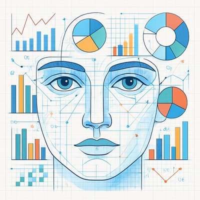
It is defined by the use of visual cues borrowed from data graphics: points, grids, networks, charts, heat maps, and layered digital structures. Instead of presenting data for analysis alone, it transforms those elements into a refined visual composition.
Is this style the same as infographic design?
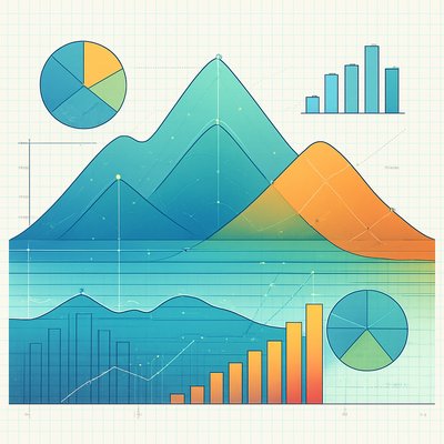
Not exactly. Infographics prioritize clarity and communication, while this style often emphasizes atmosphere, abstraction, and aesthetic impact. It can look like a visualization, but its goal is usually expressive rather than purely explanatory.
What kinds of subjects work well in this style?
Portraits, cityscapes, animals, landscapes, machines, and cosmic scenes all work well because they can be reinterpreted as systems of information. Subjects with strong outlines or internal structure are especially effective.
How do I make artwork look more like a data visualization?
Use grids, numerical or diagrammatic structure, node connections, and layered transparency. Choose a limited but vivid palette and make the form feel measured, sampled, or analyzed rather than painted in a purely gestural way.
Where is this style commonly used?
It appears in editorial graphics, technology branding, motion design, scientific communication, exhibition visuals, and contemporary digital art. It is also popular for futuristic concept imagery because it suggests intelligence, systems, and complexity.
What is the difference between this style and abstract art?
Abstract art may or may not reference information systems, while this style specifically borrows the look and logic of data representation. The image often retains a sense of measurement, mapping, or structure even when it becomes highly abstract.

Create your first Data Visualization Contemporary artwork
Describe anything — or upload a photo — and see it in Data Visualization Contemporary Art Style in seconds.
Make Something with Data Visualization Contemporary
Related Styles
Discover similar art styles