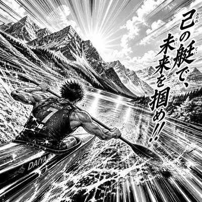
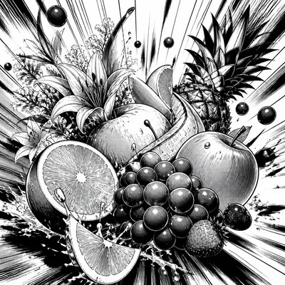
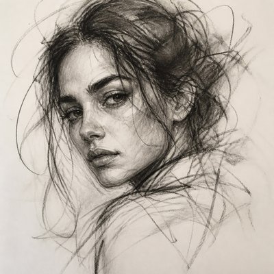
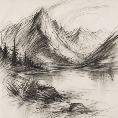
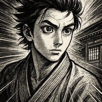
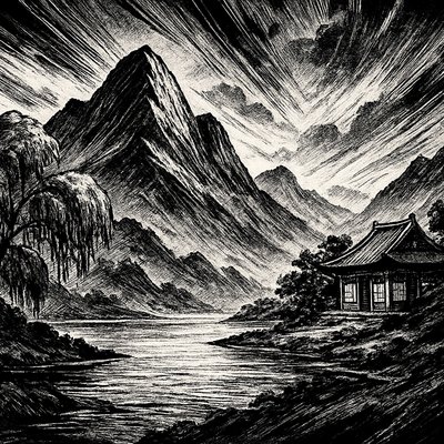
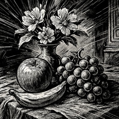
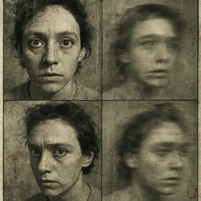
Motion Graphics Style
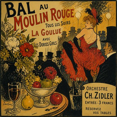
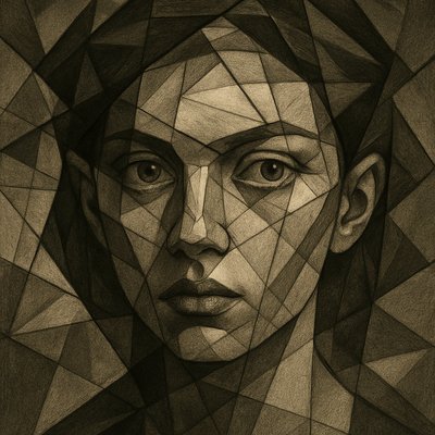
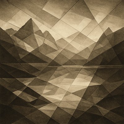
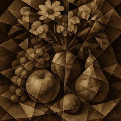
Explore Motion Graphics Style: kinetic typography, bold geometric forms, saturated color blocks, motion trails, and polished broadcast-design energy.
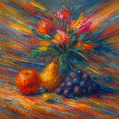
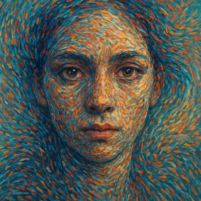
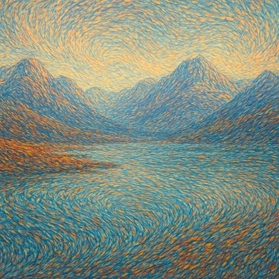
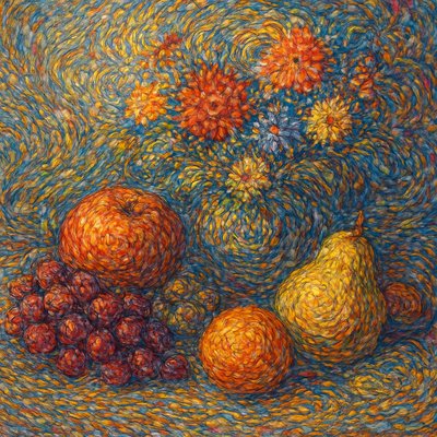
Instantly rendered in Motion Graphics — or transform a photo

Motion Graphics Gallery
Tap any artwork to explore it


What is Motion Graphics Style?
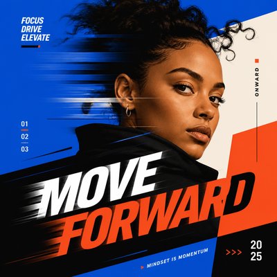
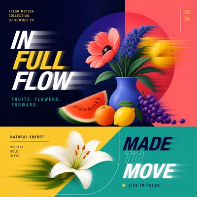
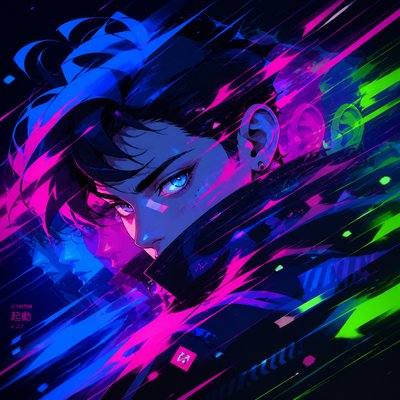
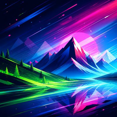
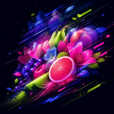
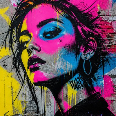
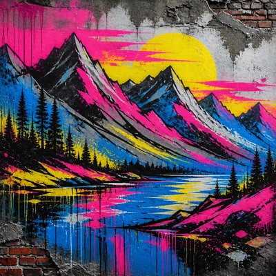
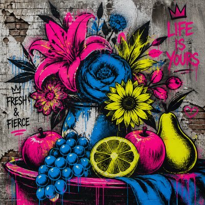
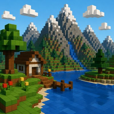
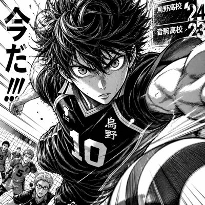
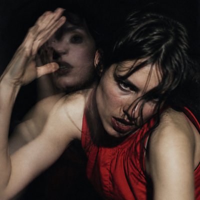
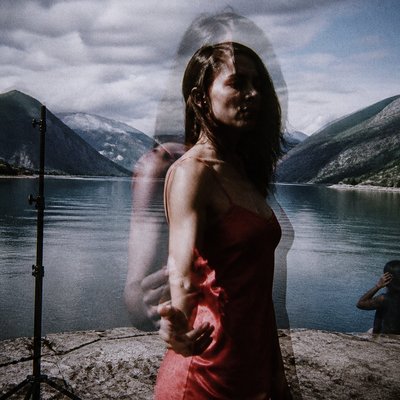
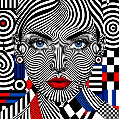
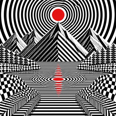
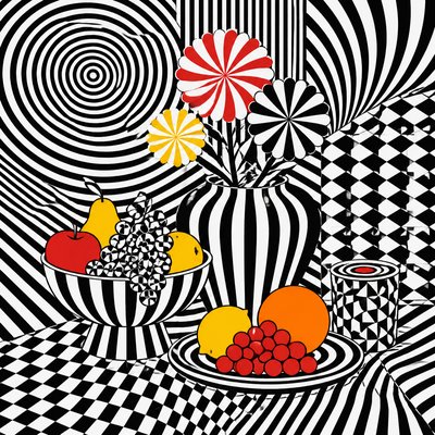
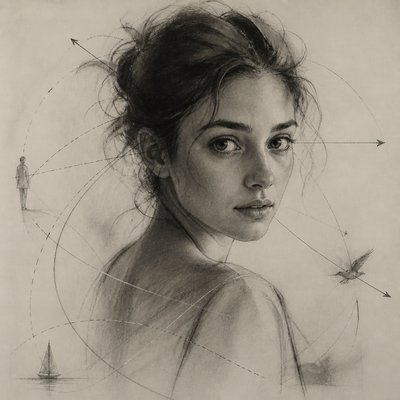
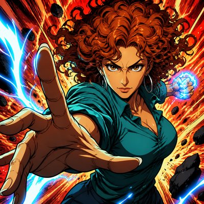
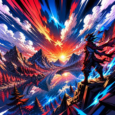
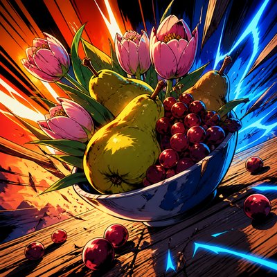
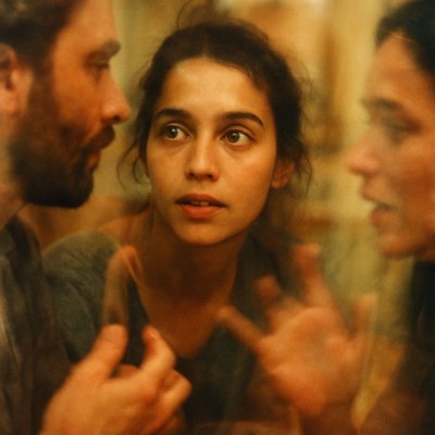
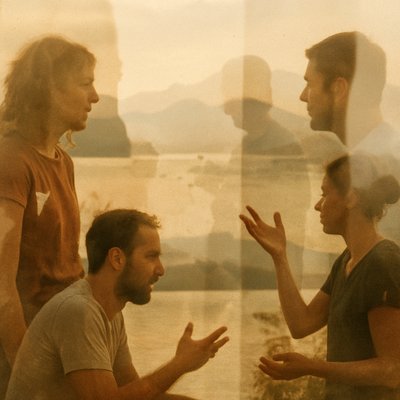
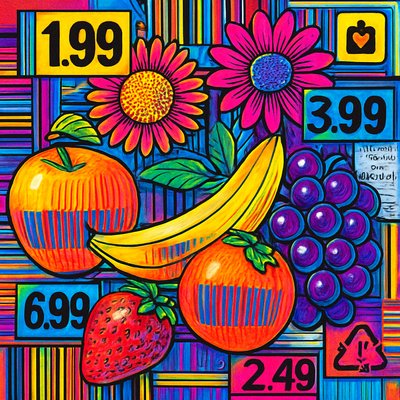
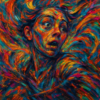
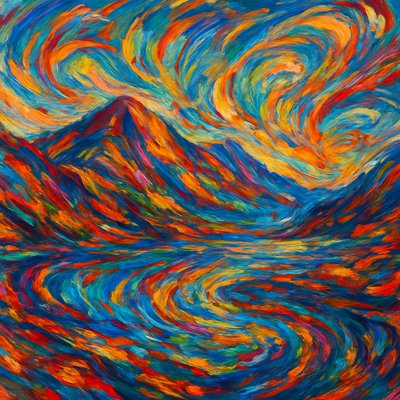
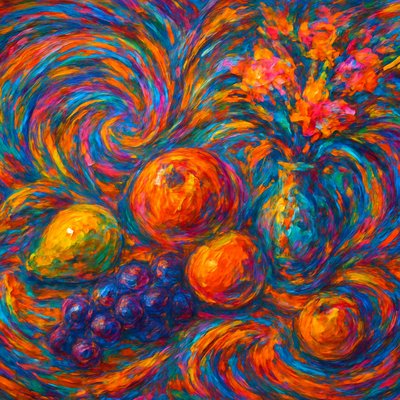
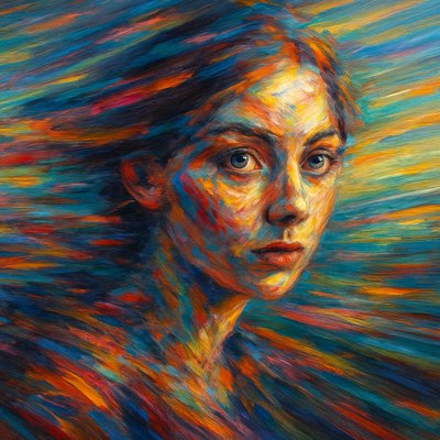
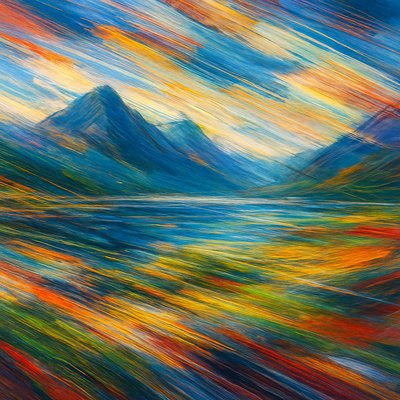
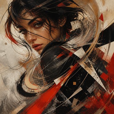
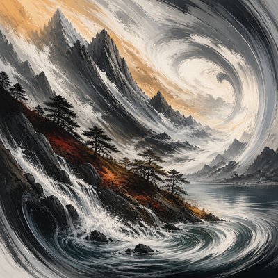
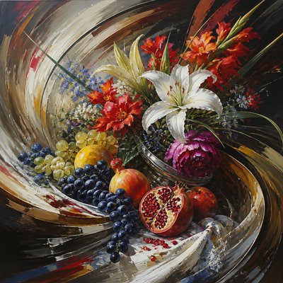
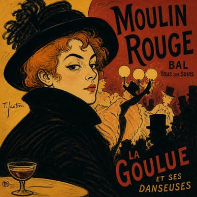
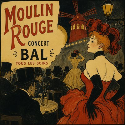
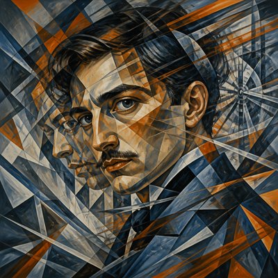
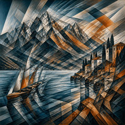
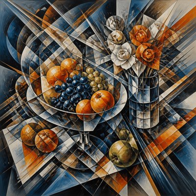
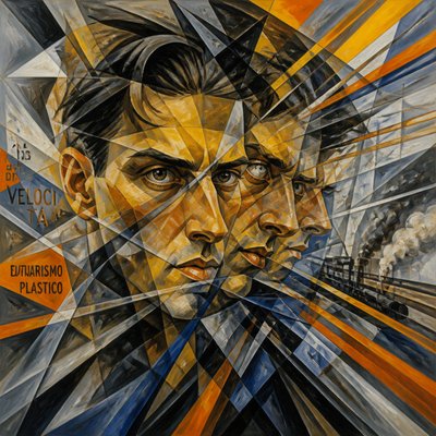
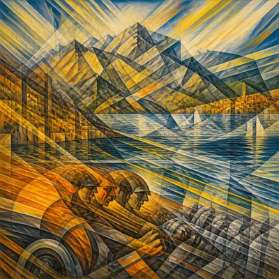
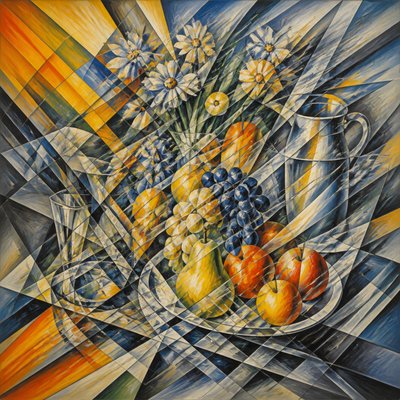
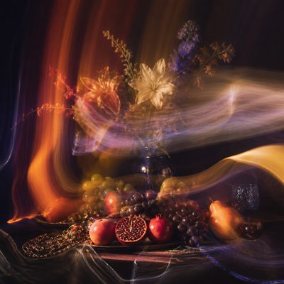
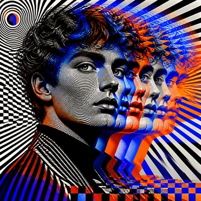
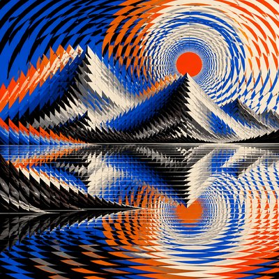
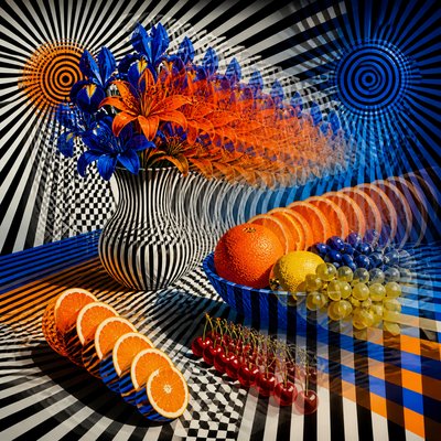
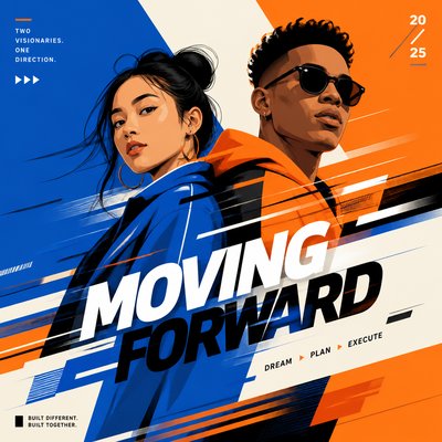
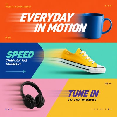
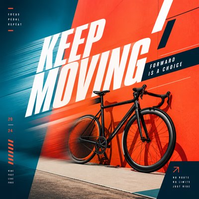
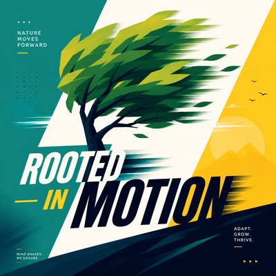
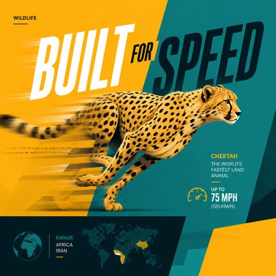
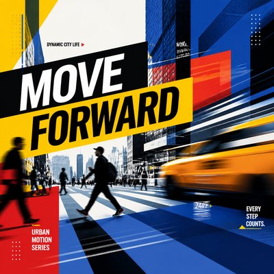
Motion Graphics Style presents movement as a single, highly designed frame. Bold flat shapes appear suspended during wipes, slides, rotations, or other transitions, while directional blur and layered fragments suggest the moments immediately before and after the image was captured. Kinetic typography is often integrated as a structural element rather than added as a caption, with letterforms cutting across, overlapping, or accelerating through the composition.
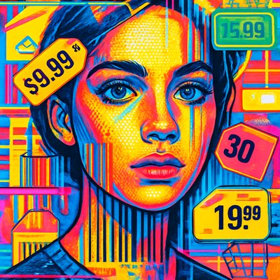
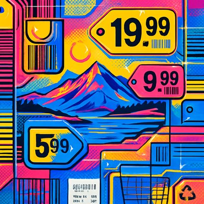
The style combines clarity with controlled dynamism. Saturated color blocks, sharp silhouettes, clean masks, and strong alignment create a readable visual system, while offset layers, speed lines, cropping, and depth cues provide energy. Its polished appearance reflects the conventions of broadcast packages, title sequences, digital advertising, music visuals, interface animation, and contemporary branding.
Try It On Your Photos
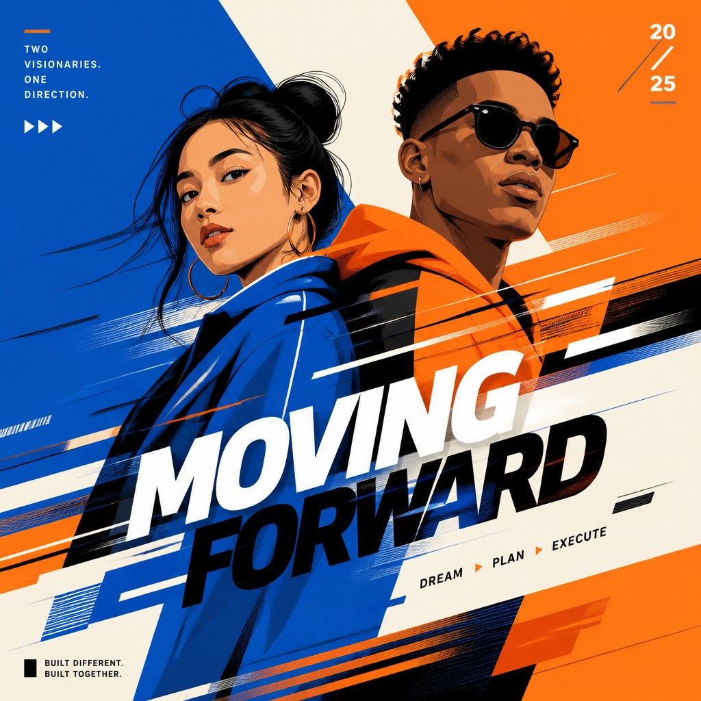
Upload any photo and convert it into Motion Graphics Style — drag the sliders to compare before and after.

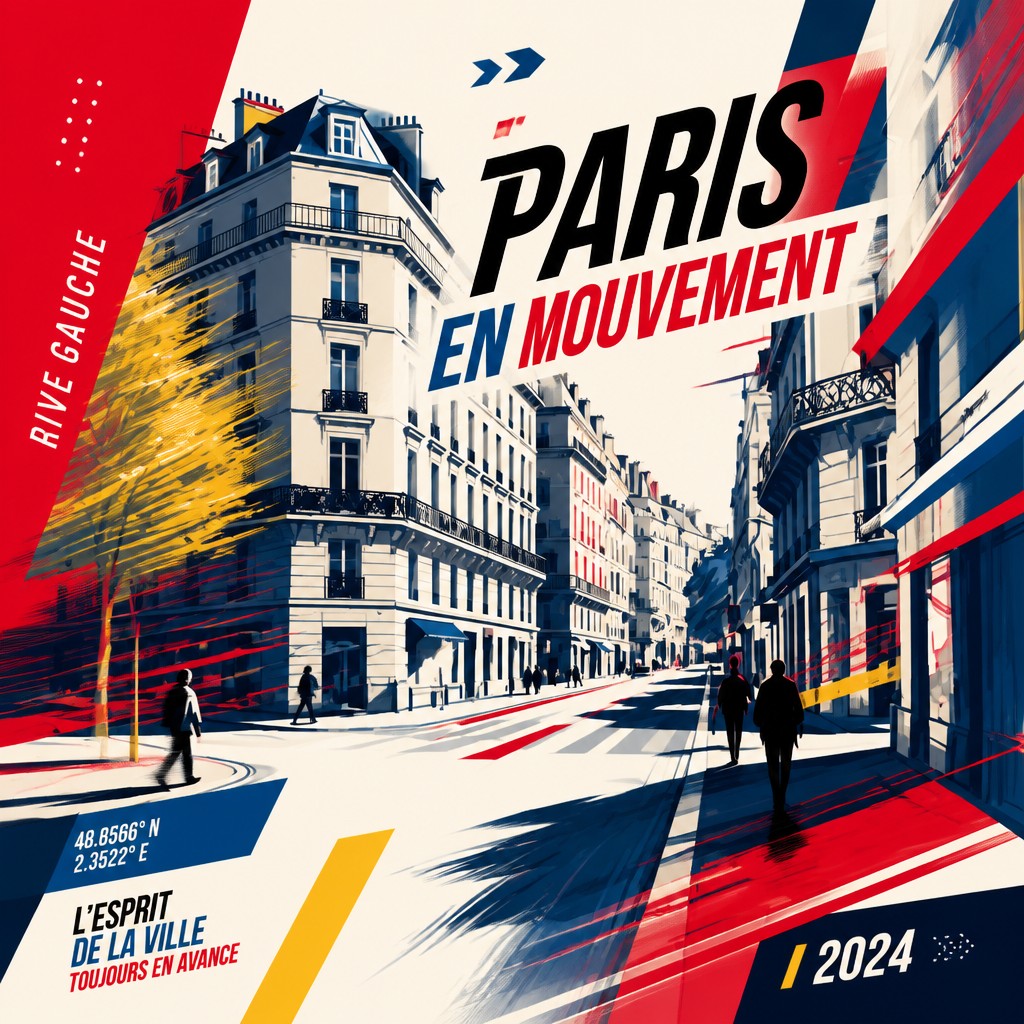

What Defines Motion Graphics Style
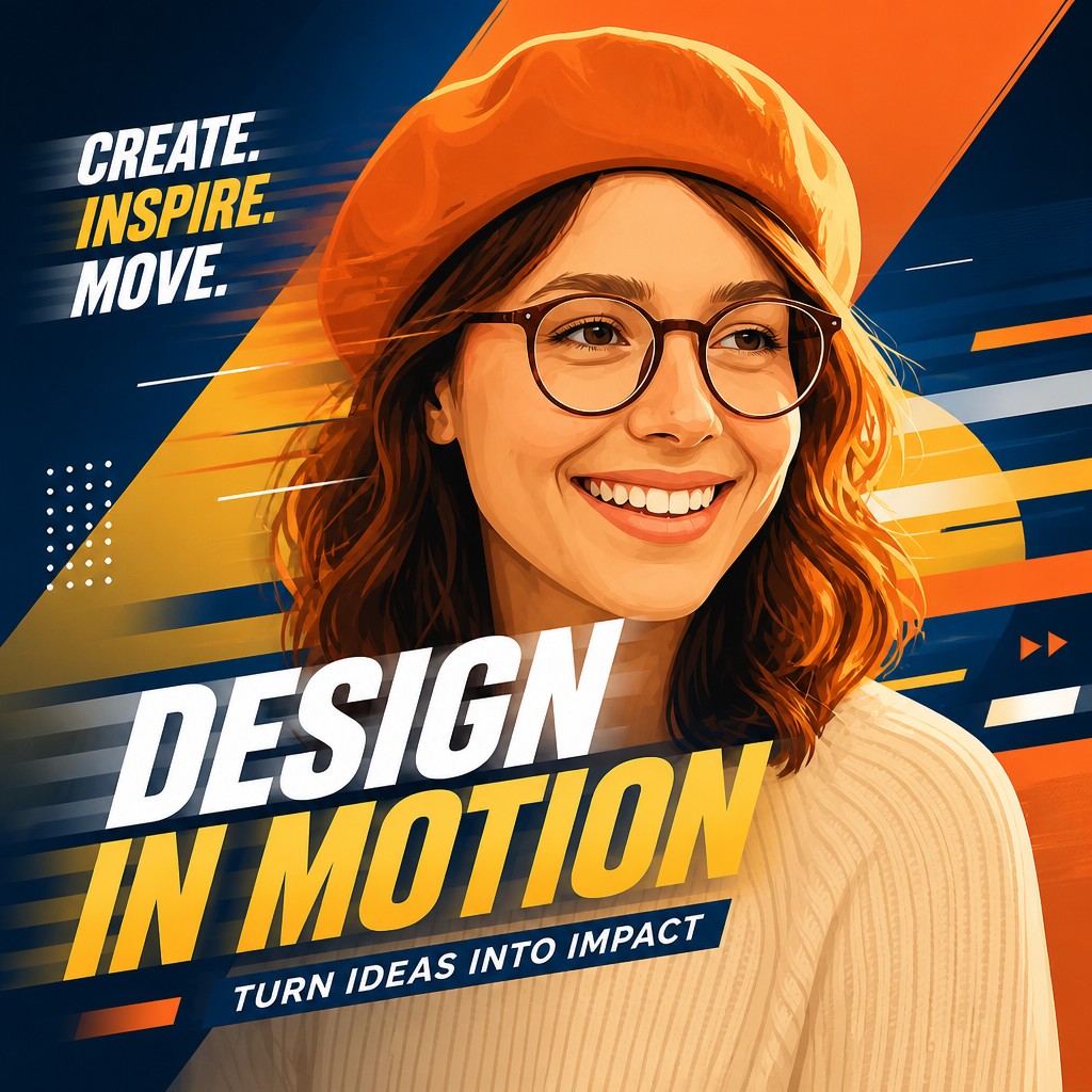
The signature details, up close
Kinetic typography
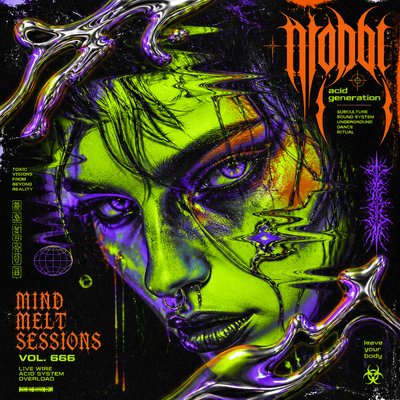
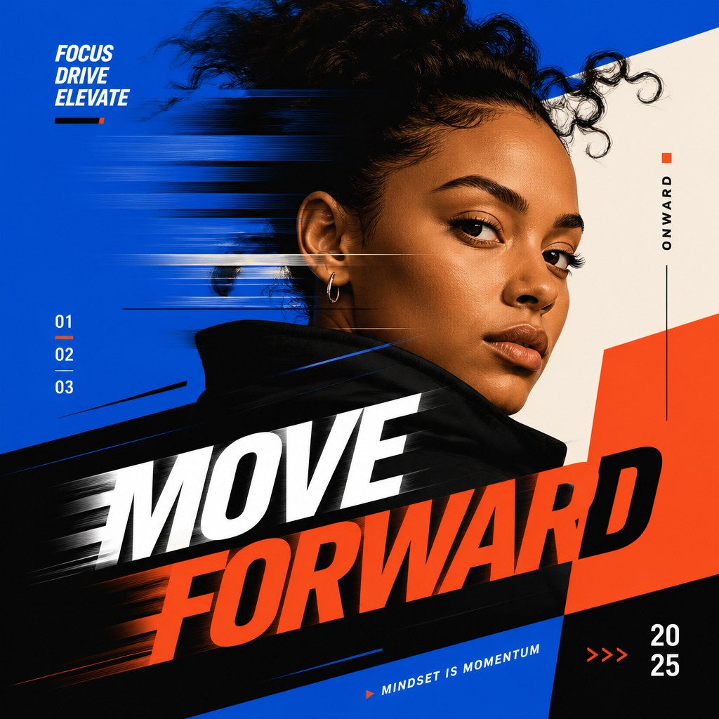
Large, condensed, or geometric letterforms move through the composition as active shapes. Cropping, overlap, skewing, and directional placement imply sliding, scaling, or rapid assembly.
Directional motion trails
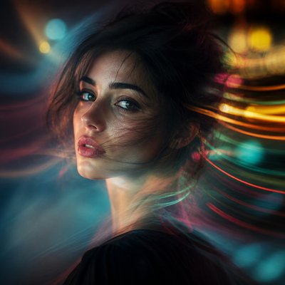
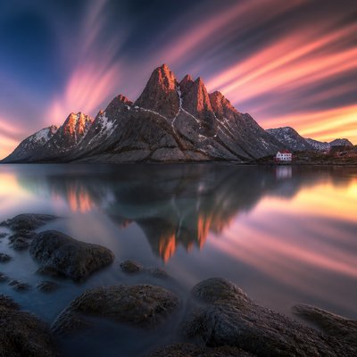
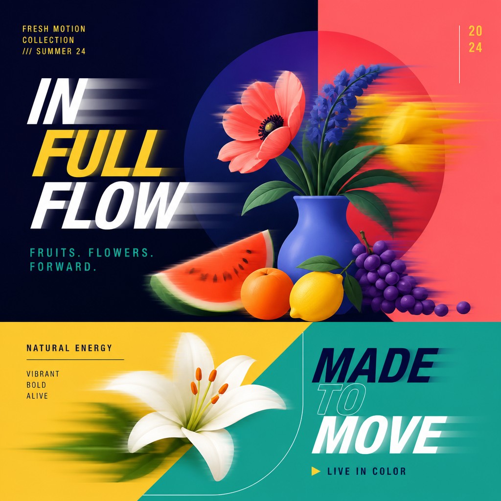
Blurred duplicates, translucent echoes, streaks, and offset contours indicate the direction and speed of an implied movement. These effects remain controlled and graphic rather than atmospheric.
Bold geometric forms
Circles, bars, grids, wedges, rectangles, and abstract silhouettes organize the frame. Their simple construction keeps the image legible even when multiple layers overlap.
Saturated color blocking
High-impact hues are arranged in clean fields or sharply bounded panels. Strong contrasts between complementary or near-complementary colors help separate layers and reinforce visual rhythm.

Wipes, masks, and transitions
Hard-edged reveals, diagonal cuts, split screens, and nested frames imitate the logic of an animated transition. Shapes often appear partially hidden, as though the image is caught between two design states.
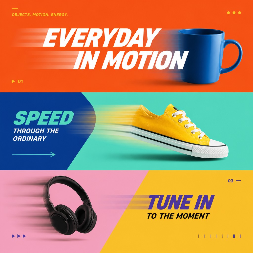
Layered depth
Stacked planes, shadows, translucent overlays, and scale changes create spatial hierarchy without relying on realistic modeling. Depth is primarily compositional and diagrammatic.
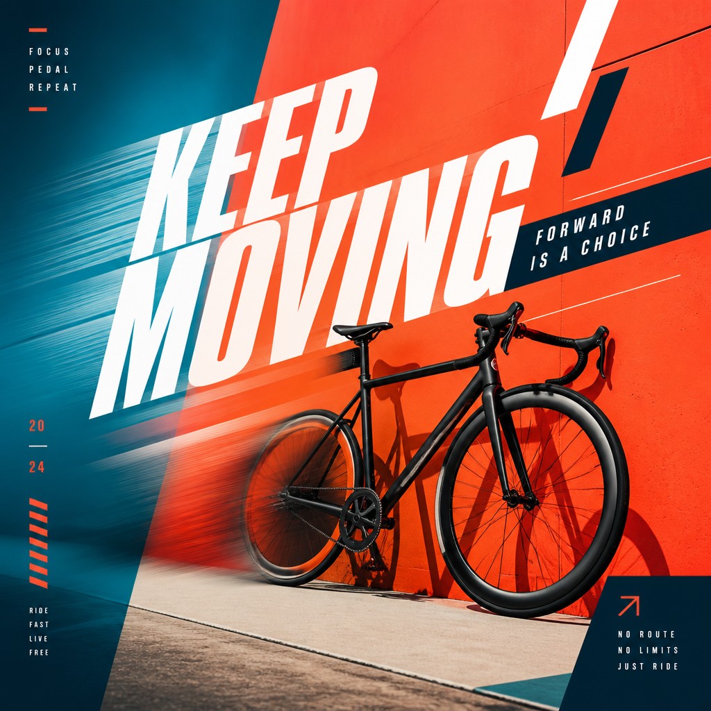
Broadcast-finish precision
Crisp edges, disciplined spacing, restrained texture, and consistent alignment give the work a professional screen-graphics appearance. Even complex compositions usually retain a clear focal path.
Motion Graphics Prompt Ideas
Start from an idea — each one opens the generator with the style ready to go. See all 40 Motion Graphics prompts →
How to Create Motion Graphics Art
Master the craft step by step — or skip straight to creating. Read the full guide →
- 1
Build a modular composition
Begin with a grid and a small vocabulary of circles, bars, panels, and text blocks. Establish a clear reading order before adding overlaps or motion effects.
- 2
Design the movement first
Choose a directional action such as a horizontal slide, radial burst, vertical wipe, or diagonal sweep, then place repeated elements along that path. In digital software, duplicate layers and offset them to create echoes and trails.
- 3
Use typography as an image
Select sturdy sans-serif or display letterforms and treat words as compositional masses. Crop, stretch, rotate, or partially mask the type while preserving enough contrast and scale for legibility.
- 4
Control color and edges
Limit the palette to a few saturated hues plus a neutral or dark anchor. Keep primary silhouettes sharp, reserving blur and transparency for secondary motion layers so the frame does not lose focus.
- 5
Create a convincing still frame
For digital or AI-assisted creation, specify the subject, camera framing, movement direction, typography placement, palette, geometric transitions, and degree of blur. Ask for a polished broadcast-design finish and crisp vector-like edges rather than generic action or photographic motion blur.
The Story
History & Origins of Motion Graphics
Motion Graphics Style is a contemporary synthesis rather than a historically codified art movement. Its lineage extends from early twentieth-century geometric abstraction, constructivist composition, modernist typography, and graphic poster design, then develops through television title design, broadcast identity systems, computer animation, digital compositing, and screen-based advertising.
As editing and compositing software made movement easier to design frame by frame, principles once associated with animated titles and television graphics became common in still posters, editorial images, social media graphics, and digital illustration. The frozen mid-animation effect is therefore best understood as a visual translation of time-based design into a single image.
Influences: The style draws on geometric abstraction, constructivist and modernist graphic design, Swiss-influenced grid systems, kinetic typography, experimental film titles, television broadcast packages, editorial poster design, comic-book motion lines, and contemporary interface animation. It also borrows the visual grammar of transitions in video editing and compositing, translating temporal effects such as wipes, easing, scaling, and blur into a single static frame.
Frequently Asked Questions
What defines Motion Graphics Style?
It is defined by the illusion of animation within a still image: kinetic typography, repeated forms, directional trails, saturated color blocks, and sharply controlled transitions. The composition usually feels like one frame extracted from a title sequence, broadcast ident, or digital interface animation.
Is Motion Graphics Style an established historical art movement?
No. It is best treated as a contemporary design aesthetic and a synthesis of time-based graphic practices. Its foundations lie in geometric abstraction, modernist typography, broadcast design, animation, and digital compositing rather than in a single historical school.
How does it differ from flat design?
Both may use simple shapes, limited palettes, and clean edges, but flat design generally prioritizes static clarity and usability. Motion Graphics Style adds implied time through trails, offsets, transitional masks, cropped type, and directional layering.
Does the typography need to be readable?
Usually, at least the main word or phrase should remain partly readable so it functions as both language and form. Secondary lettering can be cropped, overlapped, or abstracted, but excessive distortion may make the image look like generic decoration rather than kinetic type.
What tools and techniques are used to make it?
Vector drawing, layer-based compositing, masking, frame-by-frame animation, typography controls, and directional blur are common techniques. A still image can be built in vector or raster software by duplicating shapes, shifting layers along a motion path, and freezing the composition at a dynamic moment.
Where is this style commonly used?
It appears in television and streaming title sequences, channel identities, music visuals, advertising, event screens, editorial covers, posters, social media graphics, and technology branding. Its strong hierarchy and immediate movement cues make it effective wherever information must feel energetic and quickly readable.
Create your first Motion Graphics artwork
Describe anything — or upload a photo — and see it in Motion Graphics Style in seconds.
Related Styles
Discover similar art styles