Japandi Aesthetic
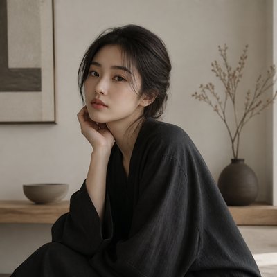
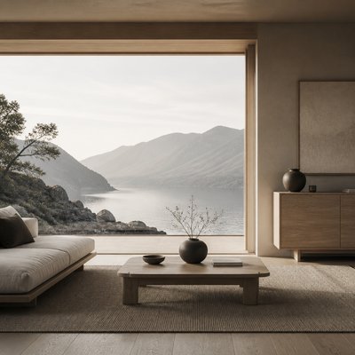
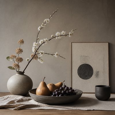
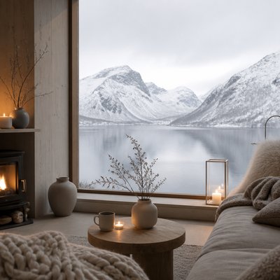
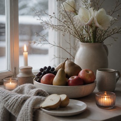
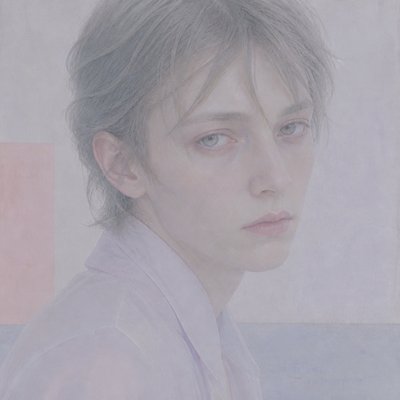
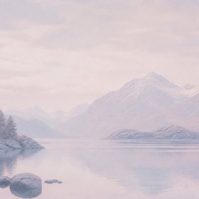
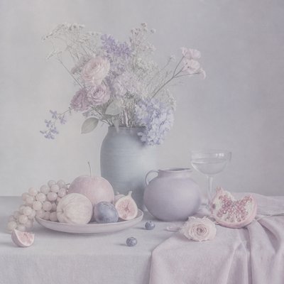
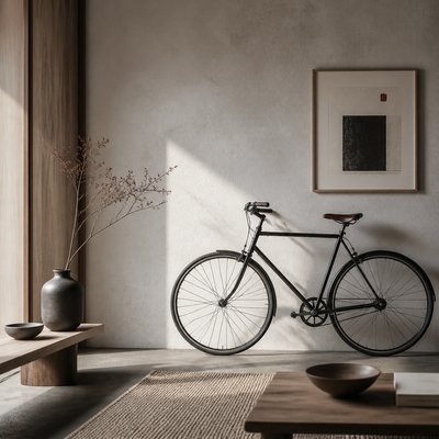
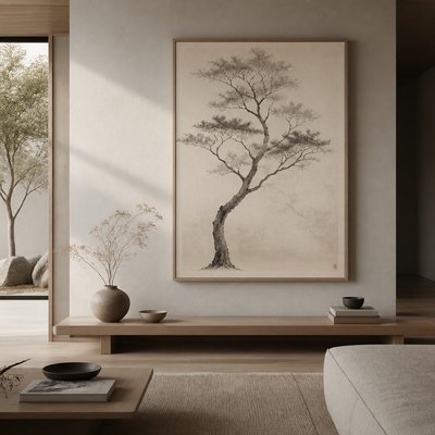
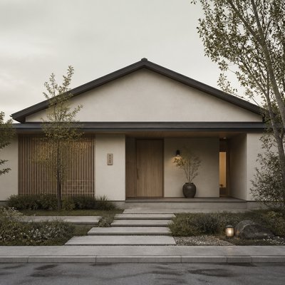
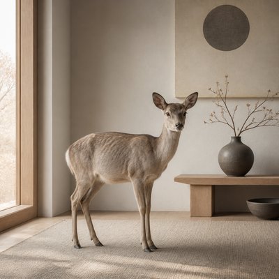
Japandi aesthetic blends Japanese calm with Scandinavian warmth through light oak, greige tones, clean lines, and serene negative space.
Instantly rendered in Japandi Aesthetic — or transform a photo
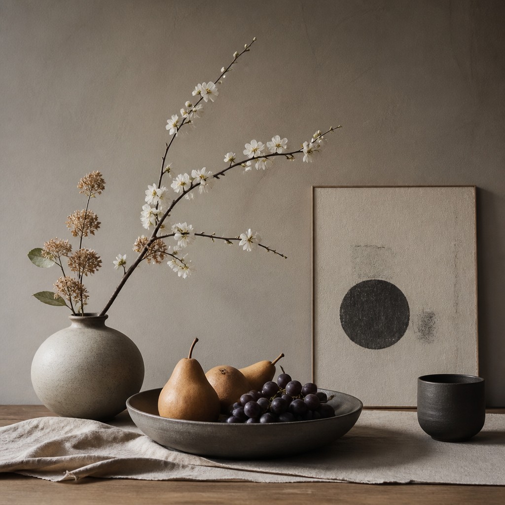
Japandi Aesthetic Gallery
Tap any artwork to explore it
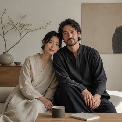
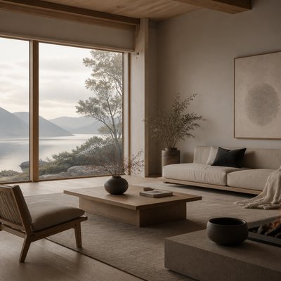
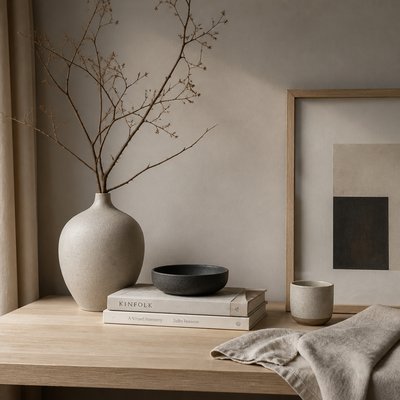
What is Japandi Aesthetic?
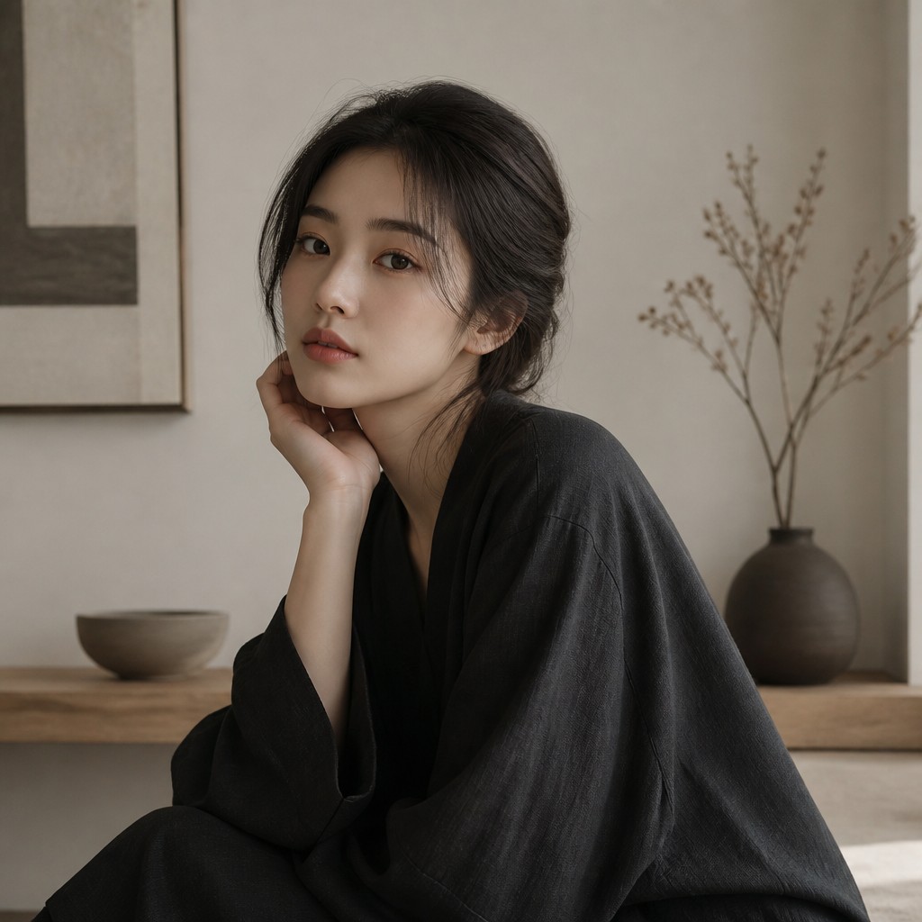
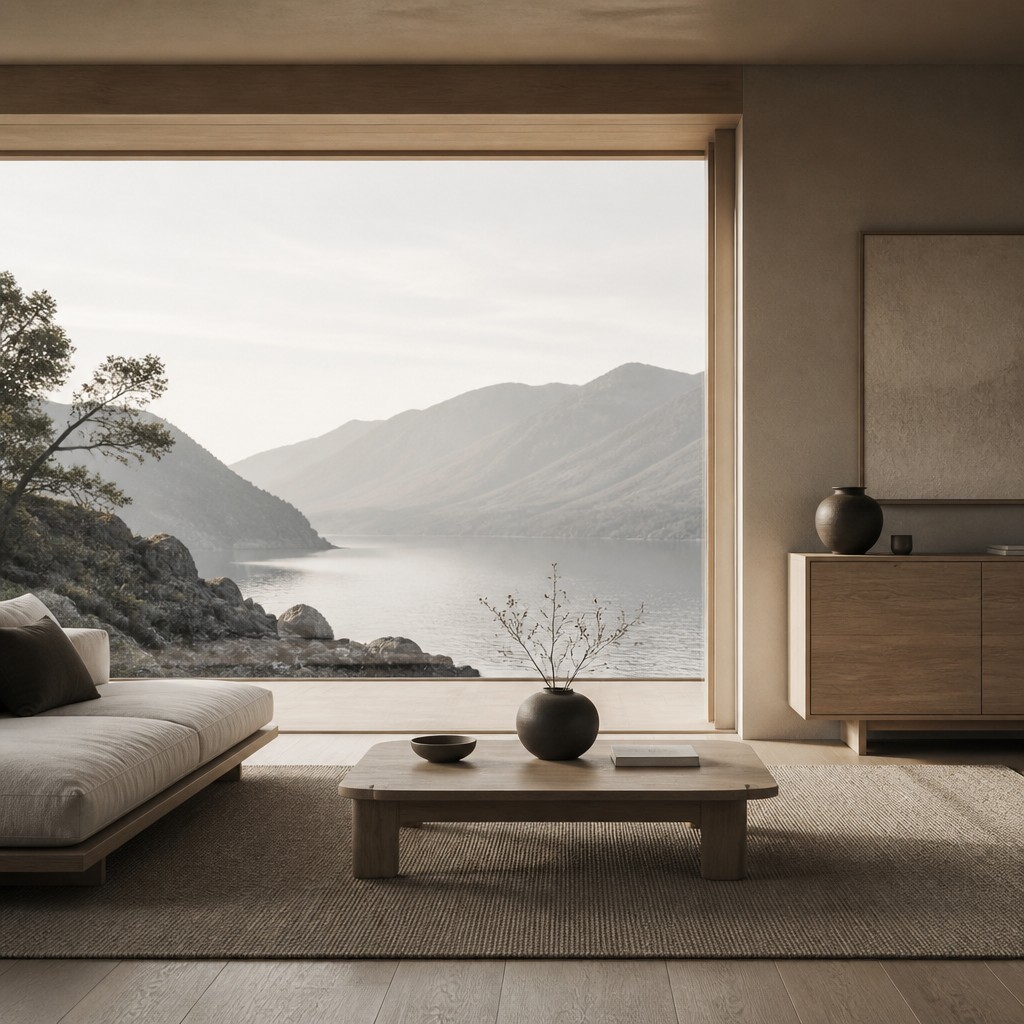
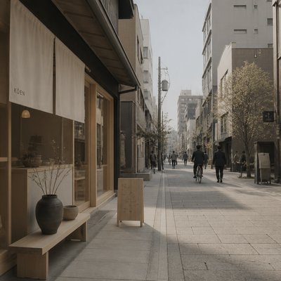
Japandi aesthetic is a hybrid visual style that combines Japanese restraint with Scandinavian warmth. It favors simple forms, low silhouettes, muted earth tones, and a careful balance between emptiness and texture. The result is understated rather than sparse, calm rather than cold, and tactile rather than decorative.
In visual terms, Japandi is built from honest materials and quiet composition: light oak, linen, matte ceramics, paper, stone, and brushed or weathered surfaces. Color is typically limited to warm white, greige, charcoal, clay, and soft brown. The style’s appeal comes from this disciplined softness, where every object feels selected for utility, harmony, and visual breathing room.
Try It On Your Photos
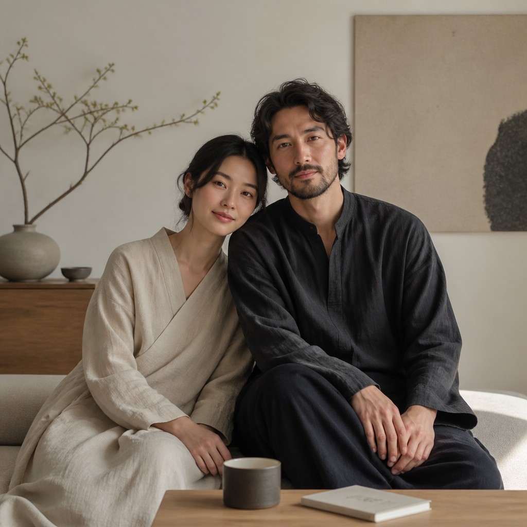
Upload any photo and convert it into Japandi Aesthetic — drag the sliders to compare before and after.



What Defines Japandi Aesthetic
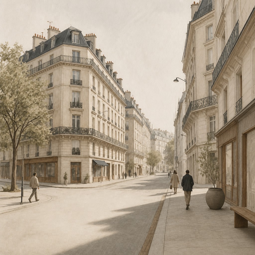
The signature details, up close
Muted, nature-based palette
Colors are usually restrained to warm white, greige, sand, charcoal, soft black, and muted clay. The palette creates visual quiet and supports the style’s emphasis on balance and calm.
Light wood and tactile materials
Light oak is especially common, along with linen, wool, paper, stone, and matte ceramic. Surfaces tend to feel honest and natural rather than glossy or heavily processed.
Low, clean silhouettes
Furniture and objects often sit close to the ground and use simple, linear geometry. Shapes are functional and uncluttered, with minimal ornament and little visual noise.
Generous negative space
Composition leaves room to breathe, whether in a room, a still life, or a page layout. Empty space is treated as an active design element rather than something to fill.
Soft contrast and diffused light
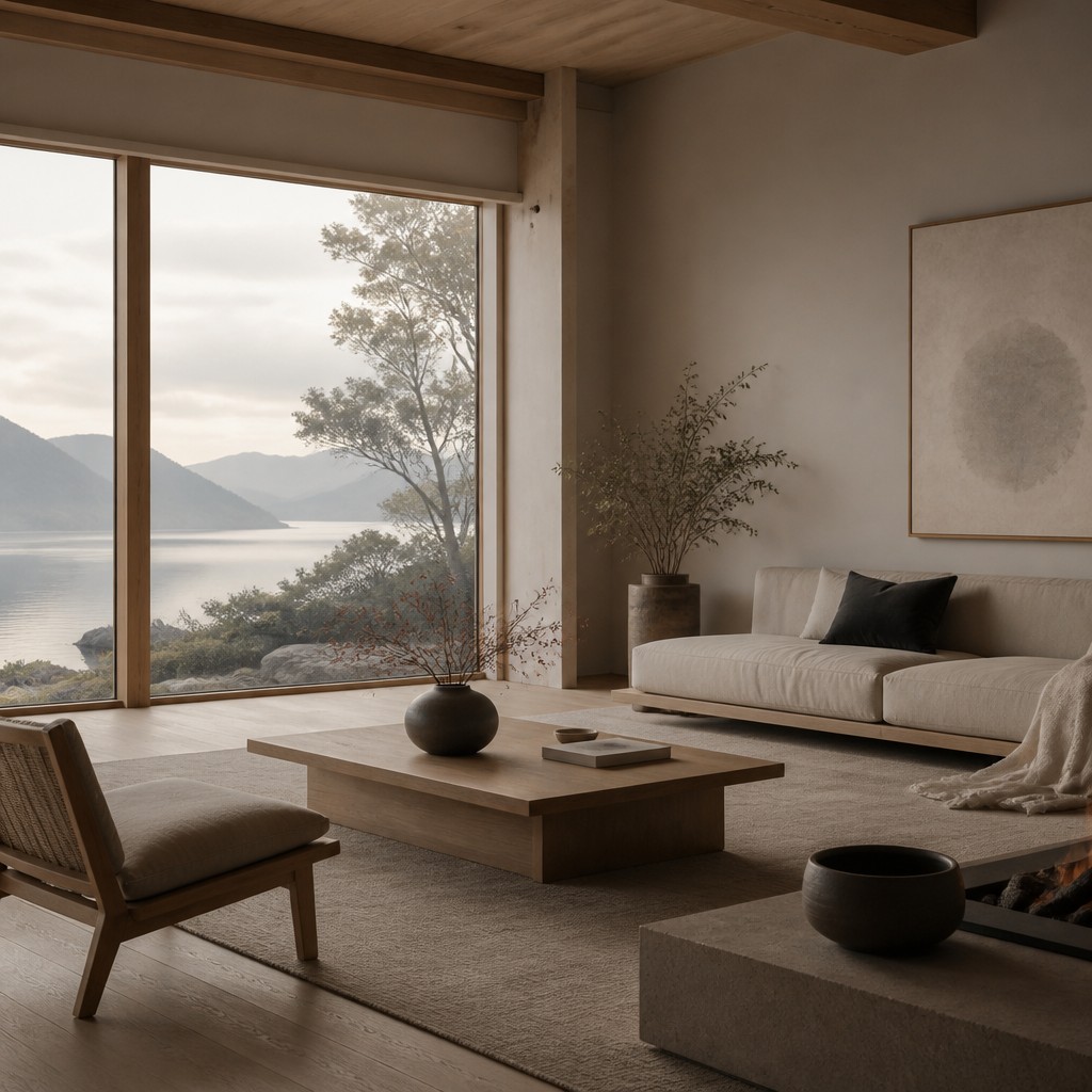
Lighting is usually natural, gentle, and shadow-rich without harsh drama. Contrast exists, but it is softened so forms read clearly without becoming severe.
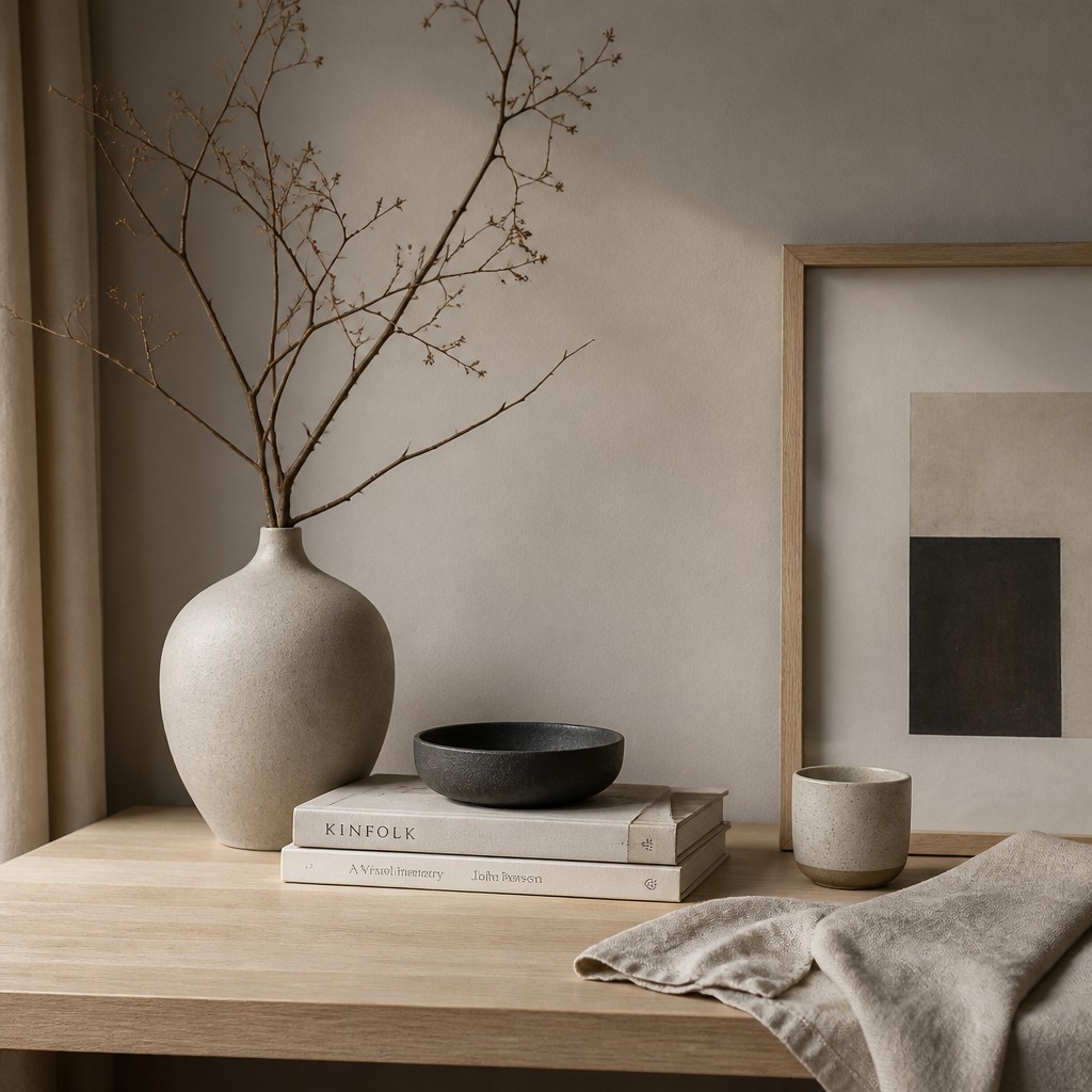
Subtle imperfection
The style allows slight irregularities from handcraft, but keeps them quiet and refined. A handmade mug, linen crease, or grain variation adds warmth without breaking the overall calm.
Try It
Create Videos in Japandi Aesthetic
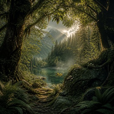
Styles aren't just for stills — describe a scene or animate an image and get a short video rendered in Japandi Aesthetic. Press play to see this pond come to life.
Make a VideoJapandi Aesthetic Prompt Ideas
Start from an idea — each one opens the generator with the style ready to go. See all 40 Japandi Aesthetic prompts →
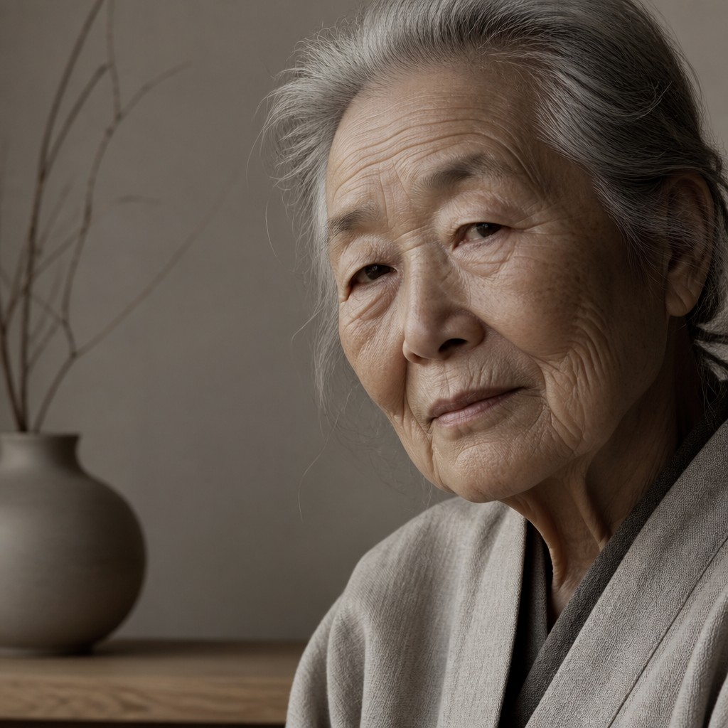
“close-up portrait of an elderly person with expressive weathered features”
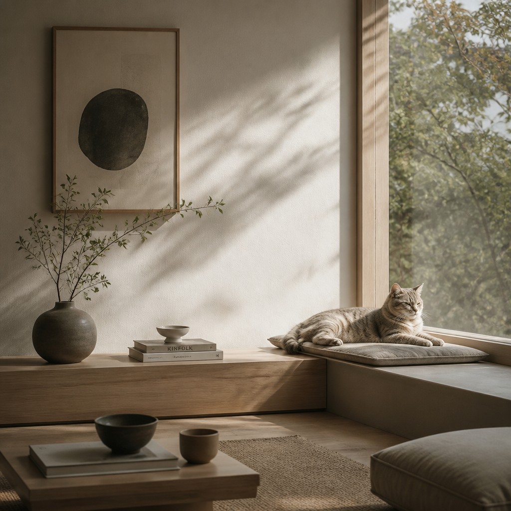
“a cat lounging in a sunlit window”
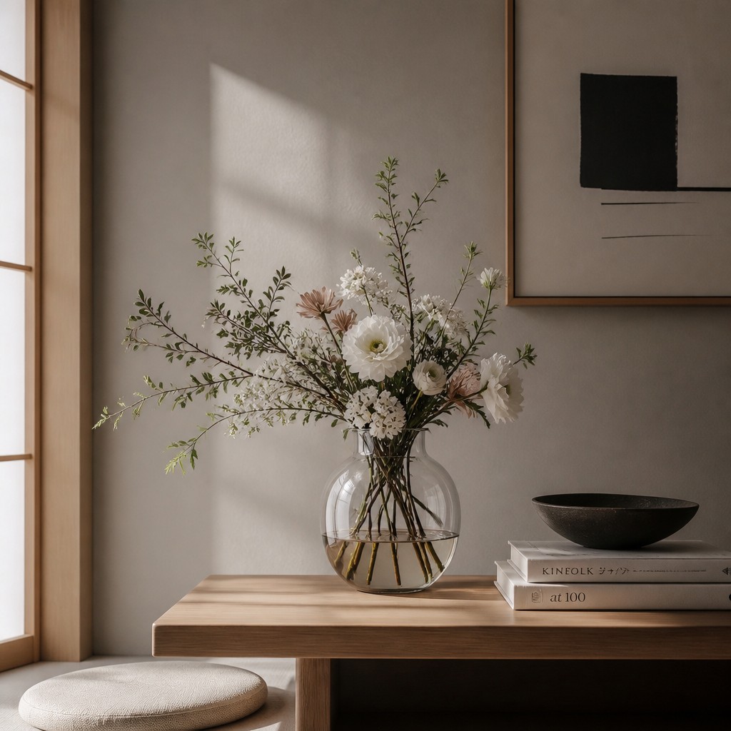
“bouquet of flowers in a glass vase”
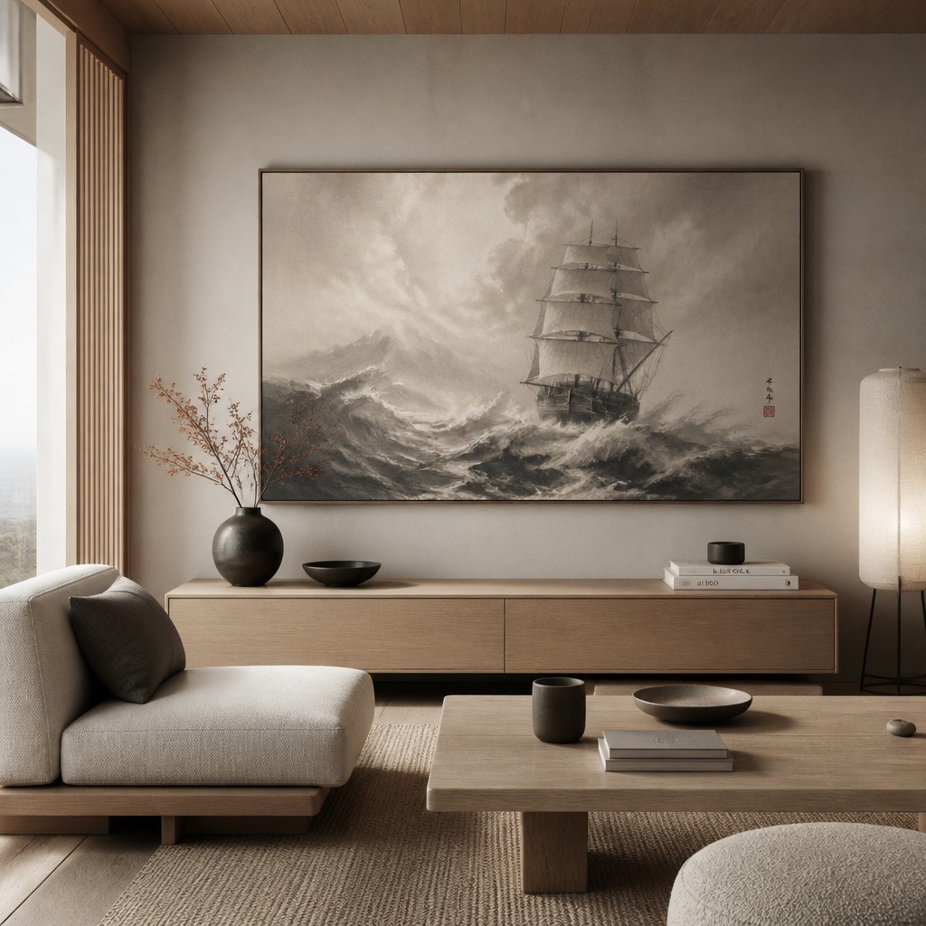
“sailing ship on a stormy sea”
How to Create Japandi Aesthetic Art
Master the craft step by step — or skip straight to creating. Read the full guide →
- 1
Choose a narrow material palette
Start with one light wood, one textile, and one neutral surface tone, then resist the urge to add more variety. In drawing, painting, or styling a scene, let material contrast do the work instead of color complexity.
- 2
Build around empty space
Compose with fewer objects than you think you need and leave clear margins around them. Whether you are photographing a room or designing a page, the negative space should feel intentional and spacious.
- 3
Use soft, natural lighting
Work with diffused daylight, window light, or gentle shadow gradients to avoid harsh edges. For digital art or prompt-based generation, specify serene natural light, soft shadows, and a calm interior atmosphere.
- 4
Keep forms low and functional
Favor simple silhouettes with horizontal emphasis: low tables, shallow bowls, plain chairs, and straight-edged shelving. Avoid ornate profiles or decorative layering unless the embellishment is extremely restrained.
- 5
Prioritize tactile realism over gloss
Show texture in oak grain, woven linen, paper fiber, or matte ceramic glaze rather than shiny finishes. In digital workflows, use subtle surface detail and avoid over-smoothing the image.
- 6
Prompt for restraint, not emptiness
When generating imagery, describe the subject first, then add cues like warm white, greige, light oak, muted clay, soft shadow gradients, and generous negative space. The goal is a balanced, lived-in quiet rather than a sterile minimalism.

The Story
History & Origins of Japandi Aesthetic
Japandi is not a historical movement with a fixed period or manifesto; it is a contemporary design aesthetic that emerged from the overlap of Japanese and Scandinavian interior and product design values. Its lineage draws from Japanese traditions of simplicity, asymmetry, and appreciation for natural materials, as well as Scandinavian modernism’s functional clarity, pale woods, and human-centered warmth.
The style became especially visible in the 2010s as global interest grew in minimalist interiors that still felt livable and inviting. It reflects broader design principles associated with Japanese wabi-sabi, zen-influenced calm, and Scandinavian hygge, while translating those ideas into contemporary interiors, objects, branding, and lifestyle imagery.
Influences: Japandi draws from Japanese design principles such as wabi-sabi, zen-inspired spatial restraint, and traditional material sensitivity, alongside Scandinavian modernism and Nordic interior design. It also overlaps with broader minimalist and contemporary slow-living aesthetics. In practice, it borrows the quiet composition of Japanese interiors and the warmth, livability, and pale wood surfaces associated with Scandinavian designers and architecture, while avoiding direct imitation of any single canonical artist or movement.
Frequently Asked Questions
What defines the Japandi aesthetic?
Japandi is defined by calm composition, muted neutrals, natural materials, and a balance between Japanese restraint and Scandinavian warmth. It typically uses light oak, linen, matte ceramics, and generous negative space. The style feels clean and functional, but not sterile.
Is Japandi the same as minimalism?
Not exactly. Minimalism often emphasizes reduction above all else, which can result in a cool or severe look. Japandi keeps the simplicity but adds warmth, texture, and a more lived-in softness through natural materials and gentle color.
How is Japandi different from Scandinavian design?
Scandinavian design is one of Japandi’s key influences, but Japandi usually feels more meditative and more tightly restrained. It often introduces Japanese ideas of imperfection, quietness, and spatial emptiness, while Scandinavian design tends to be a bit more openly cozy and functional.
What colors work best in Japandi art or interiors?
Warm whites, greige, sand, taupe, charcoal, muted clay, and soft browns are the most typical choices. Strong saturation is usually avoided unless it appears as a very small accent. The palette should feel grounded and natural rather than decorative.
Where is the Japandi aesthetic used?
It is common in interiors, product design, photography, editorial layouts, lifestyle branding, and homeware. It also appears in digital illustration and image-making when the subject benefits from a quiet, refined atmosphere. Its versatility comes from its ability to make ordinary objects feel calm and intentional.
How do I make an image look more Japandi?
Reduce the number of objects, simplify shapes, and use natural textures with soft daylight. In digital or AI-assisted creation, describe light oak, linen, matte ceramic, warm neutrals, and serene negative space. Avoid clutter, glossy surfaces, and loud contrast.
Create your first Japandi Aesthetic artwork
Describe anything — or upload a photo — and see it in Japandi Aesthetic in seconds.
Make Something with Japandi Aesthetic
Related Styles
Discover similar art styles