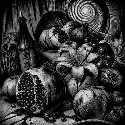
Stippling Dotwork Style
Explore stippling dotwork: monochrome images built from thousands of ink dots, with velvety gradients, tactile texture, and meditative precision.
Instantly rendered in Stippling Dotwork — or transform a photo
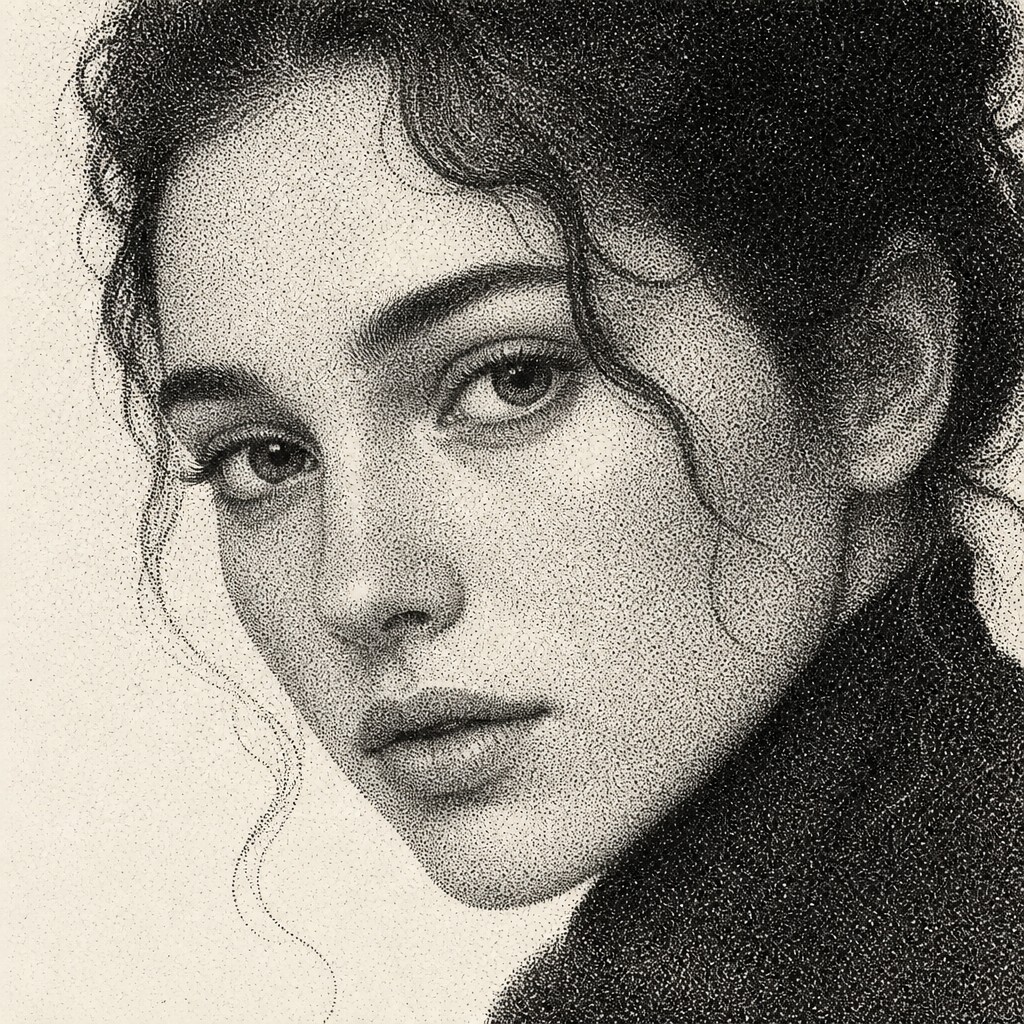
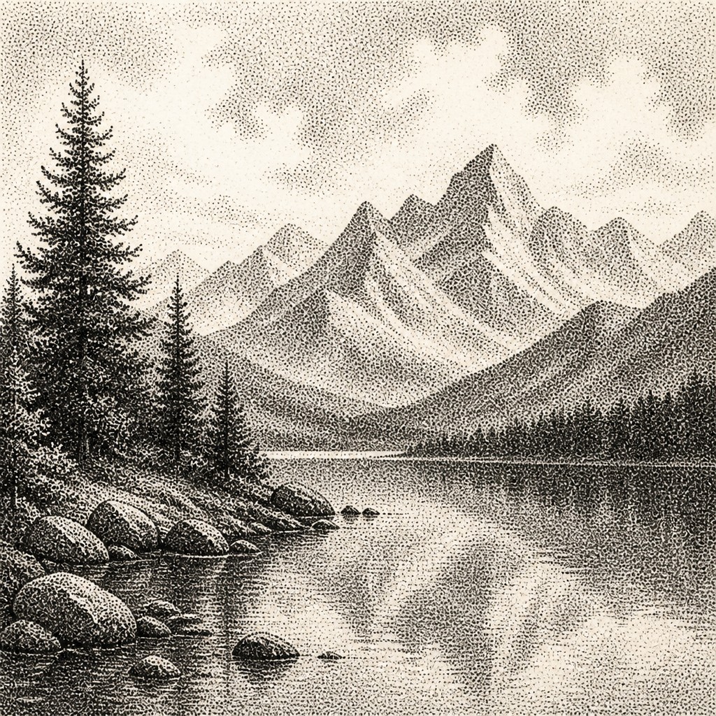
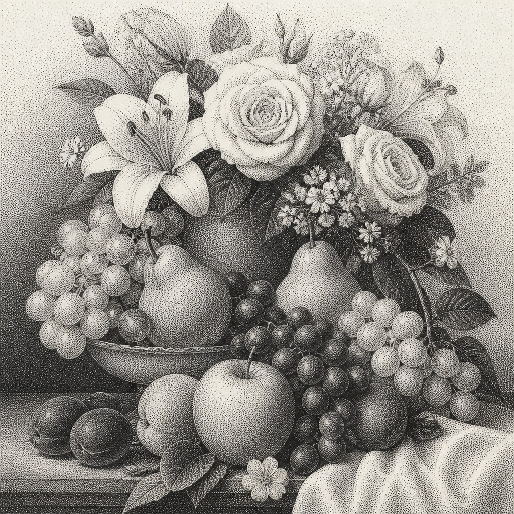
Stippling Dotwork Gallery
Tap any artwork to explore it
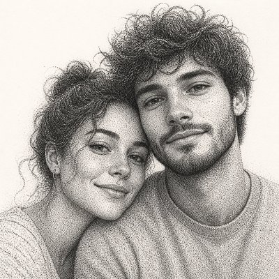
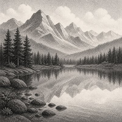
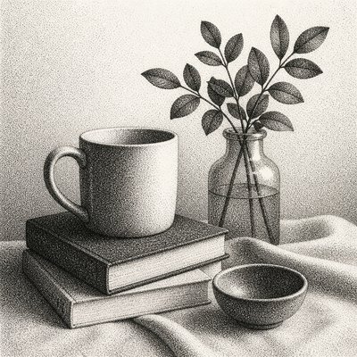
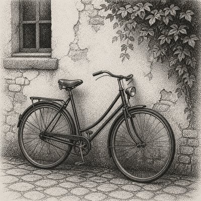
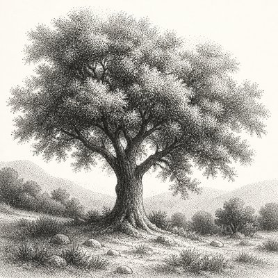
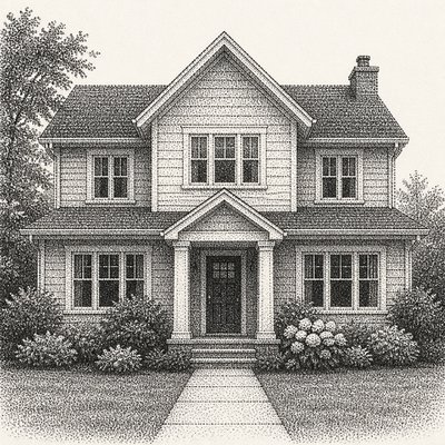
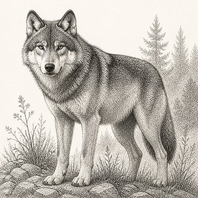
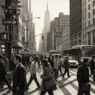
What is Stippling Dotwork Style?
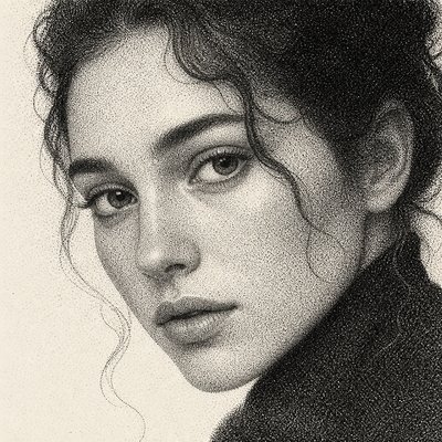
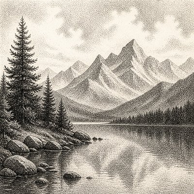
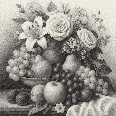
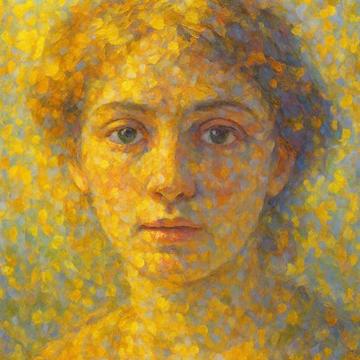
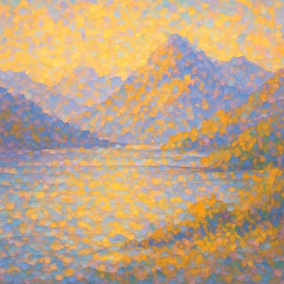
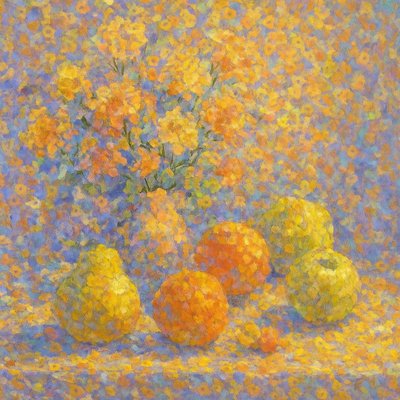
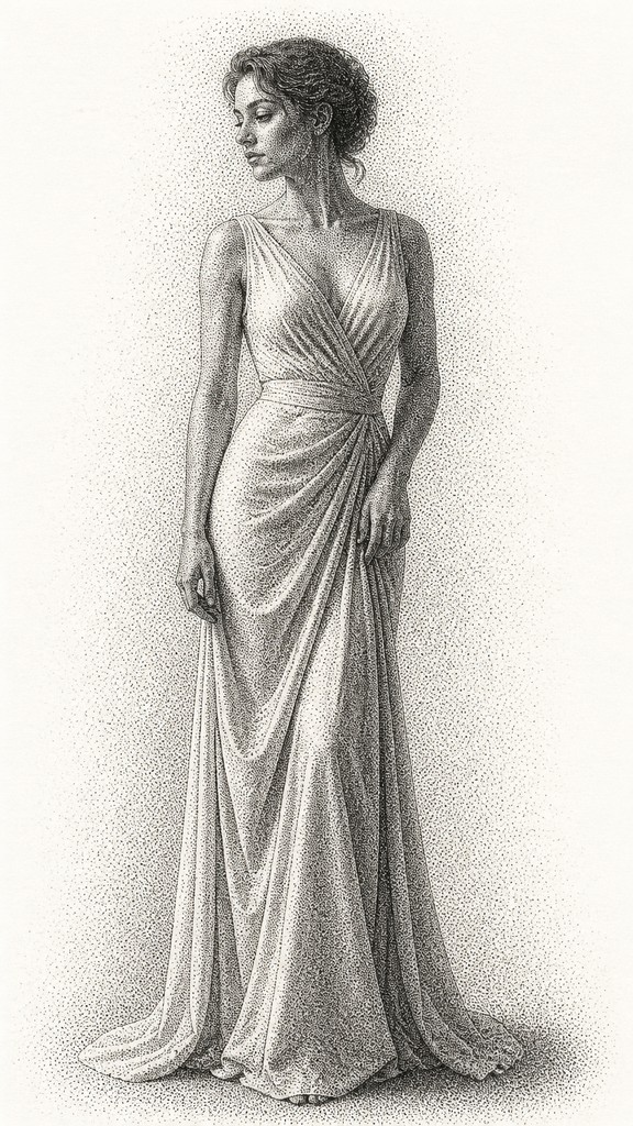
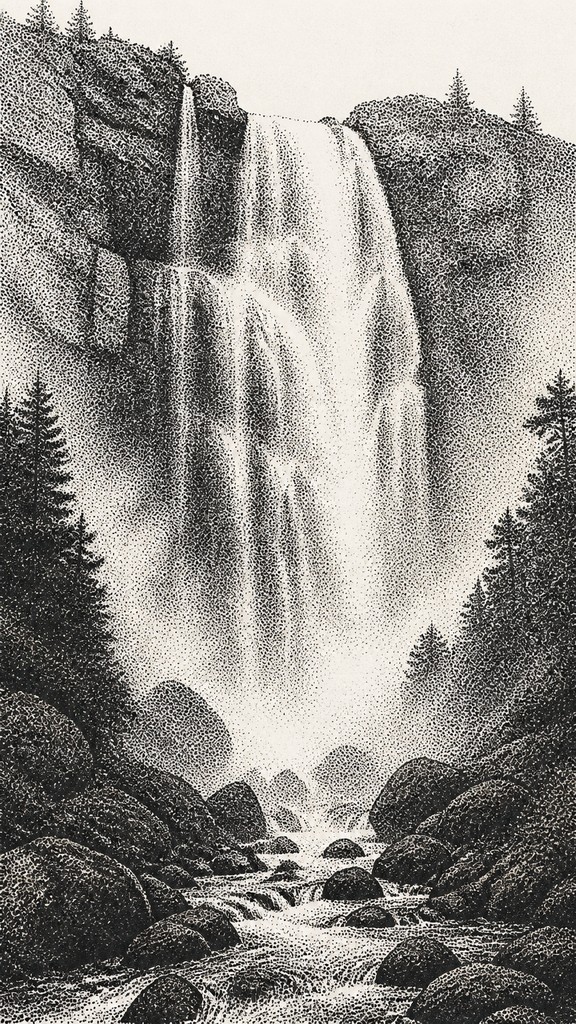
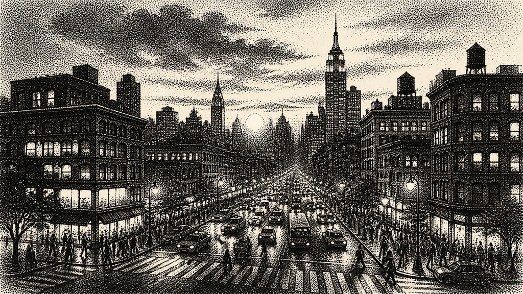
Stippling Dotwork Style constructs images from individually placed dots rather than continuous lines, brushstrokes, or flat fills. Dark areas contain dense clusters of marks, while lighter areas use fewer, more widely spaced dots, allowing the eye to blend them into tonal gradients. The result is a monochrome image with a soft, velvety surface and a distinctly tactile sense of labor.
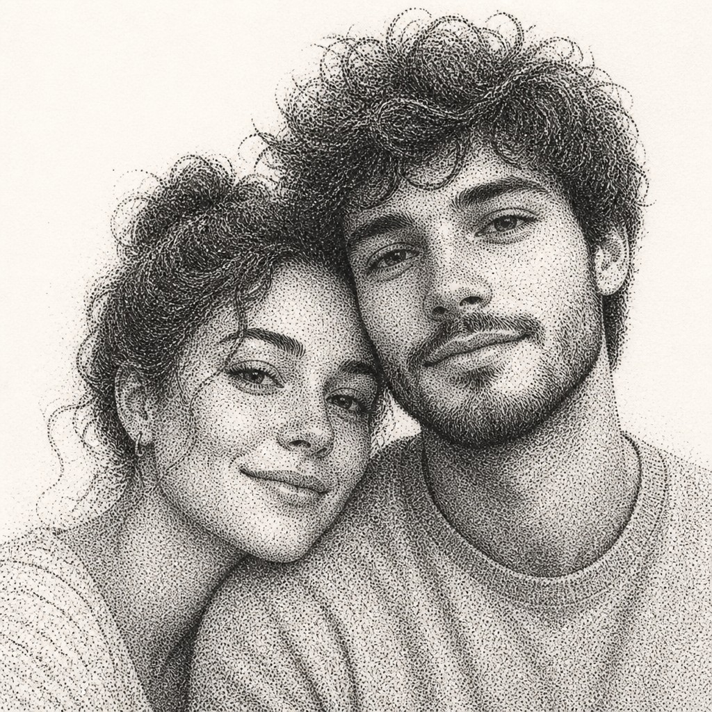
Try It On Your Photos
Upload any photo and convert it into Stippling Dotwork Style — drag the sliders to compare before and after.
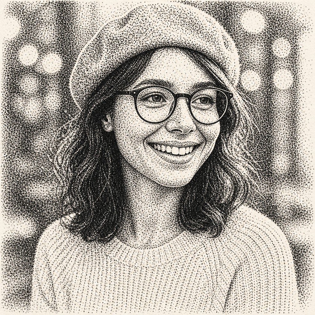

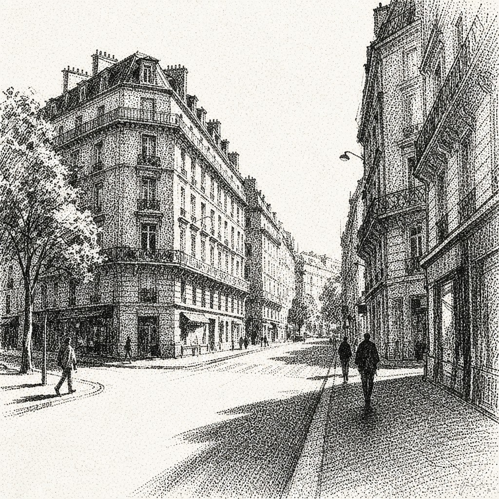

What Defines Stippling Dotwork Style
The signature details, up close
Dot-only construction
Forms, shadows, and highlights are built from individual ink points. Continuous outlines and painterly brush marks are minimized or omitted.
Density-based shading
Tone is controlled by the number and spacing of dots: compact clusters create deep blacks, while open spacing produces pale gray and paper-white areas.
Soft tonal transitions
Carefully modulated dot density creates gradual, almost velvety shifts between light and dark. The softness comes from optical blending rather than blurred edges.
Monochrome contrast
The characteristic palette is high-contrast black ink against warm white or ivory paper. Limited color can be introduced, but it changes the traditional graphic effect.
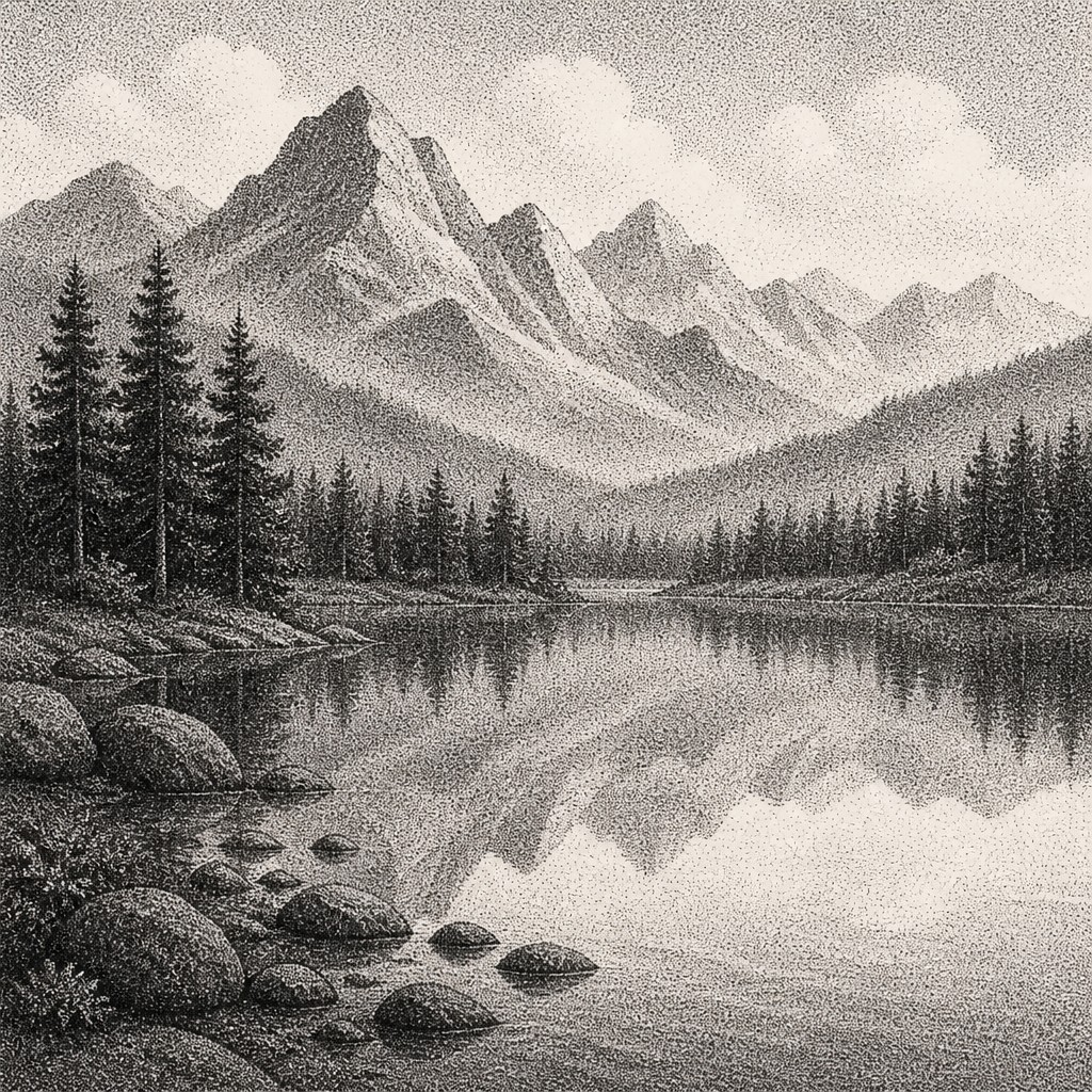
Tactile microtexture
Every surface carries a visible field of tiny marks, giving skin, fabric, stone, foliage, and clouds different rhythms without relying on conventional linework.
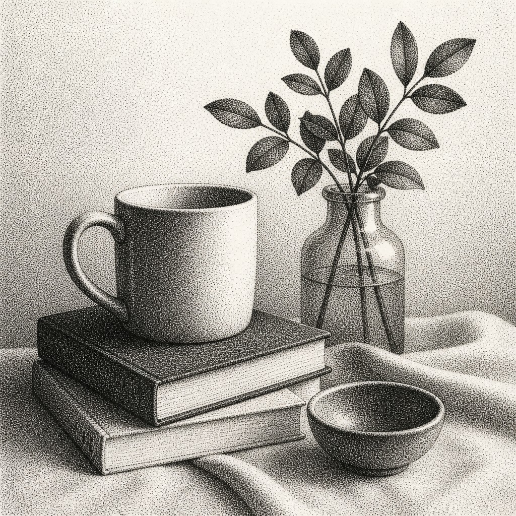
Meditative precision
The style suggests patience, repetition, and close observation. Its visual calm depends on consistent marks and controlled transitions rather than gestural spontaneity.
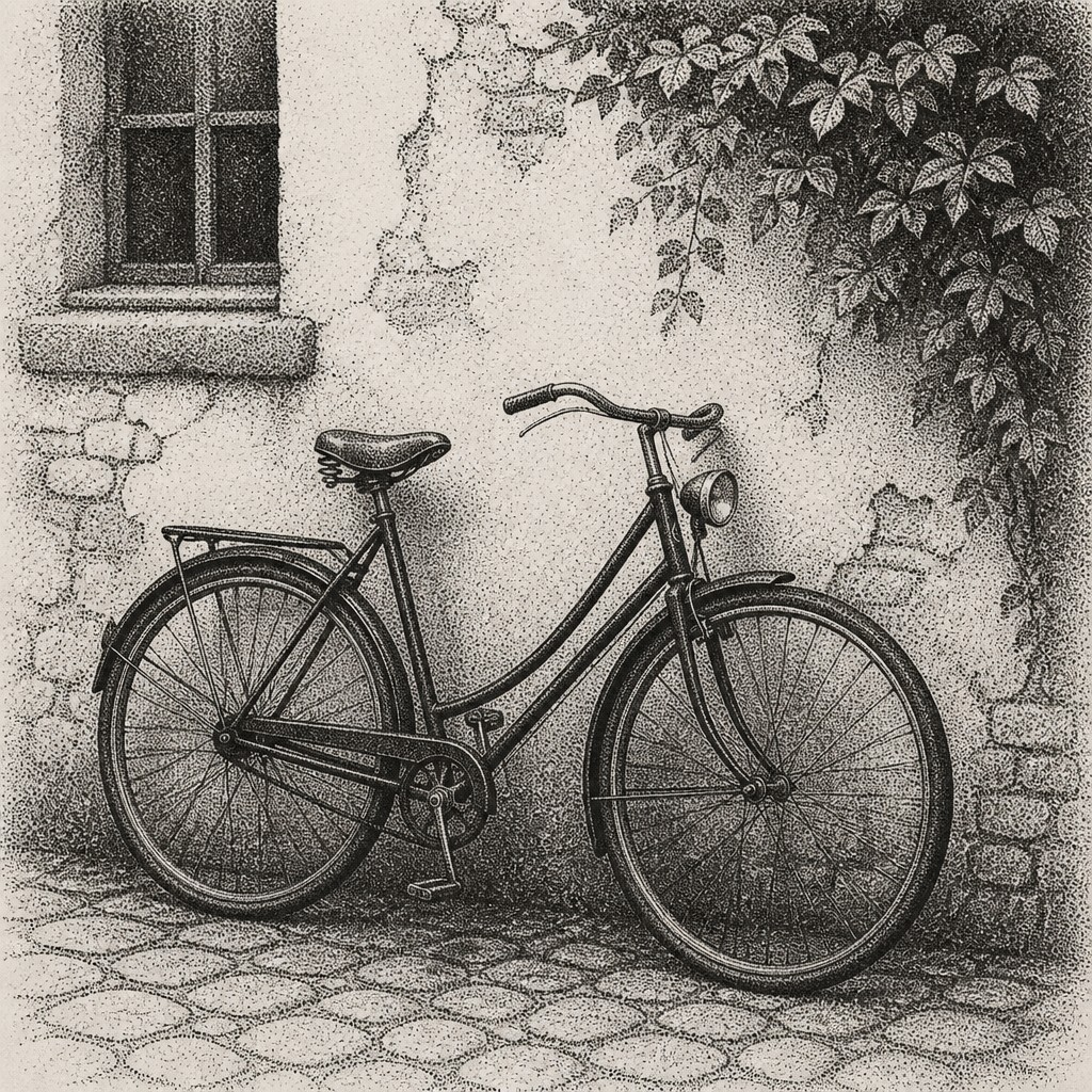
Strong silhouette and value structure
Because fine detail can merge at a distance, successful compositions usually depend on clear shapes, readable contours, and a well-planned range of dark, middle, and light values.
Try It
Create Videos in Stippling Dotwork Style
Styles aren't just for stills — describe a scene or animate an image and get a short video rendered in Stippling Dotwork. Press play to see this pond come to life.
Make a VideoStippling Dotwork Prompt Ideas
Start from an idea — each one opens the generator with the style ready to go. See all 40 Stippling Dotwork prompts →
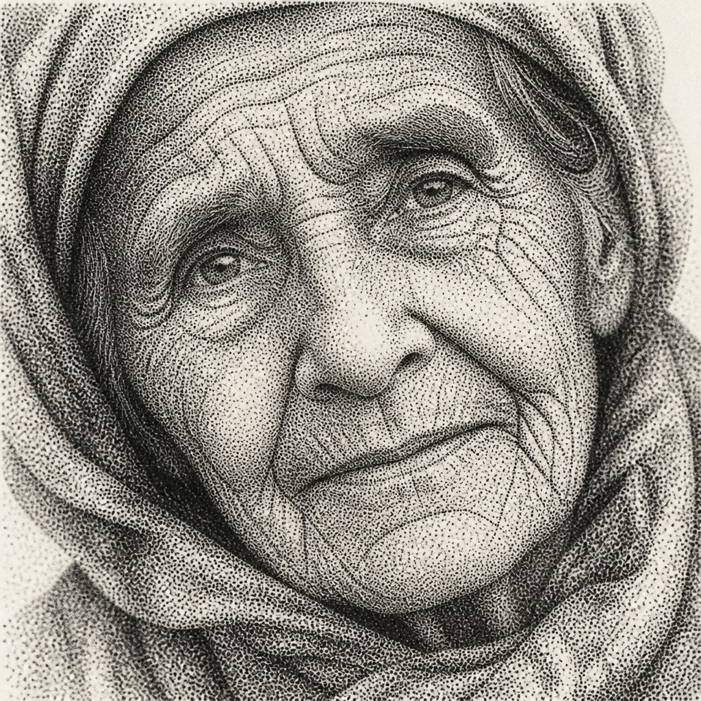
“close-up portrait of an elderly person with expressive weathered features”
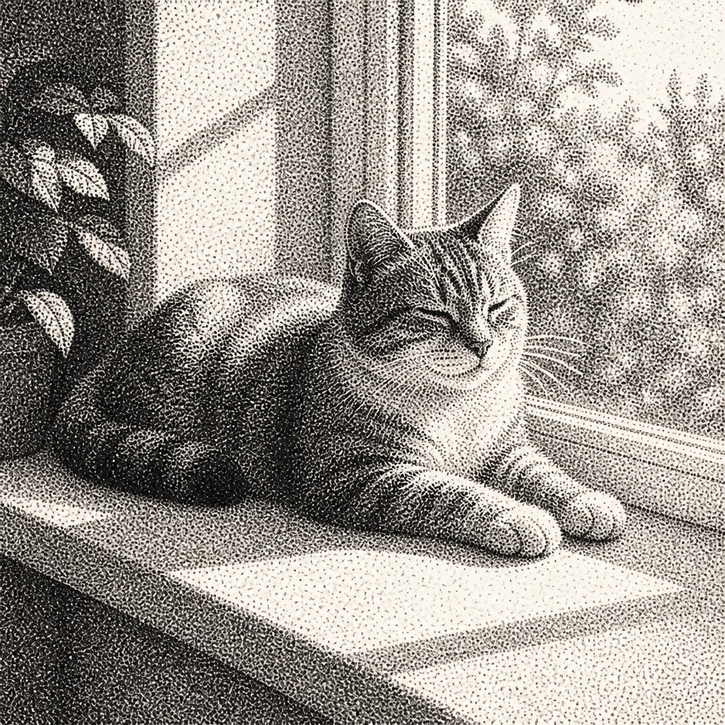
“a cat lounging in a sunlit window”
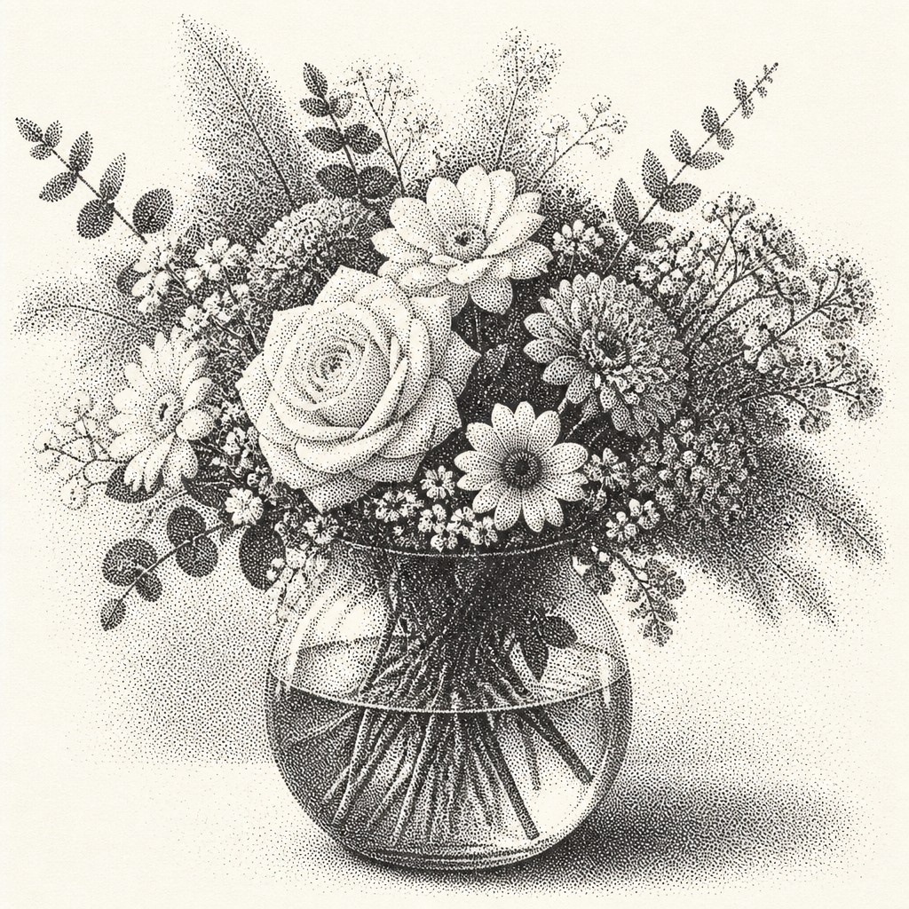
“bouquet of flowers in a glass vase”
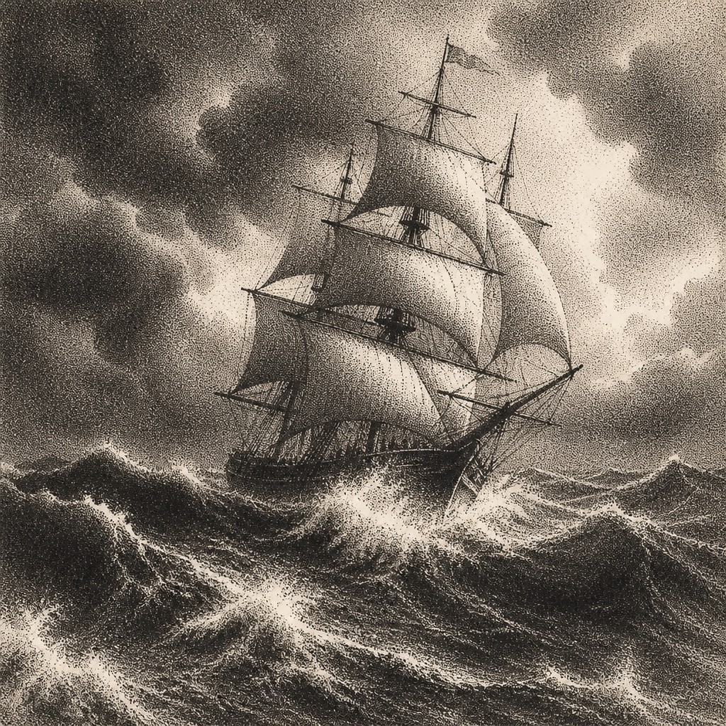
“sailing ship on a stormy sea”
How to Create Stippling Dotwork Art
Master the craft step by step — or skip straight to creating. Read the full guide →
- 1
Plan the value map
Reduce the subject to a few major tonal zones before adding dots. Establish the darkest masses first and reserve untouched paper for the brightest highlights.
- 2
Control dot spacing
Use uniform dots for calm, even shading and vary spacing or size sparingly for emphasis. Avoid accidental scribbles, since the style depends on deliberate mark rhythm.
- 3
Build form gradually
Layer clusters in several passes instead of placing maximum density immediately. Follow the curvature of objects subtly so the dots describe volume while remaining separate marks.
- 4
Choose suitable tools
Traditional methods include technical pens, fine felt-tip pens, dip pens, and archival black ink on smooth paper. Digitally, use a hard round brush with pressure or opacity controls disabled or tightly limited.
- 5
Preserve the paper or canvas color
A warm white ground reinforces the printlike character and provides natural highlights. In digital work, begin with an ivory background and use a restrained near-black rather than a range of soft gray brushes.
- 6
Describe the rendering explicitly
For prompt-based creation, specify thousands of fine ink dots, density-only gradients, no lines, black ink, warm white paper, and meticulous texture, then name a subject with clear lighting and readable silhouettes.
The Story
History & Origins of Stippling Dotwork
This is best understood as a contemporary hybrid aesthetic rather than a single historical art movement. Its lineage extends through stippling in pen-and-ink drawing, tonal dot systems used in printmaking and scientific illustration, comic-book shading, tattoo dotwork, and the broader tradition of rendering volume through repeated marks. It also recalls the optical logic of 19th-century Neo-Impressionism, although that movement generally used colored paint and visible dots for optical color mixing rather than fine black ink on paper.
Influences: The style draws on traditional pen-and-ink stippling, engraving and halftone approaches to tonal reproduction, natural-history illustration, comic-book point shading, and tattoo dotwork. Its careful value modulation also relates to Neo-Impressionist optical theory, while its limited palette and warm paper ground connect it to vintage scientific plates, handmade prints, and minimalist graphic illustration.
Frequently Asked Questions
What defines Stippling Dotwork Style?
It is defined by images constructed almost entirely from discrete dots, with tonal value created through dot density rather than lines, brush blending, or solid gray fills. The usual appearance is monochrome black ink on warm white paper with soft but highly controlled transitions.
Is stippling the same as pointillism?
They share the principle that separate marks can merge visually, but they are not identical. Pointillism is primarily associated with colored paint and optical color mixing, while stippling traditionally uses dots as a monochrome drawing or shading method.
How is dotwork different from halftone shading?
Halftone systems often use mechanically regular dots whose size or spacing reproduces an image for printing. Dotwork is usually more handcrafted or organic, with mark placement, density, and rhythm adjusted to describe form and texture.
Can I make this style with ordinary pens?
Yes. A fine technical pen or archival fineliner on smooth paper is sufficient, although several nib sizes make it easier to establish a wider value range. Work slowly, build dark areas in layers, and protect the page from smudging.
Does this style work for portraits and photographs?
It works especially well when the reference has strong lighting, clear planes, and recognizable silhouettes. Simplify complicated photographic detail into value groups before translating those groups into different dot densities.
Where is stippling dotwork commonly used?
It appears in pen-and-ink illustration, editorial graphics, scientific and botanical studies, tattoo design, poster art, comics, album artwork, and digital image treatments. Its controlled texture is useful when an image needs both precision and a handmade print character.
Create your first Stippling Dotwork artwork
Describe anything — or upload a photo — and see it in Stippling Dotwork Style in seconds.
Related Styles
Discover similar art styles