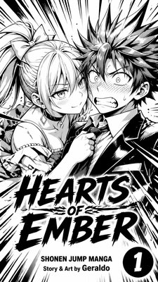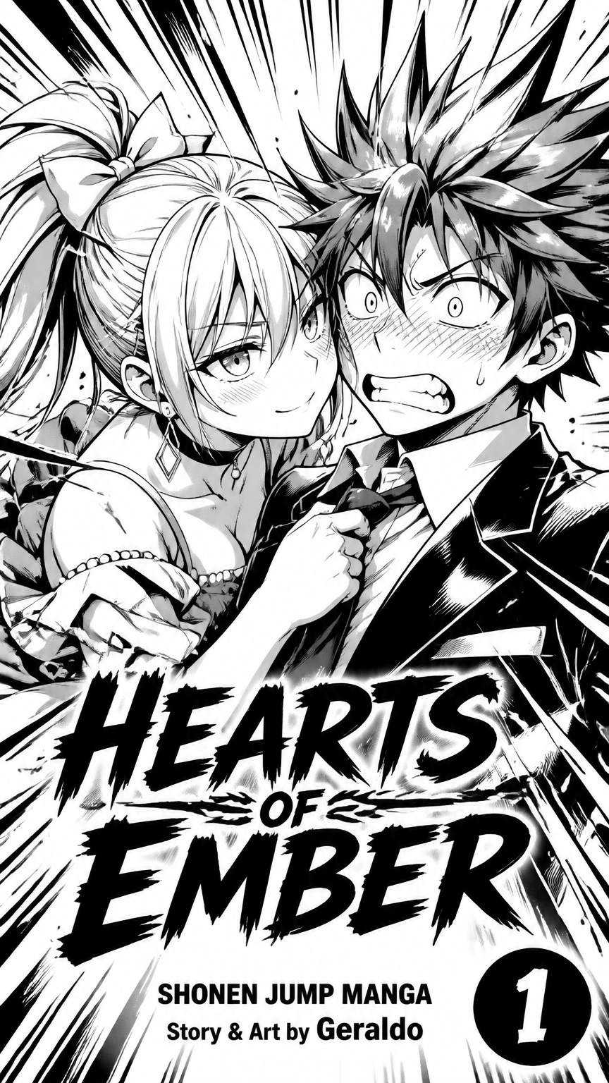
**Hearts of Ember – Official Manga Volume Cover Description**  The cover is designed in classic **Shonen Jump manga volume style**, with a clean white background that makes the characters stand out sharply.  In the center of the cover stand Blake and Rosé in a tight close-up composition. The art is pure manga style: strong black outlines, clean cel-shading, sharp shadows, and highly expressive faces. The linework is confident and polished, matching the look of high-quality Jump volume covers.  Rosé is positioned on the left, leaning in close. Her silver-grey hair is drawn with sharp, flowing strands tied in a high ponytail with a yellow ribbon. Her bright green eyes have strong highlights, and she wears a calm, teasing smirk. A light blush sits on her cheeks. She is wearing a yellow dress with clean folds and small pearl details, along with a black choker and geometric silver earrings. Her expression is relaxed and in control.  Blake is on the right, looking completely flustered. His spiky red hair is drawn with energetic, sharp spikes. His eyes are wide and panicked, with heavy red blush across his face rendered in classic manga style. He wears a black suit, white shirt, and bold red tie, all drawn with clean folds and solid black areas. His posture feels stiff and overwhelmed.  Their faces are extremely close, creating clear character chemistry. The lighting is bright and even, typical of Jump covers, with only minimal background shading so the focus stays entirely on the two characters.  At the bottom of the cover, in large, bold, stylized lettering, the title **HEARTS OF EMBER** sits prominently.  Below the title, in clean text:  **SHONEN JUMP MANGA**  Under that:  **Story & Art by Geraldo**  In the bottom right corner, a solid black circle contains the volume number in big white digits.  The overall design follows the exact structure of classic Shonen Jump volume covers: clean white background, strong character focus, bold title logo at the bottom, author credit, and volume number badge. The art style is clearly manga — sharp lines, expressive faces, and high contrast — so it immediately reads as an official Jump volume.
Public

**Hearts of Ember – Official Manga Volume Cover Description** The cover is designed in classic **Shonen Jump manga volume style**, with a clean white background that makes the characters stand out sharply. In the center of the cover stand Blake and Rosé in a tight close-up composition. The art is pure manga style: strong black outlines, clean cel-shading, sharp shadows, and highly expressive faces. The linework is confident and polished, matching the look of high-quality Jump volume covers. Rosé is positioned on the left, leaning in close. Her silver-grey hair is drawn with sharp, flowing strands tied in a high ponytail with a yellow ribbon. Her bright green eyes have strong highlights, and she wears a calm, teasing smirk. A light blush sits on her cheeks. She is wearing a yellow dress with clean folds and small pearl details, along with a black choker and geometric silver earrings. Her expression is relaxed and in control. Blake is on the right, looking completely flustered. His spiky red hair is drawn with energetic, sharp spikes. His eyes are wide and panicked, with heavy red blush across his face rendered in classic manga style. He wears a black suit, white shirt, and bold red tie, all drawn with clean folds and solid black areas. His posture feels stiff and overwhelmed. Their faces are extremely close, creating clear character chemistry. The lighting is bright and even, typical of Jump covers, with only minimal background shading so the focus stays entirely on the two characters. At the bottom of the cover, in large, bold, stylized lettering, the title **HEARTS OF EMBER** sits prominently. Below the title, in clean text: **SHONEN JUMP MANGA** Under that: **Story & Art by Geraldo** In the bottom right corner, a solid black circle contains the volume number in big white digits. The overall design follows the exact structure of classic Shonen Jump volume covers: clean white background, strong character focus, bold title logo at the bottom, author credit, and volume number badge. The art style is clearly manga — sharp lines, expressive faces, and high contrast — so it immediately reads as an official Jump volume.

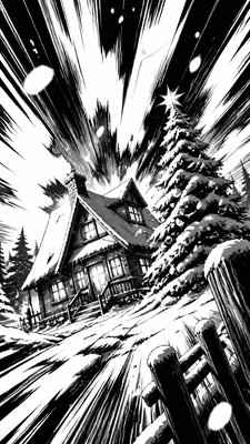
Style Used
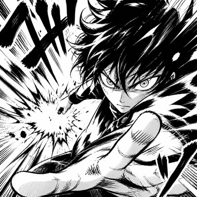
This shonen battle manga art style emphasizes dynamic action through bold ink work and explosive panel layouts. Featuring heavy speed lines, impact bursts, and dramatic facial expressions, it captures the intensity of combat scenes in black and white.

See More

**Hearts of Ember – Official Manga Volume Cover Description**  The cover is designed in classic **Shonen Jump manga volume style**, with a clean white background that makes the characters stand out sharply.  In the center of the cover stand Blake and Rosé in a tight close-up composition. The art is pure manga style: strong black outlines, clean cel-shading, sharp shadows, and highly expressive faces. The linework is confident and polished, matching the look of high-quality Jump volume covers.  Rosé is positioned on the left, leaning in close. Her silver-grey hair is drawn with sharp, flowing strands tied in a high ponytail with a yellow ribbon. Her bright green eyes have strong highlights, and she wears a calm, teasing smirk. A light blush sits on her cheeks. She is wearing a yellow dress with clean folds and small pearl details, along with a black choker and geometric silver earrings. Her expression is relaxed and in control.  Blake is on the right, looking completely flustered. His spiky red hair is drawn with energetic, sharp spikes. His eyes are wide and panicked, with heavy red blush across his face rendered in classic manga style. He wears a black suit, white shirt, and bold red tie, all drawn with clean folds and solid black areas. His posture feels stiff and overwhelmed.  Their faces are extremely close, creating clear character chemistry. The lighting is bright and even, typical of Jump covers, with only minimal background shading so the focus stays entirely on the two characters.  At the bottom of the cover, in large, bold, stylized lettering, the title **HEARTS OF EMBER** sits prominently.  Below the title, in clean text:  **SHONEN JUMP MANGA**  Under that:  **Story & Art by Geraldo**  In the bottom right corner, a solid black circle contains the volume number in big white digits.  The overall design follows the exact structure of classic Shonen Jump volume covers: clean white background, strong character focus, bold title logo at the bottom, author credit, and volume number badge. The art style is clearly manga — sharp lines, expressive faces, and high contrast — so it immediately reads as an official Jump volume.
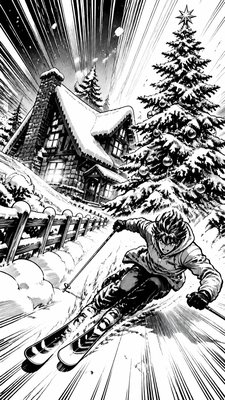
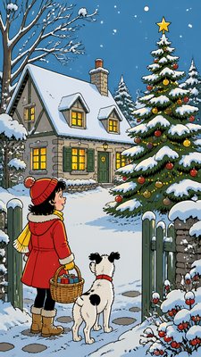
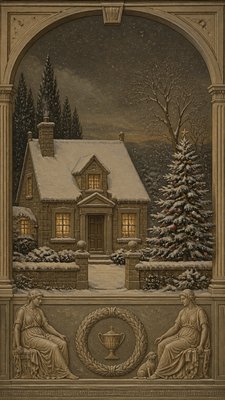
a snow-covered cottage with warm glowing windows beside a decorated pine tree, gentle snowfall, no text
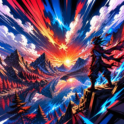
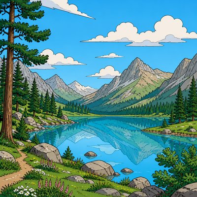
serene landscape with pine-covered mountains around a still lake, drifting clouds, no people and no animals
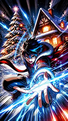
a snow-covered cottage with warm glowing windows beside a decorated pine tree, gentle snowfall, no text
serene landscape with pine-covered mountains around a still lake, drifting clouds, no people and no animals
a snow-covered cottage with warm glowing windows beside a decorated pine tree, gentle snowfall, no text
Volume 1 – Chapter 1: “Running Away”

Story Points:

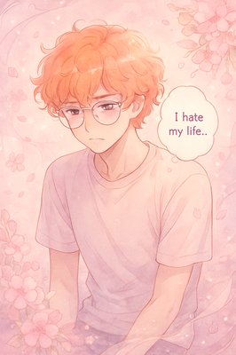
Ji Hun is bored and unhappy with his life in the band “Forever.” Inner thoughts reveal his frustration and desire to escape.

He decides to run away; changes his appearance with a ginger curly wig and glasses to hide his identity.

Ji Hun sneaks out, but security guards notice him and start chasing him.

While running, he accidentally bumps into Min Joon, a girl with long curly black hair, wearing a hoodie and baggy jeans. They fall on the ground.

Min Joon helps him up and insists on taking him to her home to relax.

She offers him tea and biscuits; they start talking. Ji Hun lies and says his name is “Jin” and that he is an accountant.

He notices posters of his band “Forever” in her room and realizes she is a fan. Min Joon praises Ji Hun’s voice, making him shy.

Ji Hun talks about never enjoying life; Min Joon promises to teach him how to enjoy life.

Ji Hun hesitates, worried about being recognized, but she reassures him. He agrees to go with her.

Min Joon prepares to take him outside, setting up the transition to Chapter 2 (car ride and amusement park).

Page/Panel Flow Suggestions:

Pages 1–3: Ji Hun’s frustration, morning in the band dorm, decision to escape.

Pages 4–5: Ji Hun changing disguise.

Pages 6–8: Running and being chased by security guards.

Pages 9–12: Collision with Min Joon, first meeting.

Pages 13–16: Min Joon taking him home, tea and biscuits scene.

Pages 17–20: Conversation about Ji Hun’s unhappiness, Min Joon promising to show him joy.
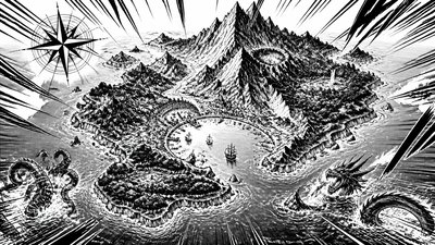
a map of an island realm with mountains, forests, a sheltered bay, sea monsters in the water and a compass rose, no text labels
a snow-covered cottage with warm glowing windows beside a decorated pine tree, gentle snowfall, no text
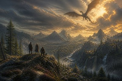
A wide 1920x1080 landscape vista, epic fantasy realism, painterly digital art with photographic lighting.

Composition: an asymmetrical, rugged wilderness panorama shot from a slightly elevated vantage point, looking across a deep valley toward a jagged mountain range in the far background, peaks partially wreathed in drifting cloud and haze for atmospheric depth. The terrain is uneven and wild — wind-carved rock outcrops, scattered scrub pine, patches of heather and loose scree, a narrow river or ravine cutting diagonally through the middle ground rather than running straight. Avoid symmetry: shift the horizon line off-center (roughly lower third), stagger the mountain silhouettes at varying heights and distances, and let foreground rock formations break the frame unevenly on one side.

Sky and creature: a large dragon in flight overhead, positioned off-center in the upper portion of the frame, wings partially unfurled mid-glide, casting a soft moving shadow across the valley floor below it. Weather is dynamic — heavy, textured clouds catching low golden-hour sunlight, with the dragon partially backlit so its silhouette reads clearly against a break in the clouds.

Figures: on a rocky hill in the middle distance, three small silhouetted figures stand together looking outward toward the vista and the dragon, backs mostly to camera, scaled realistically small against the vast landscape (do not make them a focal foreground element). From left to right: a human man with a bow slung diagonally across his back, an elven woman with a sword sheathed at her hip and windswept hair, and a stocky dwarf gripping an axe loosely in his right hand, axe head resting near the ground. Their poses should feel natural and slightly off-balance, weight shifted, not posed symmetrically or facing perfectly forward — as if they just stopped walking to take in the view.

Lighting and mood: warm late-afternoon or early-evening directional sunlight raking across the terrain from one side, long soft shadows, visible atmospheric haze/depth fog between the middle ground and the mountains, subtle color grading toward amber and cool blue-grey contrast. Add fine environmental imperfections — dust motes in the light shafts, uneven cloud texture, slightly irregular rock erosion patterns — to avoid a clean, overly-rendered digital look.

Style: realistic fantasy concept art in the tradition of high-budget game key art (think Guild Wars 2 or The Witcher 3 promotional environment art), painterly brushwork with photographic-grade lighting and texture detail, natural imperfect framing, no vignette, no heavy symmetry, no centered "hero shot" composition. Wide 16:9 aspect ratio, 1920x1080, designed as a background/banner image with usable negative space near the top-left or top-right for potential UI overlay.

Negative cues: avoid perfect bilateral symmetry, avoid centered dragon, avoid glossy over-saturated "AI sheen," avoid cartoonish proportions, avoid characters facing camera directly, avoid clean/sterile lighting.
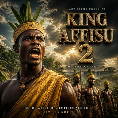
Absolutely. Here’s a detailed prompt matching the KING AFFISU 2 poster you uploaded. I’ve kept the visual style, composition, costumes, atmosphere, and typography direction very close to the reference. A strong poster works best when the hero is the clear focal point and the title has its own clean space. 

🎬 KING AFFISU 2 — Movie Poster Prompt

> Create an ultra-realistic cinematic African historical-action movie poster for a film titled “KING AFFISU 2.”

A powerful young Black African king stands prominently in the foreground, occupying the left and center of the frame. He has an intense commanding expression, mouth open as if shouting a battle command, strong facial features, realistic dark skin texture, and a fierce royal presence.

He wears a traditional golden-yellow royal warrior garment draped over one shoulder, a textured yellow ceremonial headband/crown, with several tall fresh green leaves rising from the crown. Around his neck is a dark traditional beaded necklace with a small metallic royal pendant.

Behind him are four African royal guards/warriors, standing in formation at different distances. They wear matching yellow headbands, traditional brown waist garments, and simple white ceremonial body markings. They stand proudly in a natural African landscape, creating depth and scale.

Background: lush tropical African vegetation, earthy brown ground, distant trees, dramatic dark storm clouds covering the sky, sunlight breaking through the clouds, powerful atmospheric contrast, subtle mist and dust in the air.

Lighting: dramatic cinematic lighting, warm golden sunlight hitting the king from the side, deep shadows, strong facial highlights, realistic skin texture, volumetric rays through the clouds, high contrast, subtle golden color grading, epic historical-film atmosphere.

Composition: premium theatrical movie-poster composition, hero extremely prominent in the foreground, supporting characters smaller in the background, strong depth of field, realistic perspective, layered cinematic composition, visually balanced negative space on the upper-right side for the movie title. The poster should feel like an expensive African epic film.

Typography: On the upper-right, place large dramatic three-dimensional weathered stone-and-gold metallic lettering:

KING
AFFISU
2

Above the title, small widely spaced white uppercase text: JAZY FILMS PRESENTS

Under the title: THE SPIRIT OF THE LAND

At the bottom: LEGENDS ARE BORN. EMPIRES ARE BUILT.

Then smaller golden text: COMING SOON

Make the title extremely readable, monumental, embossed, textured, metallic, slightly weathered, with realistic shadows and highlights.

Visual style: photorealistic, cinematic Hollywood-quality African epic, 8K detail, realistic skin pores, realistic fabric texture, natural vegetation, dramatic clouds, volumetric lighting, atmospheric perspective, cinematic depth of field, subtle film grain, HDR, high dynamic range, professional theatrical key art, premium color grading, epic and powerful mood.

Aspect ratio: 2:3 vertical theatrical movie poster.

Important: no cartoon appearance, no plastic skin, no distorted faces, no extra limbs, no duplicated characters, no blurry faces, no misspelled title, no modern buildings, no modern clothing, no futuristic elements.


This follows the same kind of hero-first hierarchy, dramatic contrast, atmospheric depth, and typography-aware composition commonly used in cinematic poster design.