Frutiger Aero Aesthetic
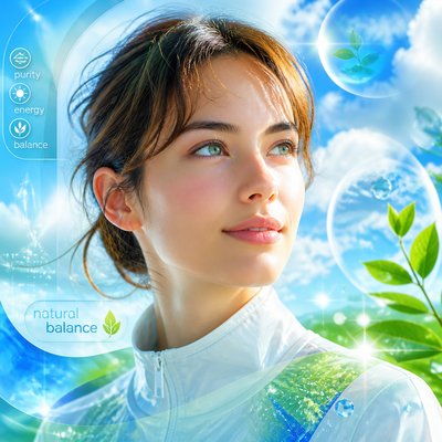
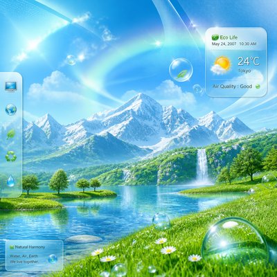
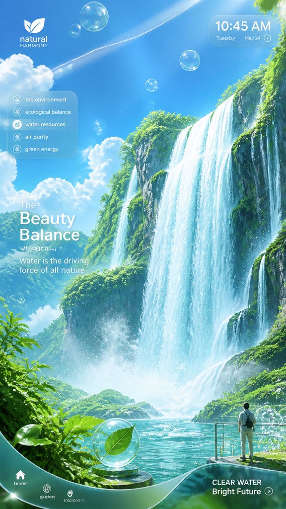
Glossy eco-tech visuals with bubbles, dewy greens, sky blues, glassy highlights, and optimistic mid-2000s digital polish.
Instantly rendered in Frutiger Aero Aesthetic — or transform a photo
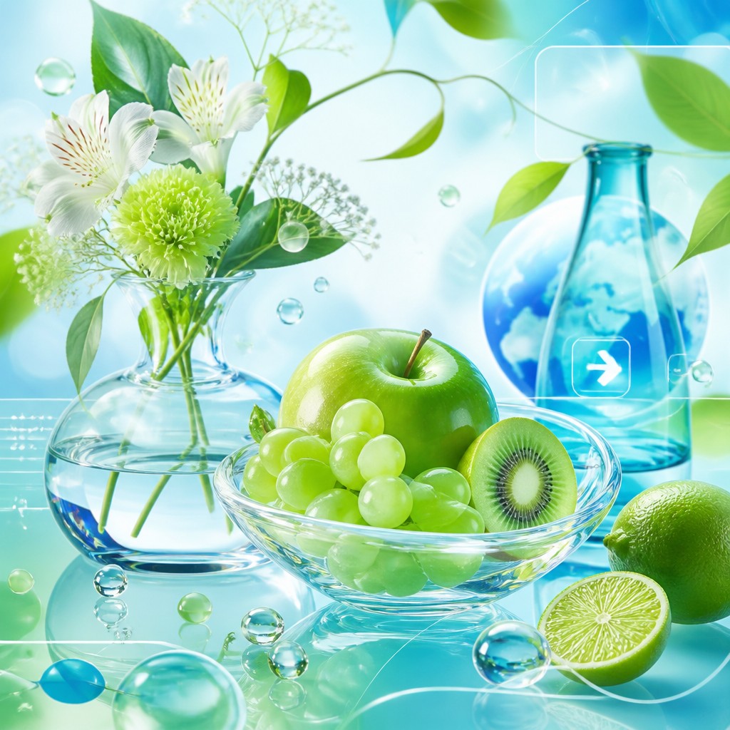
Frutiger Aero Aesthetic Gallery
Tap any artwork to explore it
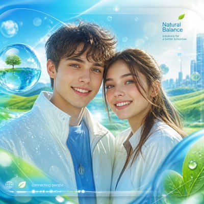
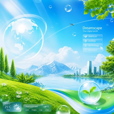

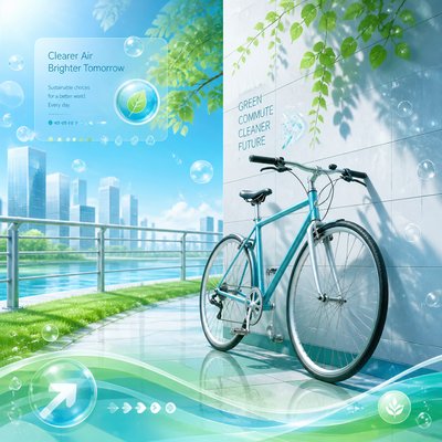
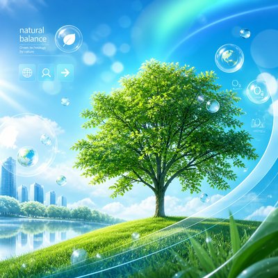

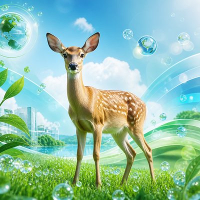
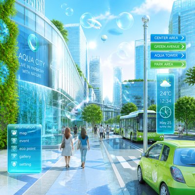
What is Frutiger Aero Aesthetic?
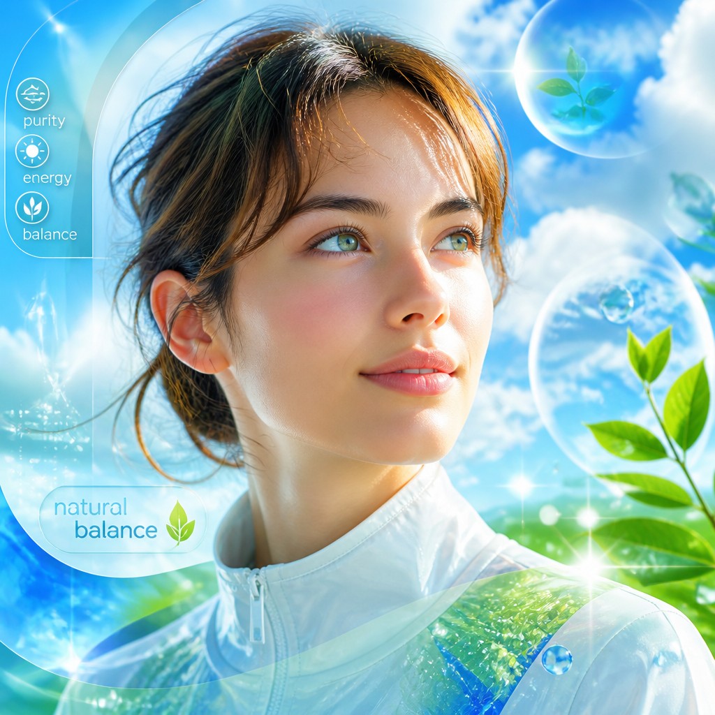
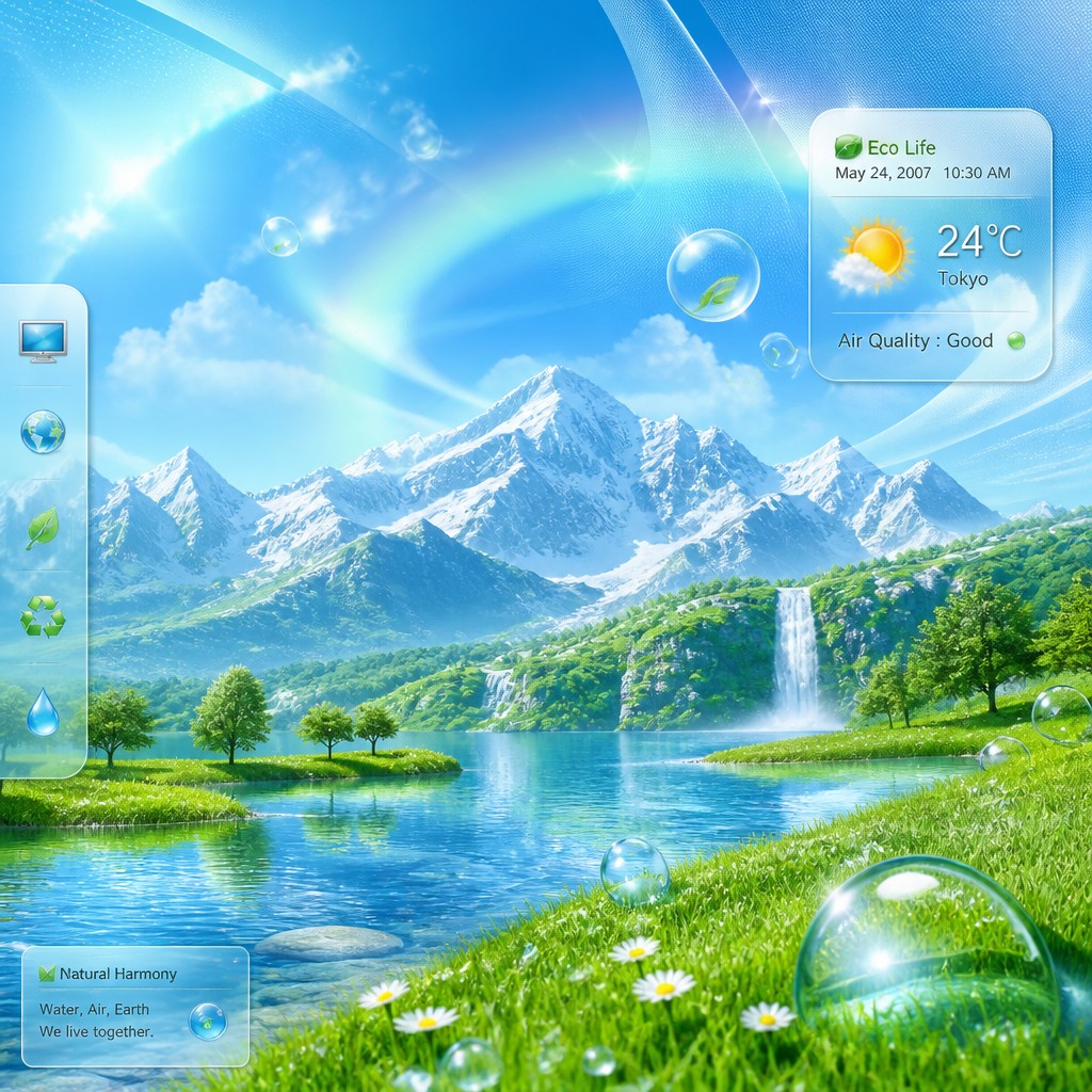
Frutiger Aero is a mid-2000s to early-2010s visual aesthetic associated with clean, optimistic digital interfaces and glossy commercial design. It is defined by bright aqua blues, fresh grass greens, translucent glass effects, floating bubbles, water droplets, and a polished sense of air and light.
The style evokes a human-friendly vision of technology: sleek but soft, futuristic but familiar, and often subtly ecological. Its look comes from the visual language of consumer software, mobile interfaces, stock imagery, advertising, and product renderings that used reflective surfaces, skeuomorphic cues, and luminous gradients to make digital environments feel tangible and inviting.
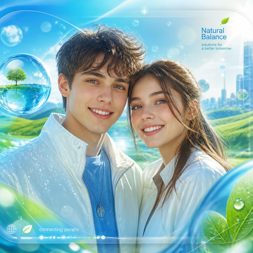
Try It On Your Photos
Upload any photo and convert it into Frutiger Aero Aesthetic — drag the sliders to compare before and after.


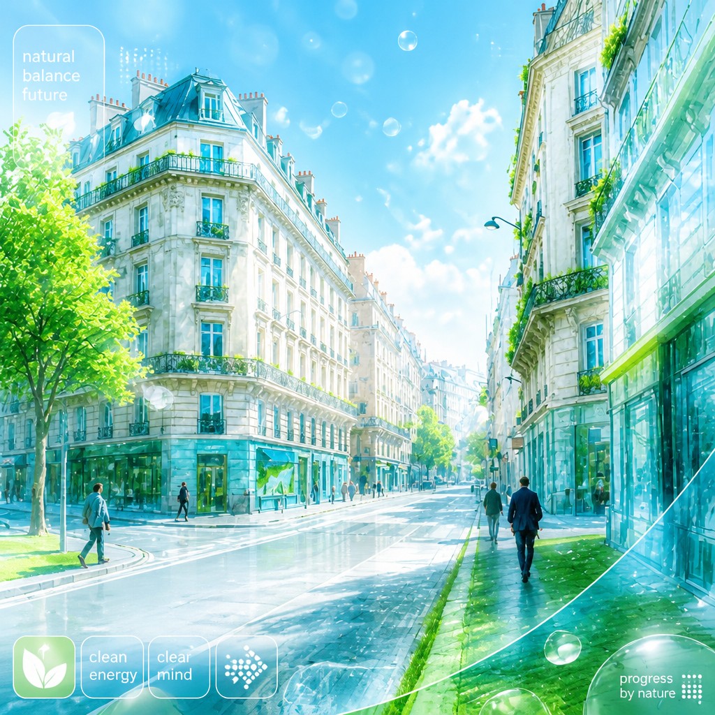

What Defines Frutiger Aero Aesthetic
The signature details, up close
Glassy translucency
Surfaces often look like polished glass, acrylic, or liquid crystal, with soft refractions and bright edge highlights. This creates the signature clean, airy, semi-transparent finish.
Aqua and grass-green palette
The most recognizable colors are cool sky blues, turquoise, mint, and fresh leaf greens. White is used heavily to keep the composition bright and sanitary-looking.
Bubble and droplet motifs
Floating bubbles, condensation, raindrops, and water beads are common symbolic elements. They reinforce the style’s association with freshness, purity, and movement.
Soft bokeh and daylight glow
Lighting is usually diffuse, high-key, and optimistic, with sparkling highlights and gentle blur in the background. The result feels open, breathable, and slightly idealized.
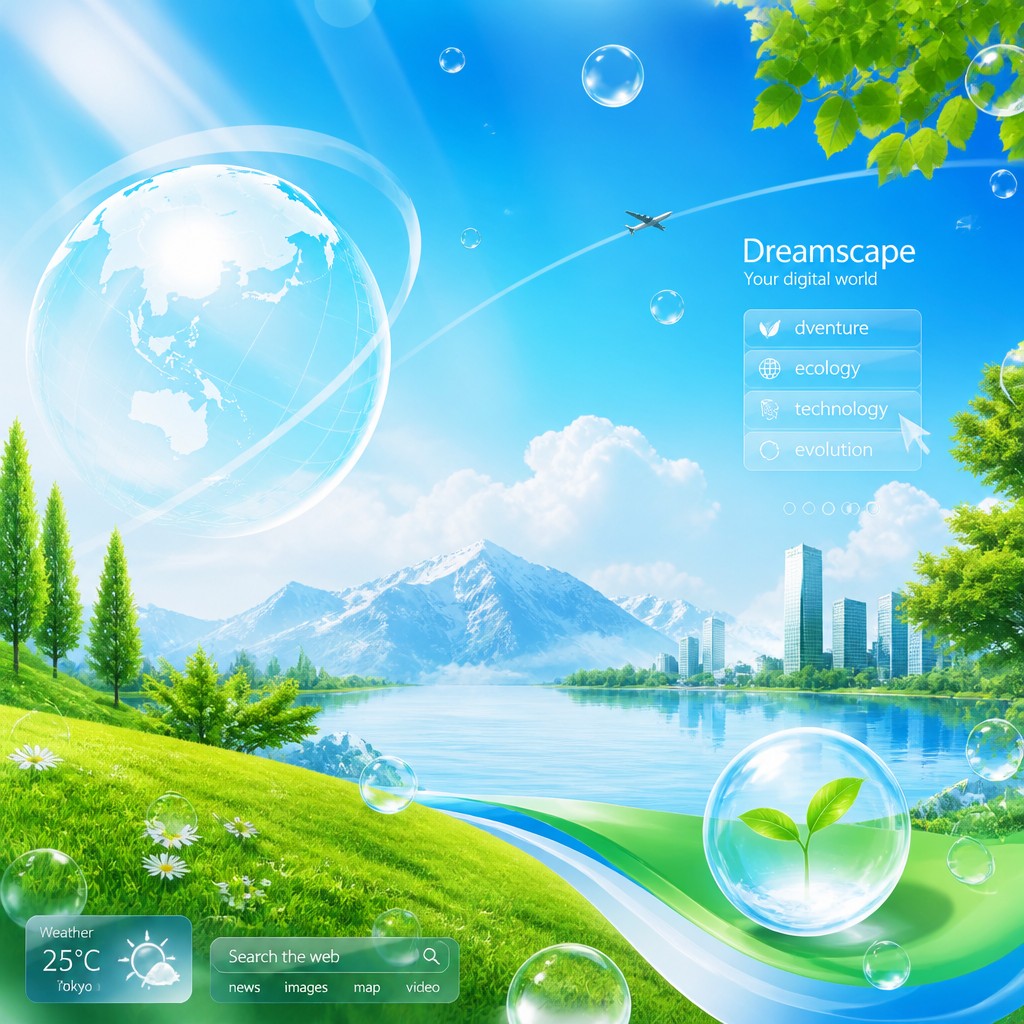
Skeuomorphic digital polish
Buttons, panels, icons, and UI elements often mimic physical materials such as glass, chrome, or polished plastic. This visual tactility makes the interface seem approachable rather than abstract.

Eco-tech symbolism
Leaves, grass, water, clouds, and sunlit landscapes frequently appear alongside technology. The style imagines a harmonious relationship between nature and modern devices.
Try It
Create Videos in Frutiger Aero Aesthetic
Styles aren't just for stills — describe a scene or animate an image and get a short video rendered in Frutiger Aero Aesthetic. Press play to see this pond come to life.
Make a VideoFrutiger Aero Aesthetic Prompt Ideas
Start from an idea — each one opens the generator with the style ready to go. See all 40 Frutiger Aero Aesthetic prompts →

“close-up portrait of an elderly person with expressive weathered features”
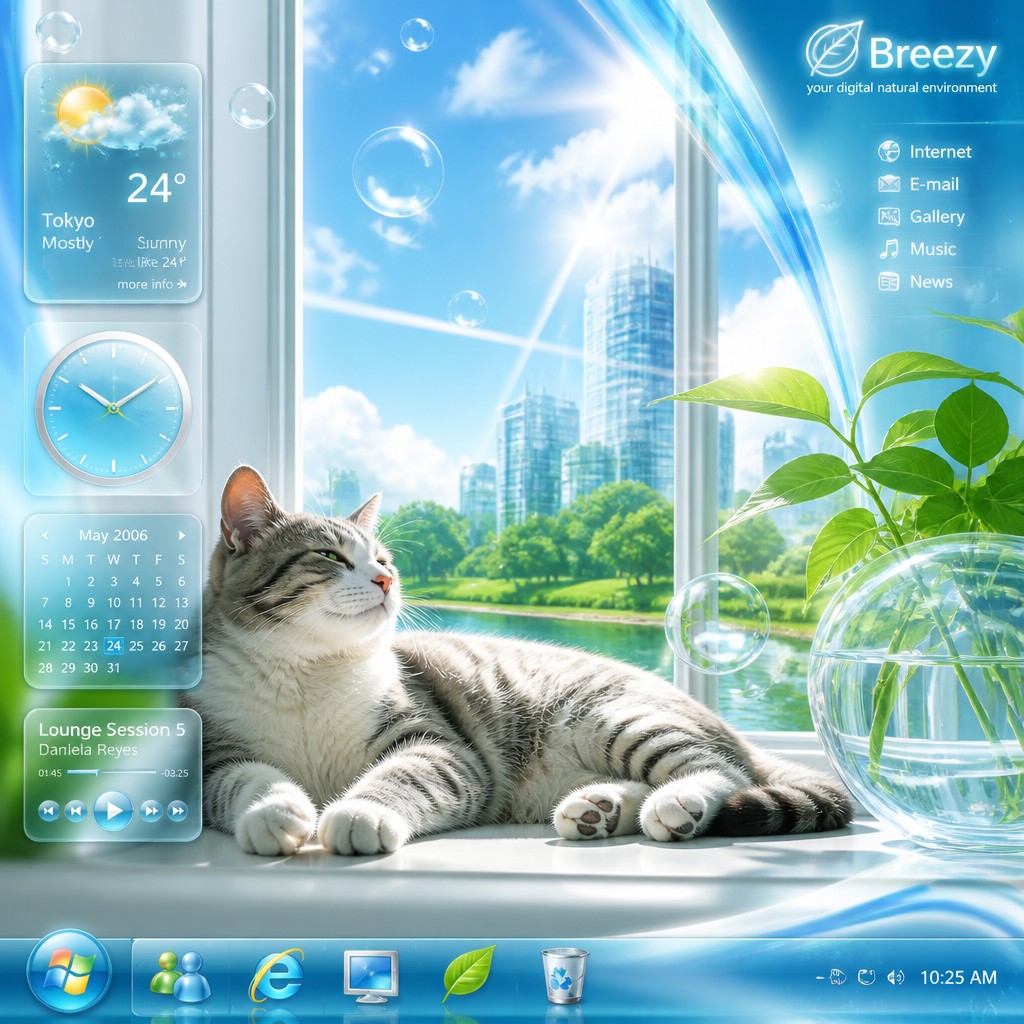
“a cat lounging in a sunlit window”

“bouquet of flowers in a glass vase”
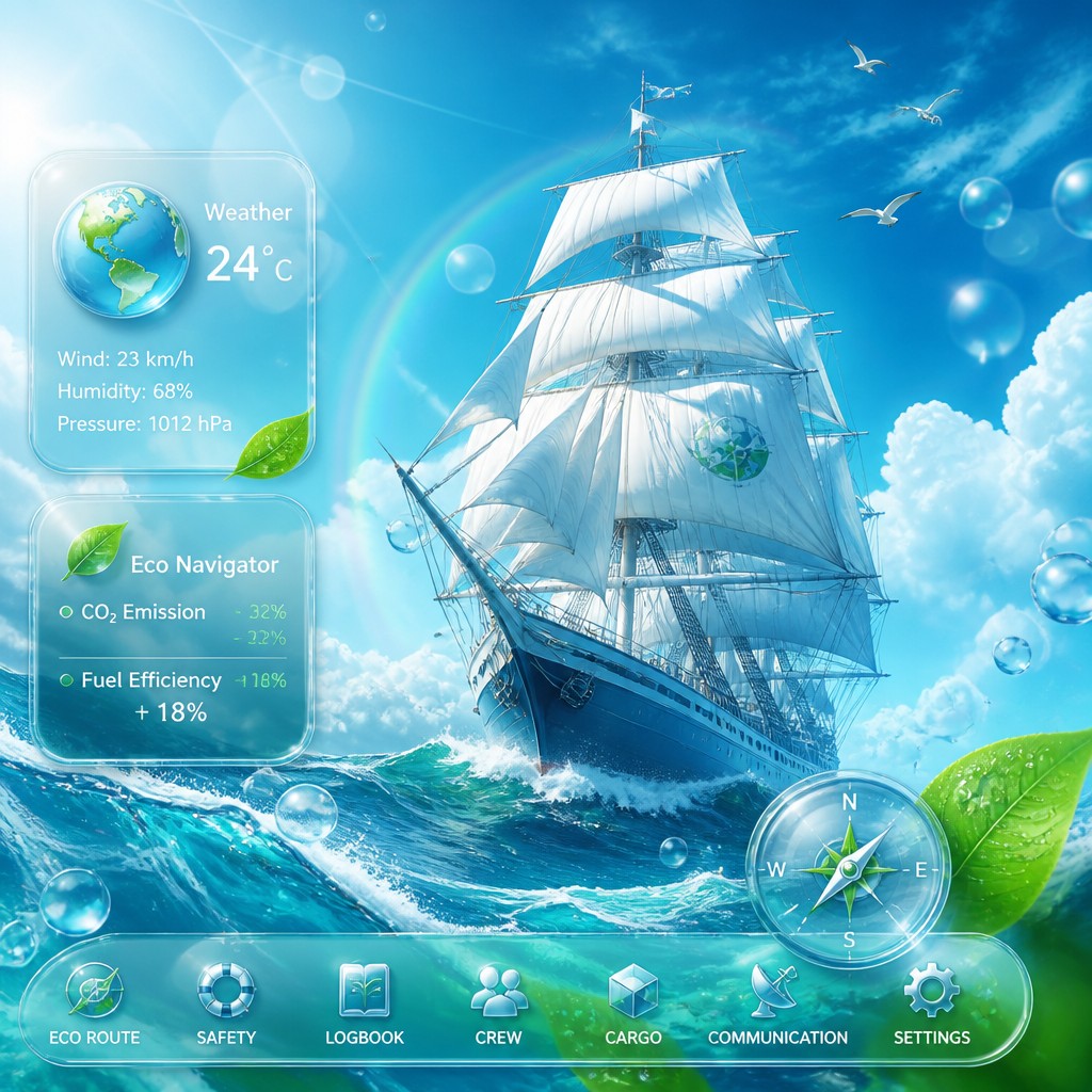
“sailing ship on a stormy sea”
How to Create Frutiger Aero Aesthetic Art
Master the craft step by step — or skip straight to creating. Read the full guide →
- 1
Use bright, clean materials
Build the image around translucent glass, glossy plastic, and wet surfaces with crisp specular highlights. In traditional media, this means careful layering and controlled reflections; in digital work, use gradient maps, transparency, and subtle blur to simulate depth.
- 2
Favor aqua and green harmonies
Limit the palette to cool blues, mint greens, white, and a few silver accents so the image stays airy and coherent. A small amount of warm light can help keep the composition from feeling sterile.
- 3
Add water and atmosphere
Include bubbles, droplets, mist, soft bokeh, or faint lens glow to create the moist, optimistic atmosphere associated with the style. These effects should feel integrated rather than decorative, as if the environment itself is fresh and luminous.
- 4
Keep forms sleek and simplified
Use rounded edges, smooth contours, and clear silhouettes instead of rough texture or heavy distortion. Whether drawing by hand or composing digitally, the image should read as polished, legible, and interface-like.
- 5
Balance nature and technology
Combine leaves, grass, sky, and water with device shapes, UI panels, or futuristic product forms. The key is contrast: organic imagery should soften the technology rather than overwhelm it.
- 6
Prompt for specific surface and lighting cues
When generating images, specify glossy glass, translucent sheen, aqua gradients, water droplets, floating bubbles, bright daylight, and crisp digital clarity. Strong material and lighting language matters more than elaborate subject matter.

The Story
History & Origins of Frutiger Aero Aesthetic
Frutiger Aero is not a formal historical art movement, but a retroactive label for a broad visual trend that flourished in the mid-2000s, especially around operating systems, mobile devices, web graphics, and corporate branding. The name combines Adrian Frutiger’s humanist typographic legacy with the Aero interface language popularized by Microsoft Windows Vista and Windows 7, though the style extends beyond typography into a wider ecosystem of glossy digital design.
Its lineage draws from late-1990s and early-2000s skeuomorphism, stock photography, product visualization, and the broader optimism of consumer tech culture before flat design became dominant. The aesthetic emerged from attempts to make digital interfaces feel transparent, clean, and physical, using glassy surfaces, soft highlights, airbrushed gradients, and nature imagery to suggest both technological progress and environmental harmony.
Influences: Frutiger Aero draws from late-20th-century skeuomorphic interface design, glossy corporate branding, stock imagery, and product render aesthetics, especially the visual language associated with Windows Aero. It also echoes the humanist clarity of Adrian Frutiger’s typographic approach, the smooth gradients of digital illustration, and the aspirational environmental imagery of early-2000s tech advertising. Related real-world references include the broader visual culture of Microsoft’s Aero era rather than a single canonical art movement.
Frequently Asked Questions
What defines the Frutiger Aero aesthetic?
It is defined by glossy, translucent surfaces; aqua and green color schemes; bubbles, droplets, and soft bokeh; and a clean, optimistic, human-friendly sense of technology. The style often mixes natural imagery with polished digital forms.
Is Frutiger Aero a real historical art movement?
No. It is a retroactive aesthetic label used to describe a design trend from the mid-2000s to early-2010s, especially in interfaces and commercial visuals. It is best understood as a visual culture or design aesthetic rather than a formal movement.
How is it different from Y2K design?
Y2K design tends to lean more heavily into chrome, metallic futurism, techno-brightness, and a late-1990s cyber look. Frutiger Aero is softer, cleaner, and more nature-inflected, with more glass, water, daylight, and eco-optimism.
How is it different from flat design?
Flat design removes depth, texture, and physical simulation, while Frutiger Aero depends on them. It uses gradients, highlights, translucency, and skeuomorphic cues to make digital surfaces feel tangible and glossy.
What kinds of subjects work best in this style?
Interfaces, products, landscapes, abstract wallpapers, and tech-adjacent scenes work especially well. Subjects that combine nature and technology are especially characteristic because they match the style’s optimistic eco-tech mood.
How can I make my art look more authentic to this style?
Use a bright aqua-and-green palette, glossy glass effects, soft atmospheric lighting, and clean rounded forms. Avoid heavy grunge, harsh contrast, or matte textures, since those quickly move the image away from the style’s polished feel.

Create your first Frutiger Aero Aesthetic artwork
Describe anything — or upload a photo — and see it in Frutiger Aero Aesthetic in seconds.