Memphis Design
Memphis Design: bold 1980s postmodern geometry, squiggles, grids, and bright clashing colors on crisp white backgrounds.
Instantly rendered in Memphis Design — or transform a photo
Memphis Design Gallery
Tap any artwork to explore it

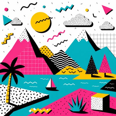
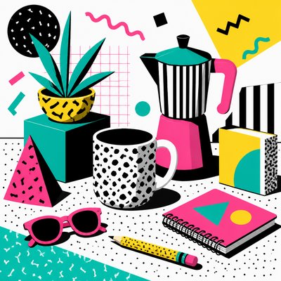
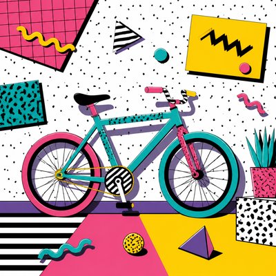
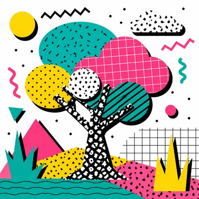
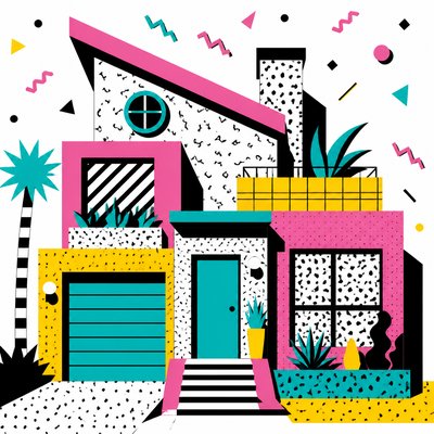
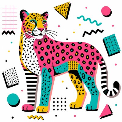
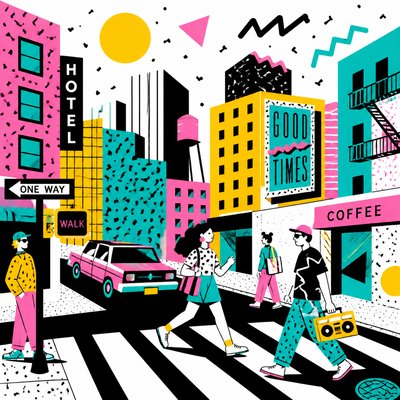
What is Memphis Design?
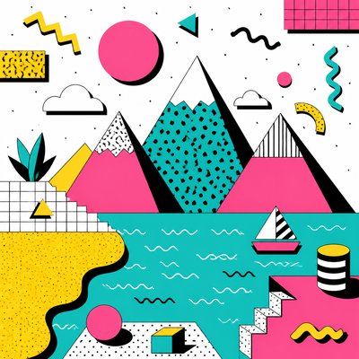
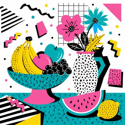
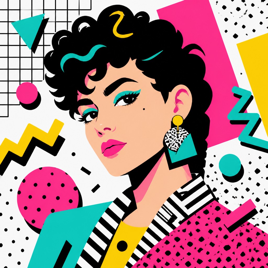
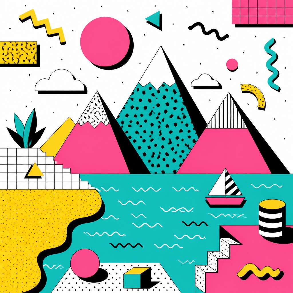
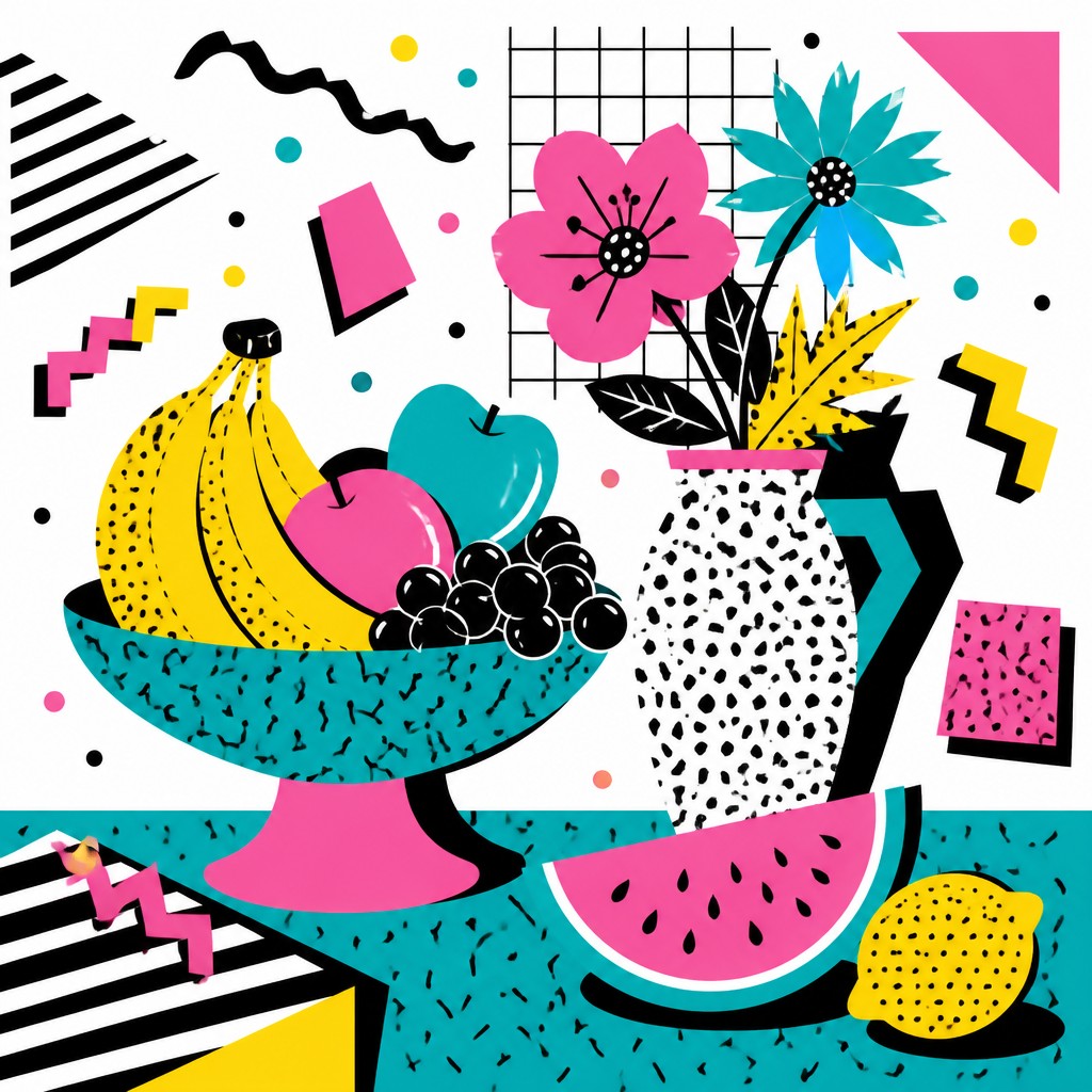
Memphis Design is a postmodern visual style defined by playful geometry, loud color, and deliberate visual contradiction. It combines squiggles, zigzags, circles, grids, confetti dots, terrazzo speckle, and black-and-white stripes with bright flat blocks of hot pink, turquoise, yellow, red, and black, usually set against a clean white ground. The result is energetic, irreverent, and unmistakably artificial: an anti-minimalist look that turns pattern, ornament, and asymmetry into the main subject.
The style looks the way it does because it was meant to reject restraint. Instead of harmony, Memphis favors friction; instead of subdued modernism, it uses a cheerful collision of forms and materials. Hard-edged graphic shapes, poster-flat color, and cartoonlike motifs create a sense of designed spontaneity, as if a playful system has been intentionally broken and reassembled. That mix of order and absurdity is what makes Memphis Design feel both architectural and whimsical.

Try It On Your Photos
Upload any photo and convert it into Memphis Design — drag the sliders to compare before and after.


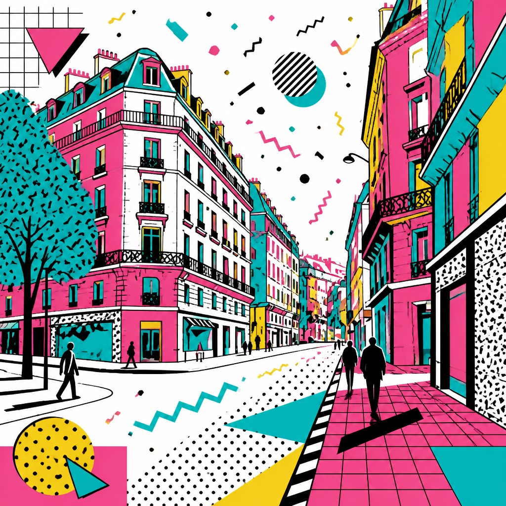

What Defines Memphis Design
The signature details, up close
Clashing bright palette
Hot pink, turquoise, yellow, black, red, and white are used in high contrast combinations. The palette is intentionally loud rather than harmonious, creating a festive and slightly confrontational energy.
Playful geometric forms
Squiggles, triangles, circles, arcs, grids, and lightning-bolt or zigzag motifs recur throughout the style. Shapes often feel like they are in motion even when the composition is static.
Flat, graphic surfaces
Color is typically rendered as solid blocks with little or no modeling. The effect is poster-like and crisp, emphasizing design over illusionistic depth.
Pattern as structure
Black-and-white stripes, terrazzo speckles, confetti dots, and repeated linear motifs are used as active design elements. These patterns help unify the composition while also increasing its visual noise.
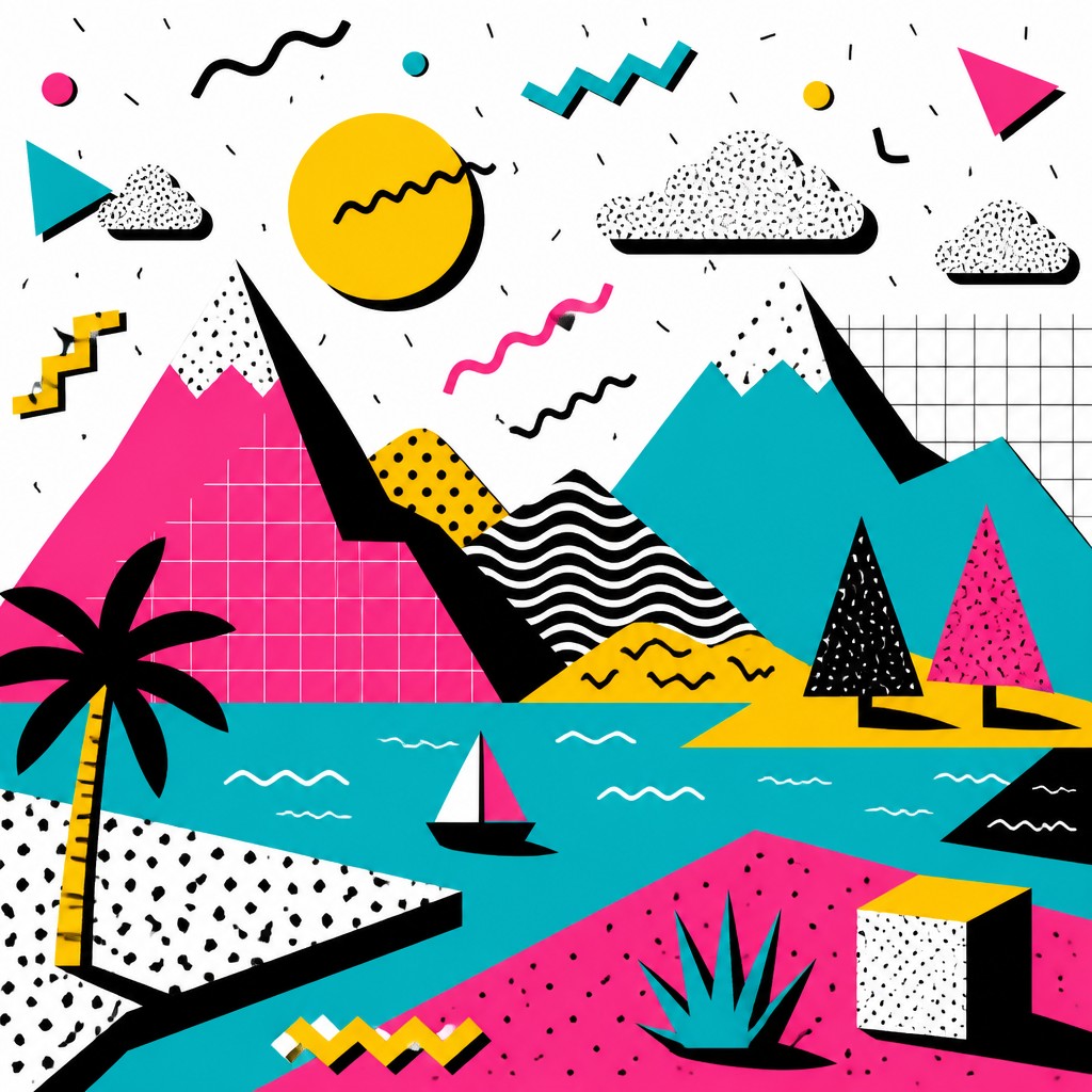
Deliberate asymmetry
Layouts often avoid centered, balanced arrangements in favor of off-kilter placement. The instability is intentional and contributes to the style’s sense of humor and spontaneity.

Hard-edged shadows and outlines
Graphic drop shadows, sharp edges, and clean contours give forms a cut-paper or screen-printed clarity. Shadows are stylized rather than realistic, reinforcing the constructed look.
Try It
Create Videos in Memphis Design
Styles aren't just for stills — describe a scene or animate an image and get a short video rendered in Memphis Design. Press play to see this pond come to life.
Make a VideoMemphis Design Prompt Ideas
Start from an idea — each one opens the generator with the style ready to go. See all 40 Memphis Design prompts →
How to Create Memphis Design Art
Master the craft step by step — or skip straight to creating. Read the full guide →
- 1
Build a white-stage composition
Start with a plain white or very light background and place a small number of bold shapes on top. Leave open space so the geometry can read clearly and the composition feels intentionally sparse rather than cluttered.
- 2
Combine incompatible motifs
Mix squiggles, grids, polka dots, stripes, and abstract blocks in the same image. The key is not consistency but productive conflict, so vary scale and orientation to keep the layout lively.
- 3
Use flat color and sharp contrast
Choose saturated, poster-like colors and avoid soft gradients. In traditional media, use crisp masking, clean vector edges, or opaque paint; in digital work, favor flat fills and clear separations between shapes.
- 4
Add graphic pattern fields
Fill selected areas with stripes, terrazzo speckles, or dot clusters rather than detailed texture. Keep the patterns stylized and repetitive so they feel designed, not naturalistic.
- 5
Write prompts around form and palette
For text-to-image generation, specify the subject first and then add Memphis cues such as playful postmodern geometry, hot pink and turquoise, black-and-white stripes, confetti dots, hard drop shadows, and white background. For image-to-image, preserve the source subject while simplifying contours and replacing realistic texture with flat graphic patterning.
The Story
History & Origins of Memphis Design
Memphis Design emerged in Milan in the early 1980s around the Memphis Group, founded by Ettore Sottsass in 1981. The group’s furniture, objects, and interiors challenged the austerity of modernist and functionalist design by embracing ornament, theatrical color, and unconventional materials such as laminate, plastic, and patterned surfaces. Its visual language quickly expanded beyond furniture into graphics, textiles, product design, and editorial imagery, becoming one of the clearest symbols of 1980s postmodern design.
Its aesthetic lineage draws from several real traditions rather than a single historical source. Memphis borrows the flatness and bold contour of graphic design, the playfulness of pop art, the geometry of constructivist and Bauhaus-era abstraction, and the anti-rational wit of postmodern architecture and design. It also reflects the broader 1980s appetite for surface, spectacle, and irony, when design frequently treated visual language as a system to be quoted, remixed, and exaggerated rather than merely optimized.
Influences: Memphis Design sits at the intersection of postmodernism, pop art, graphic design, and earlier geometric abstraction. It echoes the bold color and mass-culture energy of artists like Andy Warhol and the hard-edged visual systems of constructivist and Bauhaus design, while also rejecting their seriousness and functional purity. Its furniture and objects are inseparable from the Memphis Group’s broader critique of modernist restraint, making it a defining example of 1980s design culture.
Frequently Asked Questions
What defines Memphis Design?
Memphis Design is defined by bright clashing colors, playful geometric shapes, bold patterns, and deliberate asymmetry. It usually appears on a white background and favors flat, graphic treatment over realism. The style is meant to feel witty, decorative, and slightly rebellious.
Is Memphis Design the same as 1980s retro?
Not exactly. Memphis Design is one specific 1980s postmodern style within the broader retro-vintage category. Many 1980s looks use neon or chrome, but Memphis is more closely tied to geometric pattern, graphic ornament, and anti-minimalist design language.
How is Memphis Design different from Bauhaus or minimalism?
Bauhaus and minimalism tend to value clarity, function, and reduction, while Memphis deliberately adds visual noise, humor, and decorative excess. It borrows geometric structure from modernism but overturns modernism’s discipline with bright color, odd patterns, and asymmetrical composition.
Where is Memphis Design commonly used?
It is widely used in posters, editorial graphics, packaging, branding, textiles, interiors, and social-media visuals. Because it is instantly recognizable and energetic, it is often chosen for projects that want a playful retro-modern feel.
Can Memphis Design work in illustration and photography?
Yes. In illustration, the style is natural because it relies on flat shapes and pattern. In photography, the look is usually created by stage dressing, colored props, graphic overlays, or compositional treatments that simplify the image into bold shapes and bright contrasts.
What are the most important colors and motifs to include?
Hot pink, turquoise, yellow, black, and white are the most iconic color cues, often with red or blue as accents. Common motifs include squiggles, zigzags, circles, grids, stripes, terrazzo speckle, and confetti-like dots.
Create your first Memphis Design artwork
Describe anything — or upload a photo — and see it in Memphis Design in seconds.
Related Styles
Discover similar art styles