Watercolor Portrait vs Digital Illustration Portrait: What's the Difference?
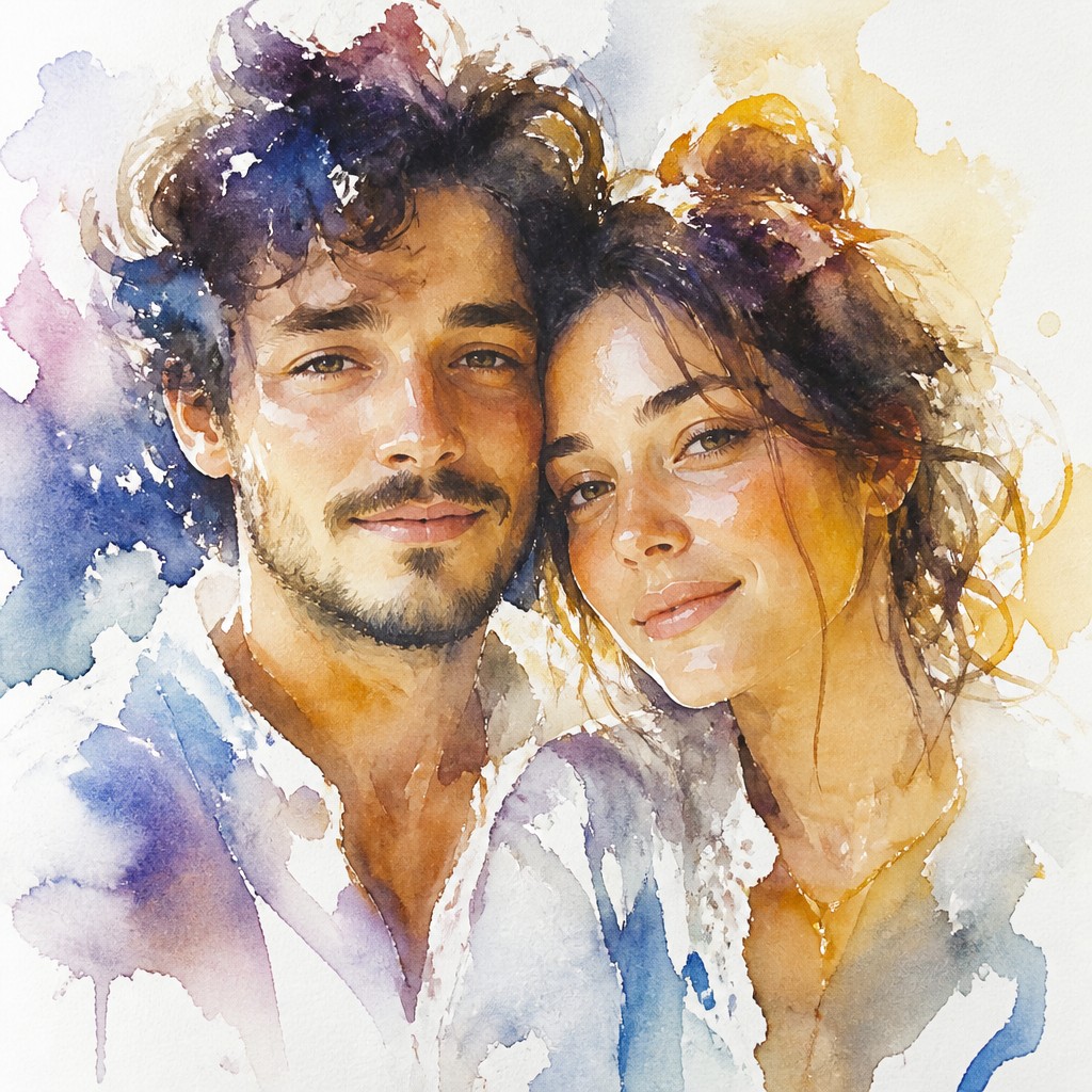
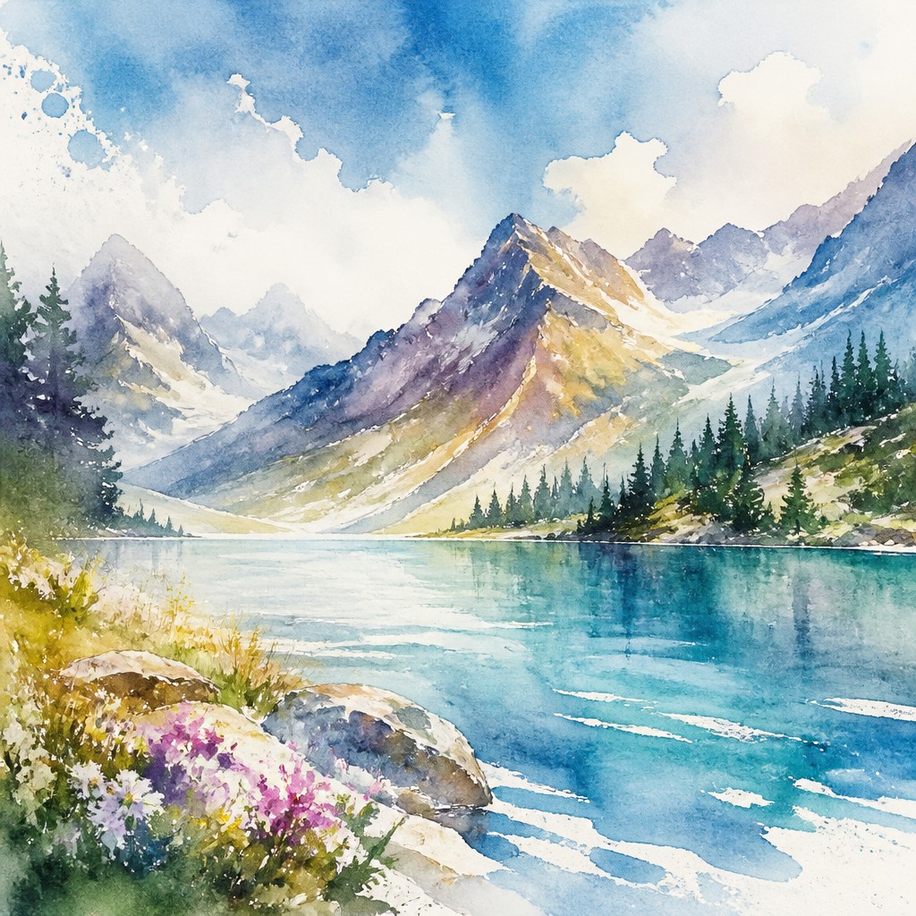
Watercolor Portrait Art Style uses transparent washes, soft bleeding edges, and visible white space to create portraits that feel luminous, delicate, and atmospheric. It often suggests form rather than fully outlining it, giving skin, hair, and clothing a light, handmade quality rooted in traditional watercolor painting.
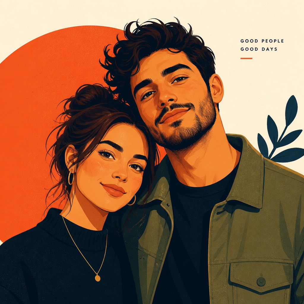
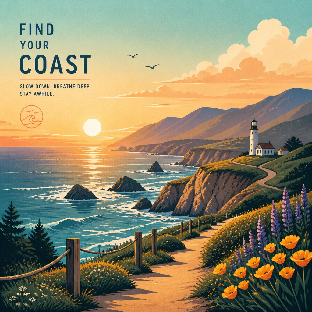
Digital Illustration Portrait Style uses clean linework, controlled gradients, and saturated color to produce polished, modern portraits with crisp readability. People compare the two because both can look expressive and contemporary, but they differ in how they handle edges, texture, color control, and the balance between spontaneity and precision.
Same Prompt, Both Styles
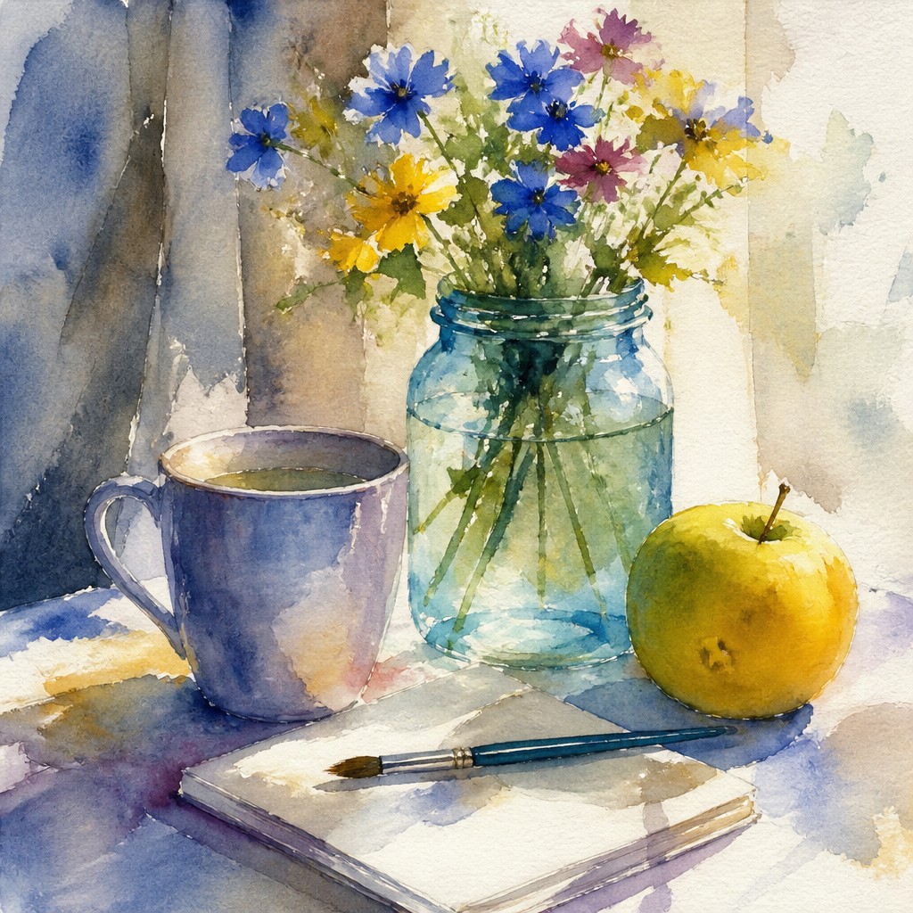
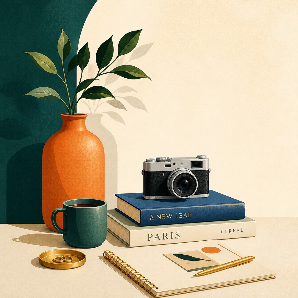
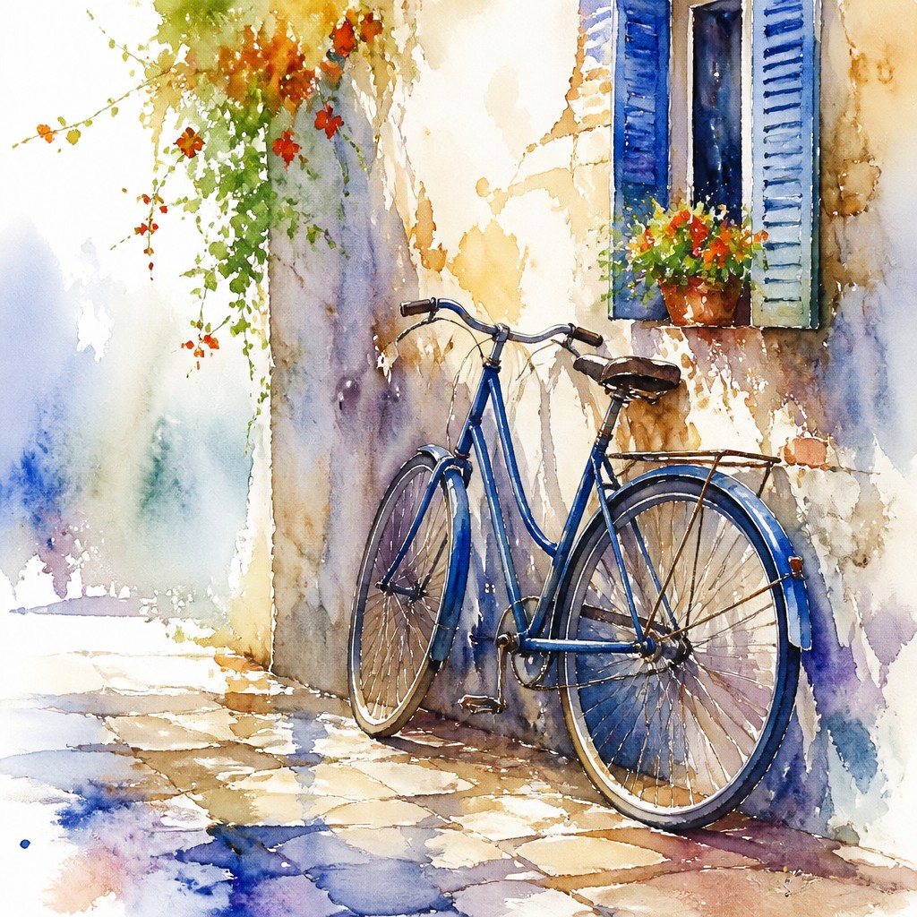
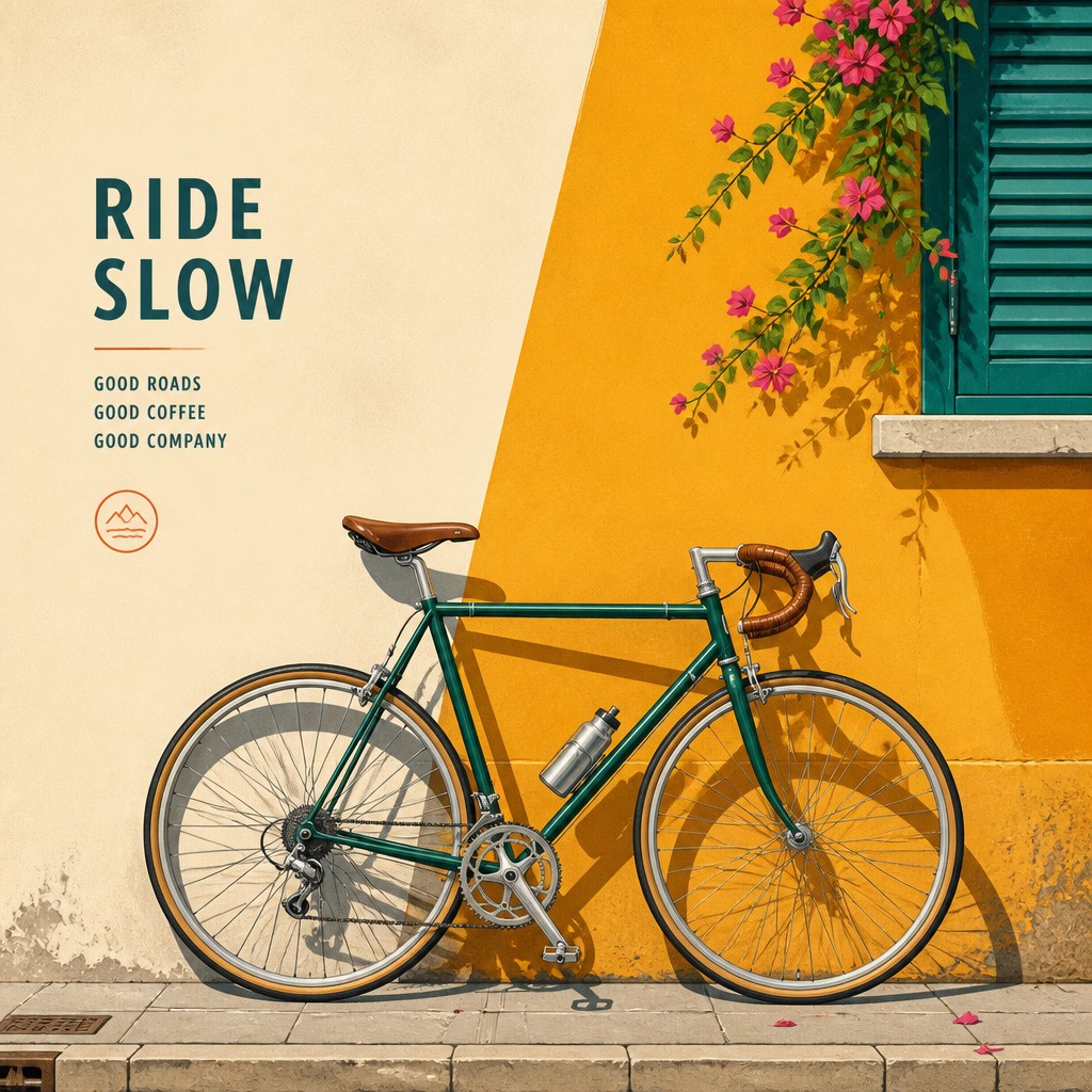
Each pair below was generated from the identical prompt — only the style changed.
“portrait of two people together”
“wide landscape with natural scenery”
“still life with everyday objects”
“bicyle resting against a wall”
Key Differences
| Watercolor Portrait | Digital Illustration Portrait | |
|---|---|---|
| Line & form | Soft, implied edges with forms shaped by wash transitions. | Defined contours and cleaner shape separation. |
| Color handling | Transparent layers create light, airy color with natural variation. | Bold, saturated colors with consistent digital control. |
| Texture | Paper texture, granulation, and pigment blooms often remain visible. | Smooth surfaces with minimal texture unless added intentionally. |
| Light & shading | Highlights often come from preserved paper rather than painted white. | Shading is built with gradients, overlays, and precise lighting. |
| Mood | Fresh, intimate, and dreamy with a breathable feel. | Crisp, modern, and editorial with stronger visual punch. |
| Workflow | More dependent on timing, water flow, and physical media behavior. | More editable, repeatable, and easy to refine layer by layer. |
| Mood | ethereal, delicate, expressive, luminous | modern, clean, polished, expressive |
| Energy | calm | balanced |
| Detail level | moderate | detailed |
| Color | soft transparent washes, light natural tones | vibrant gradients, controlled contrasts, broad palette |
| Texture | fluid washes, soft blooms, paper grain | smooth, crisp, vector-like |
| Origin | 18th-century Europe | digital-native aesthetic |
| Best for | portrait commissions, editorial illustrations, book covers, greeting cards, fine art prints | editorial portraits, profile illustrations, posters, album covers, social media graphics, character art |
| Difficulty | advanced | moderate |
Which Should You Choose?
Pick watercolor portrait style if you want softness, organic edges, and a handmade atmosphere that feels light and expressive. Choose digital illustration portrait style if you need crisp clarity, saturated color, easy revisions, and a polished look suited to modern branding, editorial work, or scalable reproduction.
Frequently Asked Questions
Which style is more realistic for portraits?
Digital illustration usually delivers more controlled realism because proportions, shading, and edges can be refined precisely. Watercolor can still be realistic, but it often prioritizes atmosphere and suggestion over exact detail.
Which style is better for expressive, emotional portraits?
Watercolor often feels more emotionally open because its soft edges and translucent layers create a gentle, human quality. Digital illustration can also be expressive, but it tends to communicate through clarity, color, and composition rather than paint behavior.
Is watercolor or digital better for consistent results?
Digital illustration is usually more consistent because every layer can be adjusted and reproduced with precision. Watercolor naturally introduces variation from pigment flow, paper absorption, and drying patterns.
Can digital art imitate watercolor effectively?
Yes, digital tools can simulate washes, blooms, and paper texture quite well. However, the result often feels more controlled than traditional watercolor because the medium does not behave unpredictably in the same way.