Venetian Colorism Renaissance vs Renaissance: What's the Difference?
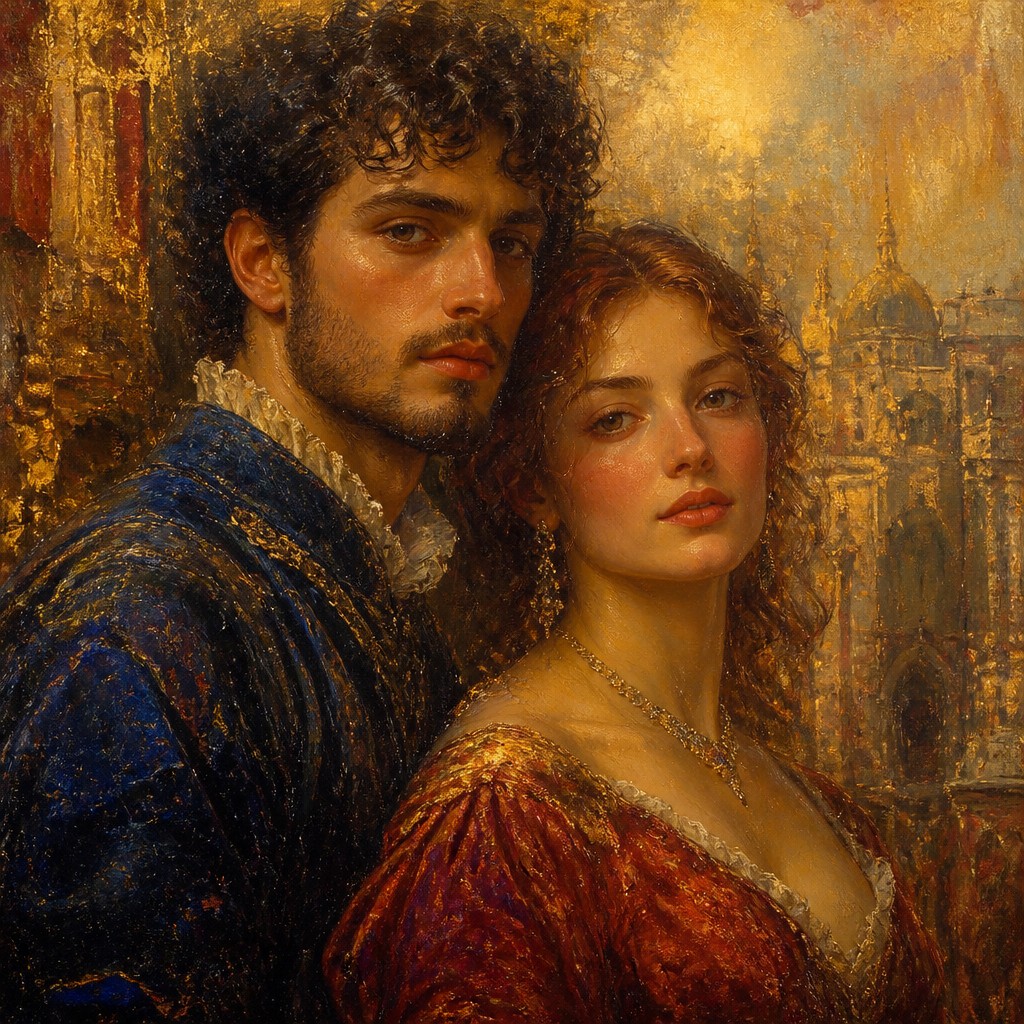
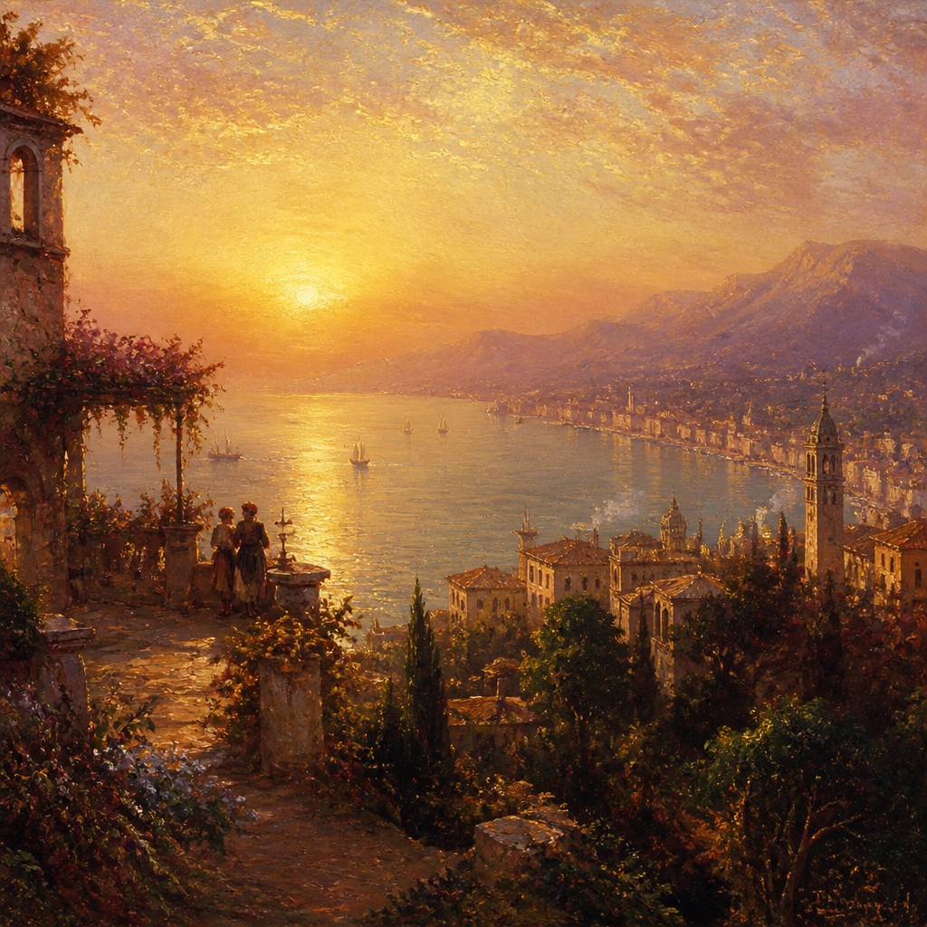
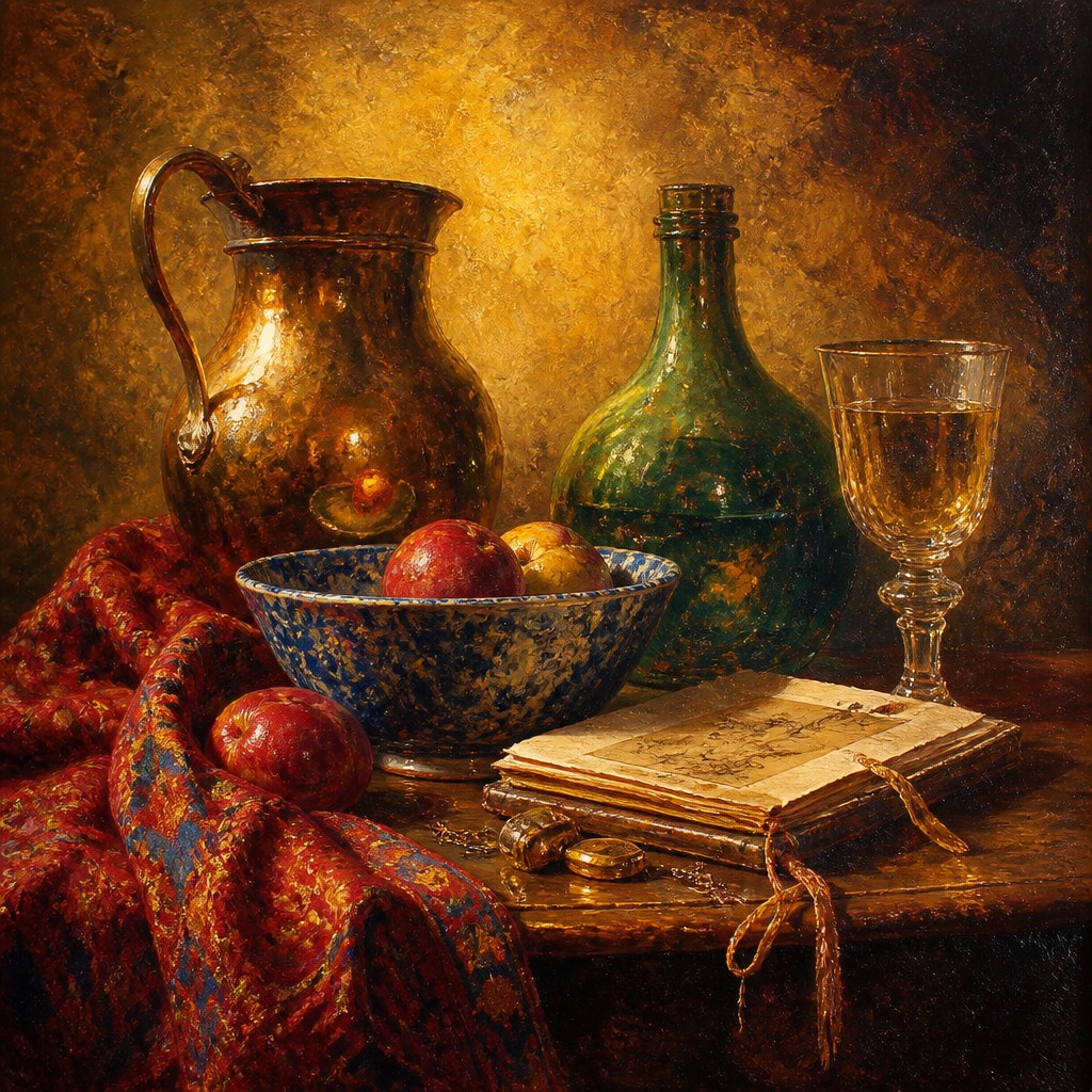
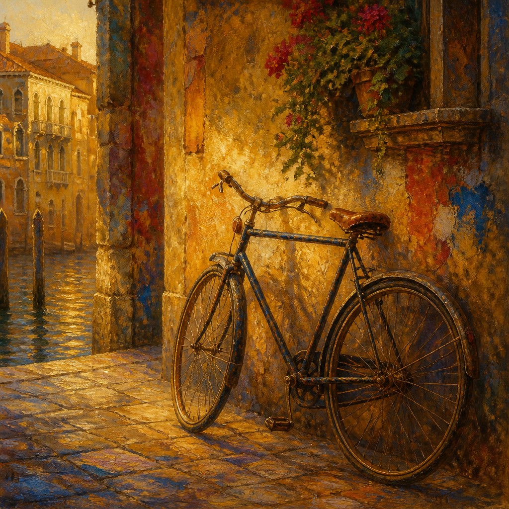
Venetian Colorism Renaissance art emphasizes luminous color, layered oil glazing, atmospheric light, and sumptuous surfaces. It often creates a warm, sensual mood where color and light carry much of the visual drama, and forms may feel softer or more painterly.
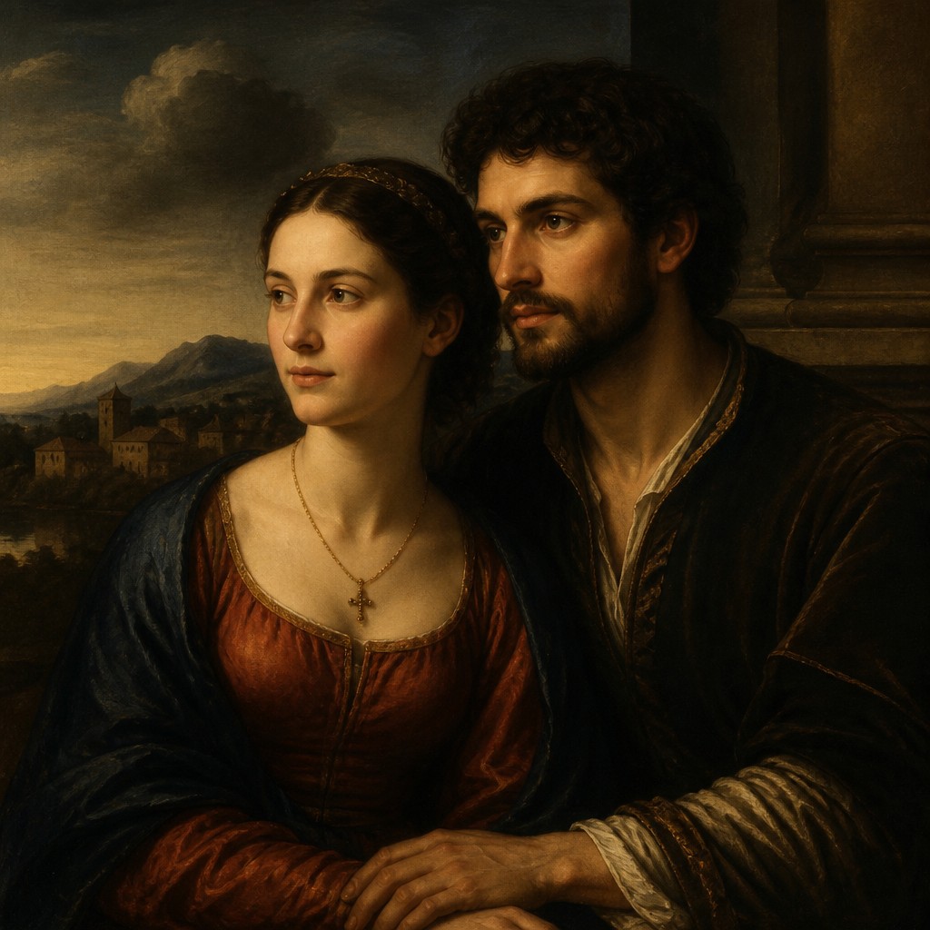
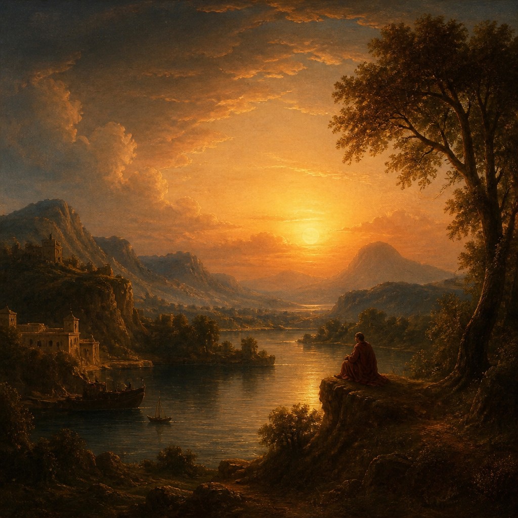
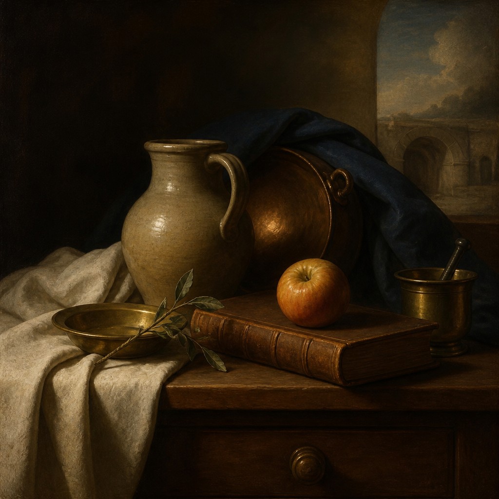
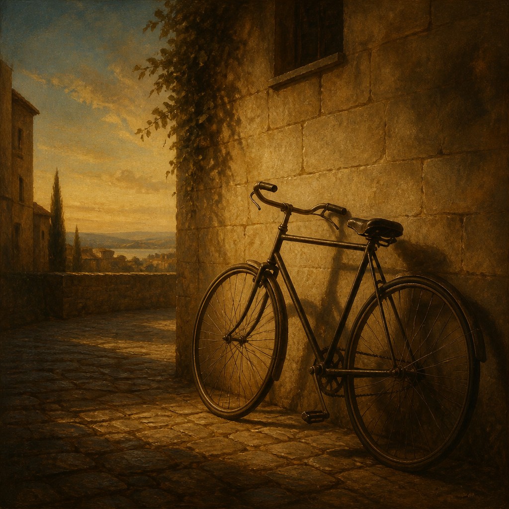
Renaissance art in the broader classical sense focuses on balanced composition, idealized figures, linear perspective, and clear spatial order. People compare the two because they share Renaissance roots, yet they differ in priority: Venetian colorism leans toward color and light, while the classical approach often stresses drawing, structure, and proportion.
Same Prompt, Both Styles
Each pair below was generated from the identical prompt — only the style changed.
“portrait of two people together”
“wide landscape with natural scenery”
“still life with everyday objects”
“bicyle resting against a wall”
Key Differences
| Venetian Colorism Renaissance | Renaissance | |
|---|---|---|
| Primary emphasis | Color, light, and surface effects dominate the painting. | Drawing, structure, and proportion guide the composition. |
| Handling of form | Forms feel soft, atmospheric, and often blended into color. | Forms are more clearly defined and carefully modeled. |
| Light treatment | Warm, glowing light creates a rich and immersive mood. | Light supports clarity, volume, and balanced visibility. |
| Composition | Compositions may feel sensuous, layered, and visually dense. | Compositions often feel ordered, symmetrical, and measured. |
| Technique | Built through transparent glaze layers and luminous pigments. | Built through precise perspective, sfumato, and careful draftsmanship. |
| Overall mood | Evocative, rich, and emotionally resonant. | Idealized, calm, and intellectually balanced. |
| Mood | luminous, sensuous, elegant, atmospheric | harmonious, graceful, elevated, ordered, contemplative |
| Energy | calm | balanced |
| Detail level | detailed | detailed |
| Color | rich warm jewel tones, glowing flesh | rich, warm, earth-toned with luminous highlights |
| Texture | smooth glazes, soft blended luminosity | smooth modeling, fine finish, subtle layering |
| Origin | Renaissance Venice, 16th-century Italy | Italy, 14th-16th century |
| Best for | museum posters, portrait paintings, historical book covers, luxury branding, dramatic interior decor | religious scenes, portraiture, historical illustrations, museum posters, book covers, fine art studies |
| Difficulty | advanced | advanced |
Which Should You Choose?
Choose Style A if you want warmth, richness, glowing color, and a more sensual painterly effect. Choose Style B if you want clarity, idealized anatomy, strong spatial order, and a more classical, balanced Renaissance look.
Frequently Asked Questions
Are these actually different eras?
No. Both belong to the Renaissance period, but they reflect different regional priorities and painting methods. One is more color-driven, while the other is more drawing- and structure-driven.
Which style uses stronger color?
Style A typically uses stronger, more luminous color and layered tonal effects. Style B can still use beautiful color, but it usually serves form, balance, and clarity more than atmosphere.
Which style looks more realistic?
Both can be realistic, but in different ways. Style B often appears more anatomically and spatially controlled, while Style A can feel more lifelike through light, texture, and emotional presence.
Which style is better for portraits?
Style A is often preferred for rich, glowing portraiture with expressive color. Style B is a strong choice for formal portraits that emphasize ideal proportion, poise, and clean structure.