Vector Digital vs Digital Illustration Portrait: What's the Difference?
Vector Digital Art Style uses crisp, mathematically clean shapes, flat color areas, smooth gradients, and scalable edges. It is built to stay sharp at any size, making it ideal for logos, icons, posters, infographics, and other graphics that need precision and consistency.
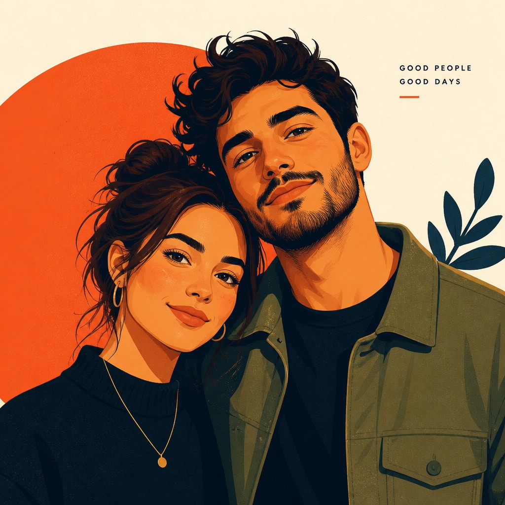
Digital Illustration Portrait Style uses clean linework, smooth shading, saturated color, and a polished editorial look to portray people with depth and personality. People compare these styles because both are made digitally and can look sleek and modern, yet one prioritizes scalability and graphic clarity while the other prioritizes expressive portrait rendering and visual nuance.
Same Prompt, Both Styles
Each pair below was generated from the identical prompt — only the style changed.
“portrait of two people together”

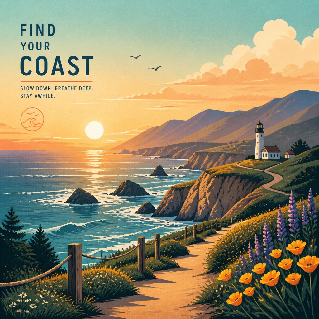
“wide landscape with natural scenery”

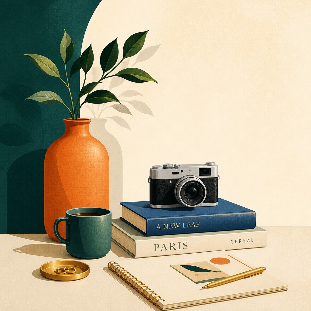
“still life with everyday objects”

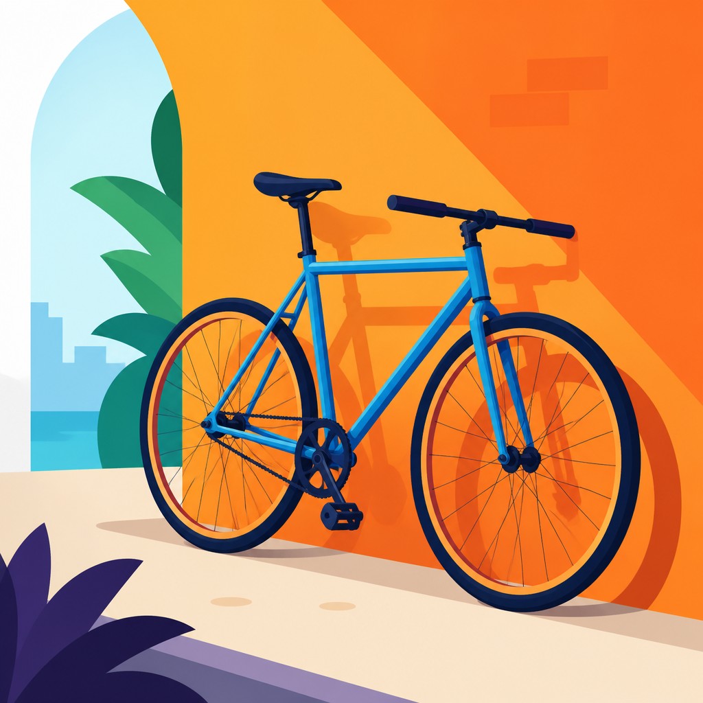
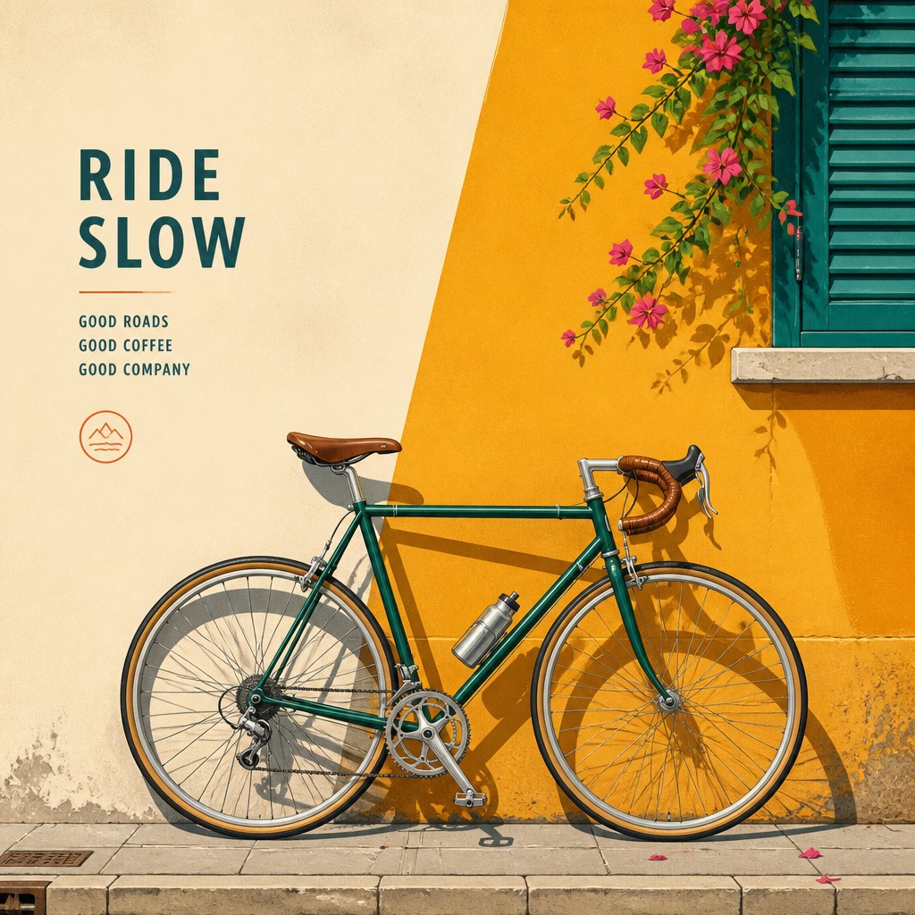
“bicyle resting against a wall”
Key Differences
| Vector Digital | Digital Illustration Portrait | |
|---|---|---|
| Primary purpose | Designed for graphics, branding, and scalable visual systems. | Designed for expressive portraits and character-focused images. |
| Line & form | Uses crisp curves, simple contours, and highly controlled shapes. | Uses clean outlines with softer transitions and more organic facial forms. |
| Color treatment | Often relies on flat color blocks with limited or stylized gradients. | Uses richer gradients and saturated tones to model skin, hair, and light. |
| Detail level | Keeps details concise and graphic for clarity at small sizes. | Adds facial features, texture cues, and lighting nuance for realism. |
| Scalability | Stays sharp at any size because shapes are resolution-independent. | Usually optimized for display sizes, not perfect infinite scaling. |
| Visual feel | Feels clean, modern, and icon-like. | Feels polished, editorial, and character-driven. |
| Mood | clean, modern, precise, polished | modern, clean, polished, expressive |
| Energy | balanced | balanced |
| Detail level | detailed | detailed |
| Color | bright flats with smooth gradients | vibrant gradients, controlled contrasts, broad palette |
| Texture | smooth, crisp, virtually textureless | smooth, crisp, vector-like |
| Origin | digital-native aesthetic | digital-native aesthetic |
| Best for | logos, icons, infographics, posters, app graphics, editorial illustrations | editorial portraits, profile illustrations, posters, album covers, social media graphics, character art |
| Difficulty | moderate | moderate |
Which Should You Choose?
Choose Vector Digital Art Style when you need artwork that must scale cleanly, read instantly, or work across branding, UI, and print applications. Choose Digital Illustration Portrait Style when the main goal is a compelling human subject, expressive features, and a more nuanced, magazine-ready finish.
Frequently Asked Questions
Is vector digital art always flatter than digital portrait illustration?
Usually, yes, because vector work emphasizes shapes, edges, and clear color separation. However, vectors can still include gradients and highlights while remaining crisp and graphic.
Can portrait illustration be made in a vector workflow?
Yes. A portrait can be created with vector tools, but the style still tends to focus on facial rendering and polished shading rather than pure icon-like simplicity. The workflow does not change the visual priorities of the style.
Which style is better for logos and social media assets?
Vector Digital Art Style is usually better for logos and assets that need flexible resizing. Its clarity and scalability make it practical for many formats and screen sizes.
Which style is better for editorial portraits or character art?
Digital Illustration Portrait Style is usually the stronger choice. It is built to communicate expression, mood, and likeness with smooth color transitions and a refined finish.