Vaporwave vs Retro Futurism Sci-Fi: What's the Difference?
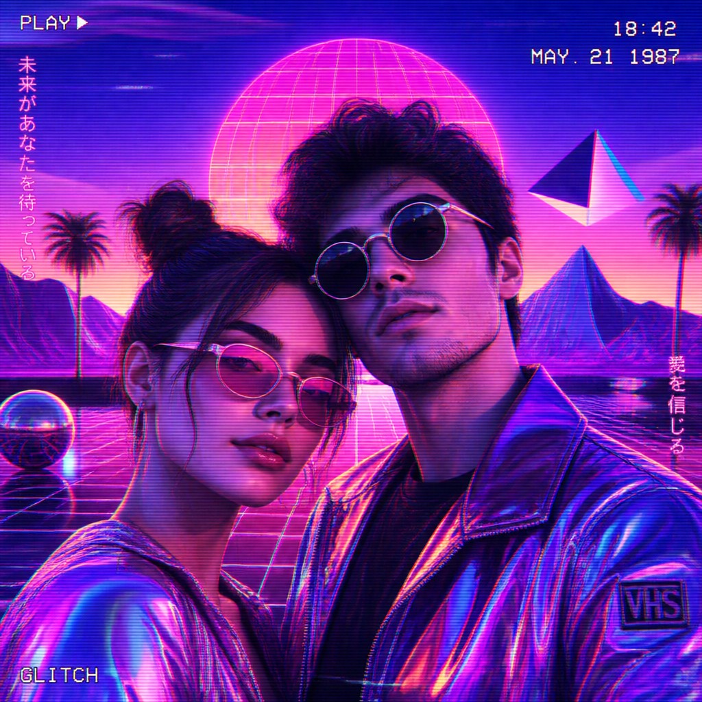
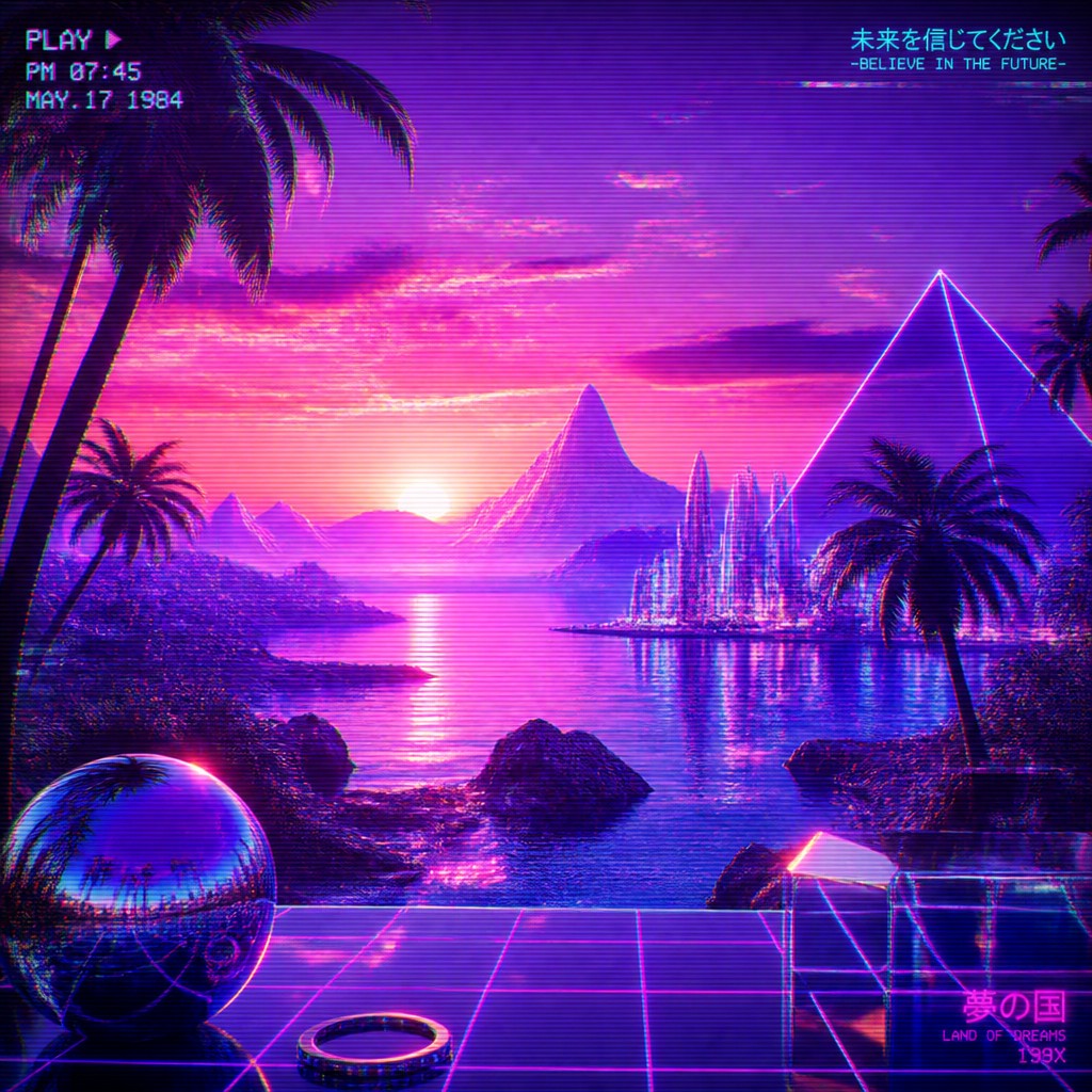
Vaporwave art is a digital, nostalgia-driven style built from neon pinks, purples, chrome surfaces, glitch effects, retro computers, and dreamlike sunsets. It often feels slow, surreal, and ironic, using old consumer technology and internet-age imagery to create a mood of faded memory and hyper-stylized decay.
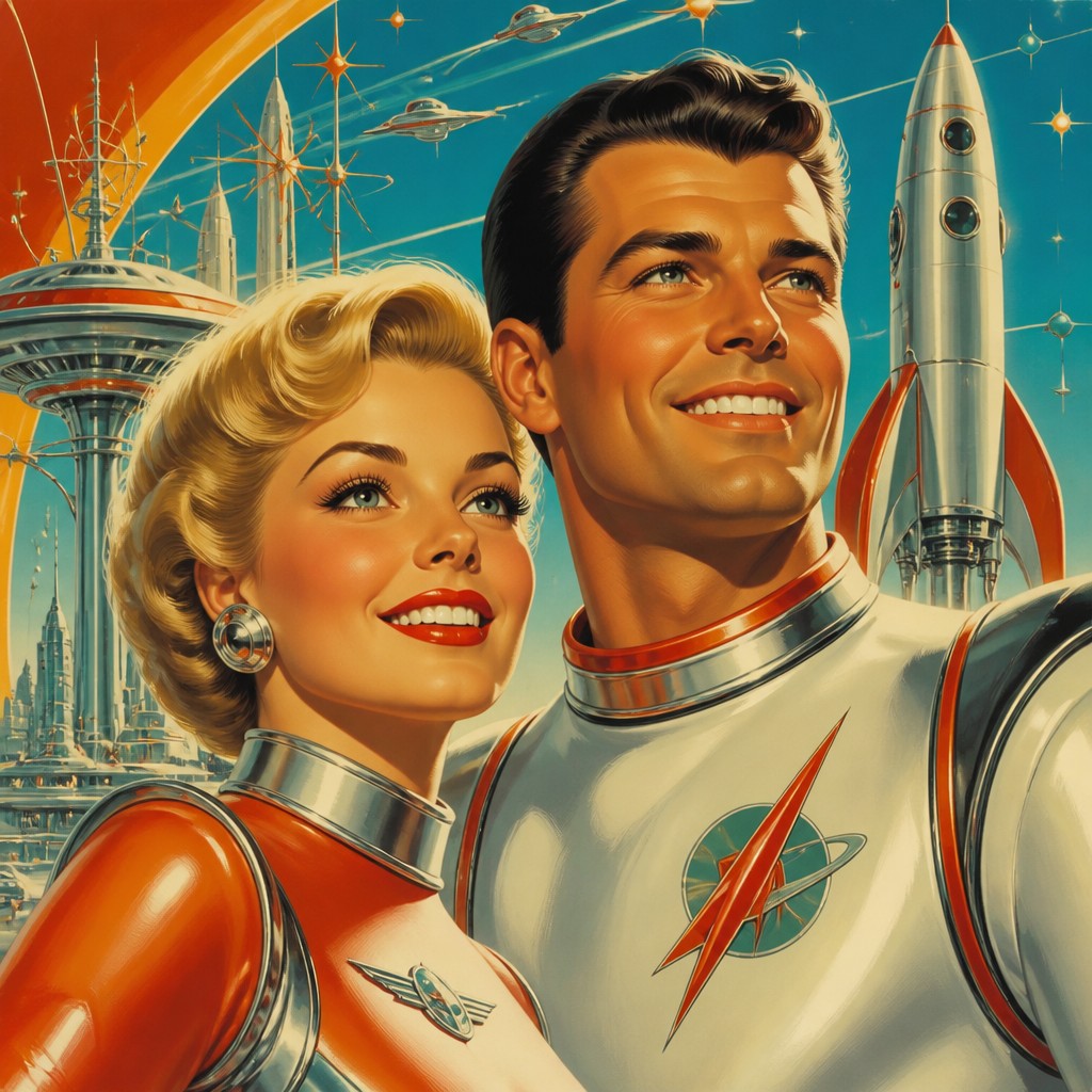
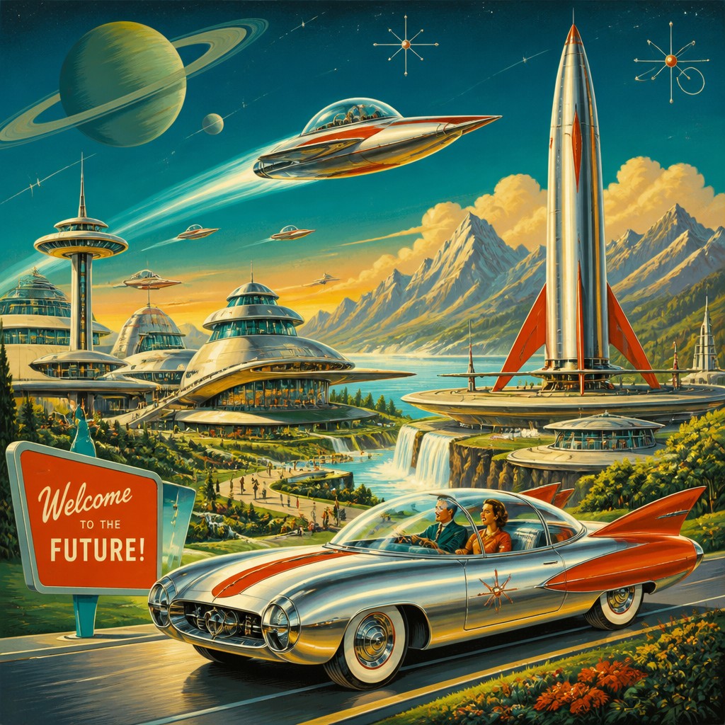
Retro Futurism Sci-Fi art looks back at mid-century visions of the future: chrome robots, streamlined vehicles, atomic-age design, bold colors, and optimistic space-age scenes. People compare the two because both remix the past into stylized futures, but they differ in tone: Vaporwave is dreamy and detached, while Retro Futurism is energetic and hopeful.
Same Prompt, Both Styles
Each pair below was generated from the identical prompt — only the style changed.
“portrait of two people together”
“wide landscape with natural scenery”
“still life with everyday objects”
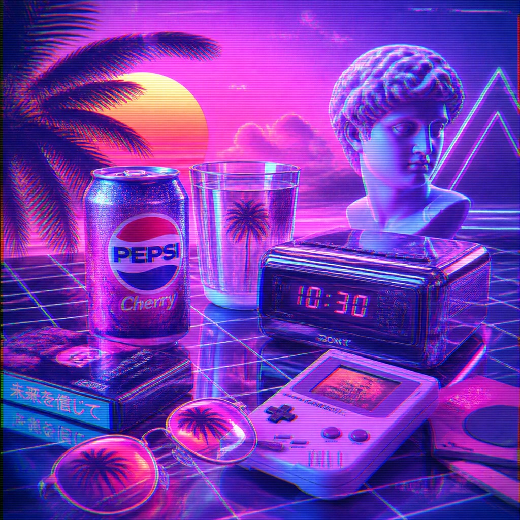
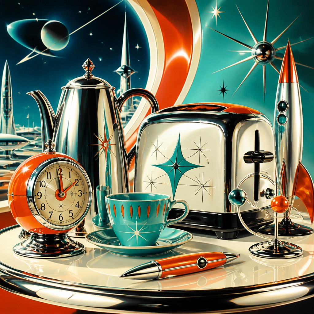
“bicyle resting against a wall”
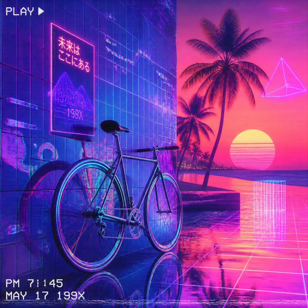
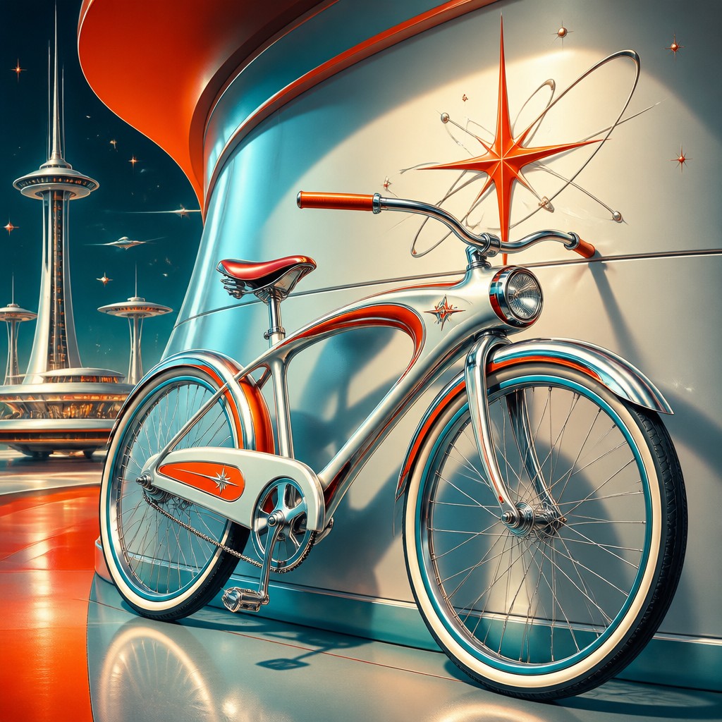
Key Differences
| Vaporwave | Retro Futurism Sci-Fi | |
|---|---|---|
| Mood | Dreamy, nostalgic, detached, and often ironic. | Optimistic, energetic, and forward-looking. |
| Color palette | Neon pinks, purples, teals, and soft digital gradients. | Bold primary colors, metallic tones, and high-contrast accents. |
| Subject matter | Retro computers, internet relics, statues, palm trees, and sunsets. | Robots, rockets, flying cars, and sleek future cities. |
| Surface and texture | Glitchy, pixelated, glossy, and sometimes washed-out. | Smooth, polished, chrome-heavy, and mechanically refined. |
| Visual language | Fragments, overlays, distortion, and nostalgic digital symbols. | Streamlined forms, clean curves, and engineered composition. |
| Relationship to the future | Treats the future as a memory, meme, or faded simulation. | Presents the future as an exciting possibility. |
| Mood | nostalgic, dreamlike, surreal, synthetic, melancholic | optimistic, nostalgic, sleek, playful, speculative |
| Energy | calm | lively |
| Detail level | detailed | detailed |
| Color | pink-purple pastels with cyan chrome accents | bright pastels, chrome silver, saturated accents |
| Texture | glossy, glitchy, CRT-like surfaces | smooth, glossy, polished surfaces |
| Origin | digital-native aesthetic | 1950s-1980s Western sci-fi design |
| Best for | album covers, poster design, web graphics, branding, digital wallpapers, motion visuals | posters, album covers, book covers, game art, branding, editorial illustrations |
| Difficulty | moderate | moderate |
Which Should You Choose?
Choose Vaporwave if you want a mood-heavy, internet-age look that feels nostalgic, surreal, and slightly ironic. Choose Retro Futurism Sci-Fi if you want a cleaner, more illustrative vision with optimism, invention, and classic science-fiction energy. In short: pick A for atmosphere and digital nostalgia, B for adventure and retro-future imagination.
Frequently Asked Questions
Are Vaporwave and Retro Futurism the same thing?
No. They both borrow from past eras, but Vaporwave is more about digital nostalgia and altered memory, while Retro Futurism imagines a future through older design ideals. Their feelings are very different even when they use similar chrome or retro elements.
Which style is more colorful?
Both can be colorful, but in different ways. Vaporwave usually uses neon pinks, purples, and soft gradients, while Retro Futurism relies on bold, saturated colors paired with metallic surfaces and strong shapes.
Which style is better for a futuristic poster?
Retro Futurism is usually better if you want clarity, action, and a classic sci-fi feel. Vaporwave works better if you want a more atmospheric, stylized, and dreamy poster.
Can these styles overlap?
Yes, they can share chrome, retro technology, and a fascination with old visions of the future. The main difference is tone: Vaporwave leans into distortion and nostalgia, while Retro Futurism emphasizes design confidence and optimism.