Trompe L'oeil Realism vs Photorealism: What's the Difference?
Trompe l’oeil realism and photorealism are both grounded in close observation and technical control, but they aim to create different kinds of visual belief. Trompe l’oeil uses perspective, shadow, and scale to fool the eye into sensing depth and physical presence, often making flat surfaces seem like they contain objects or openings.
Photorealism, by contrast, focuses on reproducing the look of a photograph with extreme fidelity. It emphasizes crisp detail, accurate textures, and reflective surfaces, so people compare the two because both can look highly realistic while relying on different visual priorities: spatial illusion in trompe l’oeil and image precision in photorealism.
Same Prompt, Both Styles
Each pair below was generated from the identical prompt — only the style changed.
“portrait of two people together”
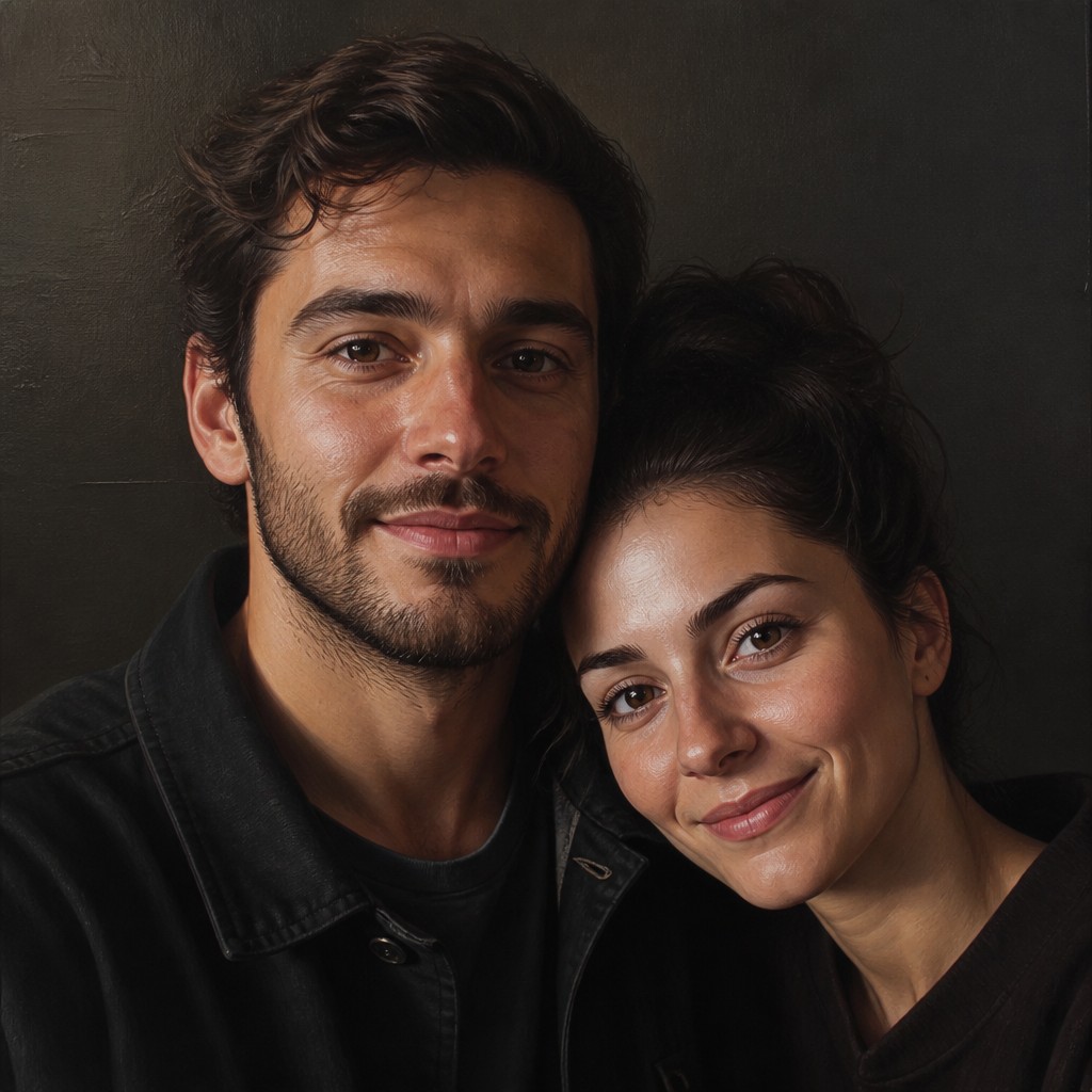
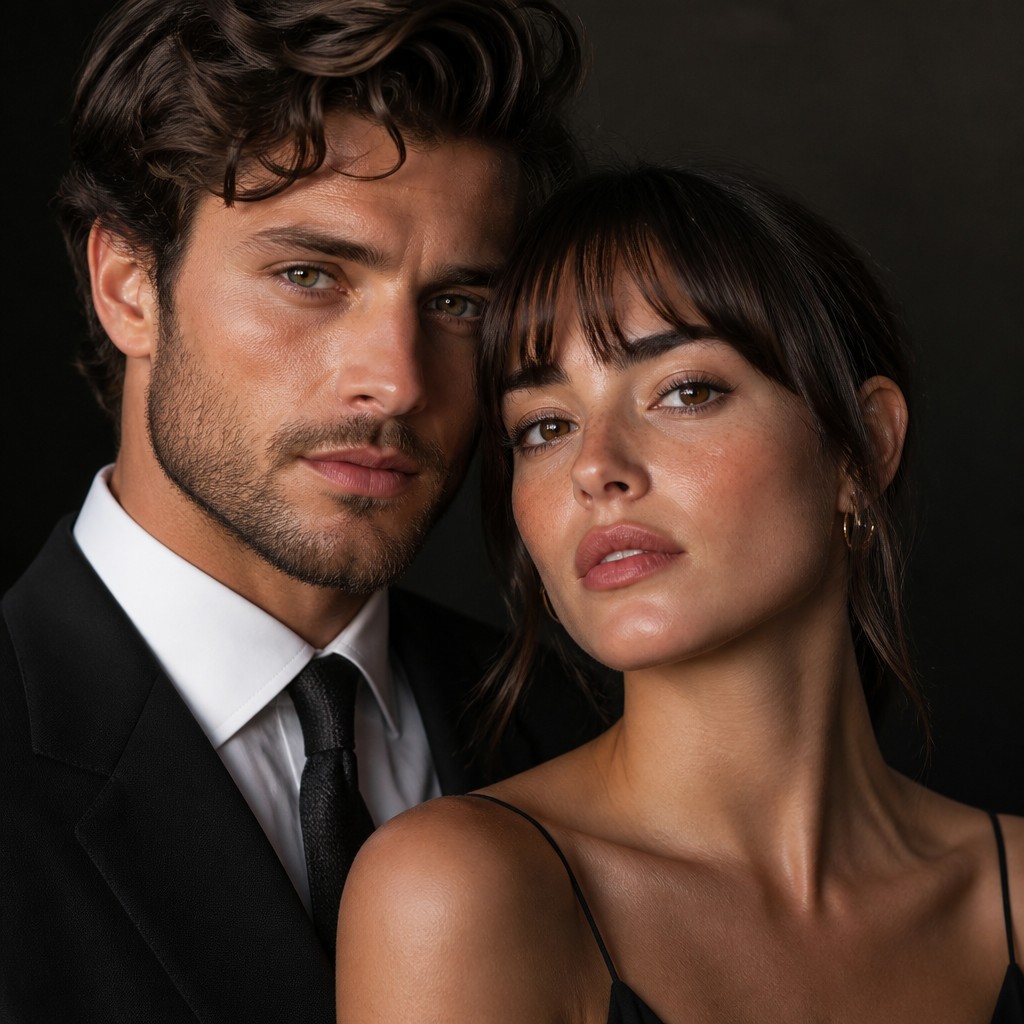
“wide landscape with natural scenery”
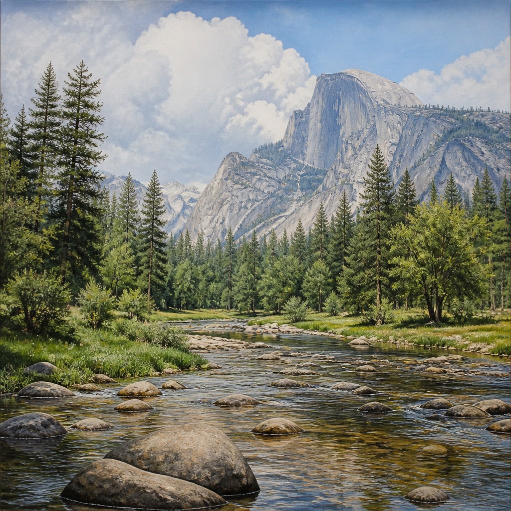
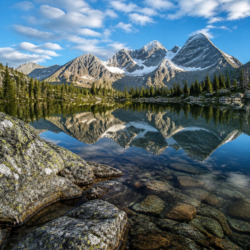
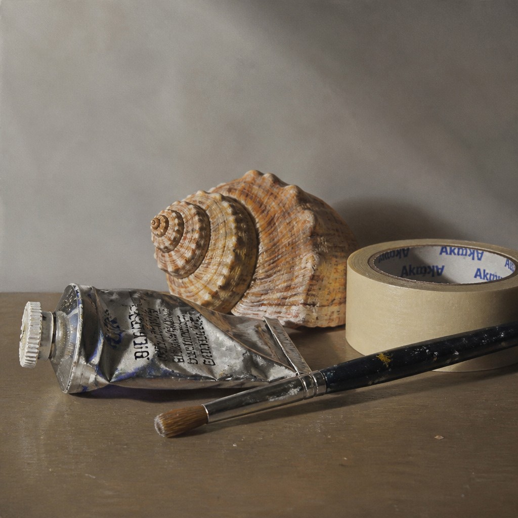
“still life with everyday objects”

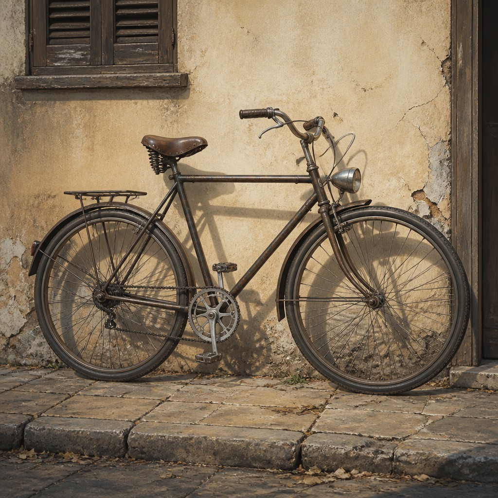
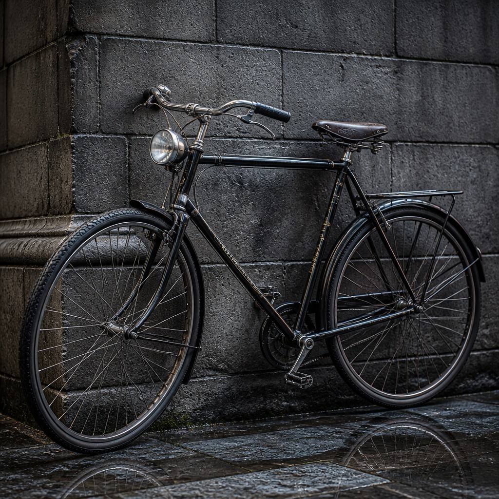
“bicyle resting against a wall”
Key Differences
| Trompe L'oeil Realism | Photorealism | |
|---|---|---|
| Core illusion | Creates the impression that objects or space exist on or beyond the surface. | Creates the impression that the image itself was captured by a camera. |
| Depth handling | Uses perspective and shadow to simulate three-dimensional protrusion or recess. | Uses accurate perspective, but depth is secondary to photographic exactness. |
| Surface treatment | May include painted edges, cast shadows, and faux texture to trick perception. | Prioritizes crisp edges, material detail, and believable surface finish. |
| Visual focus | Draws attention to the artwork’s physical place in the room or wall. | Draws attention to optical fidelity and fine visual information. |
| Typical effect | Feels playful, deceptive, and spatially immersive. | Feels exact, detailed, and image-like rather than illusionistic. |
| Best subjects | Works well for objects, niches, architectural details, and staged illusions. | Works well for portraits, still lifes, scenes, and highly reflective materials. |
| Mood | deceptive, precise, immersive, polished, contemplative | precise, observant, clinical, contemporary |
| Energy | balanced | balanced |
| Detail level | intricate | intricate |
| Color | naturalistic, muted, realistic highlights | naturalistic, crisp, high-contrast, reflective |
| Texture | smooth illusionistic surfaces | smooth, razor-sharp, highly tactile |
| Origin | 17th-century Europe | 1960s-70s United States |
| Best for | museum displays, book covers, posters, interior murals, theatrical sets, advertising | editorial illustrations, posters, product visuals, urban scenes, portraits, advertising mockups |
| Difficulty | advanced | advanced |
Which Should You Choose?
Choose trompe l’oeil realism if you want to surprise viewers and make a surface seem physically transformed, especially in murals, interiors, or decorative panels. Choose photorealism if you want maximum fidelity to a reference image and a polished, camera-like finish. In short, pick A for spatial illusion and visual trickery, and pick B for precision, texture, and photographic realism.
Frequently Asked Questions
Are trompe l’oeil realism and photorealism the same thing?
No. Both can look highly realistic, but trompe l’oeil is mainly about fooling the eye into perceiving depth or objects in space. Photorealism is about reproducing the look of a photograph with extreme detail.
Which style is more three-dimensional?
Trompe l’oeil usually feels more three-dimensional because it is designed to simulate physical presence on a flat surface. Photorealism can show depth convincingly, but its main goal is visual accuracy rather than spatial trickery.
Is photorealism always based on photos?
Often, yes, but not necessarily in a literal or copied way. The key feature is that the finished image resembles a photograph in clarity, detail, and surface rendering.
Which style is better for interior decoration?
Trompe l’oeil is often better if you want an illusion that interacts with architecture or makes a wall seem altered. Photorealism is better if you want a highly detailed image that reads like a precise, framed picture.