Superhero Comic vs Graphic Novel: What's the Difference?
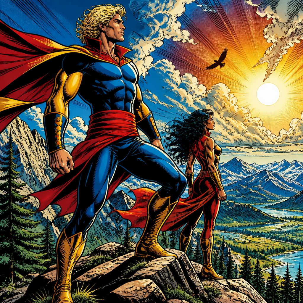
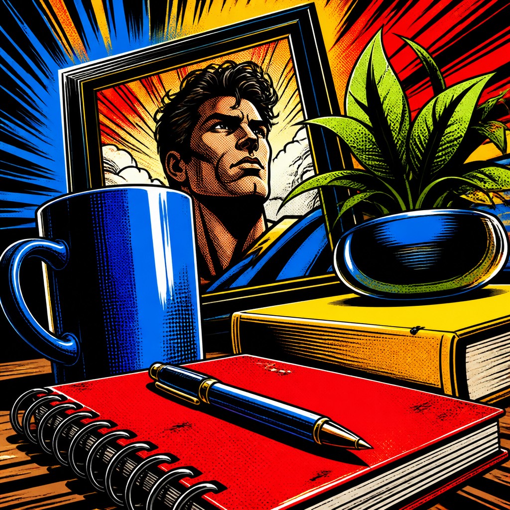
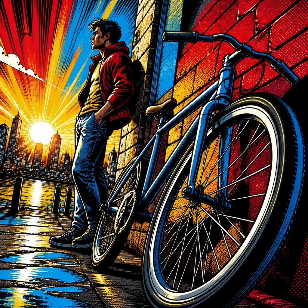
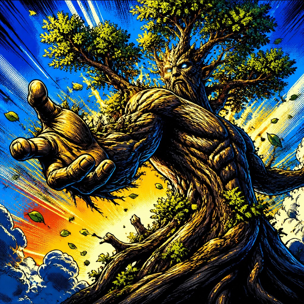
Superhero comic art is built for energy and impact. It uses bold inks, exaggerated heroic anatomy, dramatic foreshortening, and vivid primary colors to make action feel larger than life. The style is designed to read quickly, with clear silhouettes, expressive motion, and a strong sense of excitement on the page.
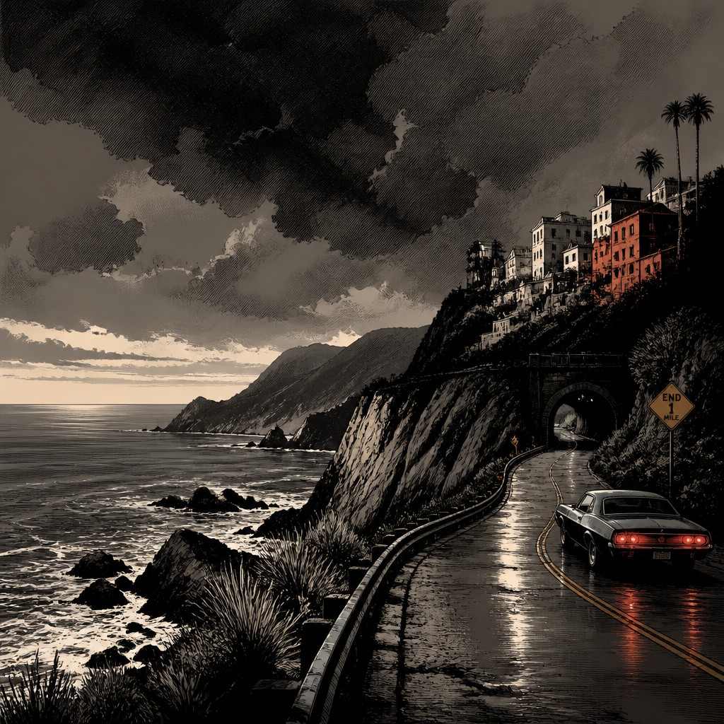
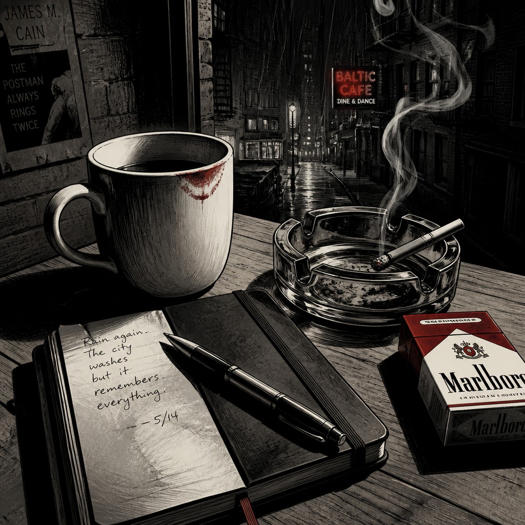
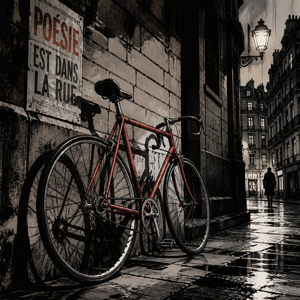
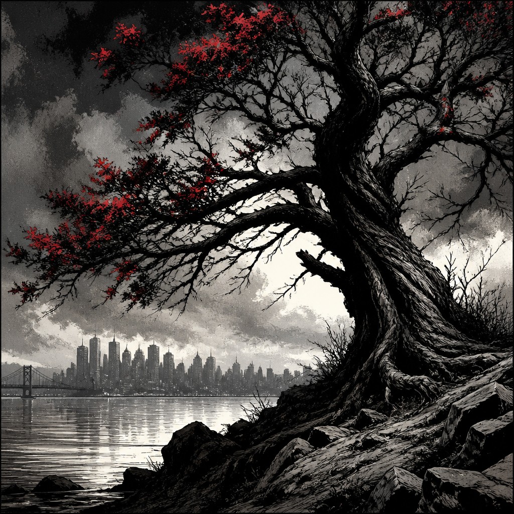
Graphic novel art is often more restrained and atmospheric. It favors realistic figures, cinematic framing, noir lighting, and crosshatching to support mood and story depth. People compare these styles because both come from comic storytelling, yet they differ in tone, visual realism, and how they guide the reader’s attention.
Same Prompt, Both Styles
Each pair below was generated from the identical prompt — only the style changed.
“wide landscape with natural scenery”
“still life with everyday objects”
“bicyle resting against a wall”
“a tree in nature”
Key Differences
| Superhero Comic | Graphic Novel | |
|---|---|---|
| Line & form | Thick, decisive outlines and highly stylized anatomy. | Varied lines with more realistic proportions and texture. |
| Color palette | Bright, saturated primary colors with high contrast. | Muted, controlled colors or limited palettes for mood. |
| Lighting | Clear, even lighting that emphasizes readability and action. | Noir-style shadows, strong contrast, and atmosphere. |
| Composition | Dramatic angles, speed lines, and explosive framing. | Cinematic framing with calmer pacing and visual tension. |
| Figure style | Idealized, muscular, and exaggerated for heroic effect. | More grounded, naturalistic, and expressive figures. |
| Story tone | Optimistic, action-forward, and spectacle-driven. | Mature, introspective, and often psychologically complex. |
| Mood | bold, dramatic, heroic, high-stakes | moody, cinematic, serious, introspective |
| Energy | intense | balanced |
| Detail level | detailed | detailed |
| Color | bright primaries with strong contrast | restrained, muted, often dark tones |
| Texture | clean inks, heavy shadows, glossy feel | clean ink lines with layered shading |
| Origin | 20th-century American comic books | late 20th century Western comics |
| Best for | superhero comics, action posters, gaming art, movie key art, collectible covers | long-form comics, novel covers, editorial illustrations, crime drama scenes, character-focused posters |
| Difficulty | advanced | advanced |
Which Should You Choose?
Choose superhero comic art when you want clear action, bold visual impact, and a larger-than-life sense of heroism. Choose graphic novel art when you want mood, realism, and a more cinematic or literary feel. If your project needs fast readability and high-energy spectacle, A is the better fit; if it needs atmosphere, nuance, and emotional depth, B is stronger.
Frequently Asked Questions
Is graphic novel art just a more serious version of superhero comic art?
Not exactly. Graphic novel art is a broader visual approach that can be serious, quiet, historical, or experimental, while superhero comic art is usually built around heightened action and clear heroics. They overlap, but their goals are often different.
Which style is easier to read at a glance?
Superhero comic art is usually easier to read quickly because it uses bold outlines, strong color contrast, and clear action poses. Graphic novel art may take a little longer to absorb because it often relies on subtle lighting, texture, and composition.
Can both styles include action scenes?
Yes, both can depict action effectively. Superhero comic art tends to make action feel more explosive and exaggerated, while graphic novel art often makes it feel more grounded, tense, or cinematic.
Which style is better for emotionally complex stories?
Graphic novel art is often better suited to emotionally complex stories because it supports nuance, atmosphere, and realism. That said, superhero comic art can also carry strong emotion, especially when the story benefits from bold symbolism and heightened drama.