Space Opera Sci-Fi vs Retro Futurism Sci-Fi: What's the Difference?
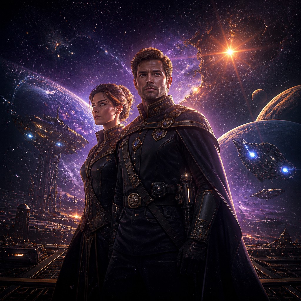
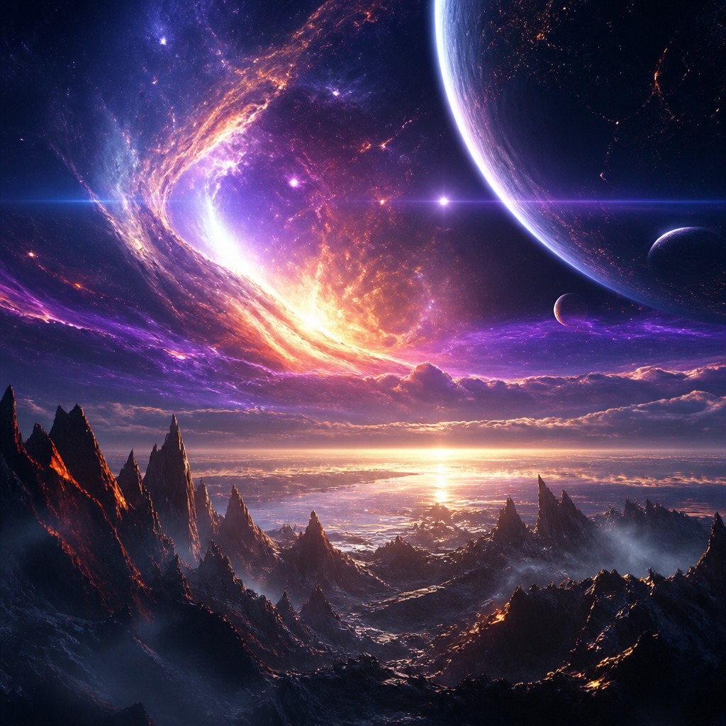
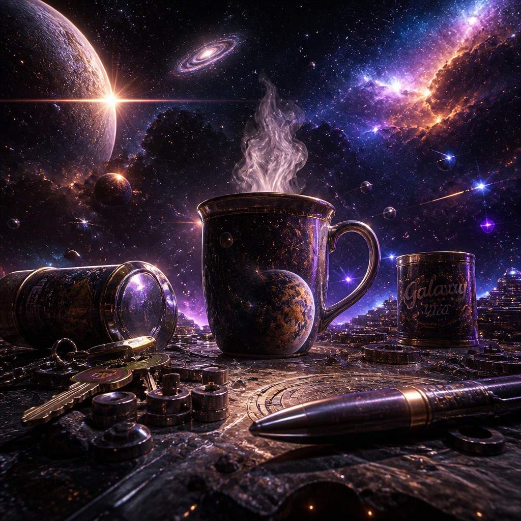
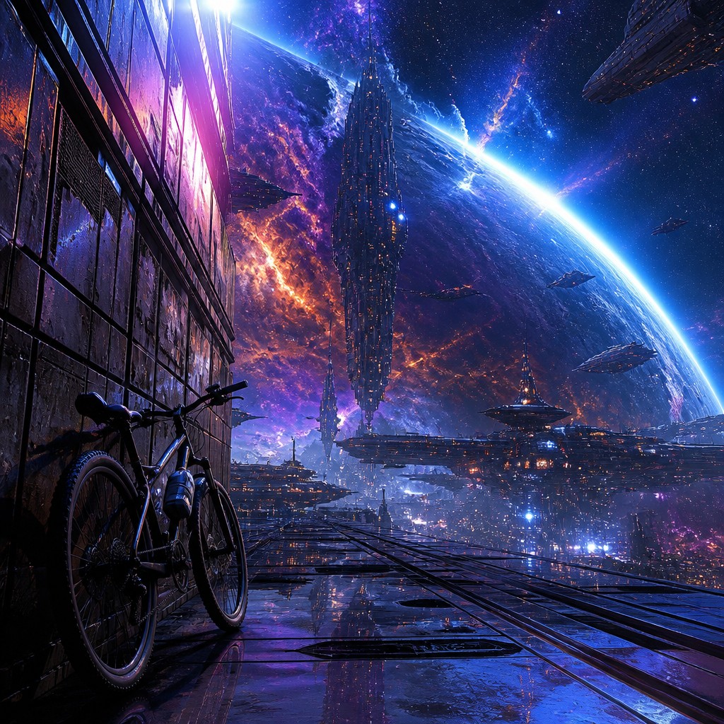
Space Opera Sci-Fi Art is built for scale, drama, and wonder. It shows vast starships, alien landscapes, cosmic conflicts, and luminous phenomena with cinematic lighting and strong contrasts. The focus is on spectacle and emotional intensity, often making the viewer feel tiny within an enormous galaxy.
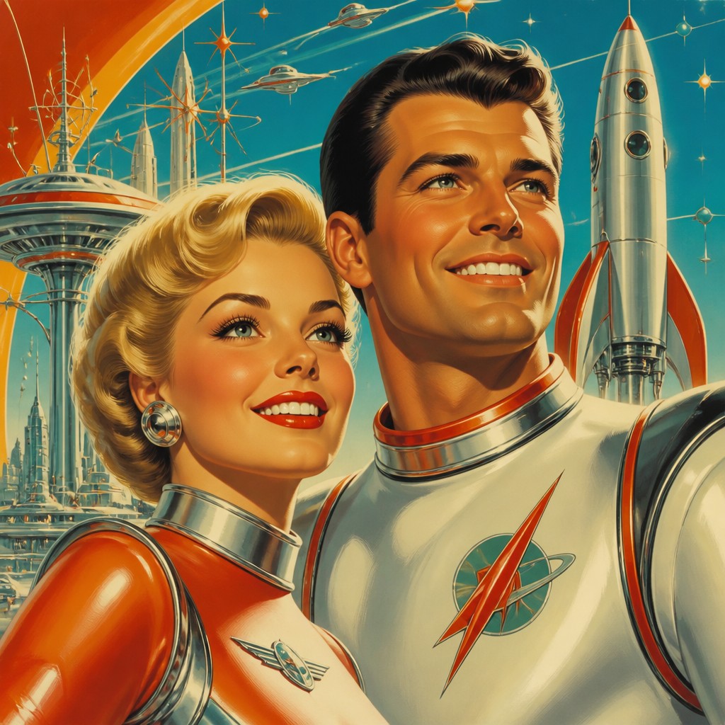
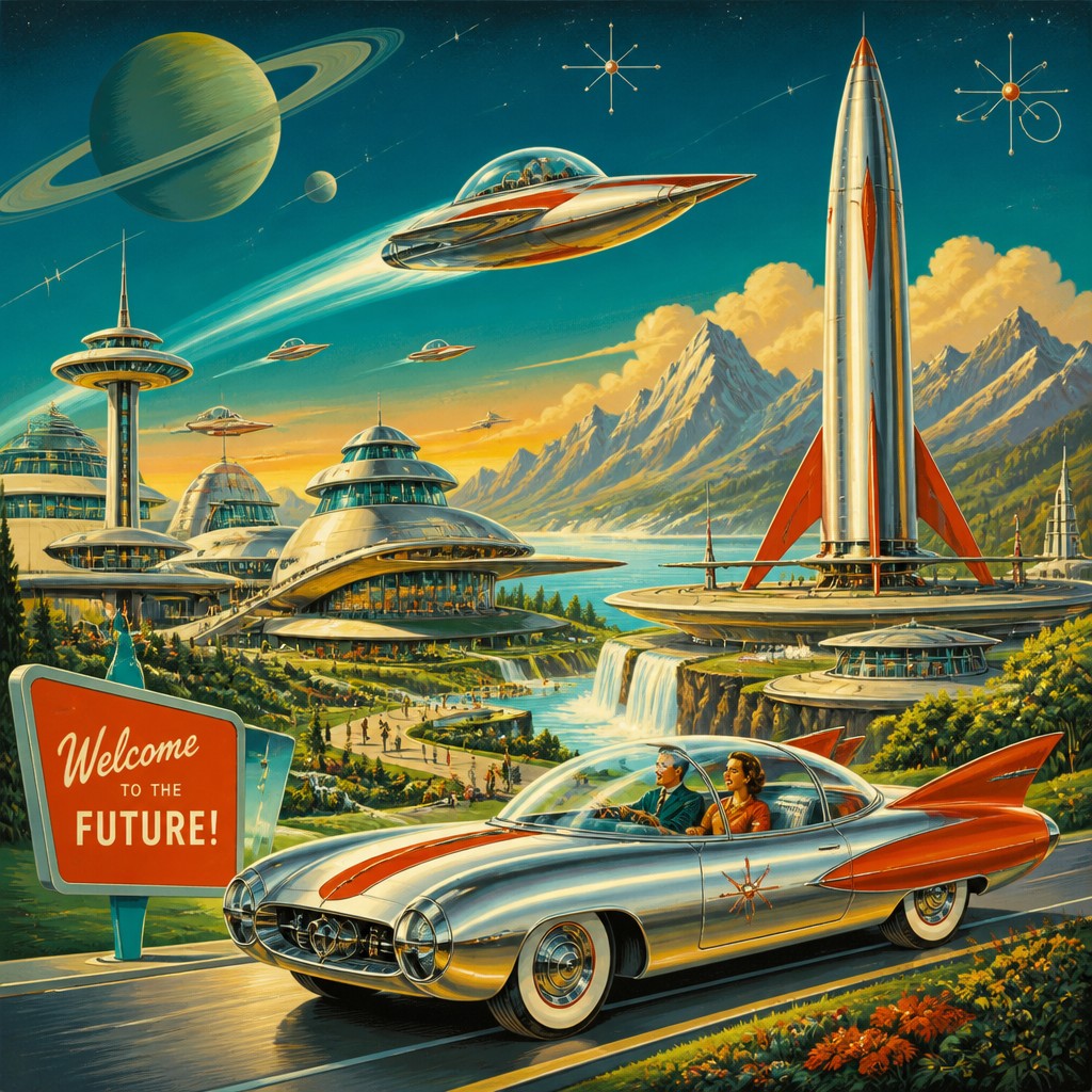
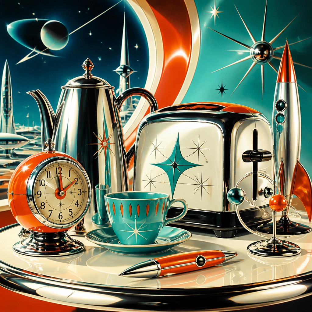
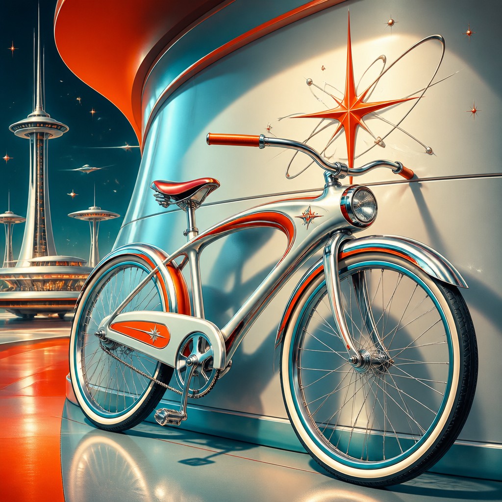
Retro Futurism Sci-Fi Art imagines the future through an atomic-age lens: chrome machines, sleek rockets, bold geometry, and optimistic technology. People compare the two because both depict imagined futures, but they differ in mood, visual language, and historical influence—one is expansive and dramatic, the other nostalgic and streamlined.
Same Prompt, Both Styles
Each pair below was generated from the identical prompt — only the style changed.
“portrait of two people together”
“wide landscape with natural scenery”
“still life with everyday objects”
“bicyle resting against a wall”
Key Differences
| Space Opera Sci-Fi | Retro Futurism Sci-Fi | |
|---|---|---|
| Mood | Epic, tense, awe-filled, and often battle-ready. | Optimistic, playful, and confident about technology. |
| Scale | Enormous ships, planets, and battles dominate the scene. | Smaller, cleaner scenes centered on devices and sleek vehicles. |
| Color | High-contrast palettes with glowing nebulae and deep space shadows. | Bright, bold colors with polished metallic highlights. |
| Line & form | Complex forms, layered details, and cinematic silhouettes. | Streamlined shapes, smooth curves, and simplified geometry. |
| Technology design | Advanced, massive, and often intimidating or military-coded. | Futuristic but retro, with chrome, dials, fins, and rockets. |
| Worldbuilding focus | Alien worlds, interstellar conflict, and vast civilizations. | Space-age daily life, exploration, and idealized progress. |
| Mood | epic, awe-inspiring, adventurous, dramatic | optimistic, nostalgic, sleek, playful, speculative |
| Energy | intense | lively |
| Detail level | intricate | detailed |
| Color | deep space blues, luminous neon accents | bright pastels, chrome silver, saturated accents |
| Texture | smooth metal, glowing haze, cosmic mist | smooth, glossy, polished surfaces |
| Origin | mid-20th century pulp and cinema aesthetics | 1950s-1980s Western sci-fi design |
| Best for | movie posters, book covers, game key art, trading cards, concept art | posters, album covers, book covers, game art, branding, editorial illustrations |
| Difficulty | advanced | moderate |
Which Should You Choose?
Pick Space Opera Sci-Fi Art if you want intensity, grandeur, and a sense of cosmic stakes—especially for battles, alien empires, and dramatic poster-like scenes. Choose Retro Futurism Sci-Fi Art if you want nostalgic charm, cleaner design, and an optimistic vintage vision of technology. In short, A is for epic spectacle, while B is for stylish retro imagination.
Frequently Asked Questions
Which style feels more cinematic?
Space Opera Sci-Fi Art usually feels more cinematic because it relies on scale, contrast, and dramatic action. It often resembles a blockbuster scene frozen at its most intense moment.
Which style is better for friendly or optimistic sci-fi?
Retro Futurism Sci-Fi Art is usually better for friendly, hopeful sci-fi. Its shapes, colors, and technology cues suggest progress, curiosity, and a positive future.
Can these styles overlap?
Yes, they can overlap in subject matter, since both can feature spaceships, planets, and advanced technology. The difference is mainly in tone and design language: epic drama versus retro optimism.
Which style uses more visual detail?
Space Opera Sci-Fi Art often uses more layered detail because it emphasizes vast environments and complex action. Retro Futurism tends to simplify forms for a cleaner, more iconic look.