Slice of Life Manga vs Seinen Mature Manga: What's the Difference?
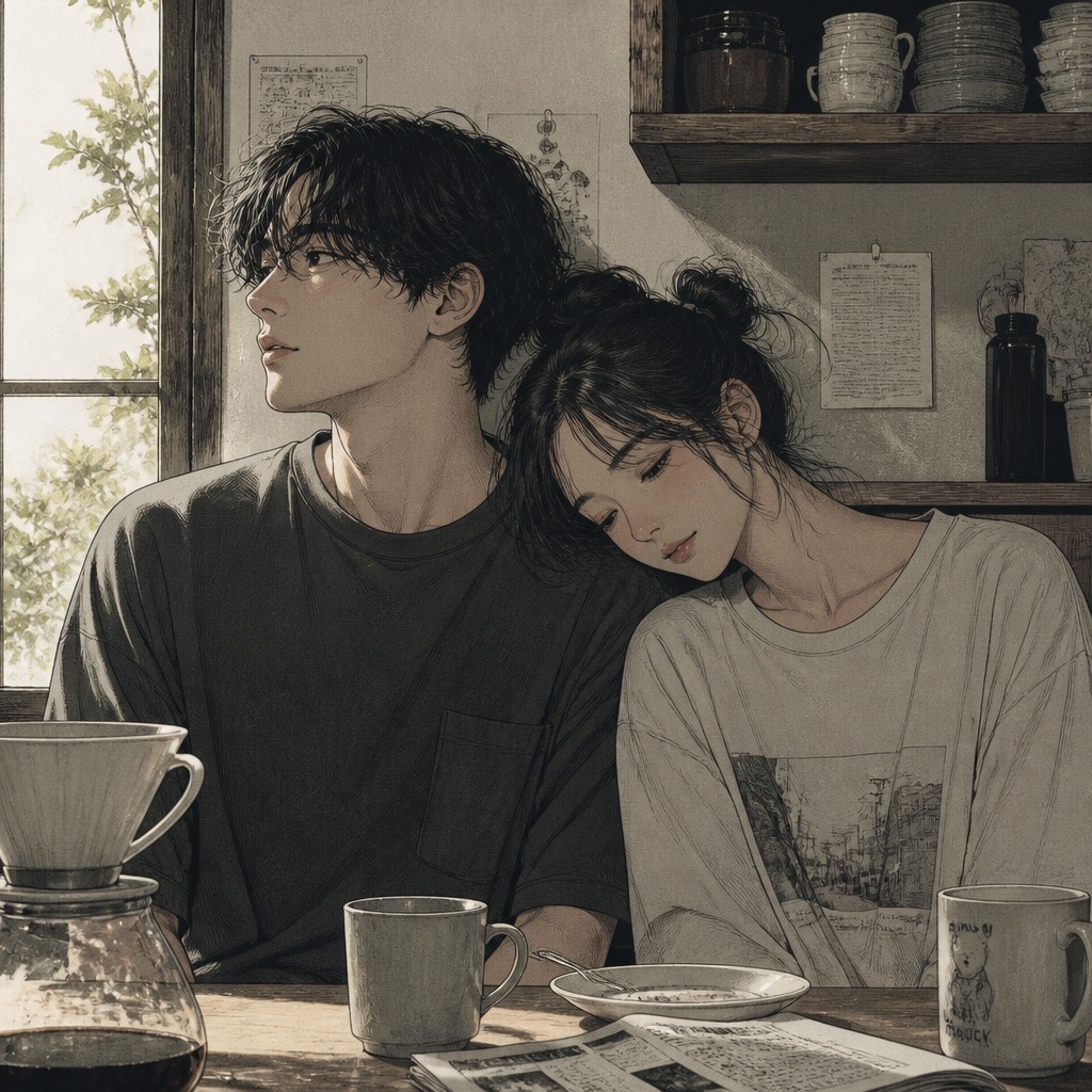
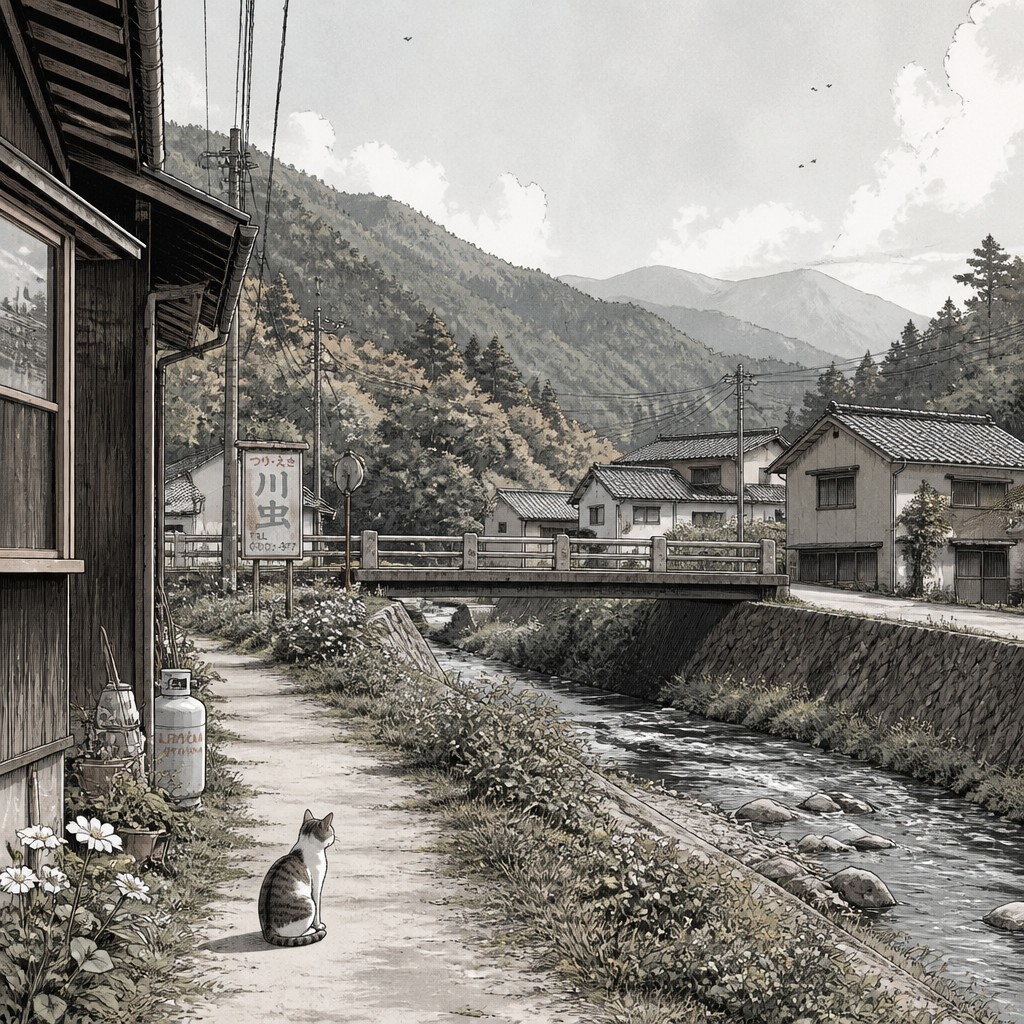
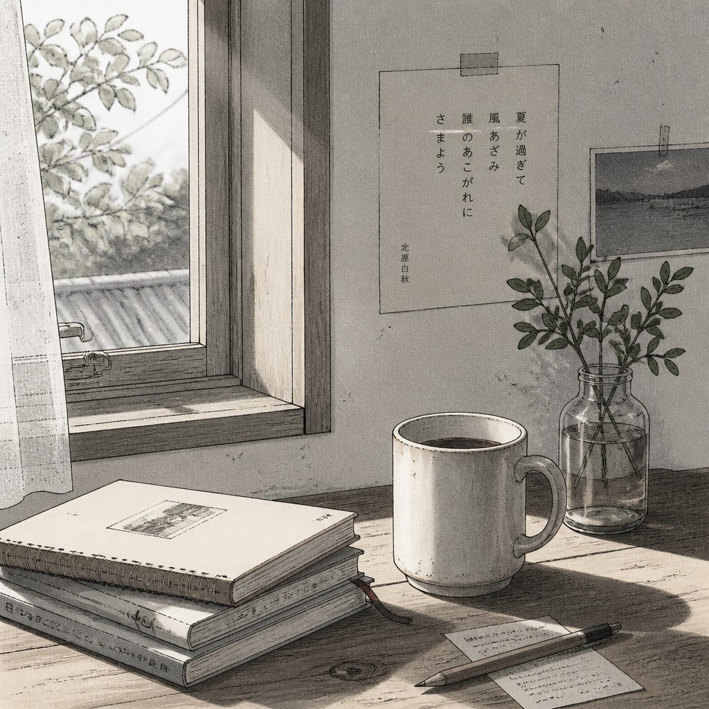
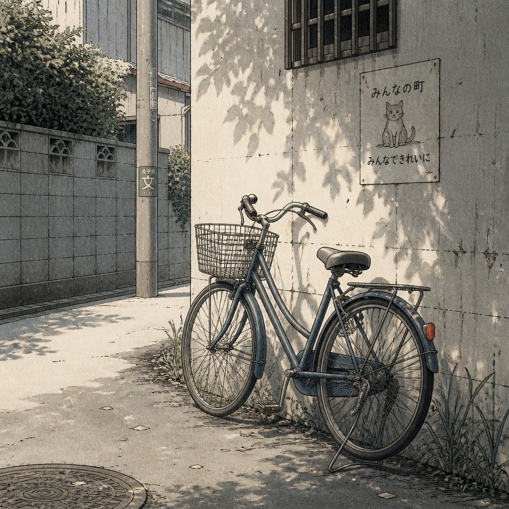
Slice of Life Manga Art Style focuses on quiet everyday moments: school commutes, meals, conversations, rooms, and small gestures. It usually uses soft tones, natural light, clean but expressive linework, and interiors that feel lived-in. The emotional effect comes from ordinary details and subtle facial expressions rather than dramatic action.
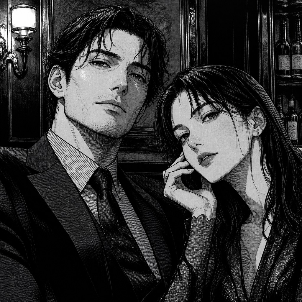
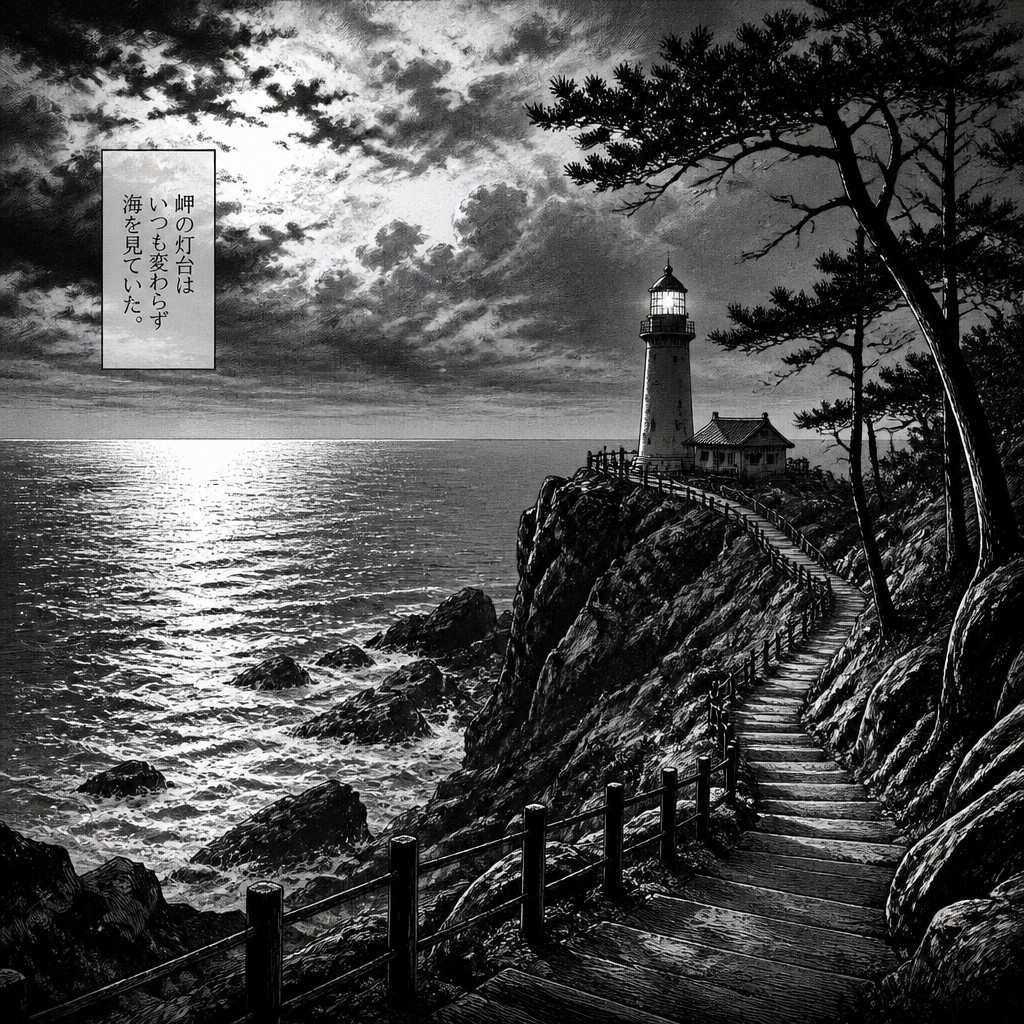
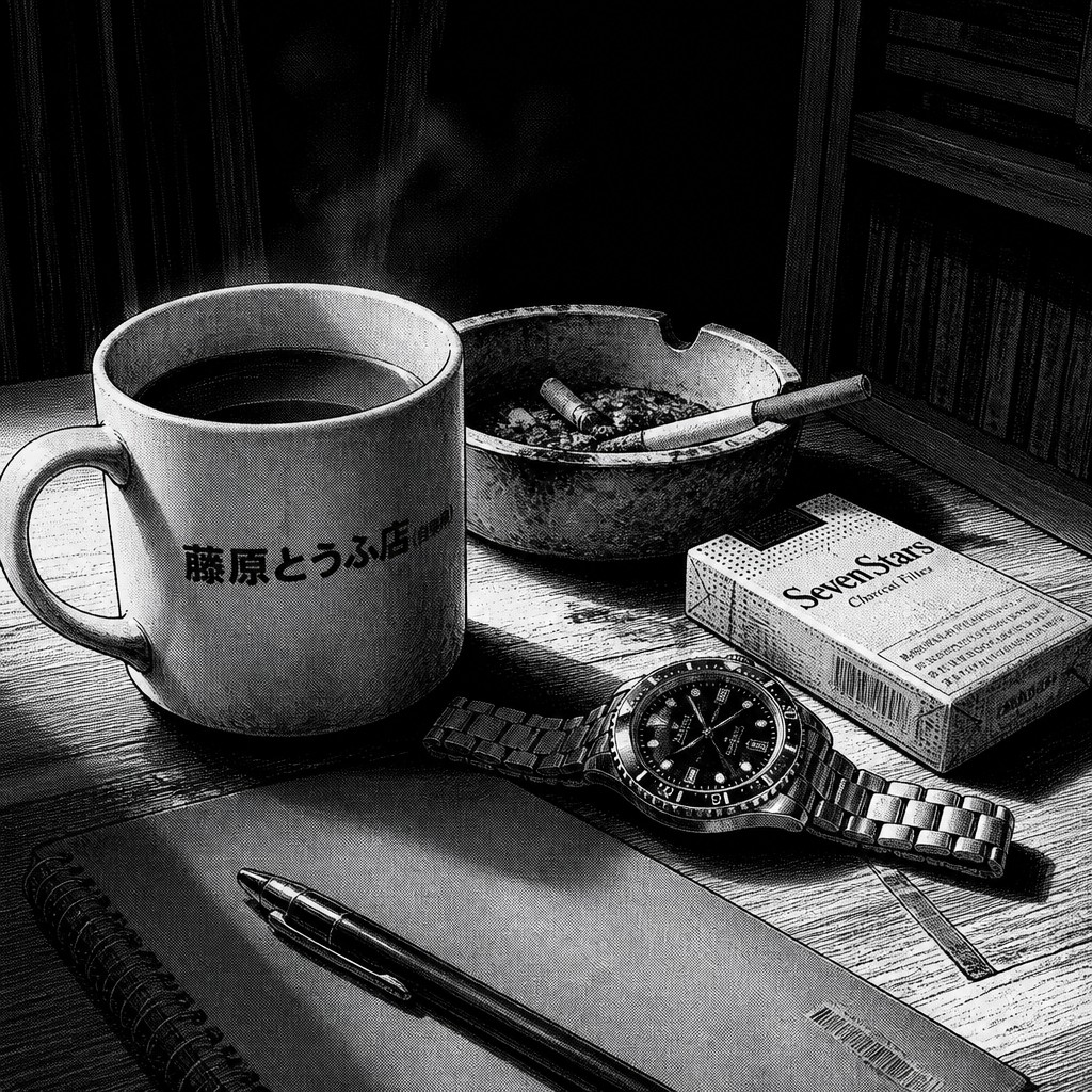
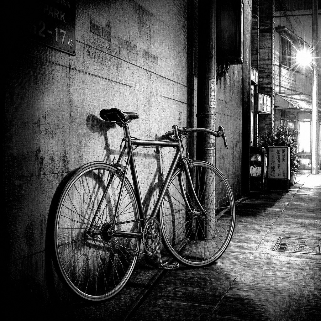
Seinen Mature Manga Art Style is built for more grounded, adult-oriented storytelling. It often favors realistic anatomy, heavier contrast, noir-inspired lighting, carefully rendered backgrounds, and cinematic black-and-white composition. People compare the two because both can be detailed and emotionally restrained, yet they differ in mood: one feels intimate and gentle, while the other feels tense, weighty, and more dramatic.
Same Prompt, Both Styles
Each pair below was generated from the identical prompt — only the style changed.
“portrait of two people together”
“wide landscape with natural scenery”
“still life with everyday objects”
“bicyle resting against a wall”
Key Differences
| Slice of Life Manga | Seinen Mature Manga | |
|---|---|---|
| Mood | Calm, warm, and reflective. | Serious, tense, and often brooding. |
| Lighting | Soft natural light and gentle shading. | High-contrast noir lighting and deep shadows. |
| Line & form | Clean, delicate lines with simplified forms. | Sharper, denser lines with more realistic structure. |
| Backgrounds | Detailed homes, classrooms, and everyday spaces. | Detailed urban or interior settings with cinematic depth. |
| Facial expression | Subtle emotion shown through small gestures. | Nuanced, restrained expressions with more gravity. |
| Story focus | Ordinary life and interpersonal moments. | Adult conflict, realism, and psychological tension. |
| Mood | quiet, reflective, tender, nostalgic, everyday | serious, brooding, tense, grounded, melancholic |
| Energy | calm | calm |
| Detail level | detailed | intricate |
| Color | soft, muted, natural tones | muted tones with stark contrast |
| Texture | clean lines, gentle shading, crisp detail | clean linework, dense shading, crisp surfaces |
| Origin | late 20th-century Japanese manga | Japan, late 20th century manga |
| Best for | coming-of-age stories, slice-of-life comics, character-driven illustrations, soft posters, book covers, ambient concept art | crime comics, psychological drama, historical fiction, slice-of-life stories, cinematic storyboards |
| Difficulty | moderate | advanced |
Which Should You Choose?
Choose Style A if you want warmth, relatability, and quiet emotional scenes centered on daily life. Choose Style B if you want a more mature, cinematic look with realism, shadowy atmosphere, and stories that feel heavier or more consequential. The best choice depends on whether your project should feel gentle and intimate or grounded and dramatic.
Frequently Asked Questions
Which style looks more realistic?
Style B usually looks more realistic because it emphasizes anatomy, lighting contrast, and detailed environments. Style A can still be detailed, but it tends to simplify forms to preserve a softer, approachable mood.
Is Style A only for lighthearted stories?
Not necessarily. Style A can handle sadness, nostalgia, or introspection very well, but it presents those feelings through quieter everyday imagery. The overall tone remains gentle rather than intense.
Can Style B still include emotional subtlety?
Yes. Style B often relies on restrained expressions, body language, and lighting to communicate emotion. Its subtlety usually feels more dramatic and cinematic than tender.
Which style is better for character-driven scenes?
Both are strong for character-driven stories, but they highlight different aspects. Style A is ideal for relationships and small emotional beats, while Style B is better for conflicted characters and more serious psychological depth.