Shoujo Romance Anime vs Shoujo Romance Manga: What's the Difference?
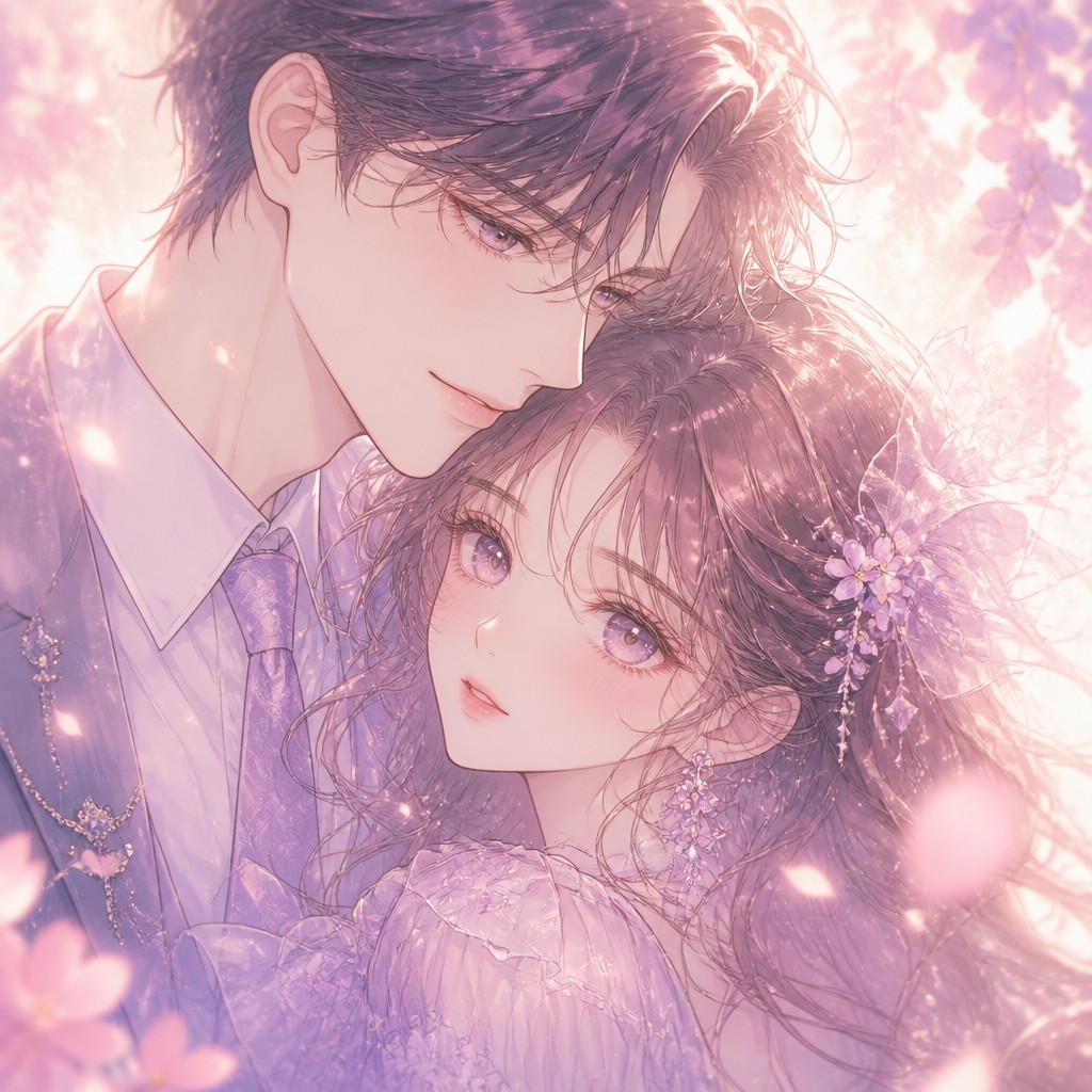
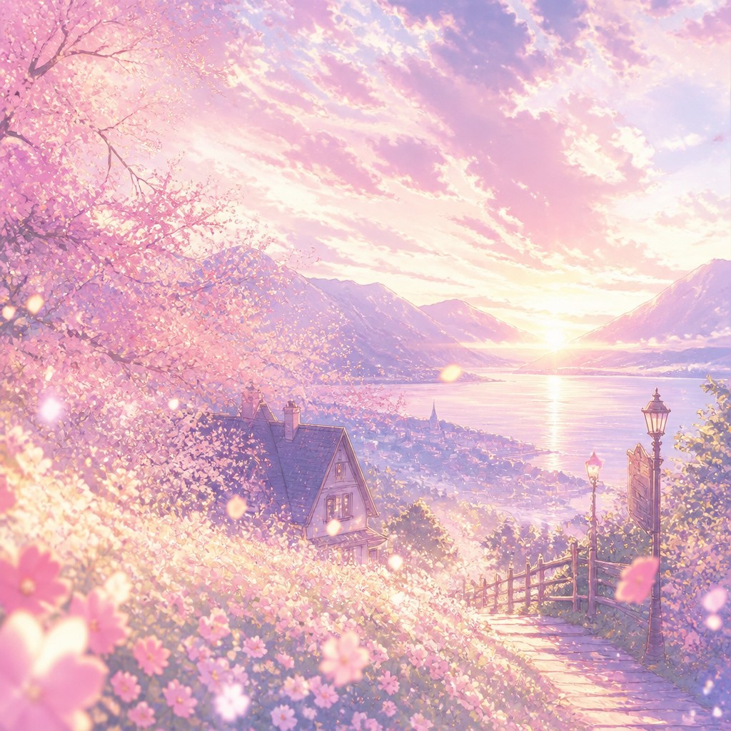
Shoujo Romance Anime Art Style uses color, light, and motion to create a soft, emotionally warm romantic atmosphere. It often features pastel palettes, watercolor-like shading, glowing effects, floral motifs, and expressive faces that feel gentle and dreamlike.
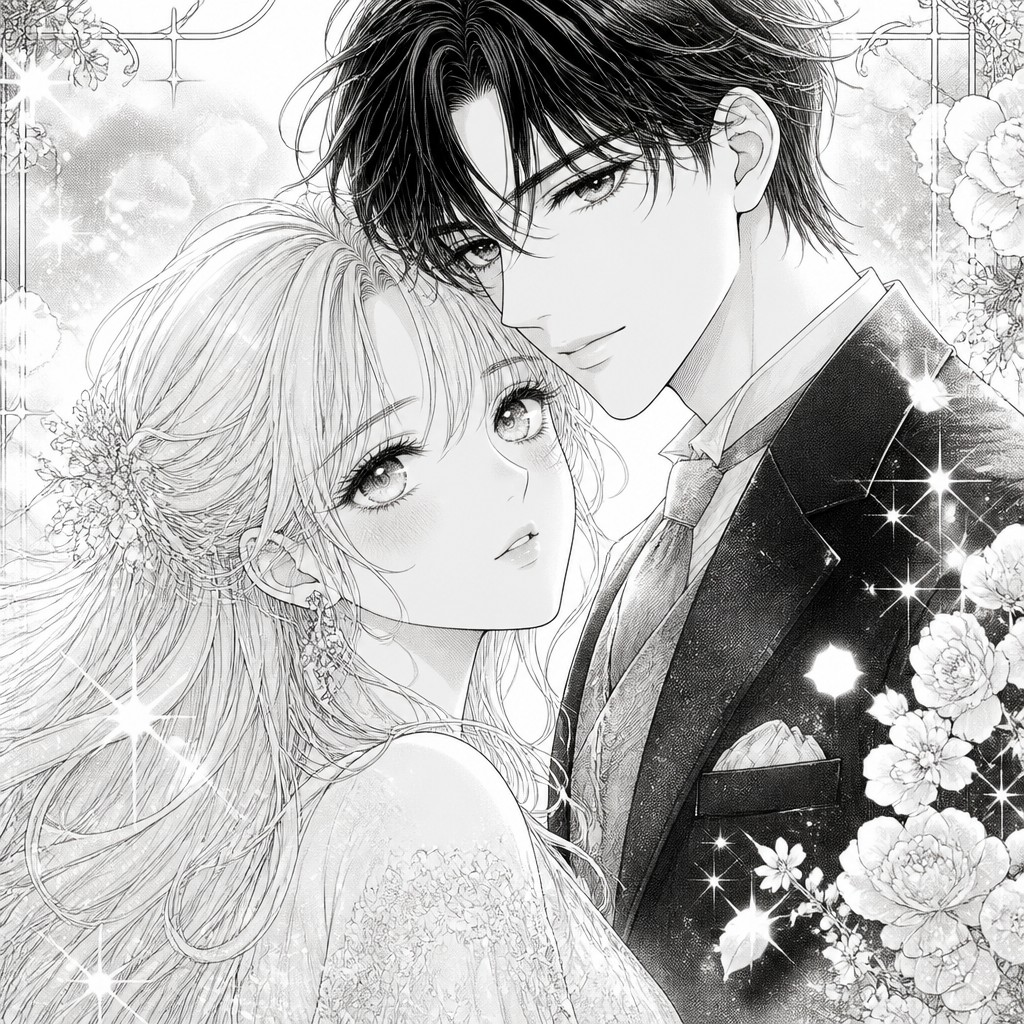
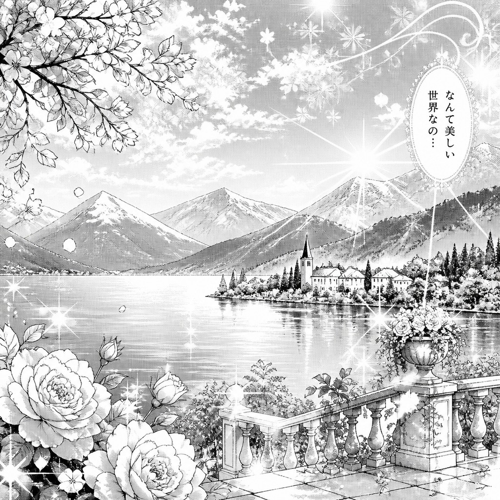
Shoujo Romance Manga Art Style tells the same kind of romantic story through monochrome drawings, screen tones, and linework. People compare them because both share the same emotional vocabulary—close-ups, sparkles, flowers, and tender expressions—but they differ in medium, texture, and how color or contrast shapes the mood.
Same Prompt, Both Styles
Each pair below was generated from the identical prompt — only the style changed.
“portrait of two people together”
“wide landscape with natural scenery”
“still life with everyday objects”
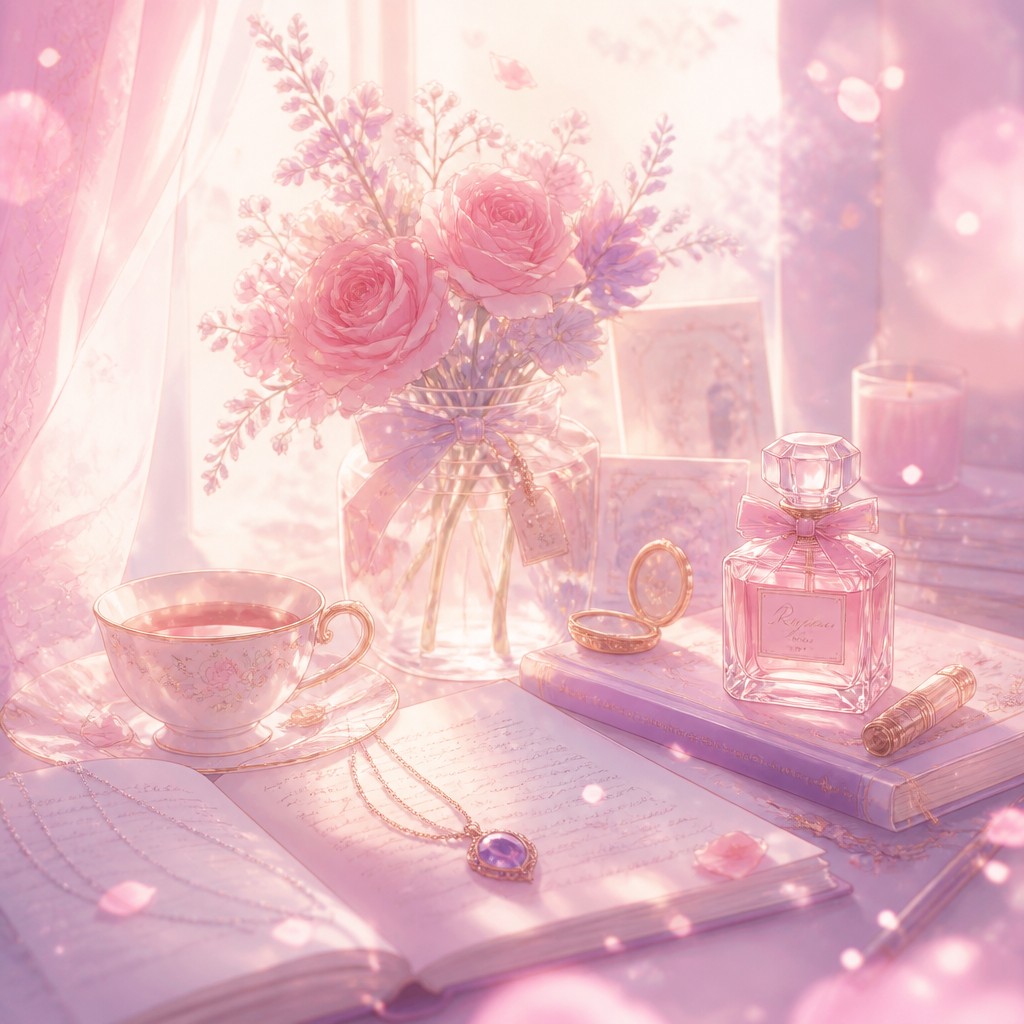
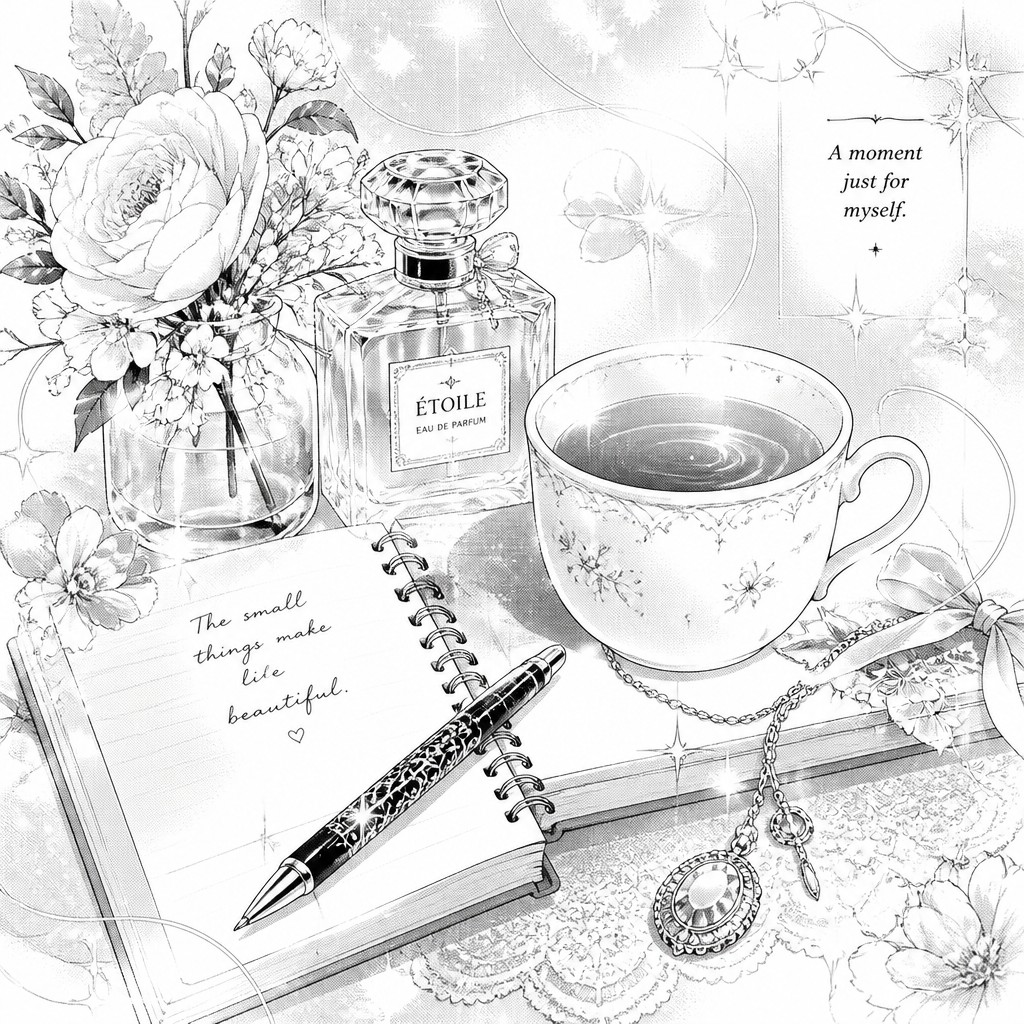
“bicyle resting against a wall”
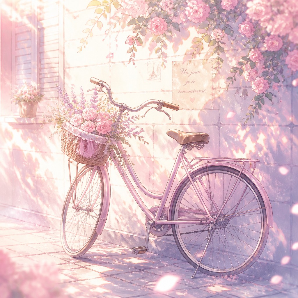
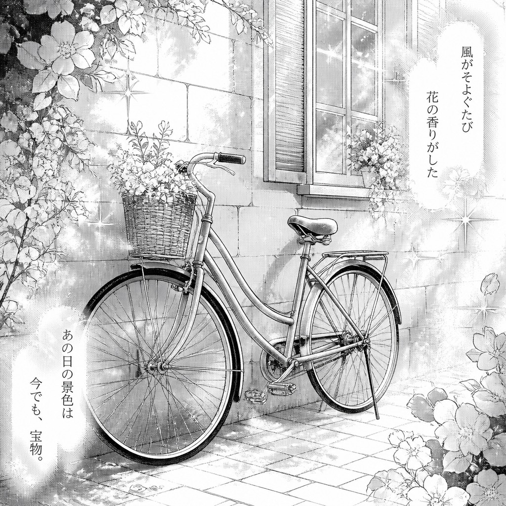
Key Differences
| Shoujo Romance Anime | Shoujo Romance Manga | |
|---|---|---|
| Color | Pastel color palettes and watercolor washes create a soft, luminous mood. | Monochrome values and screentones replace color with contrast and texture. |
| Light & atmosphere | Glowing highlights and airy backgrounds make scenes feel dreamy. | White space, sparkle effects, and tonal contrast build emotional emphasis. |
| Line & shading | Soft edges and blended shading keep forms gentle and polished. | Clean linework and screentones define forms with crisp graphic clarity. |
| Facial expression | Expressions are tender and subtle, enhanced by color and blush. | Close-up faces rely on eyes, linework, and tonal effects for emotion. |
| Floral treatment | Flowers appear as painted accents, backgrounds, or decorative framing. | Flowers often appear as patterned screentones or symbolic overlays. |
| Reading experience | Feels immersive, cinematic, and emotionally gentle. | Feels intimate, graphic, and highly focused on panel rhythm. |
| Mood | tender, dreamy, romantic, gentle | romantic, tender, dreamy, emotional |
| Energy | calm | serene |
| Detail level | detailed | intricate |
| Color | pastel pinks, creams, soft blues | monochrome with bright white highlights |
| Texture | smooth, airy, watercolor-like | fine linework with screentone grain |
| Origin | Japanese manga-anime romance tradition | Japan, late 20th century manga culture |
| Best for | romance manga, character portraits, shoujo covers, fan art, poster illustrations | romance comics, character portraits, emotive scenes, greeting cards, editorial illustrations |
| Difficulty | advanced | advanced |
Which Should You Choose?
Choose Style A if you want a romantic image with color, glow, and a soft illustrative finish that feels dreamy and emotionally expansive. Choose Style B if you want a classic manga look that emphasizes expression, pacing, and contrast, especially when the romance should feel intimate, elegant, and page-driven. If your goal is a full-color poster, cover, or animation frame, A usually fits better; if your goal is a printed comic, storyboard, or monochrome editorial illustration, B is often the stronger choice.
Frequently Asked Questions
Is one style more emotional than the other?
Not inherently. Both styles are built for romantic emotion, but they express it differently. Style A leans on color, glow, and atmosphere, while Style B uses line, contrast, and close-up framing.
Which style is better for character faces?
Both are strong for expressive faces. Style A emphasizes softness, blush, and luminous mood, while Style B emphasizes clear eye shape, line emphasis, and dramatic close-ups.
Can these styles be mixed?
Yes, many works blend them. A colored illustration can borrow manga-style composition, while a manga page can use painterly screentone effects or soft floral overlays.
Which style works better for printing?
Style B is often easier for black-and-white printing because it is designed around monochrome contrast. Style A is ideal for color printing, where its pastel palette and light effects can be fully preserved.