Sfumato Portrait Renaissance vs Renaissance Portrait: What's the Difference?
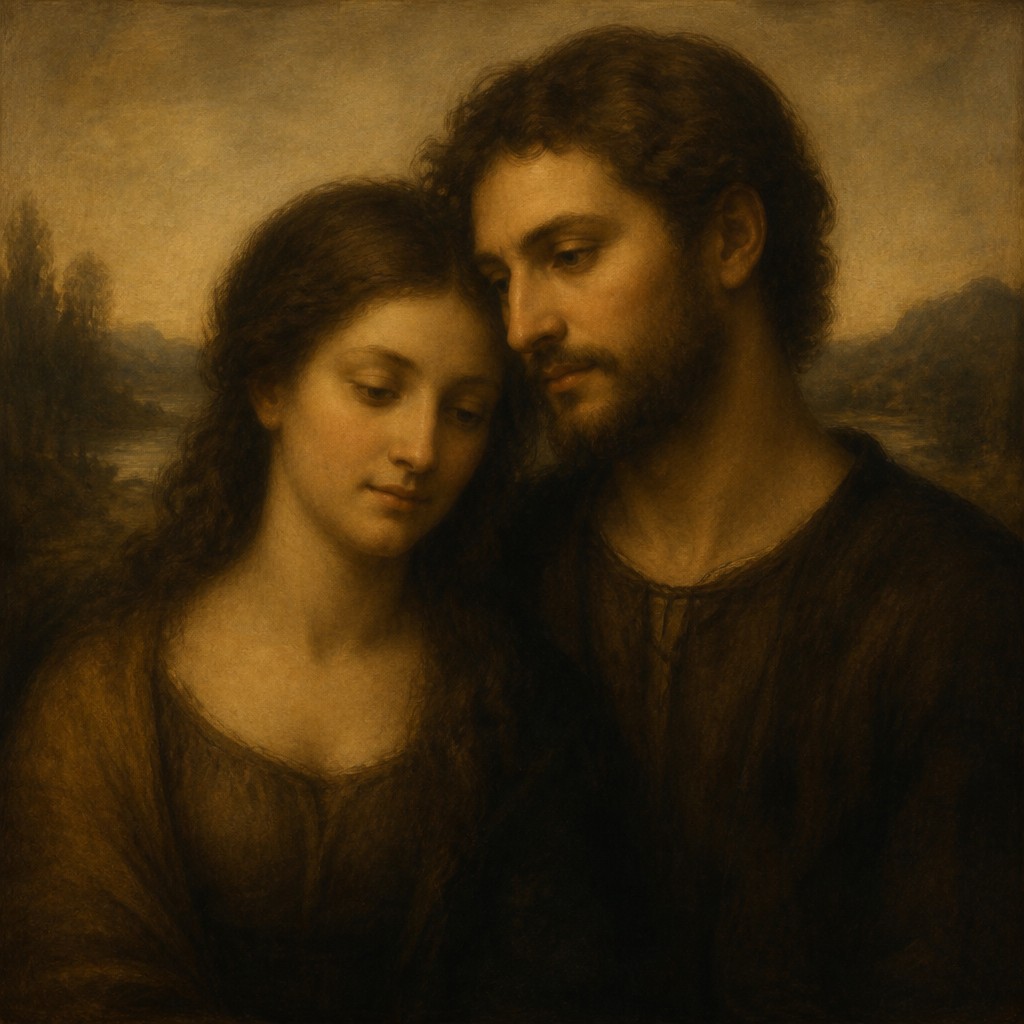
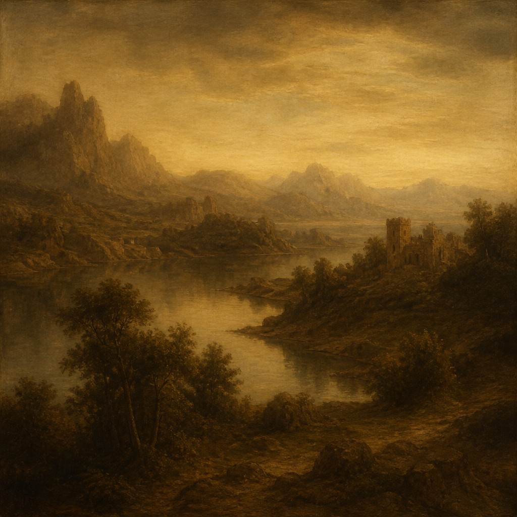
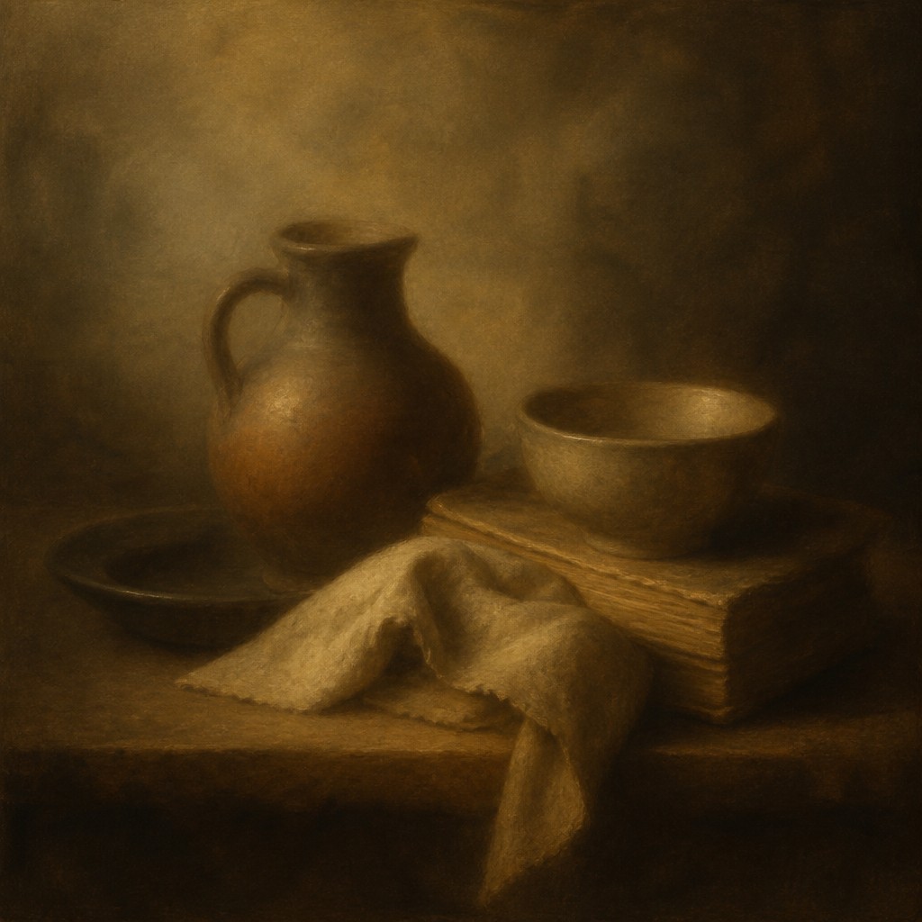
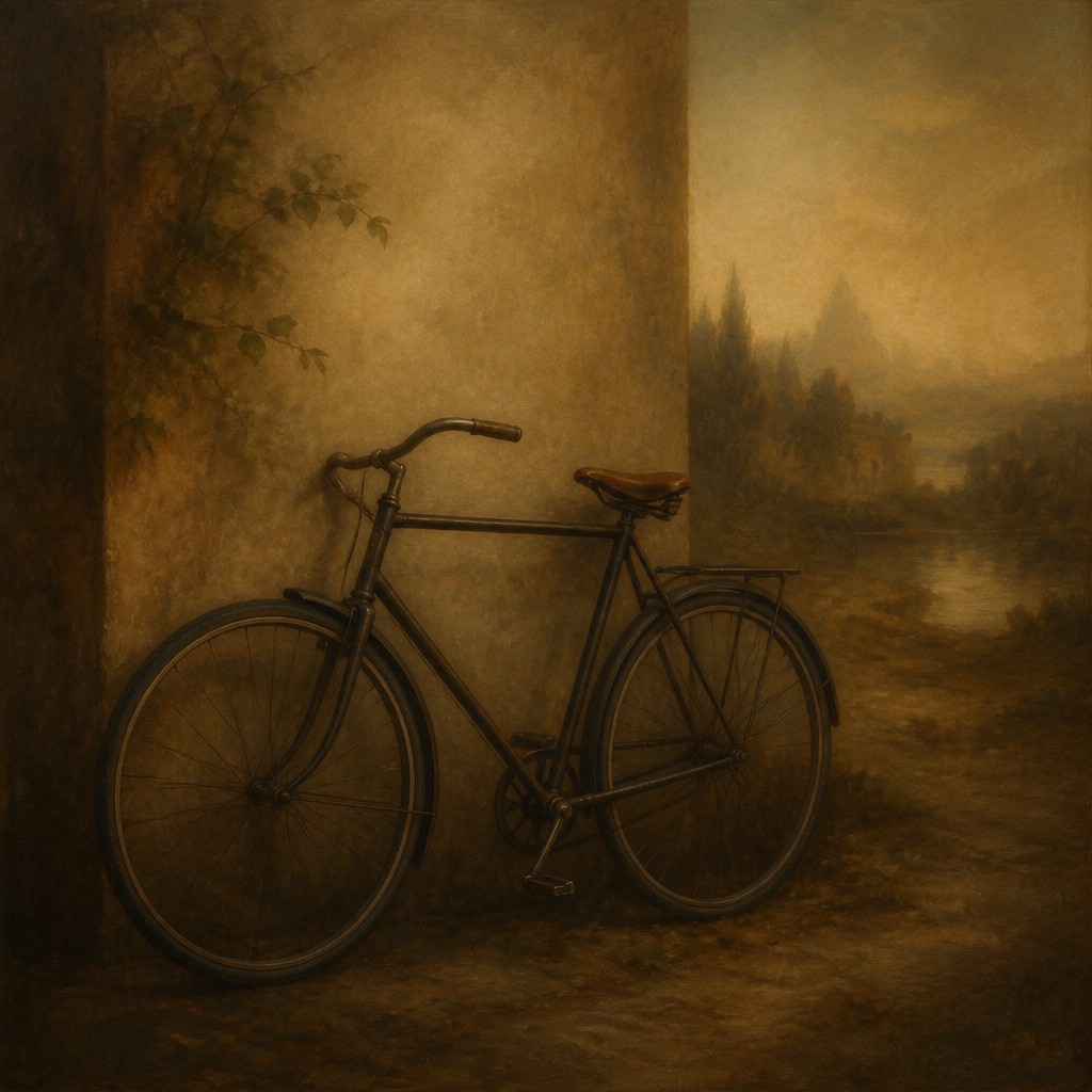
Style A is a portrait approach centered on extremely soft transitions, misty edges, and subdued earth tones. It creates a quiet, atmospheric image where forms seem to emerge gently from shadow and light, giving the portrait a reflective and timeless Renaissance mood.
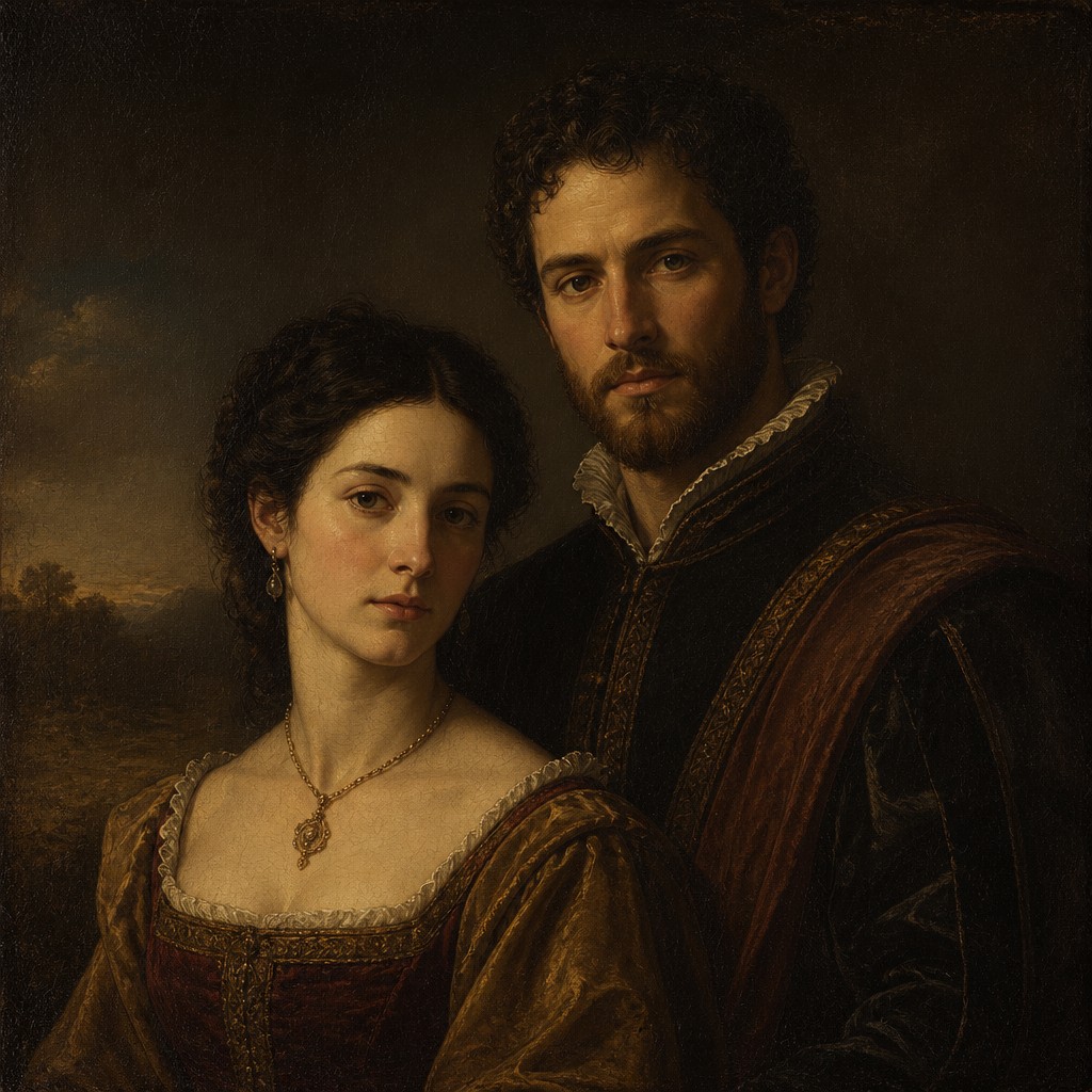
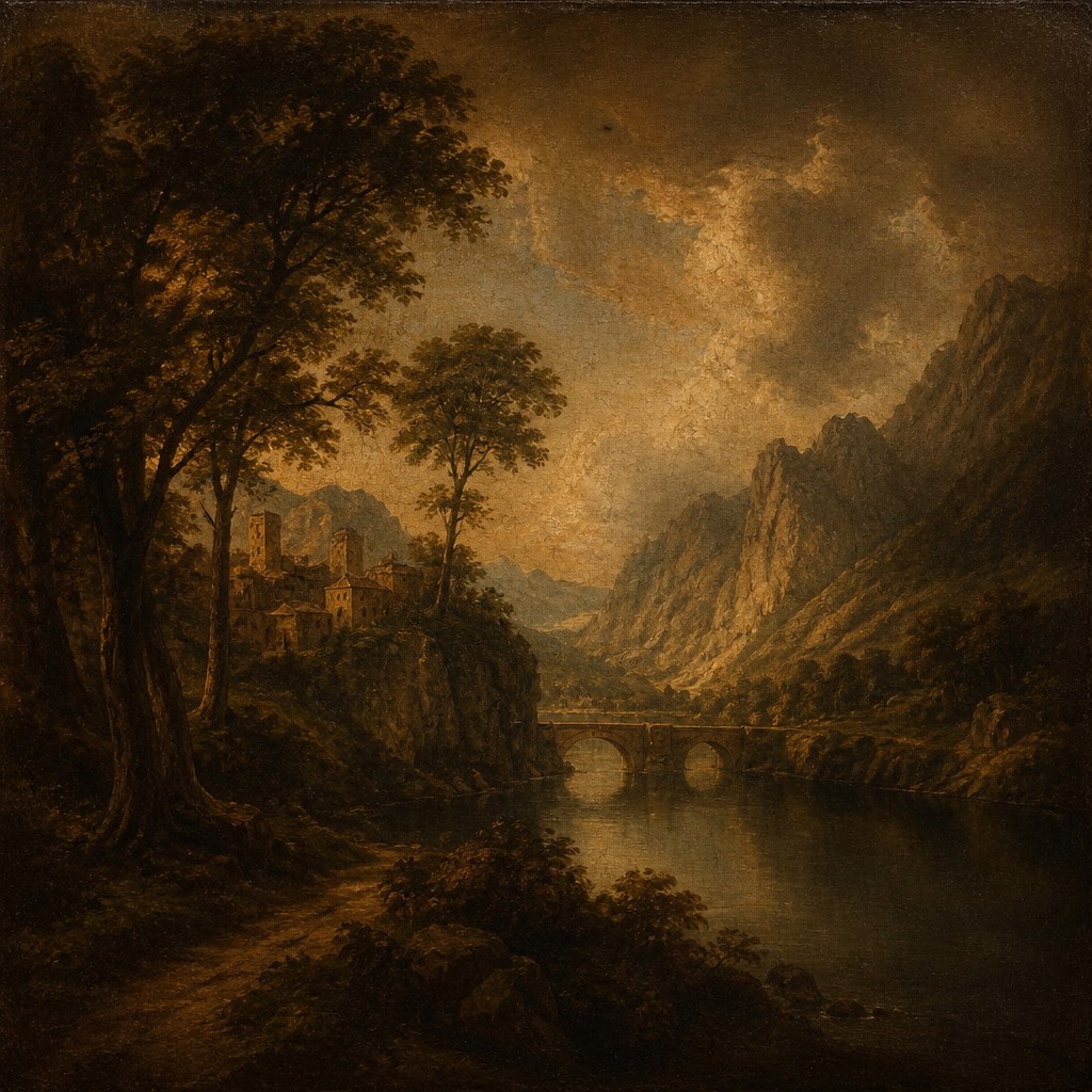
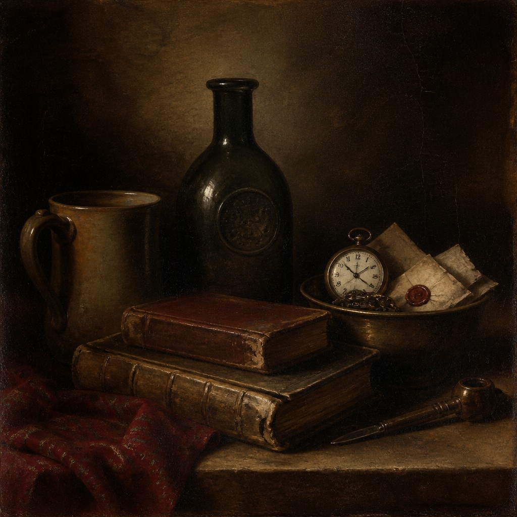
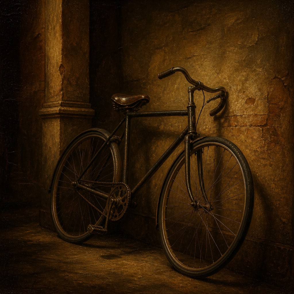
Style B is a broader classical Renaissance portrait style that still uses oil-painting traditions like sfumato and chiaroscuro, but often with stronger modeling, clearer structure, and more visible symbolic detail. People compare the two because both feel historically rooted and elegant, yet one leans toward subtle softness while the other tends to emphasize formal portrait conventions and narrative richness.
Same Prompt, Both Styles
Each pair below was generated from the identical prompt — only the style changed.
“portrait of two people together”
“wide landscape with natural scenery”
“still life with everyday objects”
“bicyle resting against a wall”
Key Differences
| Sfumato Portrait Renaissance | Renaissance Portrait | |
|---|---|---|
| Edge handling | Very soft, smoke-like transitions with blended contours. | Soft edges too, but usually with more defined facial structure. |
| Light and shadow | Gentle tonal shifts with a restrained, hazy glow. | Stronger chiaroscuro for clearer contrast and depth. |
| Color palette | Muted earth tones and subdued, atmospheric color. | Classical oils with richer variation and occasional warmer accents. |
| Pose and presentation | Quiet, intimate, and contemplative portrait presence. | Often three-quarter poses with a more formal, composed look. |
| Symbolic detail | Minimal detail to preserve mood and softness. | More likely to include symbolic objects, clothing, or status cues. |
| Overall mood | Timeless, dreamlike, and gently mysterious. | Classical, polished, and more explicitly representational. |
| Mood | mysterious, soft, intimate, dreamlike | dignified, serene, formal, reflective, timeless |
| Energy | calm | calm |
| Detail level | detailed | detailed |
| Color | muted earthy tones, subtle warmth | warm earth tones, deep shadows, muted richness |
| Texture | silky transitions, diffuse edges | smooth oil finish, soft blended transitions |
| Origin | Italian Renaissance, late 15th century | 15th-16th century Europe, especially Italy |
| Best for | fine-art portraits, museum prints, editorial covers, historical illustrations, luxury branding | formal portraits, museum-style illustrations, historical book covers, editorial features, character studies |
| Difficulty | advanced | advanced |
Which Should You Choose?
Choose Style A if you want a portrait that feels intimate, atmospheric, and softly poetic, with minimal visual interruption and a strong sense of timeless calm. Choose Style B if you want a more traditional Renaissance portrait look with clearer modeling, richer symbolism, and a formal composition that reads as historically anchored and representational.
Frequently Asked Questions
Are these two styles completely different?
No. They overlap strongly because both draw from Renaissance portrait traditions and use soft oil-painting effects. The main difference is that Style A pushes softness and atmosphere further, while Style B is broader and often more structured.
Which style is more realistic?
Style B is usually more explicitly realistic in terms of form, pose, and symbolic detail. Style A can still be naturalistic, but it prioritizes mood and gentle blending over sharp visual specificity.
Which one works better for a dramatic portrait?
Style B often suits drama better because chiaroscuro can create stronger contrast and presence. Style A can feel dramatic in a quieter way, but its effect is usually more contemplative than intense.
Can both styles use sfumato?
Yes, but differently. Style A makes sfumato the dominant visual feature, while Style B uses it as one part of a larger Renaissance portrait language that may also include stronger shadow, pose, and symbolism.