Renaissance vs Quattrocento Perspective Renaissance: What's the Difference?
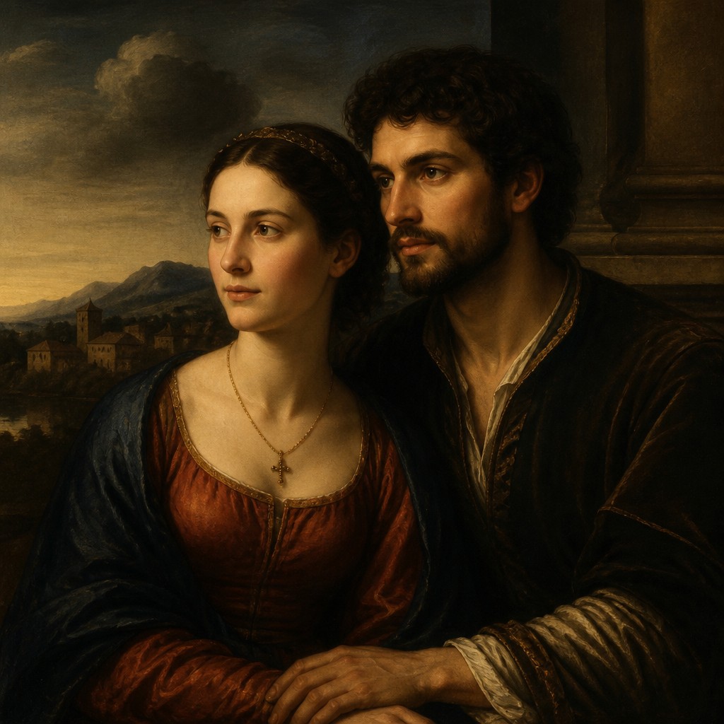
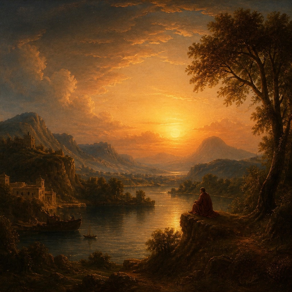
Renaissance Art Style is a broad classical revival that emphasizes idealized figures, balanced composition, linear perspective, sfumato, and chiaroscuro. It often aims for harmony between anatomy, space, and light, creating scenes that feel polished, natural, and timeless.
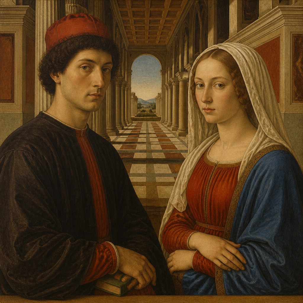
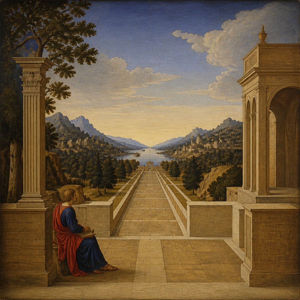
Quattrocento Perspective Renaissance Art Style is a more specific early Renaissance approach focused on precise single-point perspective, architectural order, warm earth tones, and calm spatial clarity. People compare them because both belong to the Renaissance tradition, but one is broader and more idealized while the other is more structured and spatially exact.
Same Prompt, Both Styles
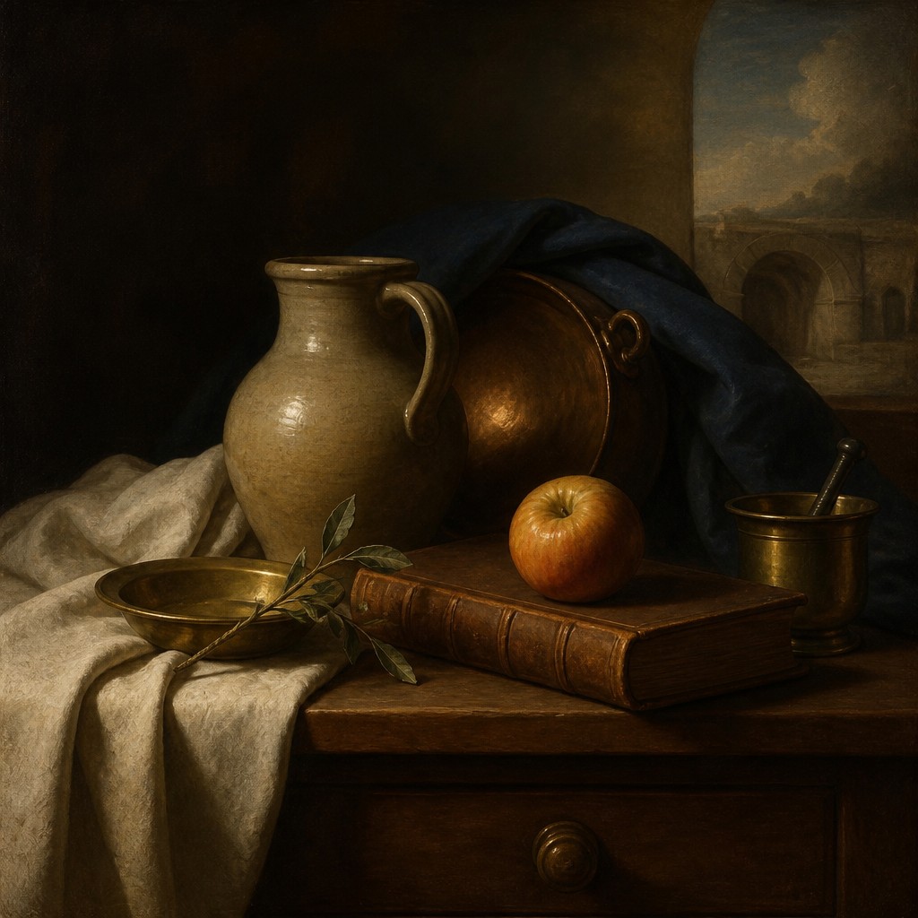
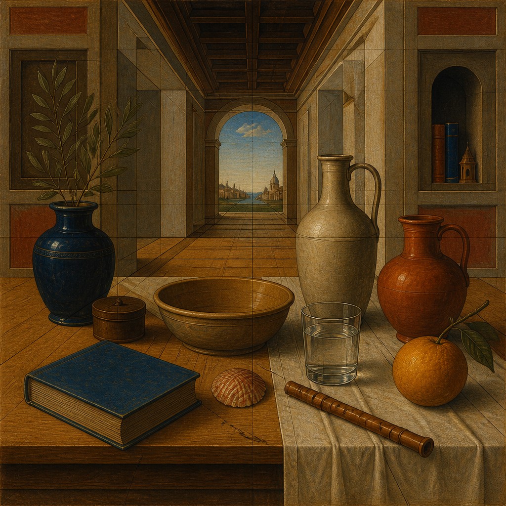
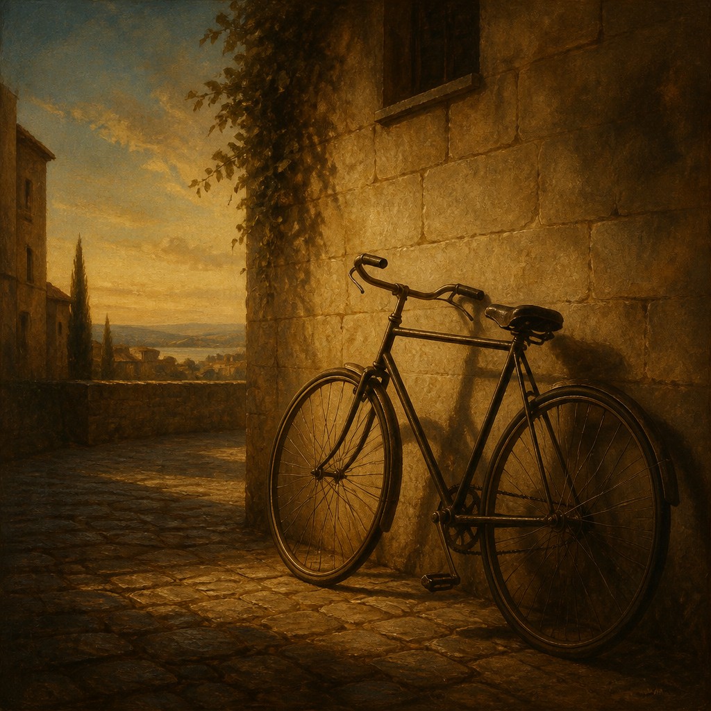
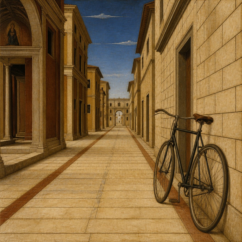
Each pair below was generated from the identical prompt — only the style changed.
“portrait of two people together”
“wide landscape with natural scenery”
“still life with everyday objects”
“bicyle resting against a wall”
Key Differences
| Renaissance | Quattrocento Perspective Renaissance | |
|---|---|---|
| Scope | Broad Renaissance manner with flexible ideals and varied subject treatment. | Early Renaissance subtype centered on perspective and spatial structure. |
| Space | Uses perspective, but may prioritize harmony over strict spatial demonstration. | Strong single-point perspective organizes the scene with clear depth. |
| Figures | Idealized bodies with graceful proportions and softened transitions. | Figures feel measured and integrated into an orderly architectural space. |
| Light & Shadow | Sfumato and chiaroscuro create soft modeling and atmospheric depth. | Lighting is clearer and more even, supporting spatial readability. |
| Color | Color ranges widely, often refined and balanced for tonal unity. | Warm earth tones dominate, giving a grounded and restrained palette. |
| Mood | Elevated, polished, and sometimes dramatic. | Calm, measured, and structurally serene. |
| Mood | harmonious, graceful, elevated, ordered, contemplative | orderly, harmonious, measured, elevated |
| Energy | balanced | calm |
| Detail level | detailed | detailed |
| Color | rich, warm, earth-toned with luminous highlights | earthy, muted, warm, balanced tones |
| Texture | smooth modeling, fine finish, subtle layering | smooth fresco-like surfaces, crisp contours |
| Origin | Italy, 14th-16th century | 15th-century Florence, Italy |
| Best for | religious scenes, portraiture, historical illustrations, museum posters, book covers, fine art studies | museum posters, historical illustrations, religious scenes, architectural scenes, book covers, editorial art |
| Difficulty | advanced | advanced |
Which Should You Choose?
Pick Style A if you want a fuller Renaissance look with idealized figures, softer atmosphere, and a more dramatic play of light and shadow. Pick Style B if you want a clearer early-Renaissance feel with orderly architecture, exact perspective, warm muted color, and a quiet sense of space. In short, A is better for refined grandeur, while B is better for precise spatial clarity.
Frequently Asked Questions
Are these two completely different art movements?
No. Both belong to the Renaissance tradition, but they emphasize different qualities. Style A is broader and more mature in its effects, while Style B is more specific to early Renaissance spatial planning.
Which style uses perspective more strongly?
Style B usually puts single-point perspective at the center of the composition. Style A uses perspective too, but it may balance it with idealized form, lighting, and overall harmony.
Which style feels more realistic?
Both aim for realism in different ways. Style A creates believable figures and light effects, while Style B creates believable space and architectural order.
Which style is better for calm interiors and architecture?
Style B is usually the better fit because it emphasizes measured space, clear geometry, and orderly composition. Style A can include interiors, but it often places more emphasis on figure idealization and tonal depth.