Post-Internet vs Post-Internet Contemporary: What's the Difference?
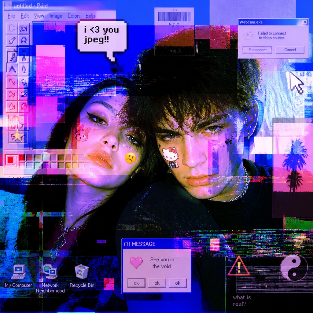
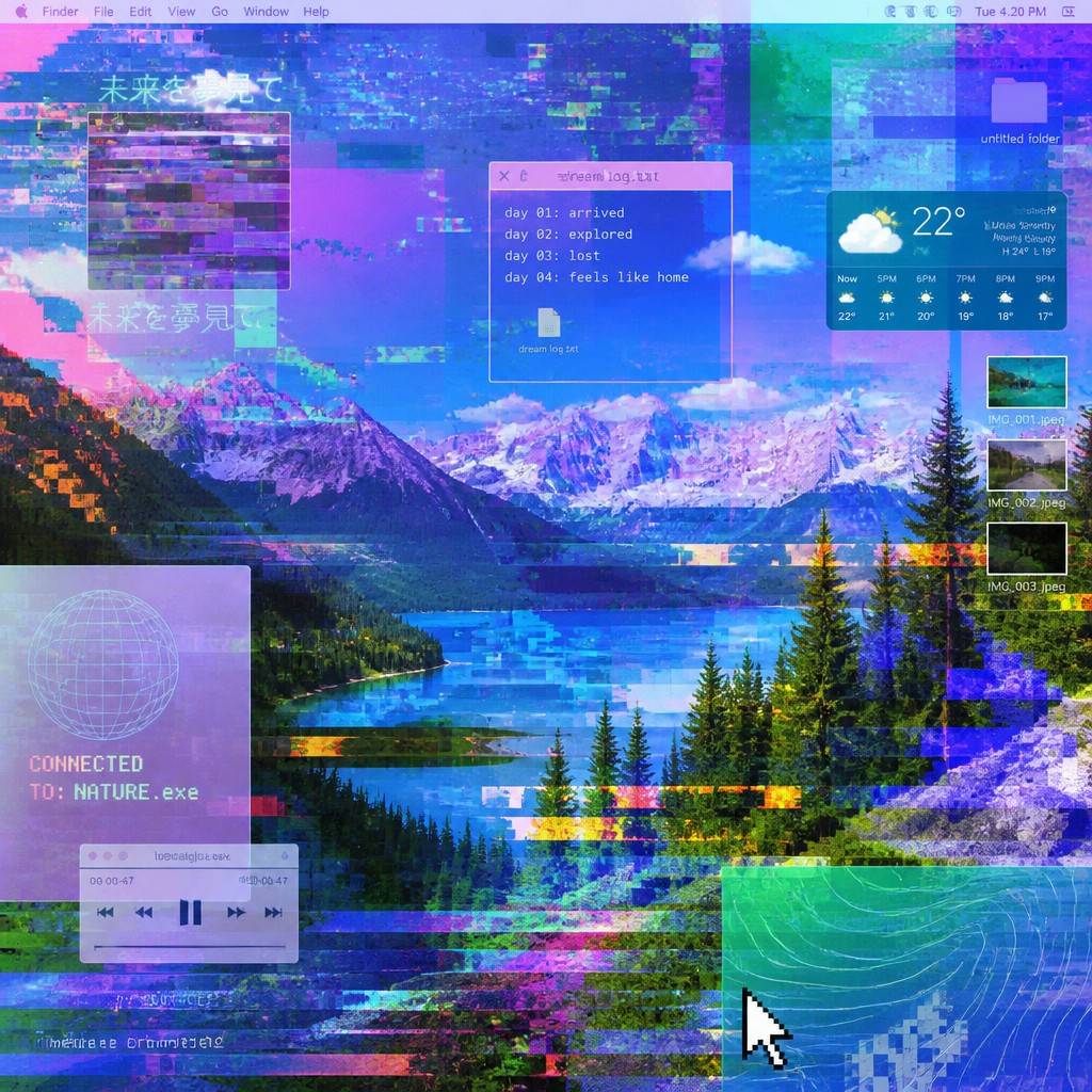
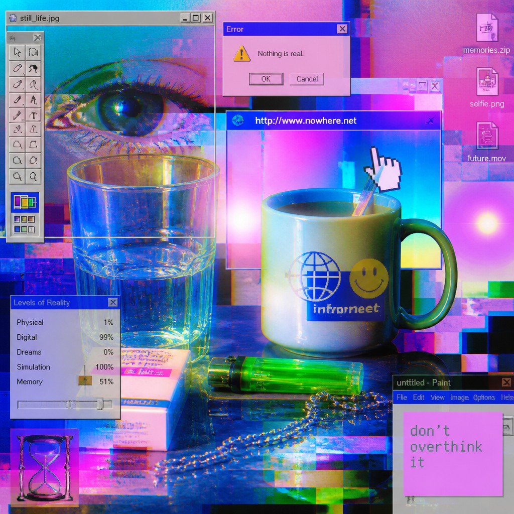
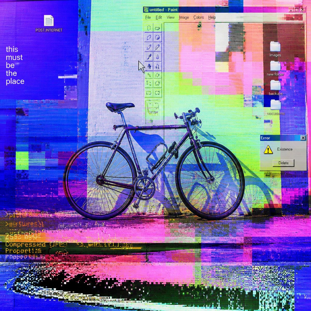
Style A is a post-internet art approach centered on glitchy digital aesthetics, compressed textures, and layered screens. It often treats the internet as a visual environment that fractures images, alters attention, and reshapes how reality is seen and understood.
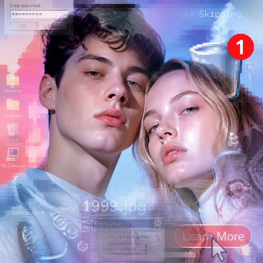
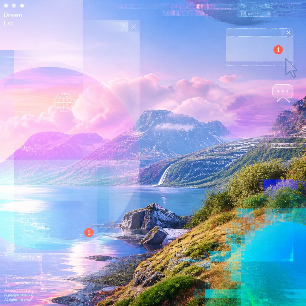
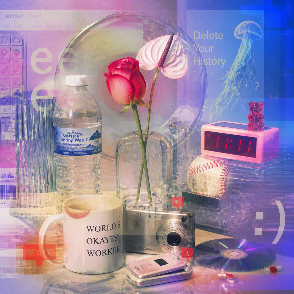
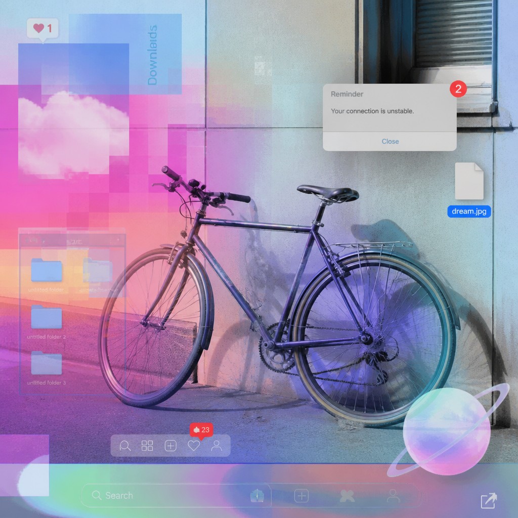
Style B is a post-internet contemporary art style shaped by internet culture more broadly, with glossy digital surfaces, glitch textures, vaporwave tones, and a mix of online and offline life. People compare them because both draw from internet-era imagery, but Style A tends to emphasize critique of perception and media systems, while Style B is broader and often more polished, atmosphere-driven, and contemporary in presentation.
Same Prompt, Both Styles
Each pair below was generated from the identical prompt — only the style changed.
“portrait of two people together”
“wide landscape with natural scenery”
“still life with everyday objects”
“bicyle resting against a wall”
Key Differences
| Post-Internet | Post-Internet Contemporary | |
|---|---|---|
| Core focus | Explores how internet culture distorts perception and reality. | Shows internet culture as a blended online-offline contemporary condition. |
| Surface quality | Compressed, rough, and visibly mediated textures. | Glossy, sleek, and more polished digital surfaces. |
| Visual language | Heavy glitching, screen fragments, and layered interfaces. | Glitch textures mixed with vaporwave hues and clean digital forms. |
| Mood | Critical, unsettled, and analytically detached. | Nostalgic, ambiguous, and stylistically eclectic. |
| Treatment of technology | Technology feels like an invasive filter on experience. | Technology feels normalized as part of everyday identity. |
| Composition | Often dense, fractured, and screen-like in structure. | Often balanced between digital polish and intentional distortion. |
| Mood | hyperconnected, cool, detached, cerebral | cool, ironic, contemplative, hyperconnected |
| Energy | balanced | balanced |
| Detail level | detailed | detailed |
| Color | synthetic neutrals with neon accents | neon brights, muted neutrals, screen-like contrast |
| Texture | glossy, compressed, pixel-noisy surfaces | glossy, mixed-media, digital-noise surfaces |
| Origin | digital-native aesthetic | digital-native aesthetic |
| Best for | album covers, editorial spreads, fashion campaigns, gallery prints, web visuals | editorial spreads, album covers, gallery posters, brand concepts, digital campaigns, fashion lookbooks |
| Difficulty | advanced | advanced |
Which Should You Choose?
Pick Style A if you want a more critical, visibly fractured look that emphasizes media overload, perception, and the instability of digital images. Pick Style B if you want a broader post-internet feel that feels more polished, atmospheric, and suitable for work exploring contemporary identity, online aesthetics, and the overlap between digital and physical life.
Frequently Asked Questions
Are these two styles actually different, or just two names for the same thing?
They overlap heavily, but they are not always used the same way. Style A is narrower and more focused on distortion, mediation, and how the internet changes perception. Style B is broader and often includes a wider range of post-internet visual trends.
Which style is more minimalist?
Neither is inherently minimalist, but Style B can appear cleaner because of its glossy surfaces and more controlled composition. Style A usually feels busier and more fragmented due to layered screens and compression effects.
Which style is better for a critical or conceptual project?
Style A is usually stronger for conceptual work because it more directly visualizes media instability and fractured perception. It tends to read as analytical and self-aware rather than purely decorative.
Can both styles use neon colors and glitch effects?
Yes, both can. The difference is in emphasis: Style A uses these elements to show disruption and media strain, while Style B often uses them as part of a polished, internet-shaped visual identity.