Pop vs Street: What's the Difference?
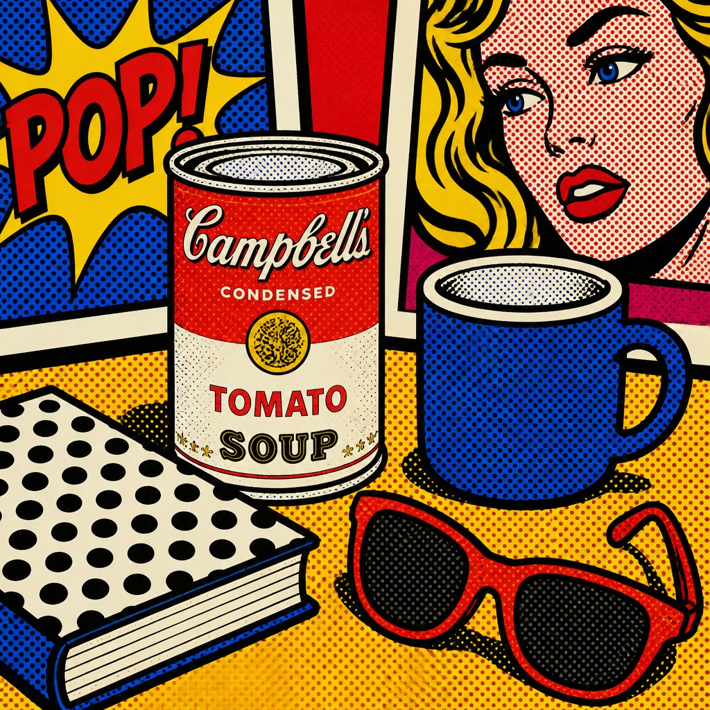
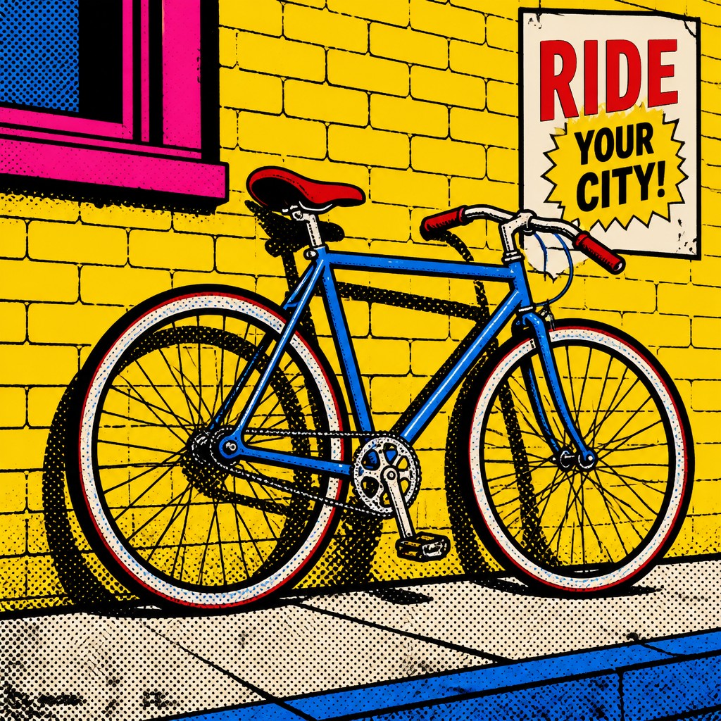
Pop Art Style turns everyday commercial images into bright, graphic artwork. It uses flat color, thick outlines, halftone dots, and a polished mass-media look that feels playful, ironic, and highly visual.
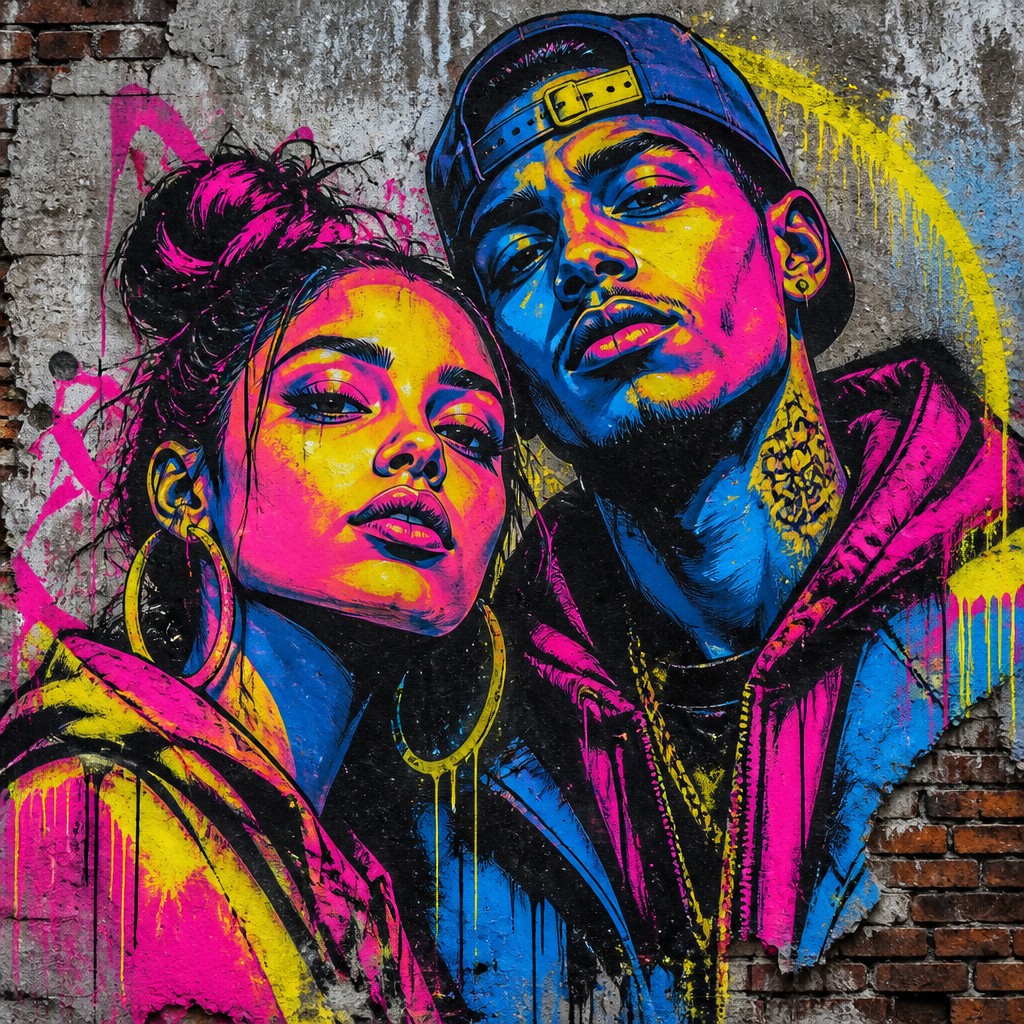
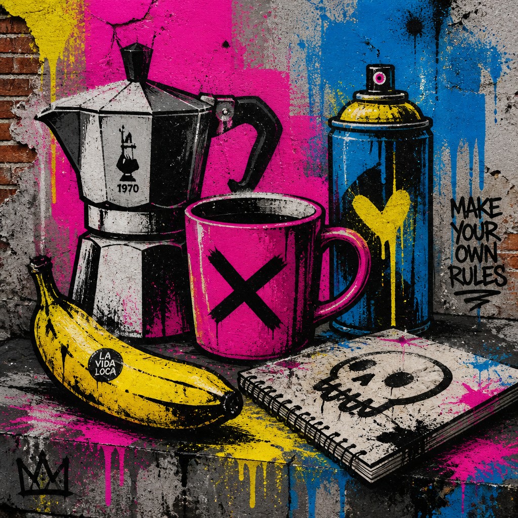
Street Art Style brings art into public urban spaces. It often uses spray paint, stencils, drips, and bold lettering to communicate direct social messages. People compare the two because both borrow from modern culture, use strong graphic impact, and make artwork feel immediate and accessible.
Same Prompt, Both Styles
Each pair below was generated from the identical prompt — only the style changed.



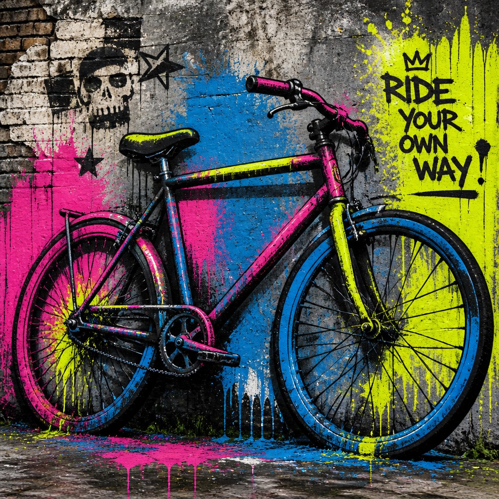
Key Differences
| Pop | Street | |
|---|---|---|
| Purpose | Recasts consumer imagery as art, often with a playful or ironic tone. | Communicates public messages, identity, or protest in visible urban spaces. |
| Setting | Usually shown in galleries, prints, posters, or design work. | Usually appears on walls, trains, shutters, and other outdoor surfaces. |
| Line & form | Uses clean, thick outlines and simplified shapes. | Uses energetic marks, rough edges, drips, and layered forms. |
| Color & texture | Relies on flat, bright color and halftone textures. | Often mixes spray gradients, stenciled shapes, and textured paint buildup. |
| Imagery | Draws from advertising, products, comics, and mass media. | Draws from city life, symbols, lettering, characters, and social themes. |
| Audience impact | Captures attention through familiar commercial visuals made striking. | Grabs passersby quickly with large-scale, high-contrast public messaging. |
| Mood | bold, playful, commercial, ironic, vibrant | bold, urgent, rebellious, socially engaged |
| Energy | lively | intense |
| Detail level | moderate | moderate |
| Color | bright saturated primaries and contrasts | high-contrast, saturated, graphic palette |
| Texture | flat, printed, dot-patterned surface | spray-paint, postered, weathered surfaces |
| Origin | 1960s Britain and United States | 1970s urban public spaces, global |
| Best for | posters, album covers, editorial graphics, advertisements, book covers, merchandise design | murals, posters, album covers, campaign graphics, apparel graphics, editorial illustrations |
| Difficulty | moderate | moderate |
Which Should You Choose?
Choose Pop Art Style if you want a clean, graphic look that feels witty, commercial, and instantly recognizable. Choose Street Art Style if you want something rawer, more urban, and more direct, especially when the goal is public visibility or social commentary.
Frequently Asked Questions
Are Pop Art and Street Art the same thing?
No. Pop Art is mainly a visual style rooted in mass media and commercial imagery, while Street Art is defined by public placement and urban execution. They can share bold graphics, but their contexts and goals are different.
Which style is more text-friendly?
Street Art often uses lettering, slogans, and message-driven words more directly. Pop Art can use text too, but it usually treats text as part of a graphic composition rather than the main message.
Which style is better for branding or posters?
Pop Art is often better for branding, posters, and editorial design because it reads clearly and feels polished. Street Art works well when you want an edgy, urgent look with a strong social or cultural edge.
Can a design combine both styles?
Yes. A design can mix Pop Art color blocking and halftone effects with Street Art spray textures or stencil elements. To keep it coherent, decide whether the final mood should feel more commercial and clean, or more urban and rebellious.