Photorealism vs Hyperrealism: What's the Difference?
Photorealism is an art style that aims to recreate a subject with photographic precision. It emphasizes crisp detail, accurate textures, believable reflections, and careful attention to how materials look under specific lighting.
Hyperrealism also uses extreme detail and lifelike accuracy, but it often pushes past the look of a photograph by heightening clarity, contrast, and perceptual intensity. People compare the two because both appear highly realistic, yet they differ in intent: Photorealism closely mirrors photography, while Hyperrealism often amplifies reality for stronger visual impact.
Same Prompt, Both Styles
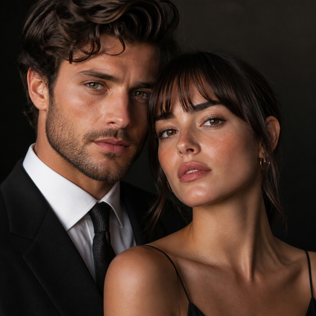
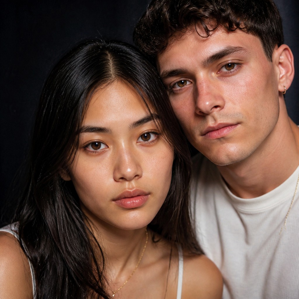
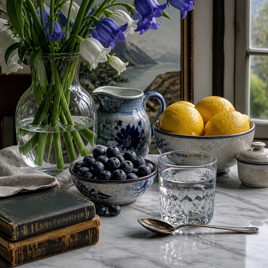
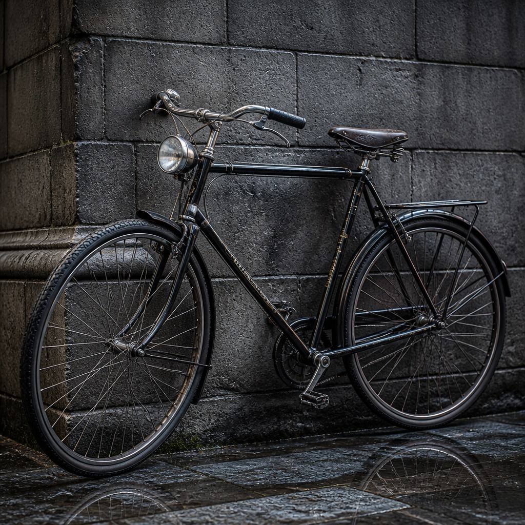
Each pair below was generated from the identical prompt — only the style changed.
“portrait of two people together”
“wide landscape with natural scenery”


“still life with everyday objects”

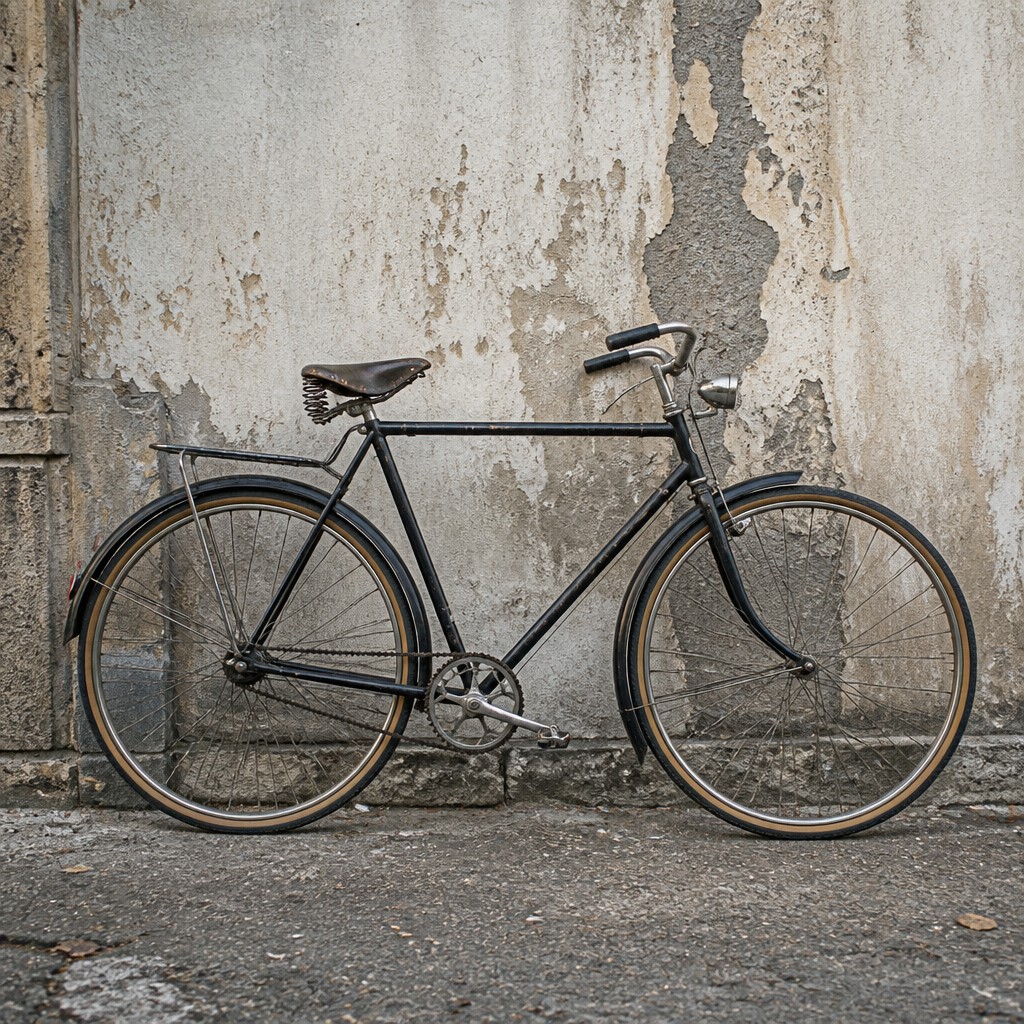
“bicyle resting against a wall”
Key Differences
| Photorealism | Hyperrealism | |
|---|---|---|
| Goal | Matches the appearance of a photograph as closely as possible. | Intensifies realism to exceed the look of a typical photograph. |
| Detail emphasis | Focuses on precise, camera-like detail and surface accuracy. | Pushes detail further, often sharpening features beyond camera capture. |
| Visual effect | Feels convincing and observational, like a well-rendered photo. | Feels heightened, vivid, and sometimes more dramatic than life. |
| Texture and materials | Carefully reproduces natural textures and reflective surfaces. | Accentuates textures and materials for stronger tactile presence. |
| Lighting and clarity | Uses realistic lighting consistent with photographic reference. | Uses crisp clarity and contrast to increase perceived realism. |
| Viewer impression | Invites close comparison with a real photograph. | Often creates surprise because it looks even sharper than a photo. |
| Mood | precise, observant, clinical, contemporary | precise, immersive, clinical, awe-inspiring |
| Energy | balanced | intense |
| Detail level | intricate | intricate |
| Color | naturalistic, crisp, high-contrast, reflective | naturalistic, high-fidelity, true-to-life tones |
| Texture | smooth, razor-sharp, highly tactile | razor-sharp, surface-rich realism |
| Origin | 1960s-70s United States | late 20th-century realism, global contemporary art |
| Best for | editorial illustrations, posters, product visuals, urban scenes, portraits, advertising mockups | portrait studies, product visuals, editorial illustrations, poster art, advertising imagery, fine-art prints |
| Difficulty | advanced | advanced |
Which Should You Choose?
Choose Photorealism if you want the artwork to resemble an actual photograph with faithful surface detail, natural lighting, and minimal exaggeration. Choose Hyperrealism if you want to heighten realism for stronger impact, sharper clarity, and a more vivid-than-photo presence. In short, pick A for photographic fidelity and B for amplified realism.
Frequently Asked Questions
Is Photorealism the same as Hyperrealism?
No. They are closely related, but Photorealism aims to replicate a photograph, while Hyperrealism goes beyond that to intensify realism. Both can look extremely real, which is why they are often confused.
Which style is more realistic?
It depends on what you mean by realistic. Photorealism is more realistic in the sense of matching a photograph, while Hyperrealism can feel more realistic to the eye because it sharpens and heightens details.
Why does Hyperrealism sometimes look more detailed than a photo?
Hyperrealism often adds clarity, contrast, and textural precision that a camera may not fully capture. This can make the image appear more vivid and exact than the source photograph.
Which style is better for portrait art?
Either can work well for portraits. Photorealism suits artists who want a faithful, camera-like likeness, while Hyperrealism suits those who want a more striking, intense, and polished result.