Op vs Geometric Abstract: What's the Difference?
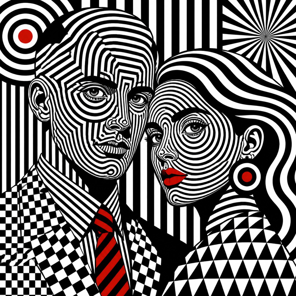
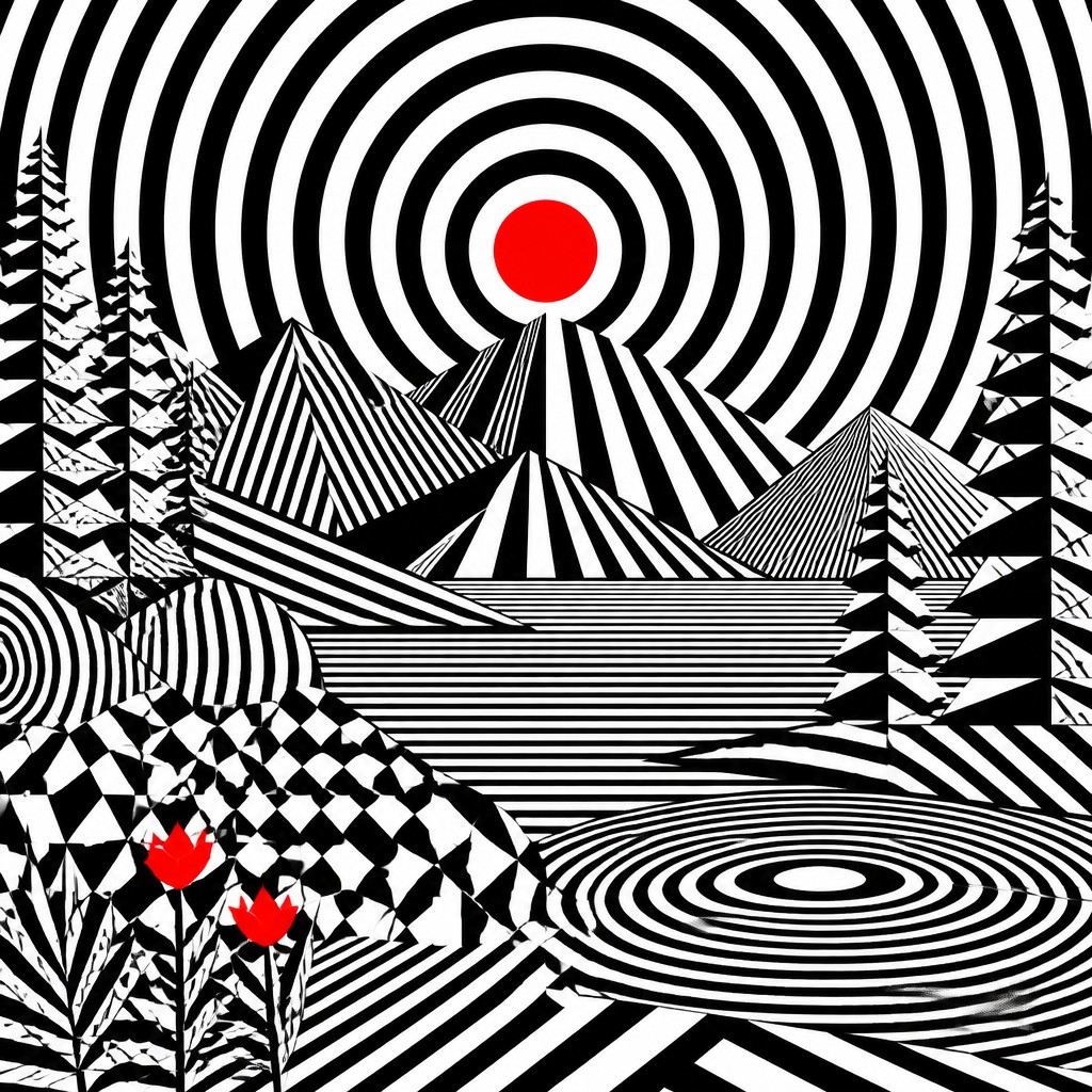
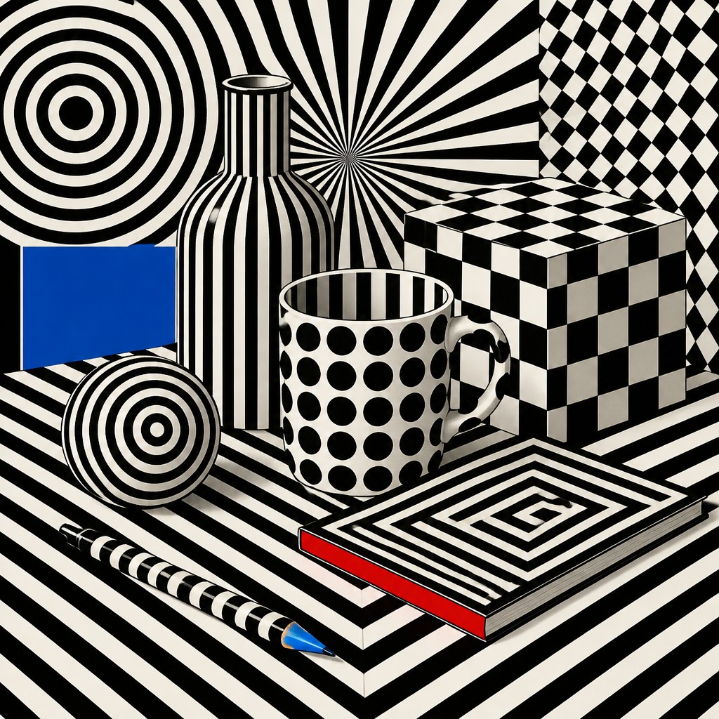
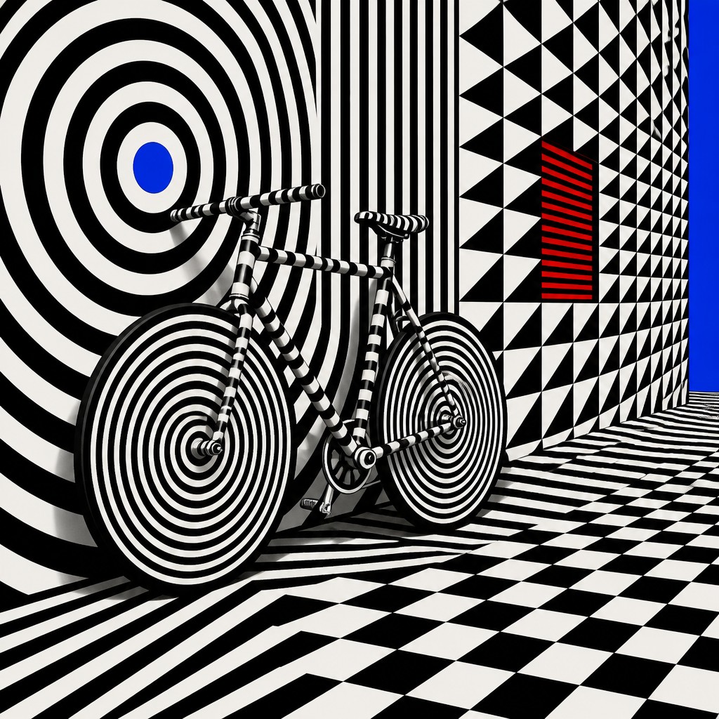
Op art is a style built from precise geometry, strong contrast, and repeated patterns that create the feeling of vibration, movement, and visual distortion on a flat surface. It often uses carefully arranged lines and shapes to make the eye see shifting effects that are not physically present.
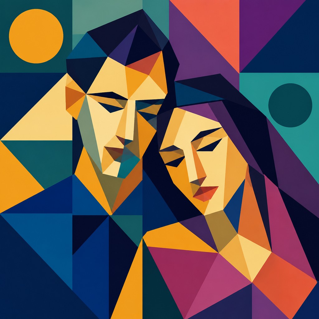
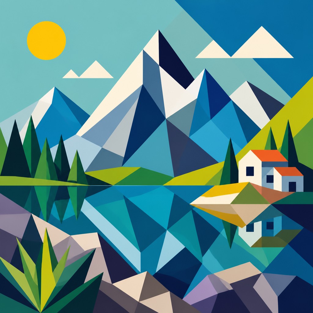
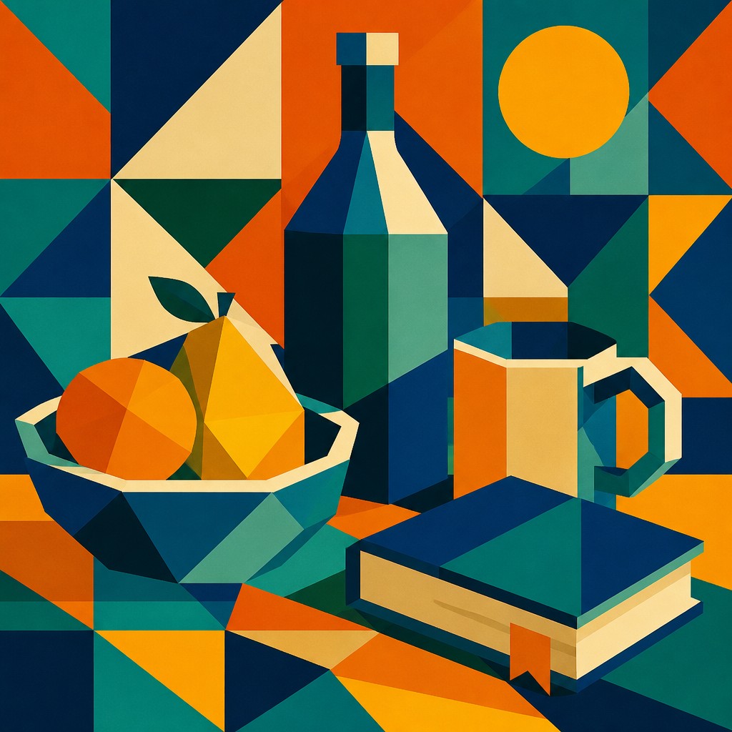
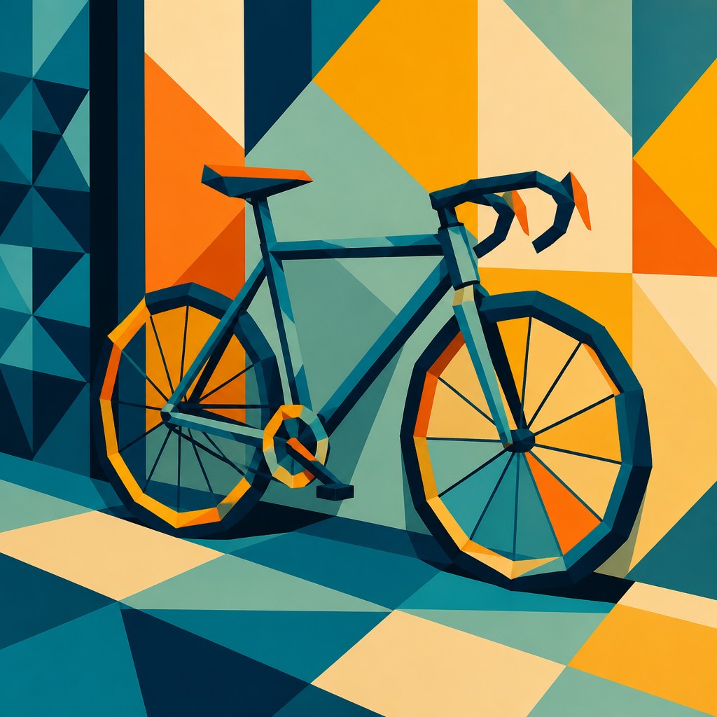
Geometric abstract art also relies on basic shapes and orderly structure, but its goal is usually to simplify subjects into polygons, circles, grids, and tessellations with flat color and crisp edges. People compare the two because both use geometry and abstraction, yet op art focuses on optical illusion while geometric abstraction focuses on balance, structure, and visual clarity.
Same Prompt, Both Styles
Each pair below was generated from the identical prompt — only the style changed.
“portrait of two people together”
“wide landscape with natural scenery”
“still life with everyday objects”
“bicyle resting against a wall”
Key Differences
| Op | Geometric Abstract | |
|---|---|---|
| Main effect | Creates optical vibration and apparent motion. | Creates ordered, stable composition. |
| Purpose | Tricks the eye with illusion and visual tension. | Simplifies forms into mathematical visual language. |
| Line & form | Uses repeated lines and high-contrast curves or grids. | Uses polygons, circles, and other clear geometric shapes. |
| Color use | Often relies on stark black-and-white or sharp contrast. | Often uses flat, controlled color areas and clear separation. |
| Surface feel | Feels active, restless, and visually unstable. | Feels calm, precise, and structurally balanced. |
| Viewer experience | The eye keeps moving because patterns seem to pulse. | The viewer reads shape relationships and overall harmony. |
| Mood | hypnotic, electric, kinetic, disorienting | ordered, calm, precise, harmonious |
| Energy | intense | calm |
| Detail level | intricate | moderate |
| Color | high-contrast black-white, vivid accent colors | clean primaries, neutrals, muted contrasts |
| Texture | crisp, smooth, visually vibrating | smooth, flat, crisp-edged |
| Origin | 1960s optical art movement, Western avant-garde | early 20th-century Europe |
| Best for | posters, album covers, textile patterns, book covers, editorial graphics | posters, logos, album covers, book covers, infographics, wall art |
| Difficulty | advanced | advanced |
Which Should You Choose?
Choose op art when you want energy, visual excitement, and a strong illusion of movement or depth on a flat surface. Choose geometric abstract art when you want clarity, order, and a composition built from simplified shapes and balanced structure. If the goal is to surprise the eye, pick A; if the goal is to organize forms into a clean abstract design, pick B.
Frequently Asked Questions
Are op art and geometric abstract art the same thing?
No. They overlap because both use geometry and abstraction, but they are not identical. Op art is defined by optical effects, while geometric abstract art is defined by simplification into shapes and structured composition.
Which style uses more movement?
Op art usually appears more dynamic because it is designed to create vibration, flicker, or motion-like effects. Geometric abstract art can feel rhythmic, but it is usually more stable and less illusion-driven.
Which style is better for a calm room?
Geometric abstract art is often better for a calm setting because its forms are clearer and its balance feels more settled. Op art may feel more stimulating because of its strong contrasts and visual motion.
Can a work belong to both styles?
Yes, some works combine geometric shapes with optical effects. In that case, the piece may be viewed as sitting between the two styles, depending on whether illusion or structure is the dominant feature.