Noir Comic vs Graphic Novel: What's the Difference?
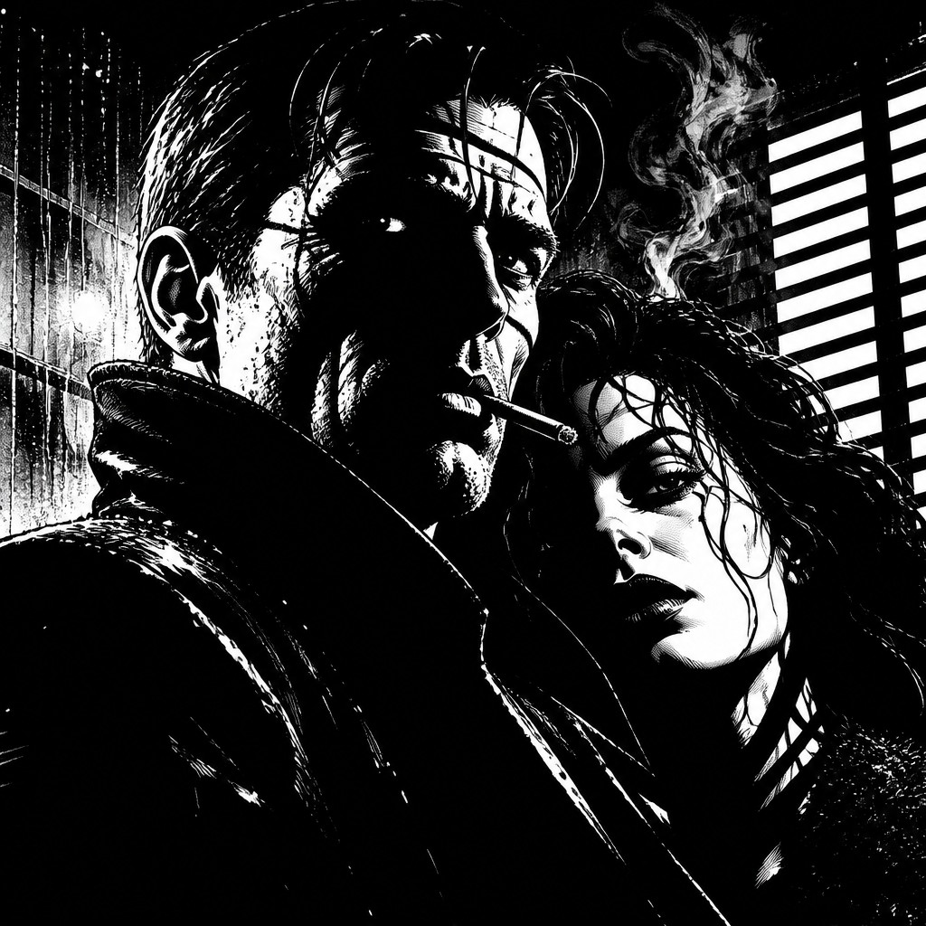
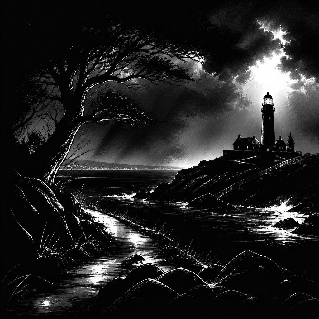
Noir Comic Art is a high-contrast black-and-white style built around heavy shadows, stark silhouettes, rain-soaked streets, and dramatic criminal or detective moods. It favors bold shapes, simplified forms, and visual suspense, turning scenes into sharp, graphic statements that feel tense and atmospheric.
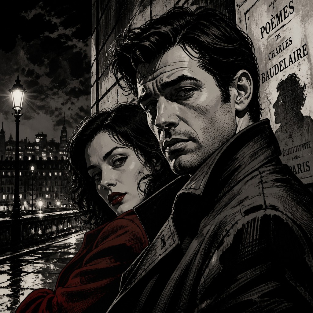
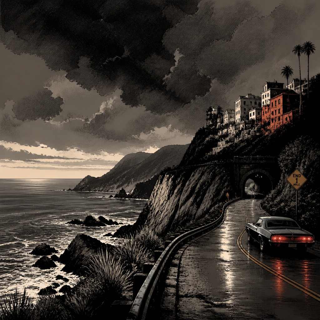
Graphic Novel Art is broader and more flexible, but in this comparison it usually means sophisticated comic artwork with noir lighting, realistic figures, cinematic framing, and detailed texture such as crosshatching. People compare the two because both can share moody lighting and mature themes, yet one leans more toward iconic visual drama while the other aims for deeper realism, nuance, and storytelling range.
Same Prompt, Both Styles
Each pair below was generated from the identical prompt — only the style changed.
“portrait of two people together”
“wide landscape with natural scenery”
“still life with everyday objects”
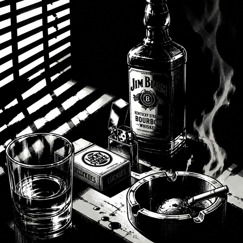
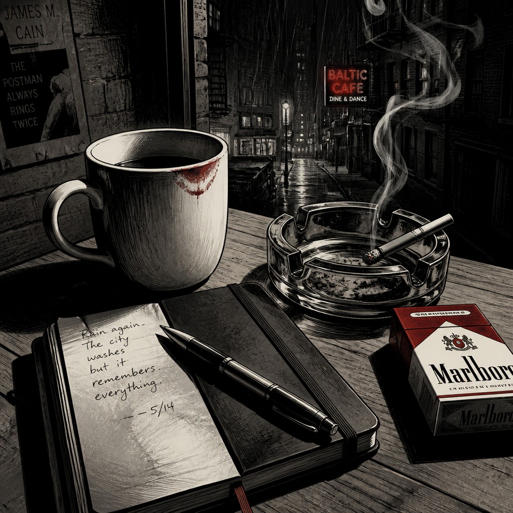
“bicyle resting against a wall”
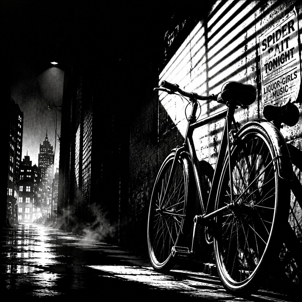
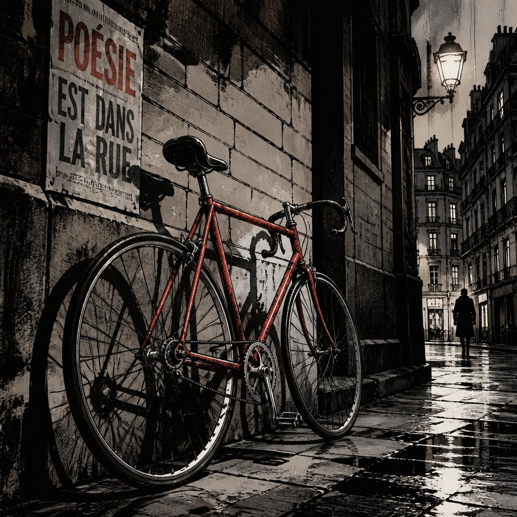
Key Differences
| Noir Comic | Graphic Novel | |
|---|---|---|
| Value range | Extreme blacks and bright whites dominate. | Broader tonal range with smoother midtones and shading. |
| Figure style | Figures are simplified, iconic, and silhouette-friendly. | Figures are more realistic, detailed, and anatomically grounded. |
| Line & texture | Bold outlines and graphic shadow masses. | Crosshatching, layered linework, and finer surface detail. |
| Mood | Hard-boiled, urgent, and relentlessly dramatic. | Serious, cinematic, and emotionally layered. |
| Setting treatment | Rain, alleys, smoke, and urban night scenes are emphasized. | Environments are more varied and can feel fully lived-in. |
| Story emphasis | Prioritizes instant atmosphere and graphic impact. | Supports complex characterization and longer-form narrative. |
| Mood | moody, tense, brooding, gritty | moody, cinematic, serious, introspective |
| Energy | intense | balanced |
| Detail level | detailed | detailed |
| Color | high-contrast black, white, and gray | restrained, muted, often dark tones |
| Texture | ink-heavy, gritty, rain-slick surfaces | clean ink lines with layered shading |
| Origin | 1930s–1950s urban crime comics | late 20th century Western comics |
| Best for | crime posters, detective covers, graphic novels, mystery scenes, album covers, editorial illustrations | long-form comics, novel covers, editorial illustrations, crime drama scenes, character-focused posters |
| Difficulty | advanced | advanced |
Which Should You Choose?
Choose Noir Comic Art if you want strong contrast, immediate mood, and a stylized, punchy look that makes shadows and suspense the main visual force. Choose Graphic Novel Art if you want a more versatile, realistic comic image that can still feel dark and cinematic while giving you more room for facial expression, texture, and narrative depth.
Frequently Asked Questions
Are these two styles basically the same?
Not exactly. They overlap in mood, especially when both use darkness, drama, and urban settings, but Noir Comic Art is typically more graphic and contrast-driven. Graphic Novel Art is usually broader, with more realism and storytelling flexibility.
Which style is better for a detective story?
Noir Comic Art is ideal if you want the story to feel sharp, shadowy, and classic noir. Graphic Novel Art works better if the detective story needs more emotional realism, nuanced characters, or elaborate scenes.
Does Graphic Novel Art always have to be in color?
No. Graphic novel art can be black-and-white or color. What defines it more is the sophisticated, narrative-focused approach to figures, lighting, and composition rather than color alone.
Which style is easier to recognize at a glance?
Noir Comic Art is usually easier to identify quickly because of its extreme contrast and heavy shadows. Graphic Novel Art can be more varied, so its identity often comes through in rendering quality and cinematic presentation.