Neo-Pop vs Pop: What's the Difference?
Neo-Pop Art Style updates the language of mass culture for a digital, internet-shaped world. It blends memes, brands, neon palettes, glitch effects, glossy surfaces, and ironic commentary to create images that feel current, loud, and media-savvy.
Pop Art Style is the earlier, classic approach built from bold commercial imagery, flat color, halftone dots, thick outlines, and the visual logic of advertising and print. People compare the two because both borrow from popular culture, repetition, and consumer imagery, but neo-pop tends to feel more digital and referential while pop art feels more print-based and historically tied to mid-20th-century mass media.
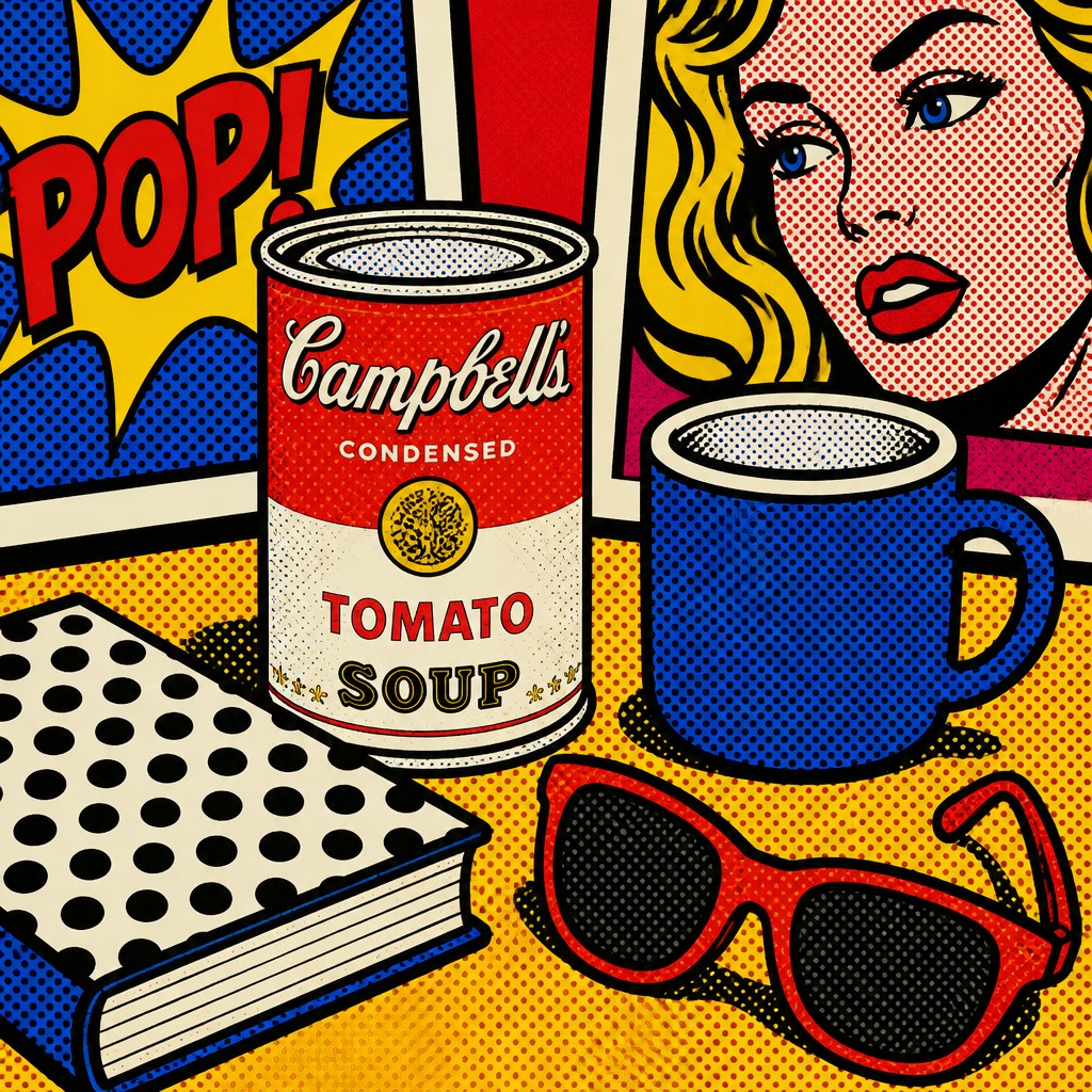
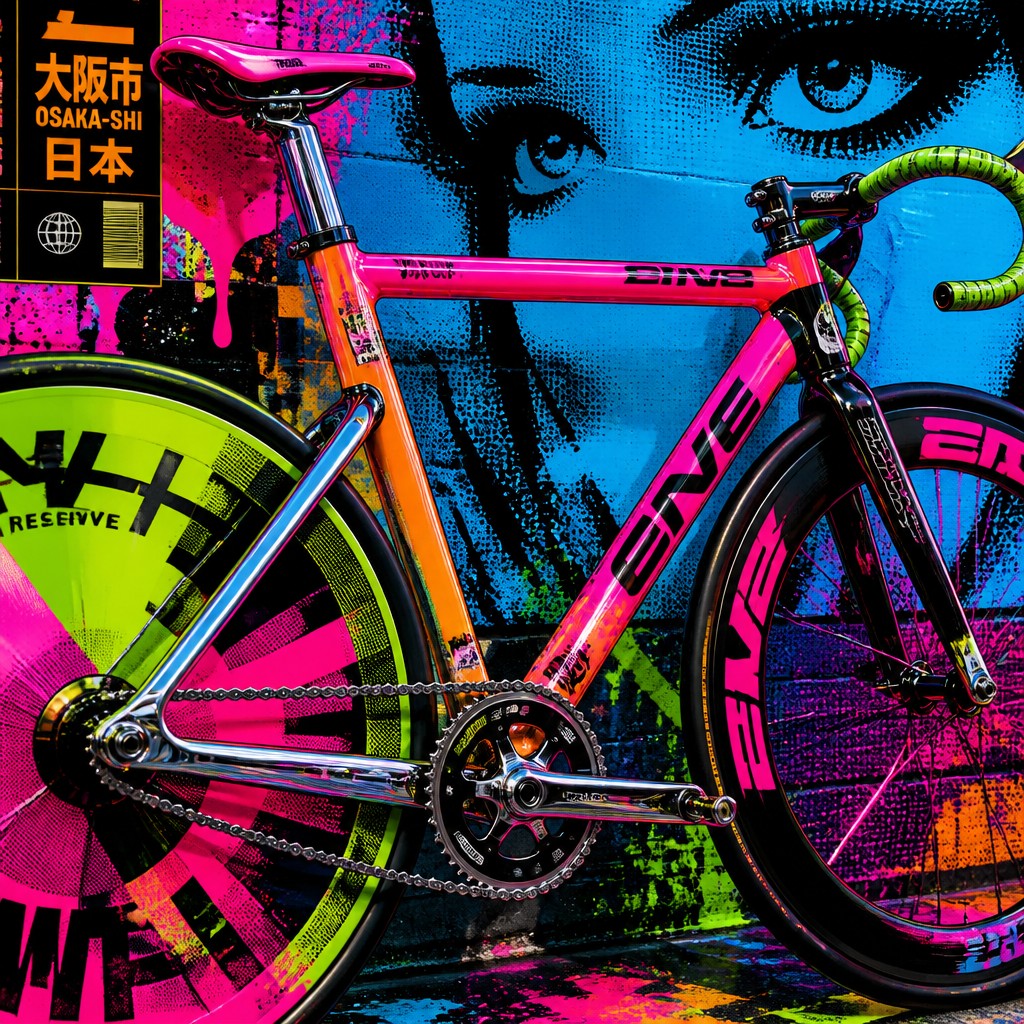
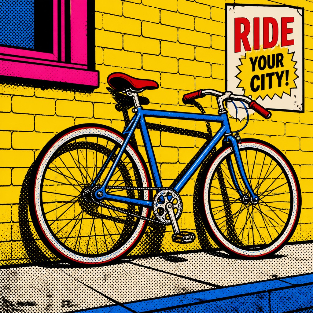
Same Prompt, Both Styles
Each pair below was generated from the identical prompt — only the style changed.
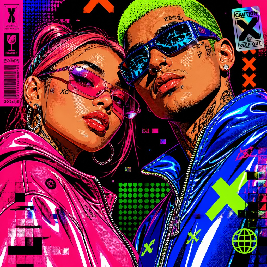

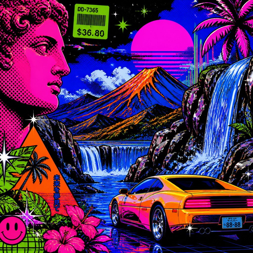
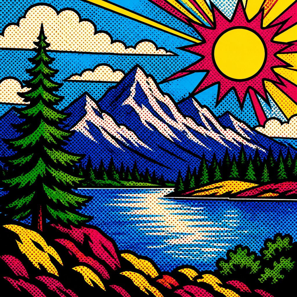
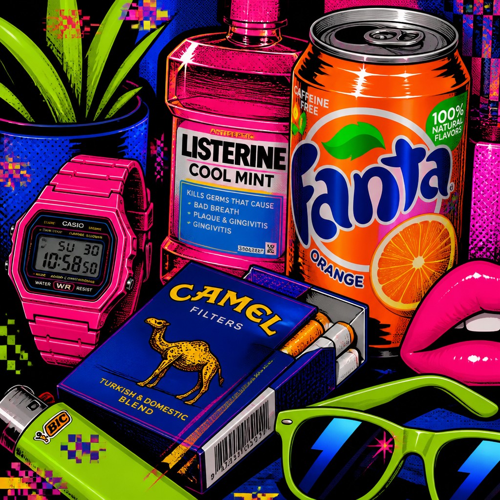
Key Differences
| Neo-Pop | Pop | |
|---|---|---|
| Cultural references | Uses memes, internet symbols, brands, and digital culture. | Uses advertisements, comics, logos, and everyday consumer goods. |
| Surface and texture | Often glossy, polished, and screen-like with glitchy artifacts. | Often matte or print-like with flat, graphic surfaces. |
| Color palette | Leans into neon, high-saturation, and electric contrast. | Uses bold, primary, or high-contrast commercial colors. |
| Line & form | May mix crisp shapes with digital distortion and layered effects. | Relies on thick outlines, simplified forms, and clear silhouettes. |
| Visual logic | Feels remix-driven, ironic, and internet-native. | Feels direct, graphic, and mass-media oriented. |
| Typical mood | Sharper, more futuristic, and sometimes satirical. | Brash, playful, and immediately legible. |
| Mood | playful, ironic, bold, satirical | bold, playful, commercial, ironic, vibrant |
| Energy | lively | lively |
| Detail level | detailed | moderate |
| Color | saturated brights with neon accents | bright saturated primaries and contrasts |
| Texture | clean graphic surfaces, glossy digital finish | flat, printed, dot-patterned surface |
| Origin | late 20th-century pop revival, digital-native aesthetic | 1960s Britain and United States |
| Best for | posters, album covers, social media graphics, editorial illustrations, brand campaigns, merchandise | posters, album covers, editorial graphics, advertisements, book covers, merchandise design |
| Difficulty | moderate | moderate |
Which Should You Choose?
Choose Neo-Pop Art Style if you want a contemporary look that speaks in the language of social media, memes, glossy branding, and digital culture. Choose Pop Art Style if you want a cleaner, more iconic commercial graphic feel with strong print influence and immediate visual clarity. If your goal is to feel current and internet-aware, pick A; if your goal is to reference classic consumer imagery with strong simplicity, pick B.
Frequently Asked Questions
Is neo-pop art just pop art with brighter colors?
Not exactly. Neo-pop often shares pop art’s love of consumer imagery, but it usually adds digital effects, meme logic, and a more contemporary cultural context. The result is more tied to online media than to traditional print culture.
Which style is more suitable for branding or packaging?
Both can work, but they communicate different things. Pop Art Style is better for simple, bold, instantly readable graphics, while Neo-Pop Art Style suits brands that want a trendy, internet-native, or playful edge.
Which style feels more historical?
Pop Art Style feels more historical because it comes from the visual language of mid-century mass media and advertising. Neo-Pop feels newer because it responds to digital culture, online identity, and contemporary media saturation.
Can the two styles overlap in one image?
Yes, they often overlap in color, consumer imagery, and graphic boldness. A work may use pop art’s flat shapes and outlines while adding neo-pop’s glossy textures, glitch effects, or meme references.