Japanese Raku Ceramic vs Nerikomi Ceramic: What's the Difference?
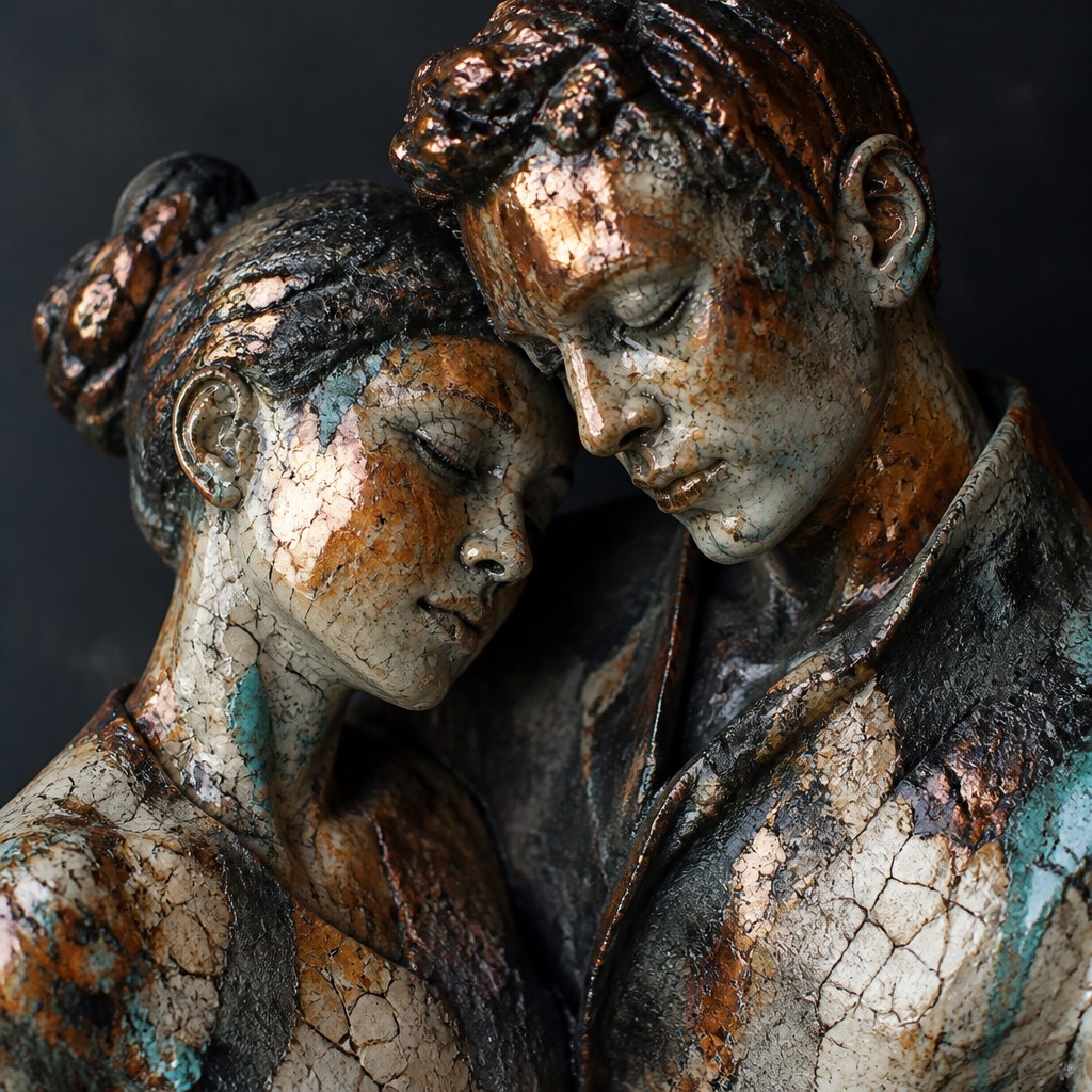
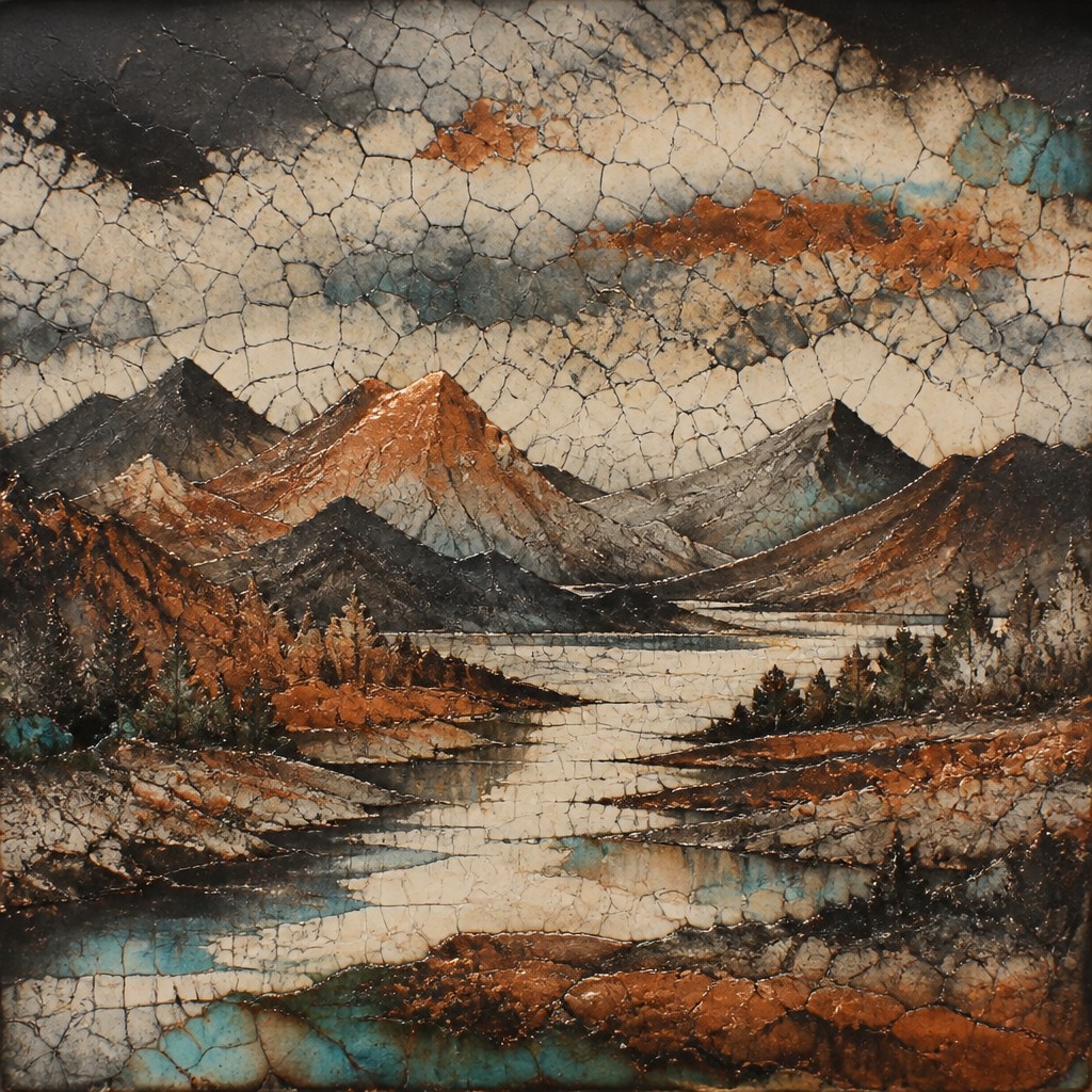
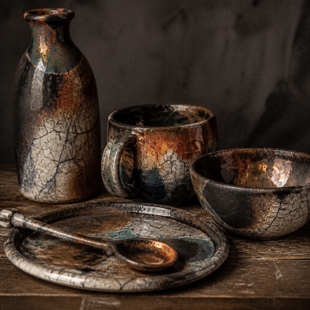
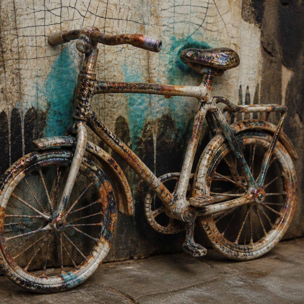
Japanese Raku ceramic art is known for its dramatic firing process, which can produce crackled glazes, smoky black surfaces, metallic luster, and uneven, wabi-sabi character. The result often feels spontaneous, tactile, and visually rich, with each piece showing clear signs of heat, chance, and rapid transformation.
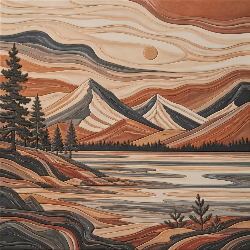
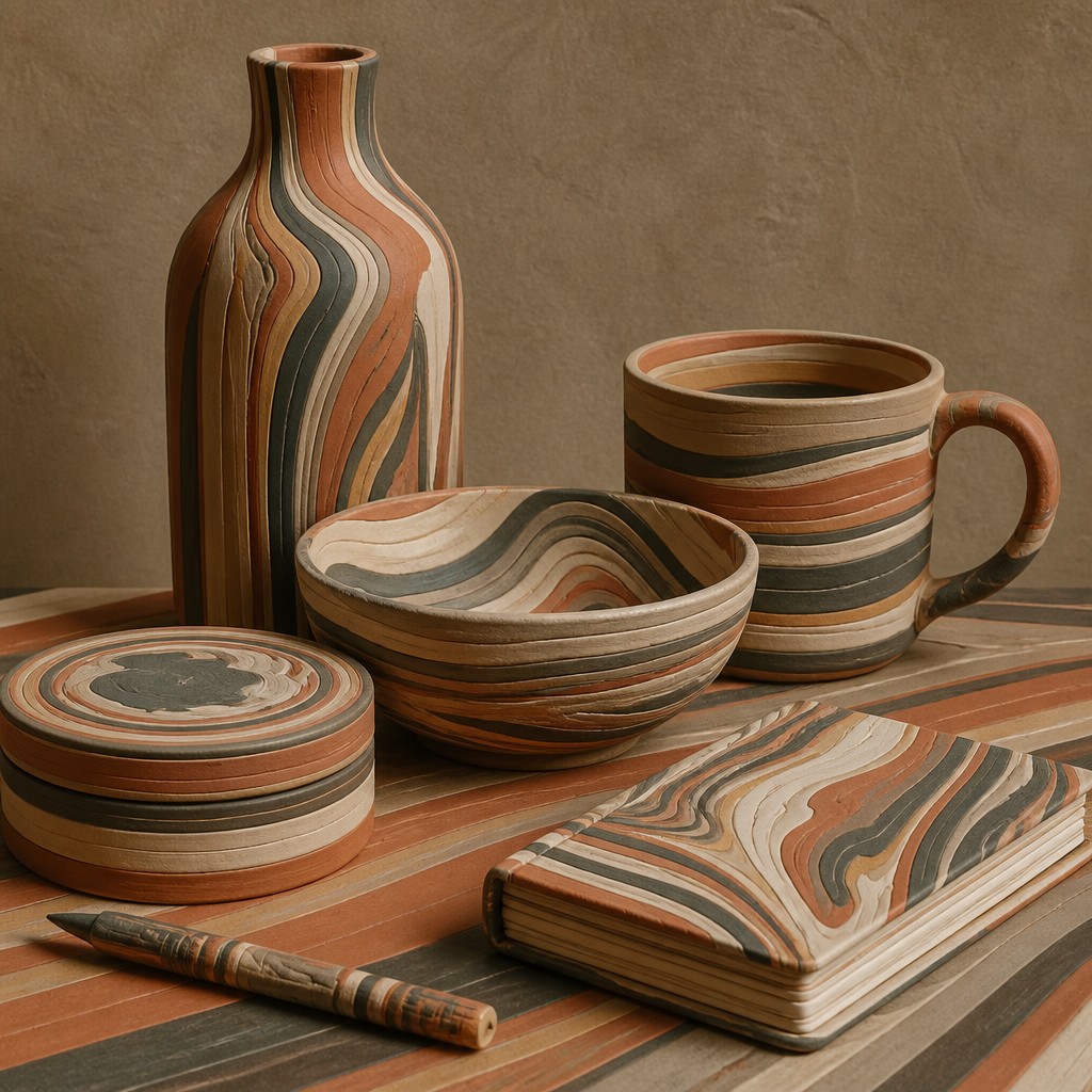
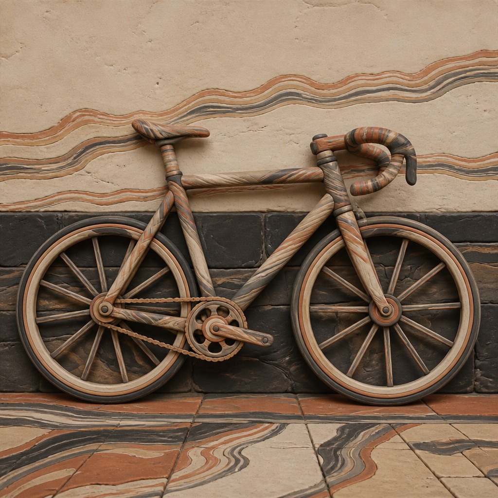
Nerikomi ceramic art, by contrast, is built from colored clay layers that are arranged before forming, so the pattern becomes part of the clay body itself. It is often compared with Raku because both celebrate handmade craft and visual variation, but they differ strongly in process and surface: Raku emphasizes fire-driven unpredictability, while Nerikomi emphasizes planned, integrated pattern and precise construction.
Same Prompt, Both Styles
Each pair below was generated from the identical prompt — only the style changed.
“portrait of two people together”

“wide landscape with natural scenery”
“still life with everyday objects”
“bicyle resting against a wall”
Key Differences
| Japanese Raku Ceramic | Nerikomi Ceramic | |
|---|---|---|
| Pattern source | Glaze and firing effects create much of the final look. | Pattern comes from layered colored clay built into the form. |
| Surface quality | Often crackled, smoky, and irregular in sheen. | Usually matte, smooth, and evenly patterned. |
| Visual feel | Earthy, dramatic, and shaped by heat-driven surprise. | Structured, calm, and carefully composed. |
| Level of control | Relies heavily on firing conditions and controlled unpredictability. | Depends on precise planning, cutting, and assembly. |
| Relationship to imperfection | Embraces wabi-sabi irregularity and spontaneous variation. | Values handmade precision and clean pattern continuity. |
| Typical visual contrast | Dark contrasts, metallic flashes, and cracked glaze networks. | Crisp seams, marbled bands, and integrated color transitions. |
| Mood | earthy, contemplative, imperfect, austere | meditative, geometric, organic, refined |
| Energy | calm | calm |
| Detail level | moderate | intricate |
| Color | earth tones, ash blacks, muted glazes | layered earth tones and soft contrasts |
| Texture | crackled, glossy, smoky, rough | smooth glazed strata, subtle tactile bands |
| Origin | Japan, 16th-century tea ceremony pottery | Japan, modern studio ceramics |
| Best for | ceramics, tea ware design, gallery objects, packaging, heritage branding | vessels, sculptural ceramics, gallery objects, pattern studies, luxury decor |
| Difficulty | advanced | advanced |
Which Should You Choose?
Choose Raku if you want a piece with strong surface drama, smoky depth, and an expressive sense of impermanence. Choose Nerikomi if you prefer carefully designed patterns, refined craftsmanship, and a more controlled, architectural look. In general, Raku feels more fire-led and atmospheric, while Nerikomi feels more planned and graphic.
Frequently Asked Questions
Is Raku the same as Nerikomi because both can look handmade?
No. They may both show handwork and variation, but the visual effects come from different sources. Raku is shaped by firing and glaze behavior, while Nerikomi is shaped by colored clay construction.
Which style is more predictable?
Nerikomi is usually more predictable because the pattern is built into the clay before firing. Raku is less predictable because heat, reduction, and glaze response can change the final result.
Which style is better for bold contrast?
Raku often delivers stronger dramatic contrast through smoky dark areas, crackle, and metallic highlights. Nerikomi can also be bold, but its contrast is usually more pattern-based and evenly distributed.
Can both styles be used on functional objects?
Yes, both can be used on functional forms, but usability depends on the specific clay body, glaze, and firing method. Raku pieces are often more delicate in a practical sense, while Nerikomi can be quite durable when properly made and fired.