Gothic vs Renaissance: What's the Difference?
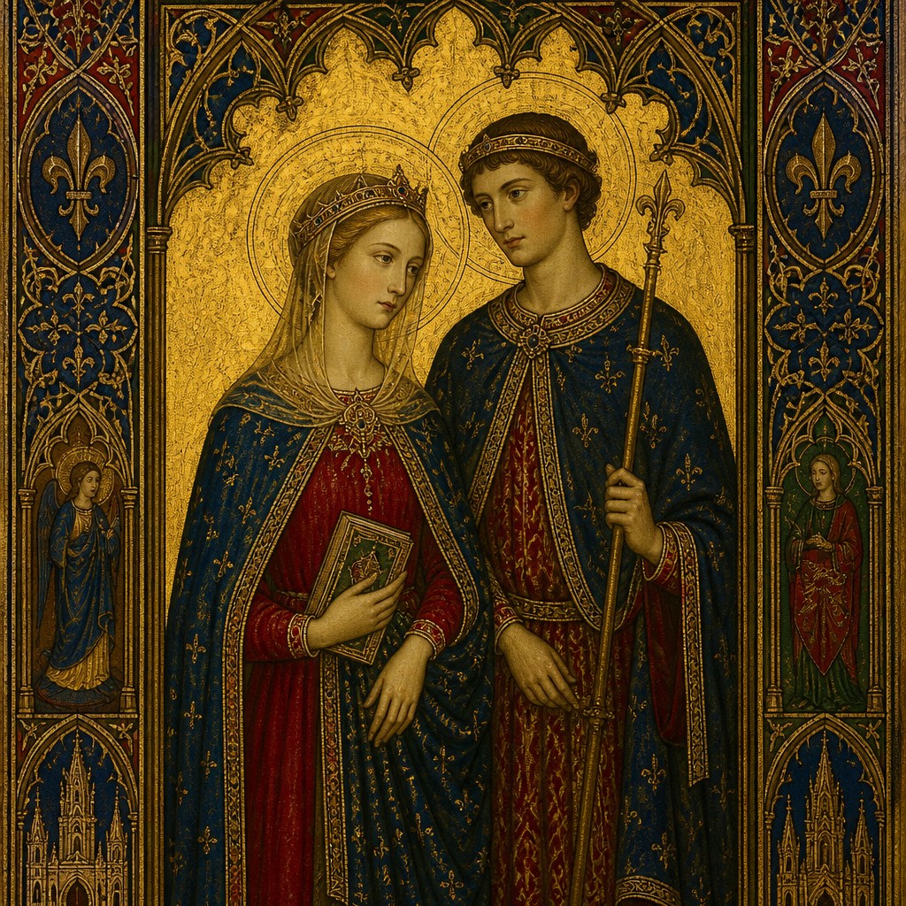
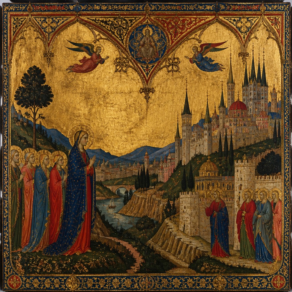
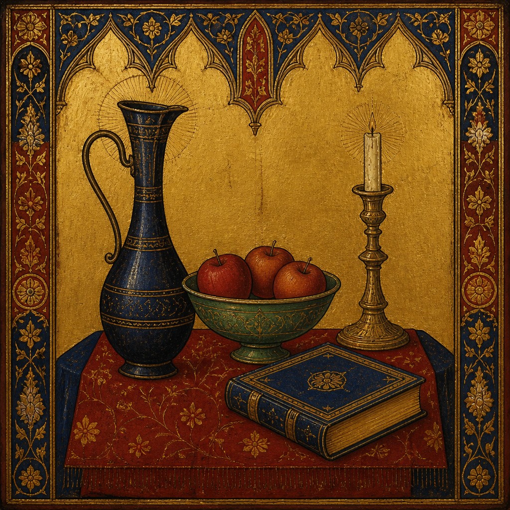
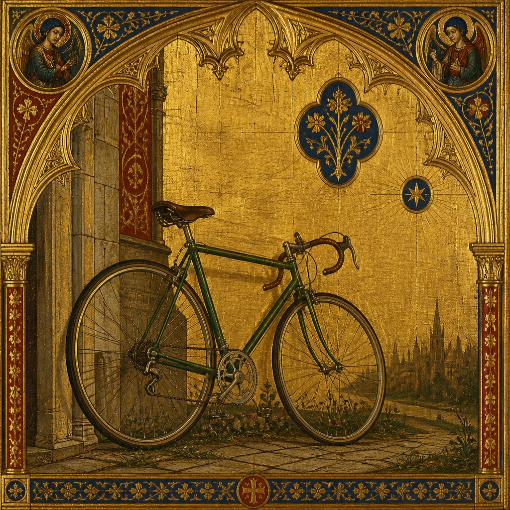
Gothic art style is a medieval sacred tradition built to inspire devotion. It often uses gold backgrounds, elongated figures, symbolic details, and a transcendent mood that emphasizes spiritual meaning over natural realism.
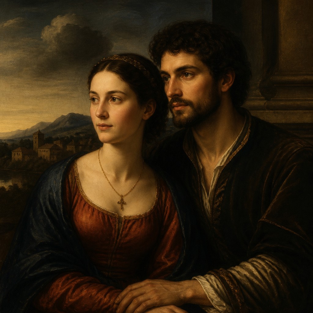
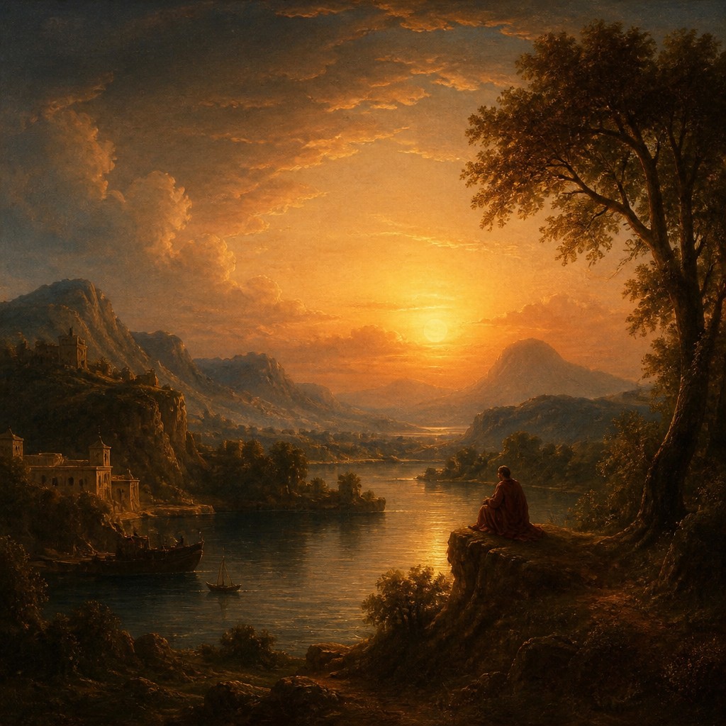
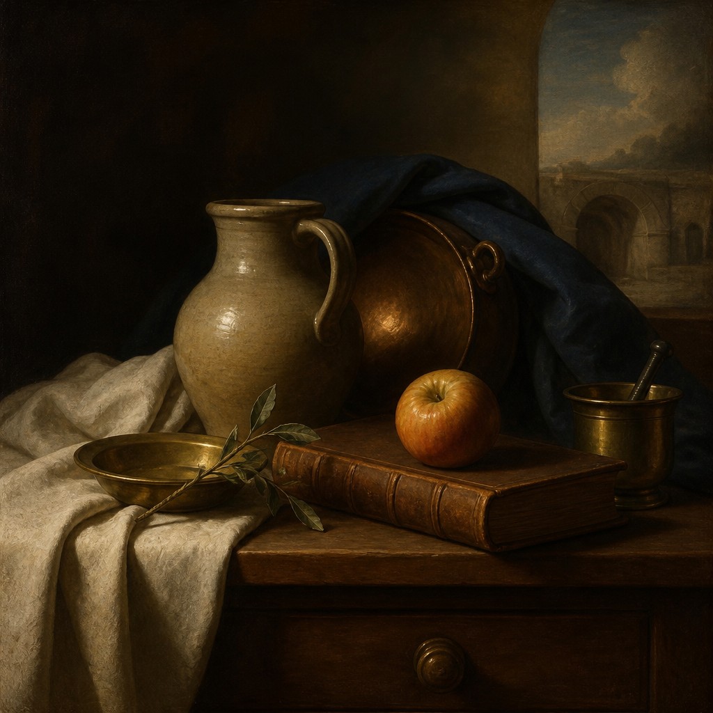
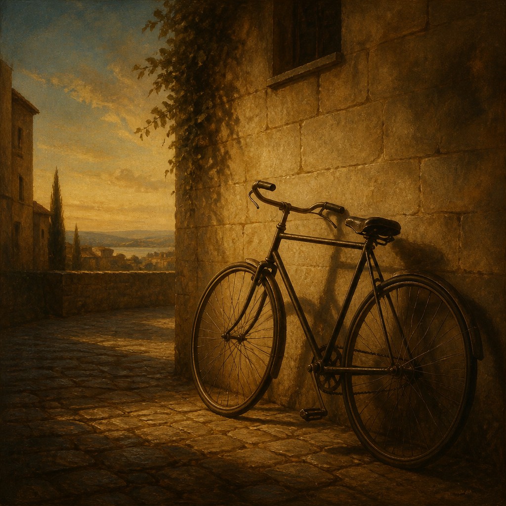
Renaissance art style marks a revival of classical ideals and observation of the visible world. It favors balanced proportions, idealized figures, linear perspective, sfumato, and chiaroscuro. People compare the two because they show a major shift from symbolic, heavenly presentation to naturalistic space, anatomy, and human-centered representation.
Same Prompt, Both Styles
Each pair below was generated from the identical prompt — only the style changed.
“portrait of two people together”
“wide landscape with natural scenery”
“still life with everyday objects”
“bicyle resting against a wall”
Key Differences
| Gothic | Renaissance | |
|---|---|---|
| Purpose | Centers religious devotion and spiritual symbolism. | Balances sacred, classical, and humanistic concerns. |
| Figures | Figures are elongated, frontal, and less anatomically natural. | Figures are idealized, proportioned, and more lifelike. |
| Space | Space is flattened and often suggests a timeless realm. | Space is structured with linear perspective and depth. |
| Light & shading | Uses shimmering gold and simplified modeling. | Uses chiaroscuro and sfumato for volume and atmosphere. |
| Detail | Symbolic details matter more than observed realism. | Observed detail supports natural appearance and clarity. |
| Mood | Feels devotional, solemn, and transcendent. | Feels harmonious, calm, and human-centered. |
| Mood | solemn, devotional, ethereal, mystical, reverent | harmonious, graceful, elevated, ordered, contemplative |
| Energy | calm | balanced |
| Detail level | detailed | detailed |
| Color | gold, deep red, blue, jewel tones | rich, warm, earth-toned with luminous highlights |
| Texture | flat gilded surfaces, fine linework | smooth modeling, fine finish, subtle layering |
| Origin | Medieval Europe, 12th-15th centuries | Italy, 14th-16th century |
| Best for | religious posters, manuscript illustrations, stained glass designs, heritage book covers, museum graphics | religious scenes, portraiture, historical illustrations, museum posters, book covers, fine art studies |
| Difficulty | advanced | advanced |
Which Should You Choose?
Choose Gothic art style if you want a sacred, symbolic image that feels timeless, spiritual, and intentionally non-naturalistic. Choose Renaissance art style if you want believable space, convincing anatomy, and a balanced, classical look rooted in observation and harmony.
Frequently Asked Questions
Which style is more realistic?
Renaissance art is generally more realistic because it uses perspective, proportion, and modeling to create believable figures and space. Gothic art is usually more symbolic than naturalistic.
Which style is better for religious imagery?
Both can serve religious themes, but Gothic art is especially associated with devotional purpose and spiritual symbolism. Renaissance art can also be religious, but it often presents sacred scenes with greater naturalism.
Why does Gothic art use gold backgrounds?
Gold backgrounds help suggest a heavenly, timeless realm rather than a physical location. They also draw attention to the sacred subject and create a luminous, devotional effect.
What makes Renaissance art feel more three-dimensional?
Renaissance artists use linear perspective, chiaroscuro, and careful proportion to model form and depth. These techniques make figures and settings appear more solid and spatially coherent.