Glitch vs Digital Glitch Modern: What's the Difference?
Glitch Art Style turns digital failure into the subject of the artwork. It often uses scan lines, pixel corruption, datamoshing, distortion, and broken signal effects to make error feel expressive, disruptive, or even poetic.
Digital Glitch Modern Art Style uses a similar visual language, but more as a polished design aesthetic than a critique of media failure. People compare them because both rely on artifacts like RGB shifts, tearing, and compression damage, yet one tends to feel raw and experimental while the other feels cleaner, more commercial, and easier to apply in modern branding or visuals.
Same Prompt, Both Styles
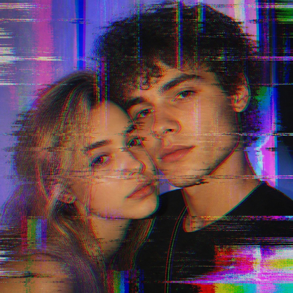
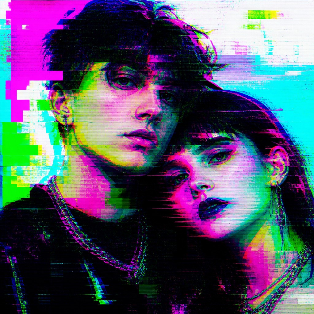
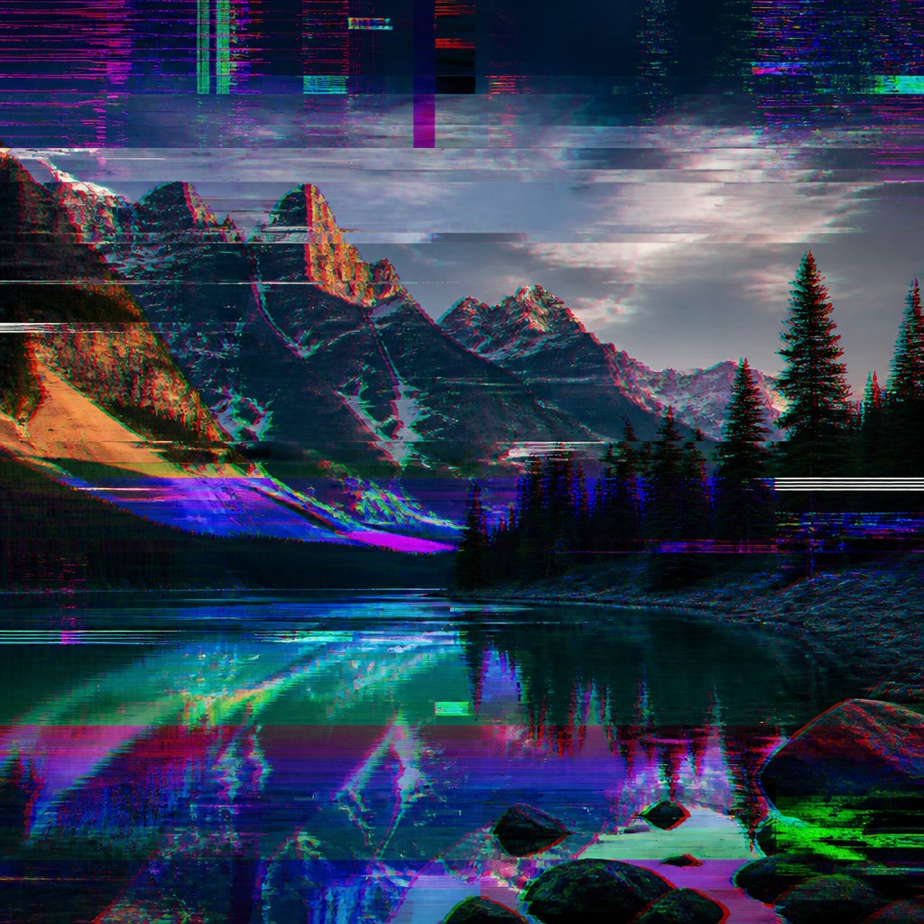
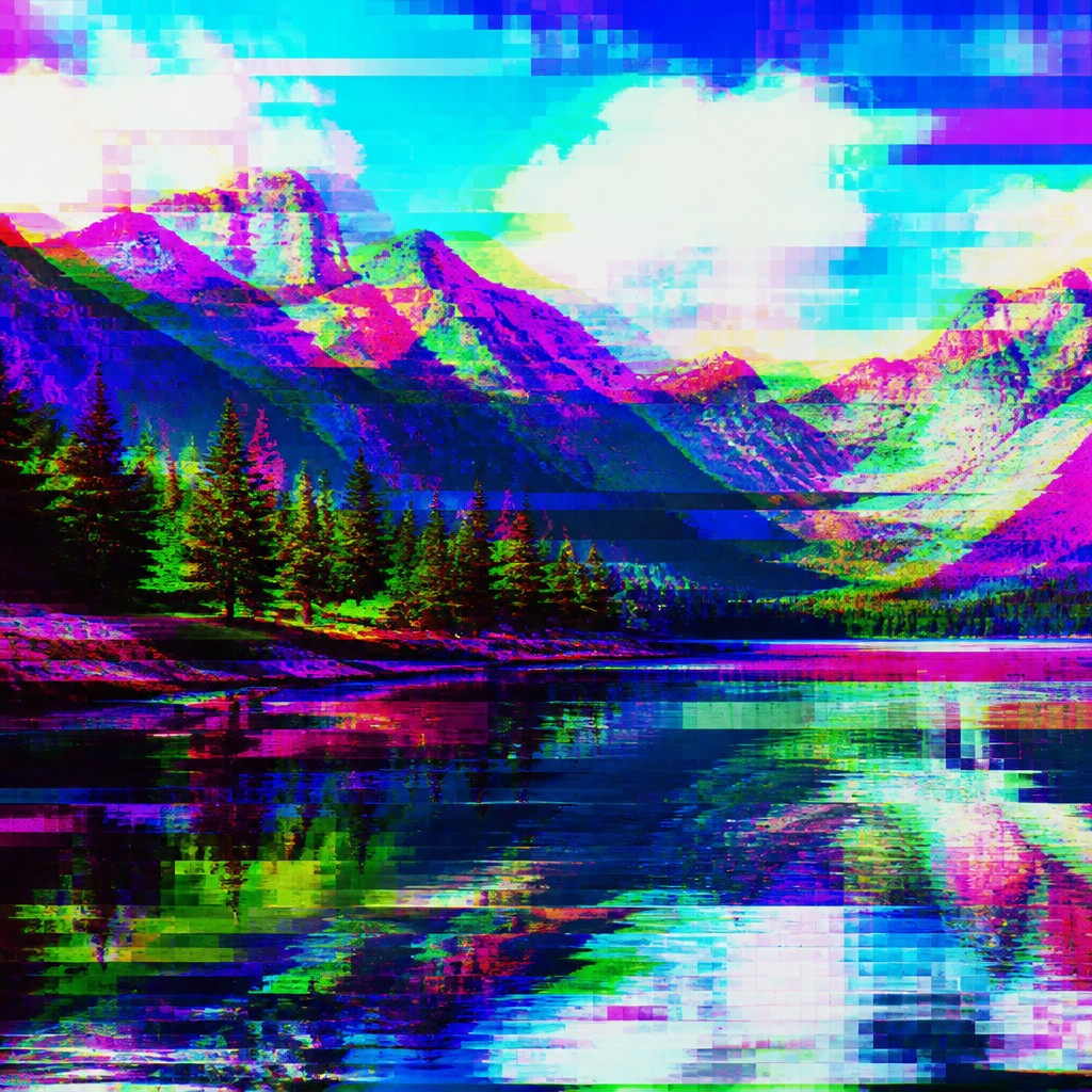
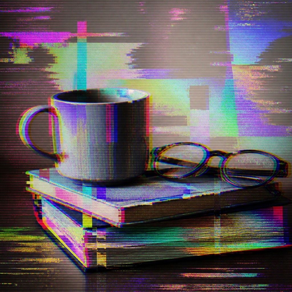
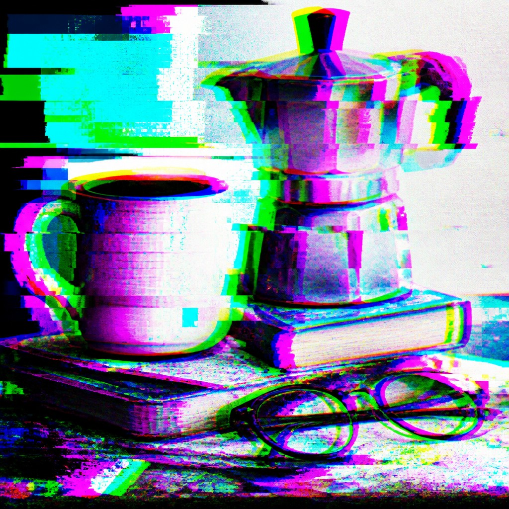
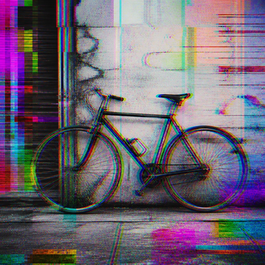
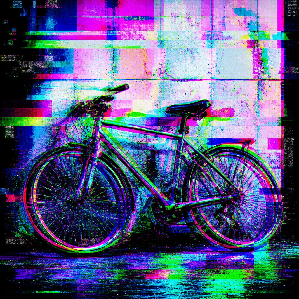
Each pair below was generated from the identical prompt — only the style changed.
“portrait of two people together”
“wide landscape with natural scenery”
“still life with everyday objects”
“bicyle resting against a wall”
Key Differences
| Glitch | Digital Glitch Modern | |
|---|---|---|
| Intent | Explores error as a concept, often questioning technology and perception. | Uses error as a stylish effect for contemporary visuals. |
| Look & texture | Rougher, more chaotic, with visible corruption and unstable image breaks. | Cleaner, more controlled, with polished artifact patterns and color shifts. |
| Common effects | Scan lines, datamoshing, pixel breakup, signal loss, and distortion. | RGB splits, scan tearing, compression artifacts, and controlled pixel noise. |
| Mood | Experimental, unsettling, sometimes critical or subversive. | Energetic, trendy, futuristic, and design-forward. |
| Legibility | Often less readable to emphasize disruption and fragmentation. | Usually more readable so the image still works in layouts and ads. |
| Typical use | Art projects, experimental media, and conceptual visuals. | Posters, album art, UI accents, motion graphics, and branding. |
| Mood | chaotic, disrupted, futuristic, edgy, unstable | futuristic, disrupted, edgy, experimental, anxious |
| Energy | intense | intense |
| Detail level | detailed | detailed |
| Color | high-contrast neon with corrupted digital tones | electric neons, corrupted RGB, dark neutrals |
| Texture | fragmented, pixel-broken, scanline-distorted | pixelated, banded, noisy, fragmented |
| Origin | late-20th-century digital-native aesthetic | late-20th-century digital-native aesthetic |
| Best for | album covers, posters, experimental branding, motion graphics, tech visuals, game interfaces | album covers, poster design, motion graphics, tech branding, editorial visuals, game art |
| Difficulty | advanced | advanced |
Which Should You Choose?
Choose Glitch Art Style if you want the work to feel like an investigation into digital failure, instability, or media breakdown. Choose Digital Glitch Modern Art Style if you want the same general aesthetic but need a cleaner, more controlled look that supports modern design, keeps text readable, and works well in commercial or editorial contexts.
Frequently Asked Questions
Are these the same style?
They overlap heavily, but they are not exactly the same. Glitch Art Style usually leans more into conceptual or experimental use of failure, while Digital Glitch Modern Art Style is more polished and design-oriented.
Which style is more readable for text and logos?
Digital Glitch Modern Art Style is usually easier to read because it is more controlled. Glitch Art Style can obscure details more aggressively, which may hurt legibility.
Which one feels more artistic versus commercial?
Glitch Art Style often feels more artistic, experimental, and critical. Digital Glitch Modern Art Style often feels more commercial because it is easier to adapt for marketing and branding.
Can both styles use pixel corruption and RGB shifts?
Yes, both can use those effects. The difference is in emphasis: Glitch Art Style often pushes disruption further, while Digital Glitch Modern Art Style uses those effects more selectively and neatly.