Fine Art Photography vs Photographic Realism: What's the Difference?
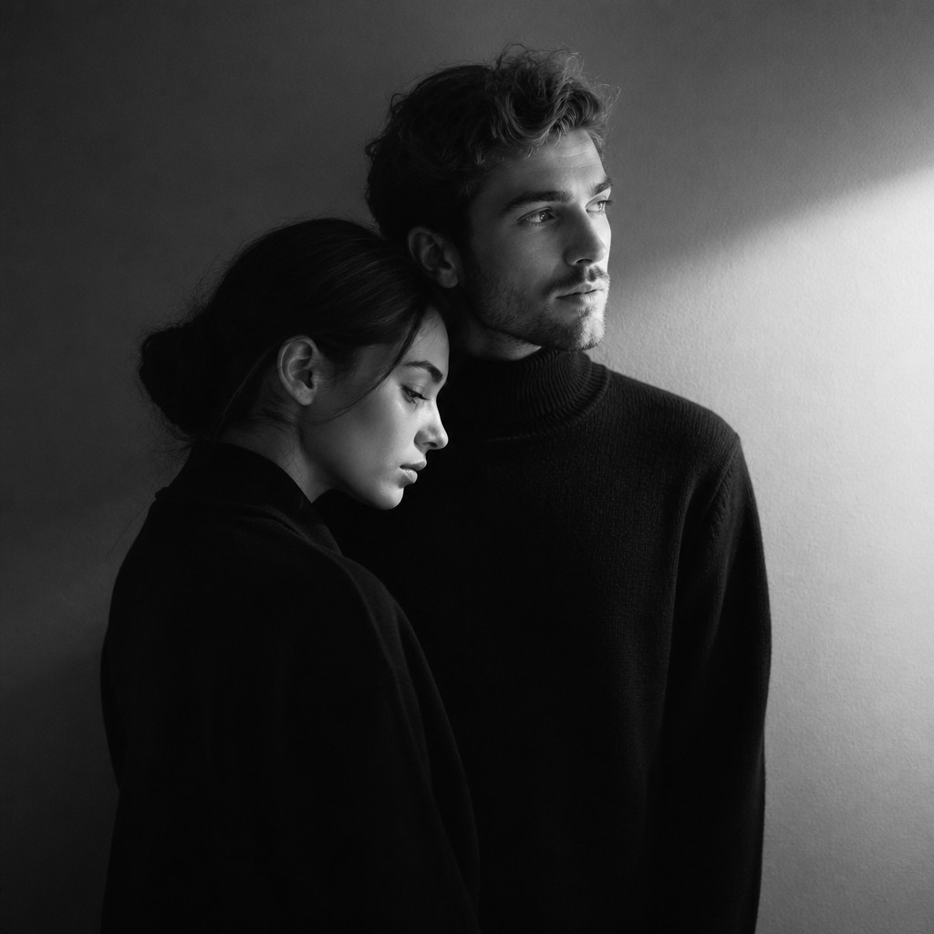
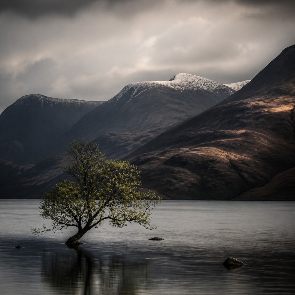
Fine art photography is an image-making style centered on concept, authorship, and visual intent. It often uses careful composition, tonal control, and expressive editing to create photographs that feel like artworks rather than straightforward records.
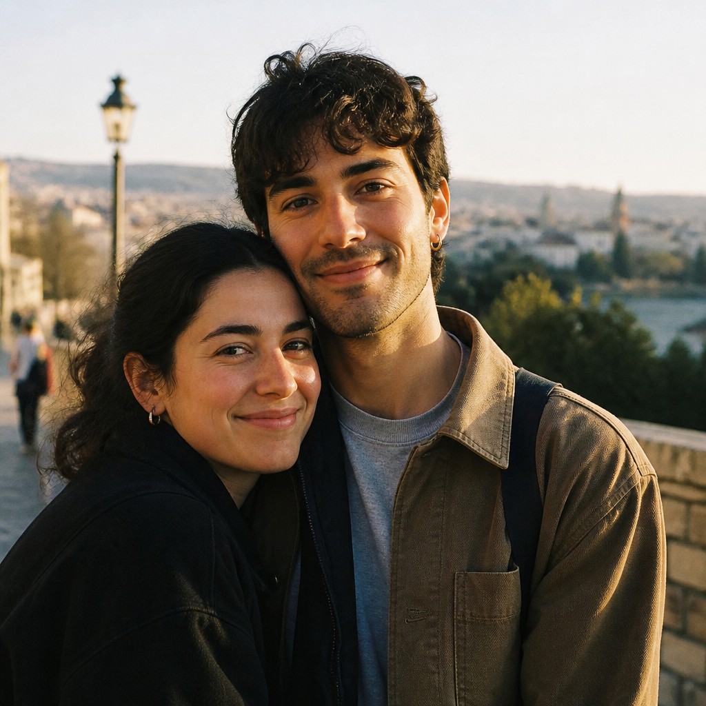
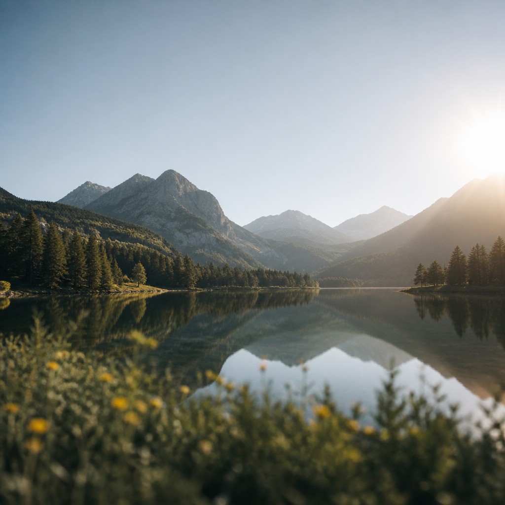
Photographic realism is an art style that aims to recreate the look of a camera image within drawing, painting, or digital art. People compare the two because both can look polished and lifelike, but one emphasizes artistic interpretation and the other emphasizes convincing camera-like realism.
Same Prompt, Both Styles
Each pair below was generated from the identical prompt — only the style changed.
“portrait of two people together”
“wide landscape with natural scenery”
“still life with everyday objects”
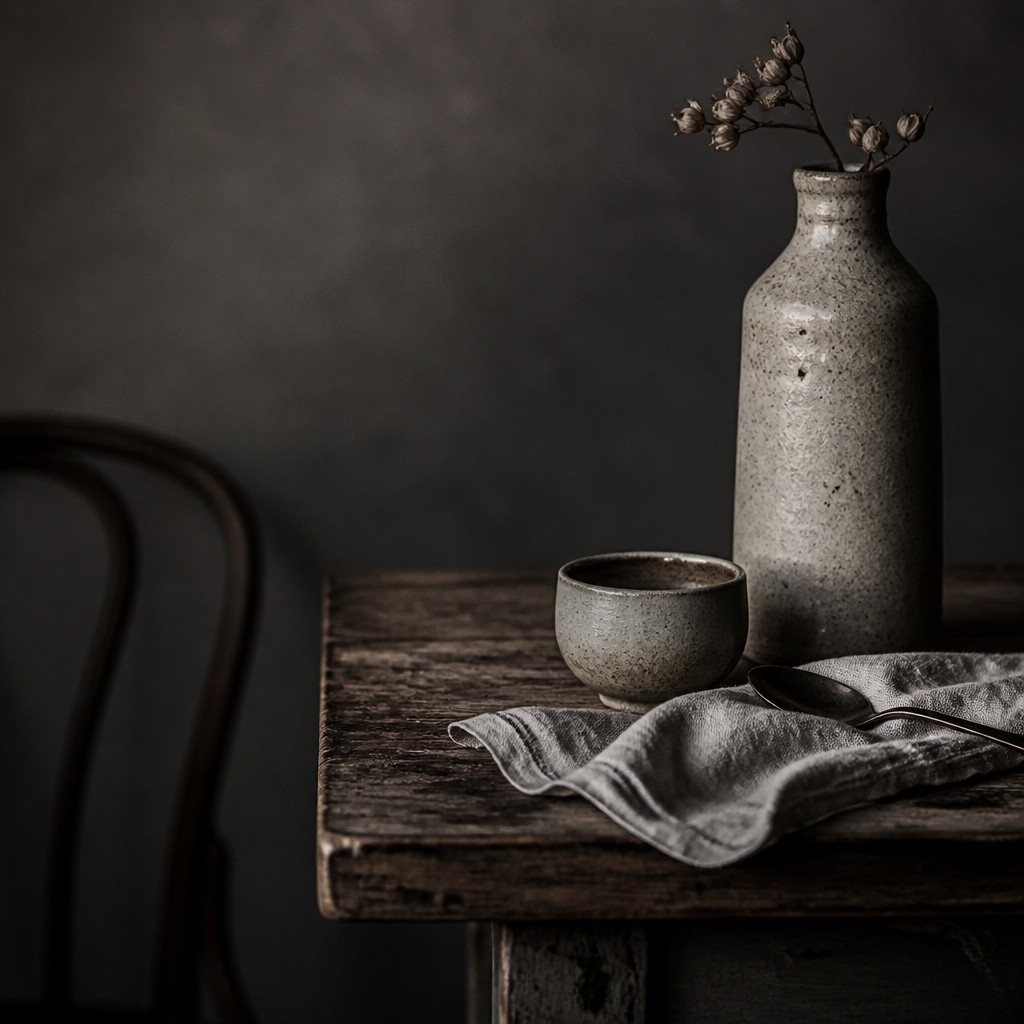
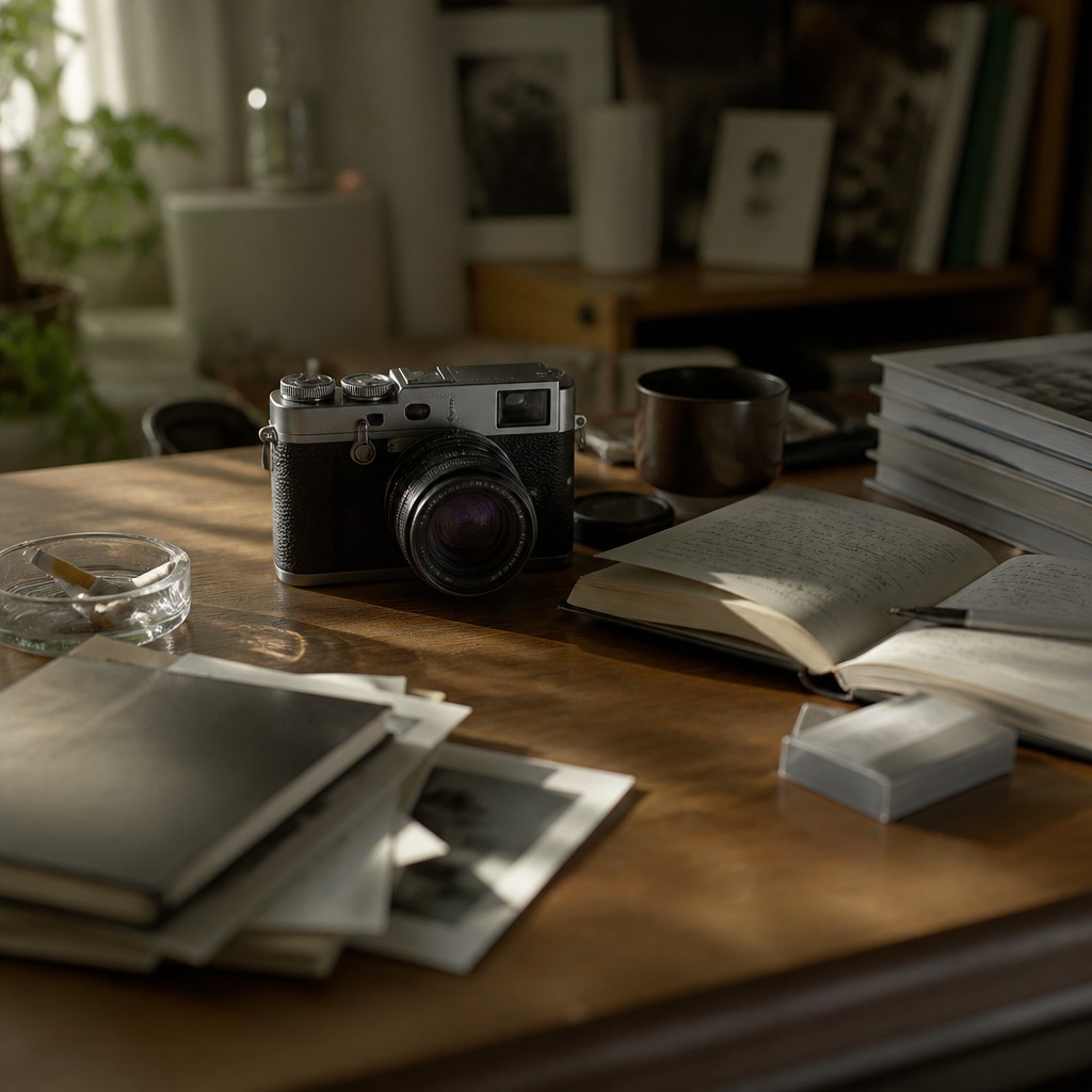
“bicyle resting against a wall”
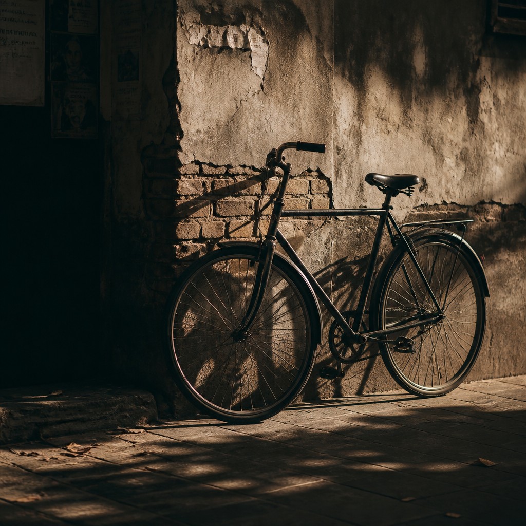
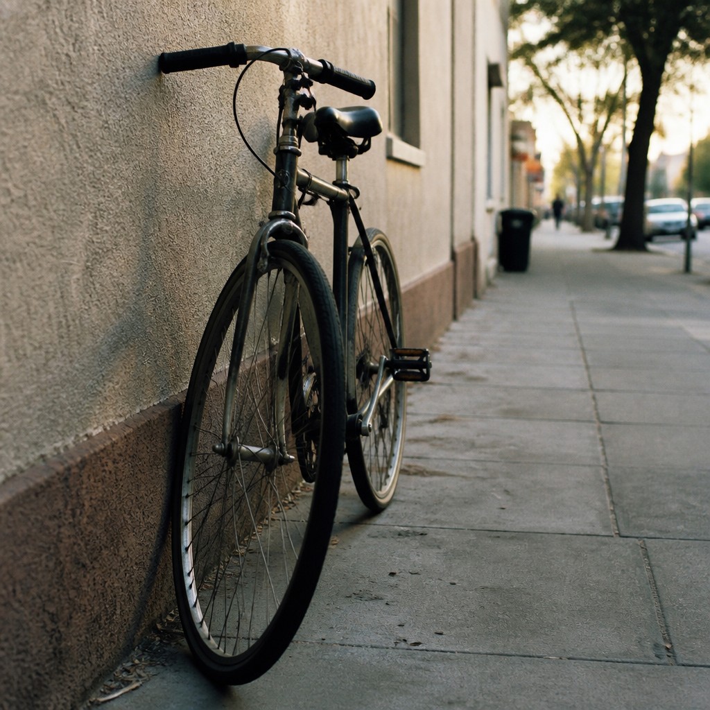
Key Differences
| Fine Art Photography | Photographic Realism | |
|---|---|---|
| Goal | Expresses a personal concept or emotion through photography. | Recreates the appearance of a real camera-captured image. |
| Composition | Highly intentional, often simplified or symbolic. | Naturalistic, as if framed by a camera in the moment. |
| Tone & Color | Controlled tonal range; may be muted, moody, or stylized. | Natural color and light with film-like or camera-like fidelity. |
| Detail Priority | Details support the idea and overall mood. | Fine detail and texture help sell realism and depth. |
| Optics | Lens effects are used selectively, if at all. | Bokeh, focus falloff, and lens behavior are often emphasized. |
| Viewer Experience | Invites interpretation and contemplation. | Creates the impression of seeing a real photograph. |
| Mood | contemplative, elegant, intimate, poetic | naturalistic, observant, restrained, concrete |
| Energy | calm | calm |
| Detail level | detailed | detailed |
| Color | muted, tonal, often atmospheric | true-to-life, nuanced, filmic tones |
| Texture | soft grain, rich tonal gradation | smooth, sharp focal detail, soft blur |
| Origin | late 19th-century Europe | modern photography-influenced realism |
| Best for | gallery prints, editorial spreads, album covers, book jackets, posters | editorial illustration, portraits, product renderings, movie posters, documentary scenes, concept art |
| Difficulty | advanced | advanced |
Which Should You Choose?
Choose fine art photography style when you want the image to communicate a concept, mood, or personal viewpoint, even if that means stylizing composition, light, or tone. Choose photographic realism when the goal is to make the artwork look like a believable camera image, with crisp focus, natural color, and optical effects that mimic photography.
Frequently Asked Questions
Is fine art photography the same as realistic photography?
No. Fine art photography can be realistic, but its main priority is artistic expression and intent. Realism focuses more on reproducing the look of an actual photograph.
Does photographic realism have to look sharp everywhere?
Not necessarily. It often uses realistic focus behavior, including depth of field and background blur, to match how cameras render scenes. The key is that those effects feel physically believable.
Can fine art photography include realism?
Yes. Many fine art photographs are highly realistic in appearance. The difference is that the image is shaped primarily by concept, composition, and artistic vision.
Which style is better for portraits or landscapes?
Either can work for both. Fine art photography suits portraits or landscapes when you want a distinctive mood or message, while photographic realism suits them when you want a convincing, camera-like result.