Fauvism vs Fauvist Impressionism: What's the Difference?
Fauvism is a modern art style known for pure, often unmixed color, bold brushwork, and expressive, non-naturalistic palettes. It prioritizes emotional impact over realistic appearance, using color as a primary tool for structure, mood, and visual energy.
Fauvist Impressionism combines the vivid color and emotional intensity of Fauvism with the lighter, atmospheric handling associated with Impressionism. People compare them because both favor expressive color and visible brushwork, but they differ in how strongly they push color away from reality and how much they preserve light, atmosphere, and observed outdoor effects.
Same Prompt, Both Styles
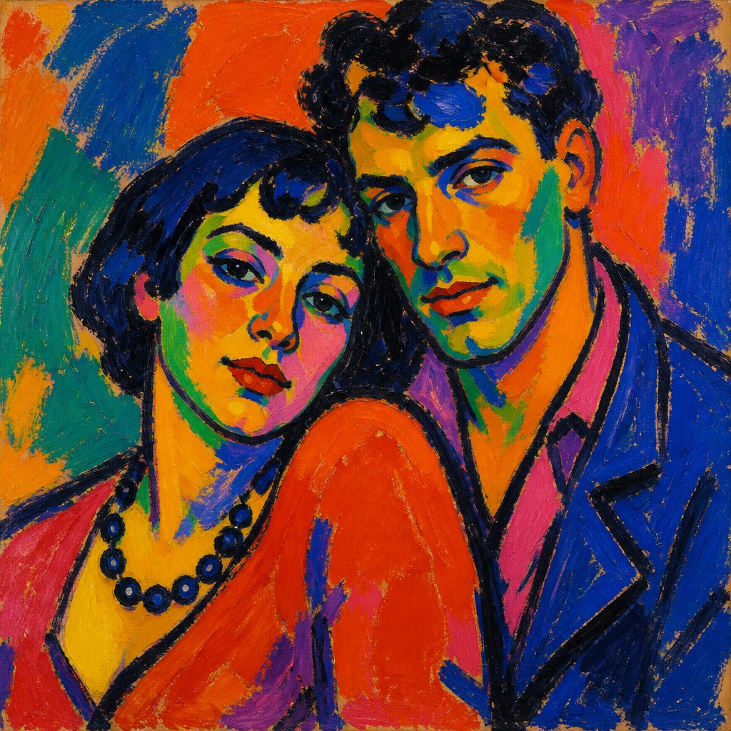
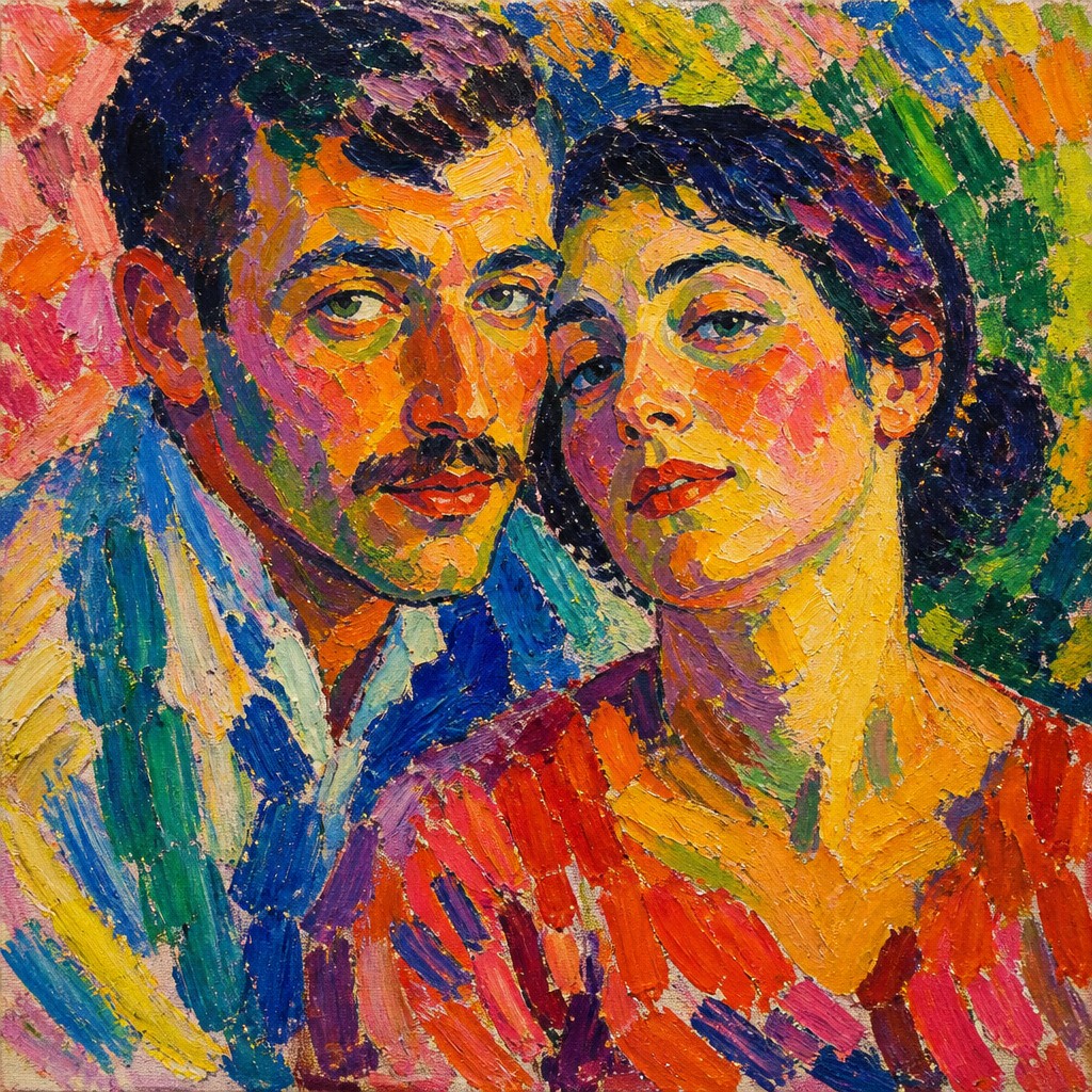
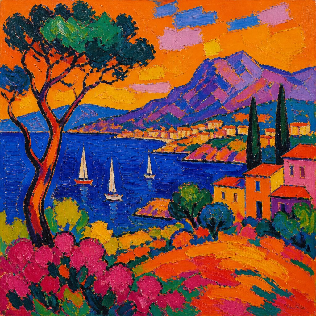
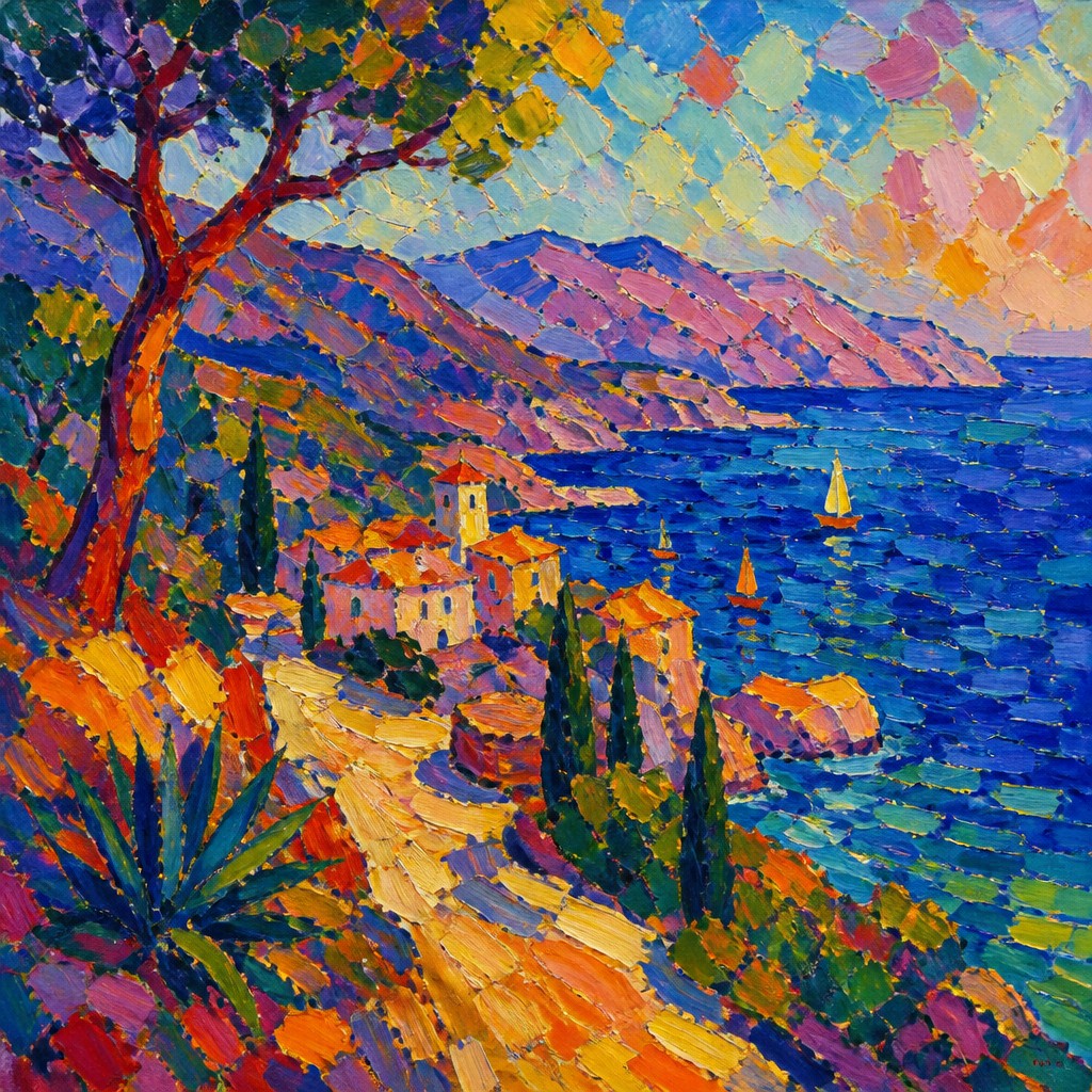
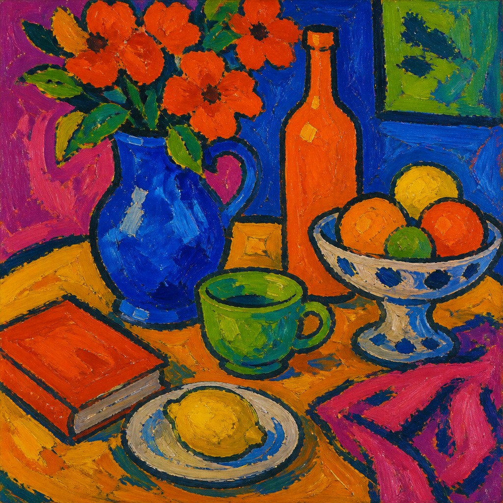
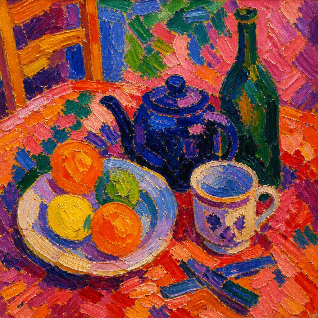
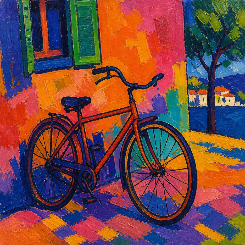
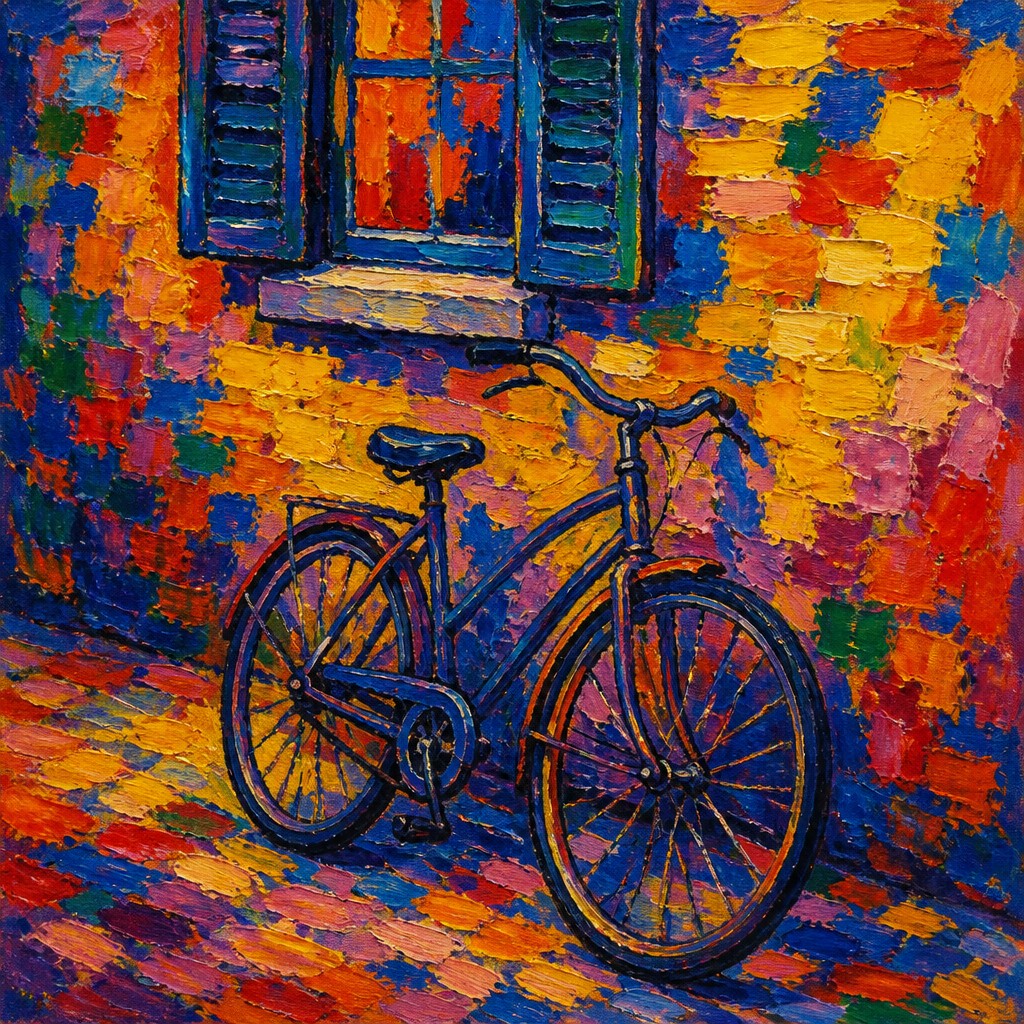
Each pair below was generated from the identical prompt — only the style changed.
“portrait of two people together”
“wide landscape with natural scenery”
“still life with everyday objects”
“bicyle resting against a wall”
Key Differences
| Fauvism | Fauvist Impressionism | |
|---|---|---|
| Color use | Pure, intense, non-naturalistic color dominates the composition. | Bold color is also central, but often feels lighter and more observed. |
| Brushwork | Brushstrokes are assertive and expressive, often broad and direct. | Brushwork is broken and lively, closer to Impressionist mark-making. |
| Relationship to reality | Color may ignore real-world appearance to heighten emotion. | Color is expressive, but usually keeps some link to observed light. |
| Light and atmosphere | Light is subordinate to color and emotional force. | Light and atmosphere remain important, often with shimmering effects. |
| Surface effect | Flat, intense areas of color can simplify forms strongly. | Surface often feels more varied, with flicker and visual movement. |
| Emotional tone | Often feels forceful, direct, and chromatically dramatic. | Often feels vibrant, luminous, and emotionally warmer. |
| Mood | bold, expressive, vibrant, rebellious | vibrant, expressive, sunlit, emotionally charged |
| Energy | intense | intense |
| Detail level | moderate | moderate |
| Color | saturated, unmixed, non-naturalistic primaries | pure saturated hues, non-naturalistic contrast |
| Texture | loose, vigorous, visible brushstrokes | visible broken brushwork, shimmering surface |
| Origin | early 20th-century France | late 19th-century France |
| Best for | posters, album covers, editorial art, decorative paintings, fashion graphics | posters, album covers, editorial illustrations, gallery prints, book covers |
| Difficulty | moderate | advanced |
Which Should You Choose?
Choose Fauvism if you want the strongest color freedom, maximum emotional intensity, and a more radical break from natural appearance. Choose Fauvist Impressionism if you want vivid, expressive color but still want light, atmosphere, and broken brushwork to suggest observed reality and outdoor sensation.
Frequently Asked Questions
Are Fauvism and Fauvist Impressionism the same thing?
No. They overlap in their use of vivid color and expressive painting, but Fauvism is more radically non-naturalistic. Fauvist Impressionism stays closer to Impressionist effects like light, atmosphere, and broken brushwork.
Which style uses brighter color?
Both use bright color, but Fauvism usually pushes color farther from reality. Fauvist Impressionism often feels bright in a lighter, more luminous way rather than purely confrontational.
Which style is more realistic?
Fauvist Impressionism is generally more rooted in observed light and atmosphere. Fauvism usually departs more clearly from realistic color and can simplify forms more aggressively.
What should a beginner look for when comparing them?
Look at whether the painting is using color mainly for emotional impact or for both emotion and light effects. Also compare the brushwork: Fauvist Impressionism often looks more flickering and broken, while Fauvism feels broader and more forceful.