Digital Pop vs Pop: What's the Difference?
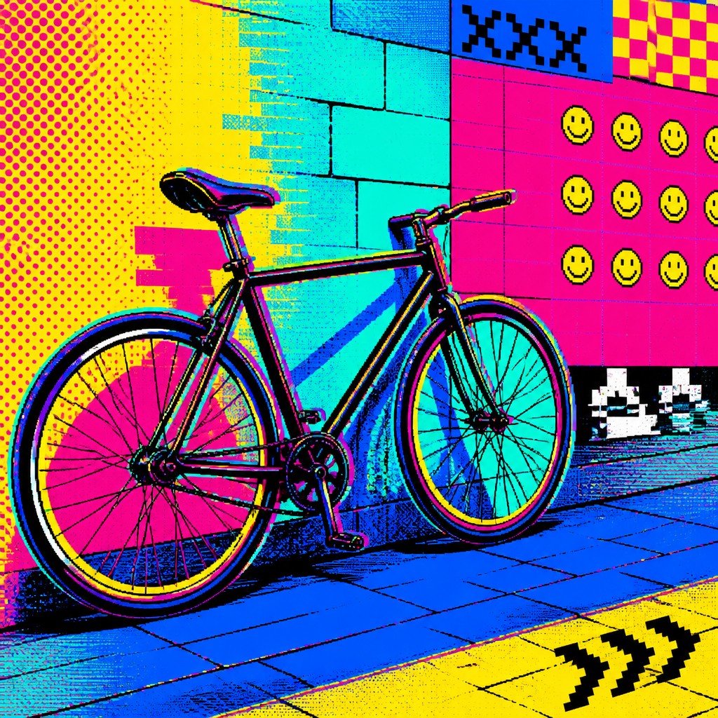
Digital Pop Art Style combines the bold, high-contrast look of pop art with pixels, emoji, glitch effects, and internet-era color palettes. It feels contemporary and screen-native, often reflecting online culture, digital identity, and fast-moving visual trends.
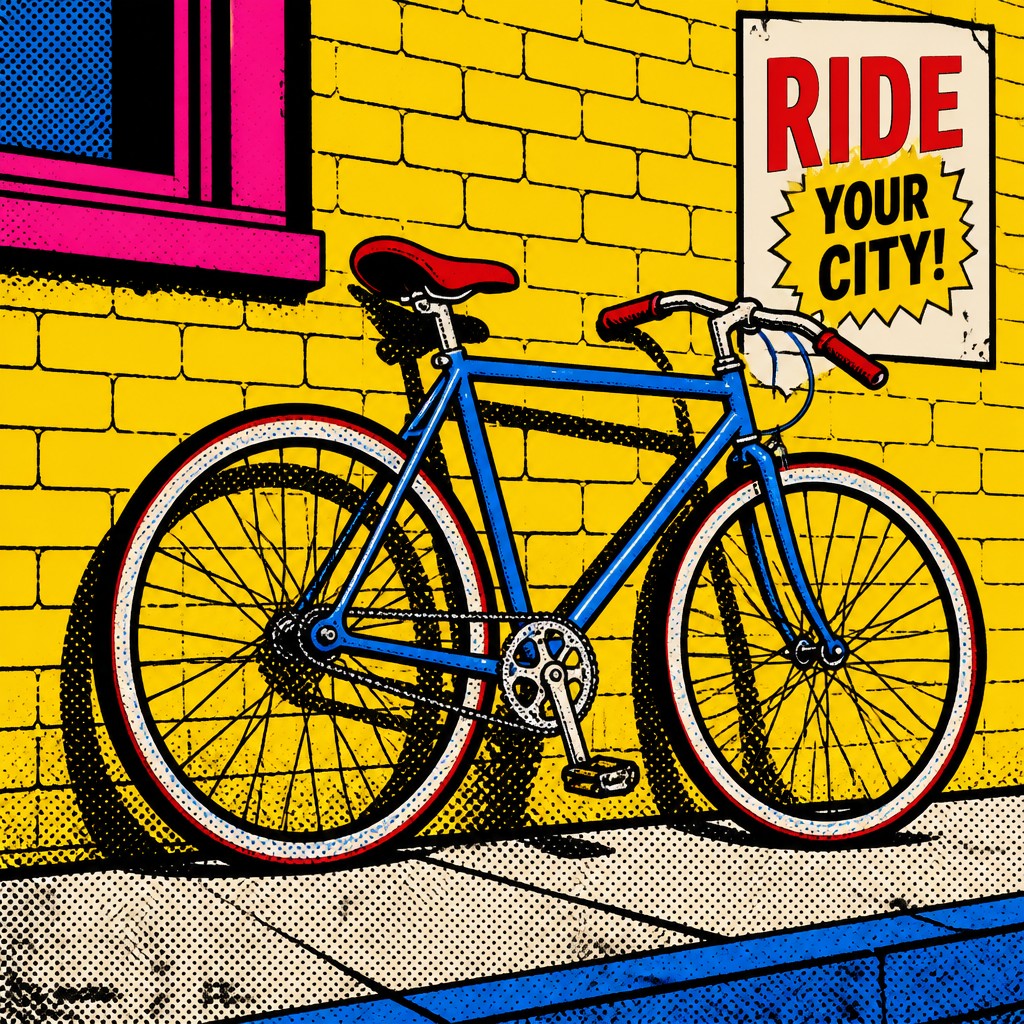
Pop Art Style uses flat color, thick outlines, halftone dots, and commercial imagery to echo mass media, advertising, and consumer culture. People compare the two because both are bright, graphic, and rooted in popular imagery, but one is designed for the digital age while the other comes from print and advertising traditions.
Same Prompt, Both Styles
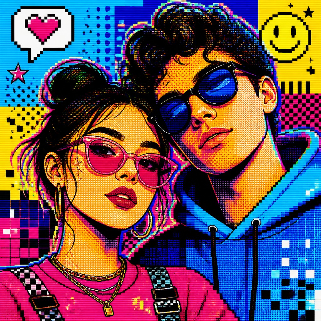
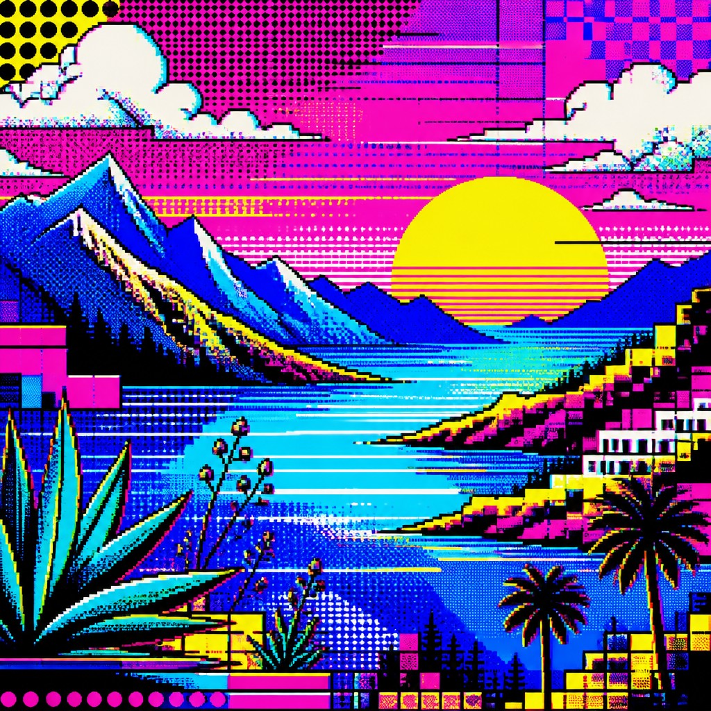
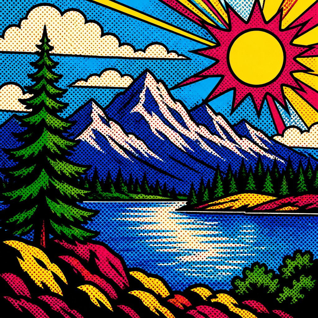
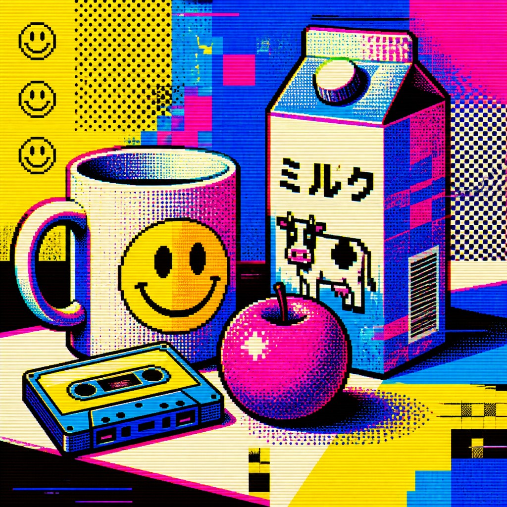
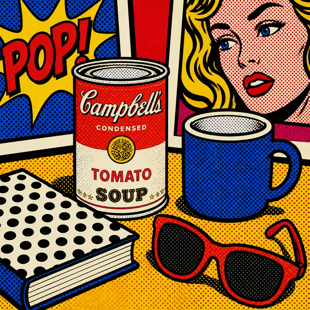
Each pair below was generated from the identical prompt — only the style changed.
“portrait of two people together”

“wide landscape with natural scenery”
“still life with everyday objects”
“bicyle resting against a wall”
Key Differences
| Digital Pop | Pop | |
|---|---|---|
| Visual source | Built from digital-native cues like pixels, UI elements, emojis, and glitch artifacts. | Draws from printed media, ads, comics, packaging, and broadcast imagery. |
| Texture | Often mixes clean vector areas with pixelation, scan lines, distortion, and digital noise. | Uses flat fills, halftone dots, and clean mechanical print texture. |
| Color | Leans toward neon, saturated gradients, and internet-age palettes. | Uses bright primary colors and bold contrasts typical of mass-media printing. |
| Line & form | Shapes may be simplified, squared, or interface-like, with crisp screen edges. | Relies on thick outlines, comic-like contours, and clear graphic silhouettes. |
| Cultural feel | Feels current, playful, ironic, and tied to online communication. | Feels retro, commercial, and centered on consumer culture and popular imagery. |
| Best use cases | Works well for tech brands, social media graphics, digital campaigns, and modern editorial art. | Works well for posters, merchandise, packaging-inspired art, and retro-themed design. |
| Mood | playful, irreverent, nostalgic, hyperconnected, satirical | bold, playful, commercial, ironic, vibrant |
| Energy | lively | lively |
| Detail level | detailed | moderate |
| Color | bright primaries with neon accents | bright saturated primaries and contrasts |
| Texture | flat digital surfaces, halftone, glitch grain | flat, printed, dot-patterned surface |
| Origin | digital-native aesthetic | 1960s Britain and United States |
| Best for | social media graphics, posters, album covers, editorial illustrations, web banners, merchandise design | posters, album covers, editorial graphics, advertisements, book covers, merchandise design |
| Difficulty | moderate | moderate |
Which Should You Choose?
Choose Digital Pop Art Style if you want a look that feels contemporary, screen-based, and connected to internet culture, especially for social media, tech, or youth-focused projects. Choose Pop Art Style if you want a cleaner retro-commercial feel with stronger ties to print, advertising, and classic mass-media aesthetics.
Frequently Asked Questions
Is Digital Pop Art just a modern version of Pop Art?
It is related, but not identical. Digital Pop Art borrows pop art's boldness and commercial energy, then adds digital textures and online visual language.
Which style is more retro?
Pop Art Style is more retro because it reflects print advertising, comics, and mid-century mass media. Digital Pop Art feels newer and more tied to current internet culture.
Which style is better for social media graphics?
Digital Pop Art usually fits social media better because it matches screen formats and digital culture. Its glitch, pixel, and emoji elements also read quickly online.
Can these styles overlap?
Yes, they can share bold color, graphic shapes, and playful imagery. The main difference is whether the work feels rooted in print-era media or digital-age language.