Digital Glitch Abstract vs Digital Glitch Modern: What's the Difference?
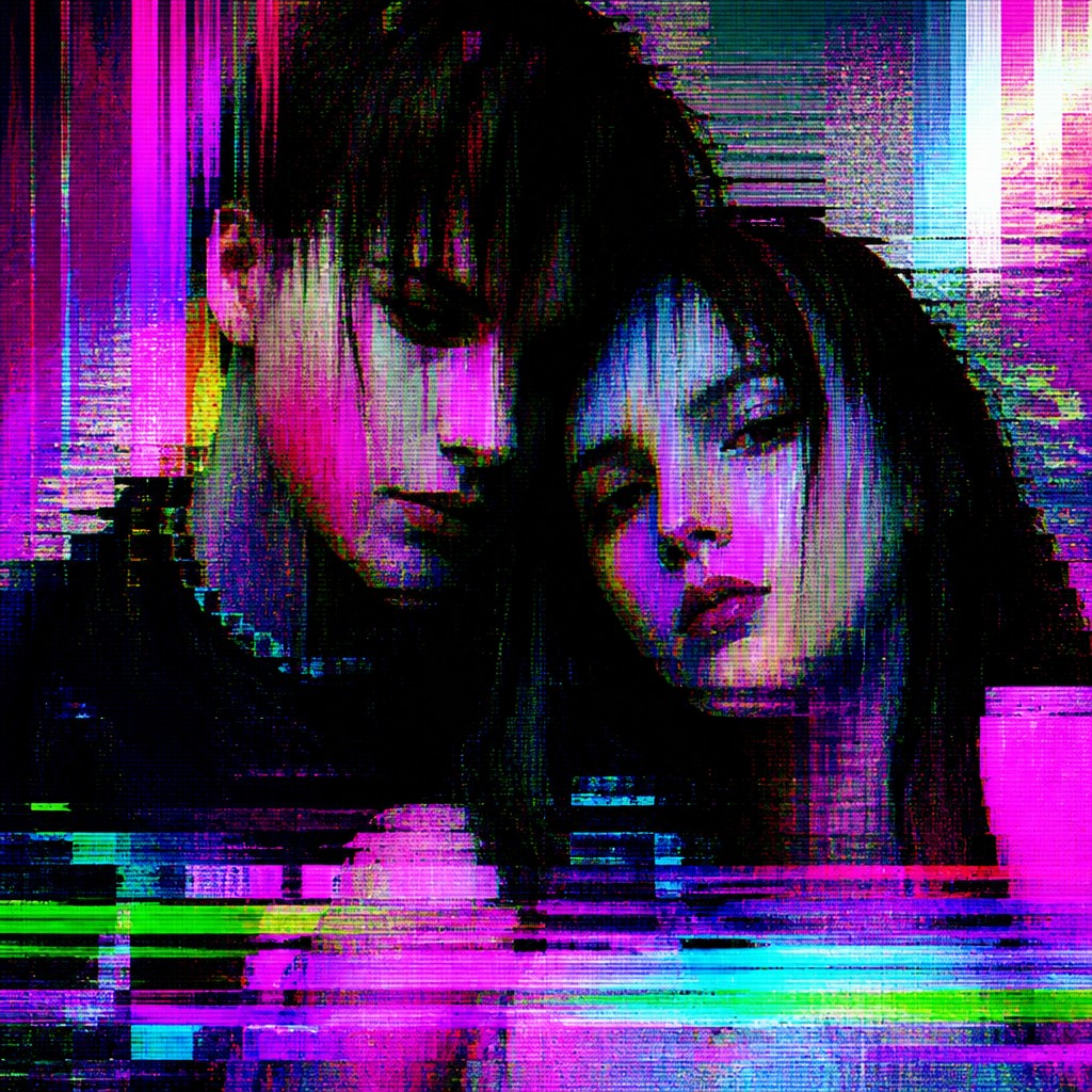
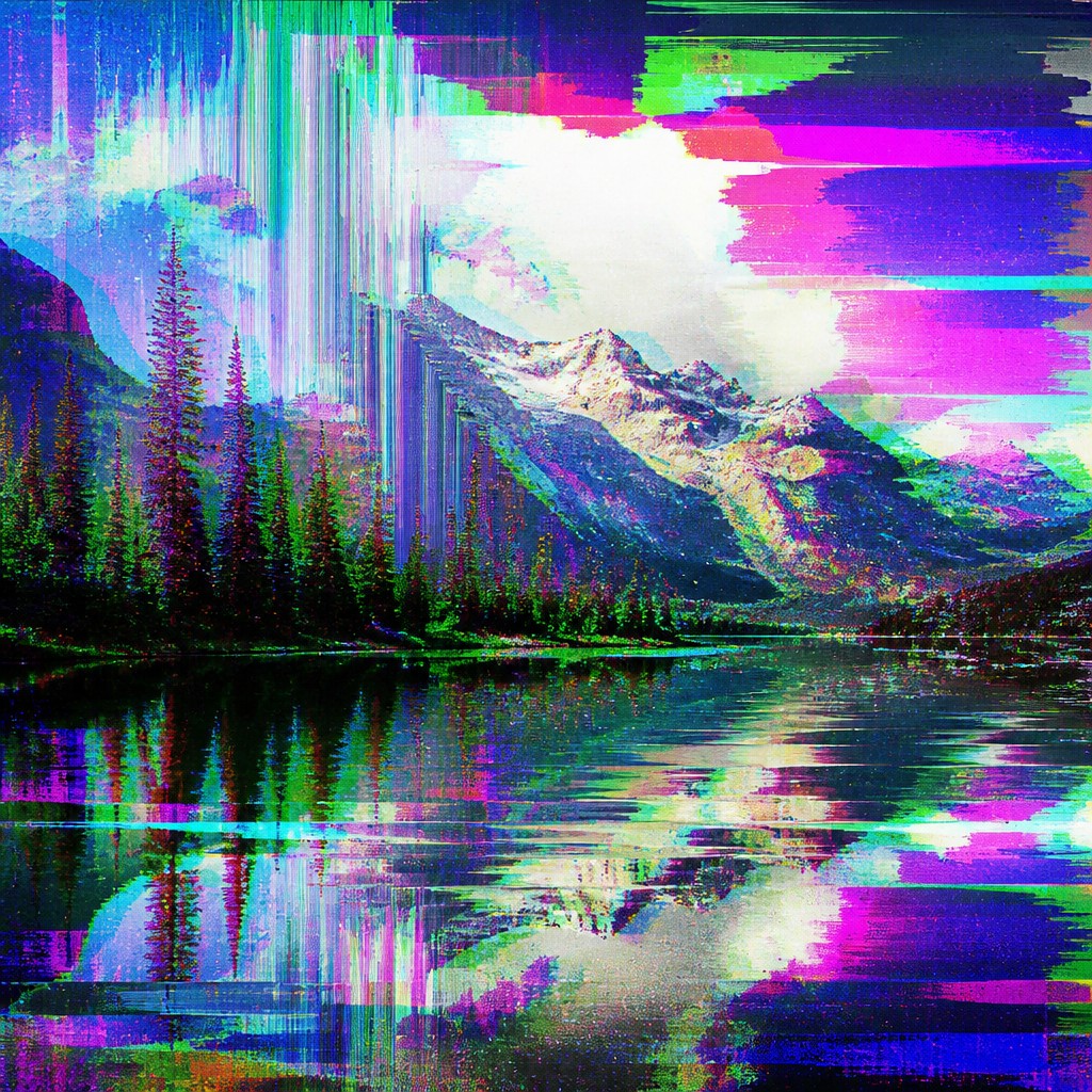
Digital Glitch Abstract Art Style uses digital malfunction as raw material for abstraction. It combines pixel sorting, compression artifacts, RGB shifts, scan lines, and datamoshed distortion to create compositions that feel unstable, fragmented, and visually experimental.
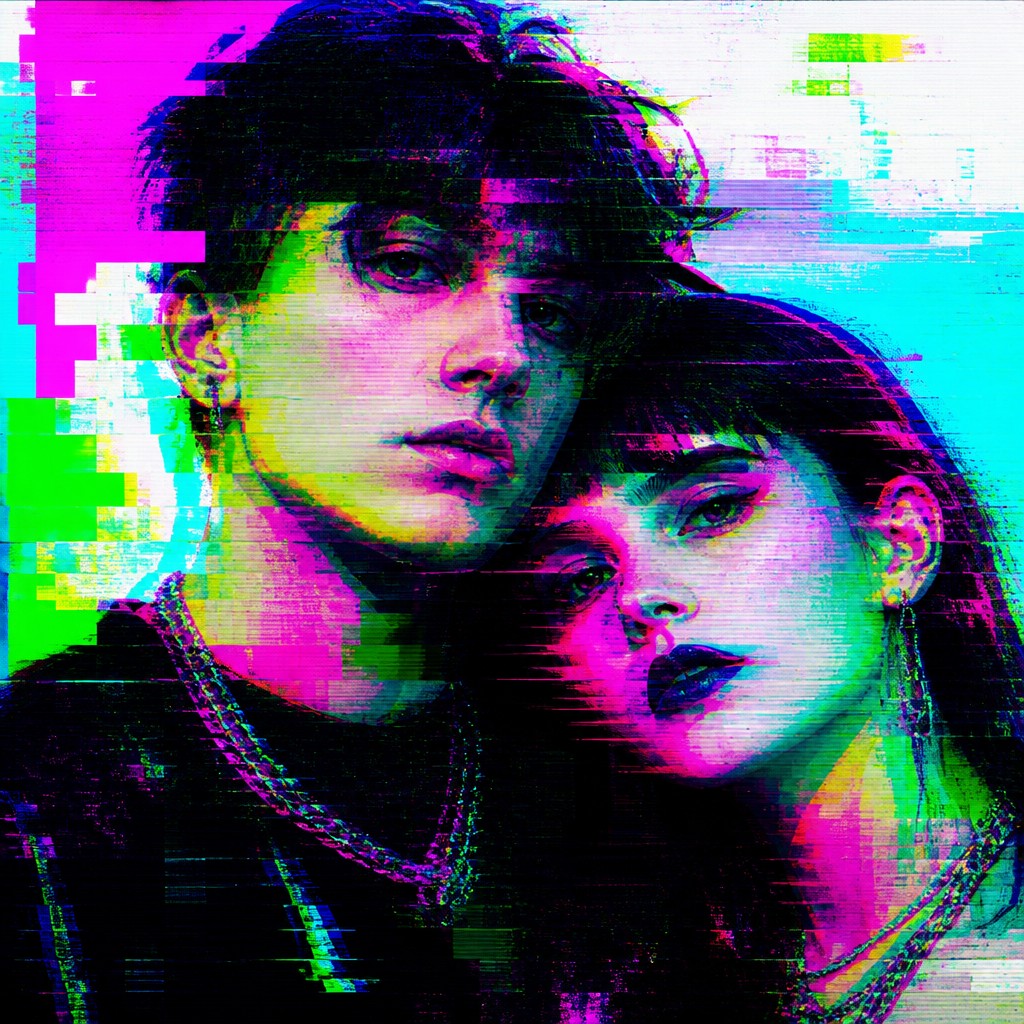
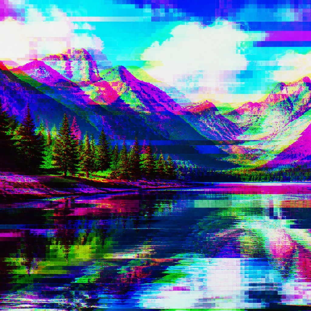
Digital Glitch Modern Art Style also uses digital error effects, but it usually aims for a cleaner, more design-forward result. It turns corruption, tearing, and color shifting into a contemporary visual language. People compare the two because both borrow from digital failure, yet one tends to push harder toward abstract expression while the other leans toward polished modern design.
Same Prompt, Both Styles
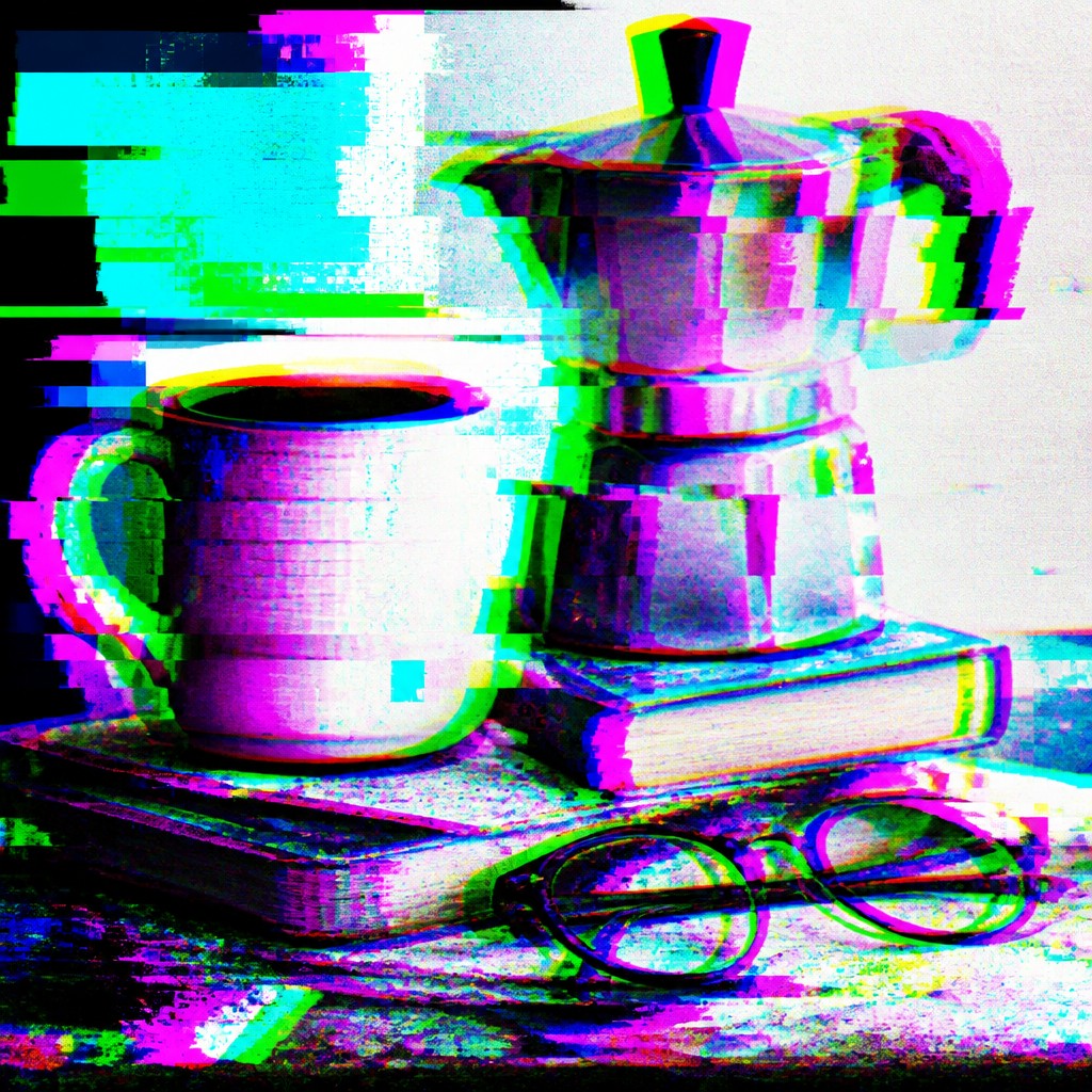
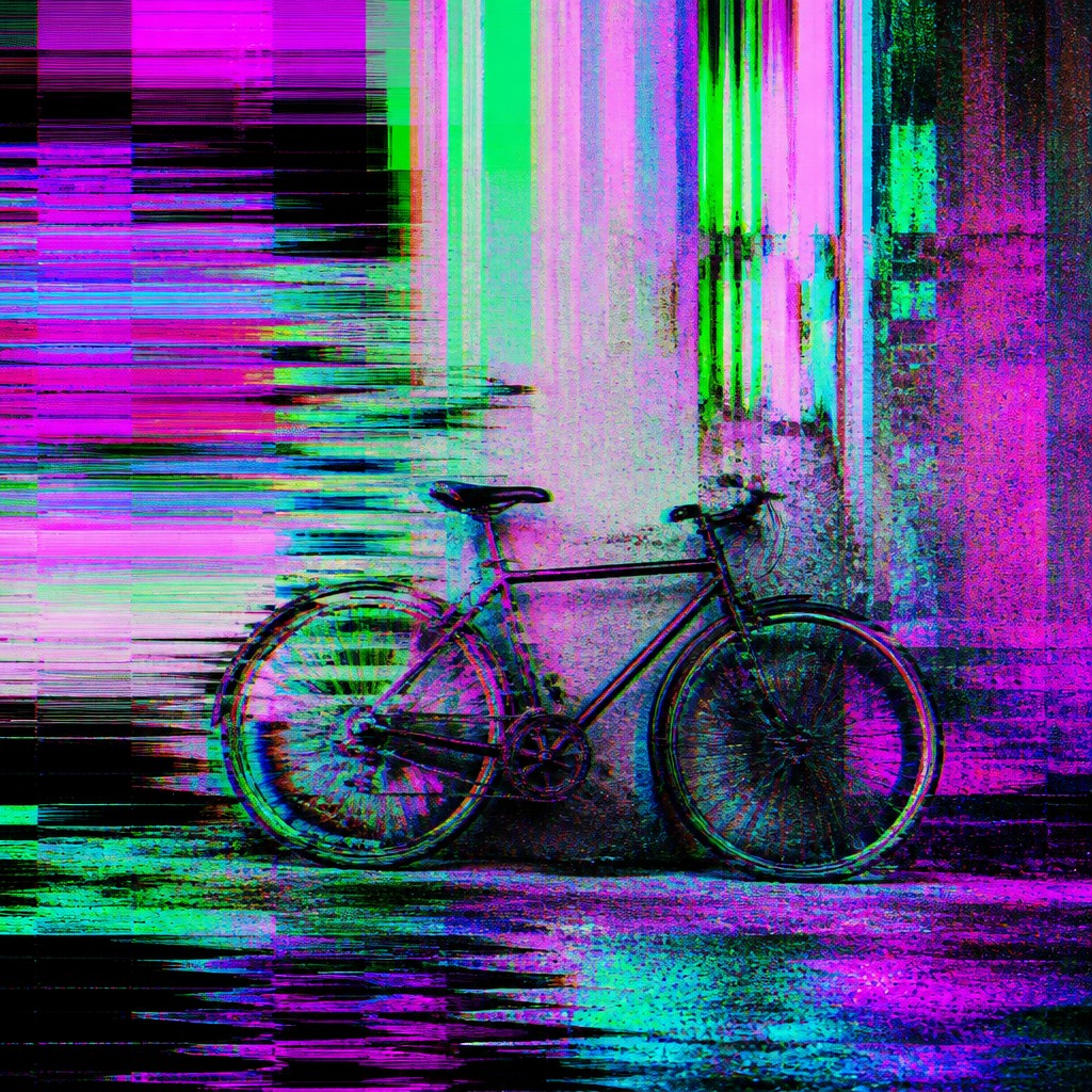
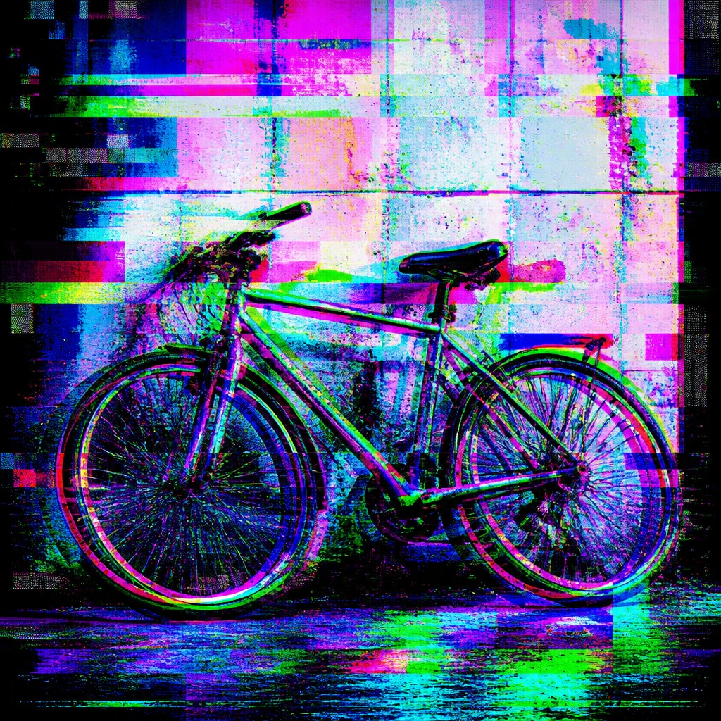
Each pair below was generated from the identical prompt — only the style changed.
“portrait of two people together”
“wide landscape with natural scenery”
“still life with everyday objects”

“bicyle resting against a wall”
Key Differences
| Digital Glitch Abstract | Digital Glitch Modern | |
|---|---|---|
| Overall intent | Pushes glitch effects into experimental abstraction. | Uses glitch effects as a sleek modern design motif. |
| Visual energy | Often chaotic, dense, and intentionally unstable. | Usually controlled, balanced, and more readable. |
| Treatment of errors | Errors become the main subject and structure. | Errors act as accents within a designed composition. |
| Color behavior | Frequently intense RGB splitting and distorted color fields. | Typically cleaner color shifts with restrained contrast. |
| Texture and detail | Heavy artifacting, pixel breakup, and scan noise. | Selective tearing, compression marks, and crisp surfaces. |
| Readability | Less literal, more immersive and abstract. | More legible, often shaped for branding or layout. |
| Mood | chaotic, surreal, futuristic, disrupted | futuristic, disrupted, edgy, experimental, anxious |
| Energy | intense | intense |
| Detail level | detailed | detailed |
| Color | neon-split, high-contrast, corrupted digital hues | electric neons, corrupted RGB, dark neutrals |
| Texture | glitched bands, pixel breakup, compression noise | pixelated, banded, noisy, fragmented |
| Origin | digital-native aesthetic | late-20th-century digital-native aesthetic |
| Best for | album covers, tech posters, motion graphics, game key art, experimental branding | album covers, poster design, motion graphics, tech branding, editorial visuals, game art |
| Difficulty | advanced | advanced |
Which Should You Choose?
Choose Style A if you want a more experimental, confrontational look that feels like the artwork is breaking apart on purpose. Choose Style B if you want a contemporary glitch aesthetic that still feels polished, organized, and easier to use in posters, covers, UI, or branding. In short, pick A for abstraction and intensity, and pick B for modern visual design with glitch accents.
Frequently Asked Questions
Are these two styles basically the same?
They overlap a lot, since both use digital error aesthetics. The main difference is emphasis: Style A pushes glitch into abstract art, while Style B uses glitch as a modern design language.
Which style is more abstract?
Style A is generally more abstract. It treats distortion as the composition itself, while Style B usually preserves more structure and clarity.
Which style works better for branding or posters?
Style B usually works better for branding and posters because it is easier to read and control. Style A can work too, but it is more disruptive and less immediately legible.
Do both styles use the same glitch effects?
Yes, they often share the same ingredients: pixel corruption, RGB shifts, scan tearing, and compression artifacts. The difference is how heavily those effects are applied and how much structure remains.