Digital Geometric vs Isometric Geometric: What's the Difference?
Digital Geometric Art is computer-made artwork built from clean polygons, crisp facets, gradient meshes, neon color, wireframes, and highly polished surfaces. It often feels futuristic, luminous, and technically precise, with forms that can look abstract, architectural, or interface-like.
Isometric Geometric Art uses parallel-axis 3D forms to create a structured sense of depth without perspective vanishing points. It relies on crisp edges, flat color planes, and carefully stacked geometry, which can produce orderly scenes and convincing spatial illusions. People compare the two because both use geometry, sharp edges, and controlled composition, yet they create depth and visual energy in very different ways.
Same Prompt, Both Styles
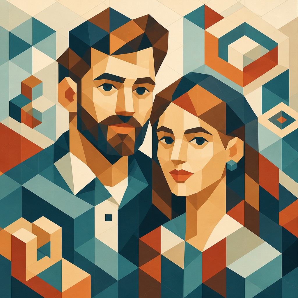
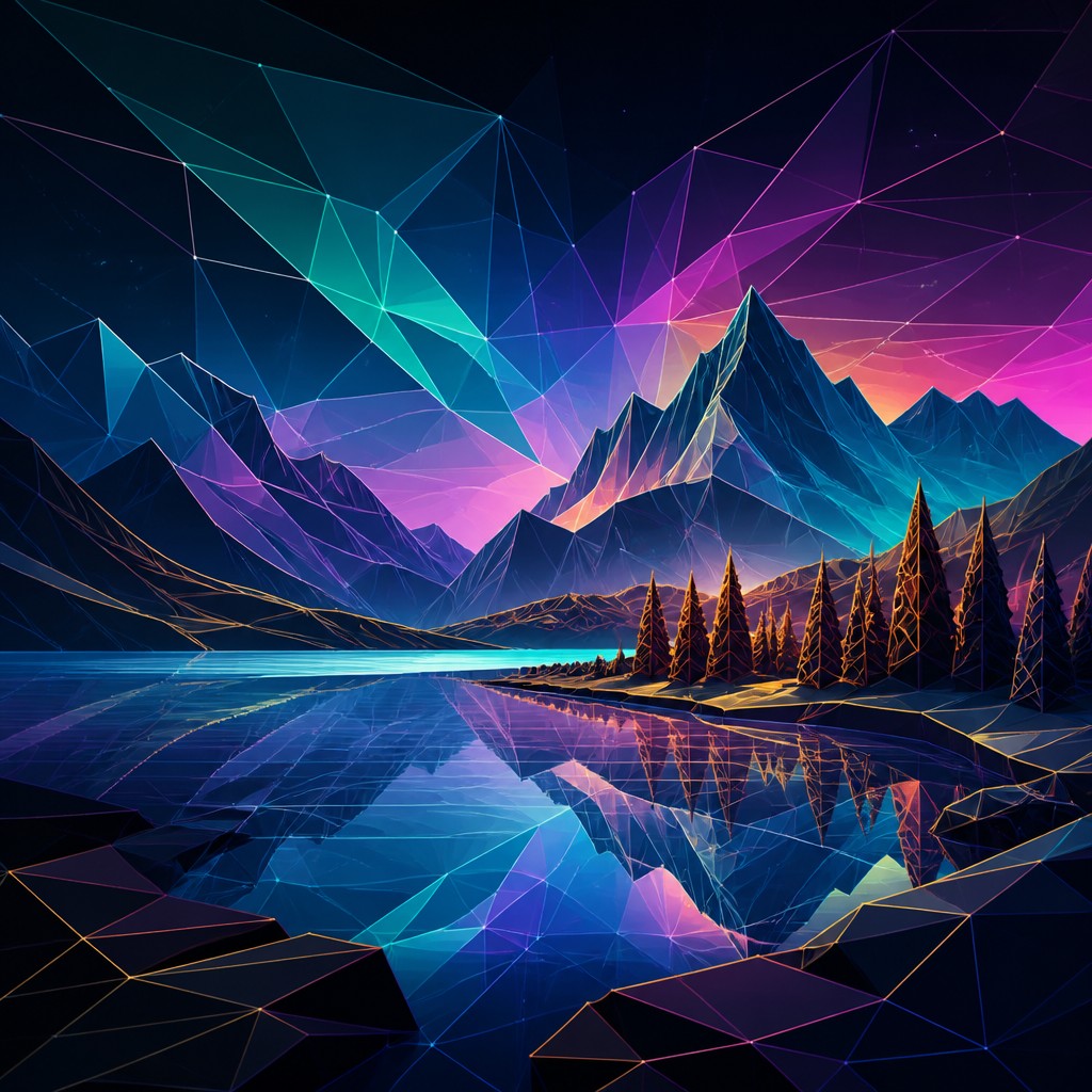
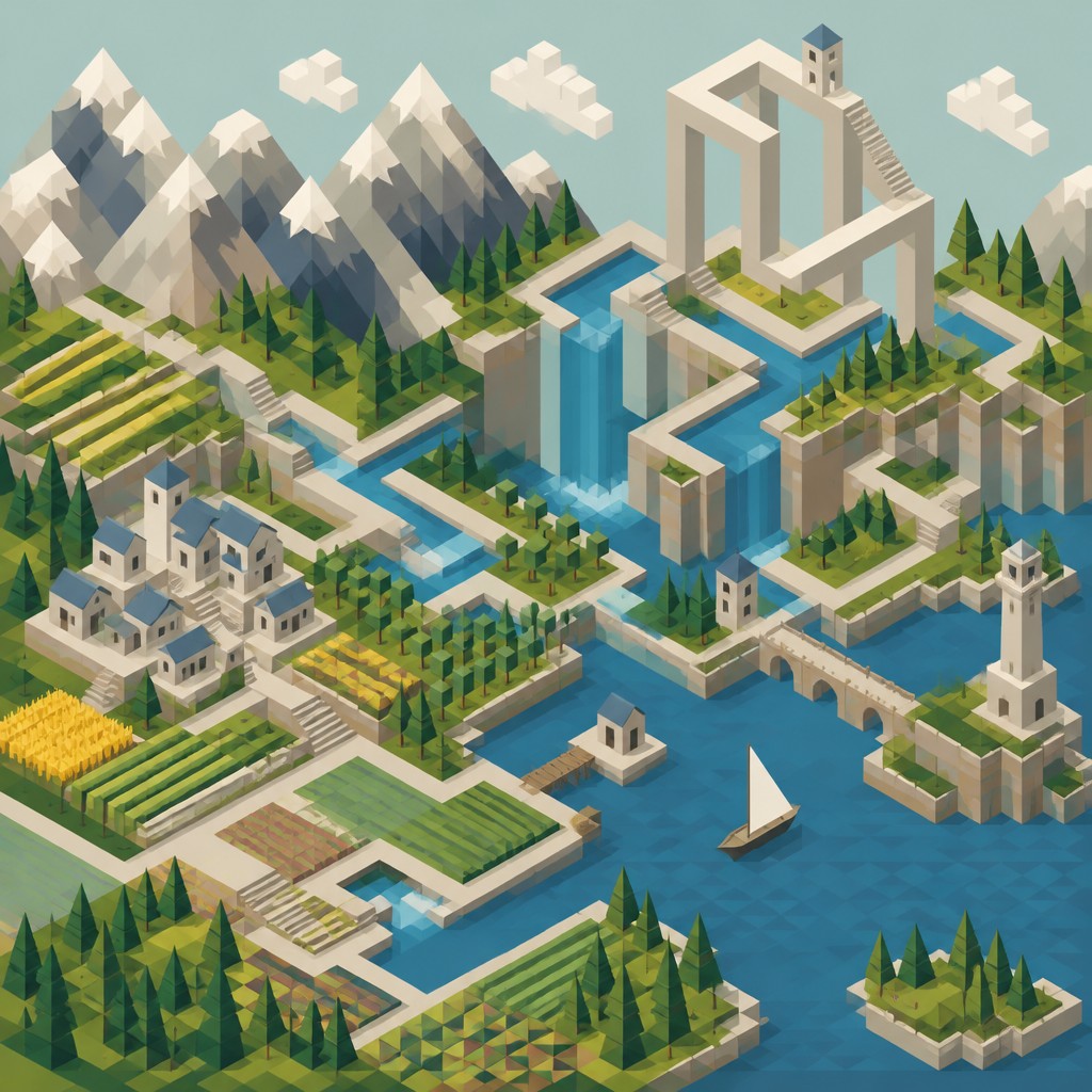
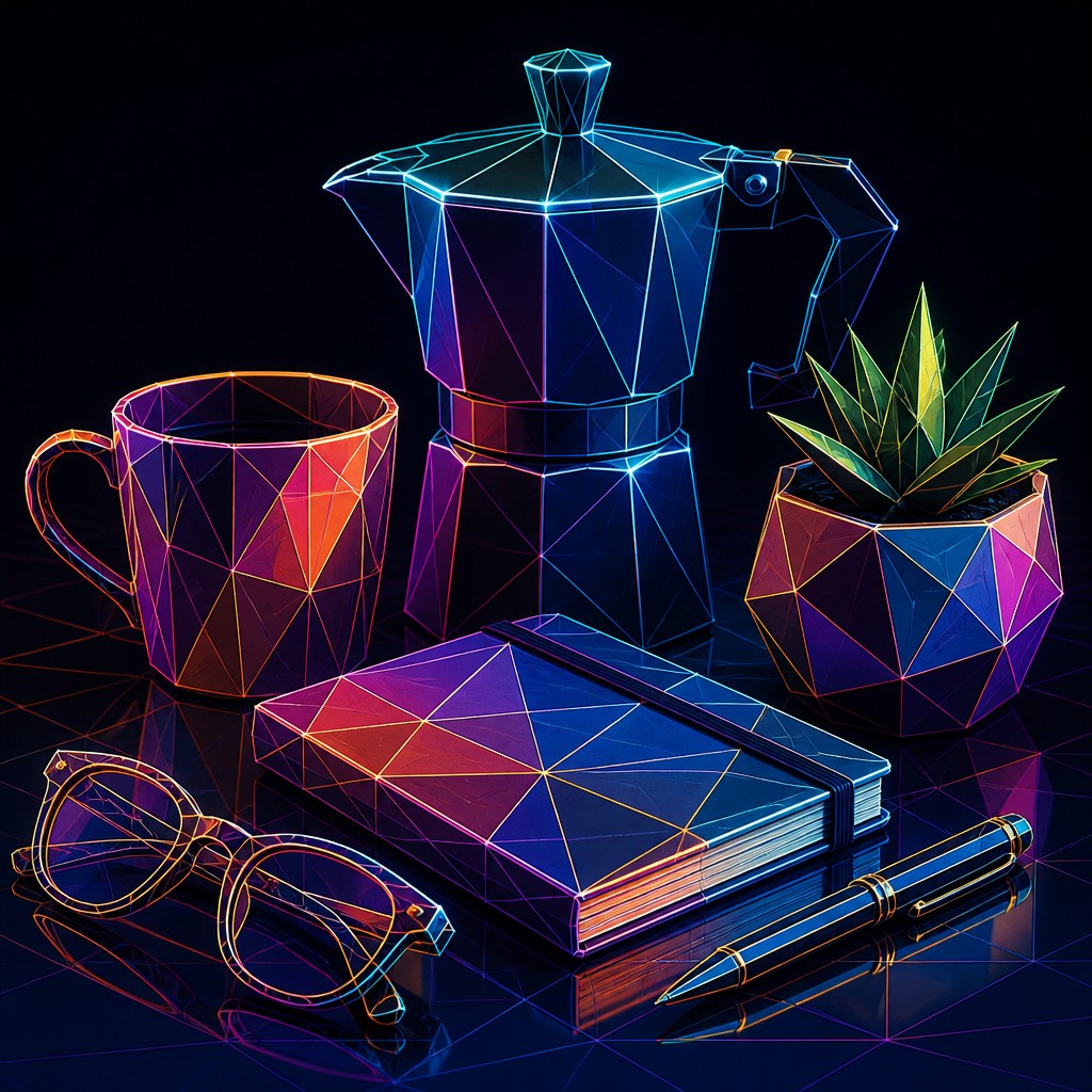
Each pair below was generated from the identical prompt — only the style changed.
“portrait of two people together”

“wide landscape with natural scenery”
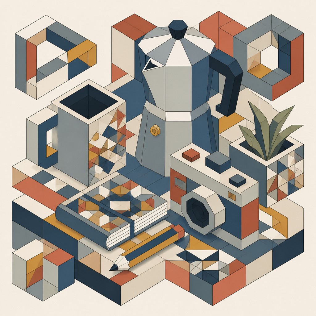
“still life with everyday objects”
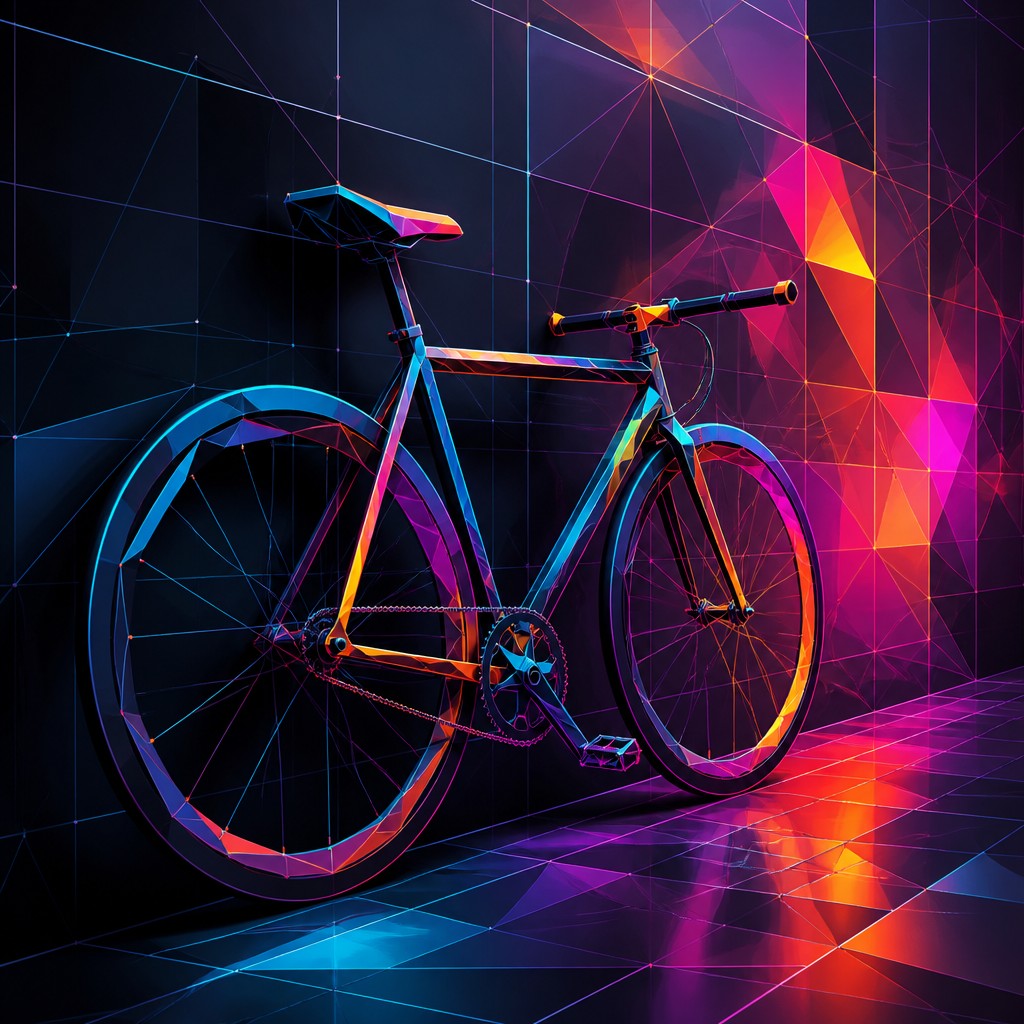
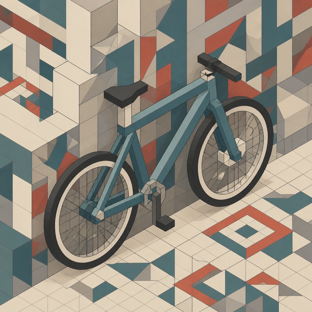
“bicyle resting against a wall”
Key Differences
| Digital Geometric | Isometric Geometric | |
|---|---|---|
| Depth treatment | Uses shading, gradients, and mesh transitions to suggest volume. | Uses isometric projection to show depth through aligned 3D angles. |
| Surface style | Often glossy, luminous, and highly rendered. | Usually flat, solid, and plane-based. |
| Line & form | May include wireframes, polygonal cuts, and layered mesh structures. | Relies on consistent edges and repeatable geometric units. |
| Color treatment | Commonly uses neon accents, glows, and smooth color blends. | Often uses simpler palettes with strong separation between planes. |
| Spatial illusion | Can feel abstract or engineered without a fixed viewing system. | Creates orderly, impossible-looking spaces through parallel projection. |
| Overall mood | Futuristic, sleek, and high-tech. | Structured, diagrammatic, and spatially playful. |
| Mood | precise, modern, clean, futuristic | precise, technical, playful, clean |
| Energy | balanced | balanced |
| Detail level | intricate | detailed |
| Color | bright gradients, clean contrasts, controlled palettes | bright, clean, often pastel or neon accents |
| Texture | smooth, crisp, non-textural surfaces | smooth flat surfaces, crisp edges |
| Origin | digital-native aesthetic | digital-native aesthetic |
| Best for | posters, album covers, UI backgrounds, branding, editorial graphics, wall art | posters, infographics, UI graphics, album covers, book covers, branding |
| Difficulty | advanced | advanced |
Which Should You Choose?
Pick Digital Geometric Art when you want a polished, futuristic look with glow, depth effects, and visual complexity that feels advanced or digital-first. Pick Isometric Geometric Art when you want clear structure, readable spatial arrangements, and a more diagram-like or architectural style that still feels dimensional. If your message depends on dramatic lighting and surface rendering, choose A; if it depends on organized space and visual clarity, choose B.
Frequently Asked Questions
Are these styles the same thing?
No. Both use geometry, but Digital Geometric Art focuses on computer-rendered surfaces and effects, while Isometric Geometric Art uses a specific parallel-axis way of showing depth.
Which style is better for infographics or UI visuals?
Isometric Geometric Art is usually better when you need clarity and structured spatial relationships. Digital Geometric Art works better if you want a more futuristic, decorative presentation.
Can both styles look 3D?
Yes, but they achieve it differently. Digital Geometric Art often uses lighting, shading, and gradients, while Isometric Geometric Art uses projection and consistent angular geometry.
Which style is easier to keep readable at small sizes?
Isometric Geometric Art is often easier to read because its flat planes and consistent angles stay clearer when scaled down. Digital Geometric Art can lose clarity if gradients, glows, or wireframes become too detailed.