De Stijl vs Bauhaus: What's the Difference?
De Stijl and Bauhaus are both early modernist art-and-design styles built from geometry, primary colors, and a belief that visual order can express a modern way of life. De Stijl reduces composition to vertical and horizontal structure, flat planes, and a strict palette, aiming for near-total abstraction. Bauhaus also uses geometric simplification and primary colors, but it is more closely tied to practical design, everyday objects, and the unity of art, craft, and industry.
People compare them because they overlap in visual language and were both shaped by the same modernist era. However, they differ in emphasis: De Stijl is more theoretical and reductionist, while Bauhaus is more functional and applied. Looking at them side by side helps clarify how two movements can share similar forms but pursue different goals.
Same Prompt, Both Styles
Each pair below was generated from the identical prompt — only the style changed.
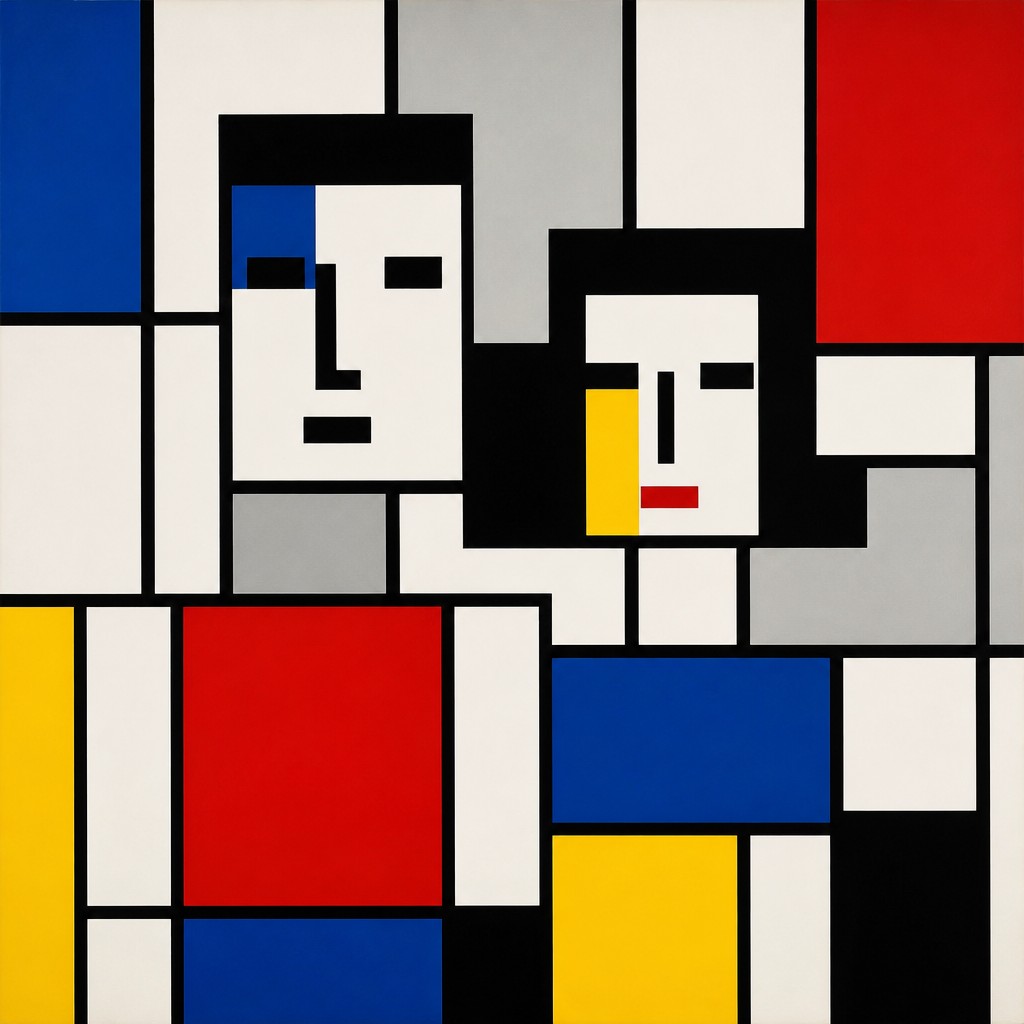
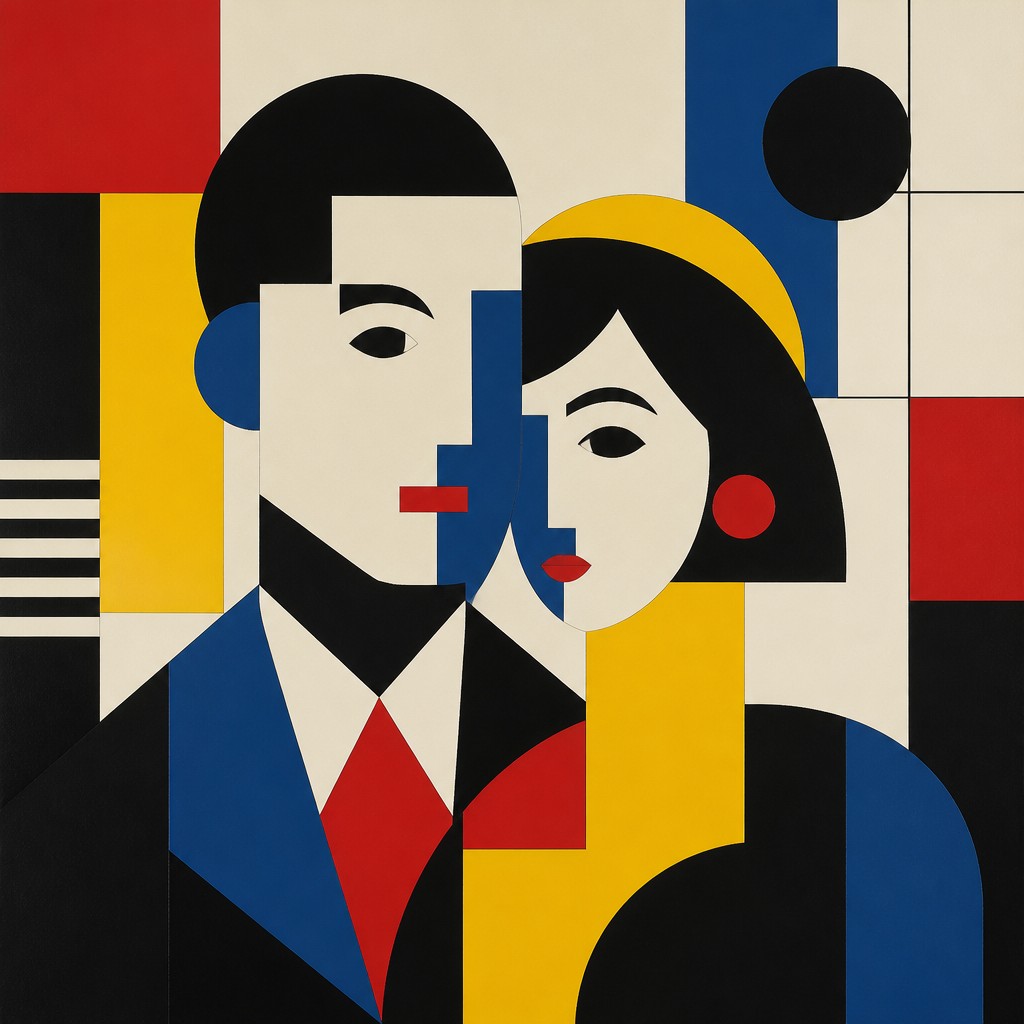
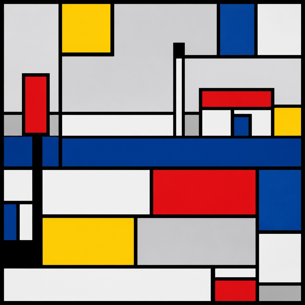
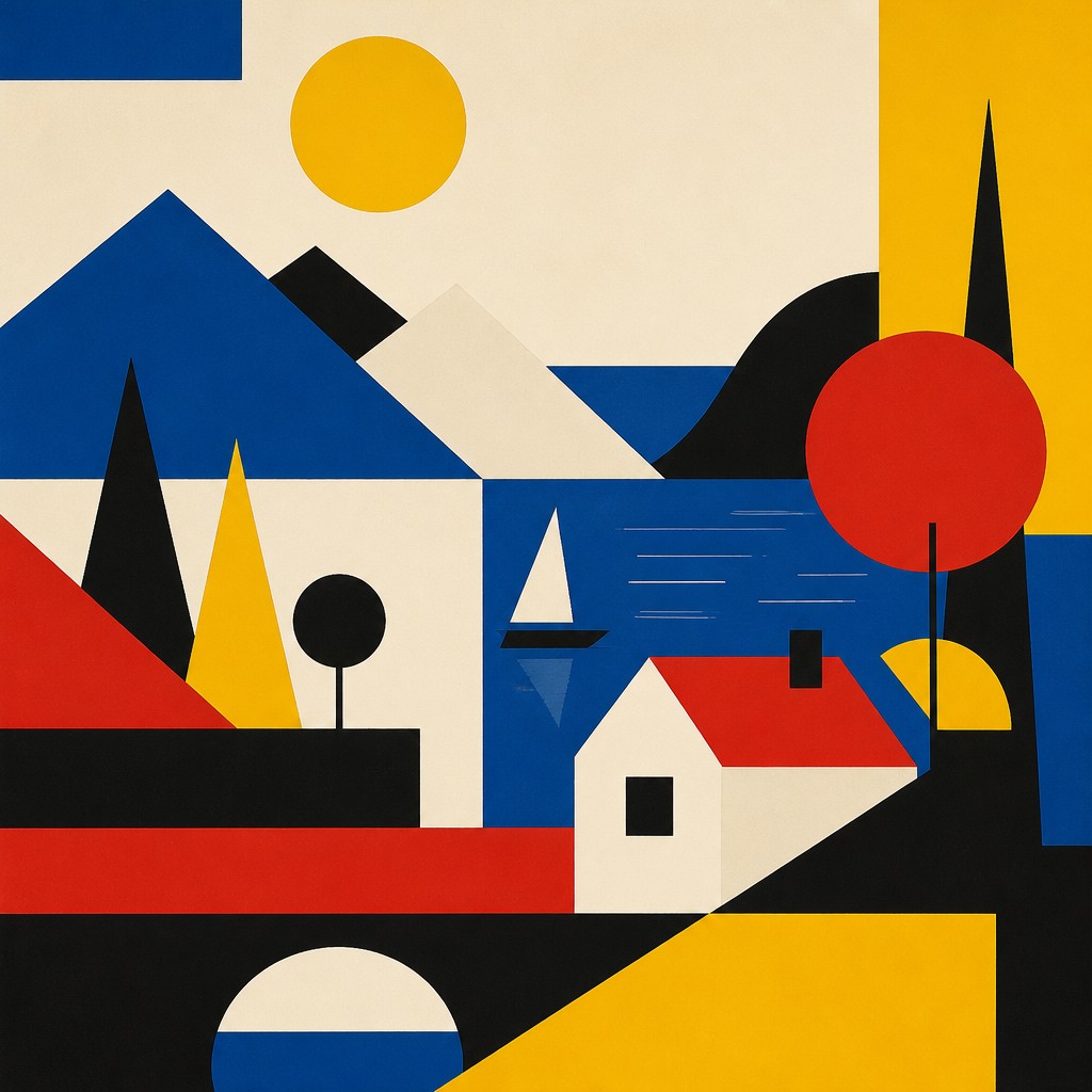
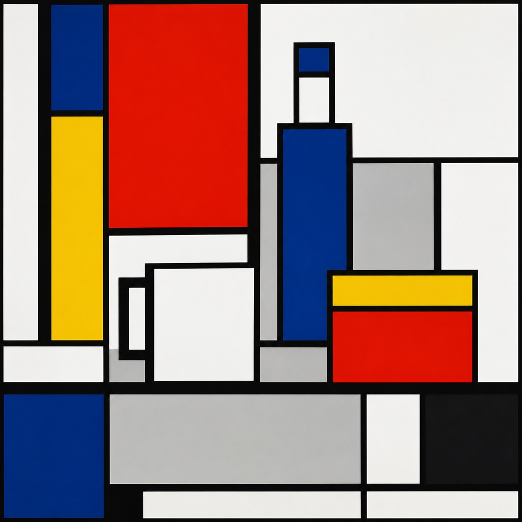
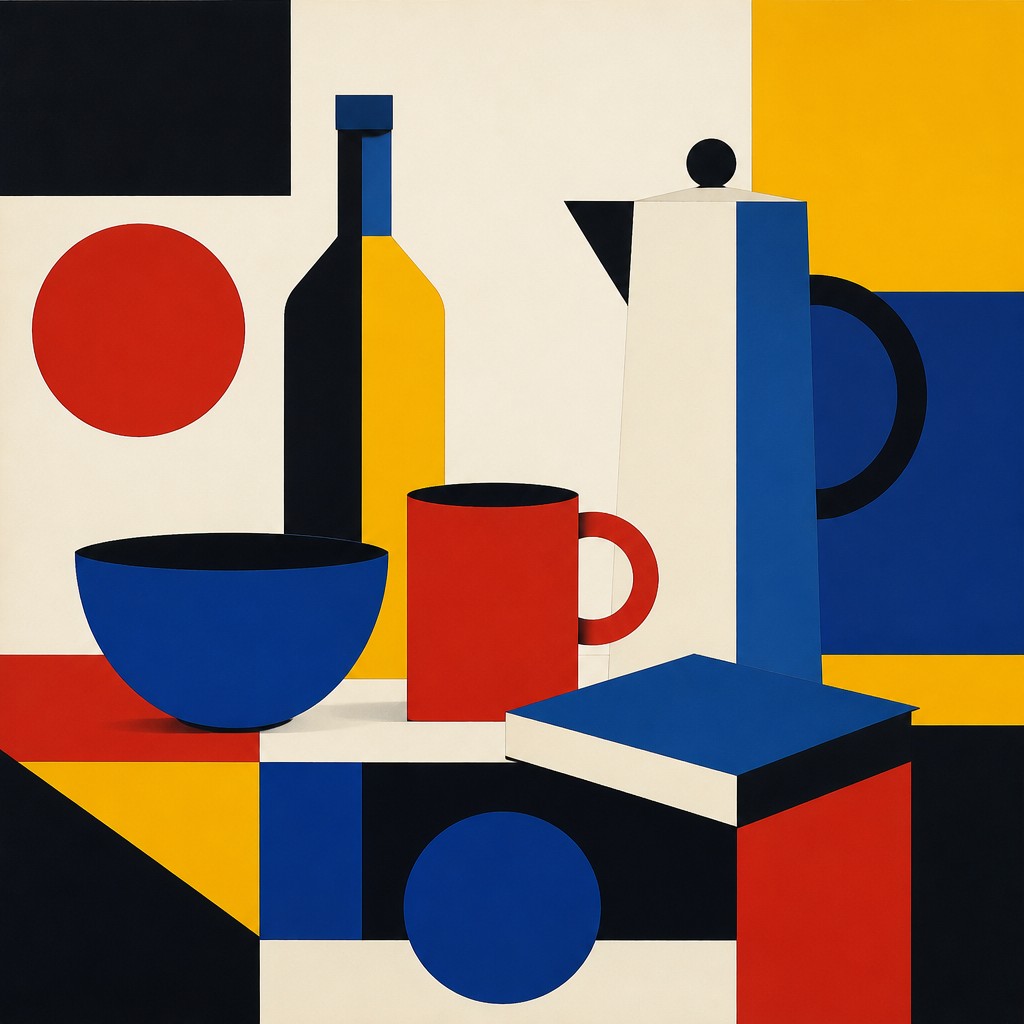
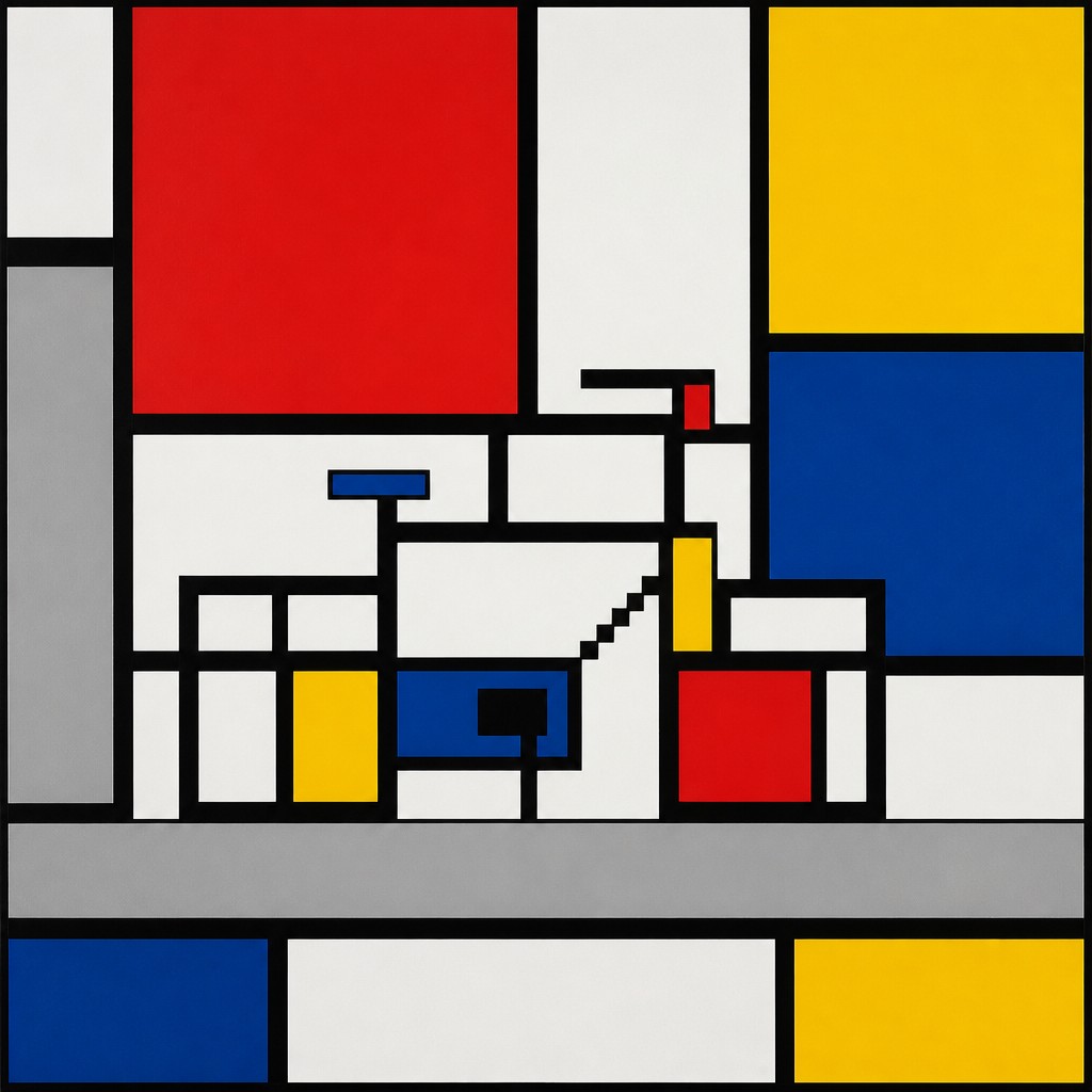
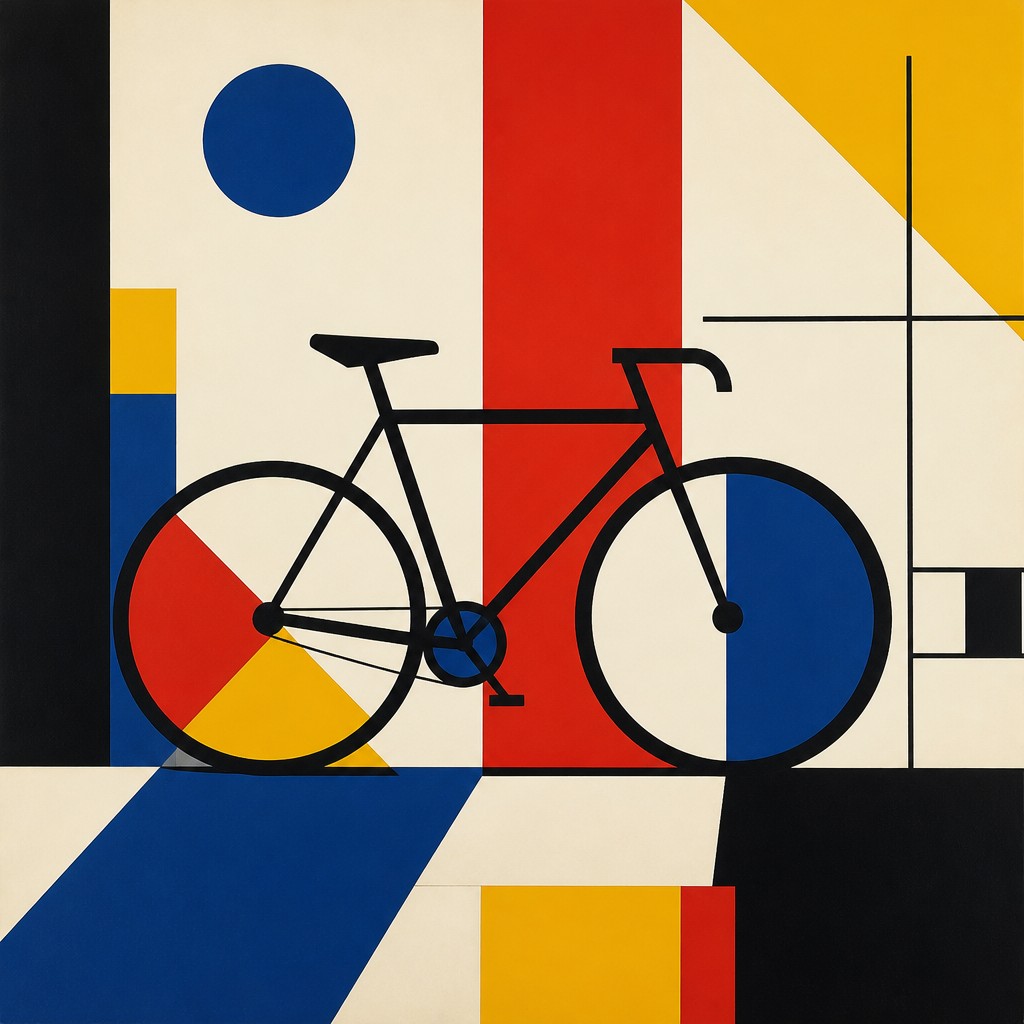
Key Differences
| De Stijl | Bauhaus | |
|---|---|---|
| Core purpose | Pure visual order and abstraction. | Design that unites beauty with function. |
| Line & form | Strict vertical and horizontal geometry. | Geometric forms with more design flexibility. |
| Color use | Primary colors plus black, white, and gray. | Primary colors, often balanced with neutrals. |
| Attitude toward space | Flat, open, highly simplified composition. | Clear structure suited to practical layouts. |
| Relationship to function | Mostly nonfunctional and painterly in intent. | Strongly connected to usable objects and architecture. |
| Overall feel | Rigid, calm, and highly ordered. | Clean, modern, and more adaptable. |
| Mood | orderly, restrained, harmonious, geometric | structured, rational, modern, clean |
| Energy | calm | balanced |
| Detail level | minimal | minimal |
| Color | primary colors with black, white, gray | primary colors with black and off-white |
| Texture | flat, crisp, clean-edged | flat, smooth, industrial surfaces |
| Origin | 1910s Netherlands modernist abstraction | 1920s Germany, early modernist design school |
| Best for | posters, logos, editorial layouts, book covers, wall art | posters, logos, furniture design, architecture diagrams, album covers |
| Difficulty | moderate | moderate |
Which Should You Choose?
Pick De Stijl if you want a look that feels строго reduced, mathematical, and purely abstract, with strong grid-like balance and minimal visual elements. Pick Bauhaus if you want the same modern geometric clarity but with a more functional, versatile feel that works well in posters, interiors, furniture, or branding.
Frequently Asked Questions
Are De Stijl and Bauhaus the same style?
No. They share modern geometric forms and primary colors, but De Stijl is more focused on pure abstraction and visual harmony. Bauhaus is broader and more connected to practical design and everyday use.
Which style is more minimal?
De Stijl is usually more minimal because it limits itself to strict vertical and horizontal structure and a very restrained palette. Bauhaus can also be minimal, but it often allows more variation to support function.
Which style is better for interior design?
Bauhaus is usually better for interior design because it was built around functional spaces and usable objects. De Stijl can work well as an interior influence, but it is more often read as an abstract visual system.
Why do both styles use primary colors?
Primary colors were seen as clear, universal, and modern, making them useful for creating strong visual order. In both styles, color is used deliberately and sparingly rather than decoratively.