Constructivism vs Bauhaus: What's the Difference?
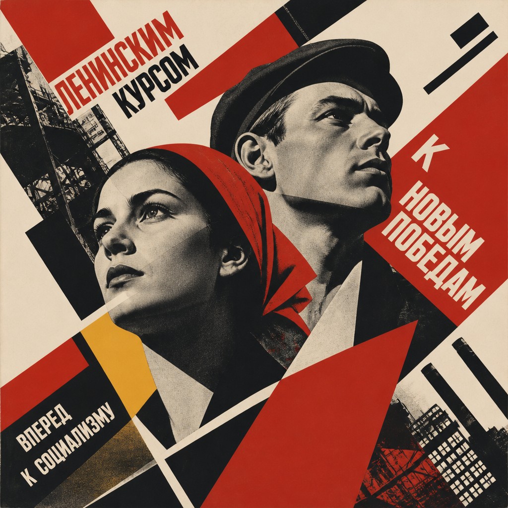
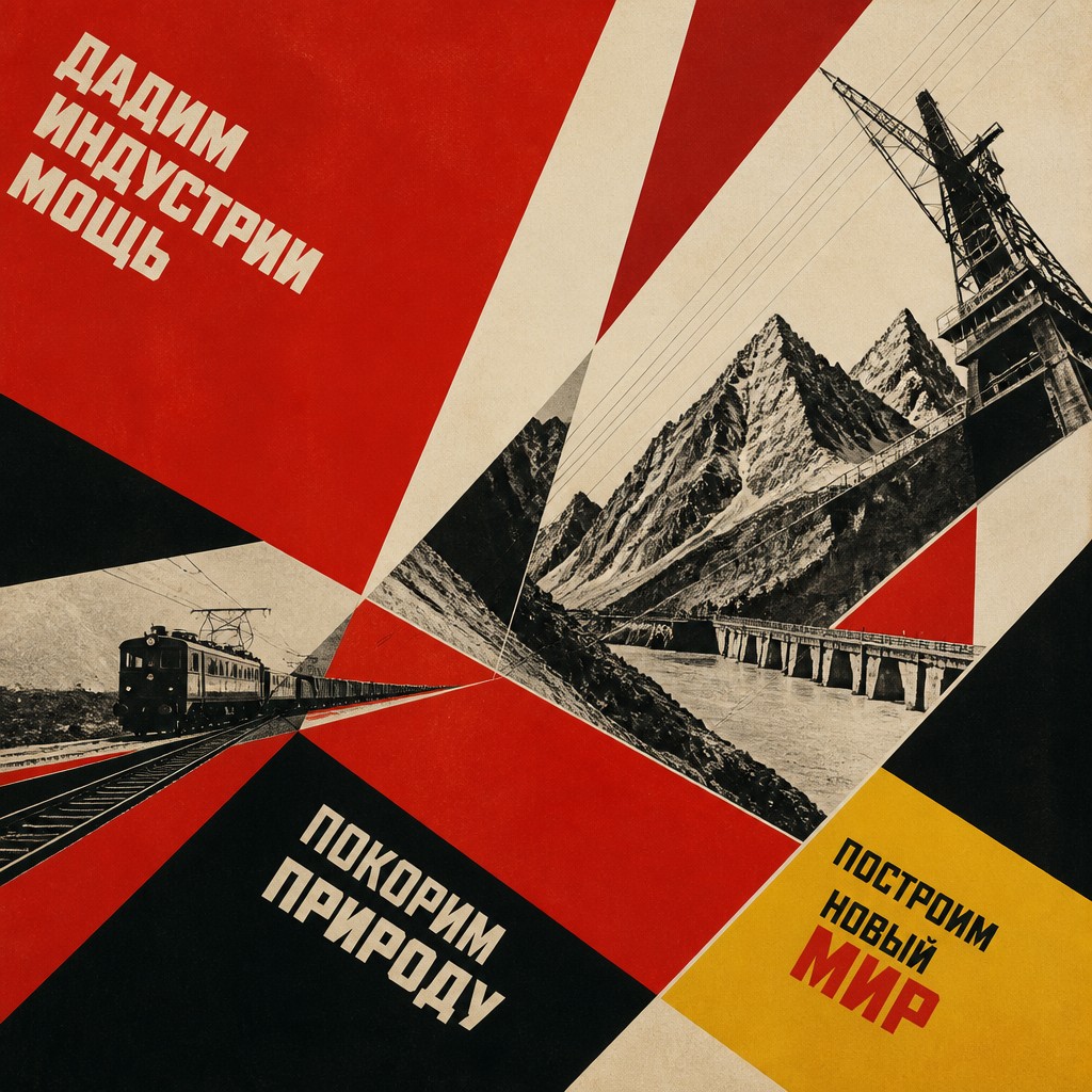
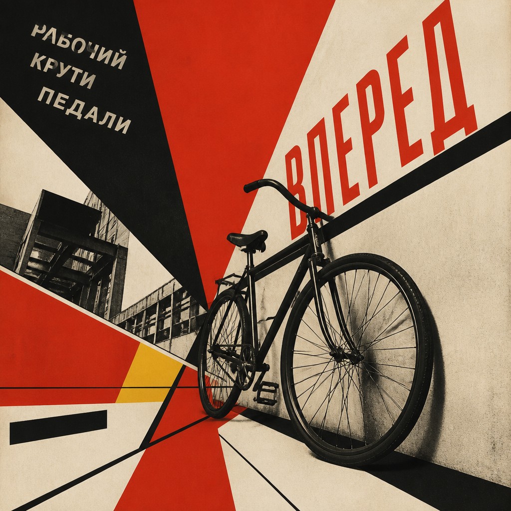
Constructivism is a graphic, politically charged style built from sharp diagonals, bold shapes, and a limited palette of red, black, and off-white. It often feels industrial and assertive, using composition to suggest movement, urgency, and practical purpose.
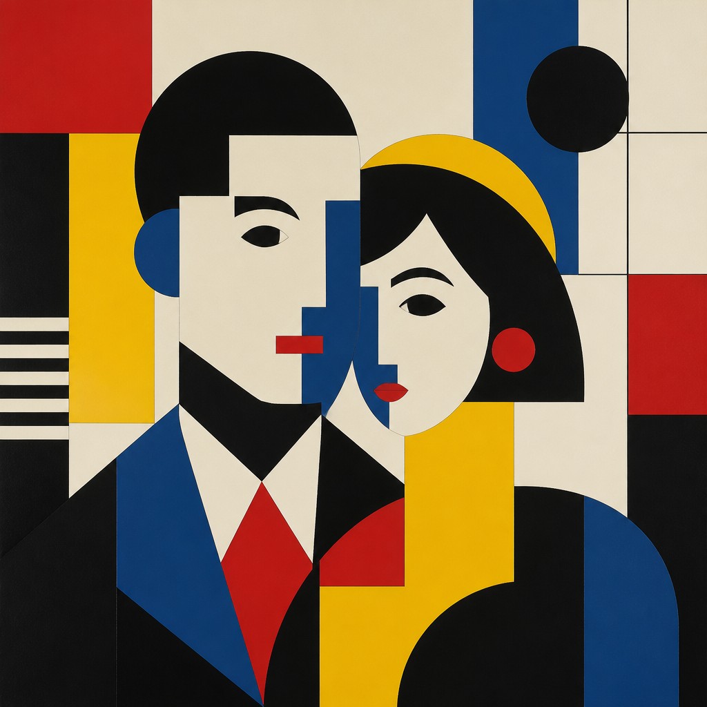
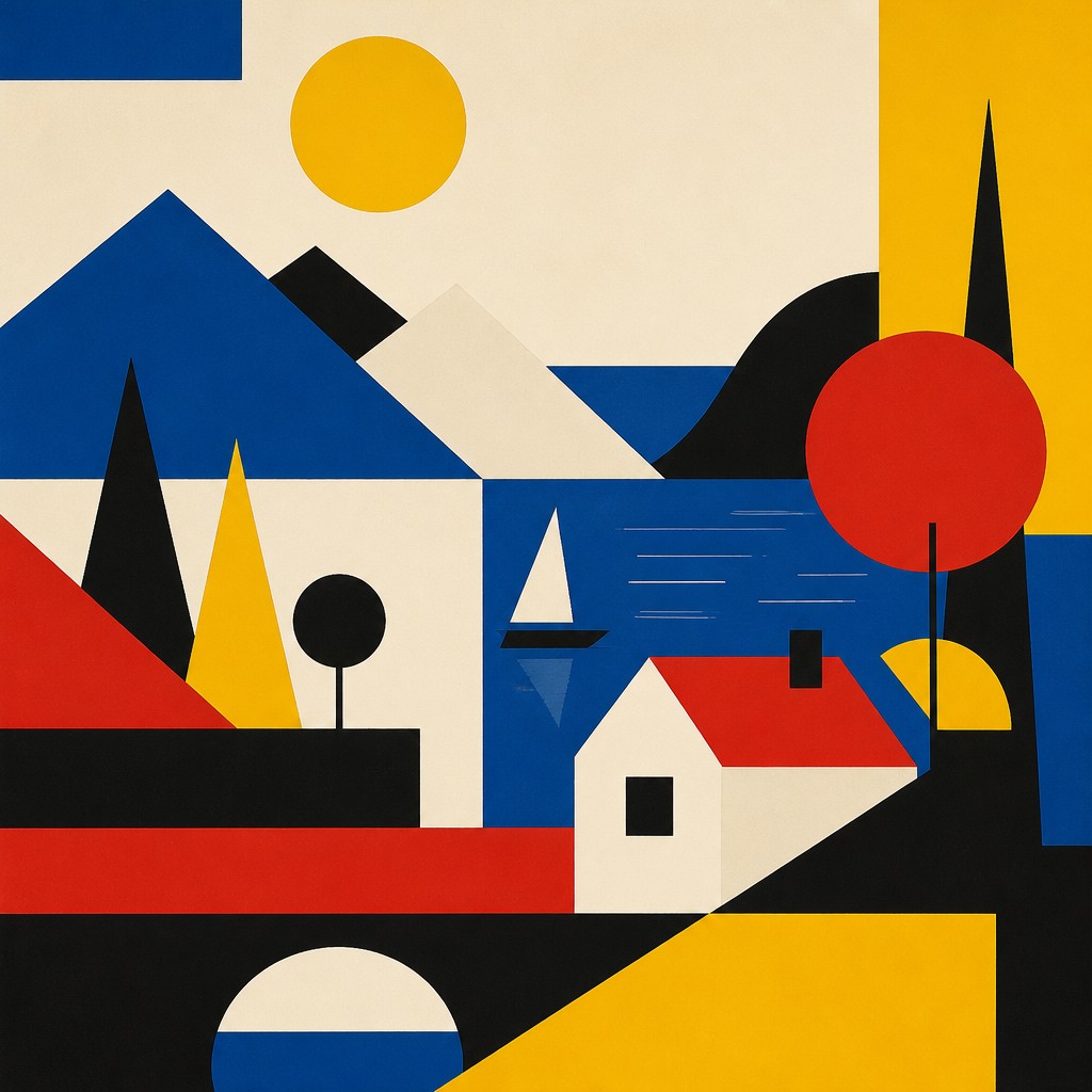
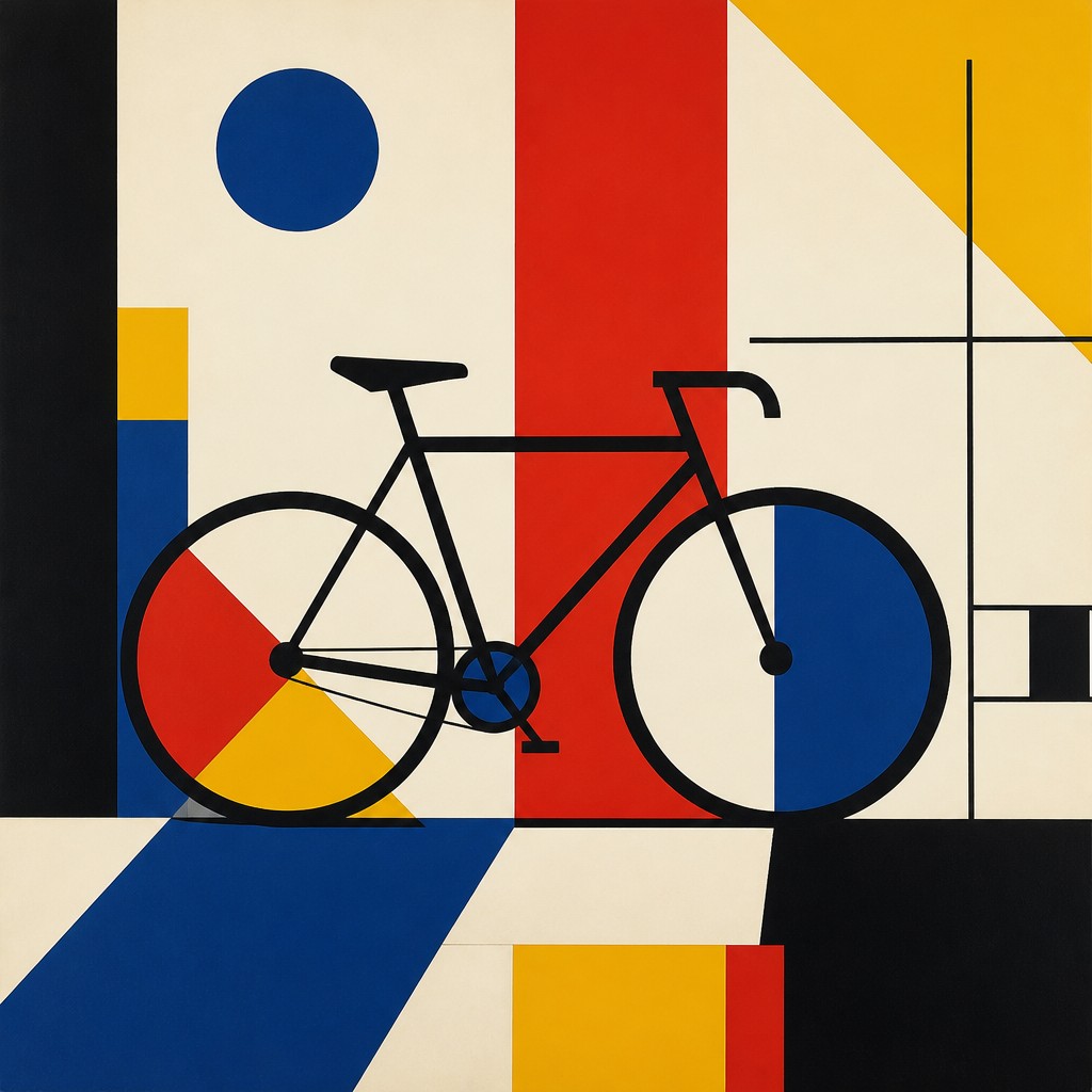
Bauhaus is a modernist design approach that favors geometric abstraction, clean lines, and functional clarity, often with primary colors and balanced spacing. People compare the two because both use simple forms and modern materials, yet one feels more revolutionary and propagandistic while the other emphasizes design discipline and everyday usability.
Same Prompt, Both Styles
Each pair below was generated from the identical prompt — only the style changed.
“portrait of two people together”
“wide landscape with natural scenery”
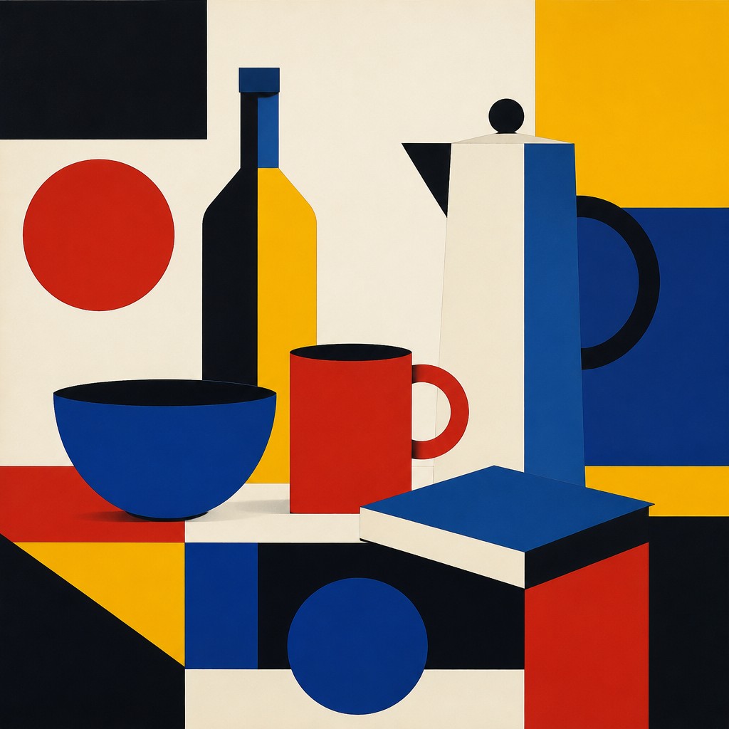
“still life with everyday objects”

“bicyle resting against a wall”
Key Differences
| Constructivism | Bauhaus | |
|---|---|---|
| Purpose | Communicates revolutionary energy and public messaging. | Prioritizes functional design and visual clarity. |
| Color palette | Mostly red, black, white, and muted industrial tones. | Often uses primary colors with neutrals and open space. |
| Line & form | Diagonal, forceful, and dynamic geometric compositions. | Clean, balanced, and more restrained geometric forms. |
| Visual tone | Bold, confrontational, and propaganda-like. | Orderly, rational, and quietly modern. |
| Composition | Asymmetrical layouts with strong directional movement. | Structured layouts with emphasis on harmony and legibility. |
| Material feeling | Suggests machinery, industry, and mass communication. | Suggests craftsmanship, design systems, and everyday objects. |
| Mood | bold, urgent, industrial, optimistic, propagandistic | structured, rational, modern, clean |
| Energy | intense | balanced |
| Detail level | moderate | minimal |
| Color | limited reds, blacks, whites, neutrals | primary colors with black and off-white |
| Texture | flat, hard-edged, utilitarian, poster-like | flat, smooth, industrial surfaces |
| Origin | early 20th-century Russia/Soviet Union | 1920s Germany, early modernist design school |
| Best for | political posters, editorial graphics, album covers, stage design, wayfinding systems, architectural graphics | posters, logos, furniture design, architecture diagrams, album covers |
| Difficulty | moderate | moderate |
Which Should You Choose?
Choose Constructivism if you want a poster, cover, or graphic that feels urgent, political, energetic, and visually confrontational. Choose Bauhaus if you want something that feels modern, orderly, versatile, and design-driven, especially for branding, interiors, layouts, or products where clarity matters more than intensity.
Frequently Asked Questions
Are Constructivism and Bauhaus the same thing?
No. They share modern geometric design, but Constructivism is more overtly political and dynamic, while Bauhaus is more focused on functional, unified design. They overlap visually, but their goals are different.
Which style uses stronger diagonal movement?
Constructivism usually uses stronger diagonals and more dramatic movement. Bauhaus tends to favor cleaner alignment and more stable composition.
Which style is better for logos or branding?
Bauhaus is often better for logos and branding because it is clear, balanced, and adaptable. Constructivism can work too, but it usually feels more aggressive and editorial.
Can I combine elements of both styles?
Yes, but the result should be intentional. Use Bauhaus for structure and legibility, then add Constructivist contrast or diagonal energy if you want more impact.