Comic Book Pop vs Superhero Comic: What's the Difference?
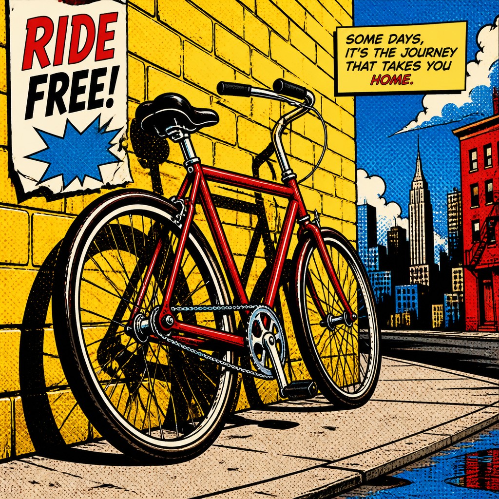
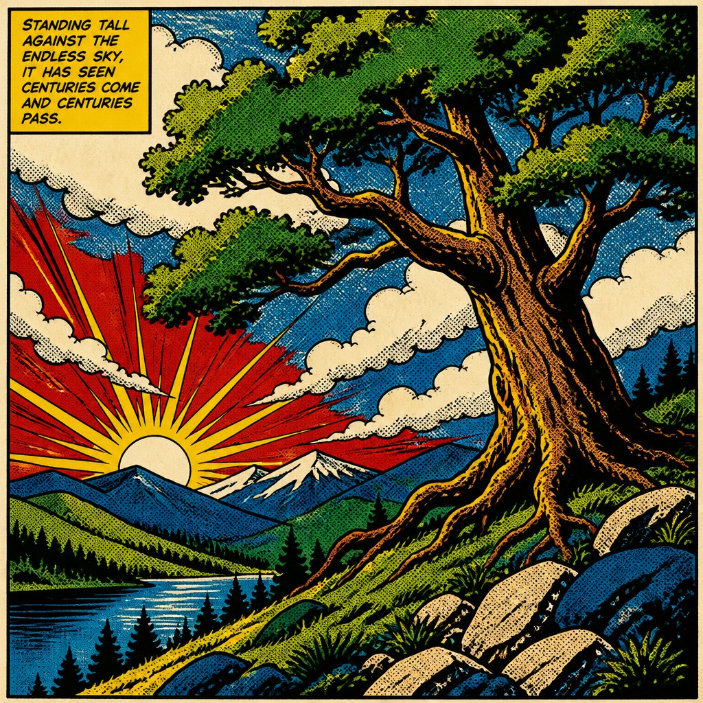
Comic Book Pop Art Style turns comic language into a graphic design language: thick black outlines, flattened shapes, Ben Day dots, and bright primary colors. It feels bold, playful, and poster-like, often emphasizing surface pattern, contrast, and visual punch over realism.
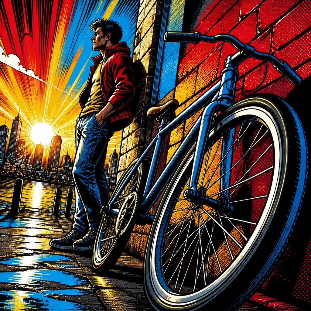
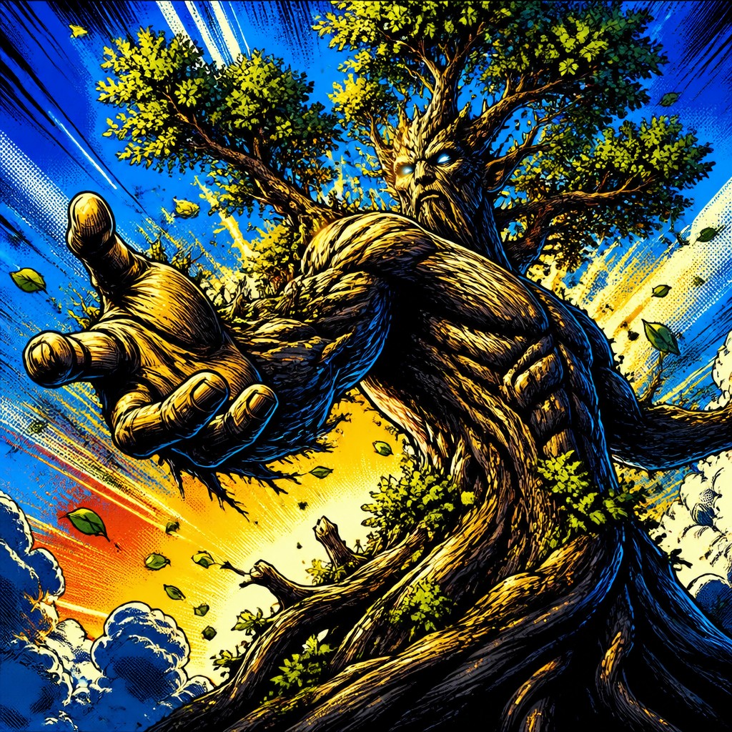
Superhero Comic Art uses the tools of comics to create action-driven scenes with energetic inking, heroic anatomy, dramatic foreshortening, and vivid color. People compare the two because both use comics vocabulary, strong outlines, and saturated color, but they aim for different effects: one is stylized and iconic, the other is cinematic and story-focused.
Same Prompt, Both Styles
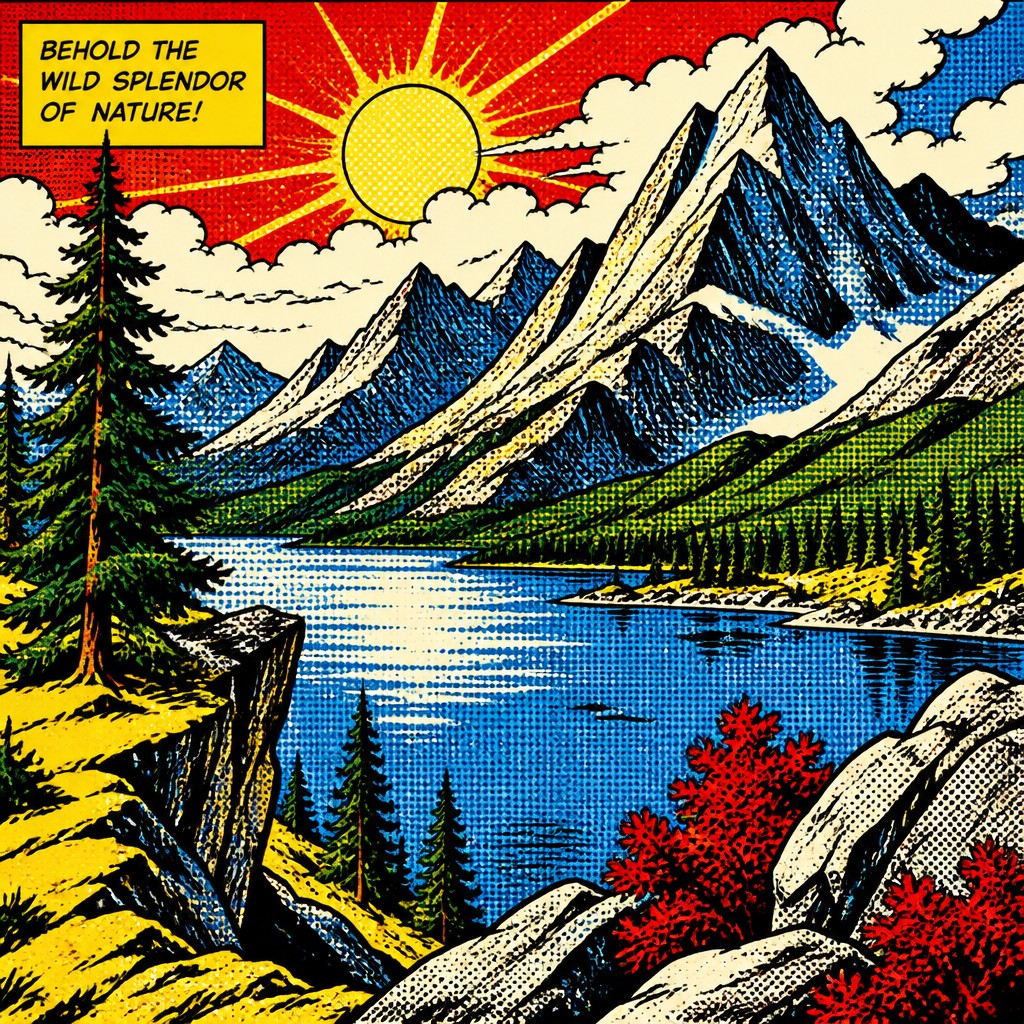
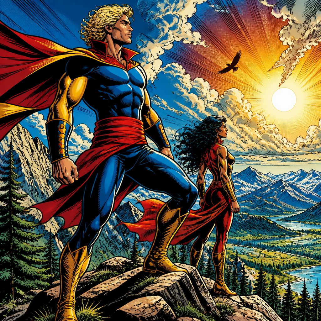
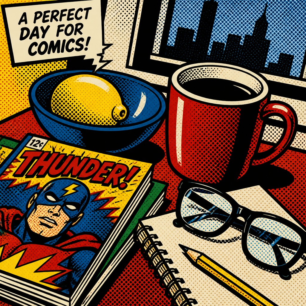
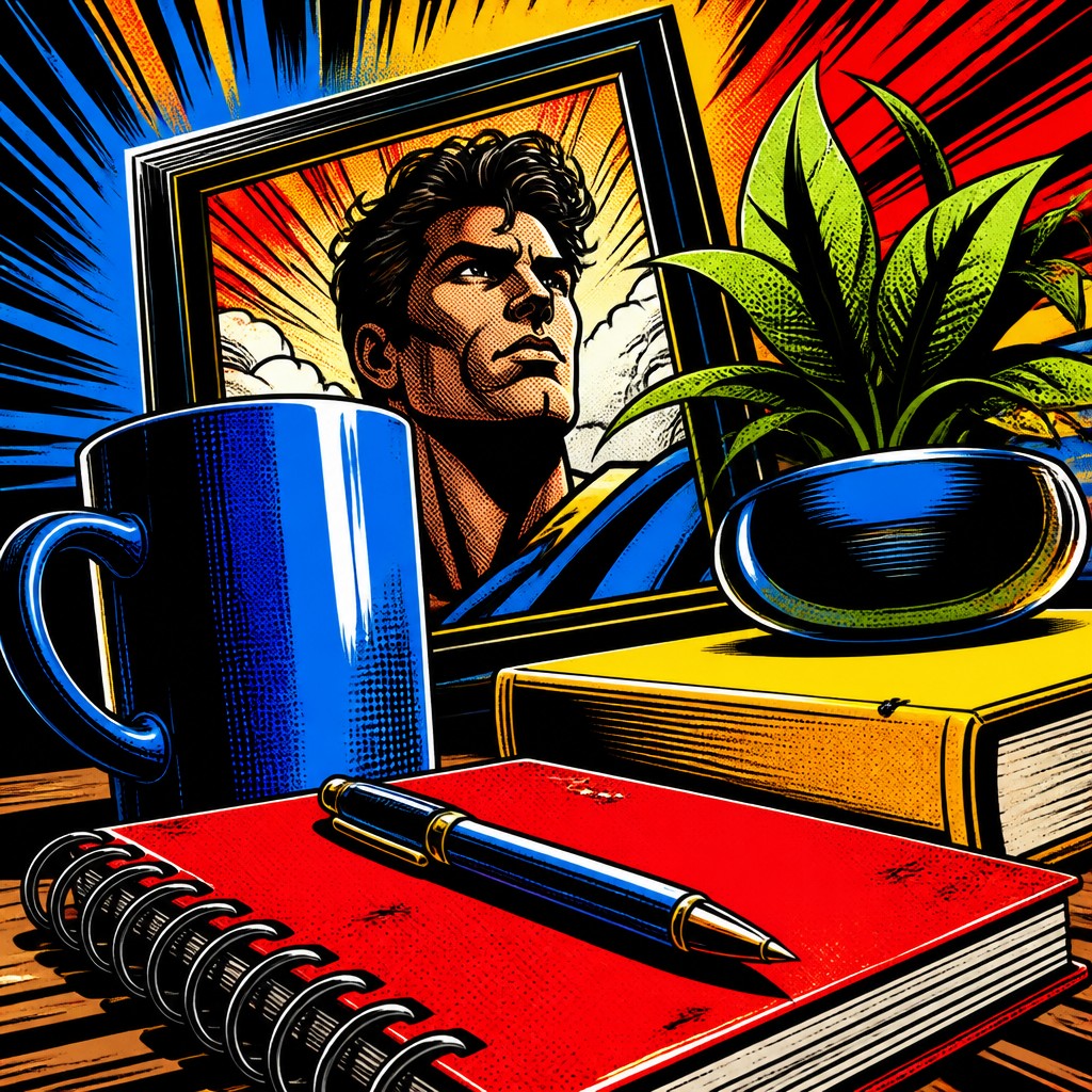
Each pair below was generated from the identical prompt — only the style changed.
“wide landscape with natural scenery”
“still life with everyday objects”
“bicyle resting against a wall”
“a tree in nature”
Key Differences
| Comic Book Pop | Superhero Comic | |
|---|---|---|
| Line & form | Clean black outlines and simplified, flat shapes. | Bold inks with more varied line weight and muscular forms. |
| Color treatment | Flat primaries with a print-like, poster feel. | Vivid primaries used for energy, depth, and scene drama. |
| Texture | Ben Day dots and graphic patterning are common. | Texture is usually drawn through rendering and ink detail. |
| Perspective | Often shallow or intentionally simplified for graphic impact. | Uses dramatic foreshortening and exaggerated angles. |
| Figure style | Figures are stylized and iconic rather than anatomically exact. | Figures are heroic, muscular, and anatomically emphasized. |
| Mood | Playful, witty, and design-forward. | Powerful, energetic, and action-oriented. |
| Mood | playful, bold, nostalgic, graphic | bold, dramatic, heroic, high-stakes |
| Energy | lively | intense |
| Detail level | moderate | detailed |
| Color | saturated primaries with stark black accents | bright primaries with strong contrast |
| Texture | flat fills, halftone dots, crisp linework | clean inks, heavy shadows, glossy feel |
| Origin | mid-20th-century American comics and pop art | 20th-century American comic books |
| Best for | posters, album covers, editorial illustration, comics, merchandise, advertising | superhero comics, action posters, gaming art, movie key art, collectible covers |
| Difficulty | moderate | advanced |
Which Should You Choose?
Choose Comic Book Pop Art Style if you want a bold, graphic look that feels like a poster, print, or design piece with strong pattern and simplified forms. Choose Superhero Comic Art if you want tension, motion, and cinematic storytelling with dynamic poses and more anatomical realism. If your image should read as editorial, decorative, or retro-pop, A fits better; if it should feel like a dramatic comic scene, B is the stronger choice.
Frequently Asked Questions
Are these styles basically the same?
They overlap visually, but they are not the same. Both use comic-inspired outlines and saturated color, yet Comic Book Pop Art is more graphic and design-led, while Superhero Comic Art is more narrative and action-driven.
Which style is better for posters or merchandise?
Comic Book Pop Art Style is usually better for posters and merchandise because it reads quickly and works well as a flat graphic image. Its simplified shapes and patterning also reproduce cleanly across print formats.
Which style is better for action scenes?
Superhero Comic Art is better for action scenes because it emphasizes movement, foreshortening, and dramatic poses. It is built to make characters and events feel larger-than-life.
Can I mix the two styles?
Yes, and the result can be strong if done carefully. A common approach is to use pop-art flats and dots for texture while keeping superhero-style anatomy and motion for the figures.